Reduction Printing with Mary Bruno

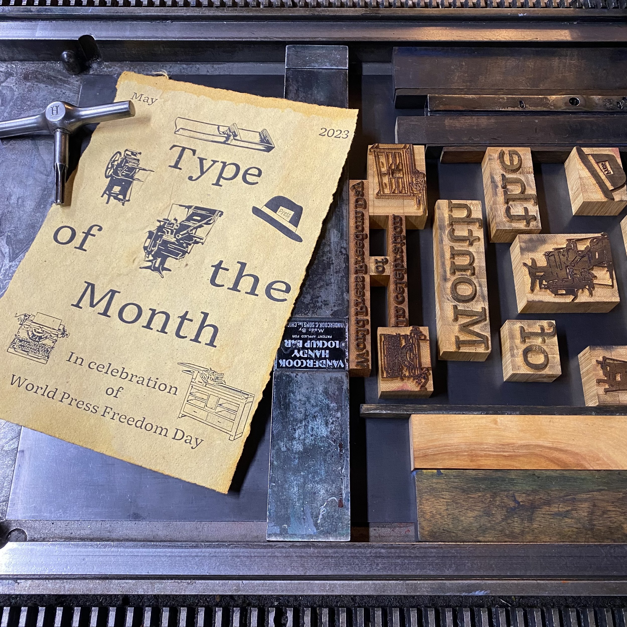
This weekend, our badass pal from the north, Mary Bruno of Bruno Press is checking in with her tips on reduction linoleum cut printing. Mary is one of the finest with this technique and I’m thrilled she can share her knowledge. If you ever have a chance to take one of her workshops (like an upcoming late nighter with typewriters!) or visit her Minnesota shop, please do.


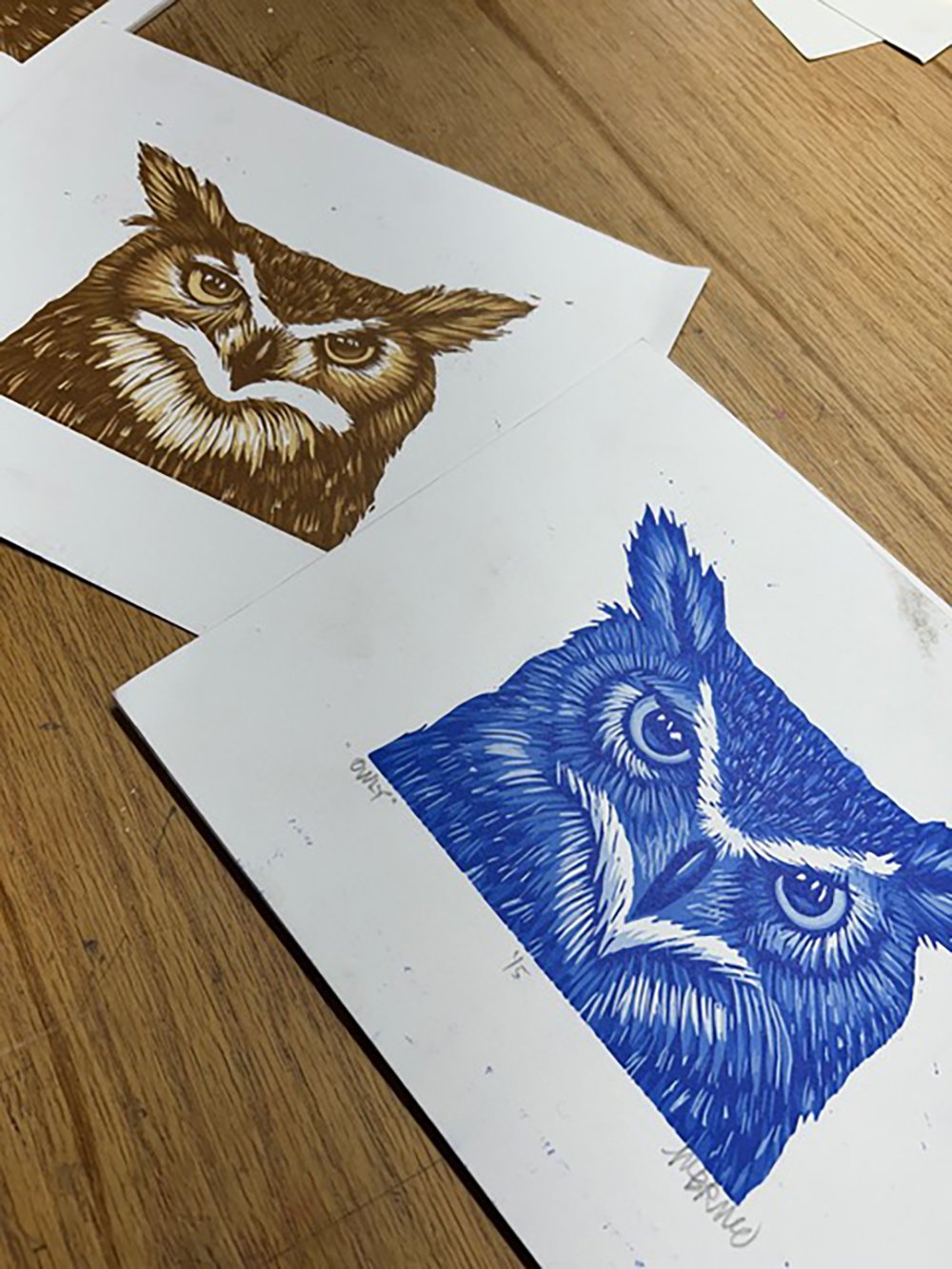
Okay, I do love to figure out a reduction print, but it does not work with just any ol’ image. Much work has to go into planning before any carving can begin. When I teach reduction workshops, which I have done a gillion times, I have learned the best way to teach it to people that don’t understand it. The first thing I learned was that I supply the images choices, because people do not know what they are looking for. I start with images where you can see at least 5 different hues of the same picture. For example, this owl is perfect.

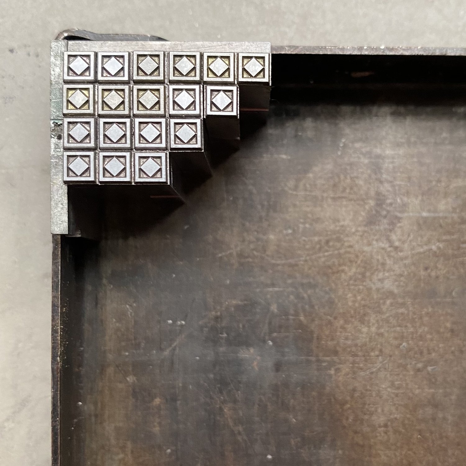
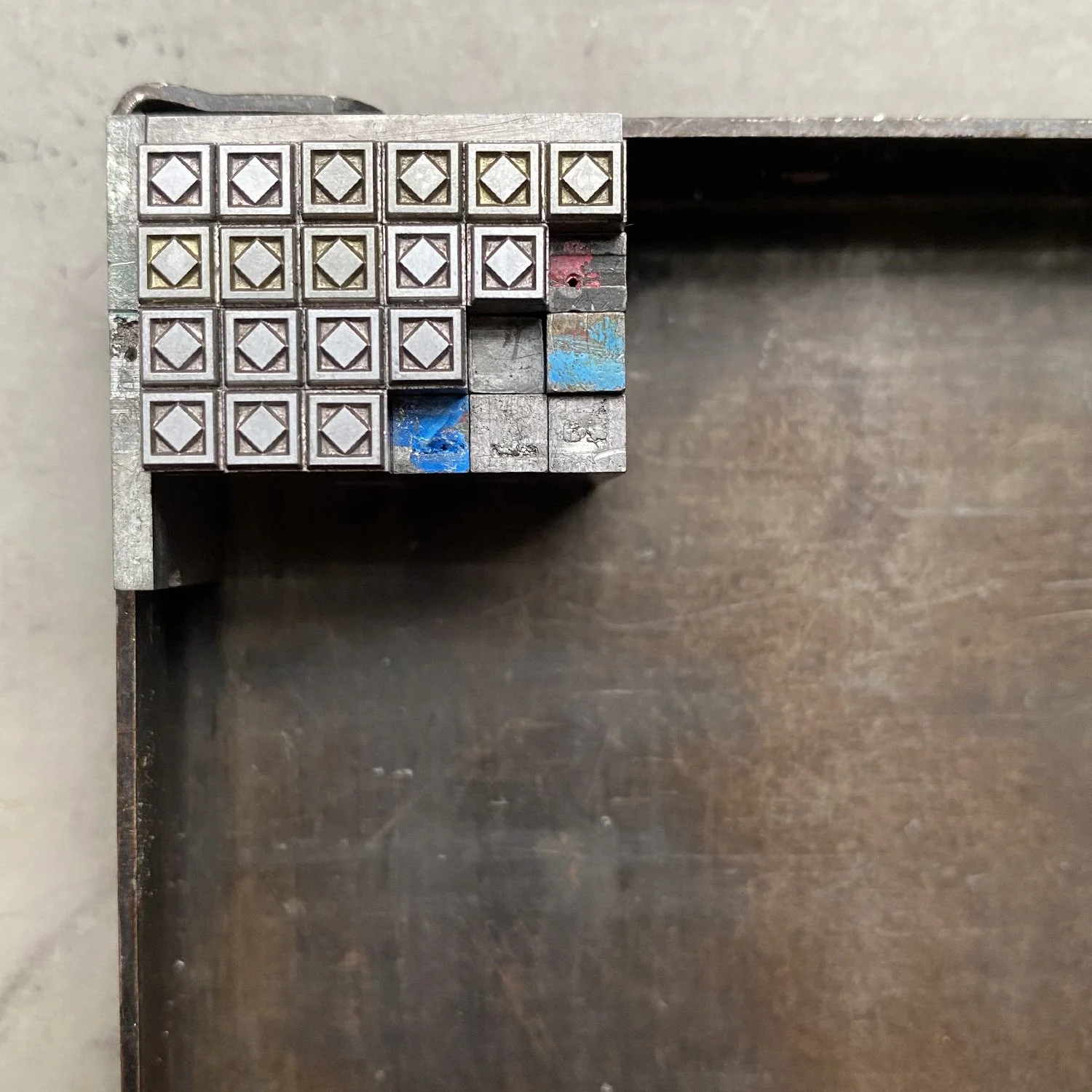
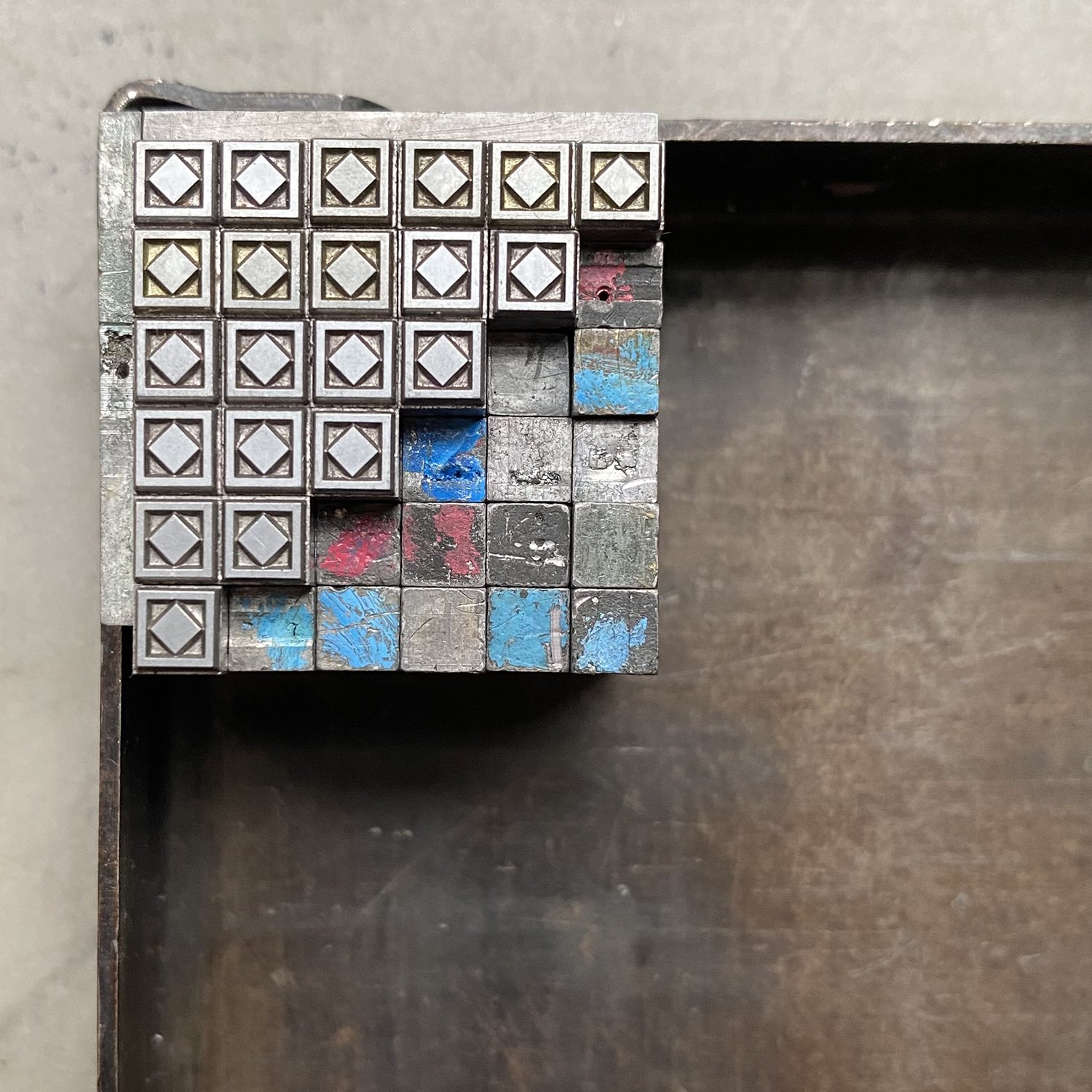
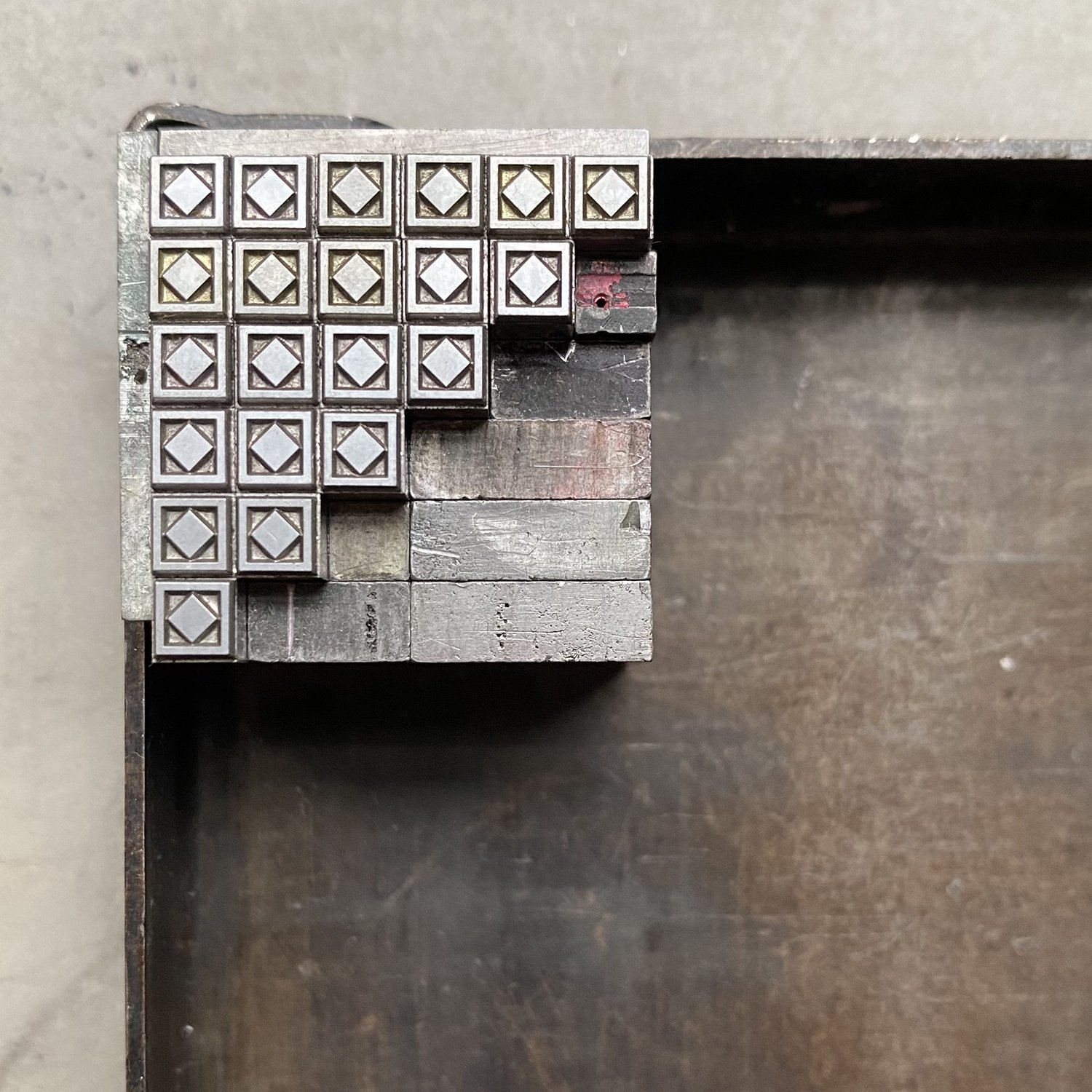
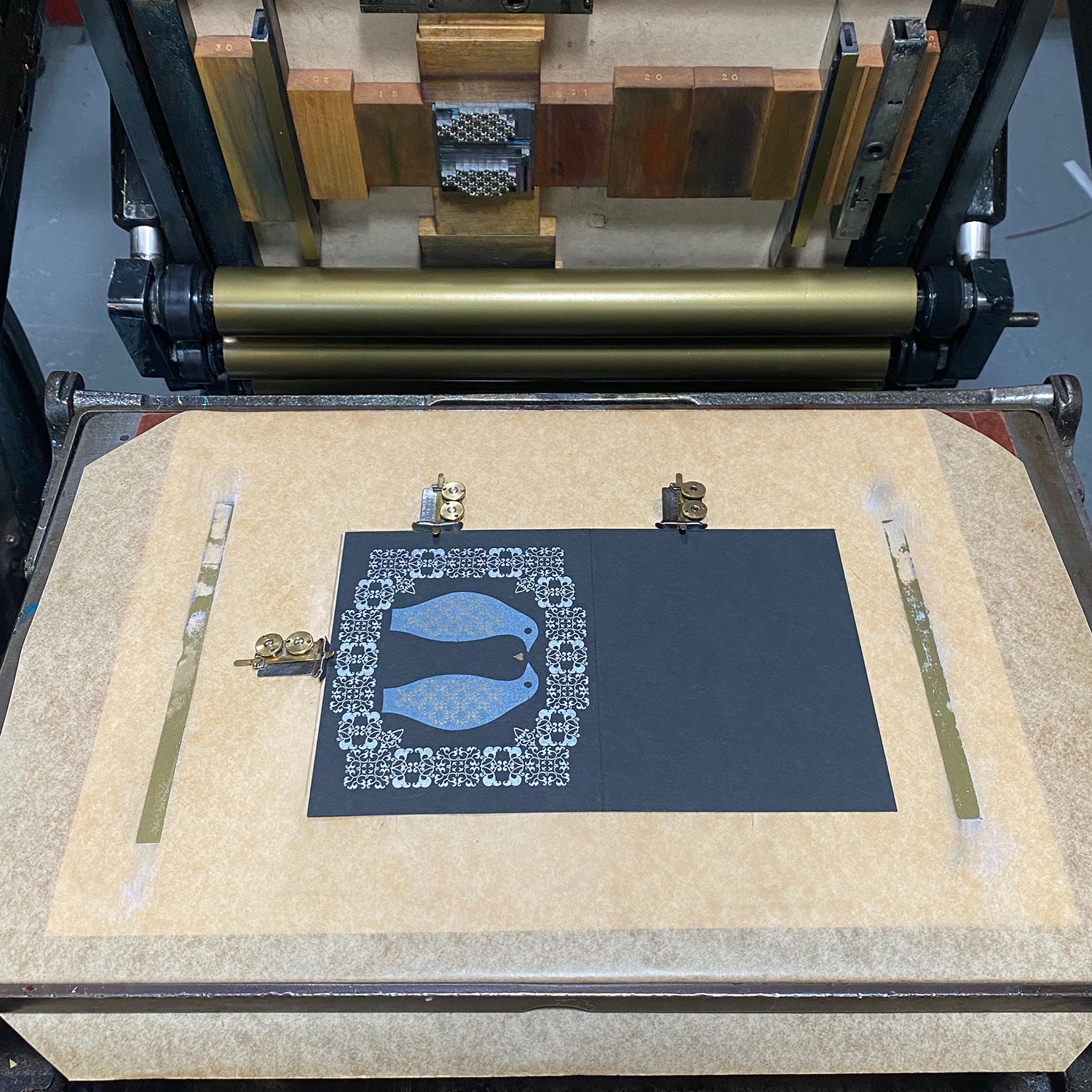
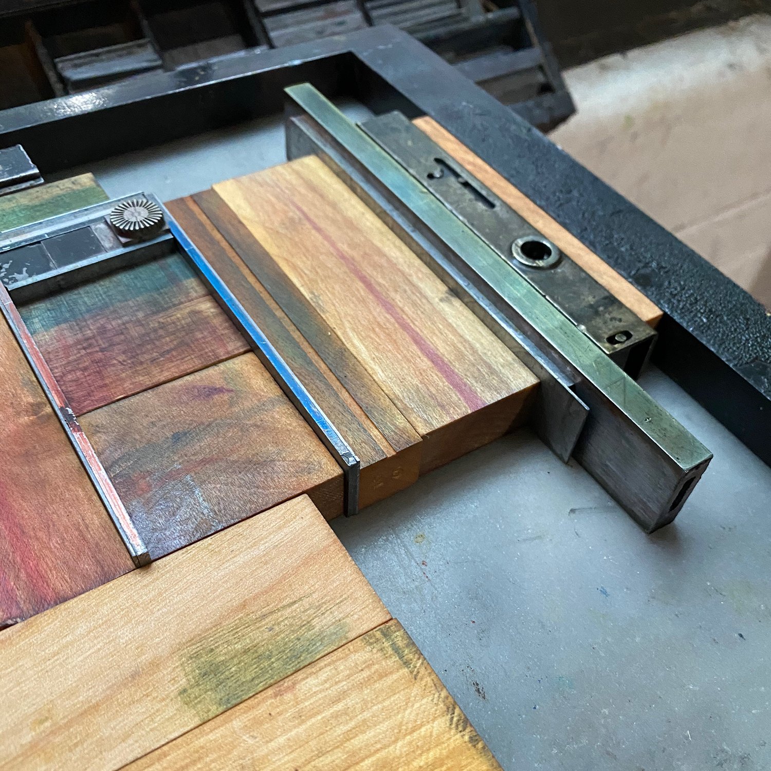
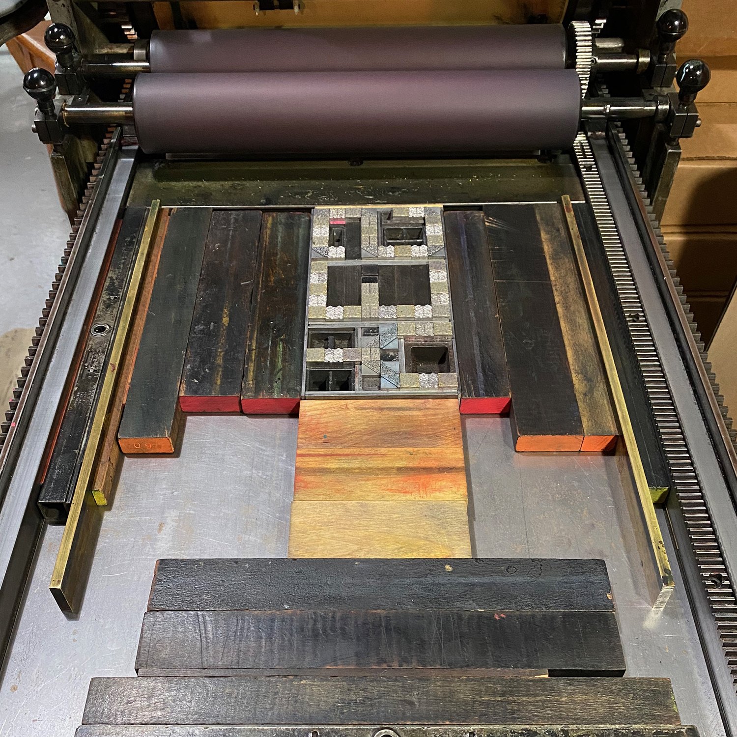
The first thing you do is transfer your images onto the mounted linoleum [ed. note: there are lots of ways to do this; the internet is your friend!], since we are printing the blocks on the Vandercook. Once the image is transferred, people need to look at the image and begin by carving away what is white, or the color of the paper. That seems easy and clear. You’ll use JUST ONE block for all of the colors, hence being called a reduction linocut print.
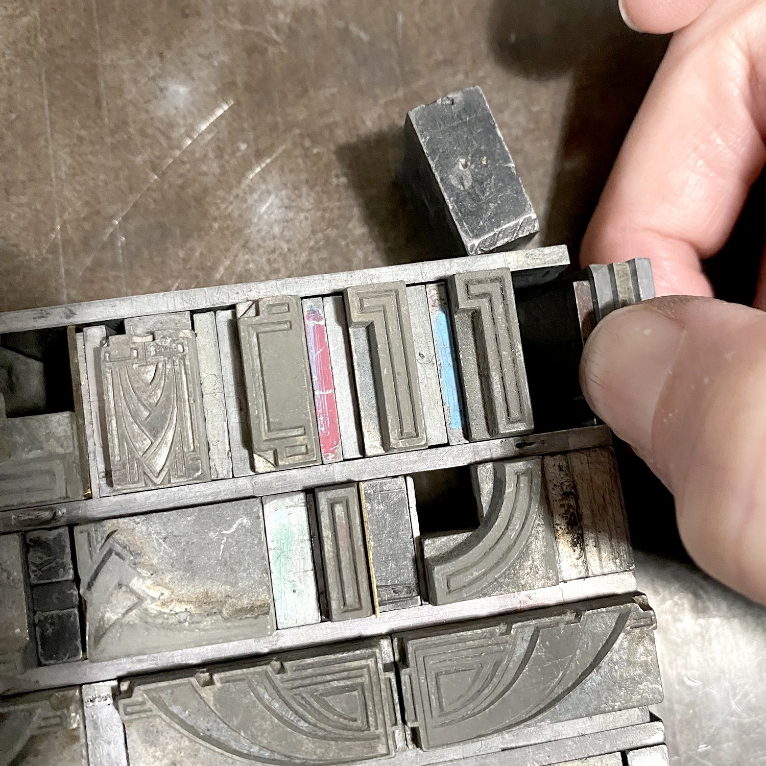
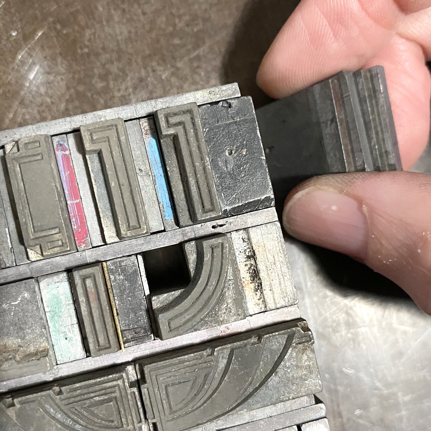
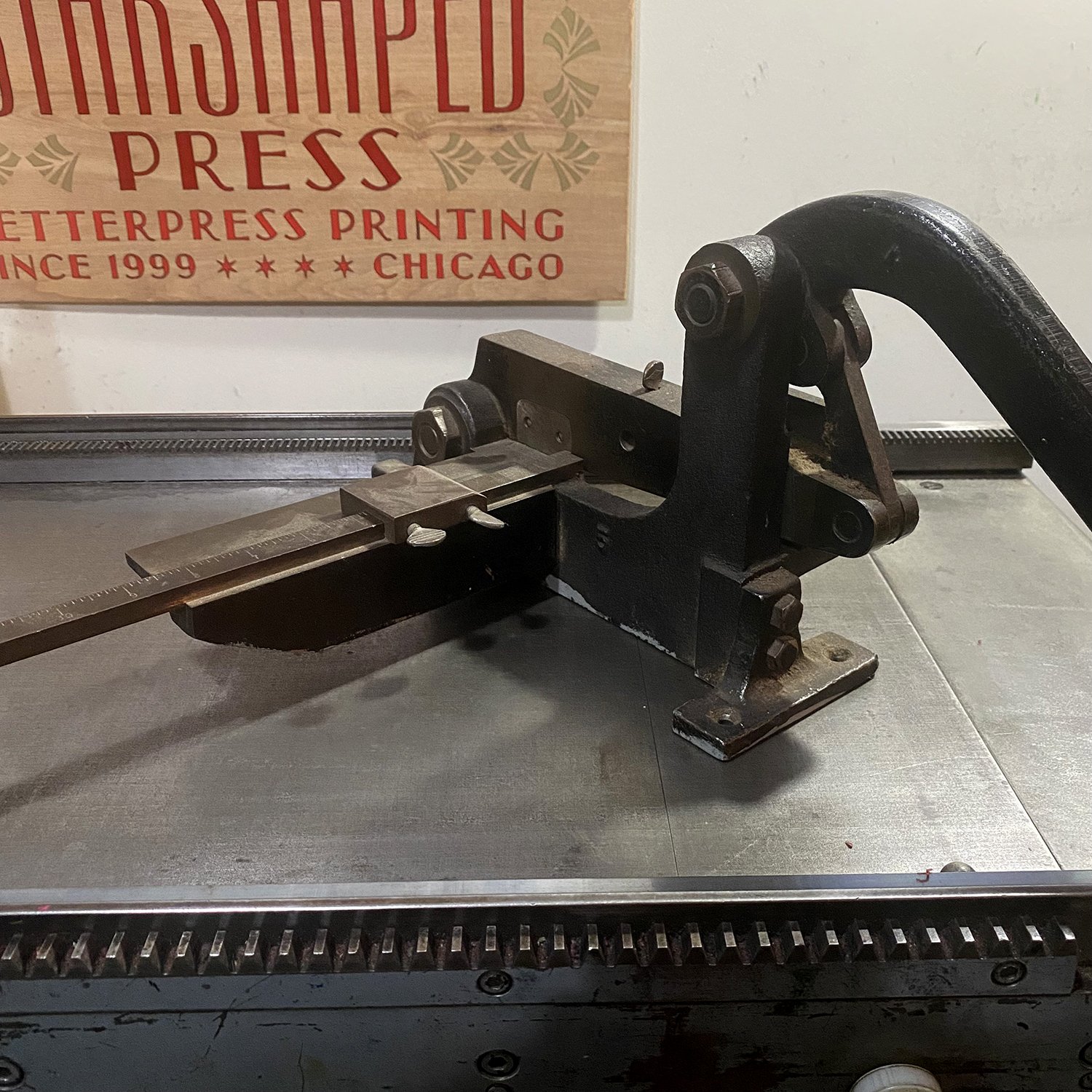
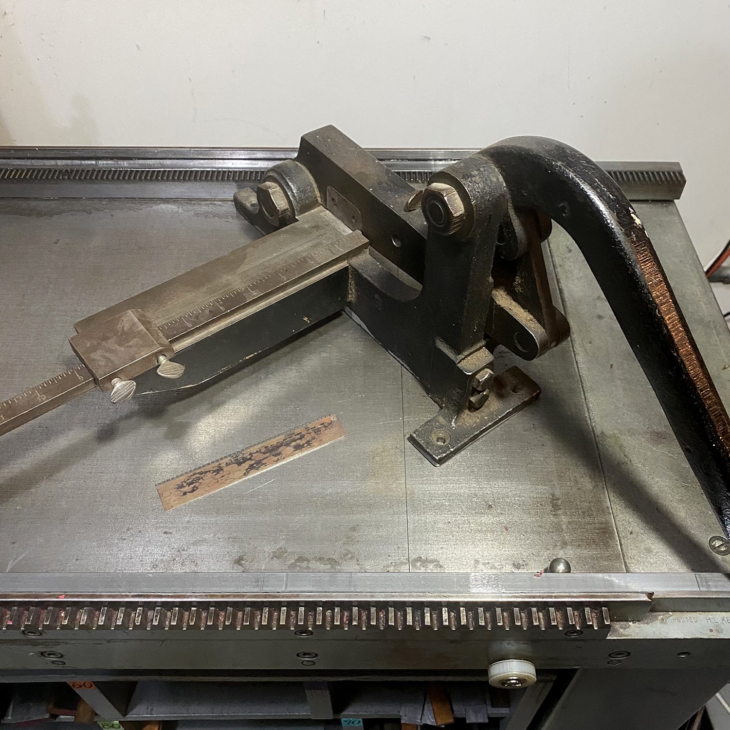
Then the block gets locked into the press and stays in that EXACT spot, and you NEVER move anything, not a single piece of furniture until the process is over. This is important so that everything lines up perfectly, which is what makes the BEST reduction prints. 

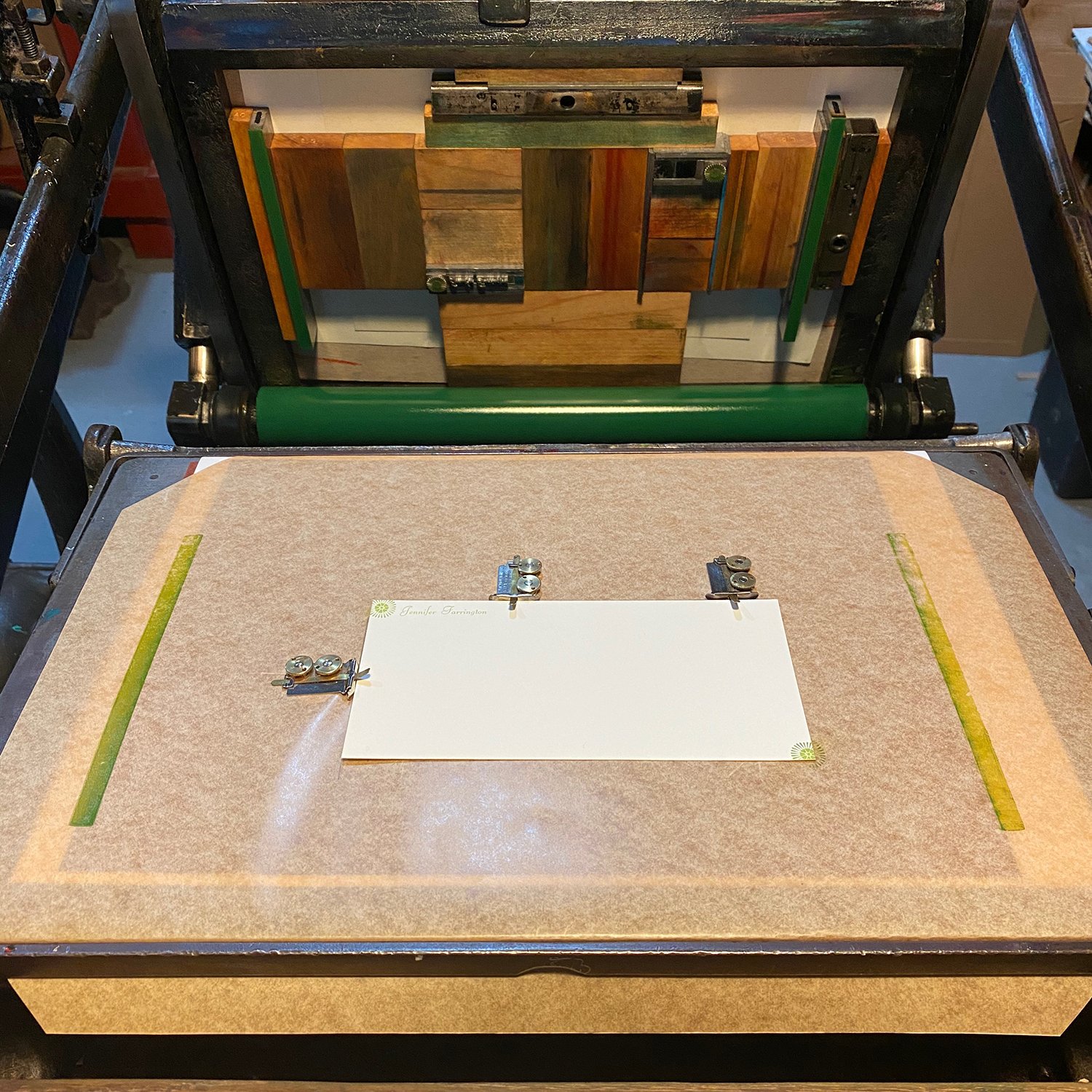
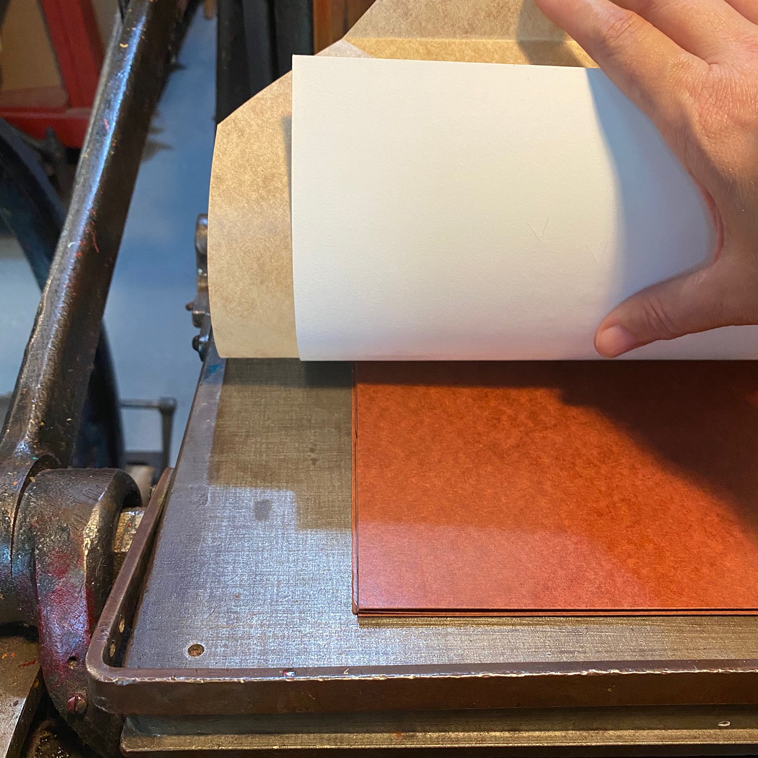
I always do my reductions on cotton-y paper so that ink will soak in and I can keep printing on top of fit. I learned that by using a more glossy paper and each time you printed over the not-yet-dry ink it would pull it right back off or smoosh it around and make a mess. I recommend a Cranes Lettra or Flurry. 
When teaching this I also try to make the color transitions simple, too. I grab a PMS book and tell folks that we start with the lightest of the color and move down a step darker at a time. 

In these workshops, I keep it to 5 “runs” or times through the press. I explain that you want each level to integrate with the next in a blending sort of way; you also don’t want to carve too much or too little on a layer or you waste it. You want to sort of balance each time with the rest. 
The owl image is another great example of blending each layer with the next and not to just do solid sections as it will be a much more impressive end result. 
As we go back and forth from the carving to the press to print, people start to understand what is happening and how to select what to carve and what to keep. You can always carve away more but you cannot put back what you have carved away. The clearest steps are the first and the final, since you can see what is white and clearly know where to carve in the beginning and at the end you know what is the darkest or the black parts. The key is to also figure it out on all the middle steps. 
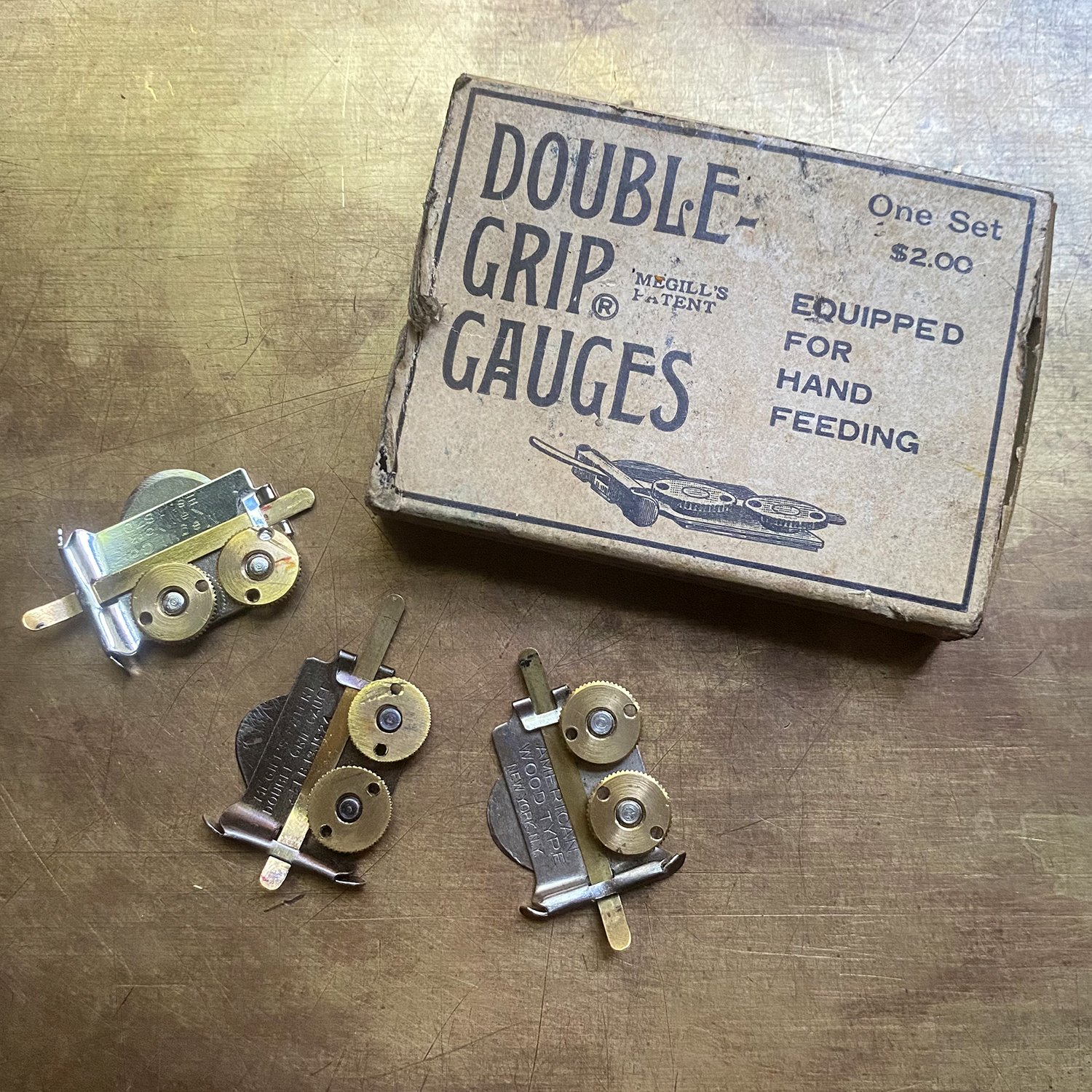
Always load your paper the same, making sure you put your block in the right way, too (if you take it out between passes to carve the next layer).

I often try to keep a print from each press run, so that later you can see what happened at each step. This is a great resource for people attempting to do this as well, then they can see how much changes with each step.

It is also at this time that folks start to understand that this is a limited edition process as well; when you are finished carving, the block is done and so is the edition. 

Here’s the owl block when it’s in its final version!

Our House, in the Middle of the Form

Building architectural forms is one of my favorite things to do with ornaments! There are so many potential options for designs and unique combinations to create everything from tiny homes to large skyscrapers. I want to highlight a few historical samples along with some tips for getting started with your own builds.

I found this piece at the Platen Press Museum that was built in the 50’s by a compositor at the Columbus Dispatch. I love how it uses a lot of linotype slides, mitered and altered to create textures and lines.

Albert Schiller was one of the premier ornamental builders and his pieces are an inspiration. Below is a great image that combines simple ornaments with rule. I encourage all beginners to look at these images as if they were on a grid. That helps to break down how they were pieced together. Sometimes I even lay a piece of pica paper over them to help discern how the ornaments are combined.

This black and white Schiller piece uses mostly rule of various thicknesses to create the idea of skyscrapers. I love how simple it is in terms of its stylization, if not in how it’s set.

When I start to get ideas for how to build something, I begin with pica paper and sketching ideas of what kinds of shapes and ornaments would work, as well as any potential roof lines and how to work with angles. This initial idea calls for both 12 and 24pt ornaments.

I often lay out more complex structures on a computer as most of my ornaments are proofed and scanned. I still set up a 6 pica grid to work from so that when I’m setting this I can measure it all out for faster setting.

When attempting a recreation of an actual structure, I look at lots of images, both full shots and detailed ones. It’s important to remember to keep an open mind because you can’t achieve an exact replica of an existing building. It’s good to shoot for something that approximates the building, more like capturing its soul instead of a perfect image.
After studying images, I make a sketch that shows how it would work as a flat image, also on pica paper so it’s easier to match ornament sizes with various positions. Then I lay it out using scans of type on a computer, though this can also be achieved by doing it with your ornaments in front of you, built on top of your sketch (remember to reverse it if you’re working from an actual building!) After building the form, pull a proof to see if it feels like the structure you want.
This project is more complex and multi-colored; below there are some simpler ideas that are a great place to start.

I look for ornaments that have strong, squarish forms that mimic actual building materials. Thankfully, Pat Reagh offers a ton of these great options in his Dingpat collection. I highly recommend stocking up on these if you want to do more architectural building.

I like to collect as many simple shapes as possible, too, like these Mono and Alphablox. Open and solid squares are perfect for creating windows. Basic shapes often go overlooked at letterpress sales so I scoop them up when I find them. They are the most useful thing I own.

Here are two examples of basic building structures. The corner store uses simple, modular square ornaments to create what would be walls, windows and a door. The text above is where it might be placed on a real store.
The printed orange house is made from 7 different styles of ornaments within the Alphablox family. It wouldn’t be difficult to replicate this basic idea with other square ornaments, leaving the window areas as a blank space (in this case, it could be a 12pt em quad.) This also has a brass rule to create a more defined roof line. Rules are great ways to add a little extra dimension, whether brass or type metal. I usually recommend separating them from the rest of the ornaments by running a thin piece of cardstock or 1- or 2-point leads along each side. This little bit of distance usually makes both rule and ornament print better.

Another way to use rules is below, as a roof (the lighter gray is a linoleum cut to give it shape). They can give you a way to create structure without getting too elaborate with ornaments.
Another thing to consider is green space, if you’re creating an outdoor building. For this I look at organic ornaments instead of architectural ones, as this simple form change can help you delineate between the built world and the natural one, even if you’re printing in one color.

When you’re ready to upgrade to multiple colors, try to design something that can be built as one form. This way, you can proof the entire structure and make sure you like it. From there, check out this post on color separations (and another post about other ways to add color is coming soon!)

I’d also like to show an example of using inspirational images to create something architectural, but in a more abstracted way. For years I’ve designed and printed calendar covers for Brick of Chicago. Each time, Will gives me his photos of a particular building/style as inspiration, knowing the final design will be similar in spirit, given metal type is ultimately different than bricks and terracotta.
This year, I looked at his images to discern the dominant angles and simple brick patterns. Then I found ornaments that are indicative of this, though not exact. Sometimes you just need to get the idea across (and it took a few iterations for this project to be right) and that’s enough!

Have you tried architectural ornamental building? If so, please share! And remember that there are as many ways to create a form as there are evolving real-world architectural styles, so have some fun with it.

All Points Lead to Success

Recently, I was asked for more details on using steel points on press after my pal, Paul Moxon, posted about them. So here’s a quick, down-and-dirty explanation of how I use them, though there may be many ways to do so.
First, the point (ha) of these handy little tools is to help hold prints in place and keep them from fishtailing on press. They are particularly useful for Vandercook prints that span the length of the bed. Here they are, locked up at the end of a form.

It’s important to have extra paper at the end of your print to accommodate the points. I usually leave an inch or more to trim after printing. This print is 8x10” and I cut it to 8x12.5”. You can see here that the points will hit the paper well below where it will be trimmed.

After the set up is complete, I still carefully feed the paper and hold it to the drum for as long as possible, following the hold on the back side as well. Here I am doing it for the three colors, with the press points helping to catch and hold the paper in place.

They’re difficult to see, but the points leave tiny marks on the paper. This is not to be used for registration purposes, but it’s helpful to see them to confirm they are in the cut off area.

If you don’t have steel points, consider adding some to your arsenal. They help tremendously with keeping your prints lined up and pristine! Just watch yourself; they are unforgiving if you accidentally put your hand down on them or brush it across while running prints through.

Count Me In

Occasionally, I need to officially number something in the shop. That’s when these handy numbering machines come out. They’re a dime a dozen and you can find them at most places that sell letterpress equipment. I’ve got some with sans serif letters and some with serifs. All the options!

These are pressure activated so that when you make an impression, the ‘No.’ depresses and advances the number reel to count up or down. There are variations in how they work but I’m going to show the ones I use the most because they offer a lot of options.
I do one job twice a year that requires these little wonders, so I’m showing that process here, as it involves a more advanced setup than numbering once on a print. When I lock these up for this particular job, I only put one quoin in, which I know is against best practices. I discovered with my numbering machines that if there’s a little too much pressure, they don’t rotate correctly, which is why I do the bare minimum.

The sans serif machines are my favorite. You can see a small, different number to the side that’s right reading. This tells you how many places WON’T print, IF you set those first two places to zero, which you can do manually. In this case, I only want 4 numbers to print.

If you look from the side, you can see that the two zeros are lower than the printing numbers and won’t print.

Also, on the side, you can see a small depression that can be switched from side to side. This is for either counting up or down and I convert it with my etching needle.

I set these up and get the placement correct on the final print BEFORE I go about adjusting for the correct starting number. There’s too much tweaking with the makeready at this point to also be concerned with what numbers are printing. The numbers themselves can usually be manually shifted to the correct spot when you’re ready to get serious.

For this job, the numbers have to appear twice, once on the receipt section of the gift certificate that the store keeps, and once on the certificate itself. The ‘No.’ part has to hit with the same impression in order to advance the reel, but we don’t want it on the final print. So I add a little piece of paper the same thickness of the certificate to the non-printing part to achieve this.

But I also need one to hit ON the certificate without printing. So I set up this frisket, using grippers on the press (this is all done on my C&P platen) and then piece masking tape between them. Now the ‘No.’ will print on the tape and not the certificate, while still advancing the reel.

With every run, I keep a note of where I left off the last time so I know where to start again. These certificates are ultimately turned into pads along the receipt side so they’re easy to move around the shop and keep track of. I also got a great tip from Paul Aken at the Platen Press Museum about stacking numbered prints. After you pull each print, flip it upside down on the receiving board so that the numbers will count correctly as you go up, without having to manually flip them after the fact. Or, you could set the counter, if it has this option, to count down instead of up.

If you’ve got numbering machines lying around, give them a whirl! They can also be a lot of fun as an artistic element in your print work, which gives you the opportunity to get a handle on their peculiarities.

Also, huge shout out to Gethsemane Garden Center for commissioning these for the past 20 years. They are pretty much the only job I do from plates vs. type given that we print over 2000 every year. They could easily convert to plastic gift cards given the volume but instead choose to support another small business. Together we create something beautiful that people WANT to buy, and I’m grateful.

Bamboo Type with Columbia Gorge Book Arts

This month’s post is by Ben Davidson of Columbia Gorge Book Arts. Find his great work here and consider joining the Type of the Month Club! Bamboo type is great to print with.


A few years ago I began making type out of bamboo. I've been a sustainable artist and wood worker for most of my life so I naturally drifted towards wood type and wanted to find a way of making it as environmentally friendly as possible. Not to say that other materials being used are better or worse– end grain bamboo just checked a lot of boxes for me with some unexpected benefits, including being able to retain a high level of detail, and that it is even self-healing! Here's a little about my process.

I usually start with some really quick sketches to help me visualize what I'm making. In this case I referenced my own machinery alongside historical images to help with perspectives (I often really struggle with drawing). Once I'm happy with something I'll re-draw a final version, ink it, then digitize it so it can be programmed into g-code for the CNC machine to read. I always carve a trial cut first and print a proper specimen before moving on to production. If everything checks out I'll continue with processing material.

I buy my bamboo from a responsible grower – it is not a food source, and doesn't contribute to loss of habitat. It is shipped to me in bulk once a year (trying to limit the carbon foot print) as 1” thick end grain boards. I square up the boards on a type saw then mill both sides flat on a high speed milling machine; the finishing pass takes the material down to 0.918” resulting in a burnished surface. The height is confirmed with both calipers and a type-high plate gauge.

Next is finishing the surface so it's suitable for printing. Since bamboo is a grass, the surface needs to be thoroughly sealed, otherwise the capillary action of the fibers will draw the ink completely through the type and cause it to weep out the other side! I'll sand the surface using micro mesh sanding pads, starting with 1500 then ending with 3600 grit, then on to French Polishing, a technique I learned from building stringed instruments in Lutherie school. I prefer to dissolve the shellac flakes with denatured alcohol in a wine bottle with a carved v-groove down the side of the cork. This allows me to  dispense a small amount at a time; I'll apply three coats, sanding in between with 3600 grit.

After the finish has sufficiently cured it's back to the type saw to cut the finished bamboo into “bars” at previously determined widths for the desired line size. These are then clamped in a CNC milling machine. First, the design is carved into the face of the type at a 60° angle; this prevents the edges from fraying. In the next process the body of the type is precisely trimmed out by the milling machine. Nicks are cut on the type saw.

Finally the body of the type is cleaned up with a chisel and honed with a hand cranked flat sander. Carbon copy proofs are made, the maker's mark is carved, and the type is then oiled with a liberal amount of jojoba oil before shipping.

Thanks for reading and happy printing!!

Peeling Back the Process Layers with Raychel of Current Location Press

This weekend’s post is by Raychel Steinbach of Current Location Press, currently located in Chicago. Raychel is a longtime friend and fellow printer, often completing projects at Starshaped and helping make the studio run efficiently. Because her process for building prints is quite different than my own, I asked her to share it so we could explore other ways to achieve great results in printmaking.


I’m a pen & paper sort of person. I am trained as a fine art printmaker, not a computer-based designer. This makes my design process seem a little unorthodox to some; I work this way for a variety of reasons that make the translation of sketch to final print go smoothly. Jen asked if I might peel that layer of the onion back for you all today.
My design method involves tracing paper at almost every stage of the process. I prefer to sketch the general flow of the print on drawing paper and then flesh out various elements on pieces of tracing paper. This allows me to cut, move, and layer things so I can make adjustments without having to redraw each time. Here are several iterations of my newest print “Urbs in Horto” for you to get a general overview of how my design process evolves.

I utilize the photocopy function on my printer/scanner often to play with scale. By enlarging/reducing various elements of my drawings, I can cut them out and collage a better composition.

Once I’m fairly happy with a general layout, I draw each layer on a separate piece of tracing paper to make the final tweaks to how each color will play with ones before it. As you can see, I still make manual edits at this part of the process, too.

Now it’s on to setting my forms for the background color fields and carving my block for the key layer. I utilize Virgin Wood Type scraps almost exclusively for the abstract color layers because they’re inexpensive, not precious, and I like the reuse aspect. I set these crazy forms on a galley and since Jen’s Vandercook has a removable bedplate, this makes printing wonky forms a breeze! [Thanks for letting me use your studio, Jen. <3]

I like to layer a piece of white paper, tracing paper with my form drawn on it (and so handy because I can easily flip it to see it wrong-reading!), and then a piece of mylar on top and set my form onto this little sandwich. I know – it seems strange – but it’s tried and true! Make sure the white paper and mylar are sufficiently longer than your form so you can remove them easily. The mylar makes these extra layers easy to slide out before I go to press and the white paper on the bottom plays double duty as making the drawing easy to see as well as allowing the tracing paper to slide out without tearing under the form. Pretend along with me that the form shown here is the same as for the rest of this post…

Then we are on to the last, but not least, way in which I use tracing paper – proofing overlays! Before I actually put ink on press, I like to run a carbon paper proof of each layer and make sure they line up like I intend. Since the layers are especially tight registered for this sort of harebrained printing method, this step is absolutely crucial.

And four runs later… I have a finished print!


You can find Raychel’s stellar work at Current Location Press.

And the Envelope Goes To...

Envelopes are lots of fun to print! I only print them on my C&P platen press (I can’t speak to those that use Vandercooks) as it’s the best tool for the job. I print on both the back flap and the front side of envelopes and both present different issues. I’m going to show both, as well as a ‘proper’ way to do the makeready and a less conventional method. Then you can figure out what works best for you.


The first envelope will have a return address on the back flap. I think it’s easier to print envelopes with the flap open and the body of the envelope going into the press first. I print on the tympan for placement, then fold back the envelope flap and use the top edge to line up along the text to get the left side placement of the gauge pin. Then I shimmy the envelope down to get the bottom pin placement, the same as I would with any other print.

After making the first print and getting the alignment where I want it, I prep the makeready by cutting notches in the envelope that are deep enough to extend into the makeready sheet, which is locked up with the tympan paper under the bail closest to the inside area of the press.

Then, after lifting up the tympan paper, you can see where those notches are on the makeready sheet under the tympan (make sure the pins are only going through the tympan paper).

I use thin, cheap packing tape to hold the envelope down, as well as build up the areas that are too light on the print. Note: I realized that the photos I have show the envelope in the wrong place with the notches before I adjusted it for the final print! Apologies for not getting the right photos.

Then I place one of the heavier press board sheets on top of this so there’s a nice, hard pack right under the tympan paper. Note that if you are adding anything to your makeready sheet, like the envelope itself, you should be mindful of how this adds to your overall packing and impression.

Sometimes envelopes have a little ‘lift’ to them because of the folds so I’ll often use grippers and gripper fingers to help hold them in place.

Printing the flaps open cuts down on impression coming through on the front of the envelope. I also check them to make sure there isn’t too much impression.

Onward to another envelope! This time, I’m printing on the front of the envelope, which presents a different issue. I start the same way with printing on the tympan to find the print location and then set the pins.

Then I get the placement just as I want it, even if the printing/impression isn’t quite right.

I’m definitely using grippers again on this because of the curvy bend in this particular set of envelopes. Grippers and fingers can be placed anywhere they won’t hit a pin or the type.

The issue with printing on the front of envelopes is that you often have to deal with multiple layers of paper. You can see here that my text will span two different ones in this corner placement.

I’m going to show the more unorthodox makeready that I sometimes do for envelopes like this, using the top of the tympan paper, because it’s easier and faster to manipulate with tiny adjustments. As I’ve often said, there are many ways to do most things in print and I’ve gotten conflicting lessons from many sources. I’m showing a method that works and is very easy to tweak.
I first cut along the second layer of the envelope in the area that will have print on it.

Then I place it back on the press, carefully holding down the piece I want to stay that will increase the area of the envelope that only has one layer of paper vs. the two on the folded edge. This will make a consistent level of packing for under the area of print.

Then I tape it down.

And cover it with a small piece of clear mylar.

The nice thing is that you can see the text run across the tympan and onto the piece of envelope you’ve cut and you can easily make minute changes if the placement is slightly off. Yes, in an ideal world, your makeready would be under the tympan, but I just want to show another down-&-dirty way to get things done.

I hope this shows a few creative solutions for printing envelopes on a platen press. Or anything that has multiple layers that force you to tweak your makeready for the best impression. It can be done with a little clever problem solving.

4, 3, 2, 1

While setting a few simple type forms lately, I realized there are things I do repeatedly to make the process go smoothly that might be helpful for others to think about, especially if you’re early on in your typesetting journey. Here are four of them, starting with line spacing.

Note: This post assumes a basic knowledge of typesetting, spacing and setting up forms. If you’re new to printing, go back to this post on spacing and go from there.

After a block of text is set and ready to be locked up, I add a few thin leads at the top and bottom. This way, if I find I want to adjust the line spacing within the text block as I’m working through the makeready, I have leads built into the form that I can easily pull without having to adjust all of the furniture around the block.

Another thing I strive to do with forms is to keep the largest spacing in each line towards the outside edges of the line. This way, when you slide the block from the composing stick, the spacing material at the end of each line is much less likely to fall over. If you put the thin spaces at the end of each line, they will definitely fall over when the form is removed from the stick. Annoying!
In the below image, em quads are at the end of all lines, with thin spaces tucked in towards the type.

While setting some orphan ornaments to proof below, I used 4 line (4 pica) slugs as spacing while I figured out the ornament placement. Then, when I realized there were 4 slugs at the end of each line, I swapped them out with 2-em 24pt quads because the math is the same. It’s not necessary but it’s one less thing that will potentially fall over when I’m sliding it out of the stick onto a galley.
I know many people tie up their forms, but I rarely do. Most are set quickly and printed just as fast and almost no forms in the studio stick around after they’ve been printed. Printing is often about finding what works for you in this day and age and my general rule is if it doesn’t hurt you, the type or the presses, then it’s fair game.

Sometimes spacing can change as you build out a form, as illustrated below with 12 point ornaments. Because I built it line by line, I added 12 pt em quads, line by line.

But then it becomes apparent that’s a lot of individual em quads. I don’t love this as it’s too many moving parts and given the age of some of the spacing, one nick on one piece can throw off the integrity of holding them all together well. I swap them out with larger spacing material to minimize these potential issues. The second images shows changing to 2 em and 3 em quads.

But my preferred solution would be a 36 pt em quad, with 2 em quads. Then you have as little spacing as you can and the least amount of potential trouble. Less is more!

And finally, I try, whenever possible, to set lines to standard furniture lengths, like this 25 pica length block below. That way, when you go to lock up your form, you have the most even distribution of pressure across your text block. And adding slugs to keep the side furniture from binding against the top/bottom furniture is also helpful (when the furniture puts pressure on itself and not the actual type form).
This isn’t always possible, but it’s a good rule to follow when you can.

I hope these are a few things to think about as you’re setting type! The more you do it, the more you encounter your own ways to expedite the process and solve problems. There are often as many ways to deal with issues that arise as there are printers, and I’ve heard conflicting solutions from printing teachers and those with decades of experience in the field. Regular practice is what makes you better, in printing and just about every craft.

Casting Type with Bowerbox Press

I’m so excited to have a guest blogger this month! Val Lucas, of Bowerbox Press, has been learning the art of casting metal type and has written up her adventures to share here. Enjoy!


Have you ever wondered if anyone is still making new type? What about new designs? There are a handful of typecasters working in the US, and I was lucky enough to reconnect with one of them in the fall of 2021. I met Jim Walczak through my APHA printing group in 2007, and watched him casting type shortly after I had started learning about letterpress printing. Fast forward almost 15 years, and I took a trip to Massachusetts to cast a font of Kennerley for a book project. 

After we’d spent a few days on the sorts caster making letters, Jim asked if I wanted to make my own type- and I jumped at the chance! It’s easy to make a polymer plate with a custom design from a digital file, but there is something special about having your very own metal type.
We started with my sketch, based on one of my favorite subjects. I traced and finessed the image in Illustrator to create a scaled vector version of the final art. 

We printed a positive transparency at 5 times the final size, and exposed a polymer plate pattern on a home-made exposure unit. The pattern is the reverse of a printing plate–the image is sunk down into the plate instead of being raised up.
The pattern is mounted on one side of the Preis pantograph engraver, and a flat brass mat is locked into place under the cutting bit. The tracer moves inside the sunken pattern image, and moves the cutter across the brass mat at a reduced scale. Jim made cutter bits that have a tip measuring .003” (or so), to get the finest detail. 

The mat is engraved in a series of shallow passes to get to the final depth of .050”. This mat can fit in a Thompson caster, or the Monotype Sorts caster. 

The mat is mounted in a holder on the casting machine, and the proper size mold is installed. 

The mat must be aligned so the type itself fits correctly on the body, and the engraving must be perfect so the type is exactly type high. 
Once all the adjustments are made, the machine can cast hundreds of sorts per hour, by pumping the hot type metal into the mat and pushing out each piece of type. Some designs hang off the edge of the type, so each piece must be “rubbed” against a file to remove the overhang. Then, it’s ready to print! 

I have truly enjoyed learning how to cast type and how to create new designs, and am proud to have made the Amanita border, a set of snowflakes, and the Folium Undulatum border so far. I hope to continue making new designs and offering brand new type for printers to enjoy.


Check out Val’s work over at Bowerbox Press.

10 Out of 10, Would Recommend

Occasionally I get asked about the tools I love best in my shop. It’s usually not the glamorous ones (I see you, rule bender) but the diminutive things that do the hard lifting without getting much credit. I also have seen many of these items go unnoticed at various letterpress sales and fairs, so I hope to point out how valuable they can be.

First up, hi speed quoins! These may be obvious to the regular printer, but they are the best quoins for any press. So tight, so easy, and they have a built in system for always locking up your forms the same way between any tweaks and alterations. I wrote a post about using these numbers for registration.

Next is corner quads! These are easy to overlook as they are not-type-high little L-shaped pieces, but they can literally make your borders come together.

These two pieces of decorative rule are mitered on the end to (hopefully) make a clean transition from one side to the next. Corner brackets are like a little hug for this, holding it together in a firmer way than how you might traditionally set borders.

On to steel points! These little guys can ruin your day if you put your hand down on top of them, but if you set up a system for using them it’s easier to be mindful. They can be used on any press but I have the most experience with them on the Vandercook. Lock them up around the deadline of your press, or wherever your paper is going to end, and these little points will help hold it into place at the bottom of the print where you can often see fishtailing of the paper, losing registration. I like to print a larger sheet and cut down this side of the print so you don’t see the little points they make (not that they’re huge). Paul Moxon is a good source if you need them yesterday.

While we’re on the subject of steel, I really adore my steel rule cutter made by JF Helmold. I have one that was a gift and another picked up as part of a set of tools to make small, angular diecutting rules. Much like slug cutters, these have one job, and it’s to cut the steel and brass that your slug cutter can’t. Mine are secondhand but it’s not hard to find new ones, or keep an eye out at those shop sales. It’s larger and heavier than your average slug cutter and mine has a traditional inch ruler (sure wish it was picas!)

Another tiny workhorse in the shop is metal furniture that’s smaller than the traditional sizes in well-appointed furniture racks. Most of mine lives in two small drawers close to the Vandercook where it gets the most action (and is nearly never organized despite best efforts). It’s especially handy with small wood type, which you can see in this post.

If you print on a platen press, you’re all too familiar with gauge pins. I have, for many years, only used double grip gauge pins because they really have a solid grip on the tympan paper. Cut a slit perpendicular to your paper, slide them in and lock it down. They even have a little key to tighten them but it’s rare I ever have to go that far. These tend to be more expensive than most gauge pins but are worth it!

Last but not least for today’s post are the ubiquitous Handy Boxes! Sometimes these seem a bit passé (I still haven’t found a good use for boxes of fractions other than the once-a-year job that needs one) but don’t overlook the most mundane options! I keep most of mine in one case so it’s easy to see them at once. I’ve gotten a lot of traction from boxes of squares, dots, symbols, math and language accents (check out this post for tips). I once built a whole letterform out of them!

These are just a few of the seemingly little boring things that make life a little easier when you’re digging in on press or with metal and wood type. I’ve seen them all at sales and occasionally online and none are bank-breakers. Next time you’re eyeballing that rare, expensive 19th century typeface on a table at a printers’ fair, remember all the far more useful bits and bobs sitting next to it that you can use weekly for the same (or less!) cost.

Bear With It

If you find you’re struggling with less than stellar rollers or you’ve got some unexplained ink slurring in certain areas of a type form, one quick fix that often solves some of these issues (assuming you’ve already adjusted your rollers as they should be) is to lock up bearers with your form. These can be anything that’s type high, but I stick with 2 pica rule.

I’ve got a number of pieces cut to fit in my platen press chases and keep them just for this purpose. We’ll get to the Vandercook a little farther down.

When locking these up in the form, you want them to span the distance of the printable surface area, while also being completely out of the way for gauge pins. I keep mine as close to the left and right side of the chase as possible. The rollers will roll up and down these as they pass over the chase.

Below you can see the chase in the press with the metal type and bearers inked in green. I often find that when printing only a line or two of metal type, I get much better results using the bearers, which help to keep the rollers consistent over the form.

You might also notice that they will print, given that they’re type high. This is why it’s important to keep them well out of the way of the gauge pins!

If you don’t want them to print on your tympan, you can easily solve the problem by adjusting the packing under your makeready sheet. Use smaller sheets that don’t extend to where the bearers hit the tympan. It might not completely eliminate hitting it, but it’ll go a long way.

For the Vandercook, I have two long 18 point brass rules as bearers. I try to keep these off to the top and bottom of the form.

Here’s one uninked:

And with ink:

These will also print on the tympan but you can do the same trick with packing as on the platen press; just use a narrower pack under the tympan.

You obviously don’t have to worry about gauge pins on the Vandercook, which is great. But you should be mindful, if the bearers are printing on the tympan, of where your paper and hands are so you’re not inadvertently getting ink on either.

Yes! You can do it! If you’re struggling with slurring or sloppy type and roller tweaks don’t sort it out, give bearers a try and see if that helps.

Wood Type Spring Cleaning from the RIT Cary Collection

This WP post is by special guest contributor, Amelia Hugill-Fontanel.

woodtype_cary.jpg

Wood type makes type nerds happy—novices and aficionados alike! These shop-worn, vintage, and often decorative characters offer freedom from typographic tightness in letterpress design. In display sizes from 4-line (48 pt.) to 40-line (480 pt.), wood type designs fuel the imagination for Wild West “wanted” posters and circus billboards for fantastic feats. Now wood type is the source of diverse expression in letterpress printmaking.[1] Wood type was first manufactured in large quantities in the early quarter of the 1800s, and continued on that scale into the mid-20th century.[2] A few 21st century artisans are making wood type today using fine analog craftsmanship and digital tools.[3] If you are lucky to get yer paws on some vintage wood type, you are now the custodian of a dwindling resource. Let me advise you on how to clean it up, so it can be a source of inspiration in your printshop for many decades to come.


RIT Graphic Design students in a letterpress printmaking class. Photo by A. Sue Weisler, 2019.

RIT Graphic Design students in a letterpress printmaking class. Photo by A. Sue Weisler, 2019.

I am a curator who prints at the RIT Cary Graphic Arts Collection—a rare book library with letterpress super powers. In addition to collecting books and archives on the history of printing and its related fields like typography and book arts, the Cary runs a working letterpress print shop with some 30 vintage presses and thousands of fonts of type. My coworkers and I preserve this equipment through use in classes, demos, and our own editions of posters, cards, and booklets.

Cleaning wood type needs only a few simple tools: rags, cotton swabs, the cleaning cream, scrap paper, the type—and some elbow grease. Photo by Daeya Shealy.

Cleaning wood type needs only a few simple tools: rags, cotton swabs, the cleaning cream, scrap paper, the type—and some elbow grease. Photo by Daeya Shealy.

A few years ago, a donor gave the Cary a large collection of vintage wood type: like some 150 fonts! It was thrilling to enhance the collection with all these designs. However, the type had been stored in a barn and was dirty from years of disuse. The sheer volume of thousands of dusty characters was too much for me to catalogue by myself. To help me clean the type and describe it, I have been crowd-sourcing the types’ restoration by inviting volunteers to clean up their own “adopted” font, and then learn how to letterpress print a poster type specimen. This process, which is like a mini-apprenticeship, is known at RIT as “Adopt-A-Font.” Adopt-a-Font has been positive on many levels: a collection is being restored and volunteers are gaining hands-on knowledge about the art and craft of letterpress printing.[4]

Hey, I made a video of the whole Adopt-a-Font shebang![5] But for those of you who want the CliffsNotes, stick to these points when cleaning your wood type.

●      Supplies: wood type, rags, shop towels, or paper towels, cotton swabs, gloves, something to cover a table like cardboard or a dropcloth

●      Cleaning product: non-abrasive mechanics’ creme hand cleaner like Permatex, Gojo, or Goop. NO GRIT can be in the cleaner like pumice or microbeads, and don’t use a citrus cleaner. These will damage the irreplaceable type.

Mechanic’s creme hand cleaners without pumice can be used to restore wood type.

Mechanic’s creme hand cleaners without pumice can be used to restore wood type.

●      Place: Ventilation is a good idea for this dirty work. I like to do this outside in the summer or in the shelter of a garage.

●      Method: Dip your rag into a small amount of cleaner and wipe the 6 sides of the type. The loose dirt and dust will come off. No scrubbing is necessary. The type will never look brand new. It just needs to be debris-free for good printing.

●      If the creme pools in a recessed area of the character, wipe it out with a cotton swab. Don’t use a pointed tool which may scratch the type.

●      Organize & Store: Sort your cleaned type into an alphabetical font. You may wish to count characters, note its manufacturer, and typeface family style, and then pull a type specimen print for reference.

●      Place it in a box or typecase for storage. Those wooden soldiers will be ready for your next print job!

Many hands make light “dirty” work when cleaning wood type!

Many hands make light “dirty” work when cleaning wood type!

Send me a note about your wood type cleaning experience. Or tag @ritcarycollection if you found our method helpful. I am always open to new approaches to restore artifacts from our shared American printing history. Plus I’d love to see your shiny, newly-cleaned wood type!


[1] Check out creative techniques in international printmaking using a range of letterpress matrices, including the use of wood type, at the Hamilton Wood Type & Printing Museum’s annual juried exhibition called “New Impressions.”

[2] The most comprehensive blog on the history of wood type is David Shield’s Wood Type Research.

[3] I have purchased expertly-crafted modern wood type fonts and ornaments from Virgin Wood Type in New York; Moore Wood Type in Ohio; Petrescu Press in Romania.

[4] Check out how an RIT professor had her interactive design students adopt fonts and then create websites about them: Nancy Bernardo, “Adopt-a-Font Condensed,” TypeCon2015: Condensed in Denver, Colorado. https://vimeo.com/143575566

[5] Amelia Hugill-Fontanel, “Adopt-a-Font: Restoring Wood Type,” RIT Cary Graphic Arts Collection, YouTube, March 2021. https://youtu.be/8lVwJY5JQiY

Letterforms are OK!

Building ornamental letterforms is one of my favorite things. And since I’m in the midst of working on a new book about it, I thought I’d share a few of the still images and details from a demo originally prepared for the 2020 Hamilton Wayzgoose.
The first thing I tackle is sketching ideas for the kind of letterform I want to make. For this demo, I went with basic and blocky, but with two different sets of ornaments, both floral and geometric. When you establish parameters for your design, it helps narrow your focus on your ornament collection and helps you choose the best ones to suit your purpose. If you don’t have any ideas, look at books (type specimens! design books! old dusty tomes!) and sketch until you get a few. The simpler they are, the more successful you’ll be.
I’ve said it a million times… math is your friend! I do most of my sketching on pica paper. If you’ve never built a complex structure before with ornaments, starting with those that are square and play well together (6, 12, 18, 24 and 36 point) is a great place to start. They fit together like a puzzle. See this previous post about building ornamental shapes.

maths.jpg

Another key feature of ornaments to consider is their negative space, or the areas that won’t print. This is very useful for letterforms as this space can help you create curves and counters. I’ll use both in my examples.

negativespaceornaments.jpg

Here are sketches for both an O and a K. One is symmetrical and the other is not, so you can see how to deal with both. I’m allowing the pica paper to help me determine the sizing as well as the angles I need to create because I know I have corner pieces that will give me the necessary 45 degrees.

bothfirstsketch.jpg

Trying to work backwards is hard enough so help yourself out; flip your sketch of the asymmetrical letter and work from that. I usually build forms directly on top of the pica paper sketches on a galley so I stay within the correct shape. Don’t reinvent the wheel if you don’t have to.

ksketchbackwards.jpg

I sketched this K so that its stem would be made up of 36 pt main ornaments, with ‘runners’ of 18 pt ornaments. As you can see from below, some of these 36 pt center pieces are actually constructed from combining the corners of a different 18 pt border. I wanted this letterform to have more delicate, floral and wavy elements. Keeping the strokes angular meant that corner sections were ideal to create the arms of the K.

Kbuildingstem.jpg
Kbuilding.jpg

Here is the final K, upside down. The nice thing about sketching it on the pica paper is that you can also see the exact spacing you need, which I colored in below. Sometimes, when setting letterforms, I’ll pull out all of the ornaments AND spacing needed ahead of time so it’s right where I need it when I need it.

Kwithsketch.jpg

The O in this exercise is made of geometric shapes and I started by filling the counter with spacing so that I could build out around it. Then I worked with the largest ornaments I liked as an anchor (36 pt) and moved to smaller ones (both 24 and 12 pt) after that. I used some of the 12 pt ornaments to create what looks like larger 24 pt pieces.

Obuilding.jpg

Here you can see how the edges are an ornament with lines just on one side. This helps create what will appear to be a smooth edge when printed. Again, be mindful of the negative space of your ornaments.

Ocorner.jpg

And lastly, I pulled a carbon paper proof of the two characters to see what they look like. This is a great time to assess if you’ve achieved balance in your forms, if the ornaments are all facing the right direction and if your form makes sense. I suggest starting with these basics and then blowing it out from there. If you have corner sorts that have curves or larger ones that are mortised you can craft pretty elegant forms. Or try playing with various weights, combining thick stems with delicate serifs. You don’t have to create a whole alphabet to have some fun with it!

bothcarbonproof.jpg

Many of the ornaments used here are readily available from Skyline Type Foundry and Pat Reagh.

Easy Color Seps

Complicated multi-color work doesn’t have to be beyond reach if you break it down to a little simple math (do I sound like a broken record?) Let’s look at my recent pigeon print which was six colors, all metal type. I first designed it entirely on my computer as I often do because my collection of ornament is digitized and motherhood prevents me from living in the studio. I planned to work with mostly 12-point ornaments that felt like they resembled cross-stitching so after hand sketching a basic concept and layout, I set up my InDesign file with a pica grid.

pigeonscreenshot.jpg

It’s always easiest to set the entire form, or as much of it as possible, as one, instead of setting separate colors. The reason for this should become clear as we progress. It also makes for a great photo of your handiwork.

pigeonform.jpg

After that, pull a simple carbon paper proof to see if everything looks the way you want it to, without investing too much time in printing it. Because I had laid most of the groundwork for this project ahead of time, I only had a few adjustments to placement. That’s not always the case; sometimes a certain ornament isn’t playing along with the design and needs to be swapped; any number of issues can occur. This is the stage in which to fix any overall problems to the composition, BEFORE you separate anything for color.

firstproof.jpg

Once the placement is correct, I choose the first color to print. This is often the one that either accounts for the largest overall weight of the composition or provides the most structure. Sometimes it’s the one that would be the biggest pain to take out of the form and then put back in! For this print, it’s the lightest gray. I printed the whole piece in this color first to check yet again that the placement is correct on the final paper. The quality of the inking doesn’t matter with this print; that will be adjusted when you’re printing just the sections in that particular color, so don’t spend any time fussing over it.

grayproof.jpg

I printed out the digital version to use as a reference guide during the print process. I noted the colors on this (though not the actual PMS colors, which I will add if I decide it’s eligible for reprints in the future) as well as any other notes that come up during the printing process. It’s also a visual reference for what ornaments need to stay or be removed for each run.

printout.jpg

I refer to this printout throughout the process. Once I’m ready to print one color, the others have to be removed. I use paint markers to indicate spacing used as placeholders for the ornaments and type pulled from the form. You don’t necessarily need a different marker for every color you’re printing as 2 or 3 will get the job done if you rotate where you use them, but it can help to have multiples.
You can see in these images that I’m in the process of pulling out a color that was just printed. Before removing it, I put in the next color FIRST as it often helps to have the visual and spatial clue of that set of ornaments.

referenceprintout.jpg

I keep at least one galley handy to pile up what’s coming out; if the type is large enough I stand it up. Sometimes I tape out areas and label them to remind myself what set goes where.

galleyorganization.jpg

I prefer hi-speed quoins for all of my presses for their reliability but they have an added bonus for registering multi-colored work. As you tighten them, you’ll see the markers move (below it’s at about 4). Once you’ve established the exact placement with your first full proof, make a note of these measurements and remember to tighten to the same number every time. I sometimes mark these as well with the paint markers. This helps keep the form in the same place.

quoin.jpg

The forms can look like funny little shadows of themselves when so little is actually there. As tempting as it may be to remove all of the parts that aren’t there to print and replace them with larger spacing and furniture, don’t do it. This is the form you started with and if you’ve done the math (sorry… pica paper is currently out of stock!) to fill in what you’ve removed then this is your best bet for achieving good registration.

wingsonly.jpg
remainingbutgold.jpg

I like to keep a set of progression prints for multi-color projects to not only remember the order of the process (because I will forget in the future) but because it’s fun to see.

colorseps.jpg

And here’s the final print! The above method is the best I’ve found for printing multiple colors but be mindful of having a little bit of sway in your design. How will it look if the colors overlap slightly? Will it be in keeping with your design idea? If really tight registration is too good to be true then it might just be that; can you alter the design to give it a little breathing room? Never underestimate the negative space in type and ornament that help provide this, too. And of course, how you feed the paper into your press accounts for a lot, whether it’s careful guidance on a Vandercook or locked in registration pins on a platen. Slow down, take your time, do it right. Persevere!

pigeon1.jpg

Design in 1, 2, 3

I came to letterpress printing while studying graphic design and typography but have discovered over the years that many printers have no background in any design fields. This isn’t surprising given the rise of the DIY movement, the wide appeal of letterpress’ tactile nature and its less critical role in commercial printing. You don’t need a degree to get some type, a press and ink and start messing around to create something, anything really, and enjoy it. In some ways, letterpress printing has always been the great equalizer. After all, the private press movement existed alongside the production of trade publications, as did DADA next to the Sears catalog. The means of production was perhaps the only link and the results changed based on the hands into which it fell.
That said, I’ve often been asked how I manage to wrangle metal & wood type into so many different designs for the commercial work that I do. It’s not magic, but rather the reliance on some basic design principles that I learned in school and continue to fall back on. If you don’t have a formal design education or don’t have much experience with 2D design, I highly recommend seeking out a few basic books on the subject. These are just a few in my library; there are hundreds out there and it doesn’t necessarily matter what decade they’re from as, gasp, good design concepts haven’t strayed far in the last 100 years. I can also suggest reaching out to any design educators you may know as they probably have favorites, too.

books.jpg

I’m going to approach three basic concepts (visual hierarchy, grids, typography) in this post and use two wedding invitations as samples. Each has very similar sets of information to convey but with different stylistic approaches.

invites.jpg

The first approach I took was to establish a visual hierarchy of information with what the client gave me. Below are the two sets of text I was emailed for the invitations. I broke it down and numbered each section based on its importance as this helped me establish the overall importance (often by size) of that text. My invitation designs tend to be quirky with a lot of type styles that indicate a particular wedding collection so this approach helps me start to ‘see’ how the type will fill the space.

invitetext.jpg

Whether I start to sketch an invitation by hand on pica paper or digitally on the computer often depends on the invitation itself. Below I’ve sketched out how the above text fell into blocks based on what I felt their importance should be.

bothinviteswithgrid.jpg

Blocking out where the text sections will go helps to determine where any design elements will be, like the floral borders below, as well as what space you have to work with. For the first invite, I didn’t want the ornaments to overwhelm the type so I looked for type that was more prominent with smaller, accent ornaments. The benefit of blocking this out is that now I’ve limited my selections of ornaments to just the pieces that will fit this sizing and style. This kind of planning helps to prevent you from getting caught up on type or ornaments you think are ‘cool’ but don’t ultimately work for your design concept.

invite1withgrid.jpg

The invite below is from my Wanted! Collection and type that fills the page is important, as is a giant ampersand. Knowing this, I already have a few large ampersands from my wood type collection proofed and scanned to show couples. The ampersand might change depending on the wood type used for their names and the negative space that remains. For tips on mixing wood and metal type at this scale, see this post.
Blocking out your ideas of where the information is going to go (Pro Tip: don’t just do one mockup as this can change!) also helps you ‘see’ the white, non-printed space. Some type has a lot of white space around the letters and this can be as jarring as using a typeface that’s considerably bolder than its neighbors.

invite2withgrid.jpg

I’ve spent years building not only my metal type collection but a digital ‘cheat sheet’ version of it that I can pull from to lay out mockups for clients (I talk a little about this here.) Yes, it involves having digital versions of the metal type and they don’t always align, but they are often close enough to get an idea across. If I don’t have a digital version then I can pull a full black proof of the actual type, scan it and build with that scan in InDesign. Sometimes I will just set the line of type I need, proof that and scan it, depending on if I am designing at home or in the studio.
Below is a selection of the typefaces I grabbed from my digital cheat file for the first invitation. Committing to a style (Deco, 20s/30s type, etc.) helps me limit my selections to these families instead of the full range of 700+ metal faces I have. Giving yourself parameters based on the project at hand involves critical thinking about the idea you’re trying to convey; it’s not just what you want the text to say, but how you want the type to say it.
Aren’t sure what typefaces convey what meanings? Do the research! Get McGrew’s book on 20th century metal type and it’ll tell you when it was manufactured; that’s your first clue as to when it might have been popular. Start to look at ephemera from different decades (including the boring stuff, like 70’s ads in magazines, etc.) What typefaces were used? Follow libraries on instagram for inspiration if you can’t get to them. Going to this original source material is the best way to achieve a certain look and feel. If you want something that feels fresh and modern you can do that, too; your first clue is that 19th century type isn’t necessarily going to get you there, but Eurostile might.

fonts1.jpg

Below are some of the typefaces I grabbed to work with for the second invitation. Looking back now, I don’t love a few of the choices but I was limited at the time to what I had to fill certain spaces in my hierarchy grid. But! The beauty of this constant practice of designing with metal type is that you start to develop a sense of what you actually need in your studio. Instead of impulse buying a wacky 19th century typeface because it ‘looked cool’ you’ll start to see things that fill holes in your collection based on the kind of design work you find yourself doing. I’ve been known to get excited about 8 pt. News Gothic because it filled a gap in a family that will make a certain design style faster.

fonts2.jpg

Establishing visual hierarchy, blocking for positive/negative space on a grid and working with typefaces that play well together are just a few graphic design principles that are easy to pull into letterpress work. Yes, there will always be room for experimenting with techniques in print. But if you want to expand your design vocabulary and understand how your materials and type will work together instead of hoping for the best when you put them in the same form, there’s merit in studying design principles. And digging into these rules and developing the muscle memory for them is often where the most creative explorations for breaking them come in.

Daredevilin' with Springtide Press

This Weekend Printer is by my guest, Jessica Spring of Springtide Press. As the originator of the term ‘daredevil typesetting’ and creator of easy-to-use kits, I thought it was best to let Jessica write this blog post!

CombiningSets.JPG

All of us letterpress printers see Starshaped Press shenanigans and wonder: is there a short cut for all this fancy typographic composition? (Is she a cyborg?!) Not really, but printer math and the right tools can be helpful in exploring what I call “daredevil typesetting.”

I began exploring some alternatives for composing type on curves and angles years ago using Plaster of Paris, foam core, moistened tissue or newsprint and plasticene. While these all can work to some degree, they can be messy, time consuming or just challenging, especially when attempting to defy gravity in a platen press.

foamcore.jpg

I have had good results composing circular type using an adjustable clamp intended for plumbing by “belting” type around a roll of electrical tape. The clamps come in a huge variety of sizes, and a set of wood circles I made—lower than type high—have been useful in setting type in circles when tape rolls are just too small.

clampcurve.jpg

During a demonstration of printing clamped type on a platen press at a College Book Arts Association conference in 2014, I cut half-inch foam core—working around the clamp portion—to lock the clamped type in a chase. It worked, but the foam core wouldn’t hold up to multiple uses since it can be compressed, plus it’s difficult to cut.

foamcoreclamp.jpg

This challenge made me wonder about creating a more stable solution. With assistance from my sister who redrew my pencil-on-graph-paper sketches, we combined laser-cut wood with plexiglas rings, similar in shape and function to the original foamcore/clamp experiment. By dumb luck, the two concentric rings had exactly 18 points of space between them: very tight, but stable with friction and tension. (I still wish brass circles were a viable option, but the expense is prohibitive.)

typeinrings.JPG

In designing the first set, it was important to have the material be strong, so we went with poplar. A good option for lasercutting, this utility hardwood won’t crumble like particle board can, and has the strength to maintain sharp corner cuts. I also prefer the height to be 5/8 inches to match existing furniture and provide maximum stability in surrounding type. The original set features two rings, about 3 inches, plus various angles.

originalDF.jpg

The thickness of the poplar requires outsourcing the lasercutting to a local shop. My sister cuts the plexiglas rings, and the laser-cut sets are hand sanded and assembled with packaging printed at Springtide Press.

originalDFpkg.jpg

Since the original set proved helpful for composition, the next two sets I designed addressed the need for creating curves and working larger. The Double Dog set features “dumbed down” circular quads—inspired by real metal ones—which have become difficult to find in good condition anymore. If you are lucky enough to have some, Jen has provided an excellent overview and the Daredevil quads work similarly.

woodquads.JPG
DoubleDog.JPG

For working in a large cylinder press, the Big Dog set features larger quads and the plexi circles are wood instead. They measure 4, 3 and 3 picas each and can be pulled out individually to fill type in the gap, or even combined to accommodate 10 line type. Multiple sets can be combined since the original set’s circle-inside-a-square can be placed within the Big Dog set.

BigDog.jpg

The basic premise to “daredevil typesetting” or any typographic composition is to build towards a rectangular form: whatever you conjure, box it in and lock it up. I also use the shapes within the sets to build forms that can be surrounded with type, ornaments or rule. These compositions then need to get boxed in again and locked up for successful printing.

Daredevilheart.JPG
rulearoundcircle.JPG

While it’s possible to set just a word or phrase on a curve, circular quads and curved leads can handle lines of type and ornaments if pushed against another curved form. It’s easy to bend one or two point leads with your fingers, working slowly. Even slugs will curve, but are happier to cooperate after being warmed up a bit in your hands. Chipboard cut to the same height as leading is an excellent substitute if you don’t have leads to spare.

Beatricelockup.JPG
curvesplusangles.JPG

Tips for working with Daredevil Furniture are provided with each set, but a few reminders follow that are helpful with any sort of typographic composition:

• Use one point leading or even cover weight paper strips with metal or wood circular quads to bridge the meeting point. If wood furniture pieces aren’t fitting together nicely, try flipping some to the “wrong” side. This can help compensate for the laser cutting and make a tighter fit of pieces.

• I typically use less word spacing than in straight line composition as curves splay out the type.

• Always work on a clean stone, galley or press bed. Check to confirm the foot of each sort is touching that surface, both by finger pressure and a planer.

• Tweezers can be helpful, but stainless steel will scratch your type, so avoid the face.

Back in 2014 when I was considering whether or not to make this furniture, I took a set to Starshaped Press to get some feedback. Jen encouraged me to go for it despite my fear over launching a new product for printers, and it was very good advice. I’m grateful to her, to my sister, and to Gabby Cooksey—who likely sanded and assembled your set if you have one. I’ve sent Daredevil Furniture around the world, and even traveled with it to universities, museums, community print shops and libraries. What an absolute delight to see printers—newbies and old farts—being daredevils, using metal type in ways I never even imagined, and sharing their #daredeviltypesetting in print.

lovecurves.jpg
Lovevolvelle.jpg

Jessica is offering free Priority shipping for US orders on all daredevil sets through the end of January, 2020. Get yours now!

Everything in its Place

I was recently asked about organizing my ornament collection and thought I’d share my systems. I try to keep all of my ornaments and borders in consolidated sections of the studio. Below is the bulk of it, largely in quarter cases and a funky cabinet found at a local shop.

quartercasesfull.jpg

My favorite storage is quarter cases like these. They’re the right size that’s not too heavy to maneuver and I can carry them around the shop to where I’m working.

quartercaseopen.jpg

It’s important to implement systems to manage any collection. As mine has grown, I’ve taken the time to make black and white proof cards of everything, even if I don’t know exactly what something is called (mine is a working shop, not a library.) This is a great intern project as well, as it requires practice with every aspect of printing processes, from identifying, to setting, to proofing on a platen press. These cards become a reference for in-studio use.

proofcards.jpg
proofcards2.jpg

Because a new rack for quarter cases is on my to-do list still, galleys are holding the remainder of my collection. As much as possible, I try to run reglet or furniture down the sides of the galleys to keep the ornaments away from the edges that can hit the runners in a galley cabinet. I use the proof cards to label these to make the ornaments easy to find.

galley.jpg

The proof cards are also scanned as 600dpi black and white .tif files so that I can use them in digital layouts for clients. I built an InDesign file with a page dedicated to a row of each border/ornament set by size. This has increased the speed of my design work as I can easily see my entire collection at once and determine which style of border/ornament will work best for my current project. Does it take time to do this? Yes. Does it save time in the long run? Absolutely.

I created labels for the quarter cases from these scans; the images are placed on one sheet that I print out on label stock so it sticks to the sides of the cases. It makes it easy to change them if I move borders around. I don’t yet have them organized by style/usage per se, and it wouldn’t necessarily speed up finding them.

onelinespec.jpg

These are just a few ways to rein in a large collection of ornament; the takeaway is that having any kind of system is important and helpful because the easier it is to find what you want, the more likely you are to use it. There are many different storage units that work great for managing borders and ornaments depending on how many you have and how much space is available.


The left image below is from Tom Parson’s shop in Denver, where he has a wonderful slanted cabinet with small wood galleys for type and ornament. To the right is one of these wooden galleys of borders from Paul Aken’s Platen Press Museum in Zion, Illinois. He has also has one of these cabinets.

If you have the mother lode of ornament like John Horn in Little Rock, Arkansas, then consider new plastic hardware units for your collection. John labels his with actual proofs of what they contain.

johnhorn2.JPG

Here is John’s second wall o’ ornament for a little organizational inspiration. #ornamentgoals, am I right?!

Getting Sweet on Wood Type

My talented pal Geri, the woman behind Virgin Wood Type, says that her gothic wood typefaces sell exceptionally well. To me that’s no surprise as they offer the widest array of design possibilities. And while there are a ton of ways to jazz them up, here’s a fun option with linoleum cuts.

I’ve always admired the way these Deco alphabets had dimension.

Using linoleum is an easy way to create a second color with gothic type. After choosing type and tweaking the letterspacing, I pull a carbon paper proof.

sweetproof.jpg

Then I use tracing paper to sketch out a design that will be the second color. This is the final design but it’s easy to try a number of options to see what you like the most. I recommend looking at type around you, whether it’s in books or in the alley for ideas on ornamentation, pattern and shading.

sweetdrawing.jpg

After reversing the design, I transfer the image to linoleum; this design is pretty easy so I used transfer paper to get it onto the linoleum for carving.

sweetlino.jpg

Sweet!

sweetfull.jpg

Here’s one more example of using linoleum to create a second color, this time with more angular strokes.

dadlino.jpg
dadfinal.jpg

Yes, there are many ways to create layers with existing wood type but I love linoleum because it’s very hands on and not perfect. In this way I think it can soften angular typefaces. So don’t overlook the simple, understated gothics of the world; they’re the workhorses of any shop and with a little imagination, can be the entertainment as well!

Outplanned? Nope.

One of the many things I love about setting metal type is the puzzle of making disparate sorts come together. And like I always say, understanding the math makes it come together faster.
Inspired by recently winning the ticket lottery to see Hamilton, I’ve outlined a simple way to think about combining different sizes of type.

1.jpg

After sketching an initial idea for how I’d like it to look, I chose my News Gothic family to realize it. If you don’t have a lot of experience combining typefaces, it’s great to start with a family because they were designed to work well together. And various sizes will add visual dynamic to the printed piece.

2.jpg

I can then go into my initial sketch and map out sizes. Next to this, I’ve drawn out what space the various fonts take up so that I know what linespacing I need. Adding the incorrect amount of leading between the lines will throw off the ‘square’ of the block you’re setting.

3.jpg

Now I can set the type and see how it lines up to my initial sketch. When using different sizes on one line, I like to line up the baselines or the top of the capitals. This allows for a smoother transition between different fonts.
And if you’re setting any of the type solid, i.e., with no leading between it for aesthetic reasons, there is the possibility that one line will bind on the one below it (or a pesky thin space will want to travel without leads to hold it in place.) Then I suggest cutting ‘leads’ from thin paper to put between the lines of type to keep them separate without increasing the line spacing by much.

4.jpg

The first carbon paper proof revealed that a little more space was needed between the lines indicated. The proof below it was just right. I love carbon paper for the ease of proofing quickly; the print quality isn’t important until you’re set and ready to go.

5.jpg

Switching up sizes for a design is an easy way to add interest to a layout and it doesn’t need to be done in the style of a ransom note. Up your setting game and give it a try!

6.jpg

Do. The. Math.

I know it’s fun to throw a bunch of big, juicy wood type on a Vandercook, slap some magnets down and go to town with it. I am often asked how I turn out a lot of work in a short period of time and it’s because I DON’T do that. What seems like the fast way is anything but, and if you want to learn a few tips to do it right, read on.

DOTHEMATH.jpg

If you’ve ever taken a workshop with me, you know I harp on about the math of letterpress nonstop (go ahead, eye rollers.) But the math is your friend and it’s not hard, especially with wood type. As we are in the midst of proofing Starshaped’s collection of wood, I snapped a few shots of intern Brea’s fine forms for this process.

fullform.jpg

There are dozens of support materials to help you achieve a form that’s built to last for multiple, consistent impressions. The first thing I do is consider the width of the form I want to build and try to keep it to standard furniture sizes if possible; the above is set to a 50 pica width. Then I place side supports (also furniture) that can run the entire length of the form. Now you know each line within this basic structure has to measure 50p.

indiantype.jpg

Use small furniture, leads and slugs that are ALL the correct size for the type you are setting. I can’t stress this enough. It will keep your form from busting out or bowing when locking up. Don’t have all of these things? Now you know exactly what you need to go get for your shop right now. Small metal furniture isn’t hard to find and you can cut leads and slugs (get a slug cutter!) to the correct sizes. Got a saw? You can cut your own furniture until you get your inky hands on the real deal. Don’t guess and grab a handful of leads; measure the size you need with a line gauge.

extraspacing.jpg

If setting a number of lines of type with a particular justification and/or potential for kerning issues, put a little extra thin spacing (in the above this is 6 point slugs) at the end of each line. Then you can take it out if you need to make internal line adjustments. This typeface was particularly tricky given it’s cut on an angle, though it thankfully came with its own end spacing.

spacingfordescenders.jpg

If you’ve noticed that some of your wood type, in particular the lowercase and punctuation, seems to be cut to different sizes, it’s critical you assess the correct baseline and/or x-height for the typeface. If you don’t have any training in typography, get thee to the library for a book on how type works and you’ll quickly see how ascender and descender issues have been dealt with in wood type. Most have been cut to align with either the top or bottom of each sort within the font, with an extra pica or two on the opposite side. This nice round number means… guess what? The math is easy! Measure from the side of your form to the descending letter (like those above) and fill it with the correct slugs.

punctuation.jpg

This is what it looks like for punctuation. Some is clearly meant to easily align with the rest of the font but a few, like the semicolon and comma, really want to drop below the baseline. Floating your punctuation up over the baseline is amateur hour; take the little extra time to get this right.
The major benefit of doing the right math for wood type forms is that you will achieve a cleaner setup overall that makes it easier to solve problems or spot them before they occur. And it’s critical if you plan to create an edition, especially if you want to register a second or third color as type not securely fastened in its place (and magnets are not secure for the long haul!) will wander… so slowly you don’t even notice.
And if this straight-laced setting isn’t doing it for you, remember this. Crawl first, then walk. When you’ve mastered the art of the math then moving to more elaborate, grid-busting forms is easier as your brain is now trained to spot how to consider correct technique that works with the type, even when you’re asking it to step outside of its comfort zone.