• Home
  • about
  • Print Work
  • Books, etc.
  • Shop
  • blog
  • Free the books
  • Weekend Printer
  • FAQ
  • Contact
  • Sign In My Account
Menu

Starshaped Press

4636 N Ravenswood Ave
Chicago, IL, 60640
773-728-6359

Your Custom Text Here

Starshaped Press

  • Home
  • about
  • Print Work
  • Books, etc.
  • Shop
  • blog
  • Free the books
  • Weekend Printer
  • FAQ
  • Contact
  • Sign In My Account

The White City

March 4, 2015 Jennifer Farrell
research1
research1

It's no secret that I love Chicago. And one of the many events I love about it is the annual Printers Row Book Fair (sure, it's called the Lit Fest now, but that doesn't sound as nice, does it?). Last June, Jo and I found some real treasures, including these souvenir booklets for the Chicago World's Fair Columbian Exposition in 1893, with lovely hand drawn illustrations of the various buildings constructed for the Fair. These were printed in Germany and were clearly either based on preliminary drafts of what would be coined The White City or descriptions of the structures as some of the illustrations are not correct, nor is there mention of the Ferris Wheel, a new-to-the-world invention but relative latecomer to the Fair. The Field Museum also presented an exhibit of some of their treasures from the Fair and that was where I picked up the other book shown here, Spectacle in the White City.

research2
research2
research4
research4
research3
research3

These buildings were screaming out to be recreated in metal type form! It's rare that this is the case, but my biggest concern was finding a paper that would allow for the exploration of printing them in white ink and I did. More on that later.

The first step was to figure out the structure and scope of the print given the sheer size of the Fair. I set the parameters so that the print would be at home with our Urbs in Horto homage to Chicago's city seal. Then I grabbed a dark sheet of paper and sketched out the basic layout.

setup
setup

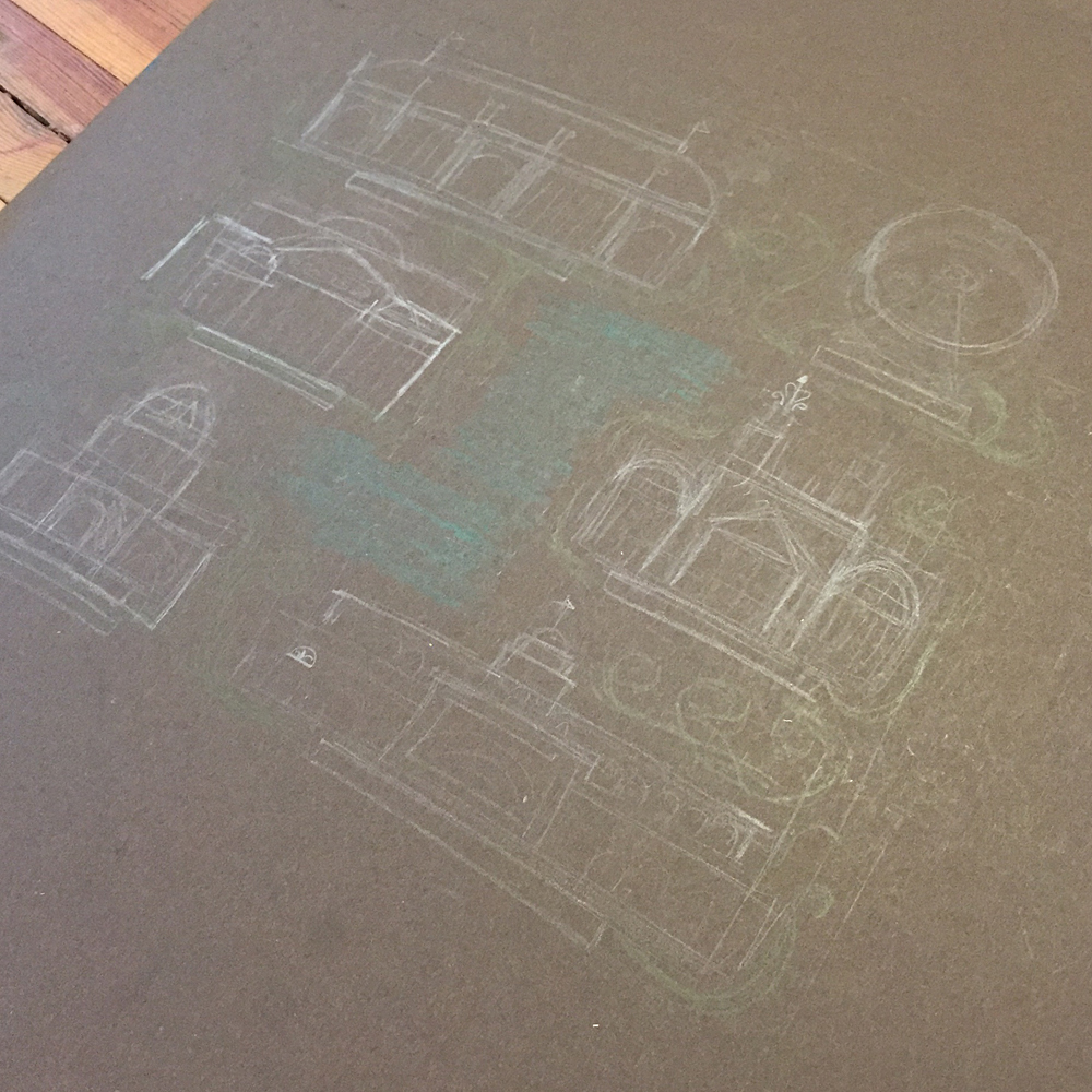
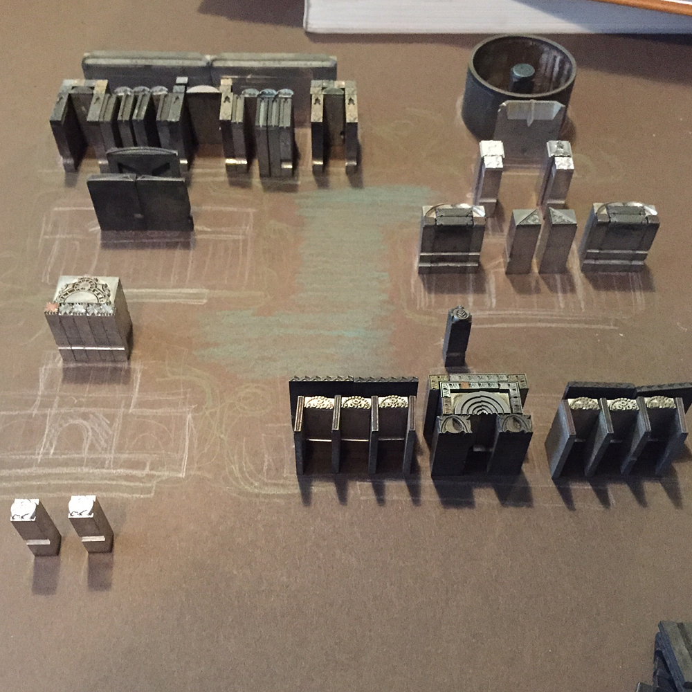
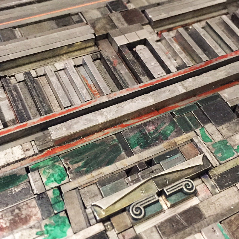
The hard part was determining what structures to include, but I think the final choices were wise ones. More on these choices in the photos to follow. Slowly and painfully, I pulled ornaments that might resemble elements of the buildings.

setup1
setup1
setup2
setup2

As the buildings started to take form, I moved on to the gardens and water features.

setup4
setup4

I read that Daniel Burnham kept a sign above his desk that said RUSH while laboring to make the Fair happen in a breathtakingly short period of time. I left out wood type to this effect to keep me on task. I also wanted to use the little 'kissing kids' ornament in the water area as it was used on the Urbs in Horto print and was also produced in Chicago at the time of the actual Fair.

setup5
setup5

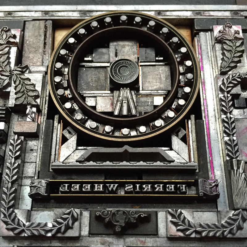
Mr. Starshaped felt the Ferris Wheel lacked something so I had to think on it a bit more. Setting circular forms is hard enough.

setup3
setup3

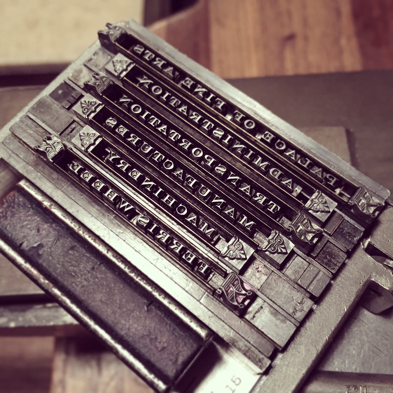
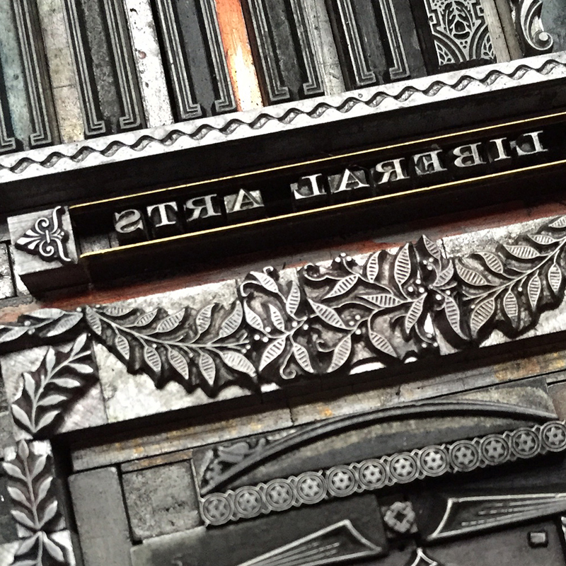
The labels for the buildings were set in tiny 6 point Engravers Roman, a particularly old and beaten up version. They are set to resemble little ribbons with great end caps.

IMG_5810
IMG_5810

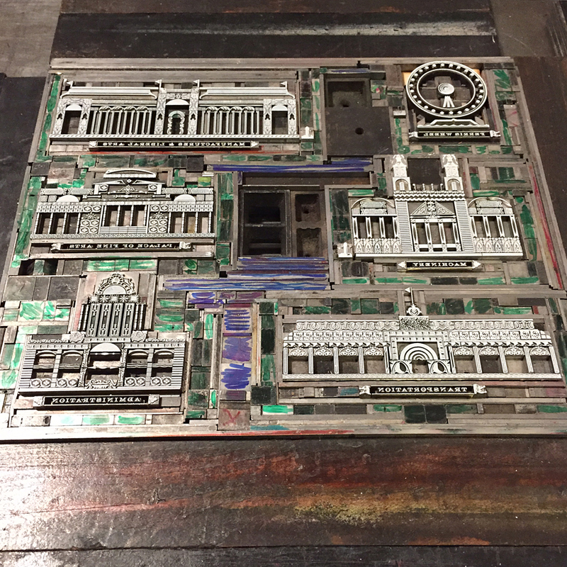
Here's the first final form! Looks great in photos, but print is another beast.

Twhitecity1
Twhitecity1

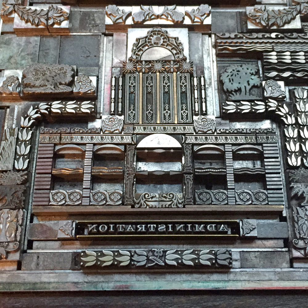
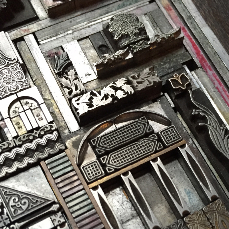
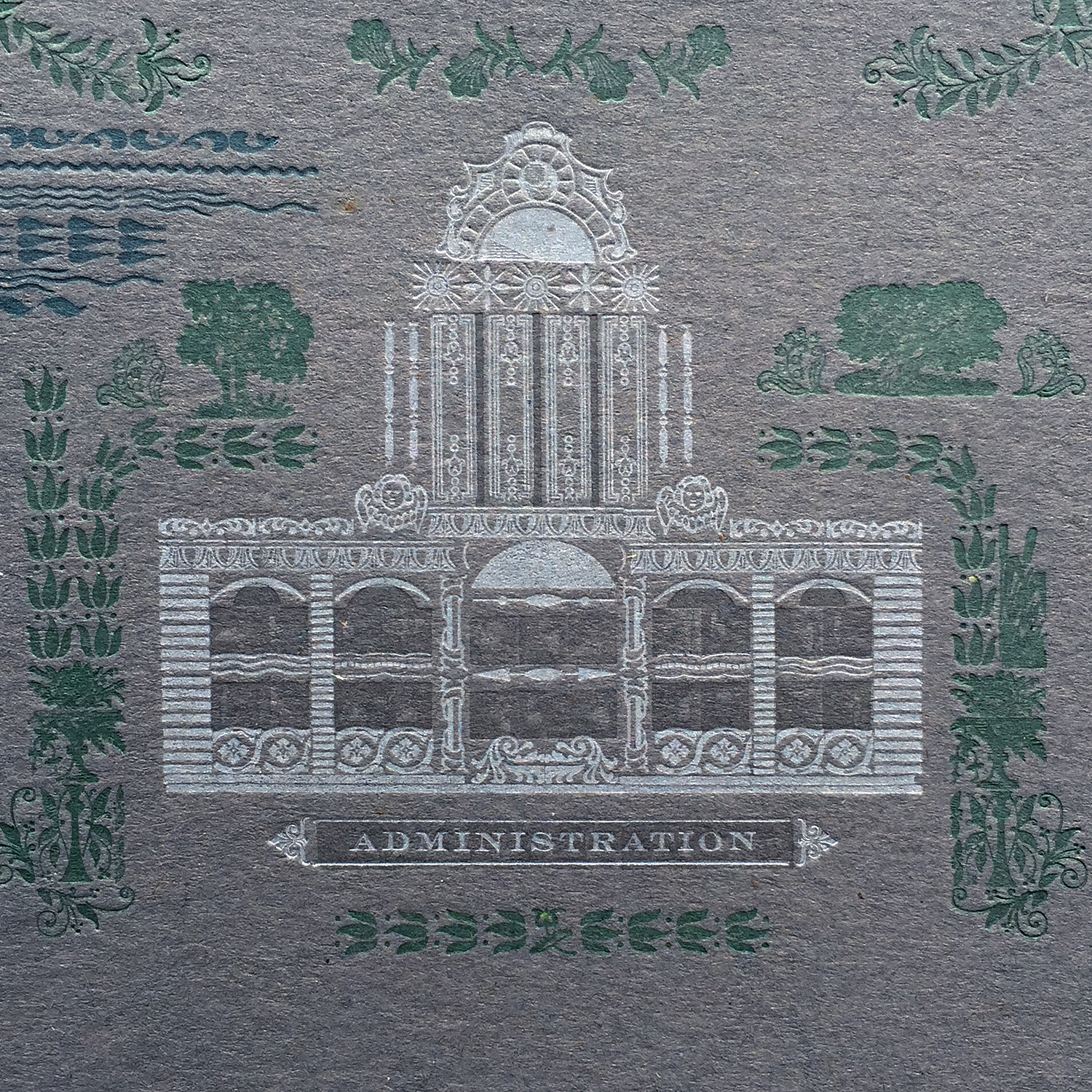
Details of the form follow here. The Administration building is one of the first you would have seen if you took the train to the Fair. I loved its stately manner and tried to work in little angel faces to represent the many symbolic sculptures that graced the façade.

admin1
admin1
admin3
admin3
admin4
admin4

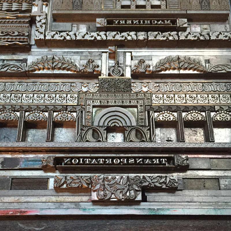
Machinery was also an appealing building for its church-like steeples and large skylights. Plus... I like machinery.

machinery1
machinery1
machinery3
machinery3
machinery4
machinery4

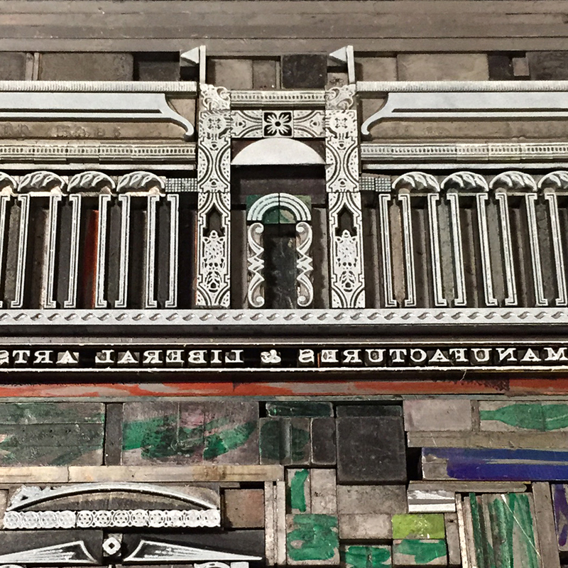
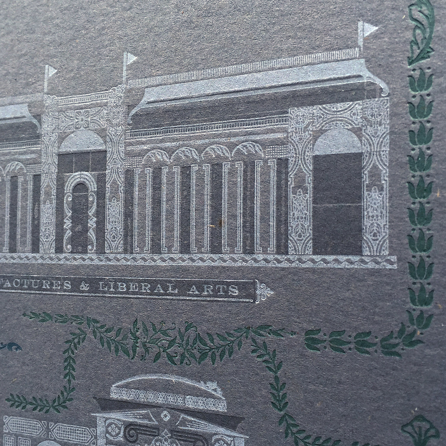
Manufactures and Liberal Arts had to be included as the largest building of the Fair. The sheer size must have been a sight to behold. This building looks better in 2-color so there are more images to come.

manufactures1
manufactures1
manufactures3
manufactures3
manufactures2
manufactures2

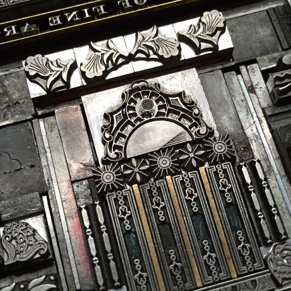
The Palace of Fine Arts was a must, given that this is the only building that still stands today in the form of the Museum of Science and Industry (Have you been there? The U-505 tour is worth the price of admission alone).

palace2
palace2
palace3
palace3

The Transportation Building was designed by Adler and Sullivan and included an incredible 'golden door'. The challenge here was to find tiny ornaments that most represented the style of work for which Sullivan is known.

transportation1
transportation1
transportation2
transportation2
transportation3
transportation3

I added circles to the Ferris Wheel to represent individual carriages. The scale of this print prevented a more elaborate solution so let's just say there might be a bigger Ferris Wheel print to come in the future.

ferriswheel3
ferriswheel3

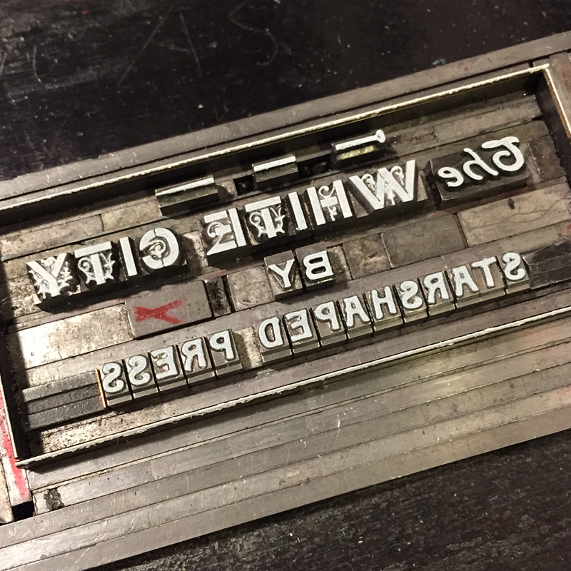
Last but not least, the title. I kept the format of the Urbs in Horto print, complete with 'pin' ornaments.

Twhitecitytype
Twhitecitytype

Before any ink touches the press I pull a series of carbon paper proofs for general placement and to get a quick glimpse of what I'm up against. Many small tweaks were made at this point.

carbonproofs
carbonproofs

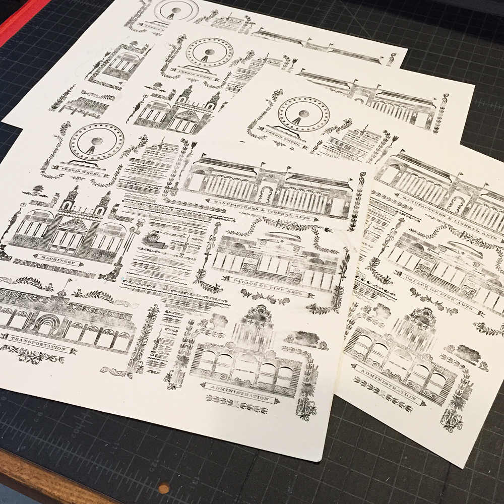
Once I was happy with the overall look I set up the first color and pulled a full proof before breaking down the form for different colors. I marked up a few changes on this as you can see, as well as left a few notes for myself going into the next colors.

fullproof2
fullproof2

The forms are pretty, inked in white.

Wtitle
Wtitle
Wpalace
Wpalace
Wtransportation
Wtransportation
Wmanufactures
Wmanufactures
Wmachinery
Wmachinery
Wadmin
Wadmin
Wferriswheel
Wferriswheel

You can see here that much of the spacing is colored with Sharpie to indicate where I put it in place of the other ornaments I pulled out. This is what passes for color separations in old school letterpress.

Wfullwhite
Wfullwhite

The second color was a subtle hit of transparent white which has the look of a varnish on the paper. I wanted to use this to make the negative spaces of the buildings recede. Not an exciting form, but here you can see a few of the solutions to create solid areas of ink.

trans2
trans2
Trans1
Trans1

Kissing kids!

water1
water1

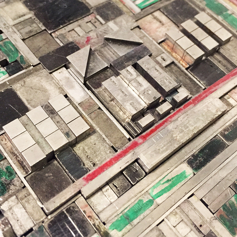
The water elements underwent the most drastic changes. I initially thought it would be set pretty solid between the buildings but then loosened it up over subsequent proofs and made it more organic. You can see the 'ghosts' of the buildings and gardens in this crazy form.

water2
water2

The final print! It measures 14x18" and is printed in 4 colors. It's a bit tough to photograph because of the subtle colors and texture of the paper. I worked with Neenah'sWrought Iron from their Environment line and it was the perfect paper; a dark enough gray to show white but light enough for darker colors, and it has little recycled inclusions that give it just a bit of the rough and tumble feel of Chicago itself. The final edition size is 125 prints.

whitecity1
whitecity1
whitecity2
whitecity2
whitecity3
whitecity3
palacefinearts1
palacefinearts1
manufactures1
manufactures1
machinery1
machinery1
administration1
administration1
lagoon1
lagoon1
ferriswheel1
ferriswheel1
whitecitytitle
whitecitytitle

Chicago will always be my first true love and its rich history, warts and all, will continue to provide ample resource material for print inspiration. The White City is officially the hardest print I have ever set and the lessons learned both about my typesetting ability and the history of the city will no doubt guide all future projects at Starshaped. Huge thanks to all of the fine folks that supported the midwestern gumption behind this project through kind words, sales and Chicago-style chop-bustin'. And much like the Fair itself, this is what the remains looked like:

buildingsongalley
buildingsongalley

The print is available for sale here while the edition lasts. This one won't be reprinted, folks.

In studio prints & posters, Uncategorized Tags chicago, columbian exposition, gray silver, the white city, type form, urbs in horto, white ink, worlds fair
← Tribute to a Tribute: Goudy at 150I've Got A Little Poster Here →
  • May 2025
    • May 21, 2025 Empathy - Extra! Extra! No. 3
  • April 2025
    • Apr 19, 2025 All Hail Humble Chipboard
  • March 2025
    • Mar 21, 2025 All Types Are Welcome Here - Extra! Extra! No. 2
  • February 2025
    • Feb 7, 2025 New Beginnings - Extra! Extra! No. 1
    • Feb 1, 2025 Announcing Extra! Extra!
  • January 2025
    • Jan 12, 2025 Sowing 19th Century Seeds
  • December 2024
    • Dec 14, 2024 25 Years of Starshaped: People & Places
    • Dec 14, 2024 25 Years of Starshaped: Prints & Projects
  • September 2024
    • Sep 7, 2024 Mom Losing Trust in Medical System
  • July 2023
    • Jul 29, 2023 21st Century Marriage, 19th Century Style
  • March 2023
    • Mar 18, 2023 The Twelve Alphabet
  • September 2020
    • Sep 17, 2020 Field Notes
  • June 2020
    • Jun 6, 2020 The City Is My Religion — Requiem
  • January 2020
    • Jan 8, 2020 Consecrated Ground
  • September 2019
    • Sep 25, 2019 The City Is My Religion — Invocation
  • July 2019
    • Jul 3, 2019 I Have This Thing About Ships
  • January 2019
    • Jan 20, 2019 The Almighty Starshaped
  • October 2017
    • Oct 31, 2017 Party with the Girls of Starshaped
  • July 2017
    • Jul 10, 2017 Residing in the Ornament
  • January 2017
    • Jan 26, 2017 The Well-Traveled Metaphor
  • September 2016
    • Sep 12, 2016 Book of Rules
  • August 2016
    • Aug 8, 2016 Sweet Home, Ornamental Chicago
  • April 2016
    • Apr 25, 2016 On My Tour of the World
    • Apr 14, 2016 For Those in Peril
    • Apr 6, 2016 A Colossal Open House
  • March 2016
    • Mar 7, 2016 The Union, Forever
  • January 2016
    • Jan 12, 2016 Gig Posters for All!
  • December 2015
    • Dec 29, 2015 Put It In A Letter
  • November 2015
    • Nov 10, 2015 Our Sweet Sixteen
  • October 2015
    • Oct 8, 2015 Maybe You're Right But This Is My Song
  • September 2015
    • Sep 7, 2015 The Well-Traveled Ampersand
  • August 2015
    • Aug 26, 2015 Well Spoken
    • Aug 6, 2015 The Letterpress Trail 2015 part 1: 80 on 80
    • Aug 6, 2015 The Letterpress Trail 2015 part 2: Bloodier Than Blood
    • Aug 6, 2015 The Letterpress Trail 2015 part 3: Redemption
  • June 2015
    • Jun 15, 2015 Made to Love Magic
  • May 2015
    • May 10, 2015 The Baby's Fed and the Tunes Are Pure
  • April 2015
    • Apr 28, 2015 Metal Type Presses On
  • March 2015
    • Mar 30, 2015 Wells or Bust!
    • Mar 16, 2015 Tribute to a Tribute: Goudy at 150
    • Mar 4, 2015 The White City
  • February 2015
    • Feb 24, 2015 I've Got A Little Poster Here
    • Feb 17, 2015 Typeforce Class of 2015
    • Feb 3, 2015 An Alphabet in Print
    • Feb 2, 2015 A Wild Rose
  • January 2015
    • Jan 2, 2015 New Year, New Type
  • November 2014
    • Nov 28, 2014 15 and Counting
    • Nov 20, 2014 Good Wood 2014
    • Nov 10, 2014 15th Annual Open House
  • October 2014
    • Oct 26, 2014 Join the Club
    • Oct 25, 2014 Alphabets are Go!
    • Oct 22, 2014 Days Like These...
  • September 2014
    • Sep 24, 2014 Metal Type Class is Back!
    • Sep 22, 2014 An Alphabet of Sorts
    • Sep 15, 2014 Just Add Color. And Linoleum.
    • Sep 2, 2014 Printing in the D
  • August 2014
    • Aug 24, 2014 Reverie
    • Aug 19, 2014 The 2014 Letterpress Trail finale!
    • Aug 18, 2014 The 2014 Letterpress Trail, part two
    • Aug 11, 2014 The 2014 Letterpress Trail, part one
  • July 2014
    • Jul 21, 2014 Seeing Stars and Moons
    • Jul 14, 2014 Maria, Dan, Butterflies
    • Jul 7, 2014 The APA Goose 2014
    • Jul 2, 2014 Master Class - July 2014
  • June 2014
    • Jun 23, 2014 Sky's the Limit
    • Jun 16, 2014 Lost Type... and Found
    • Jun 12, 2014 Words + Music
    • Jun 6, 2014 Two Cities That Never Sleep - NSS 2014
  • February 2014
    • Feb 25, 2014 Small but Mighty
  • January 2014
    • Jan 31, 2014 Master Class
    • Jan 28, 2014 Tradition and Progress
  • December 2013
    • Dec 12, 2013 A Story of Class
    • Dec 2, 2013 It's beginning to look a lot like...
  • November 2013
    • Nov 21, 2013 Mecca of the North
    • Nov 5, 2013 14 Years and Printing
  • October 2013
    • Oct 25, 2013 You Are Beautiful
    • Oct 22, 2013 Printing in Biblical times...1823
    • Oct 17, 2013 It's Beginning to Look a lot Like...
    • Oct 9, 2013 Paper Arrows Take Two
    • Oct 8, 2013 Wood, Metal, Type, Irony
  • September 2013
    • Sep 29, 2013 A Tale of Two Invitations
    • Sep 16, 2013 V-Day in... September
    • Sep 3, 2013 We're Number One
    • Sep 2, 2013 An Artistic Approach
  • August 2013
    • Aug 27, 2013 American Made... of course
    • Aug 18, 2013 The Society of Typographic Arts
  • July 2013
    • Jul 30, 2013 WNYBAC Book Fest
    • Jul 8, 2013 Open House!
  • June 2013
    • Jun 24, 2013 Amazing, Beautiful and Adventurous
    • Jun 17, 2013 Phoenix Welcomes the Goose
    • Jun 13, 2013 Skirting the Issues
    • Jun 9, 2013 A Calendar Year
  • May 2013
    • May 28, 2013 All Aboard!
    • May 20, 2013 City of Wind
    • May 12, 2013 Holiday Sneak Peek
    • May 6, 2013 Partners in Crime
    • May 2, 2013 The Annual Platen Press Museum Type Sale
  • April 2013
    • Apr 16, 2013 I Wood Die 4 U
    • Apr 9, 2013 Celebrating our Neighbors
    • Apr 1, 2013 If Rosie Can Do It
  • March 2013
    • Mar 13, 2013 Metal Typography in Context
    • Mar 6, 2013 CPG is A-OK
  • February 2013
    • Feb 18, 2013 City in a Garden... and in How Magazine
    • Feb 14, 2013 Anatomy of a Move
  • January 2013
    • Jan 27, 2013 The ongoing task of Type Proofing
    • Jan 24, 2013 Dennis and Marie at home
    • Jan 17, 2013 'Tain't What You Do
    • Jan 10, 2013 Going to Tarrytown
  • December 2012
    • Dec 13, 2012 The Hamilton Benefit, Chicago-Style
  • November 2012
    • Nov 29, 2012 Renegade Holiday 2012
    • Nov 28, 2012 Abe's Peanut postcards
    • Nov 5, 2012 Our 13th Annual Studio Open House
    • Nov 5, 2012 The Hamilton Wayzgoose 2012
  • September 2012
    • Sep 26, 2012 Emily + Frank
    • Sep 6, 2012 Our Theatrically Corrupt Chicago
  • August 2012
    • Aug 25, 2012 Printing at WNYBAC
  • July 2012
    • Jul 25, 2012 At Last!
    • Jul 16, 2012 It Takes a Village
    • Jul 9, 2012 Stephanie + Keith
    • Jul 1, 2012 Tonight... and every night after
  • June 2012
    • Jun 28, 2012 Cocktails, lemurs & dinner
    • Jun 21, 2012 The Vandercook 100

Starshaped Press · 4636 N. Ravenswood #103 · Chicago, Illinois 60640 · 773-728-6359