


Thanks for checking in with the Second edition of Extra! Extra!

Two recent prints collectively address the idea of documenting life. The first features a quote from Dan Sinker, a pal from way back when he was leading the charge with Punk Planet magazine. I love the approachability of his blog writing and asked to print this recent piece. I often say that I’m in therapy every day I work with my hands; the hand-to-brain connection is a powerful antidote to whatever awfulness the world might be spewing in your direction. It’s probably why I started printing over 25 years ago and never stopped.
The camera design was an experiment in creating a recognizable shape; it originally appeared on a Print Club postcard a while back. Because of its popularity, I recreated it as a slightly larger piece that everyone could enjoy. It’s modeled on a few point-and-shoots, including some in my collection, and printed in 4 shades of black and silver.

Dan Sinker has the uncanny ability to use simple words to paint a vivid, thoughtful picture. This text is pulled from an essay he wrote that you can read here.
The print measures 8×10” and is a heavy, recycled gray chipboard. The type is both wood and metal and printed in two colors (dark gray and muted green).

The camera is back by popular demand. It’s printed with metal ornaments and a large, wood ‘lens’. Four colors make up the image and it’s printed on soft Italian cardstock. Measures 7×5”.

Just prior to the pandemic, I created a few posters for a show that featured the visual language of the women’s suffrage era combined with modern issues and text. I hoped the satire would start and end there, but it continued for a fourth print in the wake of the fall of Roe v. Wade.
It has become clear that the current administration is taking many pages from the Nazi handbook, boasting attacks on the weakest members of society, including disabled children. From crippling limits to healthcare access to attempts at eliminating 504 plans, the aggression is unbearable. This print addresses many of these issues. You can read about it and the organization benefitting from its sales.

This poster is the latest in a series using the combination of wood and metal type for a historical letterpress design while satirically highlighting current issues. It’s meant to showcase how this type, some of which is 150 years old, is still a viable tool for disseminating ideas. Disabled children are the subject as they’re the next target of the current administration (as are adults, but kids are the focus here, given recent attacks on 504 plans and other services). It references a number of issues:
Equal is in quotations as the disabled don’t necessarily have full equality but have, until recently, had the protection of the judicial system and the ADA. ‘Pay no attention’ is a nod to the Wizard in The Wizard of Oz, who is the all-powerful man hiding behind a curtain.
504 plans meant to assist children with disabilities with basic amenities (vision and hearing aids, physical accessibility, etc.) are under attack in many states. They help to level the playing field and offer protection when needed. Greatly diminished grants through the NIH will also curtail research into many health conditions and diseases affecting children.
Insurance companies routinely fail to cover aids and therapies that help the disabled thrive.
With diminishing services and court protections, more disabled kids will need to rely entirely on a caregiver, usually a parent, who must make choices between work and full-time caregiving, often having to do both.
‘Undue burden’ is used in 504 plans to reference the removal of obstacles to learning. In this case, it’s turned around to mean the disabled are the burden, which is very much the feeling of the current administration.
Discrimination has always existed but legal protections and support services have minimized stigma and presented opportunities. That is now shifting in a detrimental way.
The poster is a limited edition of 50 and measures 10×20”. Much gratitude and love goes to Thrill of the Chase Press for research, brainstorming and ideas, as well as Jo the printer’s devil and their insight into the disabled community, of which they are a part.
$25 of each print goes to Disability Rights Advocates, working tirelessly to promote the well-being of those with disabilities who deserve to live as fully as those without.

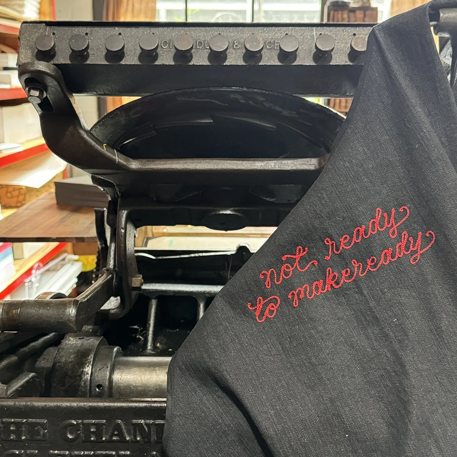
Jenna of Vichcraft is one of the coolest cats I know. We met way back at a Typeforce event and have found ways to work together since. She brings her lettering talents to all different media, including screenprinting, stained glass and sewing, but has really knocked it out of the park with chainstitching.
On Sundays, anyone can visit her shop in Chicago to grab prefabricated goods of all kind or request custom projects. You might even get a glimpse of her famous birds. Jo and I have both gotten great work done by Jenna, including Jo’s incredible pigeon jacket and my shop aprons.


Jennifer (Jenn) Graves is an educator, bookbinder, and letterpress printer in Los Angeles, CA. Her work has been exhibited both in the US and internationally. Jennifer teaches Book structures at Otis College of Art and Design and bookmaking and printing workshops at various entities, including the Printing Museum and her SCRAPScollective studio. She’s also one of my favorite printers to follow. From Jenn:
I was hooked the first time I set a line of metal type and printed on the printing press. It was magic, everything I’d thought it would be. Since then, I’ve fallen in love with all aspects of letterpress printing, with a special affinity for vintage wood type. I primarily work within the boundaries of vintage wood and metal type because of their strength and ability to tell a story. This allows me to tell new stories, avoid overthinking, and explore pathways that create a clear message. The message addresses life and social issues through a lens of love and hope. I believe whatever is being printed must serve a purpose for the greater good, no matter how big or small.

I started the Sunday Post as a way to share, encourage, and connect with others—a way for me to show up. With the busyness and messiness of life and the world, it’s nice to see and read something with no ulterior motive other than exactly what you see and read. Whether it’s a post about letterpress, bookmaking, birds, or a call to action, etc. it is what it is.
Thanks, Jenn! The Sunday Post is something I look forward to each week… a moment to unwind and enjoy someone else’s process.


Sometimes you have to cut corners… in a good way. That’s where the handy mitering machine comes in! This tiny tank gives you the chance to slice letterpress borders/rules to create a clean, mitered look, not unlike cutting wood picture frames and moldings. It’s a manual operation that involves adjusting for the angle you need then holding the rule/ornament in place while scraping along its side. The rules (lines) are a relatively soft metal so it can take some time but isn’t hard. See the video below.


These are a dime a dozen and easy to find in the letterpress community. I’ve used mine for many projects but one of my favorites is the Magic Hour print. I first sketched out what I wanted the type to look like; it’s a composite of ornamental pieces and rules that needed mitering to work as a pseudo-blackletter-style type. I digitized it as well to make a cut list of pieces needed.
You can see more images here. It’s incidentally the only type form I’ve left standing for posterity; all others are disassembled so the parts can be used for other projects.


In 2023, I rounded out my little collection of News Gothic with some welcome additions. I didn’t have a lot of ‘workhorse’ faces in that mid size, between 36-72 point, that are great for making a statement on smaller prints and filling a gap on larger ones. News Gothic is that ‘old reliable’ American sans serif, dating back to around 1908.
When I get new type in the shop, I set and proof it so there’s a visual record of what’s available (and it’s added to a spreadsheet as well). These are proof cards of the News Gothic family that I now have. Keep in mind that every point size and style (bold, italic, etc.) is a separate font of type. Sometimes the proof cards aren’t quite correct or need to be adjusted over time as new type/info comes to light, but they’re a great starting point for digging in.


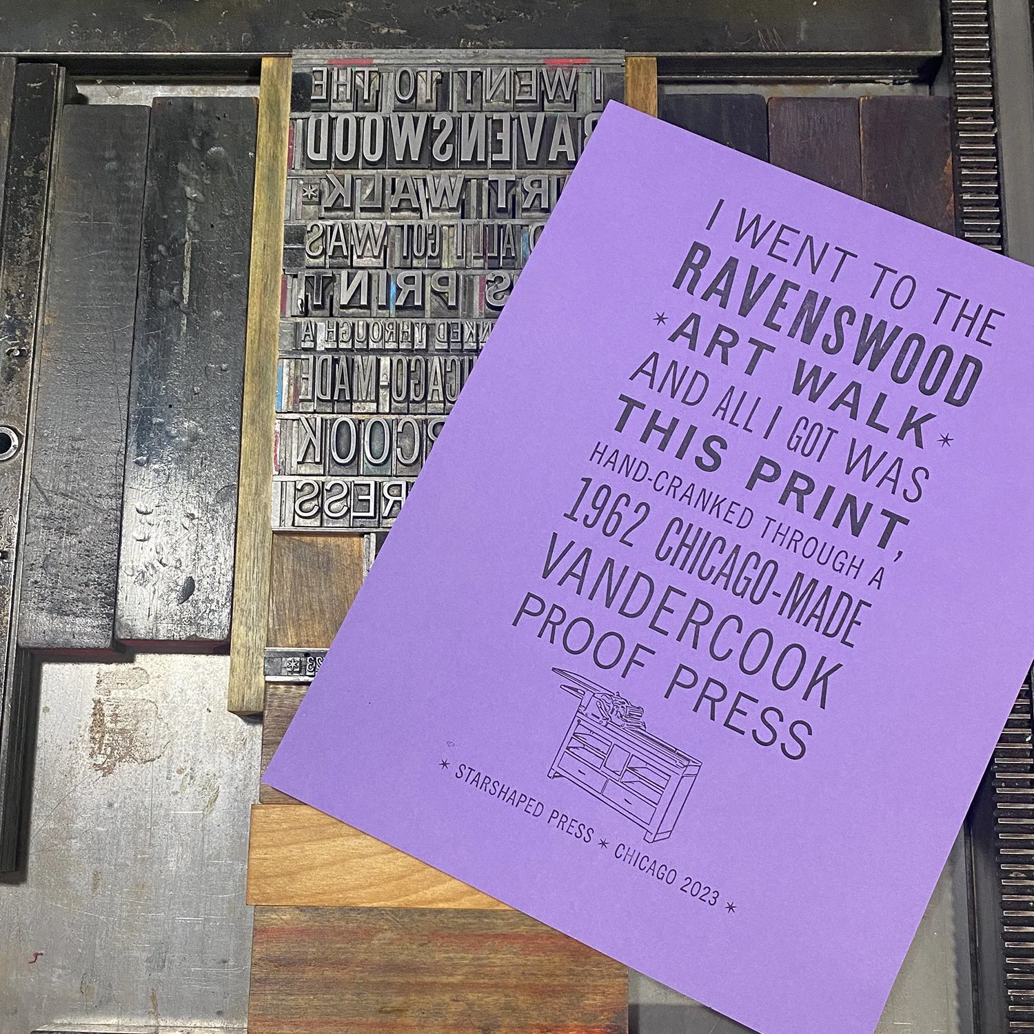
Whenever possible, I like to print something for the shop with new-to-the-studio typefaces. This gives me a feel for what it’s like to work with them. At the time, we were creeping up to the annual Ravenswood Art Walk, when the studio is open to the public; I like to have something on press for people to see. I set this print for people to pull; it shows a number of the new types in various sizes combined with a great cut of a Vandercook press made from bamboo.
Having a large run of a type family is desirable; I find you have a lot of flexibility in a design while maintaining coherence as the faces are formulated to play well together. I have a few of these in the shop and they see a lot of action because of their versatility. I often tell new printers it’s more worthwhile to invest in a family of something that feels a little understated than spend the same amount on one rare, 19th century typeface that only says one thing.

The current Print Club ended up more colorful than I anticipated this month, with dots, quilt-like patterns and a ‘brick’ wall. Check out all of the options here.


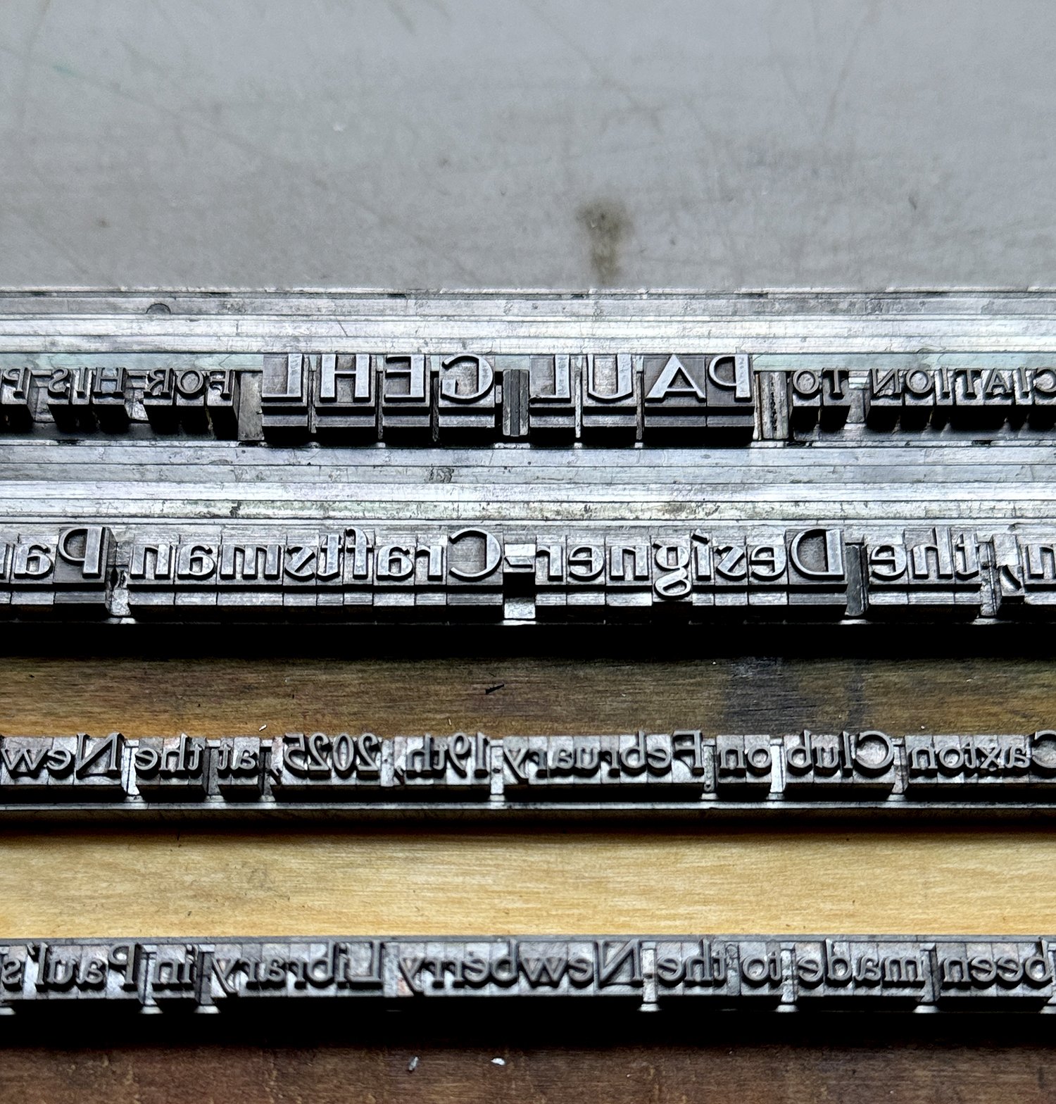
I’ve had the pleasure to print a variety of items for Paul Gehl, ranging from personal to professional achievements and everything in between (including projects he didn’t know about!) I met Paul at some point along my journey in Chicago printing and the Newberry Library, where he headed up the John M. Wing Foundation print collection before stepping down. Printing for Paul is an exercise in pristine, often mid-century typography, based on his interests and writings (this is a favorite). Below are a few snippets of past projects.


Perhaps you’re already familiar with You Are Beautiful stickers and see them around town. They also promote community art engagement through a number of open call initiatives every year and we’ve happily participated (see some below).
But did you also know they offer free stickers by mail the old-fashioned way? Send a self-addressed, stamped envelope (the infamous SASE for the Gen X and older crowd) and they’ll return it with stickers. Let’s promote snail mail any way we can!


Wanna pitch in to cover the time of creating postcards, mailings and this blog? Starshaped is now at Buy Me a Coffee for easy, one-time contributions. Thanks, as always, for your support as we strive to preserve the materials of the past for both current and future use.
