
I've never been out of the country (you don't count, Canada, to a New York gal coming of age in the 90's.) When asked about this 'choice' I am forced to both consider and share that it was anything but. The lack of travel tied into paying for my education, starting a business and ultimately owning the 1920 poky-walled bungalow of my dreams, all of these things held together with spackle, paint and sheer gumption. But with the exception of the til-death-do-us-part mortgage, life is debt-free and Starshaped boasts one of the finest metal type collections in the Midwest. My true choices were good ones.

Eponymous Dard Hunter ampersand, representing East Aurora, New York

American Uncial, by Victor Hammer, printed at the Wells Book Arts Center in Aurora, New York

Totemic, by Jim Rimmer, representing Vancouver
Given my foreign travel virginity, the irony of The Well-Traveled Ampersand series is not lost on me. My anxiety with this shortcoming often leads to insecurity and not feeling qualified to engage in conversation with exceptionally well-traveled individuals in printing circles. I am thankful for two situations that help alleviate what is likely a self-imposed stress. The first is that we live in an extremely diverse and multicultural city. The street by our home is host to many Latin and South American parades in the summer, prompting a 2-year-old Jo in 2009 to ask 'can we go to the parade this weekend?' assuming there was one every Saturday at noon. There almost always is.
The other benefit to living is Chicago is our position as travel hub for those on their way to the annual Hamilton Wood Type & Printing Museum Wayzgoose or Newberry Library. This brings a stream of travelers through the studio and exposes both of us to cultural differences and funny slang; Jo learned this year that 'trump' in England is code for 'fart.' This was a gift to a 10-year-old if ever there was one.

Concave Tuscan, a popular style for wood type, much of which was produced at Hamilton
Prior to hitching his wagon to mine, Mr. Starshaped was indeed well-traveled and spent a year living in London. I regret we were never able to travel together and it pains me to remember his first sentence after learning he had cancer: 'You need to get a passport.' I built ampersands during his illness that prompted discussions of his time and experiences abroad as well as reconnecting with the people there he loved.

London Underground, by Edward Johnston

Ampersand by Vojtech Preissig, representing Prague

Adrian Frutiger's ampersand for the Paris airport
Jo and I get a lot of mileage out of our fair city. We've spent hours in front of the Chagall windows at the Art Institute, a favorite of hers as she likes us to make up stories about the imagery. And we study the Tribune Tower which boasts stone and brick from famous structures all over the world, including the pyramids; this gives new meaning to the Magnificent Mile.
In the summer of 2015 she and I traveled by car to California and then east to New York, a trip that was physically and emotionally challenging for me (more here) but presented Jo with her first opportunity to see the ocean. She fixated on this as a personal manifest destiny-style mantra and her 8-year-old exuberance was a welcome respite.

Californian, by Fred Goudy
Over the 18 months of developing this project, I reached out to a few contemporaries, crossing my fingers they'd contribute an ampersand based on their varied travels and experiences in the world and so I could live vicariously through them. One of these was Russell Maret, who shared his Cancellaresca Milanese, the one image that breaks out of the form itself to add structures of Siena. I can't pretend to understand most of the work Russell does; what I do know is that it's visually striking and beautifully printed, and I can stare at it for hours and hours as I attempt to pick apart the brain that made it possible.

Cancellaresca Milanese by Russell Maret, to represent Siena, Italy
Another lucky shot was getting Mark Van Wageningen of Novo Typo on board to contribute. I've been watching his work with chromatic type, both digitally and in metal, for some time and fell in love with how well this form fit the cityscapes of Amsterdam.

Bixa Stencil by Mark Van Wageningen, to represent Amsterdam
Joseph Churchward's Maori was supposed to be the final ampersand as it would provide the biggest challenge to my bandsaw skills. But my quest for contributors had to be put on hold while caring for Mr. S in his final months so I jumped it ahead. It's a truly impressive ampersand, and I nailed it.

Churchward Maori, by Joseph Churchward, in homage to the Maori of New Zealand
There was a shocking lack of women designers when I first developed a list of potential ampersands. Not acceptable. It was suggested I check 'my own backyard' for talent and there's no doubt I am surrounded by it.
Nadine of Sonnenzimmer is a solid friend and comrade-in-arms in Chicago's design scene. She's always been there for me with no nonsense insight into work and a kick in the ass when it's needed. She has held me accountable to my own work and if I ever phoned it in she'd be there to let me know. As a native of Switzerland, it's impressive how quickly she developed her no-BS Chicago attitude and I love her for it. Her typographic work is anything but stale and this ampersand was the biggest challenge of the entire project.
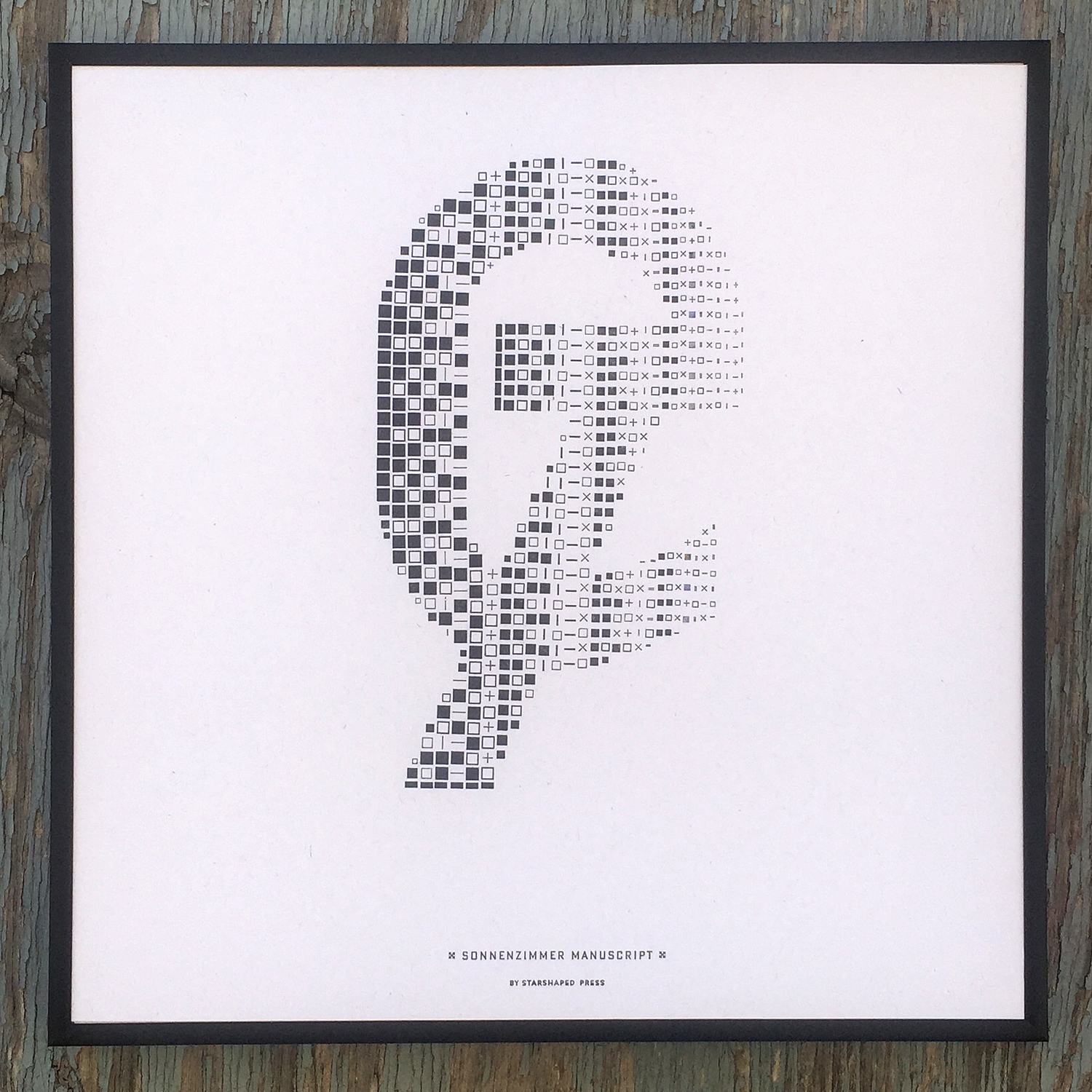
Sonnenzimmer Manuscript by Nadine Nakanishi, representing Switzerland in grid form
Frances, my Frances, the cleverest turn-of-phrase woman I know, who seamlessly maneuvers between pattern and type, provided a sprawling ampersand based on her time in Vienna. How badly did we want to call it Wiener Chic? We giggled and silenced our 10-year-old selves.

Wien, by Frances MacLeod, representing Vienna
Jenna Blazevich of Vichcraft is a beacon for feminism and owning the issues that surround empowering women and running a business. Her time studying letterforms in Rome led to Sea Change Script, and the change we hoped would come in November 2016.

Sea Change Script by Jenna Blazevich, representing Rome
I found Pooja Saxena through Alphabettes and admired her writing and type work. There is no ampersand in Devanagari script so she created a reverse stroke form that hints at the style. I found new ornaments cast at Skyline Type Foundry from Indian matrices. Tiny pigeons and kites dot the Delhi sky. This is a place to which I have longed to go for many years.

Viparit, by Pooja Saxena, representing Delhi
Chicago, my Chicago. The city is the constant in my life and grounds both Jo and me. Its streets and structures remain throughout all trials and the people, our village, are everywhere I turn.
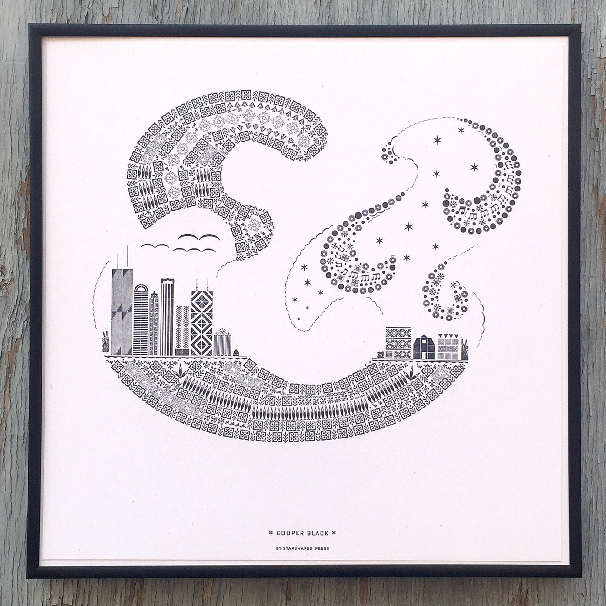
Cooper Black, by Oswald Cooper, representing Chicago
I'm ever mindful that the triple crown of parenthood, homeowner and entrepreneur is an exhausting mantle to bear and we are very slowly settling into what I call our New World Order. I am hopeful that opportunities to travel and see the world will present themselves for myself and Jo. In the meantime, the passport that I rushed for a failed attempt to leave town last summer will sit at the back of the desk drawer, patiently awaiting its first stamp.
That said, there's a substantial, challenging and exhilarating project on the horizon for Starshaped that will define the studio's place, as well as my own, within the context of Chicago's past, present and future. I am looking forward to revealing more of this as 2017, already off to a jump start, progresses.
