
Many lunch dates with a particularly good friend end with 'book store?' and we wander over to Ravenswood Used Books to see what awaits us. One fruitful trip resulted in many books, one of which covered German graphics and included this image:

Progressive German Graphics 1900-1937, Leslie Cabarga
Immediately drawn to these as having been created with metal type and rule, I thought, I could do this... but can I make them... cool? Relevant? Reflective of my experiences as a woman vs. an idealized image created by men? Can I do it with just the modular type in the studio to keep the strong contrast and bold imagery? Does everyone ask themselves a million questions before starting a project?
When I moved to Chicago, the city felt like both a warm hug and a kick in the skirt, declaring, 'what are YOU bringing that will make me even more interesting, more diverse in expression and thought and experience?' I was quickly enamored of a number of subcultures in which girls drafted their own personas based on a shared passion for style, fashion, music and writing. They were built on the past while adding something new... a tweak on the clothing, bands diverging from the originals, working in the vernacular of the street. I adored the attitude of the rude girls, mod girls, b-girls and straight-edge girls that didn't necessarily fall in line with the punk crowd. This was the perfect line up of girls to create that directly reflected my experiences, and so the research began.

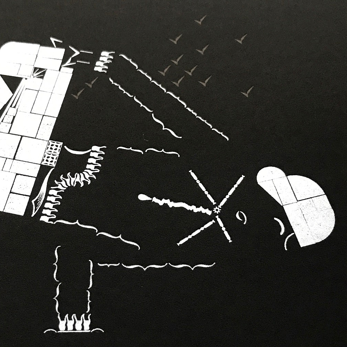
Creating angles seems like an easy enough task with metal type but not if they veer from 45º or if each image contains more than one set of angles. I attempted basic starter sketches of each girl on grid paper to look for common angles and to begin seeing how the simplest metal sorts could fill the space. I had to be mindful of what areas would be 'black' and what would be 'white,' leaving this a little up in the air as I had a sense these ladies needed to be printed on black paper.

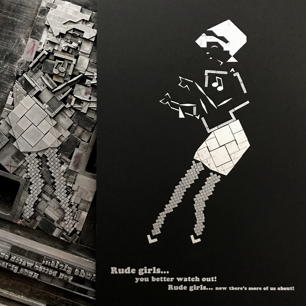
Rude Girl, with her clean, black & white sweater paired with pencil skirt, grooving to ska and rocksteady, came first. This classic image is already so graphic it felt like an easy place to start; it helped establish the use of white/negative space as part of the design itself.

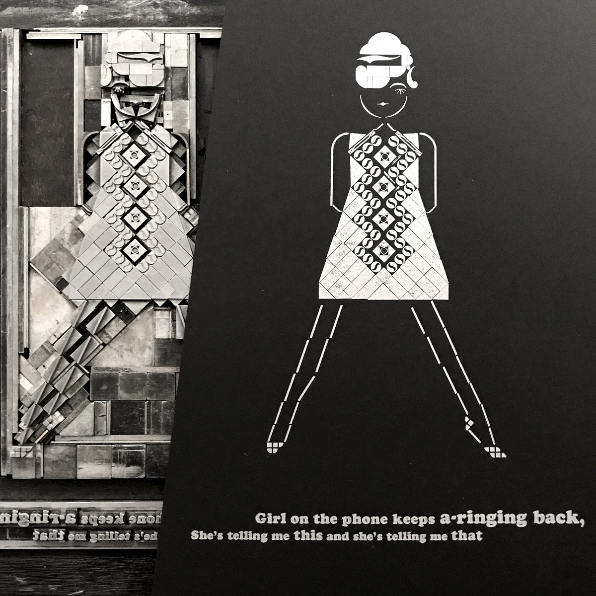
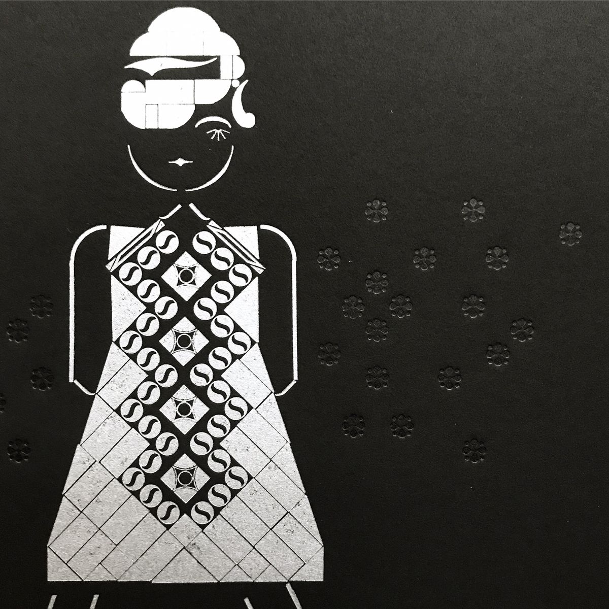
Mod Girl, that icon of 60's style so classic it persists today, was a natural follow up to Rude Girl. Her mascara and pop art dress were built to a steady soundtrack of Northern Soul and English Mods.

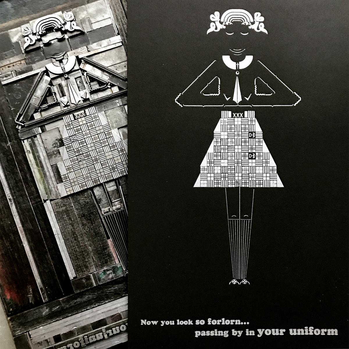
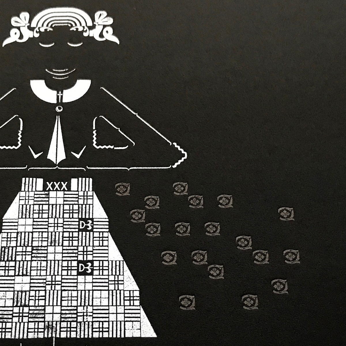
Good Girl, a variation on Straightedge Girls, preferred the scrappy sounds of garage bands and gospel soul to punk rock. She offered more opportunities to rock a uniform while staying true to her ideology. Also, it was really fun to build that skirt.

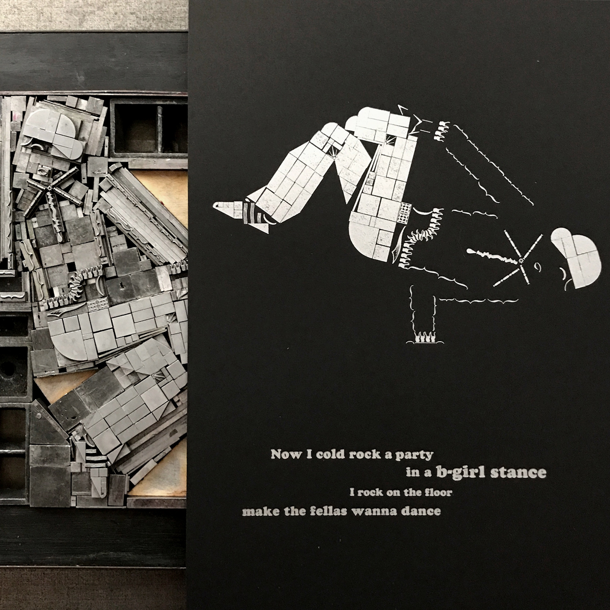
B-Girl brought it home with the most challenging form. How do you capture such incredible movement in one print? What iconic pose gives you the attitude of these breakdancing ladies without killing the energy? I went with this one to show the strength, all while rockin' the cap and Adidas.

Printer's Devil Jo and I often have what we call Dance Parties in the studio, where we turn up the tunes and let it all out. This is a good exercise after school that loosens us up to get through a few more hours at the studio. So it seemed natural to brand a series based on girls and music as such.

It also felt important to include song lyrics with the prints to ground them on their respective dance floors. Our pals at Jump Up Records suggested the Bodysnatchers for our Rude Girl and no one is ruder than these ladies. Mod Girl got a little Paul Weller because she's a girl that can scare Paul Weller. Good Girl pulled out her Alex Chilton/Big Star albums, knowing he can write about uniforms with reverence and not creepiness. MC Lyte lays it down on the cardboard harder than anyone else could for our B-Girl.
Rounding out the images, I added some subtle black-on-black ornaments for each girl for that little somethin' somethin'.

The paper, Curious Matter, is made from potato starch and has a very tactile, space age feel to it. The silver ink pops and the black is so subtle it's difficult to photograph.

These ladies definitely presented as a series and I planned to bind them as such, in a sleeve resembling that of an LP. The first page functions as colophon/liner notes. It's printed on shimmering, silver paper in all Cooper Black because nothing says Dance Party like Cooper Black.


Jo graciously brought the attitude to photograph the final product.


Half of the edition of 50 was bound and finished at Penland School of Crafts in my downtime from teaching there this Fall. When in Rome, bind like real bookbinders do.

I might not be able to get coffee and pie at Don's in Rogers Park with the mod/ska kids anymore, and I might not get to as many clubs for music as I did 20 years ago, but I'm surrounded by girls in the city who are taking the term 'girl' and owning it, removing the negative connotations that come from downplaying their cultural role and denying them status as full-fledged women. I see styles evolving from the above to give new meaning to navigating fashion, music and attitude, building confidence along the way.
To support the next generation of ass-kicking girls, 20% of the sales of Dance Party is going direct to She Crew, an organization that Jo and I can't love enough. The innovative and tireless youth of Chicago show us all that our future is savvy, smart and stylish.