
The thing that drew me to letterpress printing nearly 25 years ago was the type. Seeing all of these disparate letters and ornaments come together to create limitless imagery and text had me hooked from Day One. It’s one of the reasons I still focus on crafting all pieces from metal and wood type, alongside the fact that centenary type still has a lot of life to live and it’s the most eco-friendly option for printing.
This spring I printed wedding invitations for a couple who also love the idea of working with historic metal types. They particularly liked the styles within the Yes We Can Can collection of invitations, given that this set focuses on 19th century type and ornament.

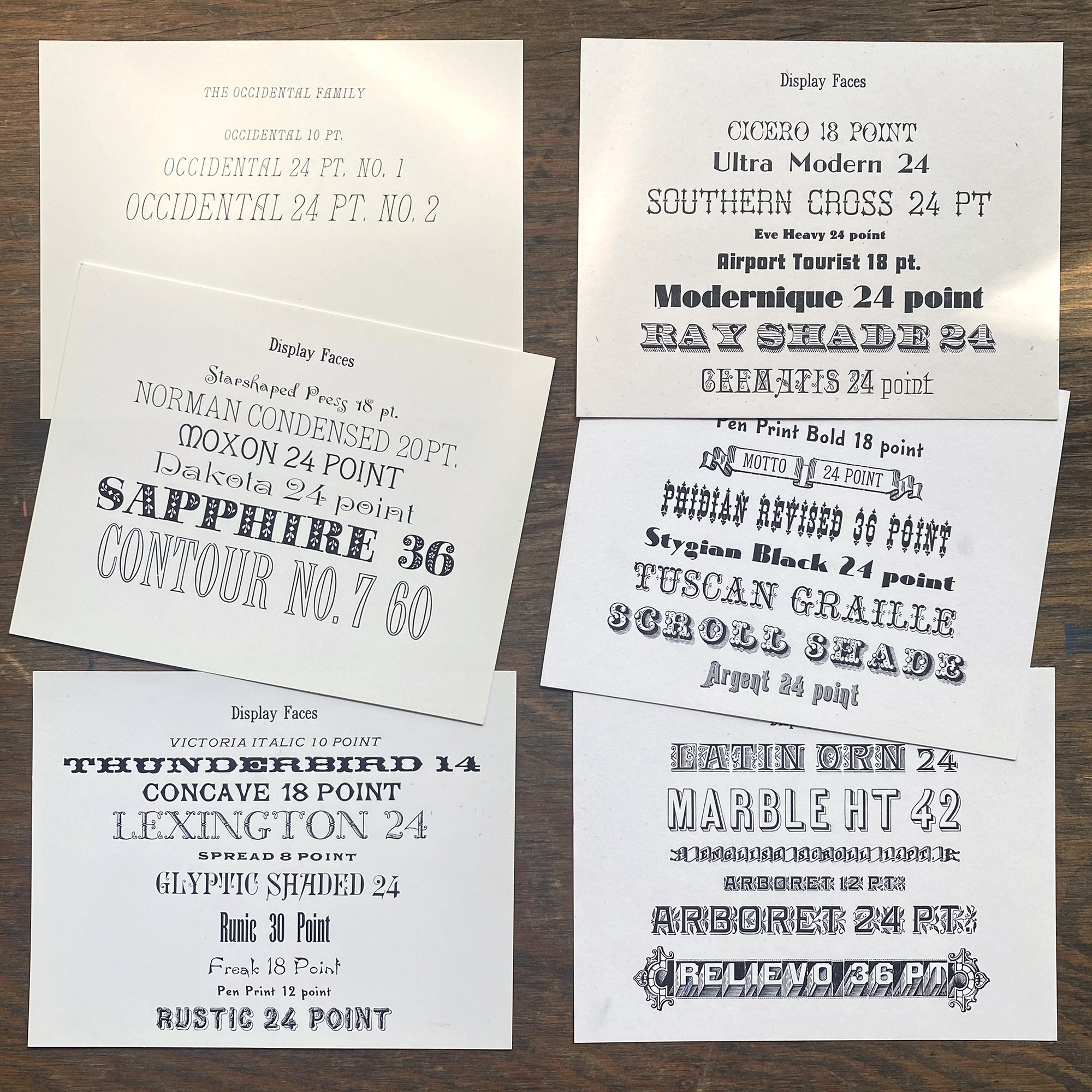
When starting a custom project, I chat with folks to get a sense of what they want and love, as well as the basic specs that are required. Then I look through the collection to pull ideas from the type and ornament that seem most appropriate. Here are a few of the proof cards that contain type samples from the studio that could work for this job.
Most of the type I have is printed and scanned into my computer, with a few exceptions that are easier to set specifically for a given project. I then build a digital composite that’s pretty close to what the final looks like, so that we can work quickly via pdfs to tweak what will be the final design. This is a snippet of the digital proof.

Then the type gets pulled and set. I really enjoy the physicality of this process, of getting all of the ornaments in place and the type aligned. A few non-19th century faces also made their way into the mix.You can see evidence of this throughout time, as shops added new typefaces and combined them with the old. And some newer typefaces are design with a nod to the past and ‘play well’ with their older cousins.
This invitation also features mortised initials, used for the first letter of their names. They have a long extension– the piece of type is not the standard rectangle but more L-shaped– so that they can be combined with other typefaces.

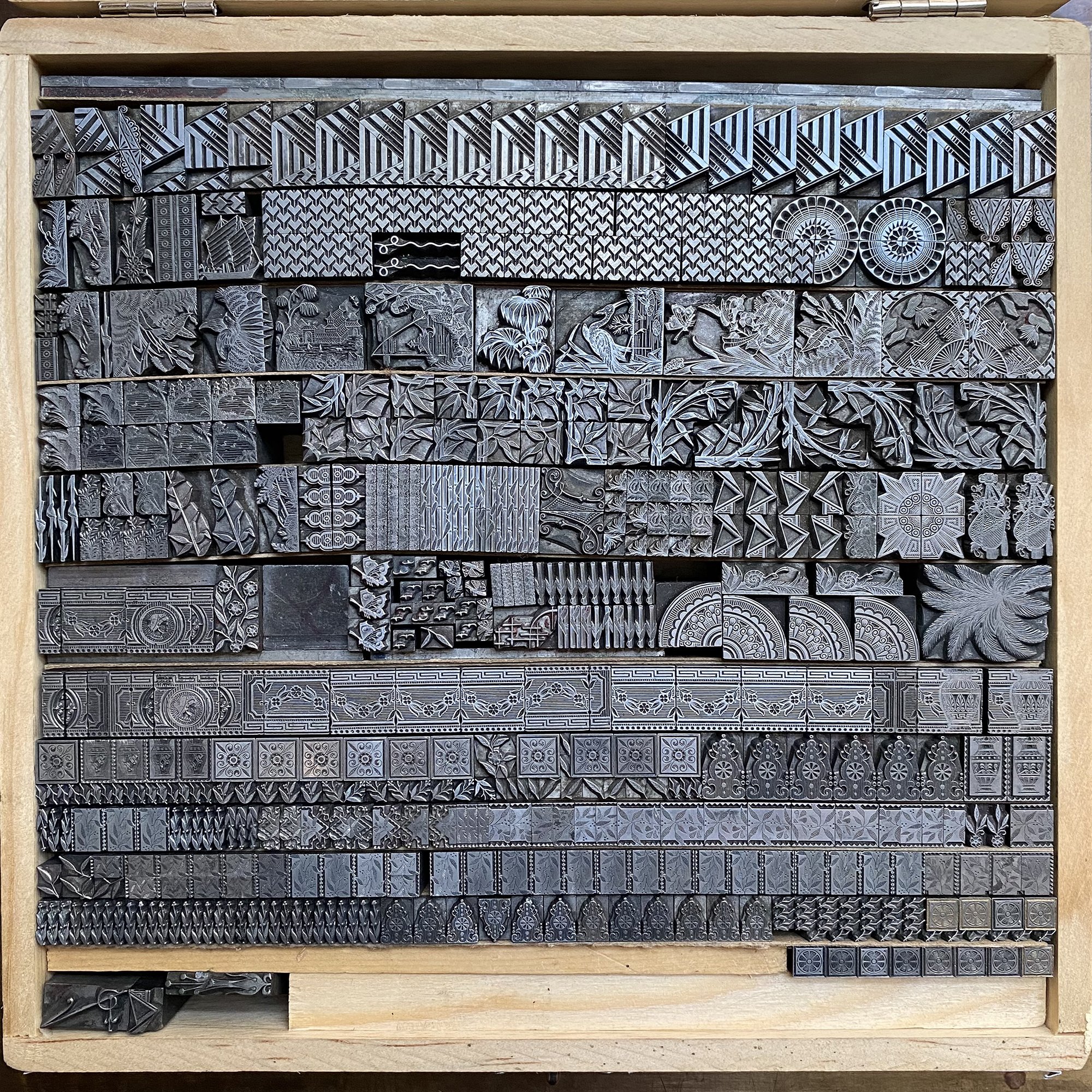
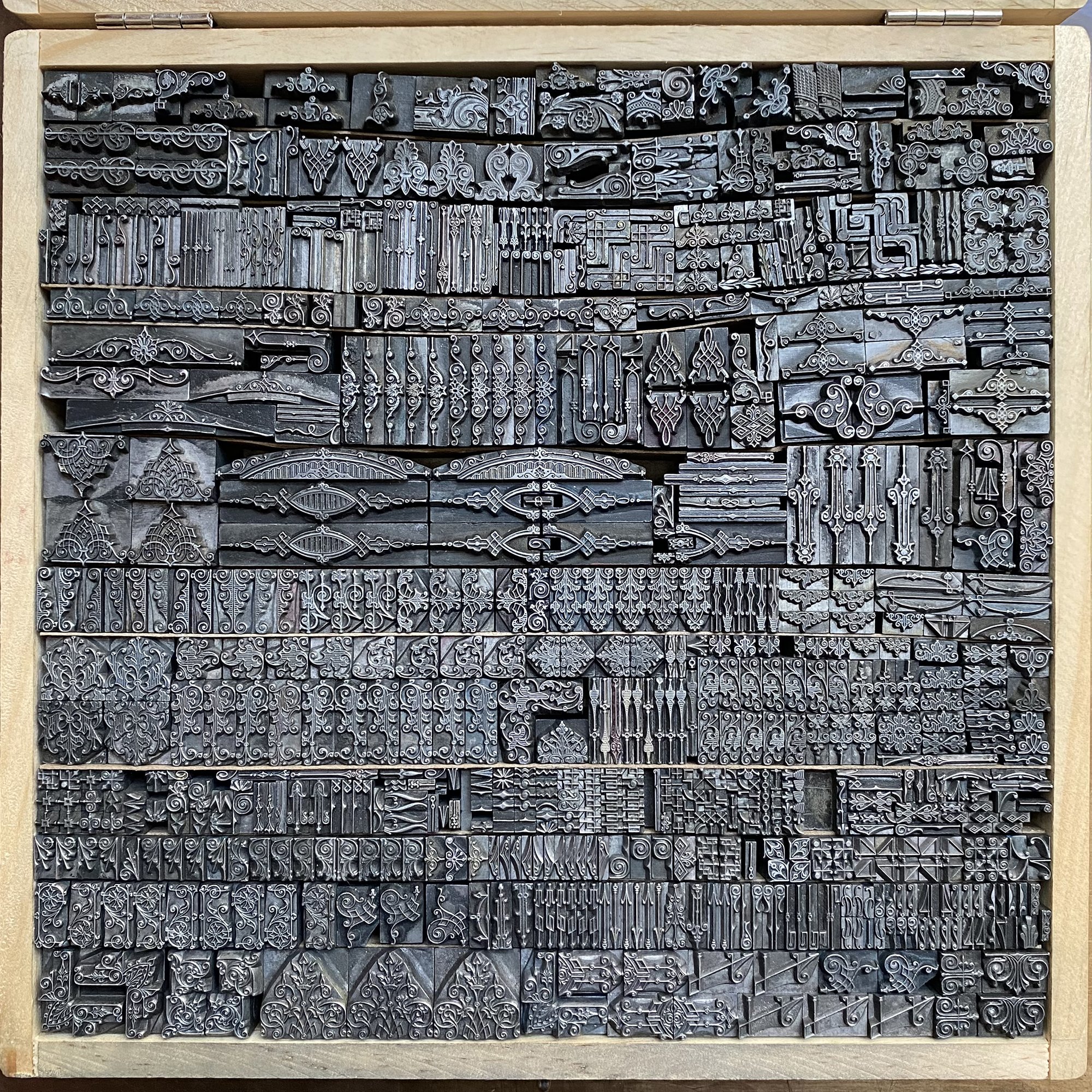
Much of this beautiful type is well over 100 years old. I have a decent collection that I keep in boxes for its protection and to easily find what I need when I need it.
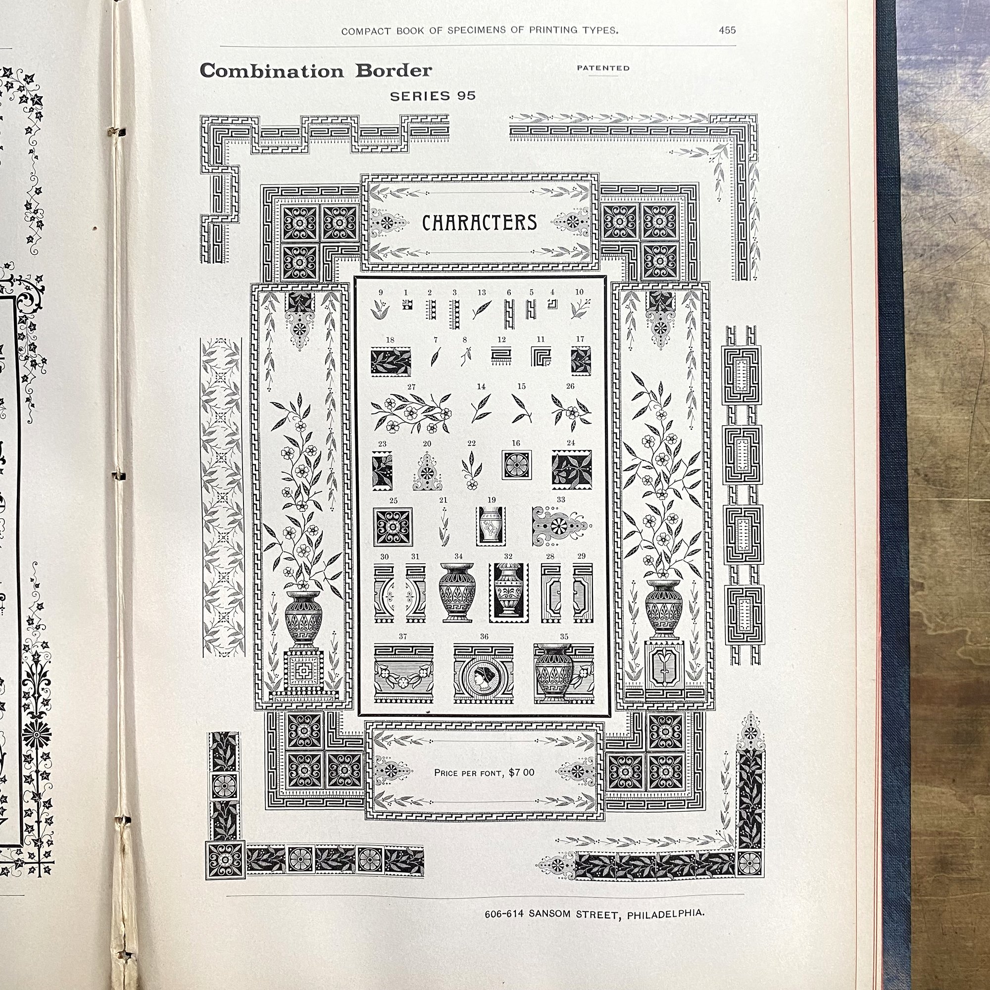
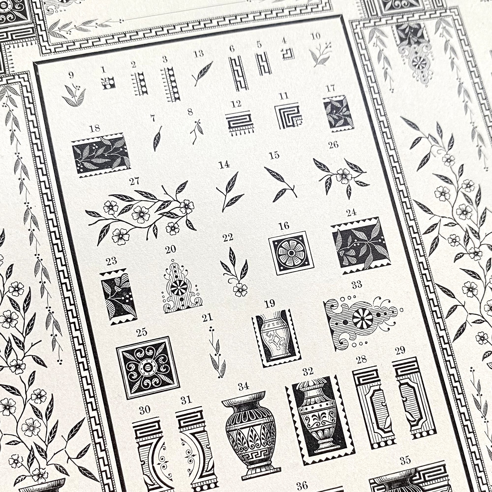
Some of the ornaments used for this invitation were made by MacKellar, Smiths & Jordan, formerly of Philadelphia, though many of mine are marked ‘Johnson’, the foundry that predates but became MSJ. This means they’re likely closer to 150 years old. The specimen book I reference in the studio dates to 1890.

These beautiful pages show endless samples of border and ornament collections and are incredibly helpful when it comes to figuring out how they’re all meant to come together. They function as both a sales tool and a glorious sampling of design work at the time, or at least design work to which one could aspire.
Erica and Adam wanted an image that included hummingbirds on the back of their invitations so I started from these sources to get ideas for something that would be in keeping with the rest of the ornaments.

I sketched a number of elements from the book and retooled them to be appropriate for the project.

When absolutely necessary, I have magnesium plates made for custom imagery that’s too detailed or small for linoleum cuts. The magnesium is mounted on wood that makes it type high, or the same height as all of the other type (.918”, just shy of one inch).

I also recently cleaned up some old brass dashes that make an appearance on this invitation. Again, something that dates back a century and prints just as well today.


Here’s a close up of the front of the invitation. There’s so much detail in these old faces that’s difficult to achieve for printing today, though some are trying and succeeding, as evidenced by my pal, Val!


And… if you’re a fan of these gorgeous typefaces, I just produced a set of cards for the Print Club that are now available for everyone. These feature many of the ornamental sets in the studio, paired with funny acronyms/phrases of today.


I know a lot of designers prefer the digital world and its seemingly endless options for typefaces and ornament in their work. While the collection of physical type slowly grows in the shop, I’m learning more about the craft of creating with these pieces over time, both in terms of their original purpose as well as what can happen when they are approached with a modern sensibility. Ornament falls in and out of fashion all the time, but this type persists, patiently sitting in cases, waiting for the right moment to wow an audience.