
In early 2021, I had the idea for a book of letterforms built entirely from 12 point metal type ornaments. This arose following a year of non-stop hustle to keep the studio afloat and the desire to do something that was a creative challenge of my own making. A mental cleanse. A brain break.
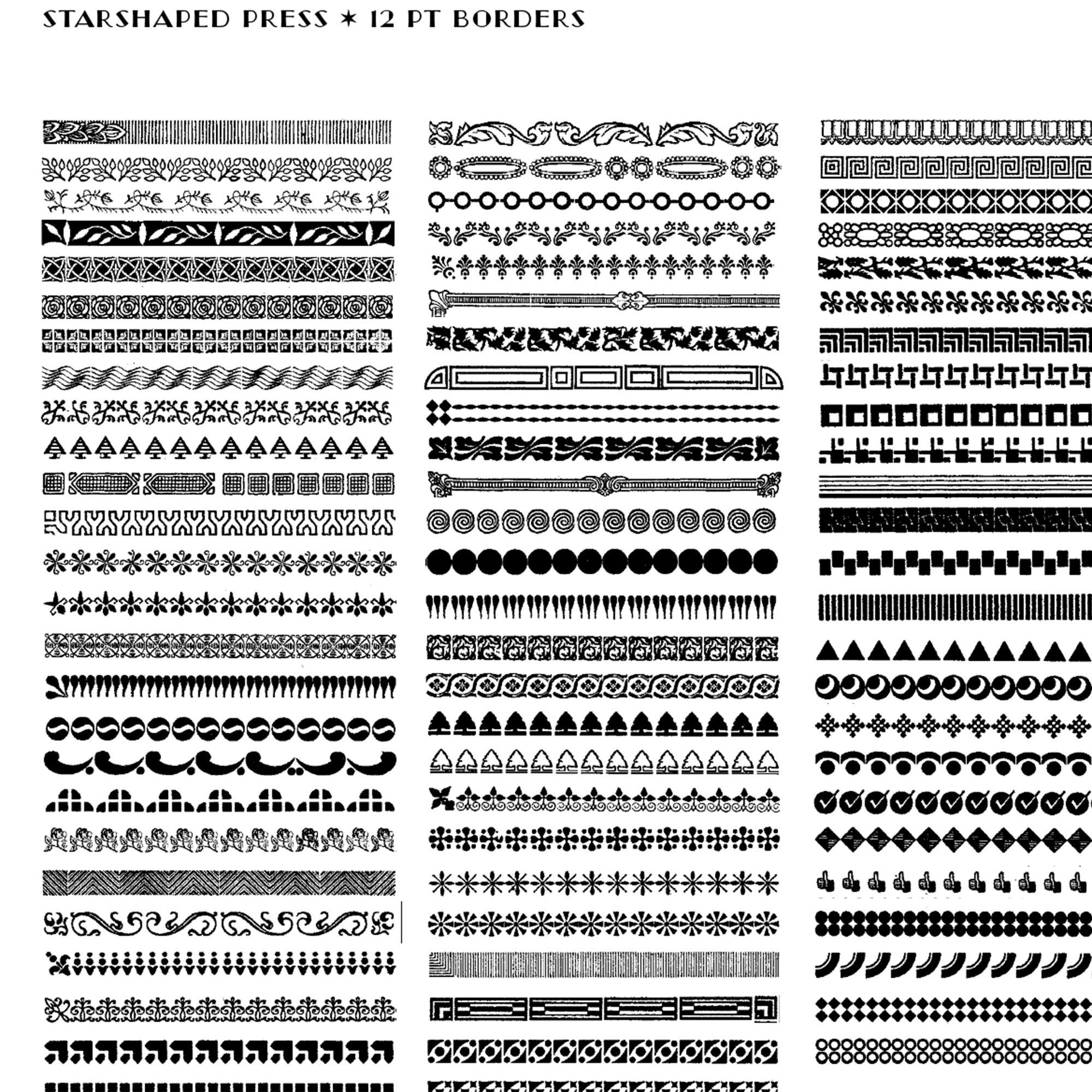
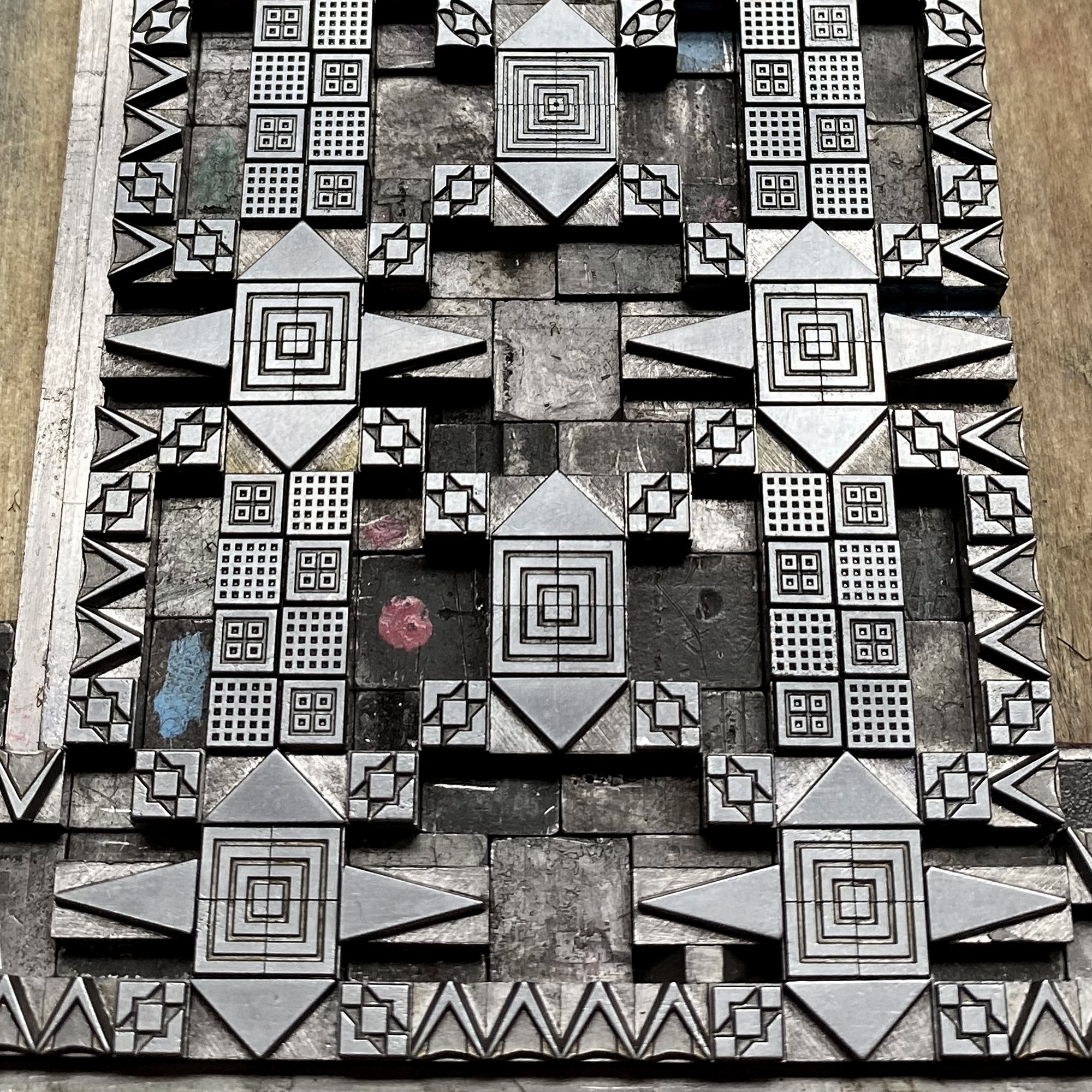
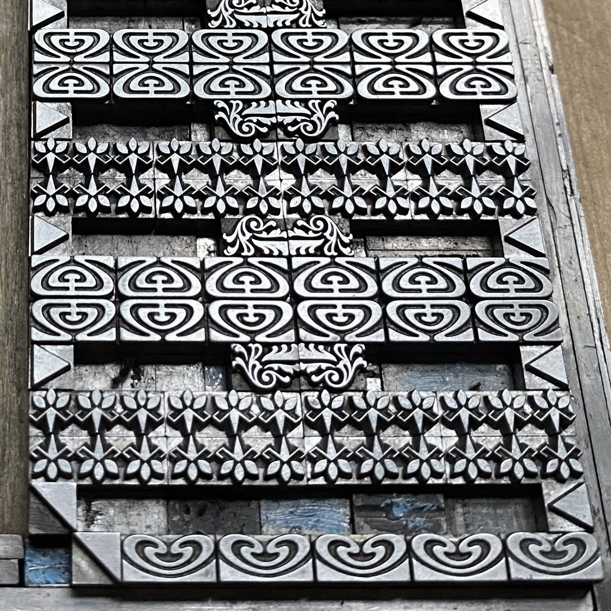
Metal type and ornament is measured in points, with 12 points making up a pica and 6 picas forming an inch. I love collecting ornaments that work on a typographic base 12 system of measurement because they play well together: 6, 12, 18, 24 and 36 point ornaments are the most plentiful at Starshaped.
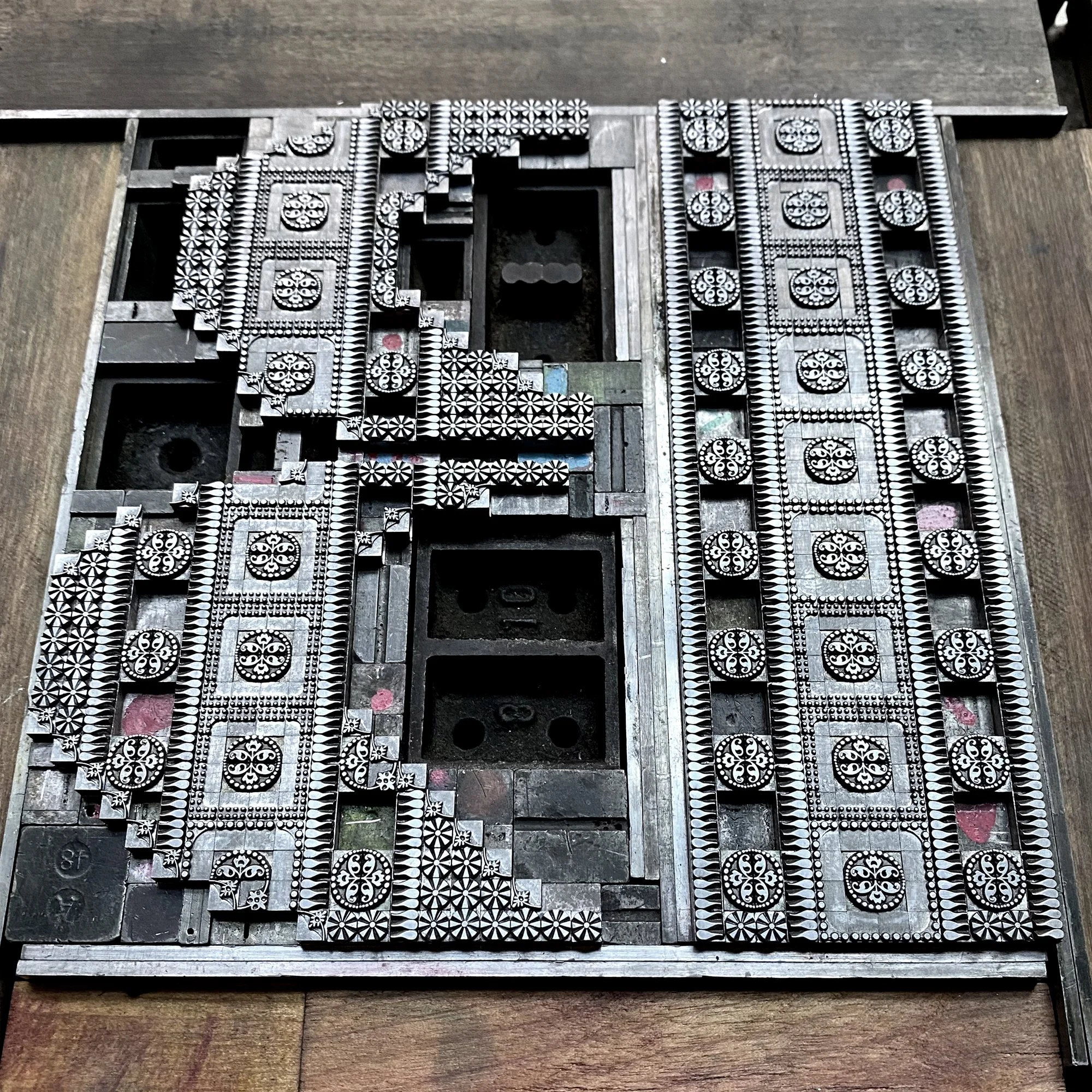
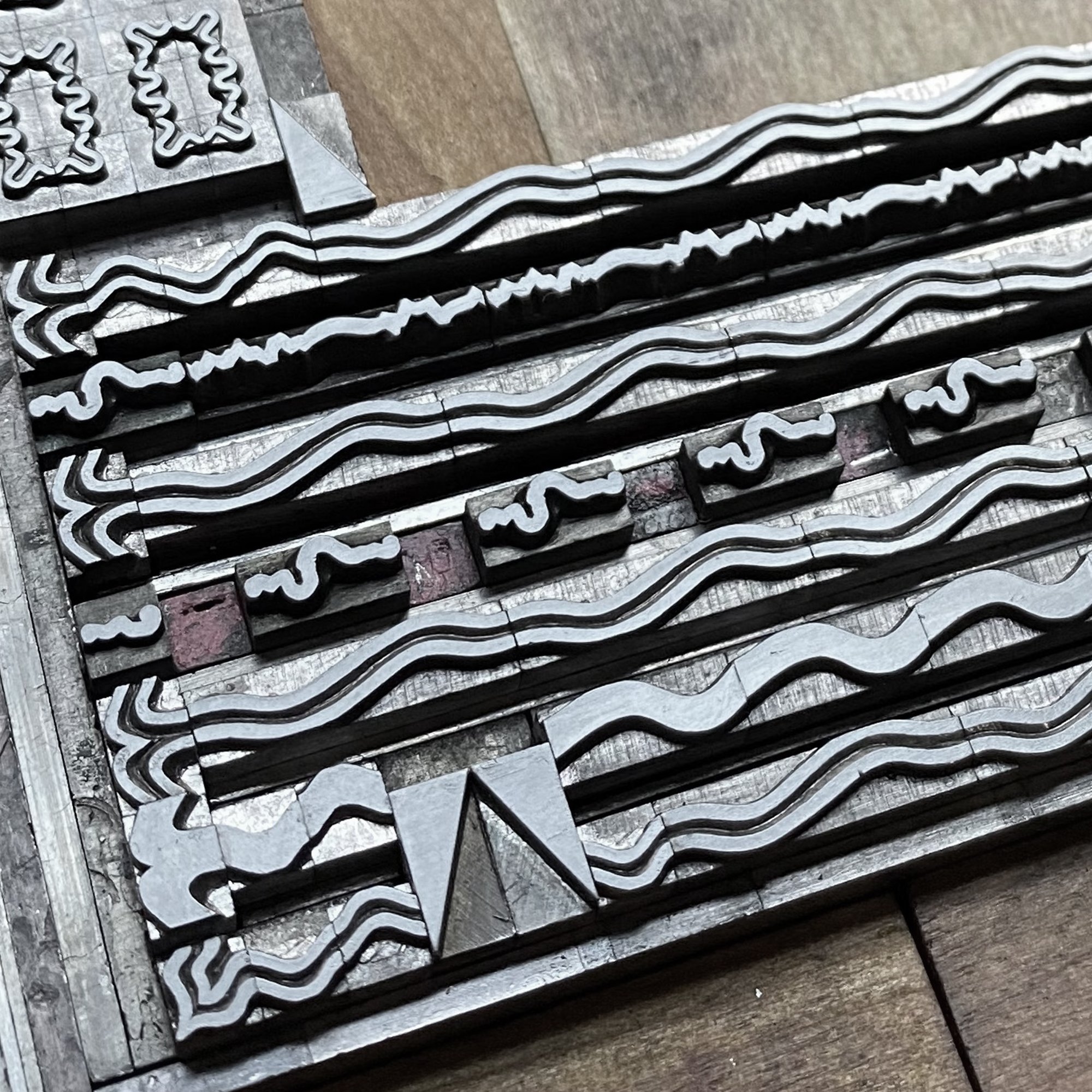
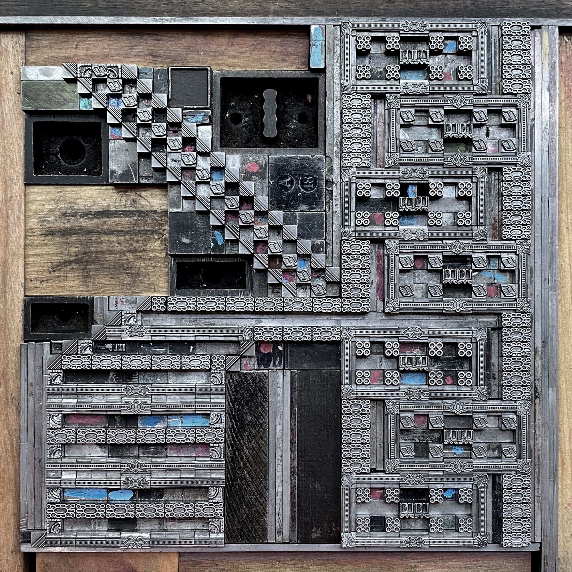
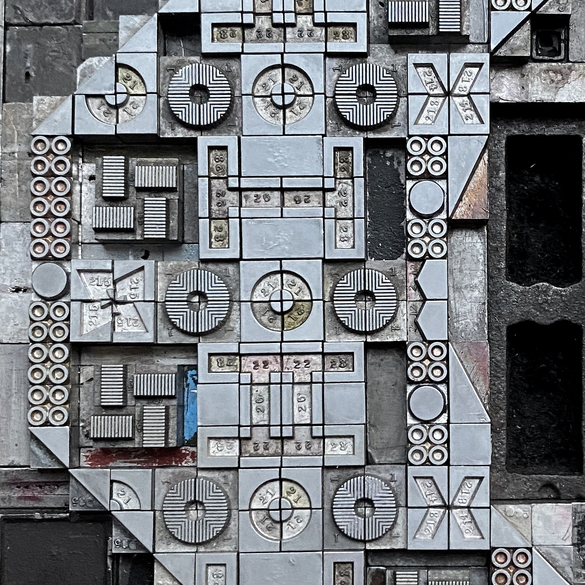
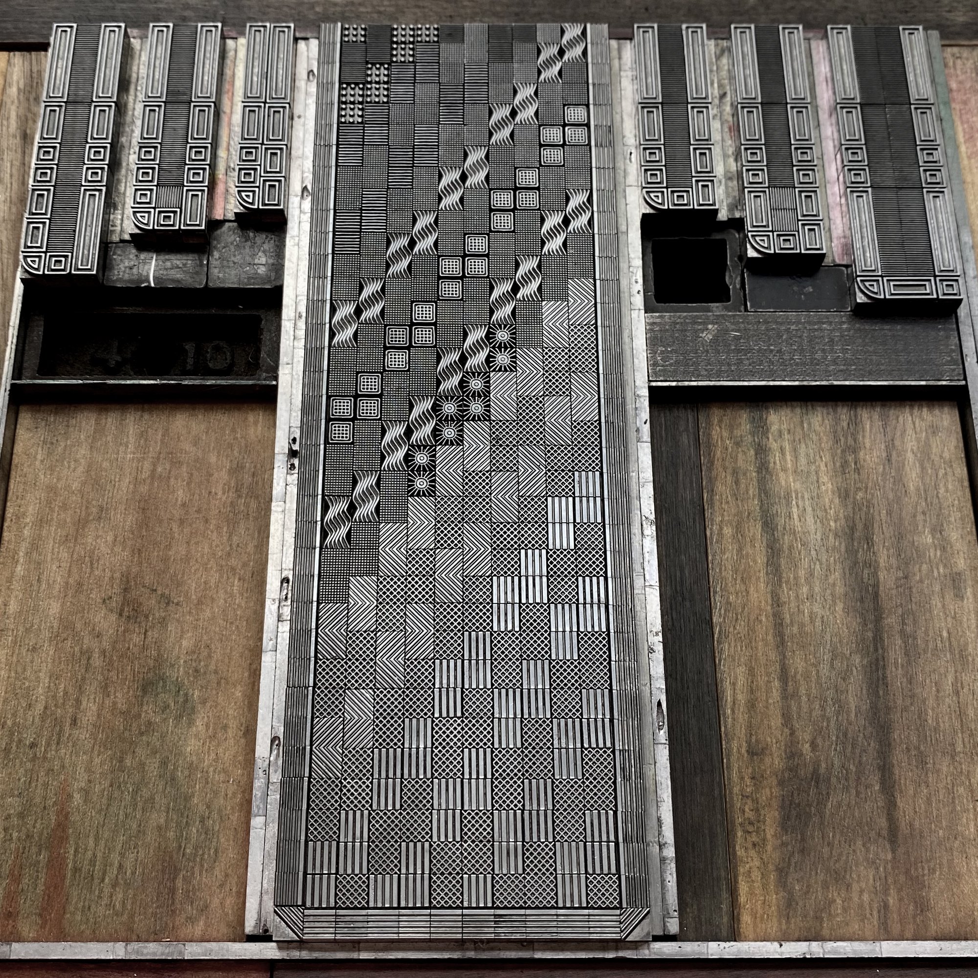
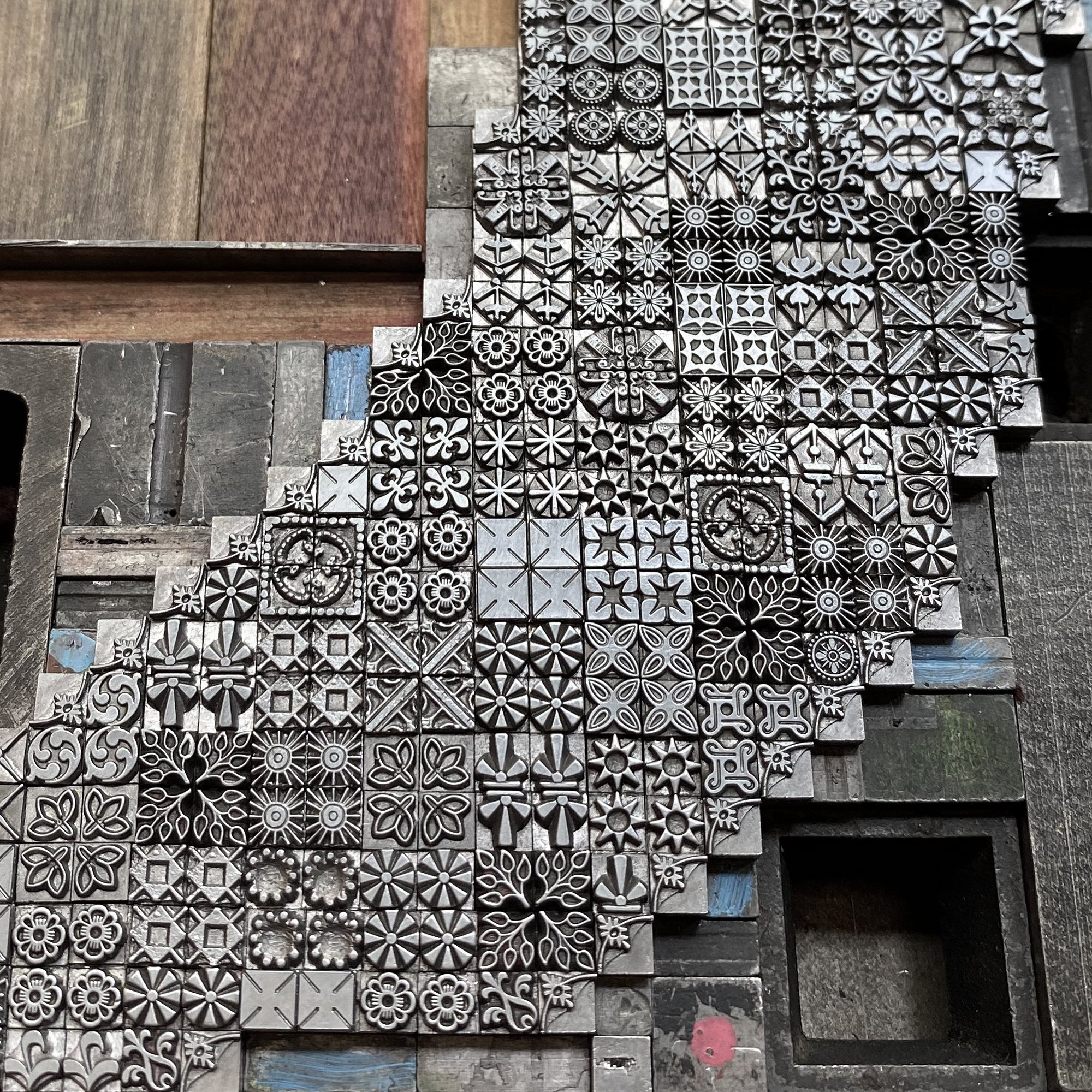
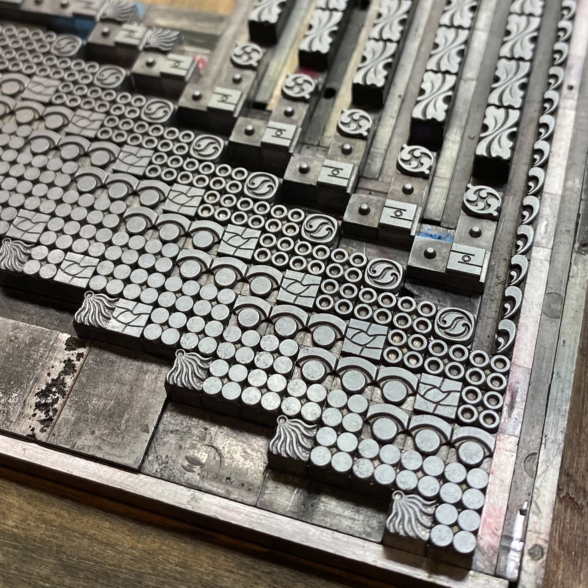
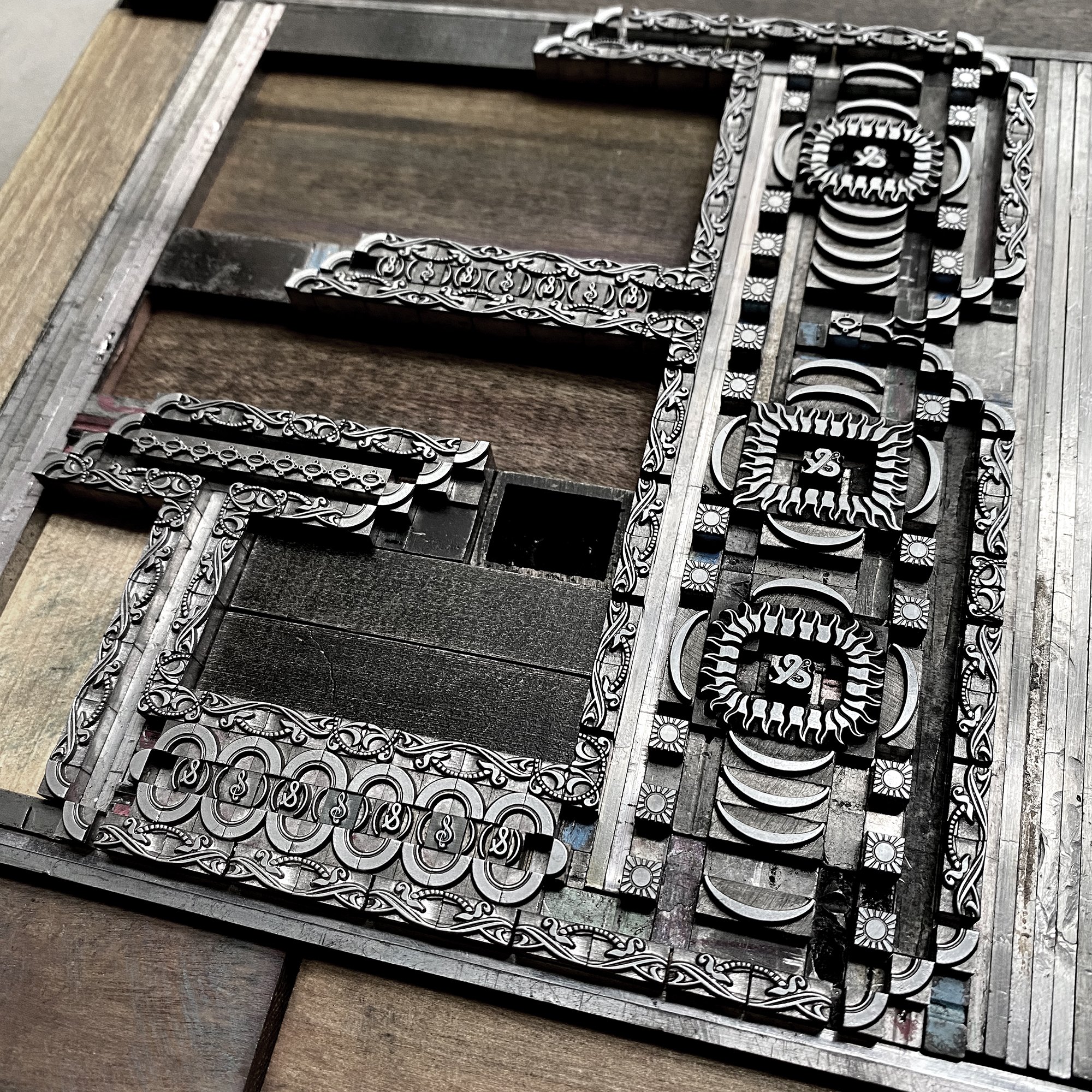
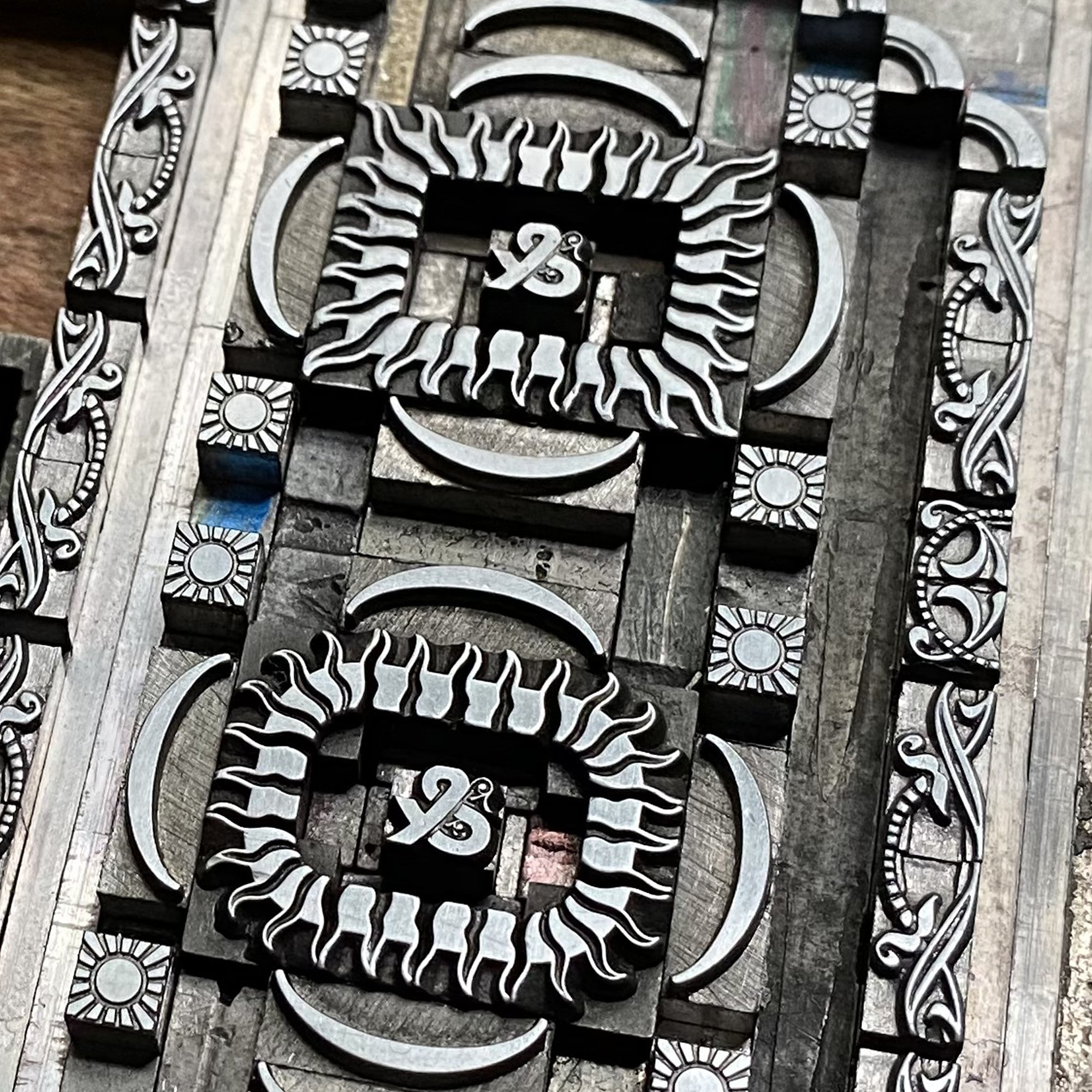
For this project, I decided any ornament in the collection that had 12 points on at least one side would qualify. In the image below, you can see that some ornaments measure 12x(insert length), can be corners for 12 point borders and are therefore L-shaped, or are 6 point ornaments that are double length. This made for endless possibilities.

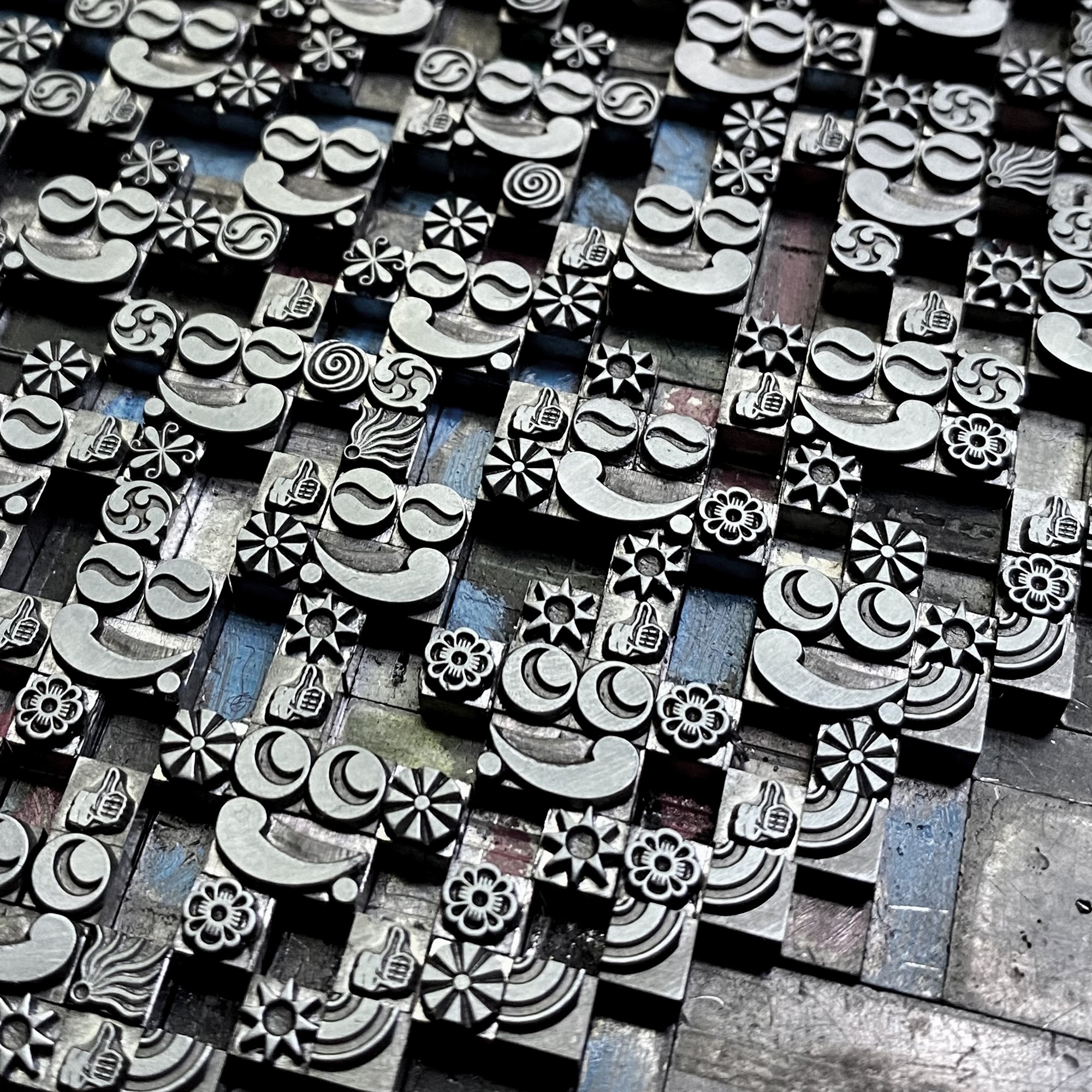
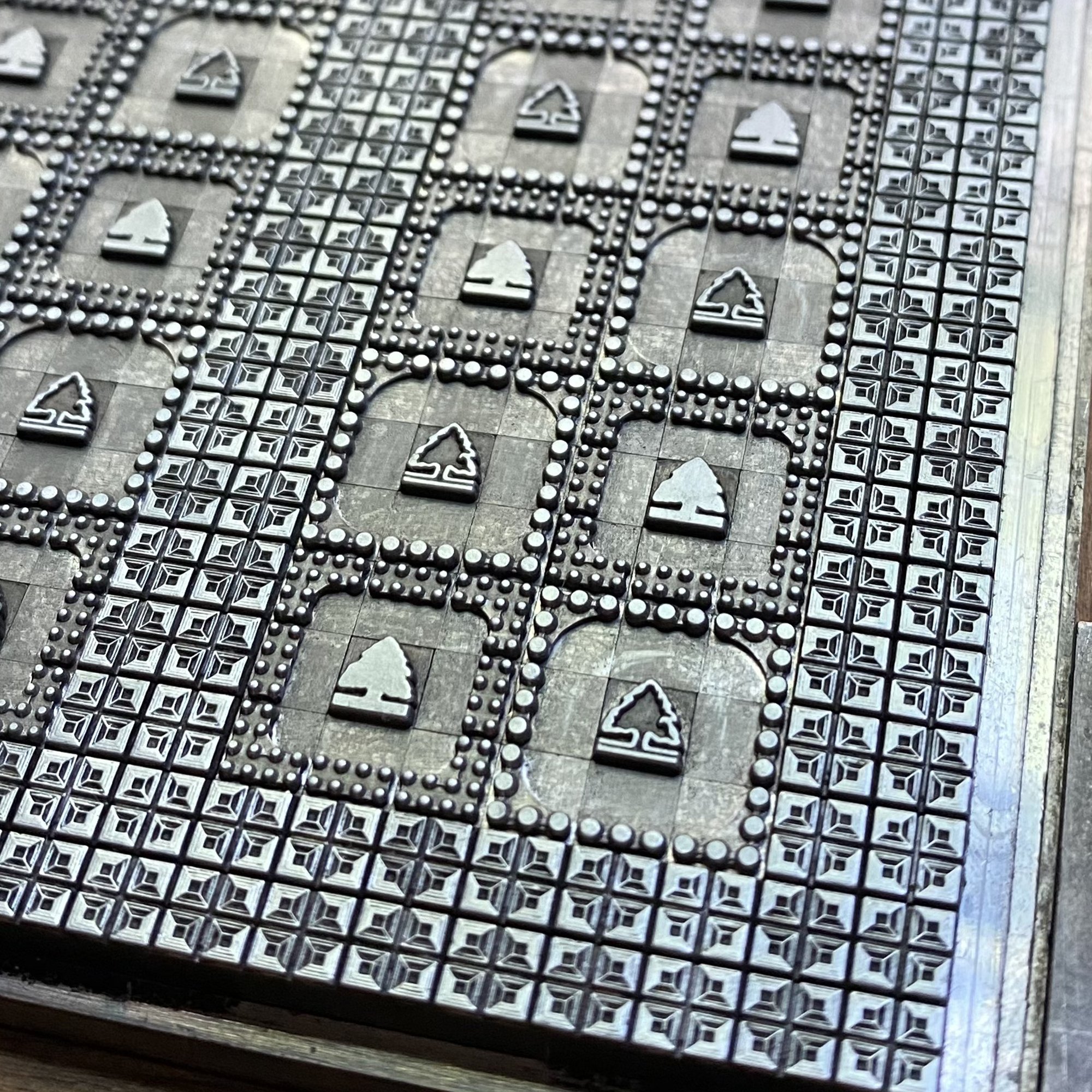
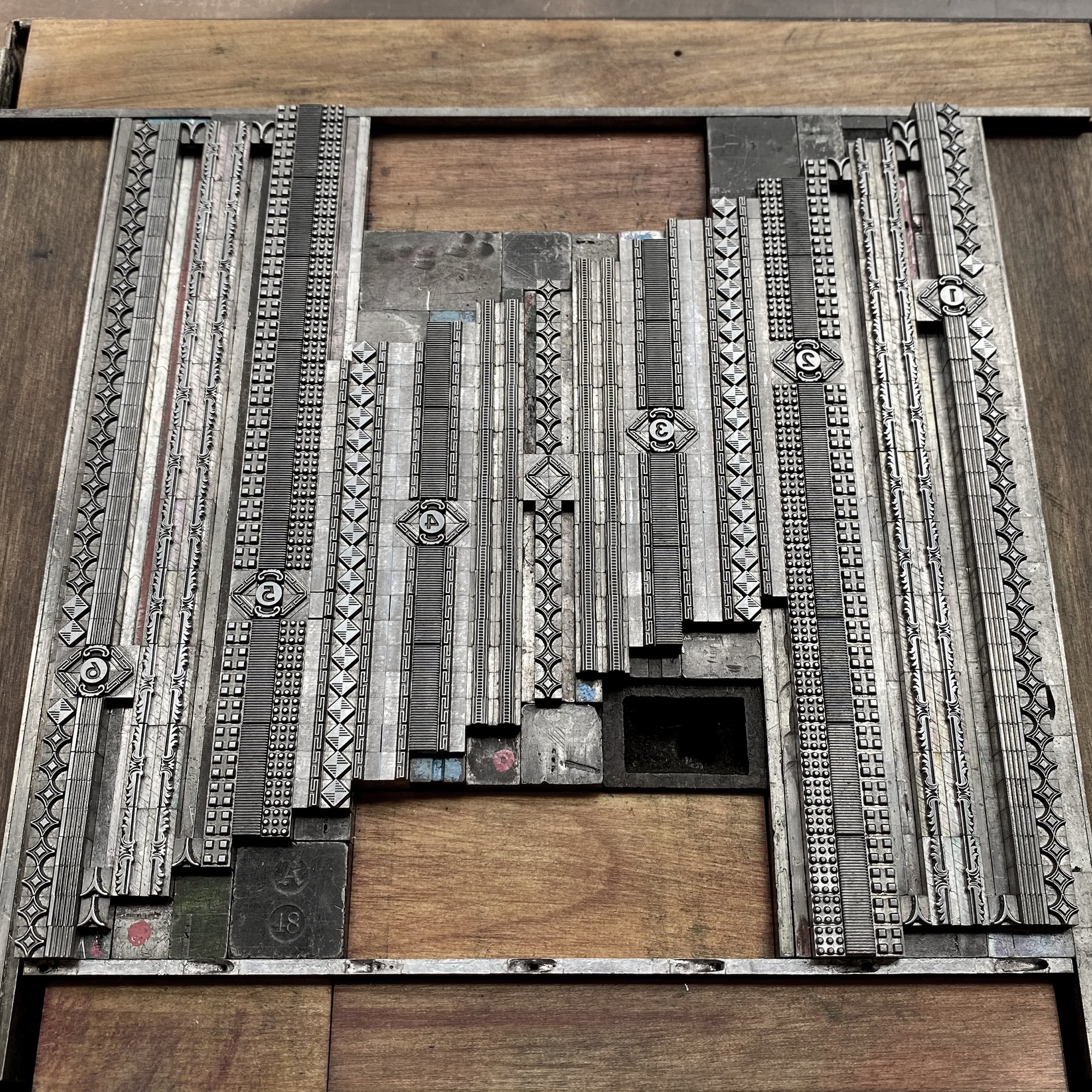
Almost as soon as new-to-me type enters the studio, I print black and white proofs of it to have a visual representation of the collection. I also scan these and create digital cheat sheets to pull from when building digital mockups for projects and client work.
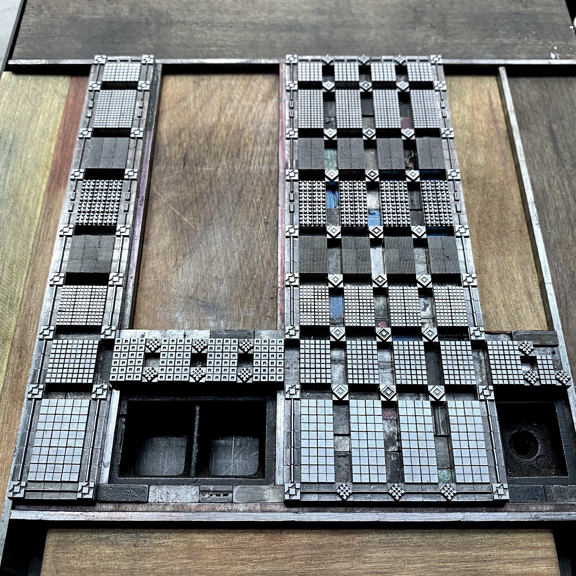
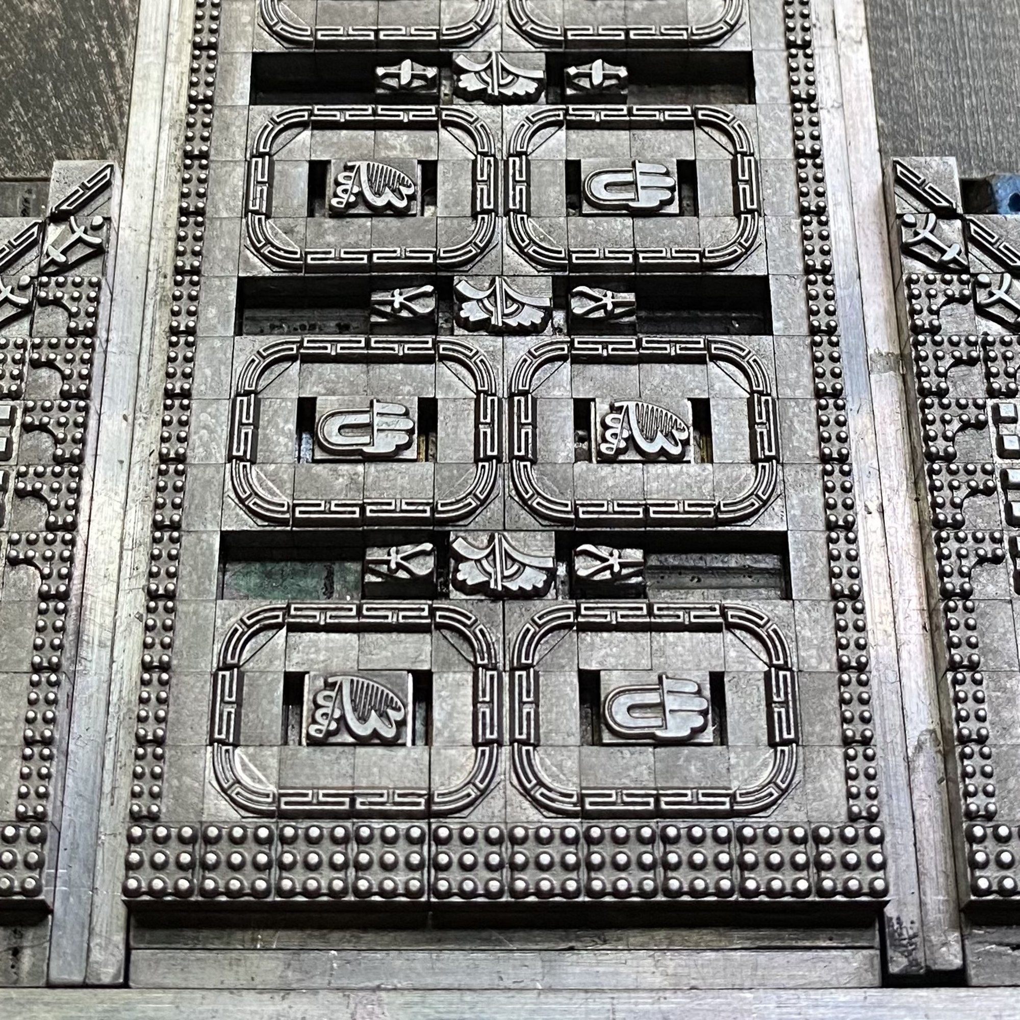
Thanks to the wonderful casting talents of Pat Reagh, my 12 point ornament collection increased significantly around the time of developing this project. Below is a screen shot of one section of the digital repository of my collection. I find this visual reference tool incredibly helpful when designing.
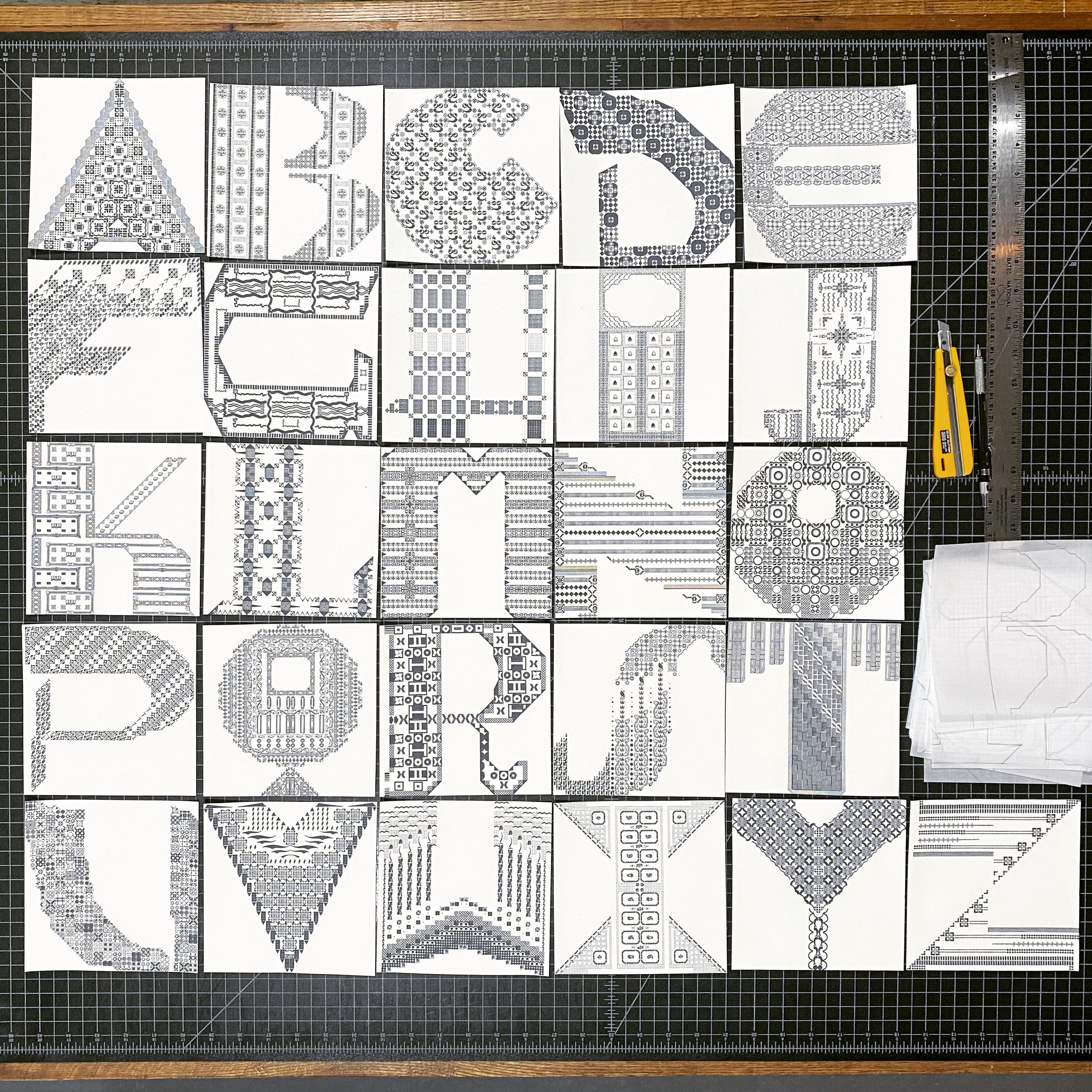
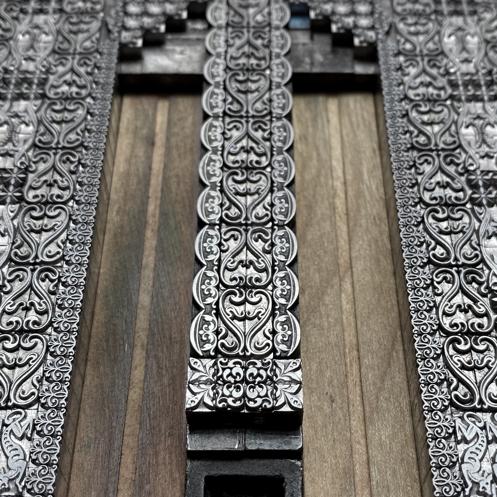
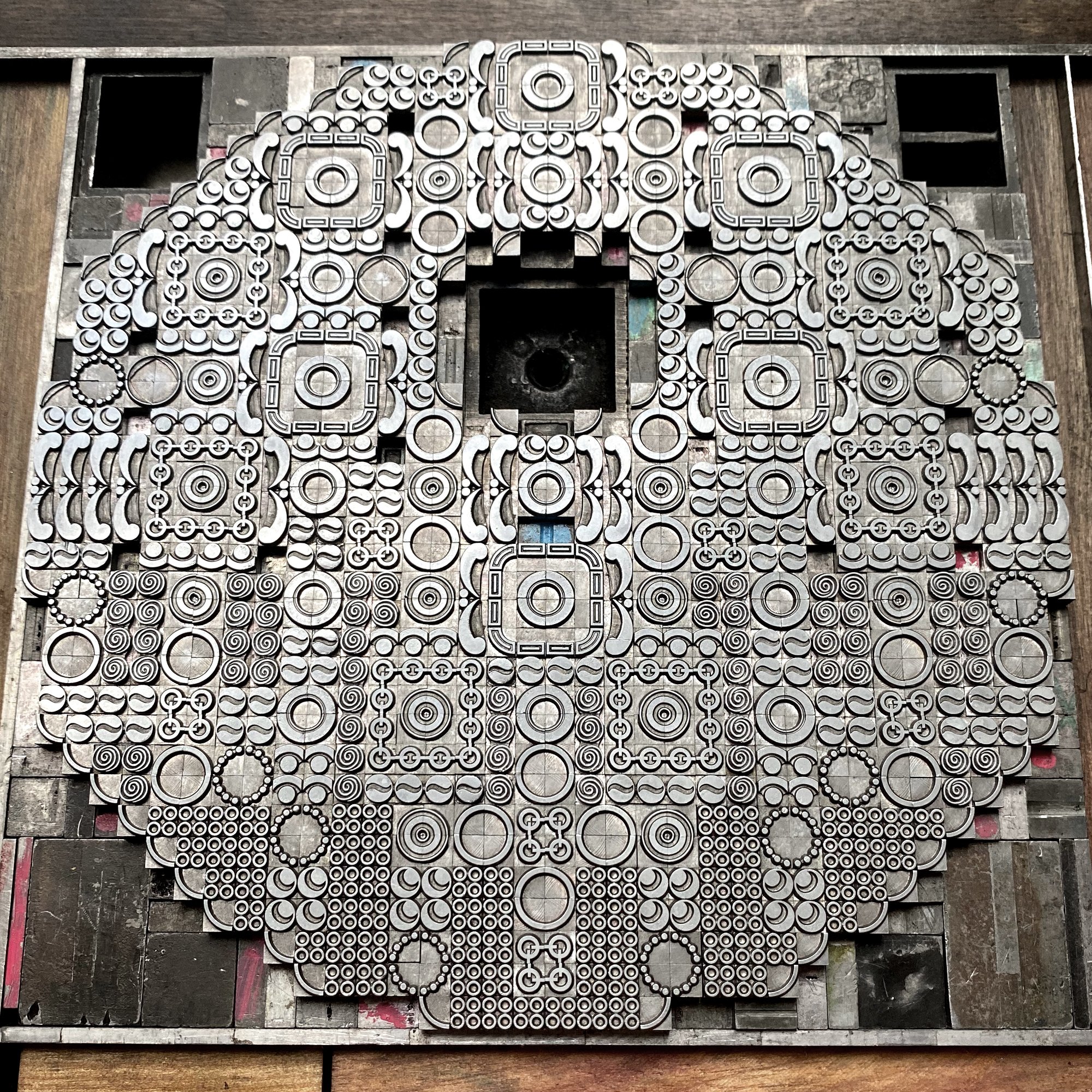
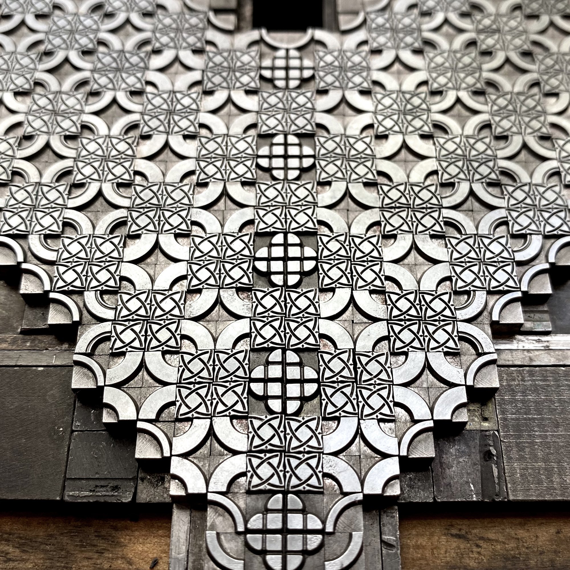
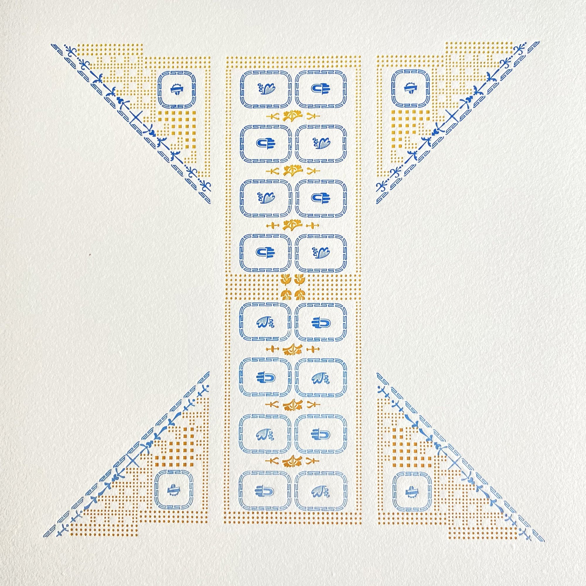
I began by looking at all types of letterforms and deciding there would not be a cohesive alphabet but instead a variety that could show off different ornamental styles. Then I sketched myriad options before slowly starting to refine the final layouts. Many have curves and there’s a limit to how to create these shapes with rectilinear metal type. I had to keep in mind its capabilities and referred to the above cheat sheets often, looking for non-solid, or non-square shapes within the very solid metal body of the physical piece of type. I often point out seeing positive vs. negative space to folks working with ornaments when building shapes, like in this Weekend Printer post.

I laid out all of the designs in a 6” square assuming a 12” page size (for obvious reasons) on the computer. Below is the first iteration of the whole alphabet. Many of these would change as I started the typesetting as there would be shortages of some of the ornaments or the occasional ‘that just isn’t right’ moments. These digital guides are just that— guides for getting the setting off the ground so there are fewer problems to solve, not an elimination of all problem solving.
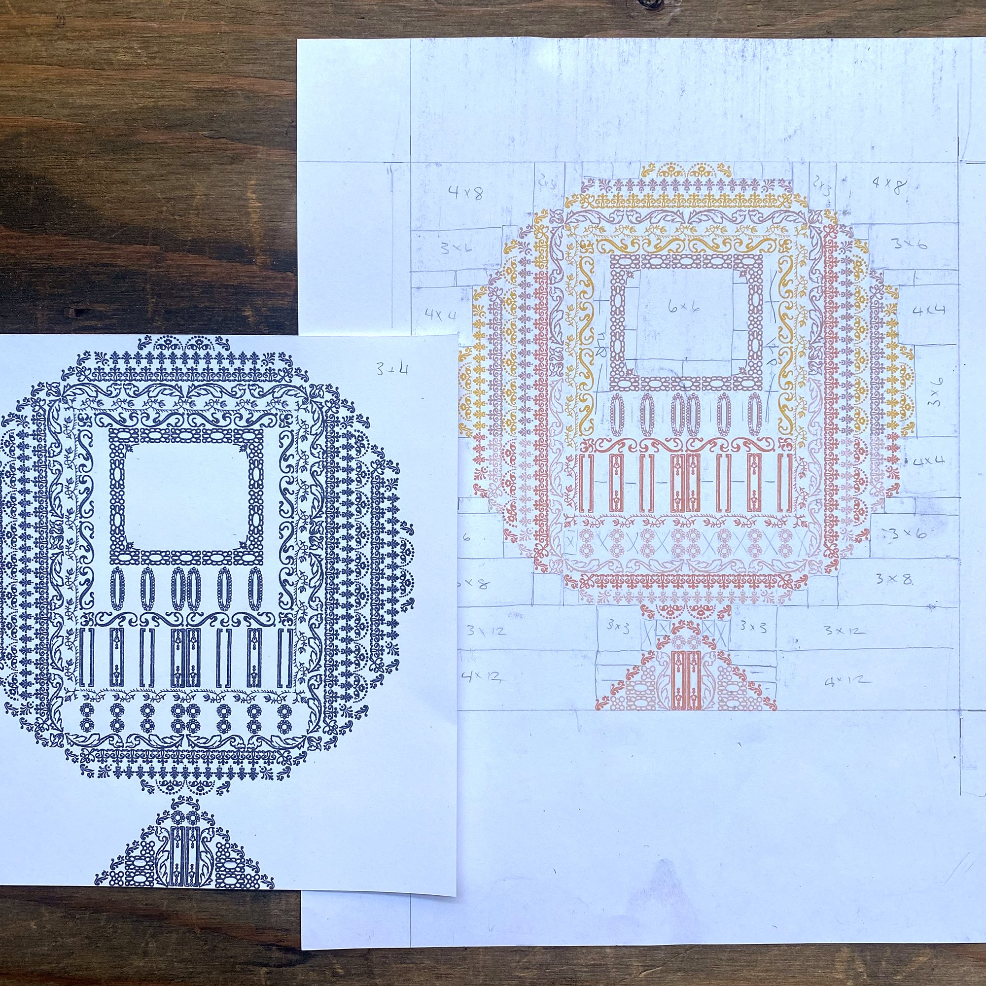
The other nice thing about having digital proofs is playing around with the color to make sure it was to my liking. More on that later.
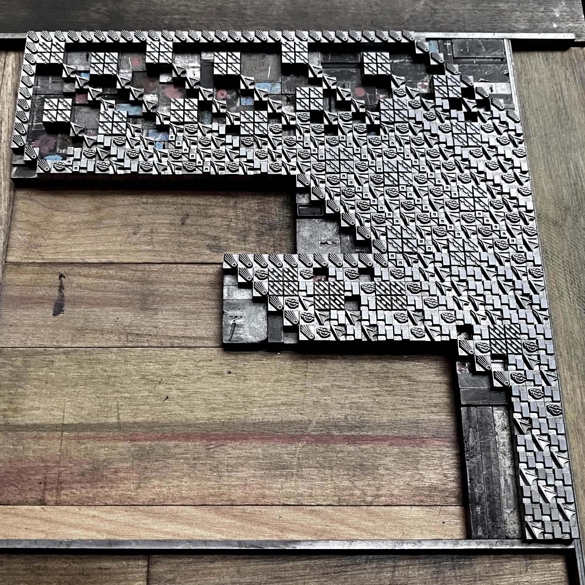
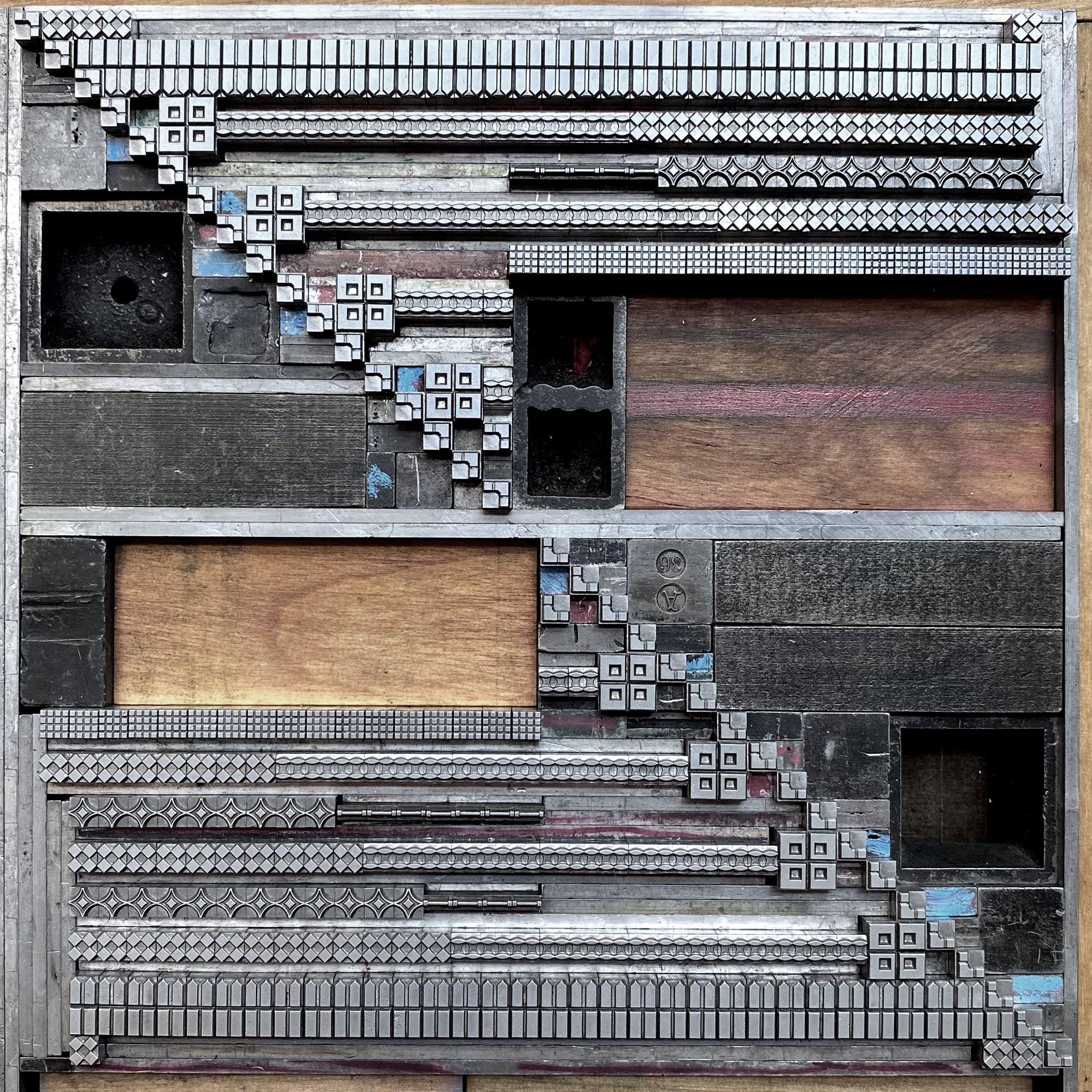
The files are also built on a grid, meaning I could block out the spacing material which is equally important, especially given that these would be printed in two passes with extremely tight registration. This sheet shows marking up what small furniture and spacing was needed to fill in around the ornaments.
I set up time lapse videos for setting all of the letterforms, one of which is here. Planning ahead with all of the ornaments and spacing pulled meant actual setting time was about an hour. I built the form on top of the computer print out of the letterform, which is often how I discovered a shortage of ornaments or a problem with the setting that needed correcting. After it was completed, I slid the paper out.
As an aside, I’ve had ridiculous comments lobbed at me by certain people in the letterpress community for using the computer for laying out projects, as if it’s not a ‘pure’ enough tool for composition. I’ve spent the last 20+ years collecting, cataloging, cleaning, meticulously identifying, proofing and USING the type and ornament that comes into the studio. I use it for every project produced at Starshaped, which is my full time job. I do this because I don’t want to use polymer (plastic!) plates and want to carry on the life of what I think is a beautiful typographic art form that people can have access to if I show them what it can do. I show them by having the means to quickly mock up their projects; I could do all of this work by hand at twice the time, which cuts into my bottom line. The computer is a tool, just like all of the other tools in the shop. Get thee off thy high horses, gentlemen.
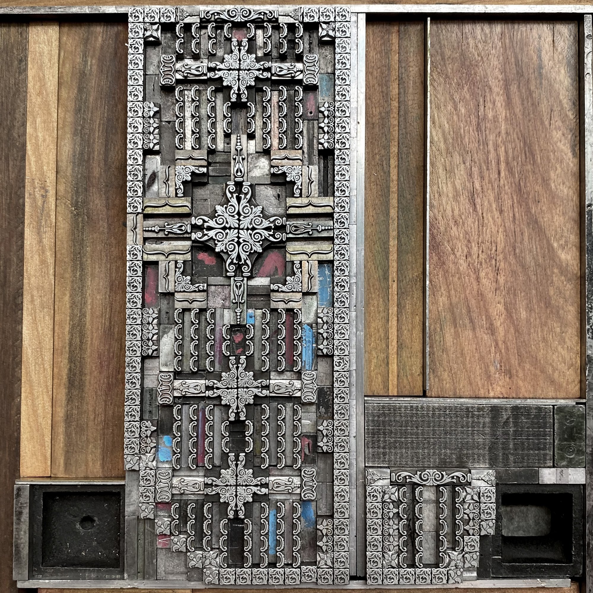
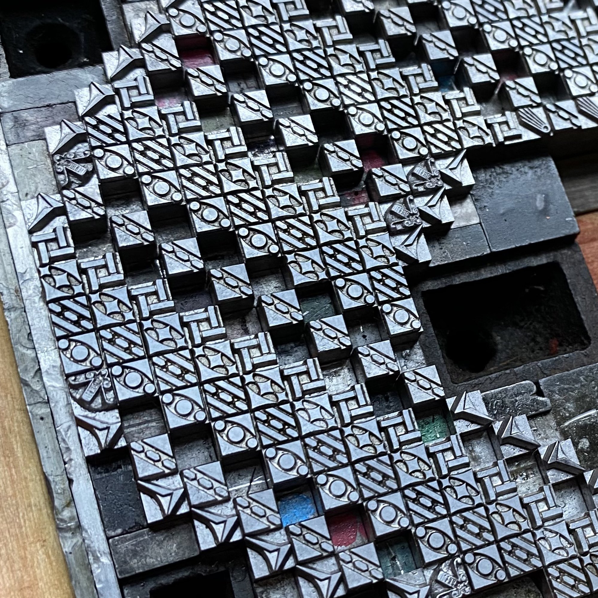
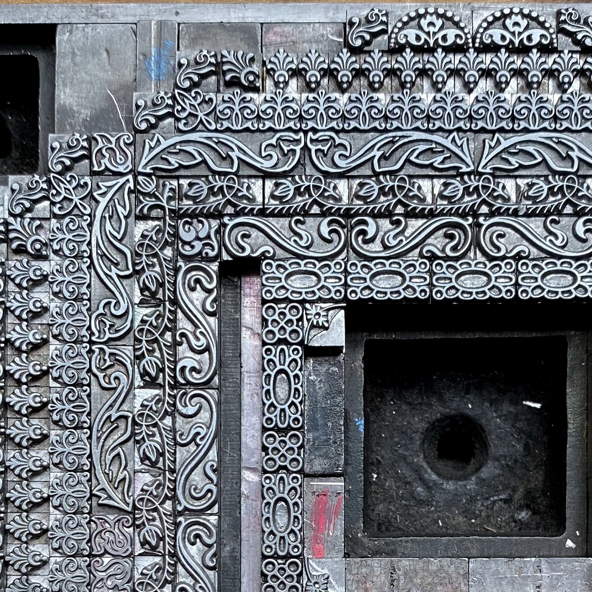
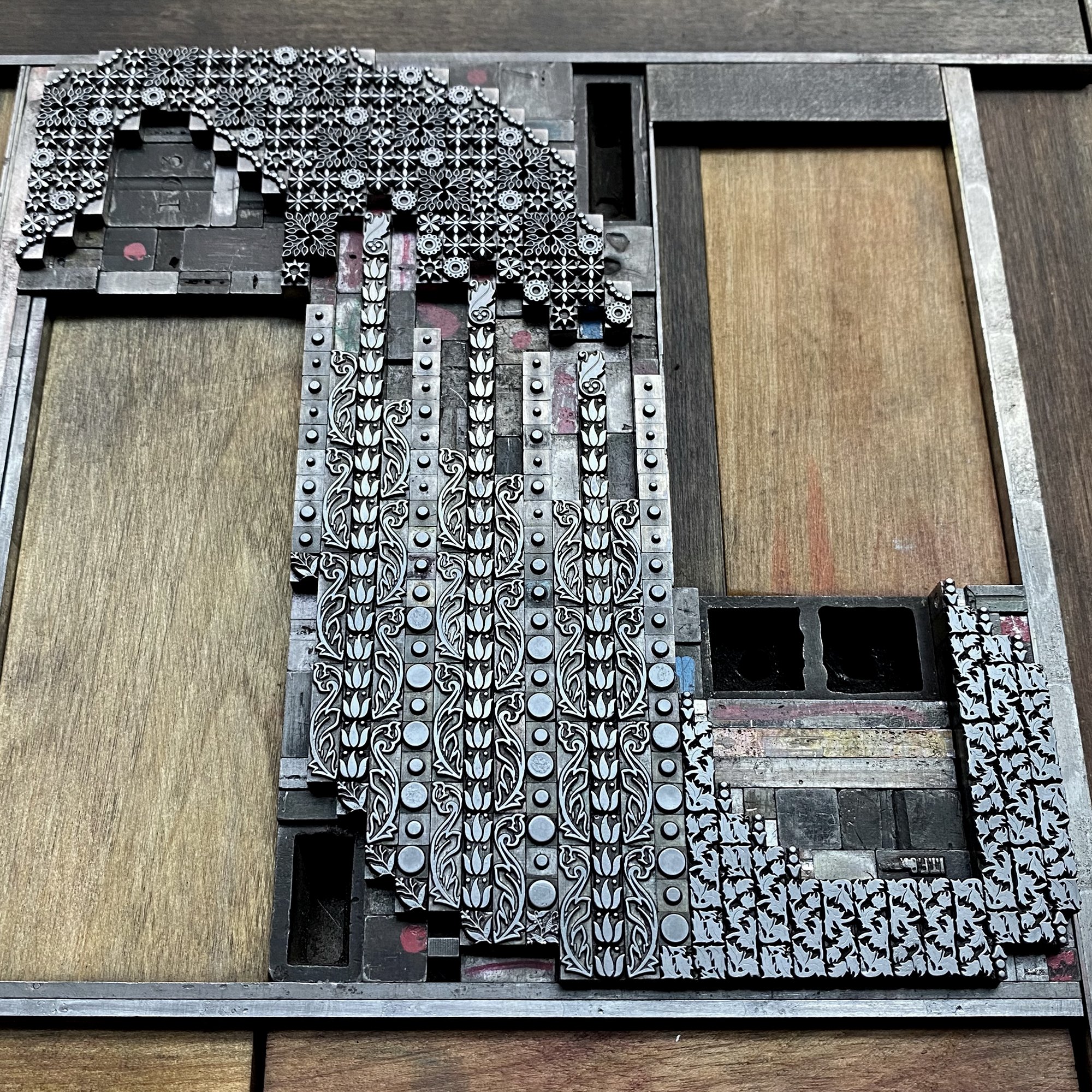
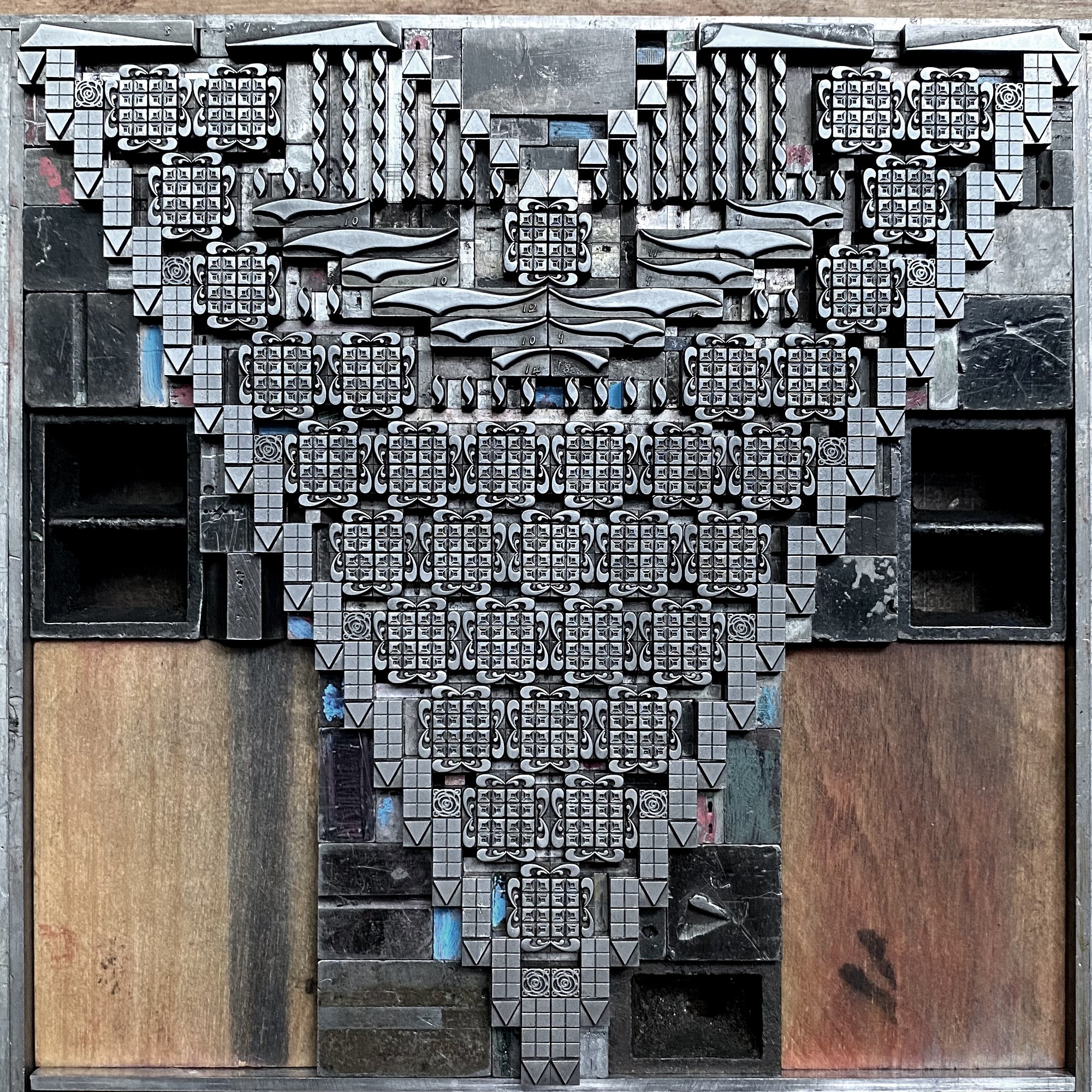
Here are some of the images taken while setting the individual letterforms, which were done one at a time and produced, as time allowed, over a few months. There are so many things I love about metal ornaments, but for this project in particular, I loved creating larger elements from many smaller pieces, or what felt like long running lines from disjointed ornaments. It’s so beautifully adaptable and credit goes to so many designers, many of whom we will never know much about.
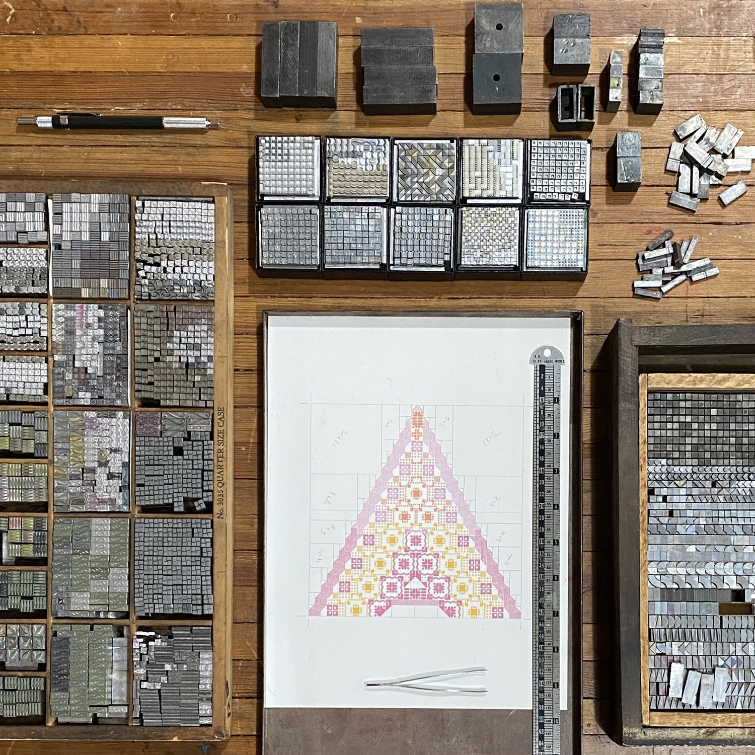

After setting each letter, I pulled a carbon paper proof, using good ol’ carbon paper instead of inking it, for a quick idea of what it would look like.

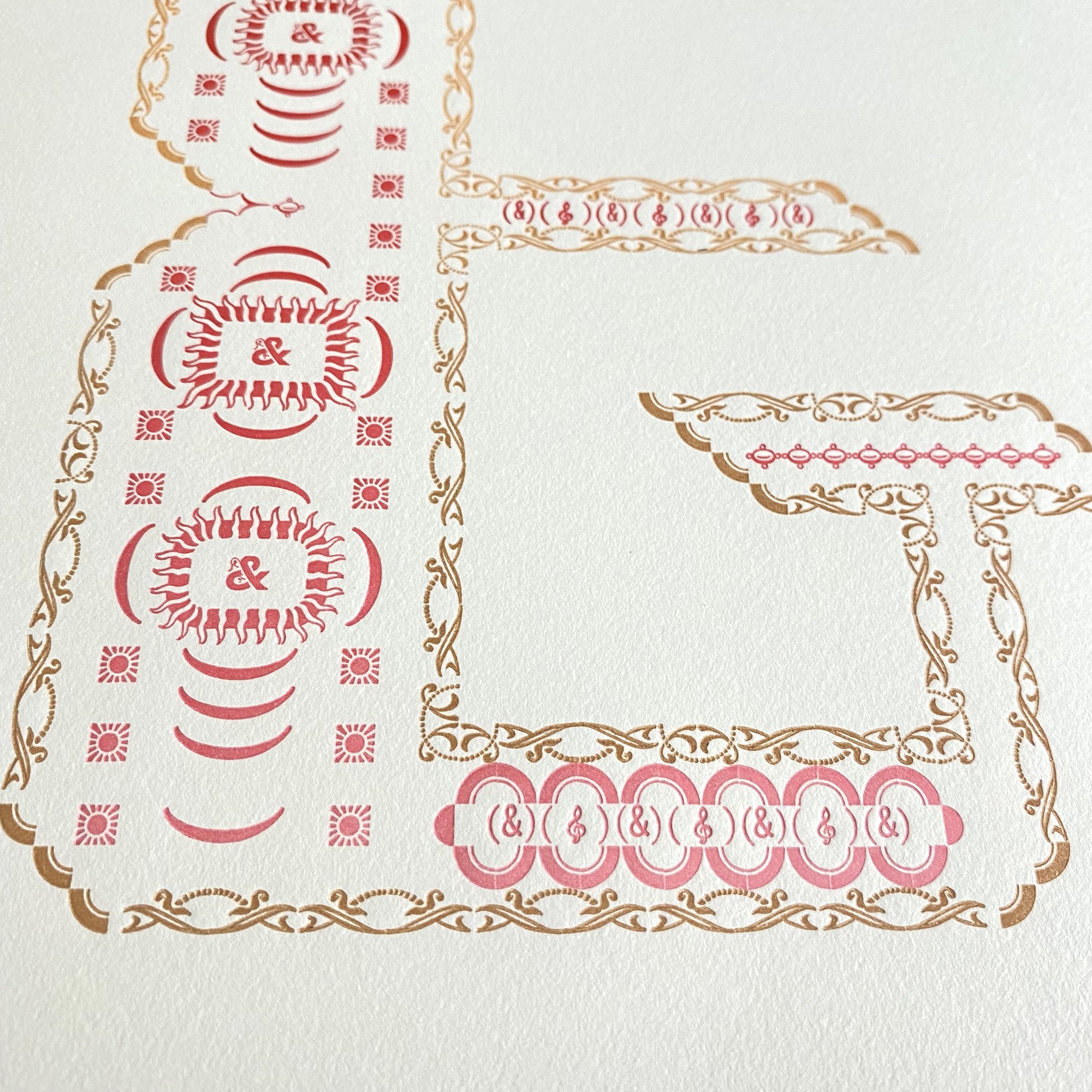
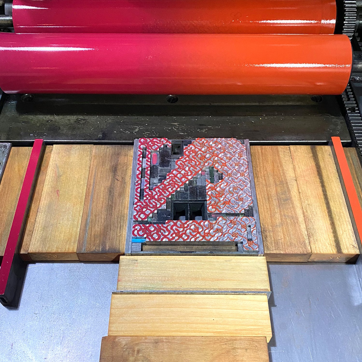
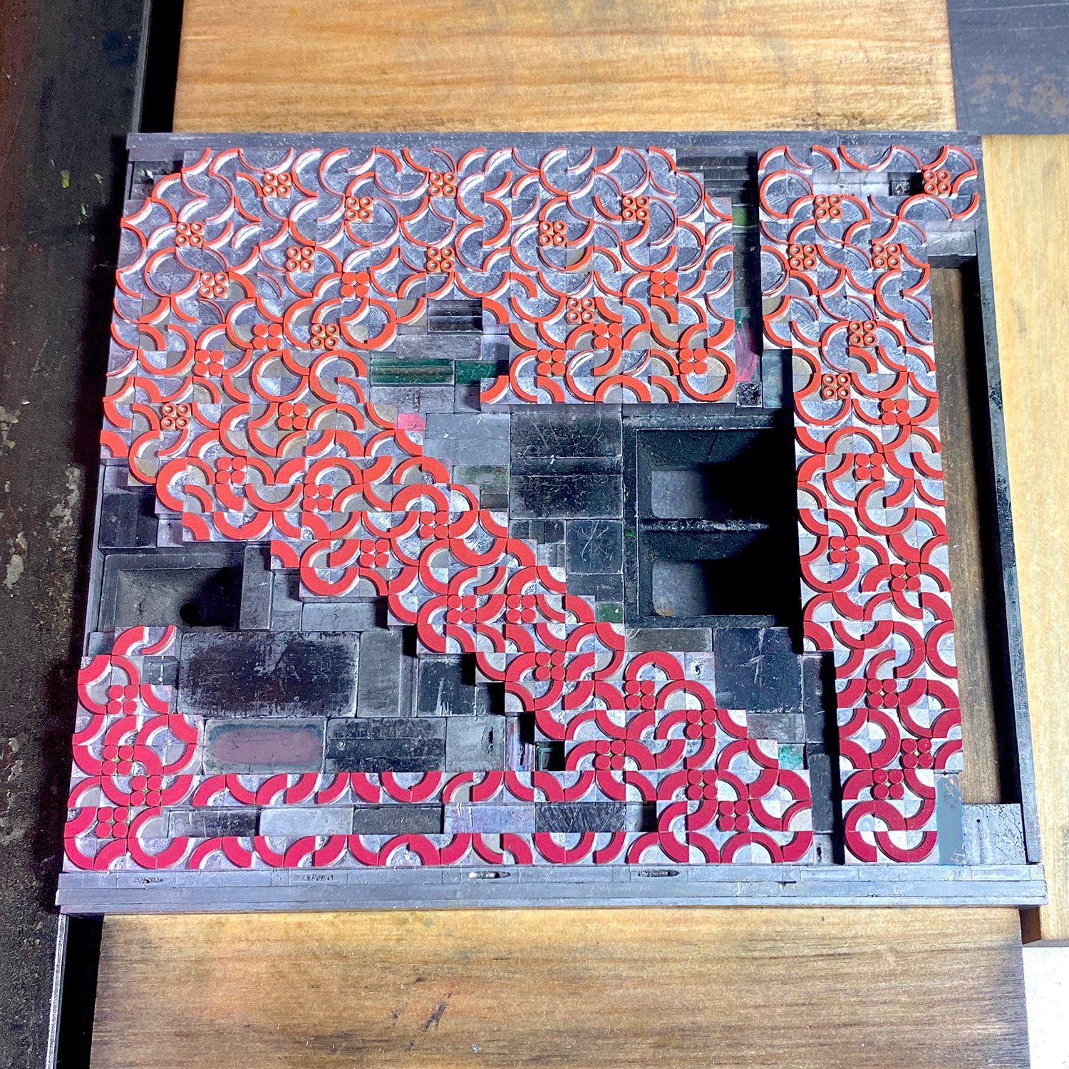
While I love the challenges of creating with metal type, proper inking makes me sweat a lot more. Each letter would be printed in two color passes, but each one would involve a split ink fountain, meaning there were two colors on the press at the same time that gently meld together in the middle (Tribune Showprint are masters of the rainbow split fountain). I established a color palette of what those splits would be and the number of combinations that could exist so that only two letterforms had the same. I mixed all of the inks ahead of time so they’d be consistent across all of the printing. They conveniently fit in the Farmer’s Fridge containers we saved from pandemic orders and hospital visits.

I proofed an entire letter with the first split color to make sure all alignment and set up was correct before pulling out the ornaments that would be used for the second color pass. You can see there’s a very gentle color shift from top to bottom.
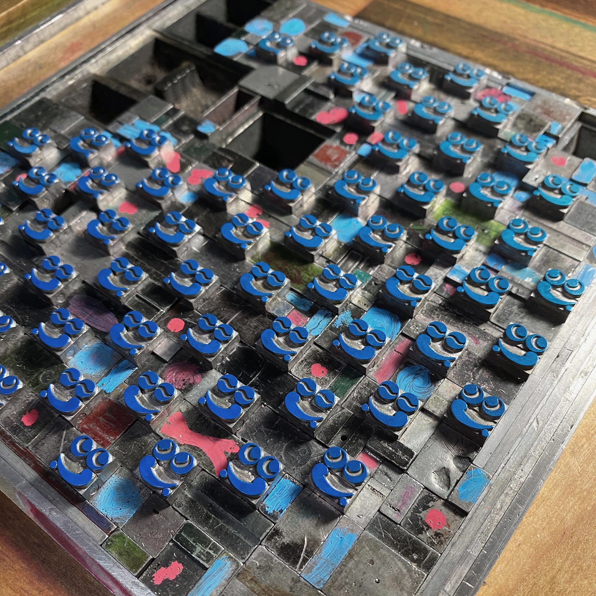
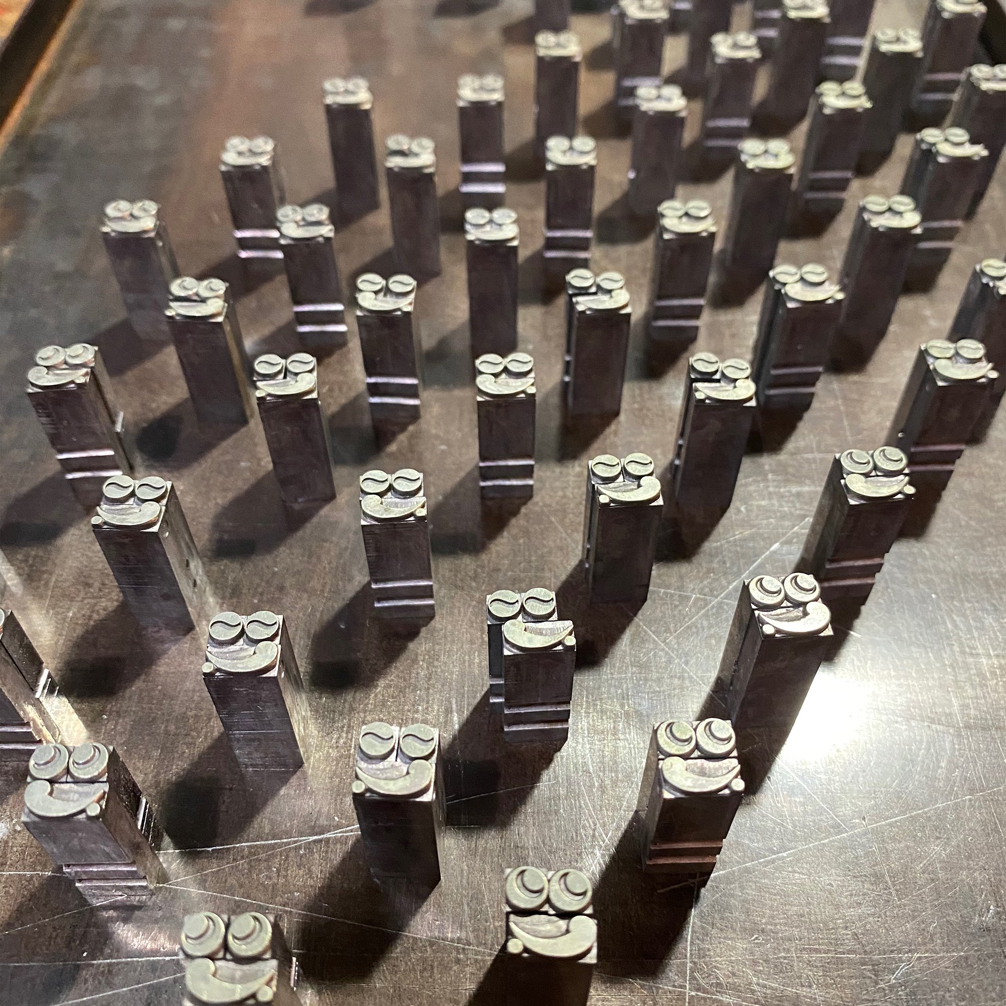
Color separations are always a tricky thing (I’ve also written more extensively about color seps on The Weekend Printer). Once I’ve got the placement established, I pull out all of the color that’s not being printed and try to mark its location by tagging the spacing used to replace it with paint marker. Then, when the first color is finished, I put the next color back in and take out all of the ornaments that were just printed. I try to keep the ‘on deck’ ornaments roughly in location on a galley; I love the look of these little faces lined up and ready to go.
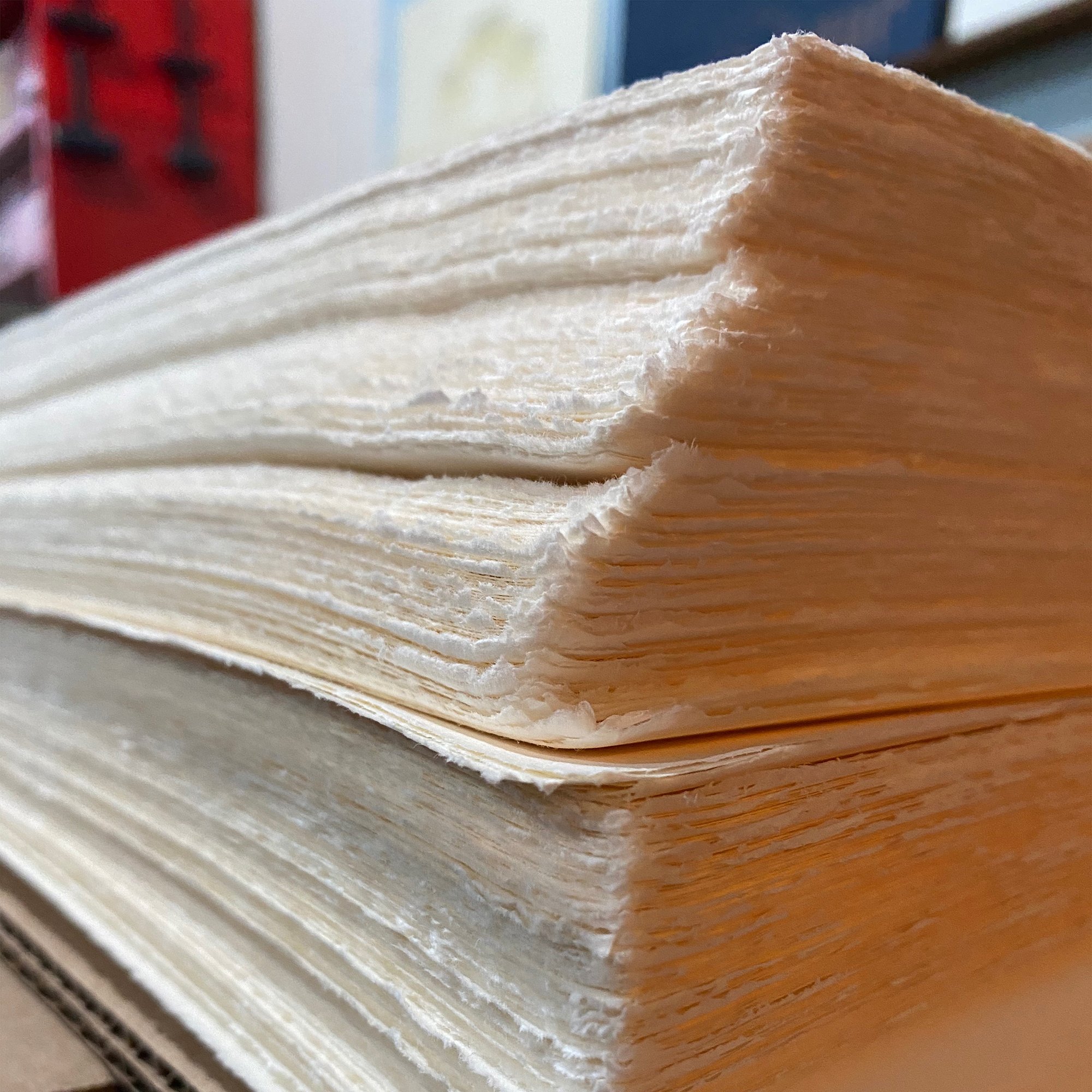
The paper is Zerkall, one of my favorites that is sadly no longer available. It comes in large sheets with fluffy edges and needs trimming to size. I cut the sheets larger than needed so all of the pages can be collated and trimmed together at the end.
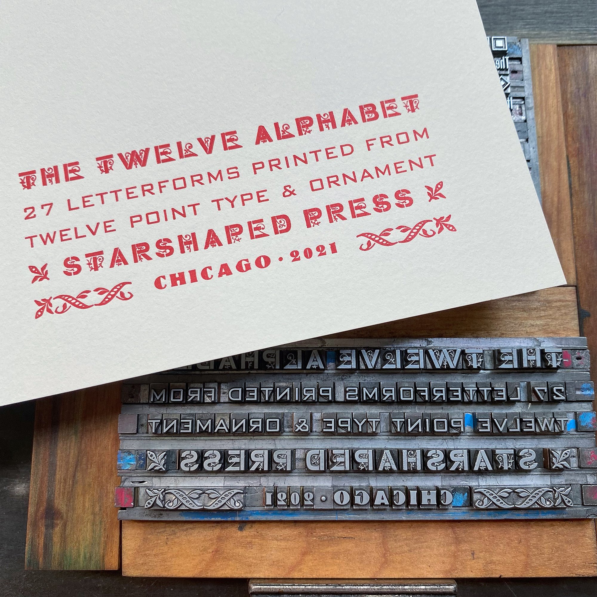
The title page and colophon were also printed in various 12 point types. I love this main typeface, Cleft Gothic, as it’s a basic gothic with a little surprise in it, which seemed appropriate for the project. It was a surprise when I got it as well, hiding amongst another gothic in a job case that went unnoticed until I started to clean it and saw pretty quickly that there were two faces on the caps side of the case.
Here are the pages laid out for collation, after going through them to pull out any less-than prints.

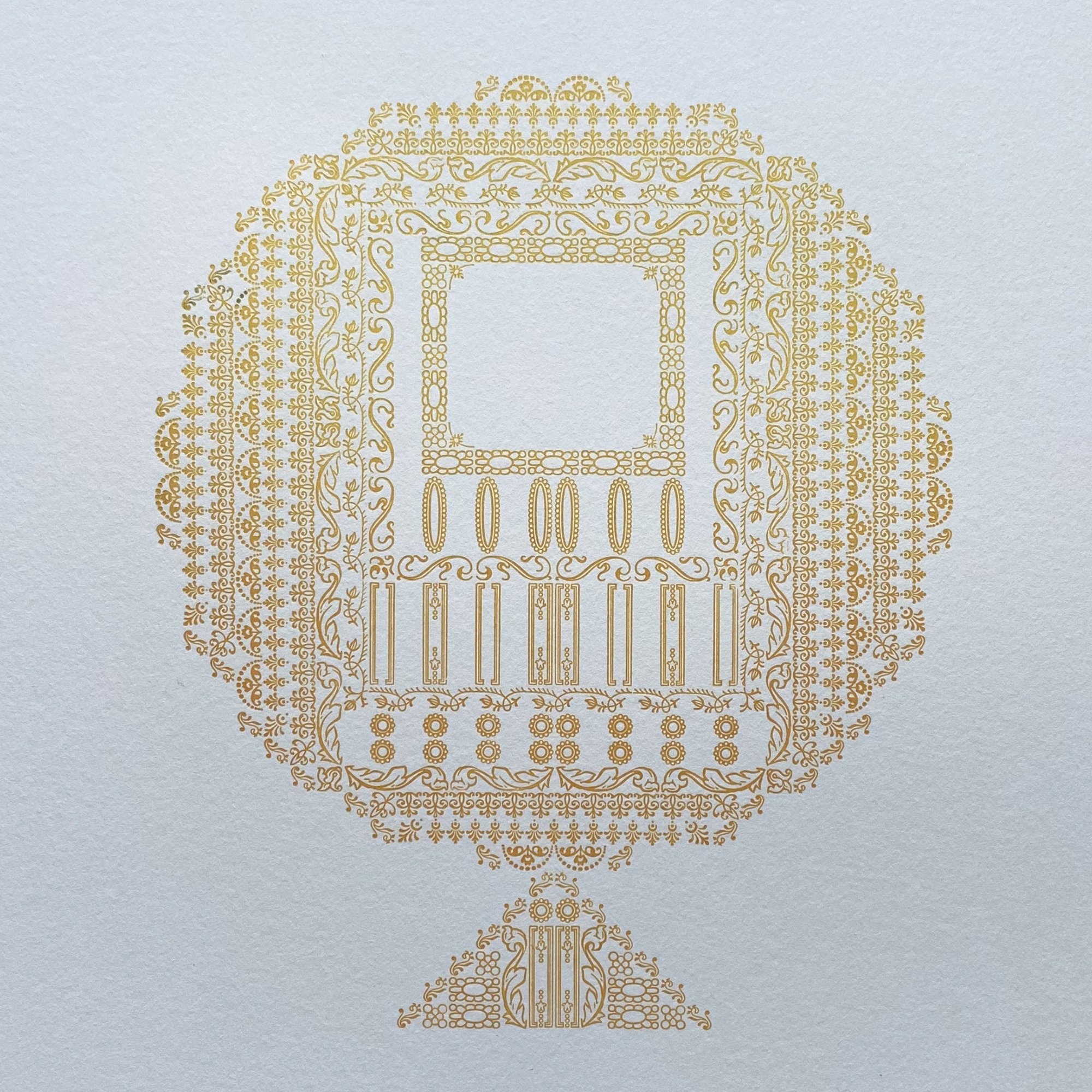
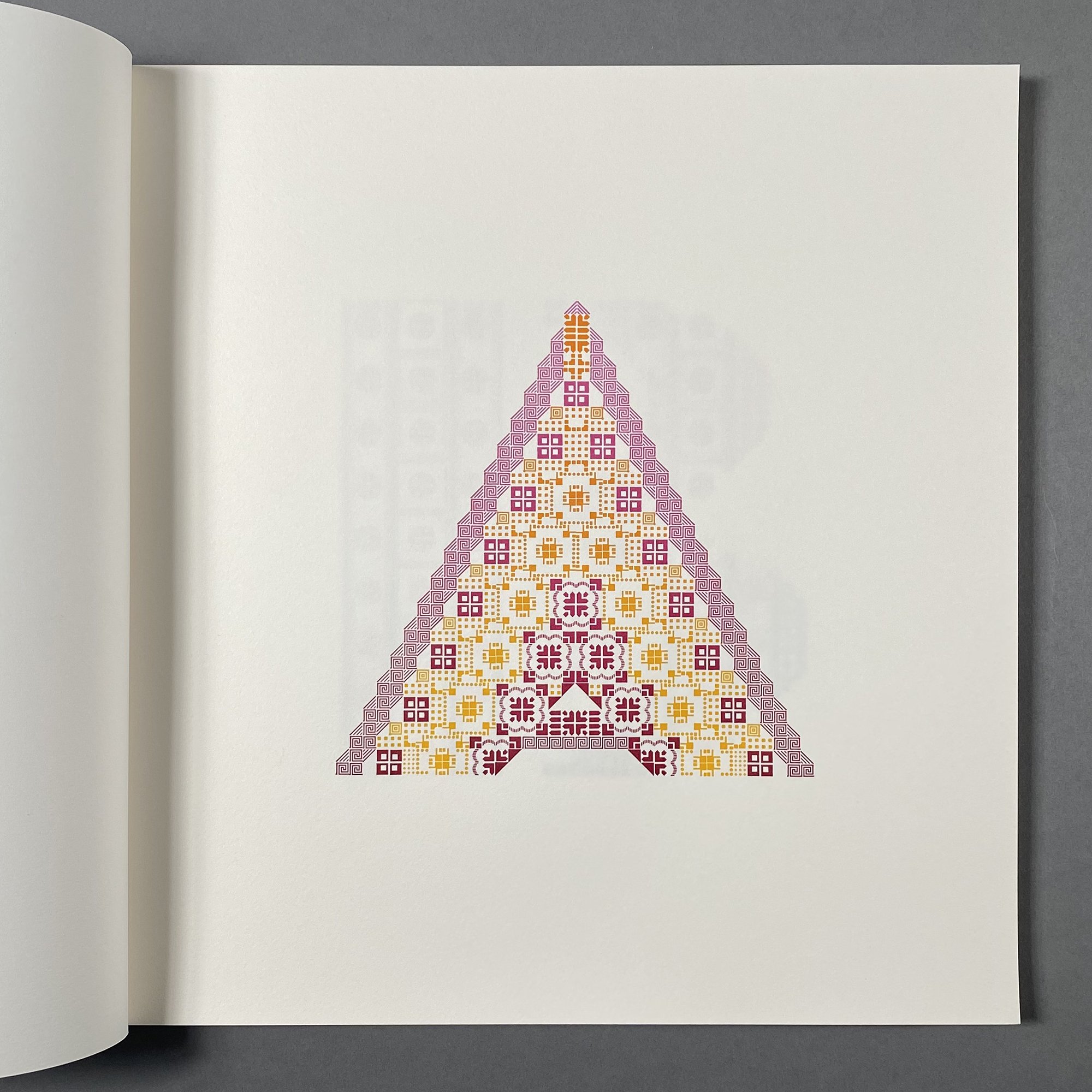
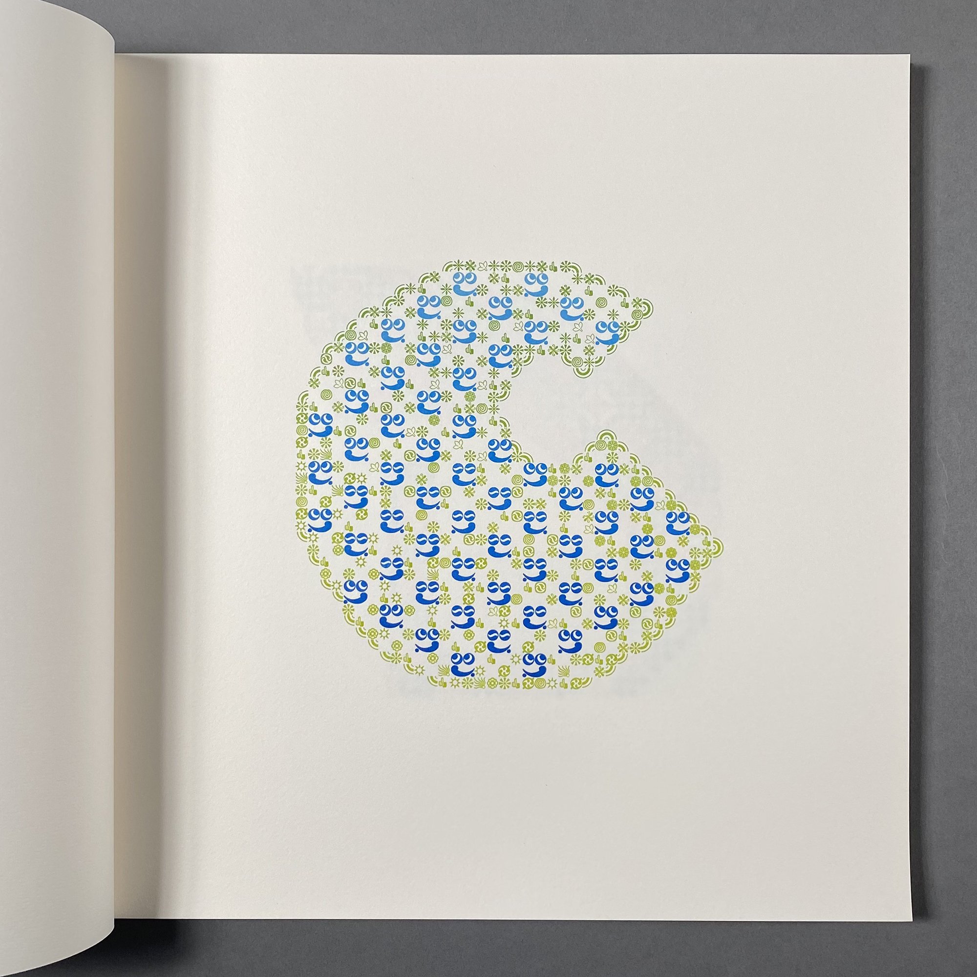
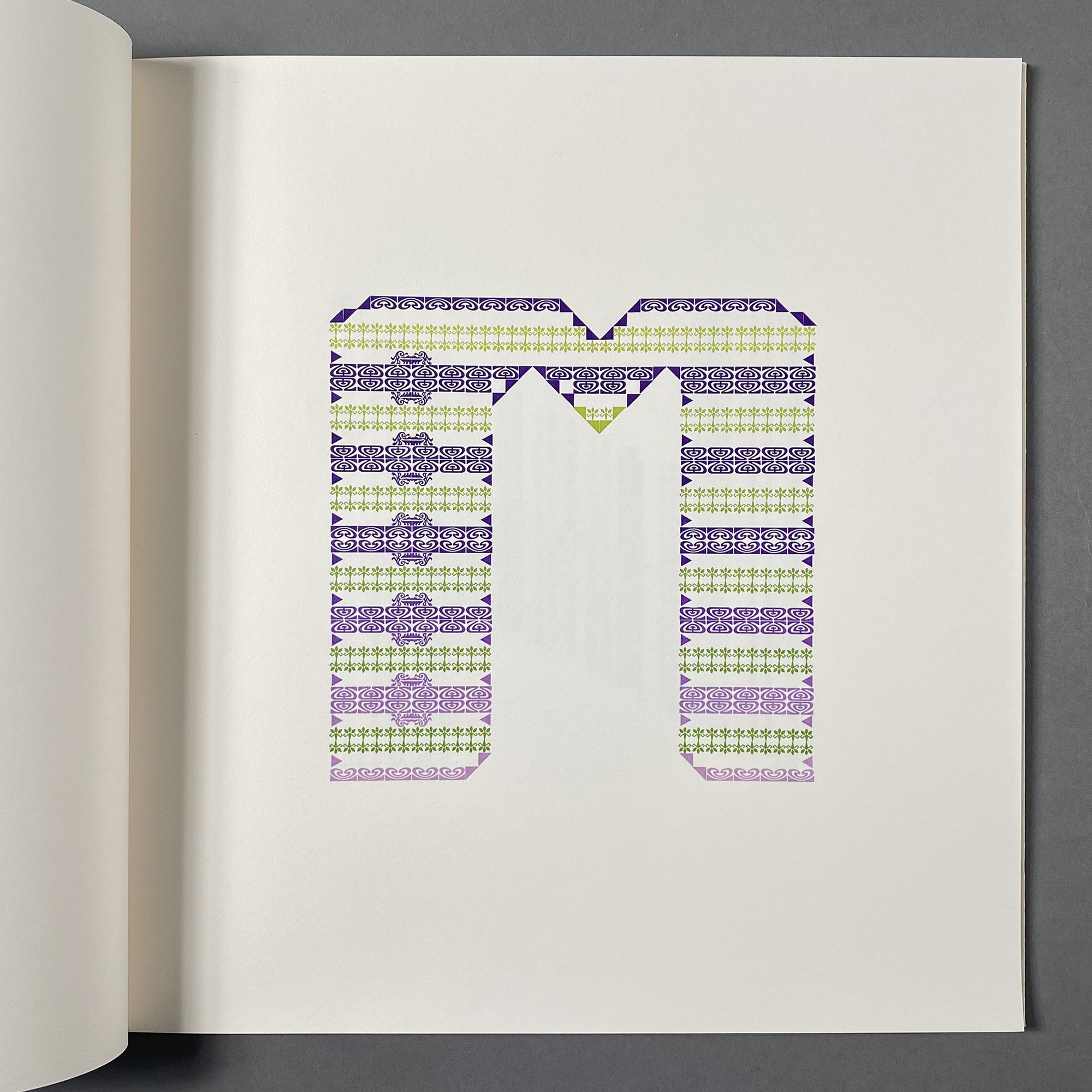
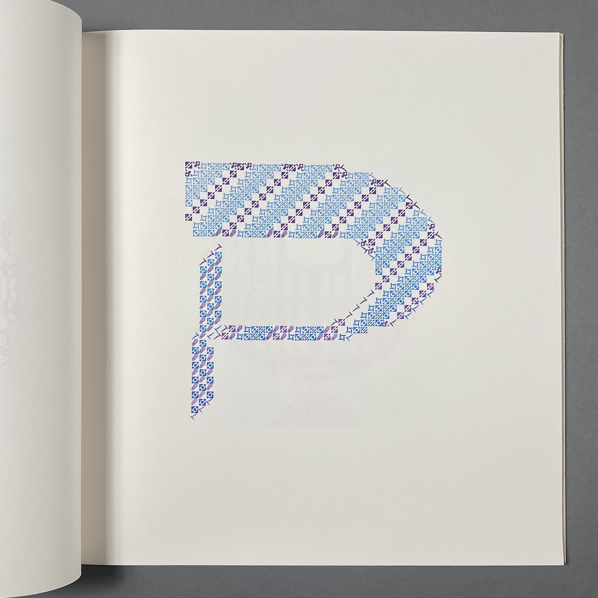
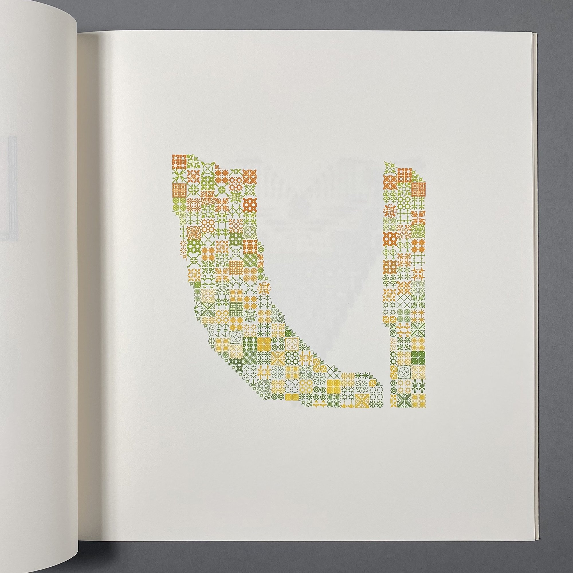
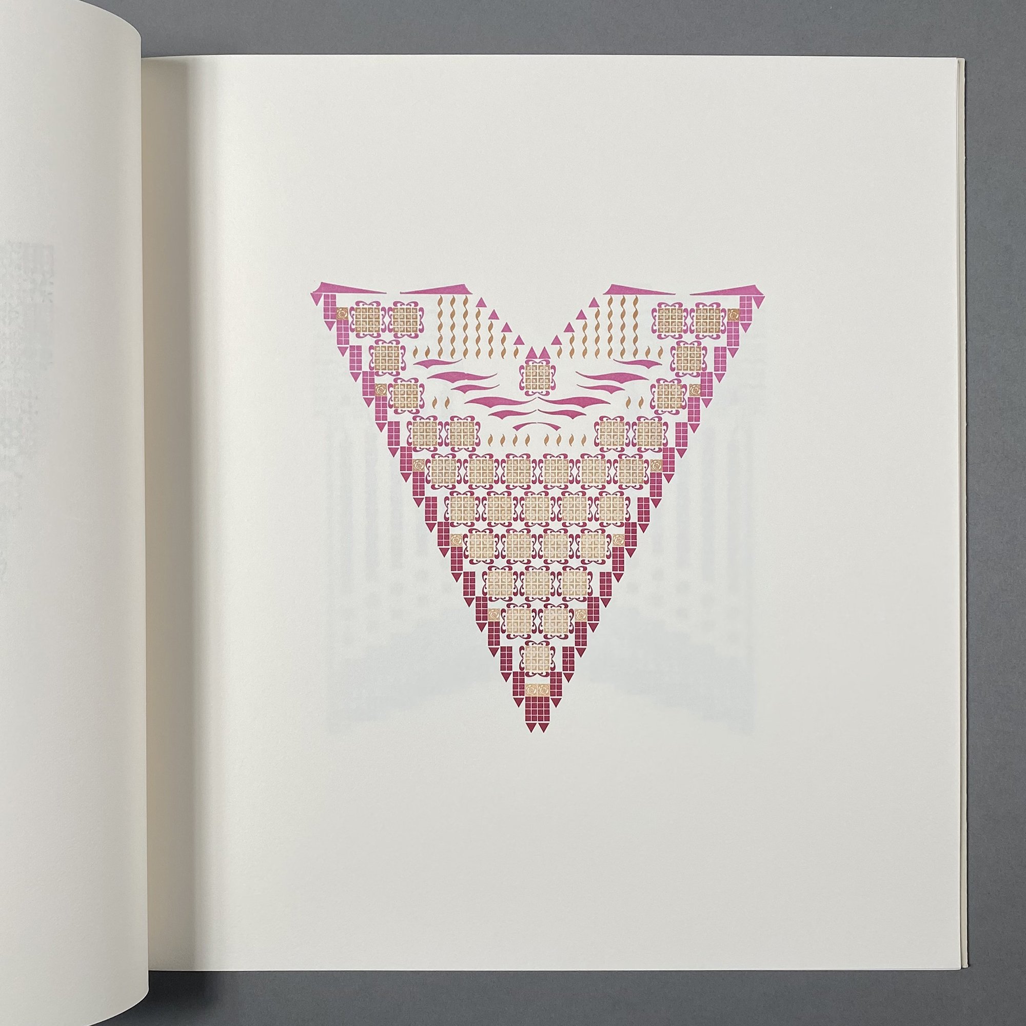
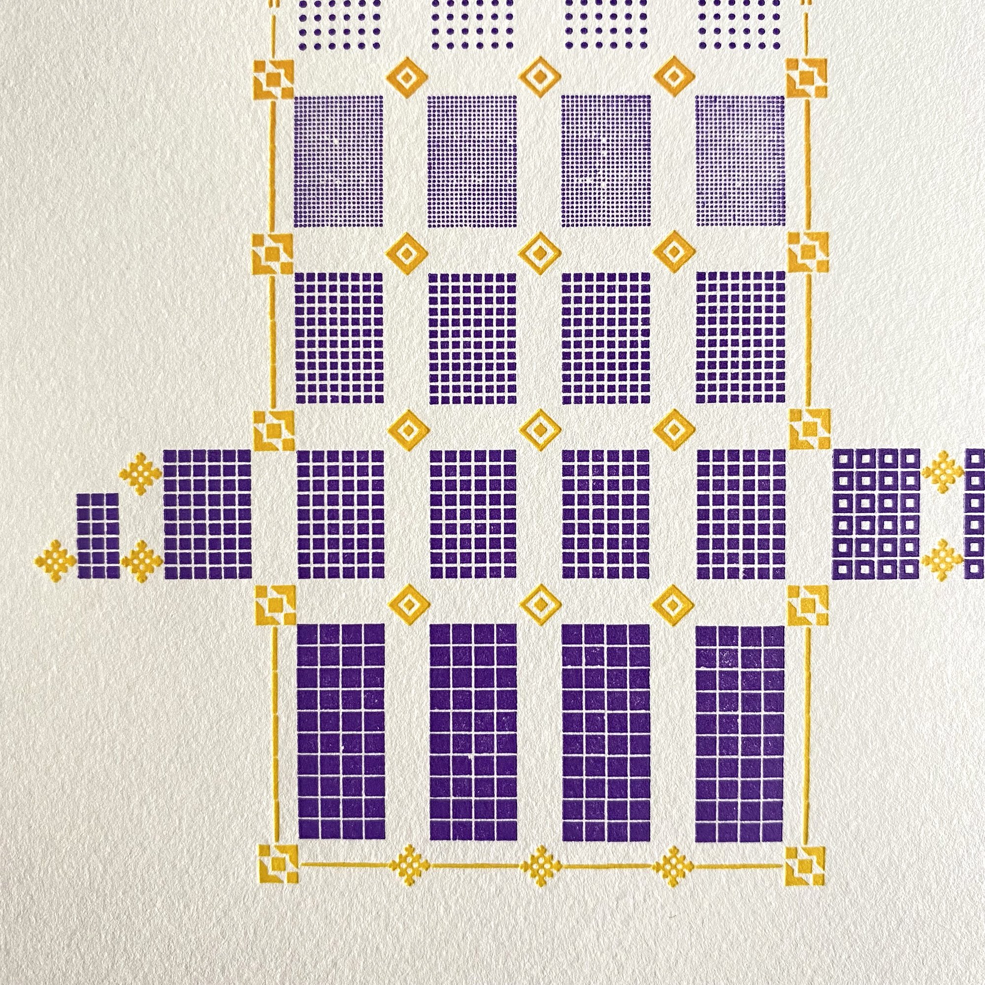
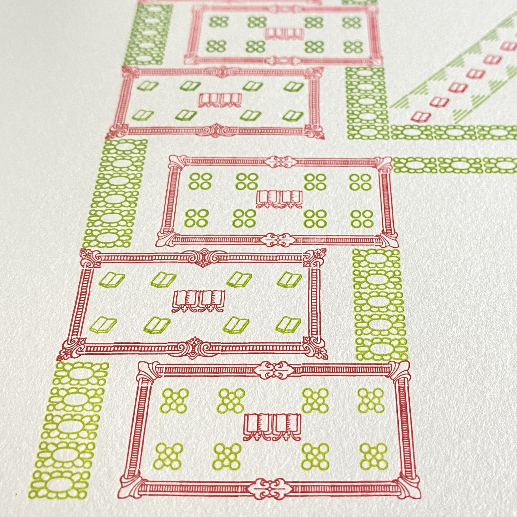
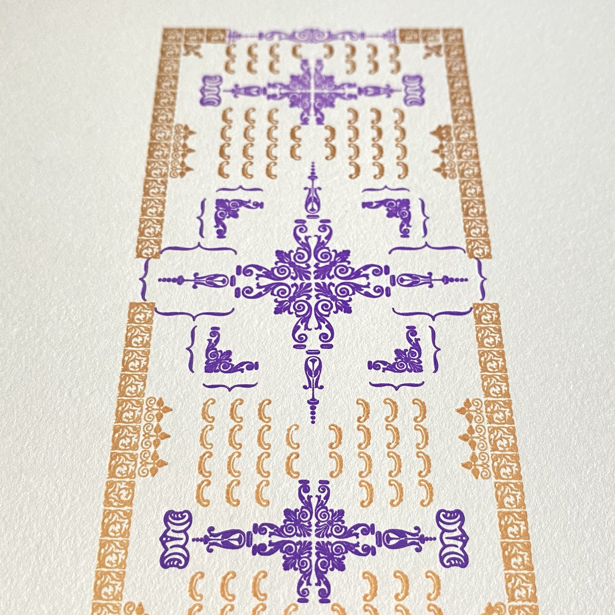
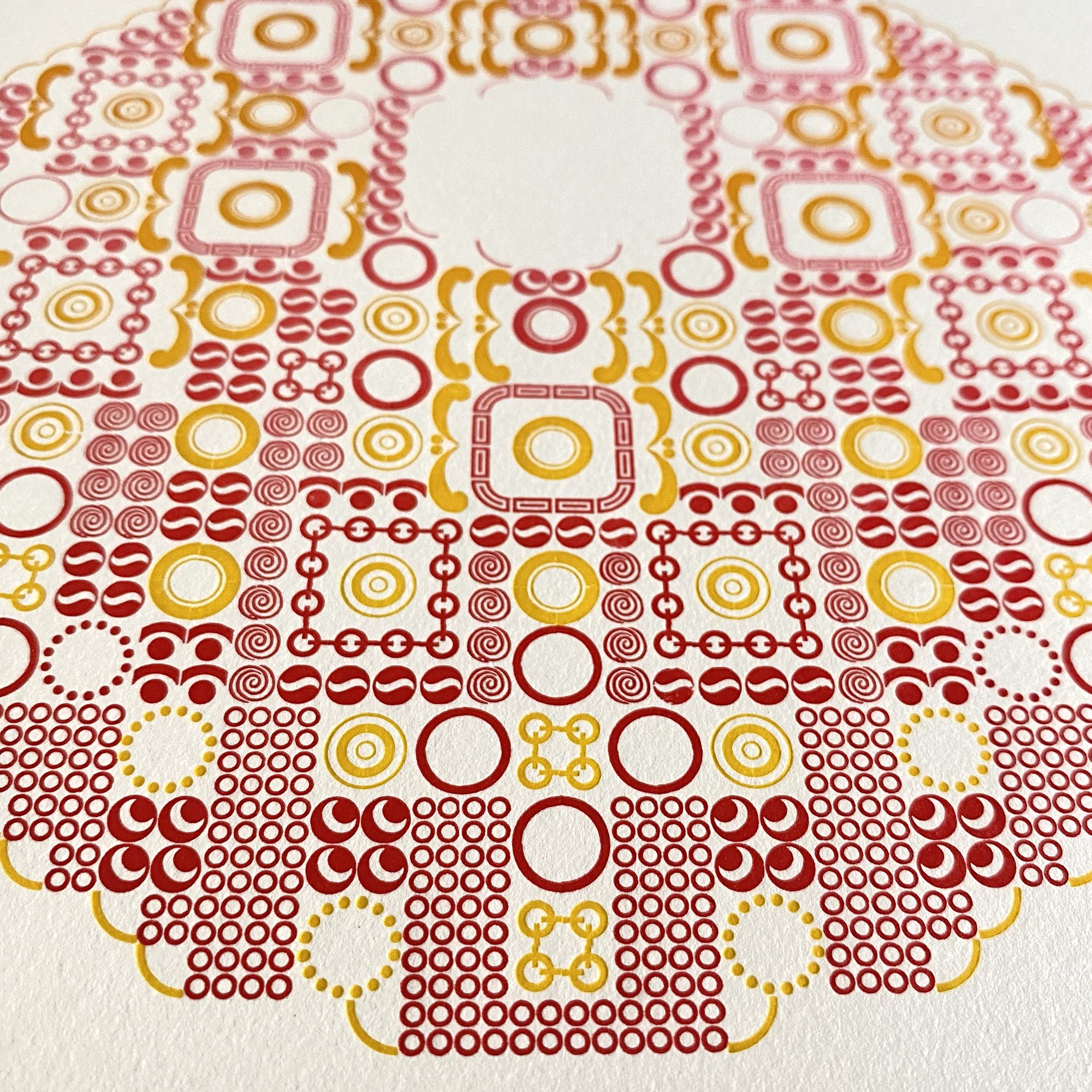
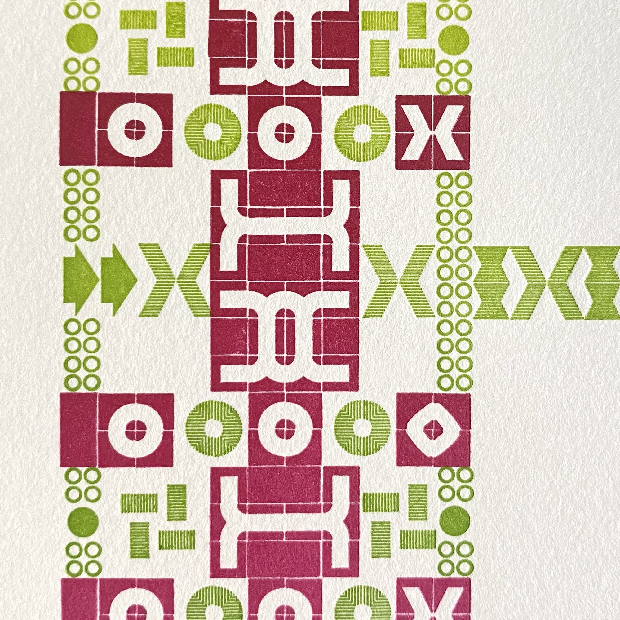
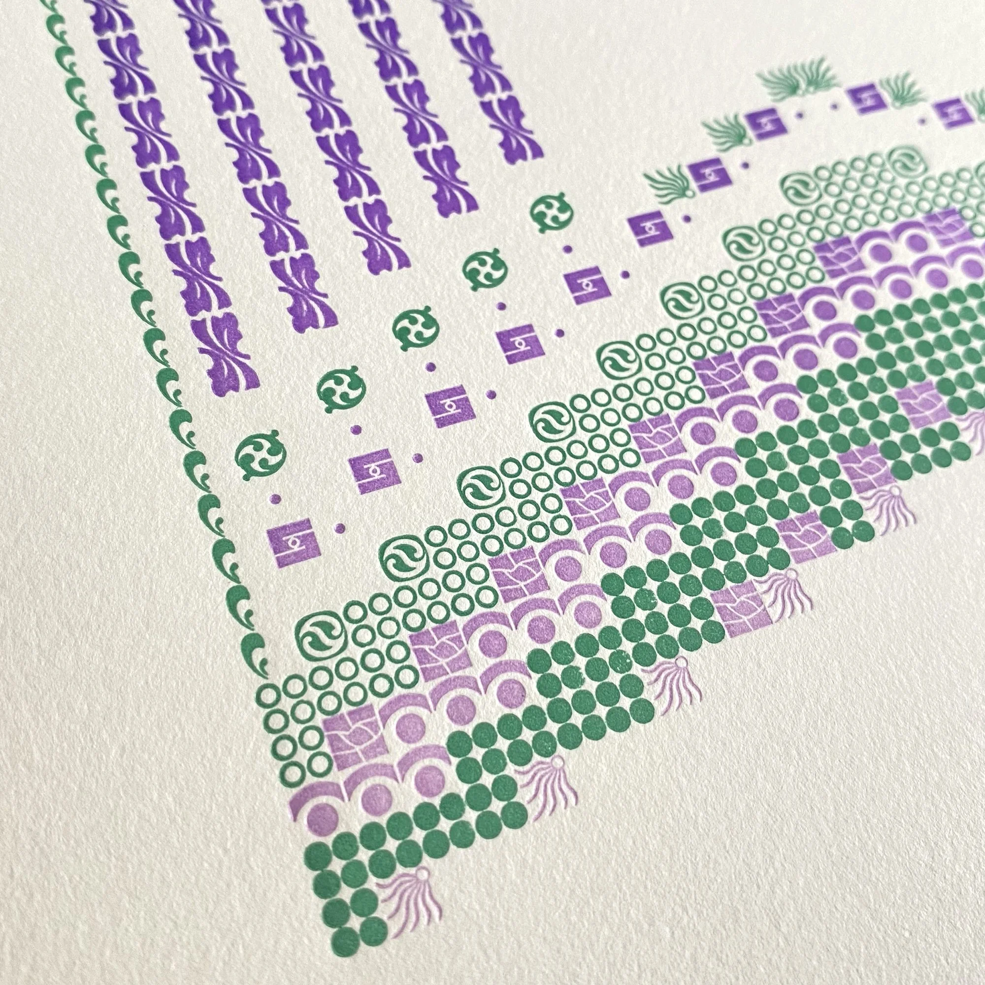
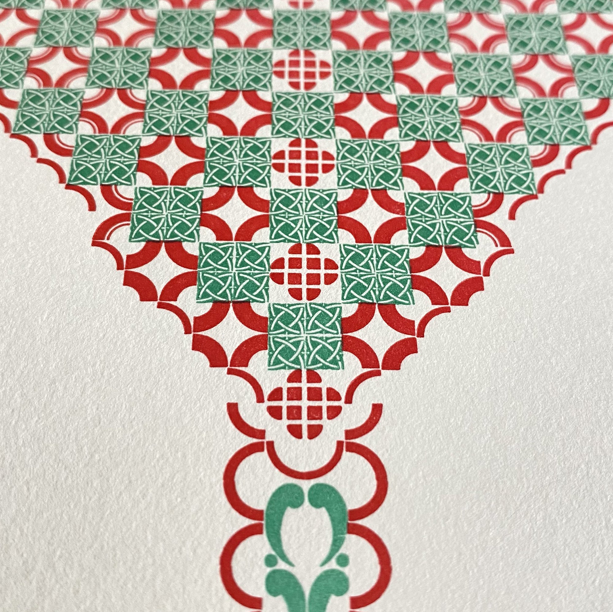
A smattering of pages and close ups! I think it’s fair to say you wouldn’t know all of the ornaments used have 12 points along one side if I didn’t tell you. The depth and variety of designs of the ornaments and how they are placed on the body is so different that the possibilities are endless. This is why I love metal type and never feel that it’s too limiting.

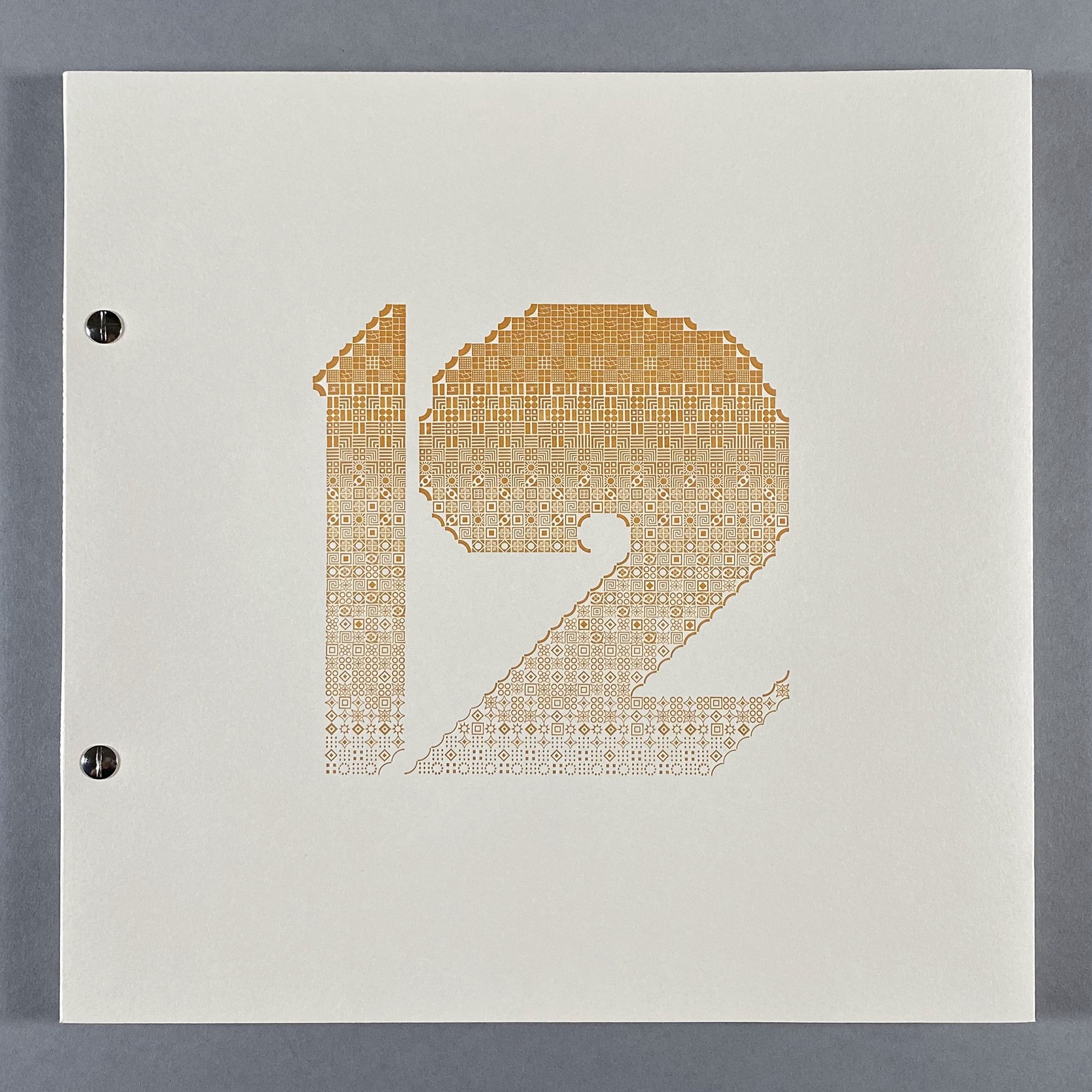
Just prior to digging into the book, I printed a prospectus in order to explore the idea of creating letterforms in this method. The number ‘12’ was printed with a subtle split fountain but with a reduced set of ornaments along a theme that went from thin curves to fat ones to create another gradation.

I liked that idea so I carried it through for the cover of the book, too. It would just be one color, with the weight of the ‘12’ changing from heavy to light because of the surface value of the ornaments themselves. I followed the same process of sketching out ideas for the shape and then playing around with what ornaments would achieve this goal.

Initially I thought the binding would be more involved and sewn. I tried a number of versions of this and was deeply unhappy with every one of them, as the sewing looked too soft and sloppy next to the bold, graphic ‘12’. Then I tried screw posts and immediately felt a connection with their subtle, industrial feel. It matched the overall tone without detracting from it. I’m so pleased with this collection of letterforms, with how they came together and what they say about my collection of type and its endless possibilities.

While most of the edition of 40 now resides in libraries and private collections, the remaining copies are available here. There were also a handful of individual prints of each letter outside of the edition that are now available to purchase here.