
Building ornamental letterforms is one of my favorite things. And since I’m in the midst of working on a new book about it, I thought I’d share a few of the still images and details from a demo originally prepared for the 2020 Hamilton Wayzgoose.
The first thing I tackle is sketching ideas for the kind of letterform I want to make. For this demo, I went with basic and blocky, but with two different sets of ornaments, both floral and geometric. When you establish parameters for your design, it helps narrow your focus on your ornament collection and helps you choose the best ones to suit your purpose. If you don’t have any ideas, look at books (type specimens! design books! old dusty tomes!) and sketch until you get a few. The simpler they are, the more successful you’ll be.
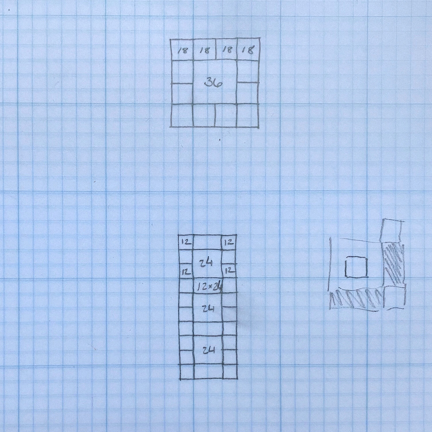
I’ve said it a million times… math is your friend! I do most of my sketching on pica paper. If you’ve never built a complex structure before with ornaments, starting with those that are square and play well together (6, 12, 18, 24 and 36 point) is a great place to start. They fit together like a puzzle. See this previous post about building ornamental shapes.
Another key feature of ornaments to consider is their negative space, or the areas that won’t print. This is very useful for letterforms as this space can help you create curves and counters. I’ll use both in my examples.

Here are sketches for both an O and a K. One is symmetrical and the other is not, so you can see how to deal with both. I’m allowing the pica paper to help me determine the sizing as well as the angles I need to create because I know I have corner pieces that will give me the necessary 45 degrees.

Trying to work backwards is hard enough so help yourself out; flip your sketch of the asymmetrical letter and work from that. I usually build forms directly on top of the pica paper sketches on a galley so I stay within the correct shape. Don’t reinvent the wheel if you don’t have to.

I sketched this K so that its stem would be made up of 36 pt main ornaments, with ‘runners’ of 18 pt ornaments. As you can see from below, some of these 36 pt center pieces are actually constructed from combining the corners of a different 18 pt border. I wanted this letterform to have more delicate, floral and wavy elements. Keeping the strokes angular meant that corner sections were ideal to create the arms of the K.


Here is the final K, upside down. The nice thing about sketching it on the pica paper is that you can also see the exact spacing you need, which I colored in below. Sometimes, when setting letterforms, I’ll pull out all of the ornaments AND spacing needed ahead of time so it’s right where I need it when I need it.

The O in this exercise is made of geometric shapes and I started by filling the counter with spacing so that I could build out around it. Then I worked with the largest ornaments I liked as an anchor (36 pt) and moved to smaller ones (both 24 and 12 pt) after that. I used some of the 12 pt ornaments to create what looks like larger 24 pt pieces.
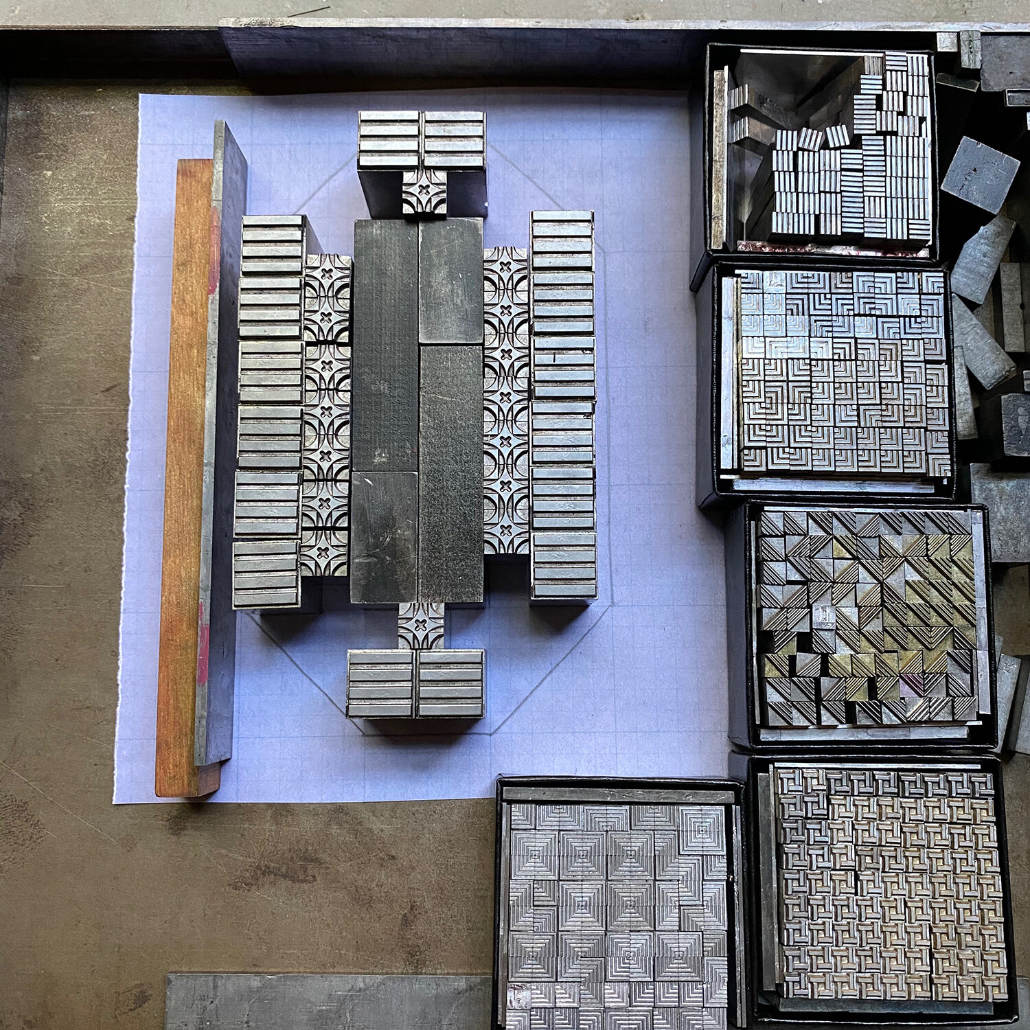
Here you can see how the edges are an ornament with lines just on one side. This helps create what will appear to be a smooth edge when printed. Again, be mindful of the negative space of your ornaments.

And lastly, I pulled a carbon paper proof of the two characters to see what they look like. This is a great time to assess if you’ve achieved balance in your forms, if the ornaments are all facing the right direction and if your form makes sense. I suggest starting with these basics and then blowing it out from there. If you have corner sorts that have curves or larger ones that are mortised you can craft pretty elegant forms. Or try playing with various weights, combining thick stems with delicate serifs. You don’t have to create a whole alphabet to have some fun with it!

Many of the ornaments used here are readily available from Skyline Type Foundry and Pat Reagh.