Refresh, Renew, Reorganize

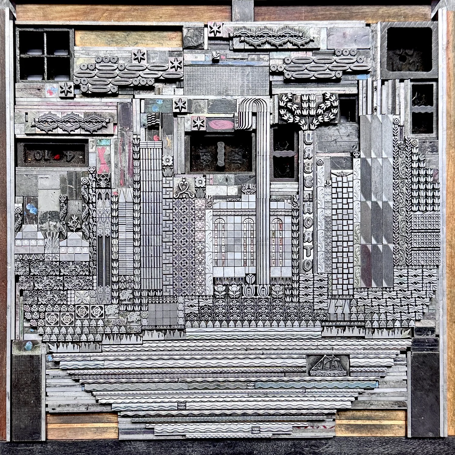
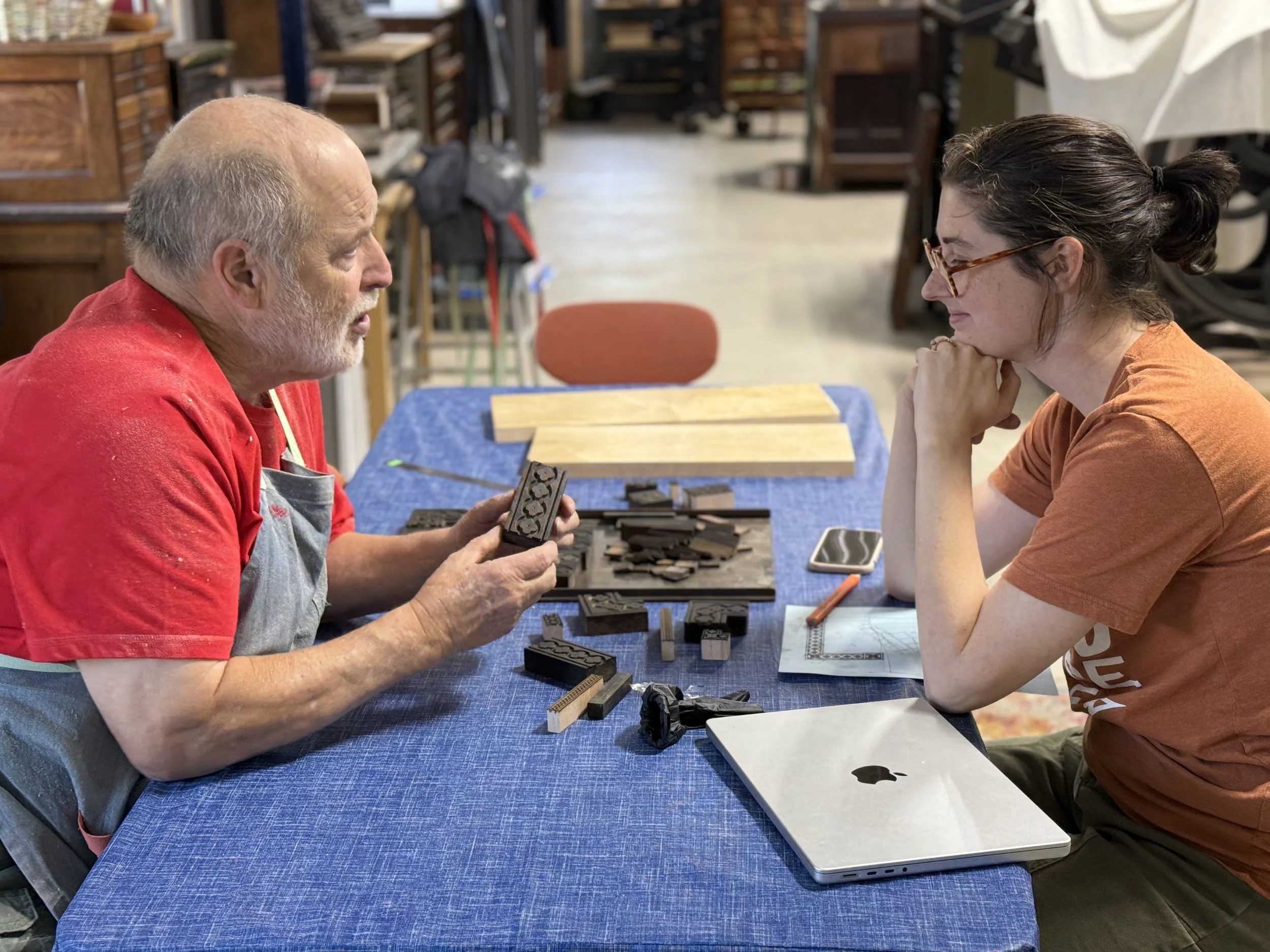
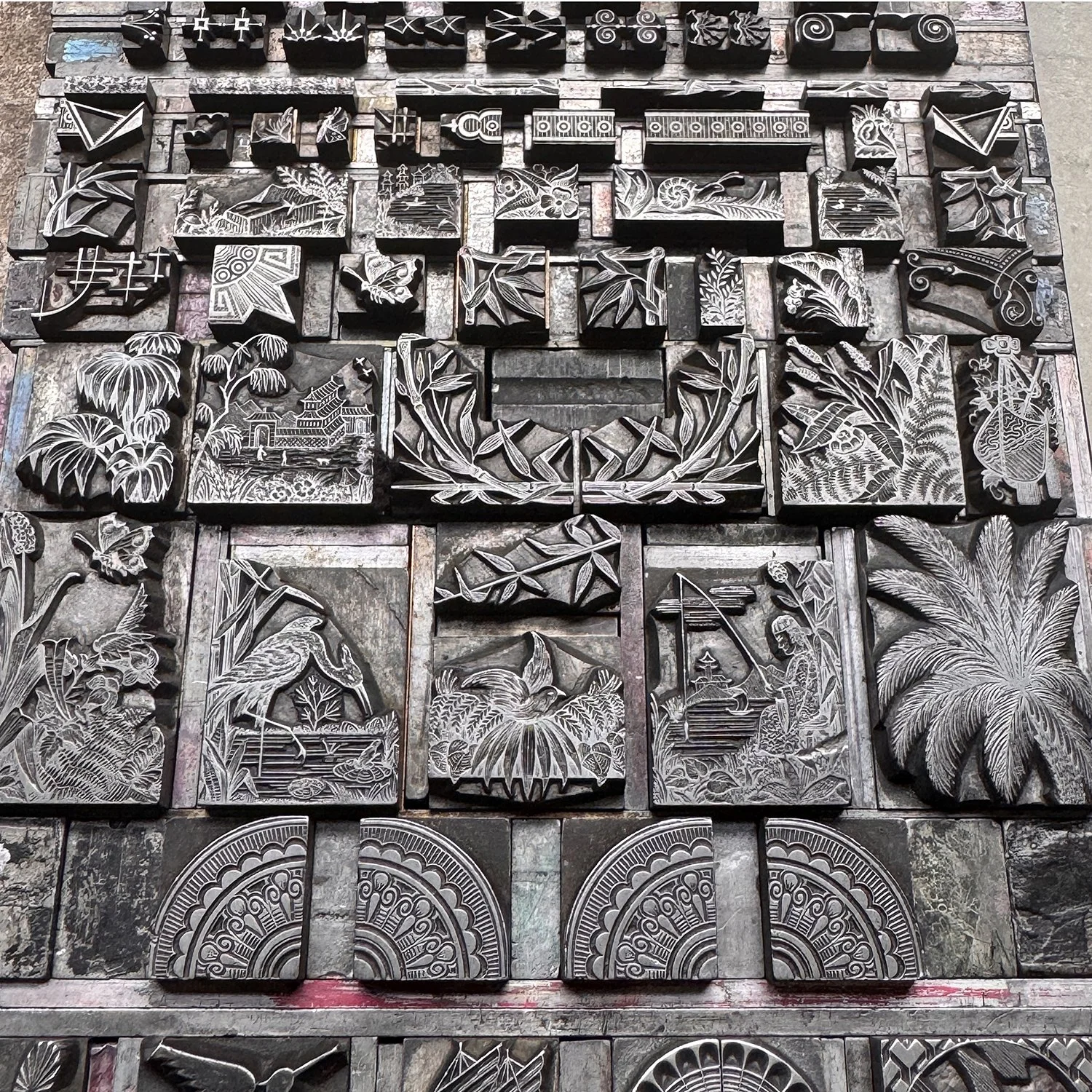
The metal type ornament collection at Starshaped is something that sparks joy and pride in me. For the past 25 years, I’ve amassed a substantial number of these tiny upright soldiers, with a curator’s eye. Nearly every set that comes into the studio starts with the question, ‘how are you going to pay the rent', meaning ‘does this ornament enhance the type of work that Starshaped does?’ Given that space is a premium, I don’t take everything that comes my way if it doesn’t answer YES to this question.
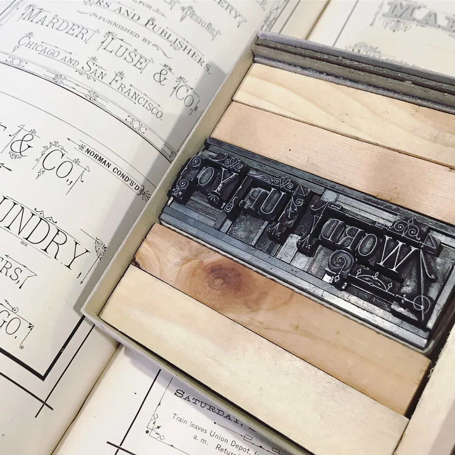
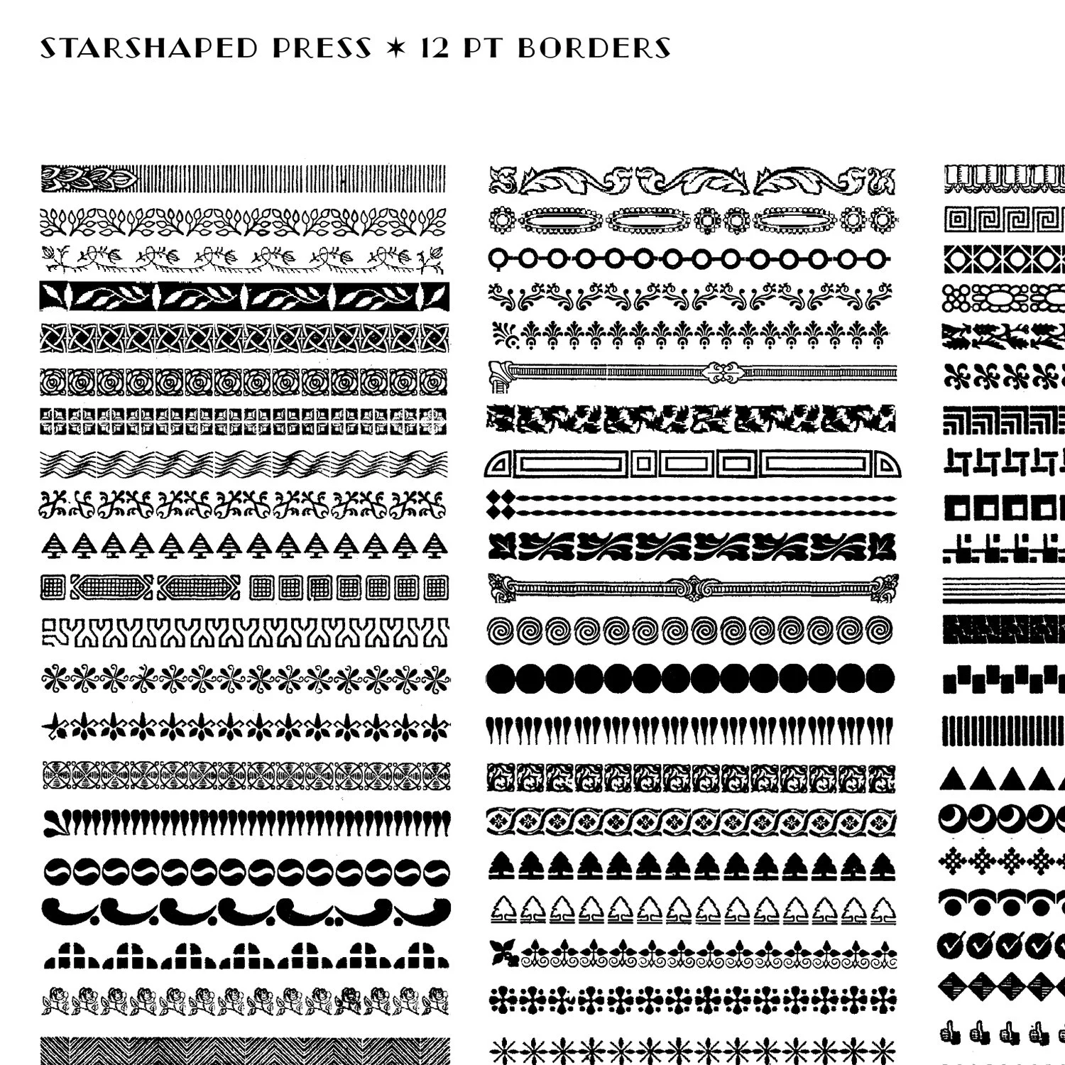
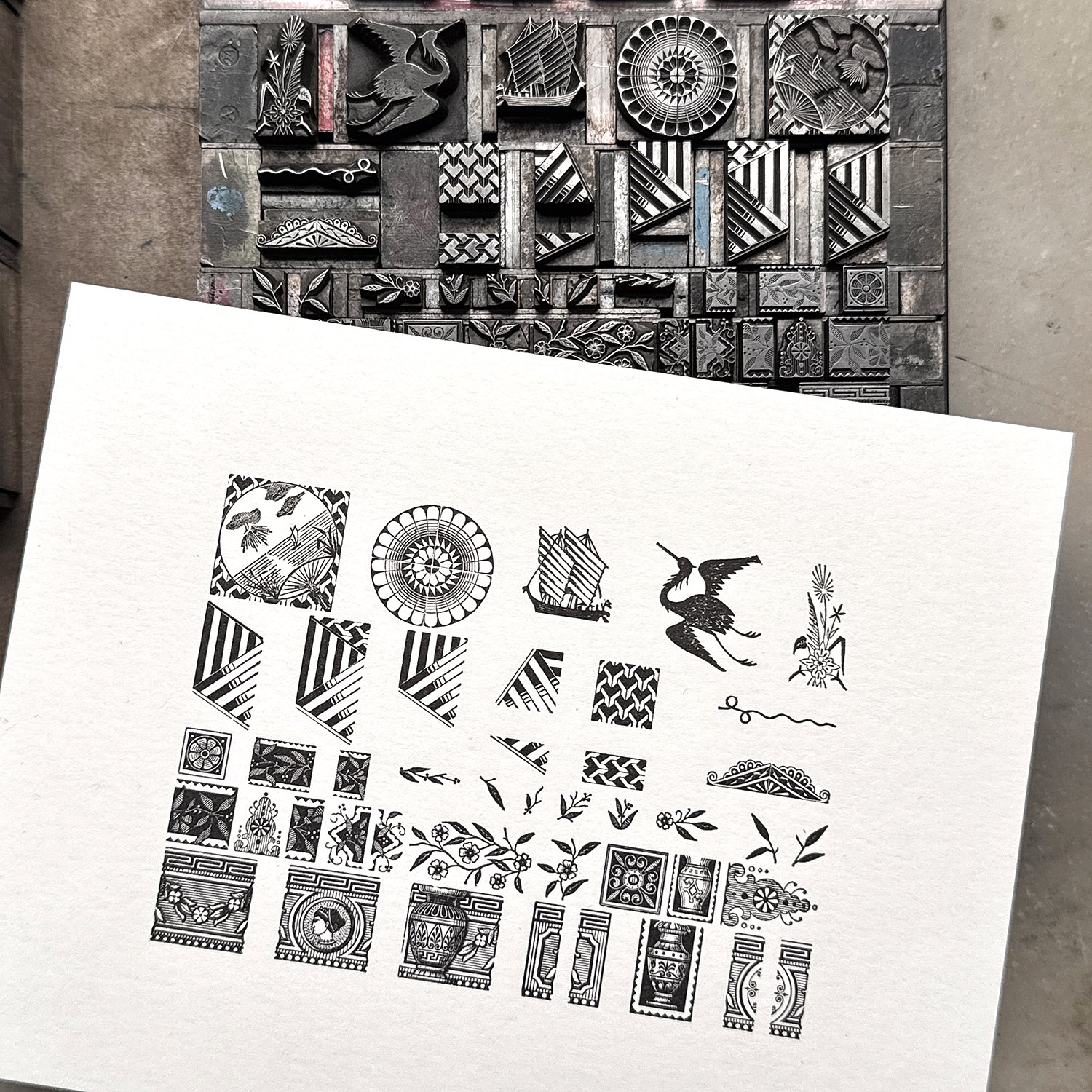
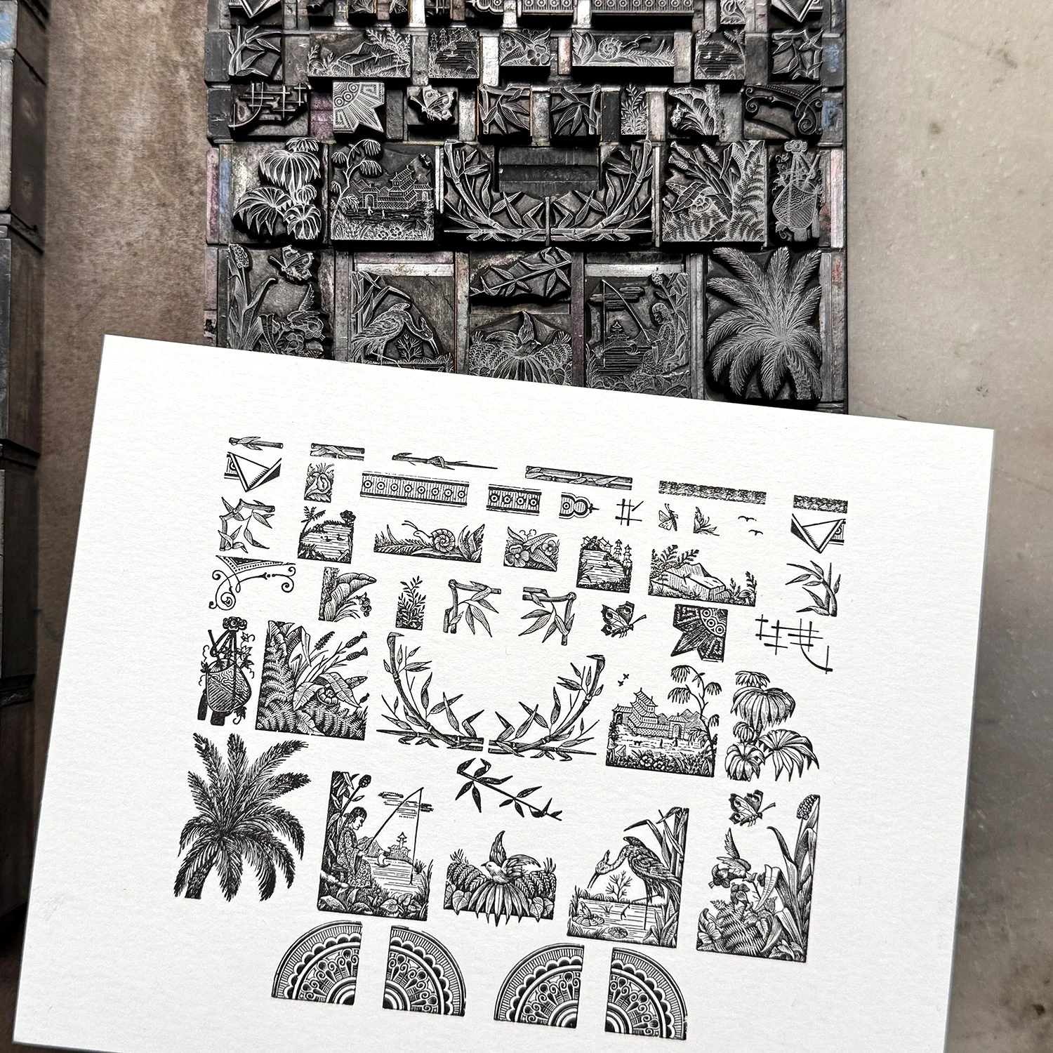
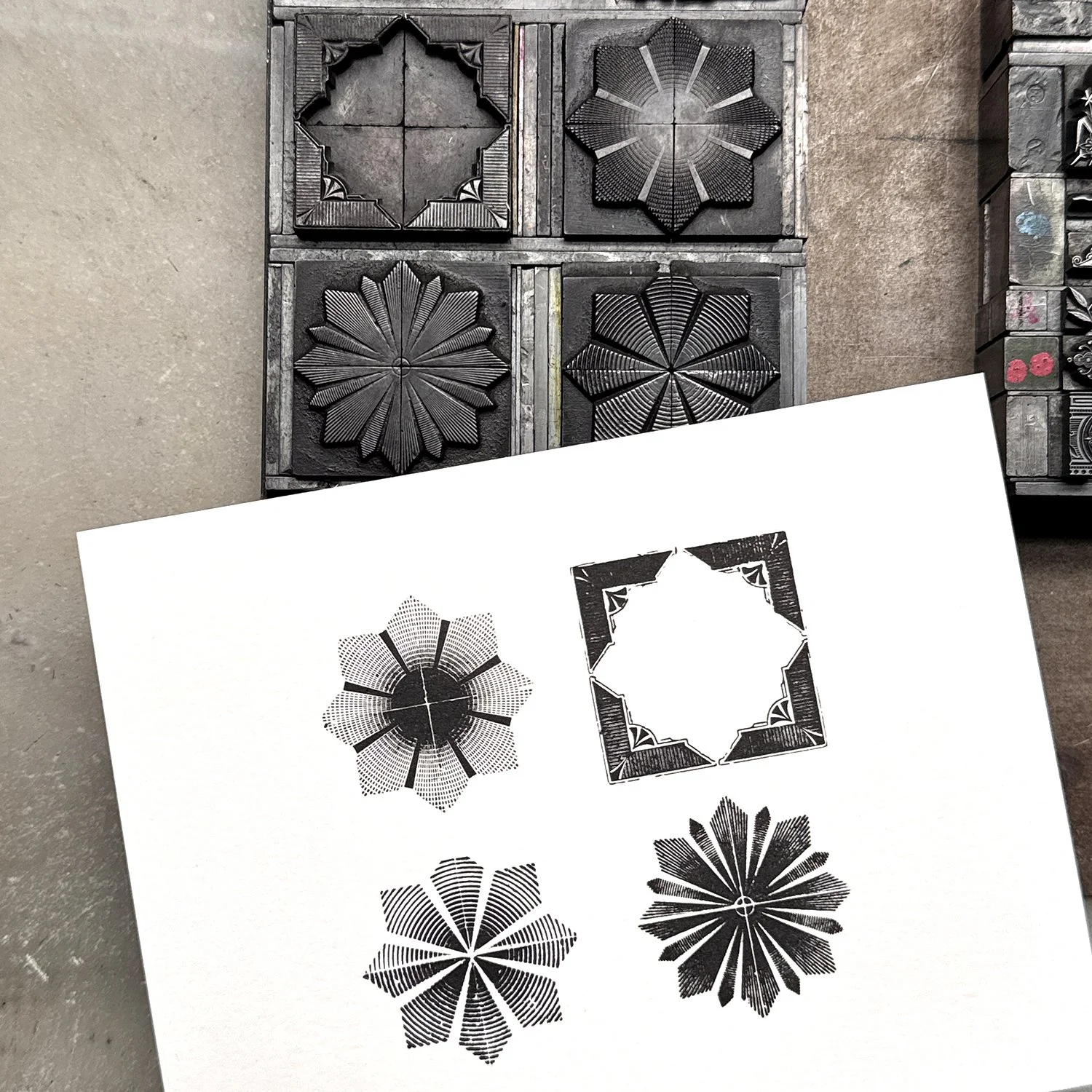
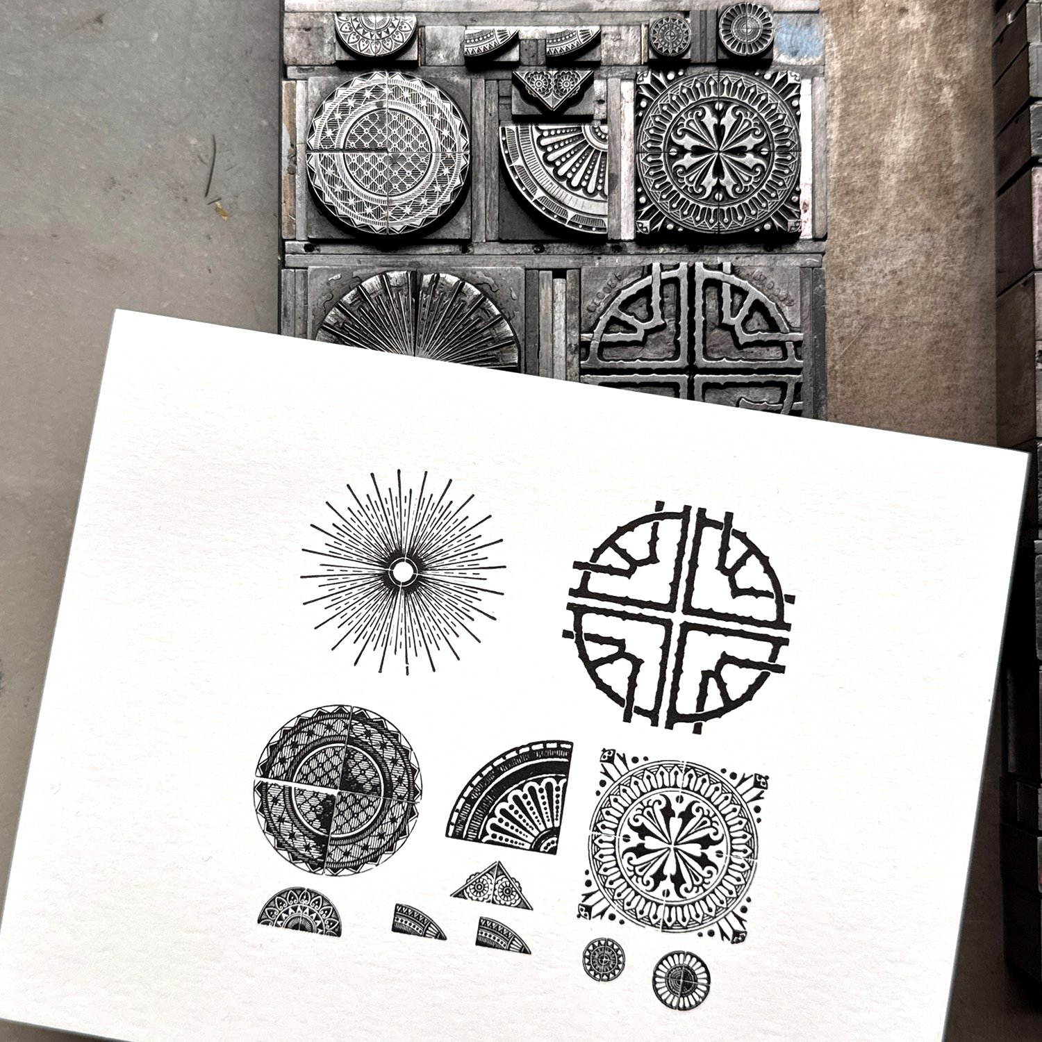
All type and ornament coming into the studio is proofed in black and white on cards so there’s a visual record of what’s available. This also makes it possible to scan them for designing digitally.

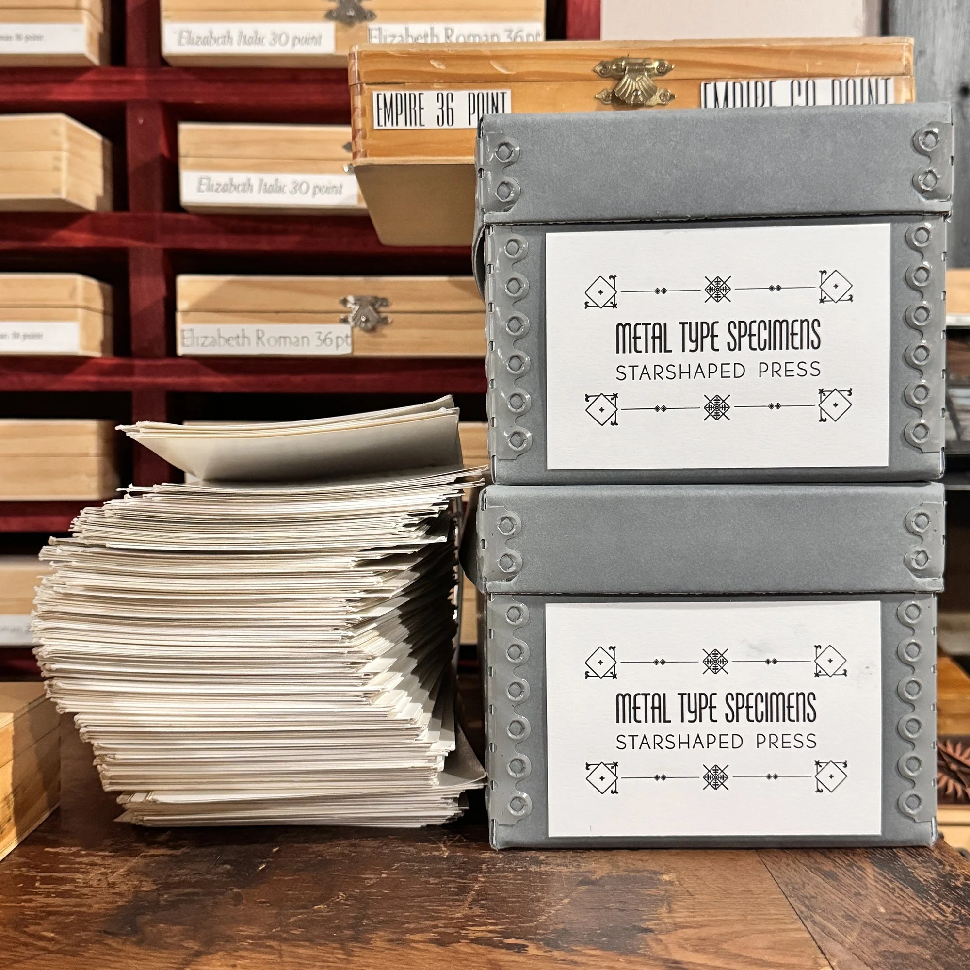
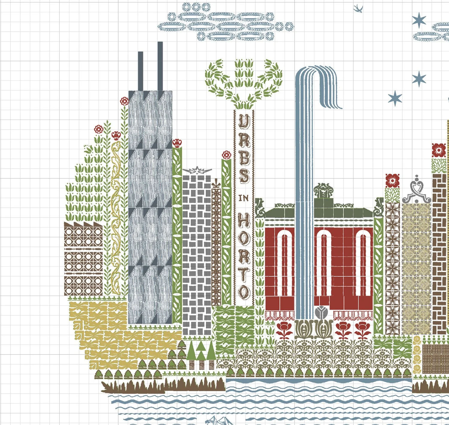
One set of proof cards goes into the large binder ring for use in the shop, and another is scanned so there’s a digital record from which to design. I compile a short list of ornaments in one file so I can easily pull the styles I need for a project. Below is a snapshot of one of these pages.

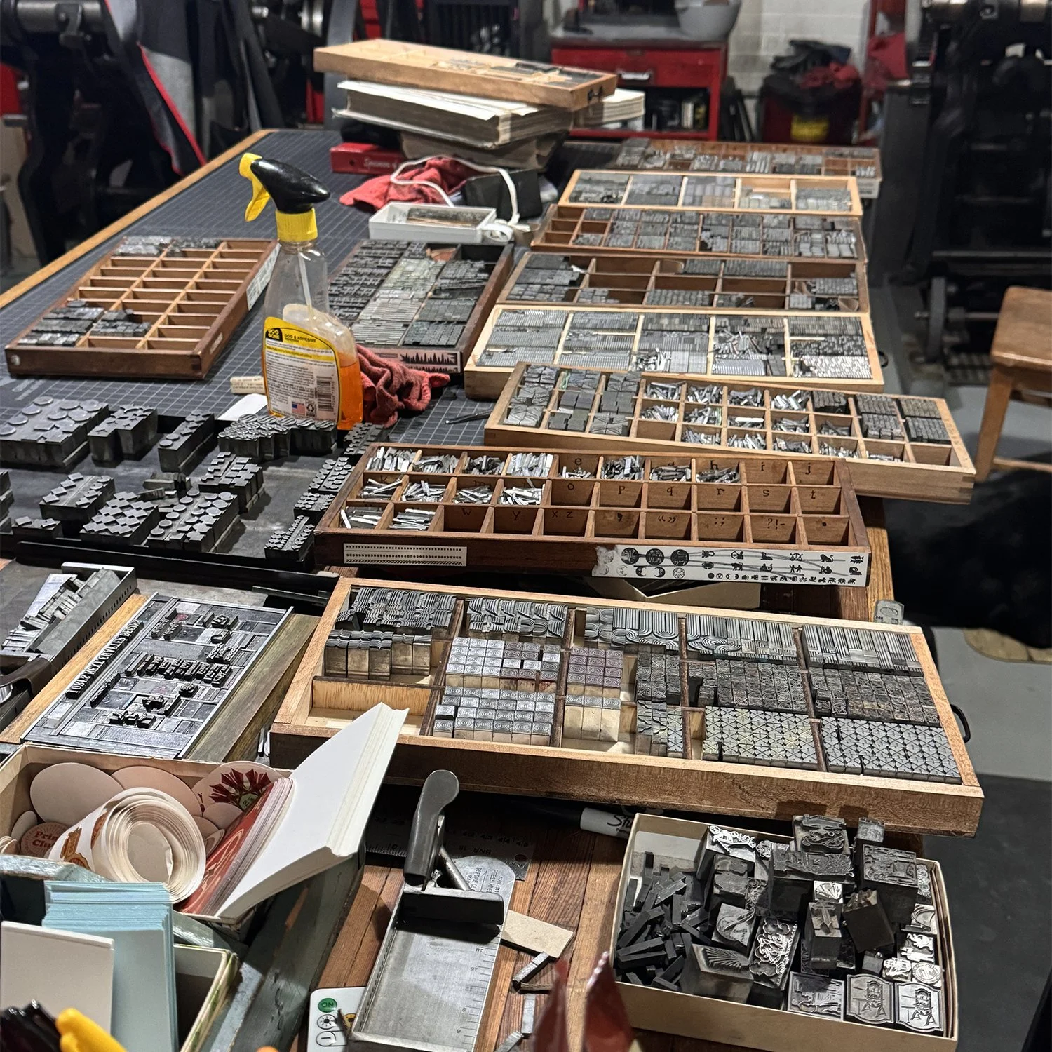
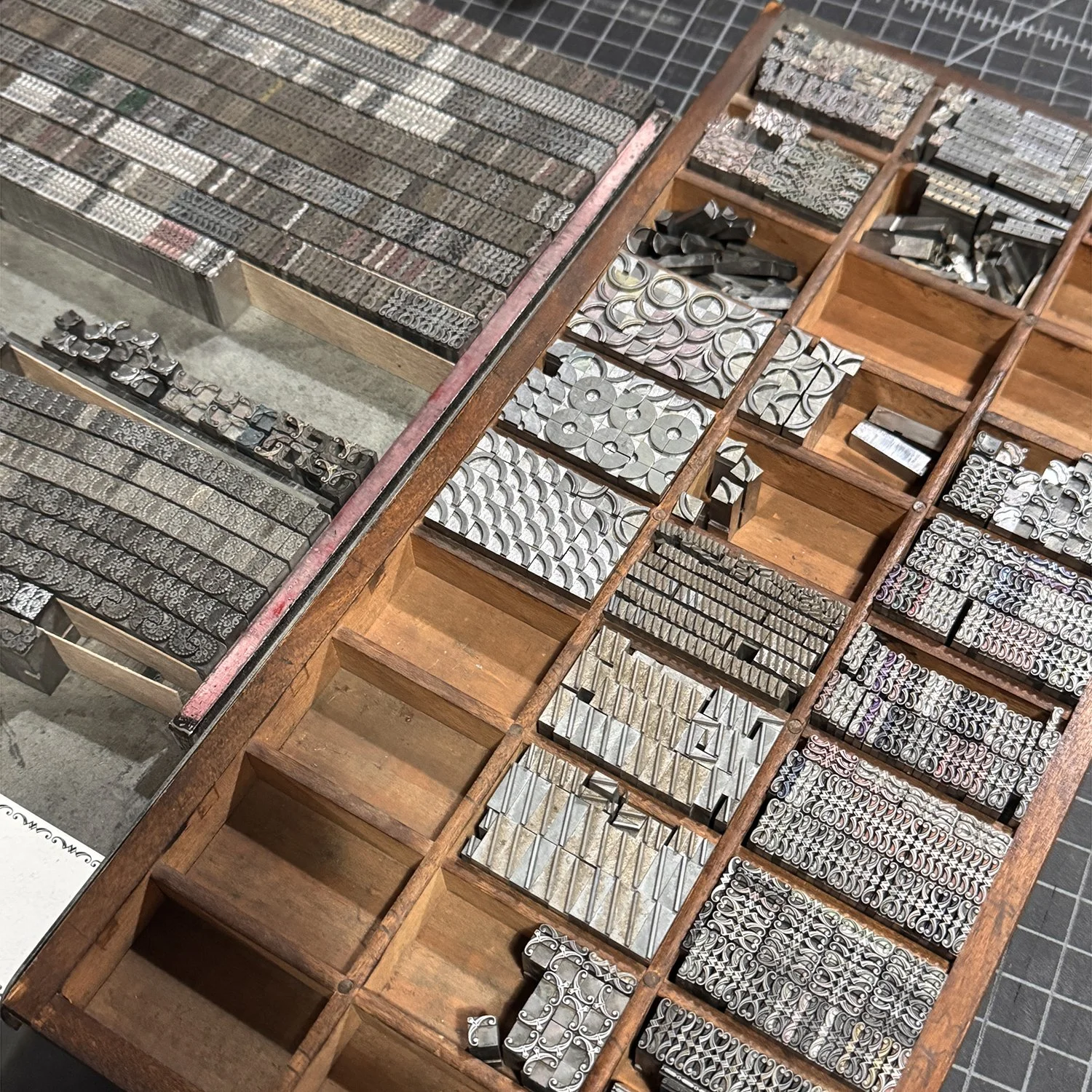
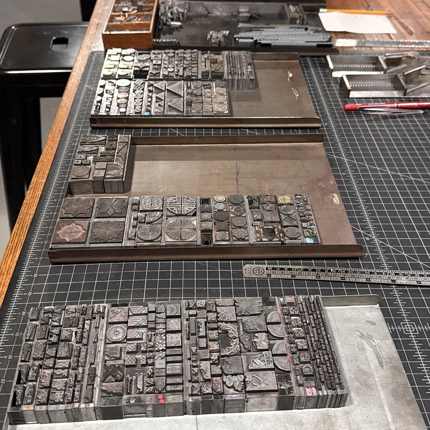
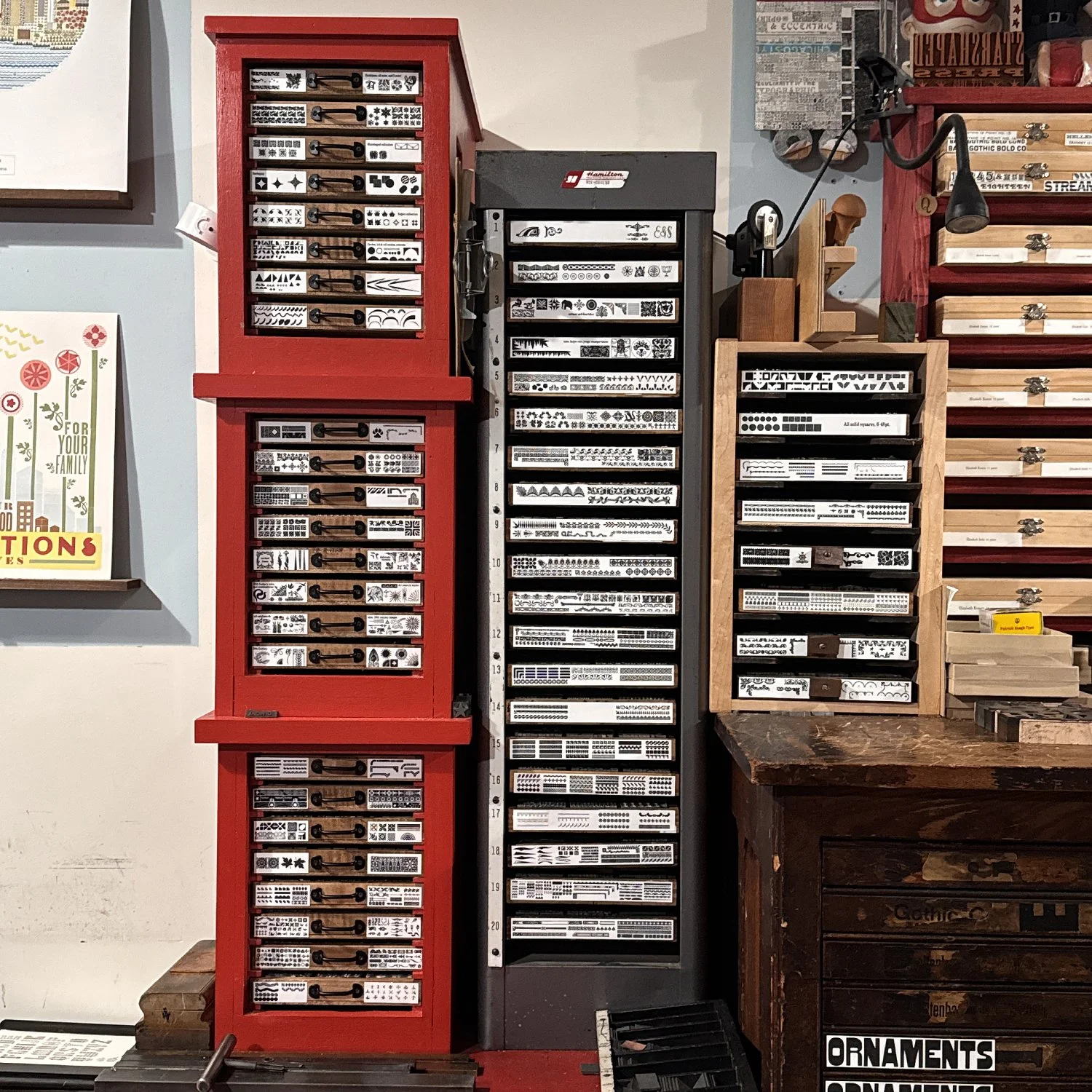
The bulk of the ornament collection is in one place in the shop, with exceptions placed on galleys, in larger type cases and various homemade shelves. The closer they are together, the easier and faster it is to work, so this winter I set about reorganizing the collection to make it more intuitive. Last summer, I acquired new quarter case cabinets to further expand storage space. Quarter cases are sized to fit 4 in a standard open case and are perfect for ornaments as these collections can get heavy. They have their own cabinets (if you’re lucky; they can be hard to find) and you can pack a lot into small spaces.
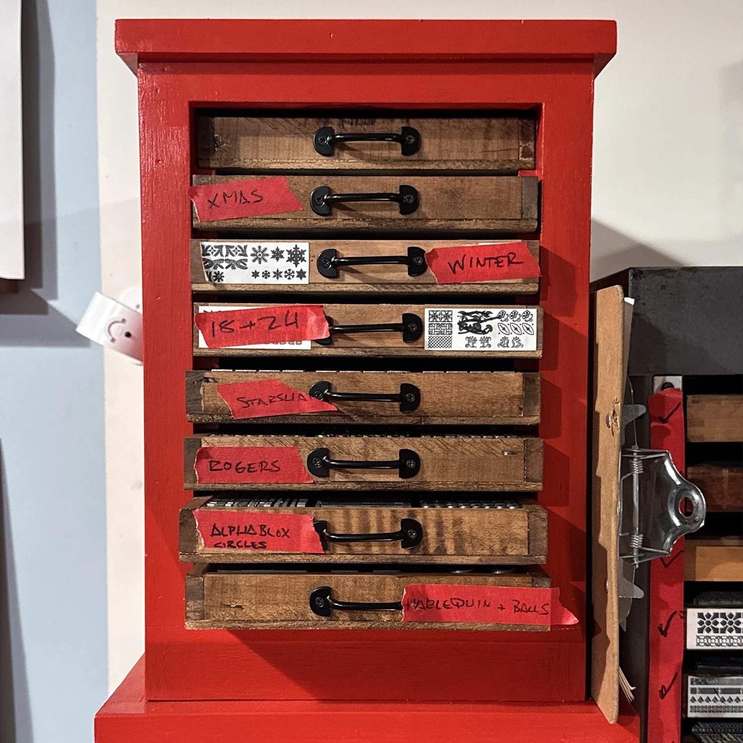
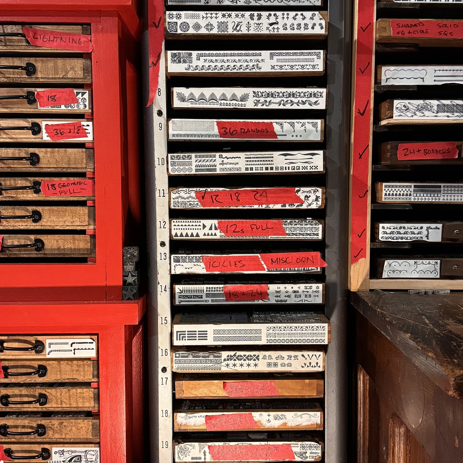
My goal was to put like with like as much as possible, such as all the miscellaneous sorts of one point size or ornaments that are similar in style. Seasonal sets and those less used can be placed together and higher up (less accessible) as they require minimal viewing. And new-to-me sets needed to fit into the cases to begin their Starshaped tenure.

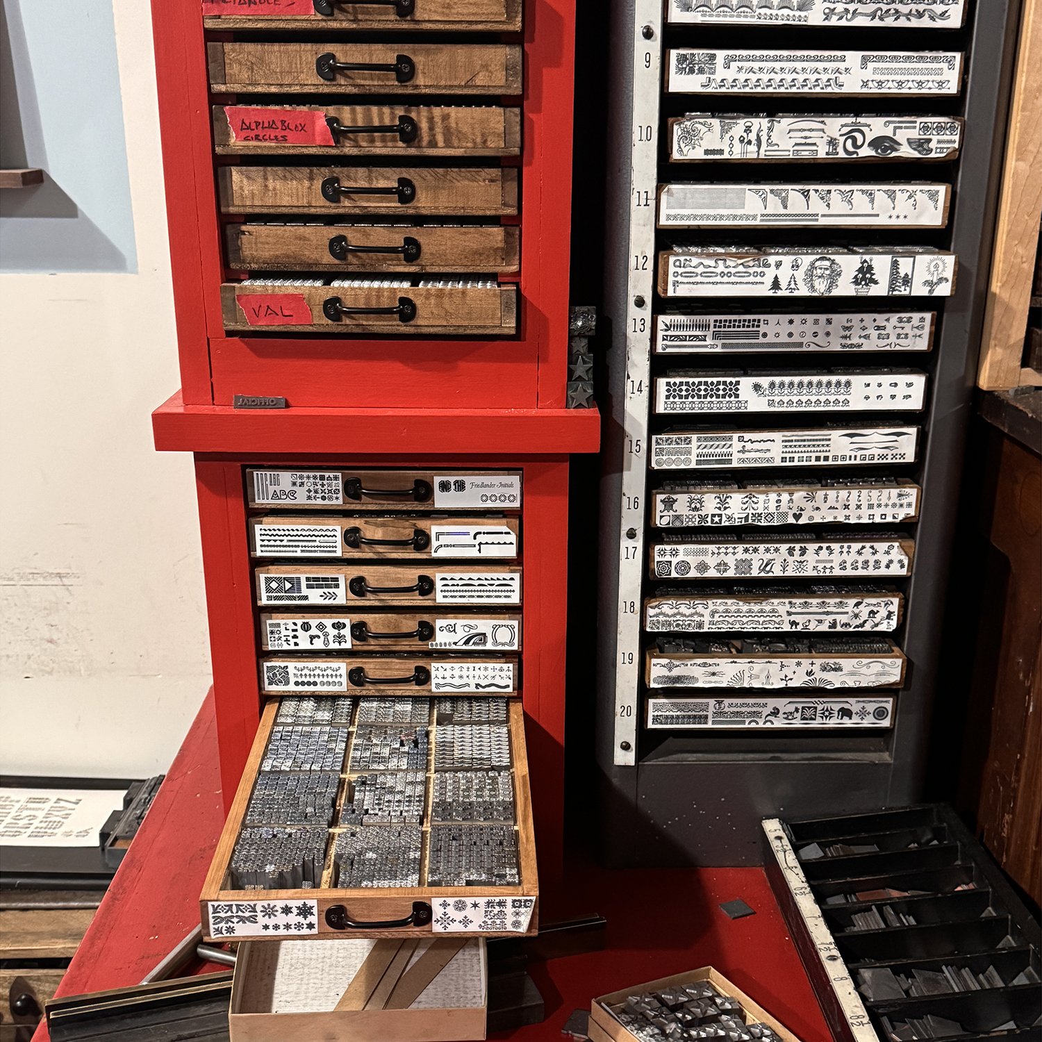
I stacked the new cabinets (yes I painted them red) and started to make tape notes on what could go where and what was moved. Once starting, there’s no going back, as all cases must be labeled as soon as possible. Not marking where something goes means it’s lost in a sea of thousands of other ornaments.

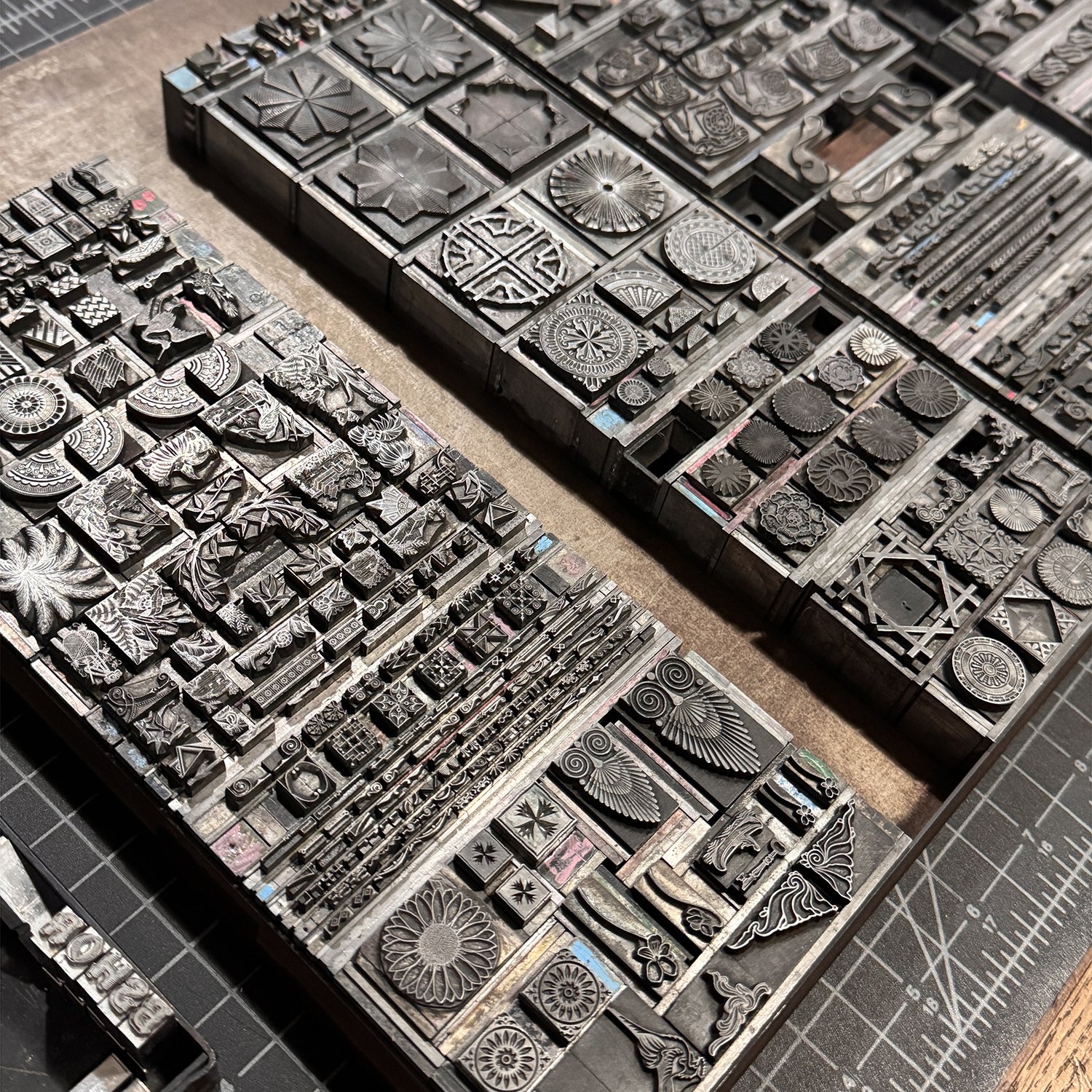
This process means making a lot of decisions quickly, as well as having multiple cases out at the same time. It’s like a little ornament dance across the table as they slowly find their partners. There’s no easy way to do it. And much like a home remodel, it’s more effective to have lived with the space (ornaments) to understand one’s traffic patterns before reconfiguring a layout.

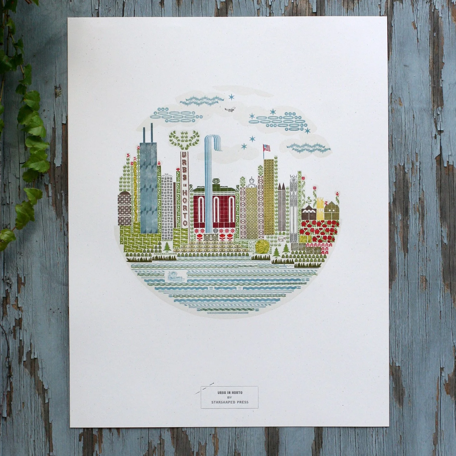
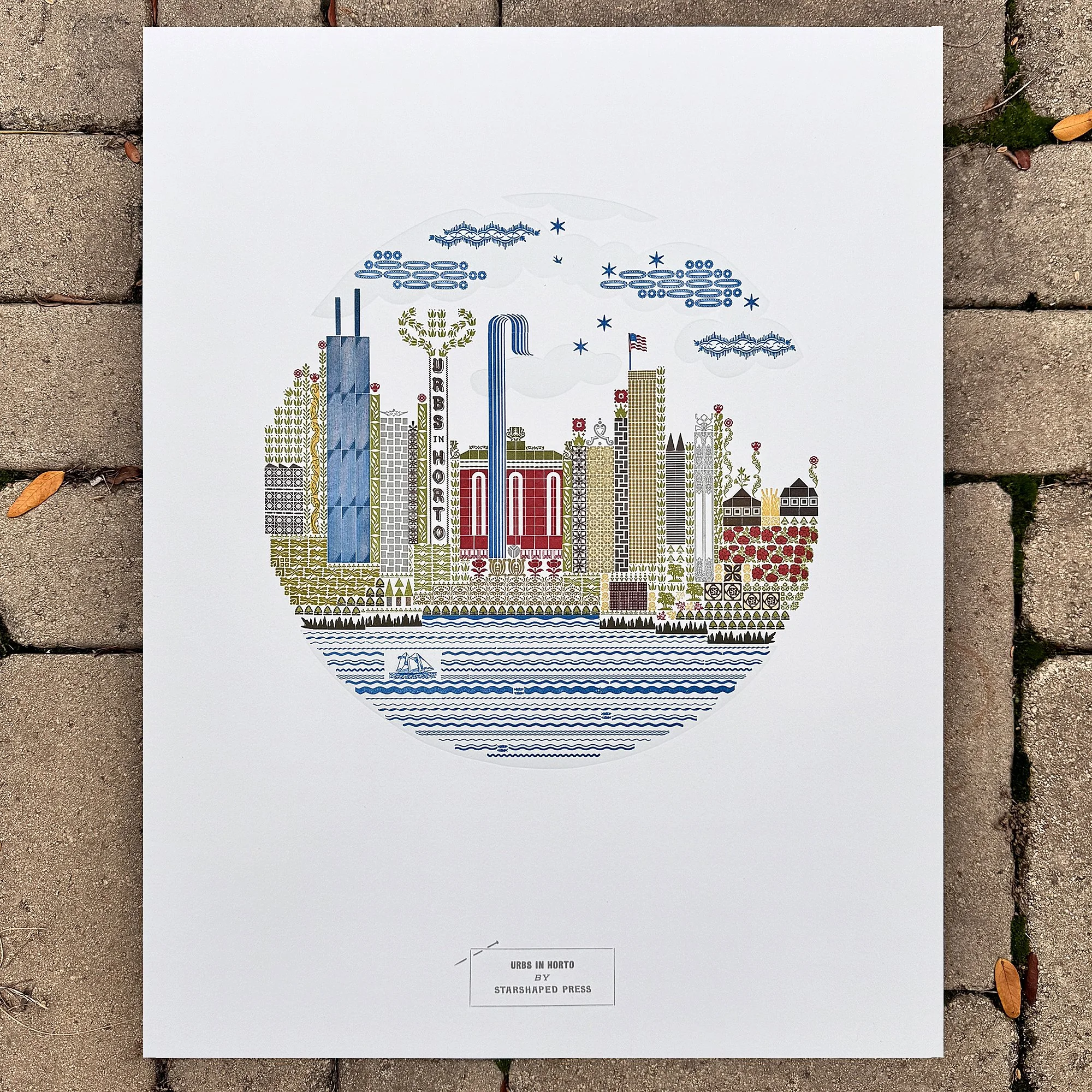
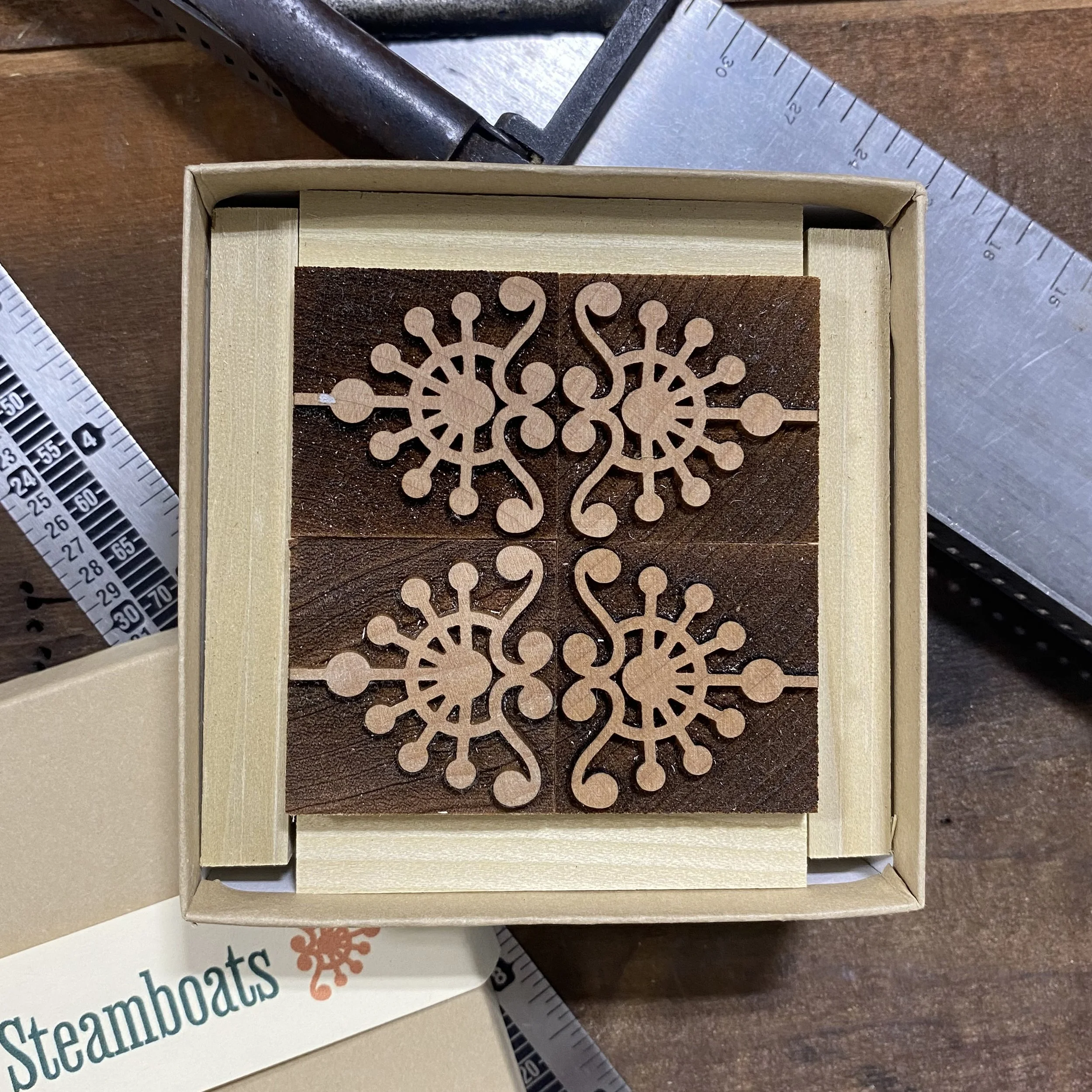
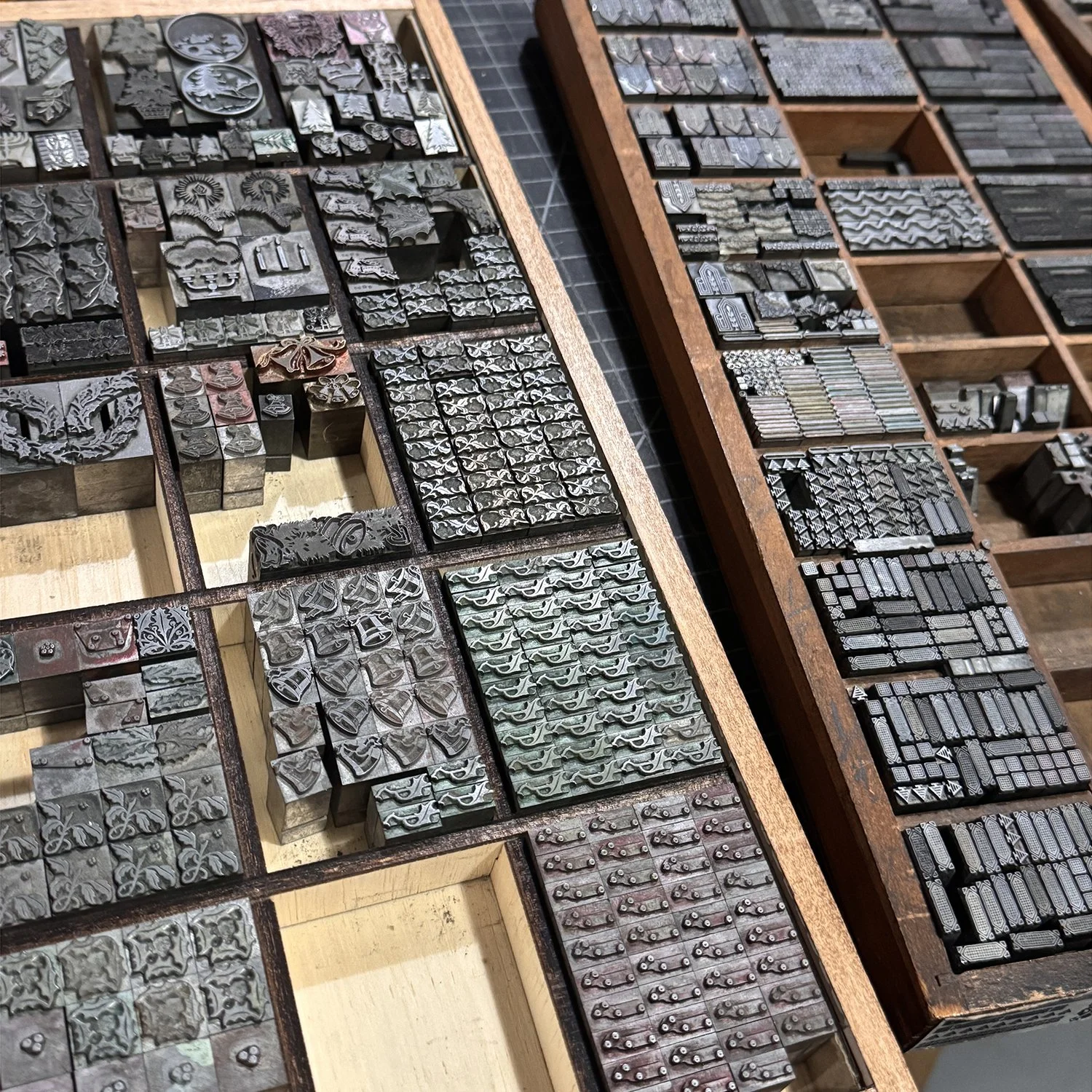
The satisfying part is compiling similar ornaments that have come into the shop at different times from different sources and getting them together as they ought to be. And lining up two color sets (like below) makes it easier to know I have both colors needed for the intended design. Two-color designs were incredibly popular for holiday printing and many still have hints of red and green ink on them from years past.

I also used boxes to help keep sets together and to move them close to whatever case was about to receive them. Some of the ornaments in quarter cases moved to other locations, such as galleys that hold larger quantities of a single design or handy boxes that are less frequently used.

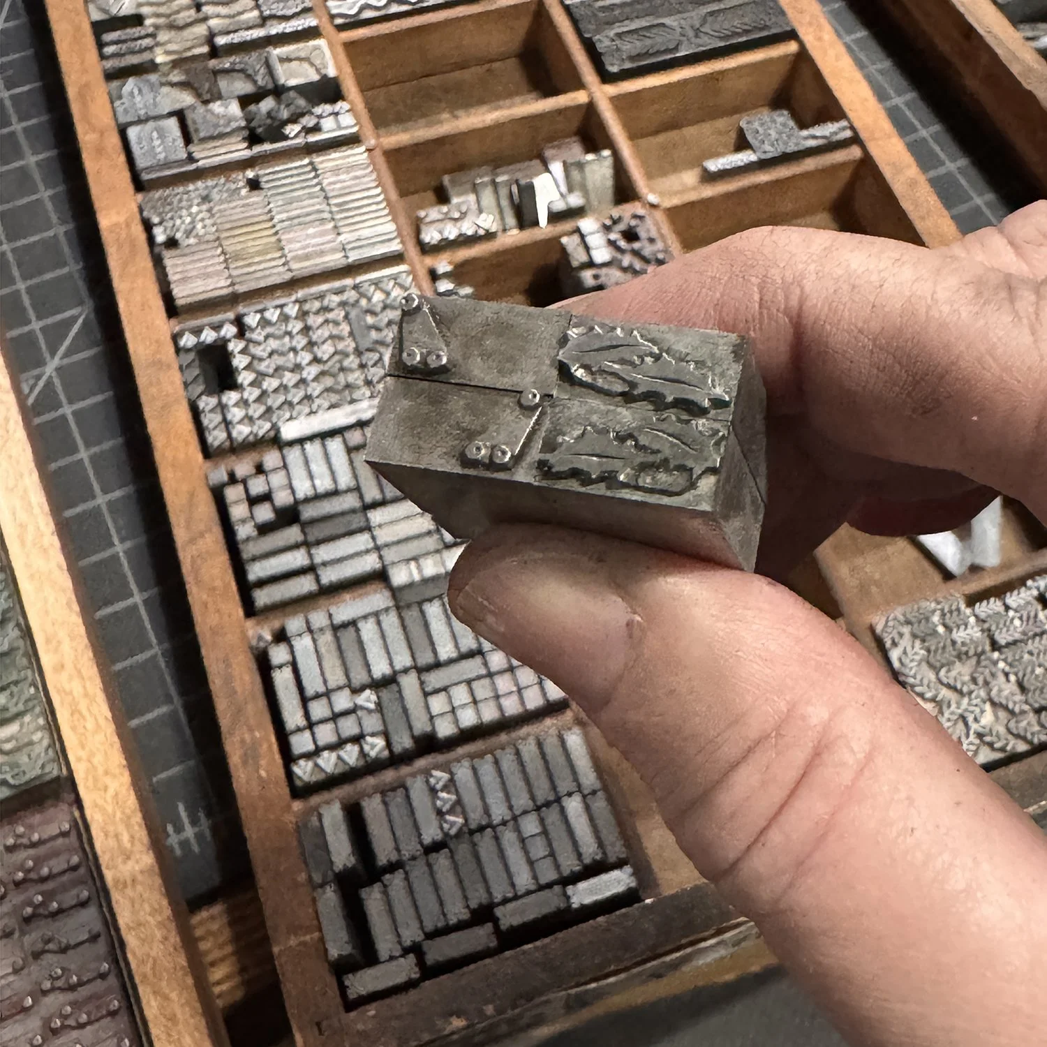
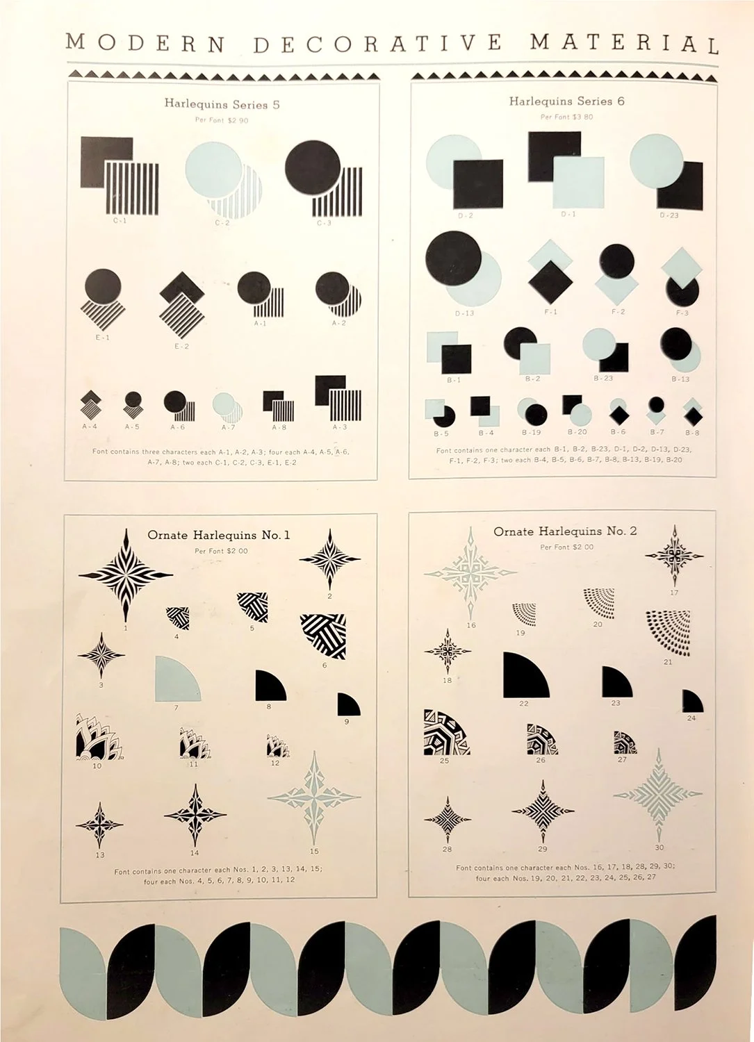
The fun of handling ornaments is identifying them. Some were made at a very specific moment in time, enjoying a fleeting popularity before receding into design history. One example is ‘Harlequin’ ornaments, as shown by this specimen page provided by Val at Bowerbox Press.

A deep clean of the sets in my shop revealed that they’re sadly in poor shape. Perhaps they were used extensively in the past or jostled around too much, smashing corners of various sorts. We can only imagine what kind of history they have.

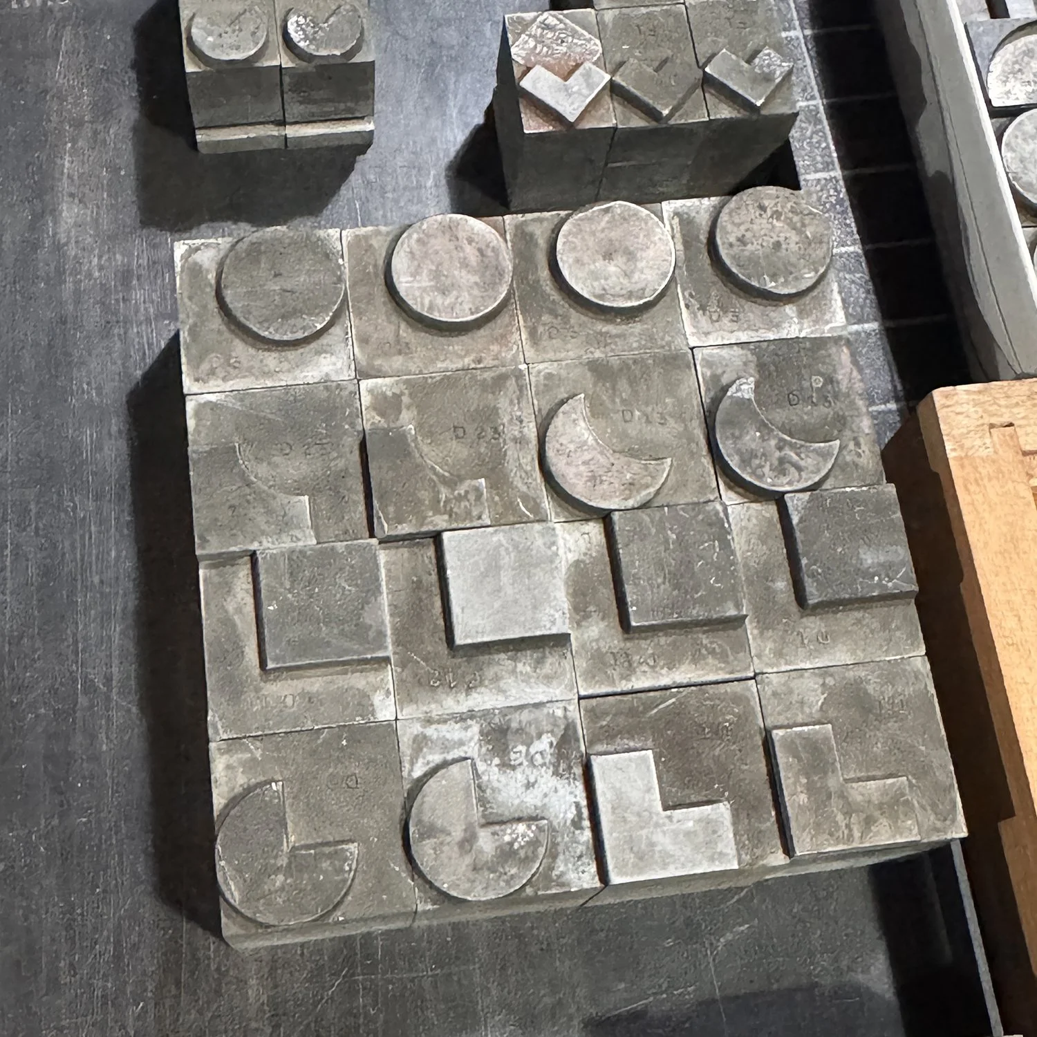
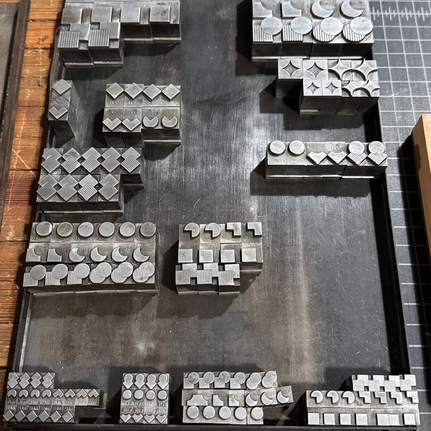
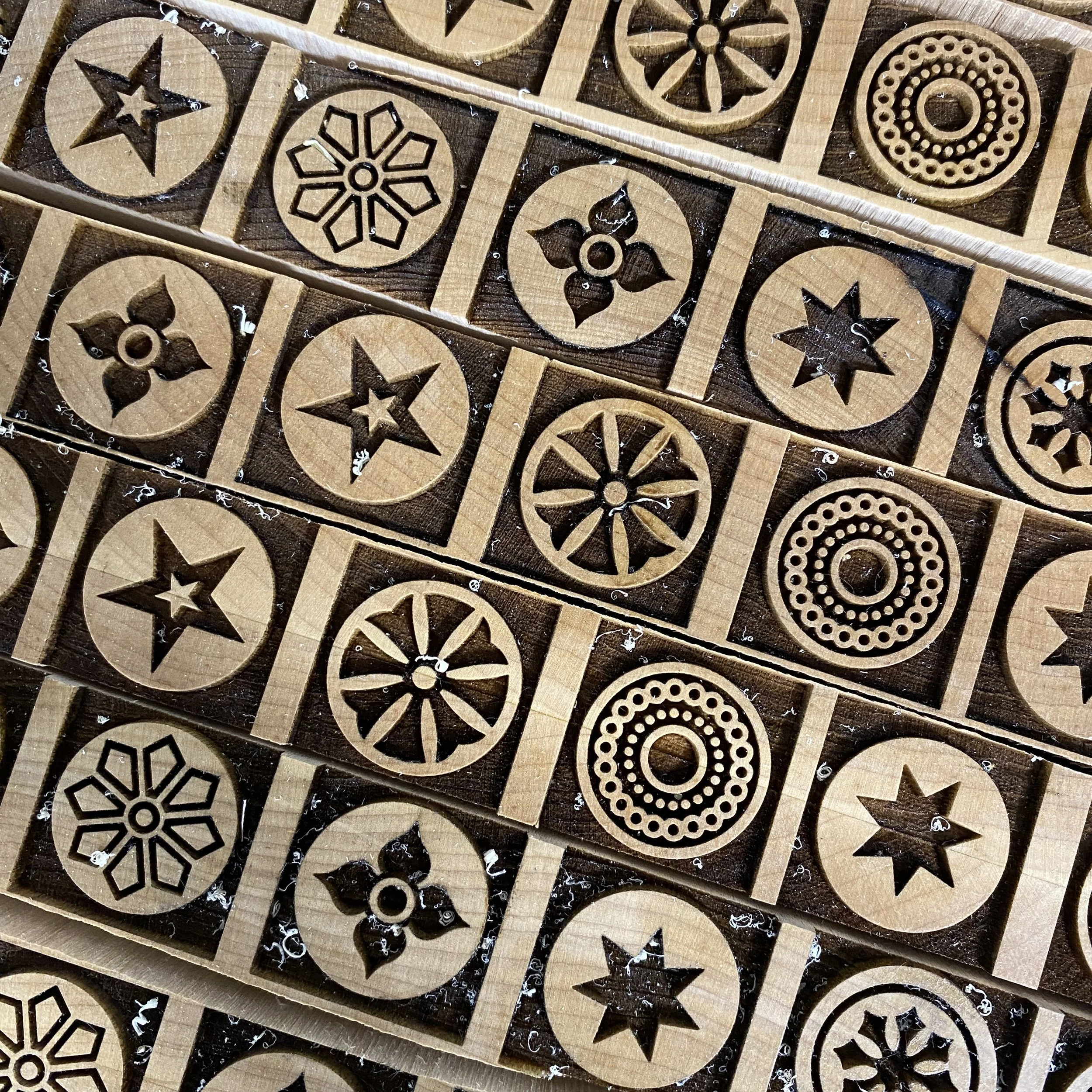
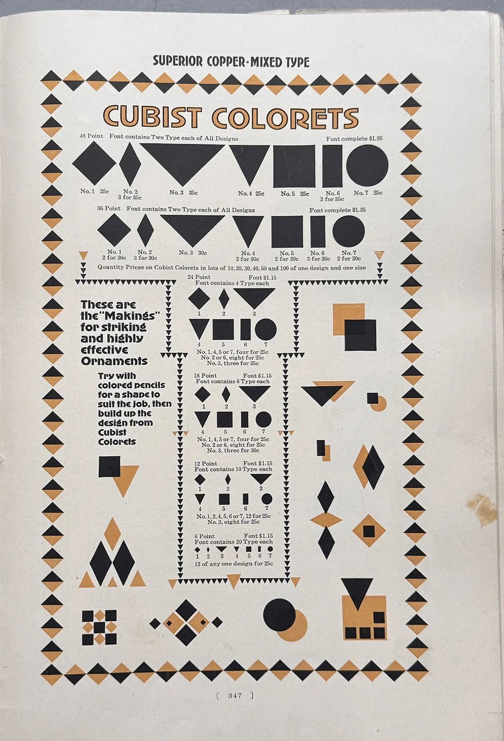
Others became workhorses that shifted from a unified collection to being separated by style. Case in point is ‘colorets’, a term I’ve found across multiple specimen books and shifting over time to represent a range of basic shapes. I chose to separate the ones I have collected to cases for circles, triangles and squares. This makes it easier when designing to grab the case that is most likely to have the shape I need.

After sorting ornaments, it’s time to proof any that are new or have slipped through the cracks over time. This included a lot of my 19th century type collection.

Below are two nearly-complete sets produced by Mackellar, Smiths & Jordan (Philadelphia). While I have often referenced them in a specimen book, having a print of exactly what is in my collection, in a way that can be annotated for the number of each sort, is much more helpful for design work.

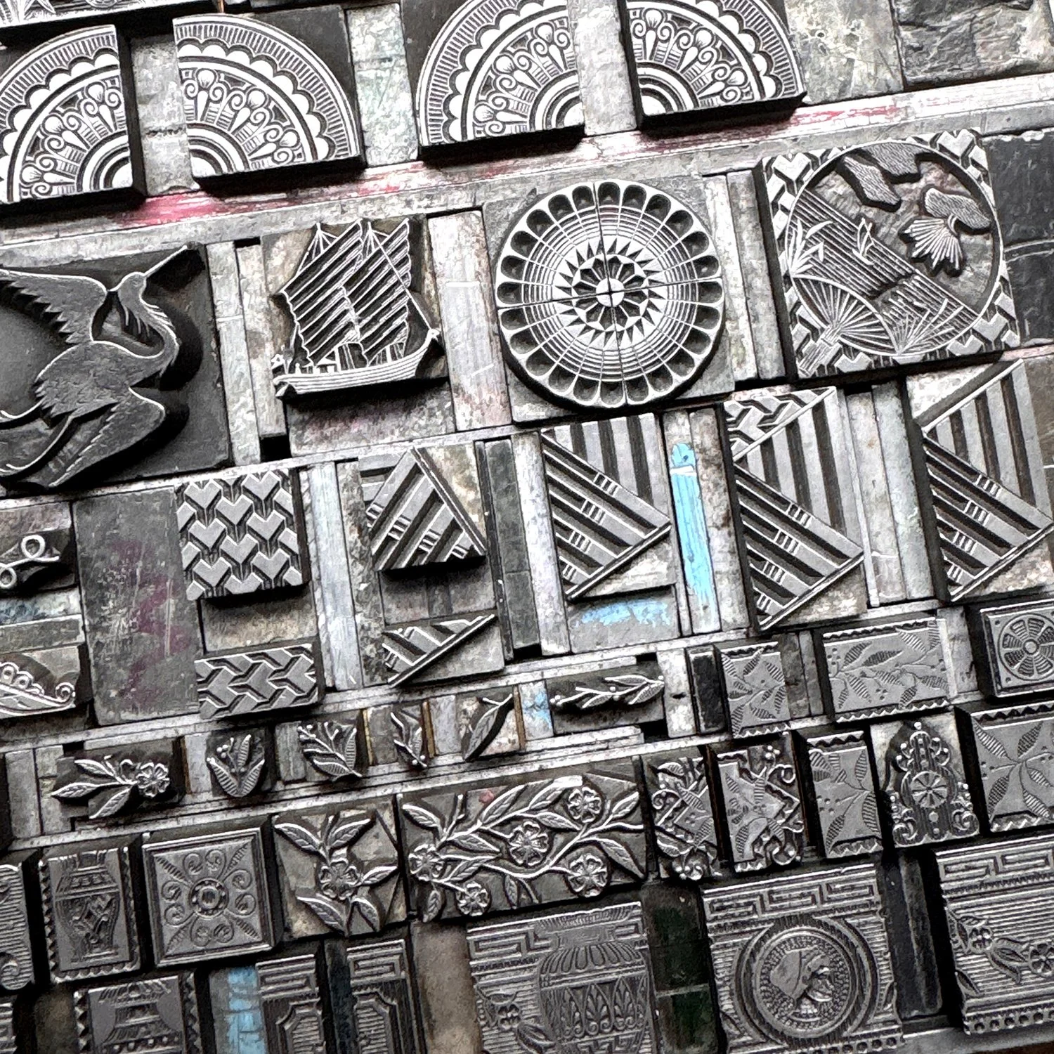
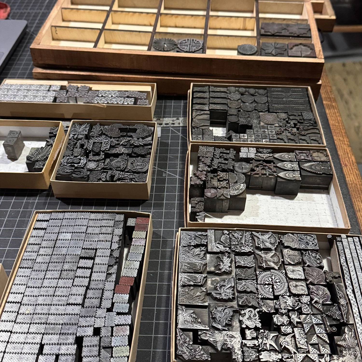
Other ornaments have been grouped together for proofing, even if they may have existed as part of different sets at some point. Some of these are very dirty and still require more cleaning and some are damaged in ways that might make them difficult to work with in the future.

Here are most of the final results of this project! The labels are digital composites of all of the proofs of the ornaments so that I can squish as many as possible on them. There’s still a little space in many of these to expand if needed.
One other homemade quarter case cabinet is in another area and I’ve used it to consolidate random cuts and other small sets that don’t get as much day-to-day traction (a collection of telephones, anyone?) There are also galleys with larger ornaments or those with a substantial number of sorts that don’t make sense filling entire quarter cases.

Overall, this process took a lot longer than I budgeted time for, making it stressful and exhausting. While attempting to make smart choices about where ornaments intuitively belong, I won’t fully know if I nailed it until I’ve done a number of projects. Having completed two major prints so far this year, I did find it faster and easier. The reorganization is promising!
The pleasure of this project is having had the opportunity to touch everything again, improving a physical connection with the collection and sparking new ideas for ornaments I haven’t thought about in a while. It’s true that sometimes you have to see things in new ways (or new places) to forge a path forward. It’s a welcome refresh for a new year.

City in a Garden, 2025

Many years ago, the Design Museum of Chicago hosted a show for local artists called The Flag and Seal Revisited. They invited folks to re-interpret the city flag and seal imagery. I thought I’d try to create something in a circular form like the seal but with nods to the city itself formed from metal type. What followed was the hardest print I’d done at that point in time. The type was set solid with very little spacing material, and was 7 colors, requiring super tight registration. Urbs in Horto is Chicago’s motto and means City in a Garden. If you live here, you know it’s true.

The first run sold out immediately so I printed a second, which also sold out. I said I’d never do it again because it was so difficult. Then I started planning for the 2025 Open House Chicago weekend, our biggest event of the year. I stared at the print for a while, knowing it would be a great seller. When I dug into what it would take to reprint, I realized that it’s no longer the hardest print I’ve done and that my skill has improved significantly over the past 8 years. So I began the process of recreating it with what I know now.
The first decision was to use a better paper that would hold the detail of the ornaments. The second was to retool it through a digital layout. I now design everything on a pica-based grid (the unit of measurement for letterpress work) and doing so significantly speeds up the accuracy and typesetting time.

Most of the ornaments and type in the shop are scanned so I can build imagery with the aid of a computer if I need to. This also helps me start to figure out what the color breakdown will be; the digital is an approximate interpretation as I pick inks once the job is ready to go. I can also easily separate the colors so I know what needs to go where for each press run. This print is six metal type colors and one linoleum cut, printed last. These are the separation cheat sheets:

Then the setting begins! I set everything together in one form, knowing a few areas will swap out for overprinted ornaments (overprinting multiple colors creates additional colors!) Because it was laid out digitally, I used a reversed printout of the design to build on for speed. I often make changes while doing this as reality doesn’t always align with digital and that’s the fun of the process. Here’s a little progression via still shots:

The last image includes a message left from shop assistant Raychel of Current Location Press, who often leaves notes of encouragement! And here’s the final form:

I ran a quick proof of the entire form to make sure the placement was correct and that I was happy with everything. A proof is not perfectly printed, just a reference going forward. It also allowed me to check the circle to aid in the sketch for the linoleum cut.

For each color run, I needed to pull out the non-printing sorts and replace them with spacing material, which holds its place and doesn’t print. I often mark spacing with a paint marker so I know what needs to be swapped out for the next color on a project. And I tried to keep the rough idea of the shape while pulling the ornaments not being printed. It’s not a hard process but is frustrating as type doesn’t like to stand upright on its own.

And here’s the final! I used Fabriano Rosapina paper in two different shades to see how the colors would perform on multiple papers. The new linoleum cut is a little more understated this time, only covering the water areas and the clouds in the sky. Overall, the design is much tighter and more detailed. I’m pleased with my registration this time around. The ‘look how much you’ve improved over time!’ experience was exactly the encouragement I needed. Find the prints here.

An Open Letter to Doctors

We spend a lot of time in hospitals. A lot. As I type this I’m recovering from another 6-hour stint in the ER, a relatively short visit because we’re champs at timing and prep. The ER should not have been our destination. For a month we’ve been reaching out to docs about an issue that could have been addressed via virtual appointment (the medical equivalent of ‘this meeting could have been an email’). But these days, go to the ER is the stock response and the buck is passed to docs that aren’t the specialists we need. It’s more strain on patients and ERs that are increasingly overloaded with visitors not in emergency situations.
For many months I’ve joked with Jo, my wonderful teen at the heart of this situation, about how we’d change the system to be patient and caregiver focused. It is NOT, and don’t let any glossy hospital flyers, commercials or slick insurance companies glad-handing you while stripping away benefits say otherwise. I suggested a class called Humanity 101 for med school, where students must go through the system as a patient. We are always surrounded by the healthiest people I’ve ever seen when in a hospital and I question if they can truly empathize with what chronic illness does to you, physically and emotionally.
Since I apparently don’t have the power or credentials to add a class to med schools, my frustrations turned to writing, which has resulted in a new book entitled An Open Letter to Doctors.

Across many notebooks and mountains of paperwork, I’ve scribbled notes to remember healthcare interactions that could have been better or more effective. I compiled all of these into ten points of reference that by no means encompass all of the details but they’re a solid summary. It would be easy to have a list of things like don’t send patients to ERs when the meeting could be an email and will we ever stop treating female bodies as riddled with anxiety instead of illness and would my kid get better care if I was a single dad instead of a single mom but that list is an ever-moving target. Instead, I went for basic concepts and in a color palette that might register attention (scrubs, anyone?)

Each block of text is printed recto-only on folded sheets of text weight paper reminiscent of EKG papers that fold after printing. I printed them on oversized sheets on the Vandercook press so they could be trimmed as collated sets. Thankfully, I was able to typeset most of the forms in their entirety, with just a few needing to wait for the letters of an already-printed form to complete the text block. Typesetting took a few days, given the design was laid out ahead of time; of course there are always changes when faced with type in its physical form in front of you. It’s not unlike reading about a patient in a book vs. seeing them in real life.

Each page starts with the boldest and biggest type and descends from there, much like our expectations when first reaching out for help and then getting beat down by the system. The forced justification isn’t just traditional book typesetting, but a nod to being forced into boxes known as ‘standard protocol’ in a healthcare setting. It’s uncomfortable and limiting.

Everything written in this book is an experience we’ve had. I can practically point you to the date, time, location and provider if needed. And the text isn’t meant to be an exposé or call out; again, if I could design a class that makes potential and existing doctors consider what it looks like from the patient and caregiver side of the relationship, I would.

But here’s the thing. As the socialists say, another world is possible! We’ve had a few truly remarkable doctors who inherently understand that dealing with one’s healthcare is exhausting, before even getting to the complications of paying for it, missing work, and adjusting your self-expectations of maneuvering through life. I have wept for the care of certain practitioners who get it, like you, Dr. Lorraine Canham, oncologist at UChicago Medicine. This is for you. How many times have we joked that we wish cancer was the biggest problem so we’d have a doctor who gets the human side of medicine so deeply and profoundly that we feel safe and seen.

On to technical details. The book is square (like a gauze pad) and sewn with antique cotton surgical thread. The slip cover is inspired by tegaderm patches and the string and button closure is grommeted over a printed representation of a steri-strip. The title and colophon sandwich the ten pages within. There are 60 copies in the edition. A printed prospectus is available by request.

As someone who must creatively solve problems every day, I’m often shocked at how little creative problem solving seems to exist in the medical field at patient-level. When a paper I love is out of stock but a project needs completed asap, I find a new paper. If type is damaged, I find a different typeface to work with, even if it wasn’t the first or perfect choice for a print. Progress dictates moving forward. So often we are faced with this won’t work so we won’t try, or it can’t be that so we won’t look for it and after all of these comments, there’s nothing left from the pros, not even hope, while we stare down life-altering illness. I hear you doesn’t mean that we’re actually being heard and considered, especially in regards to quality of life.
I joke about an art school education in the grand scheme of the world, but it did teach me to look for other solutions, even when they seem nuts. That there’s always a way to move forward, even if you fail the first five attempts. A window always opens when a door shuts, you just have to feel around for it in the dark. That, as the people know, Hope Dies Last, and Another World is Possible. I understand our healthcare system is big business and not built to actually care for illness. But if the meekest of us can march and crawl and roll to demand care, then doctors can step up, too.

None of my frustration applies to nurses. Nurses are a gift and should be protected at all costs. They should run the world but only if they want to.