The Happy Marriage of Wood & Metal

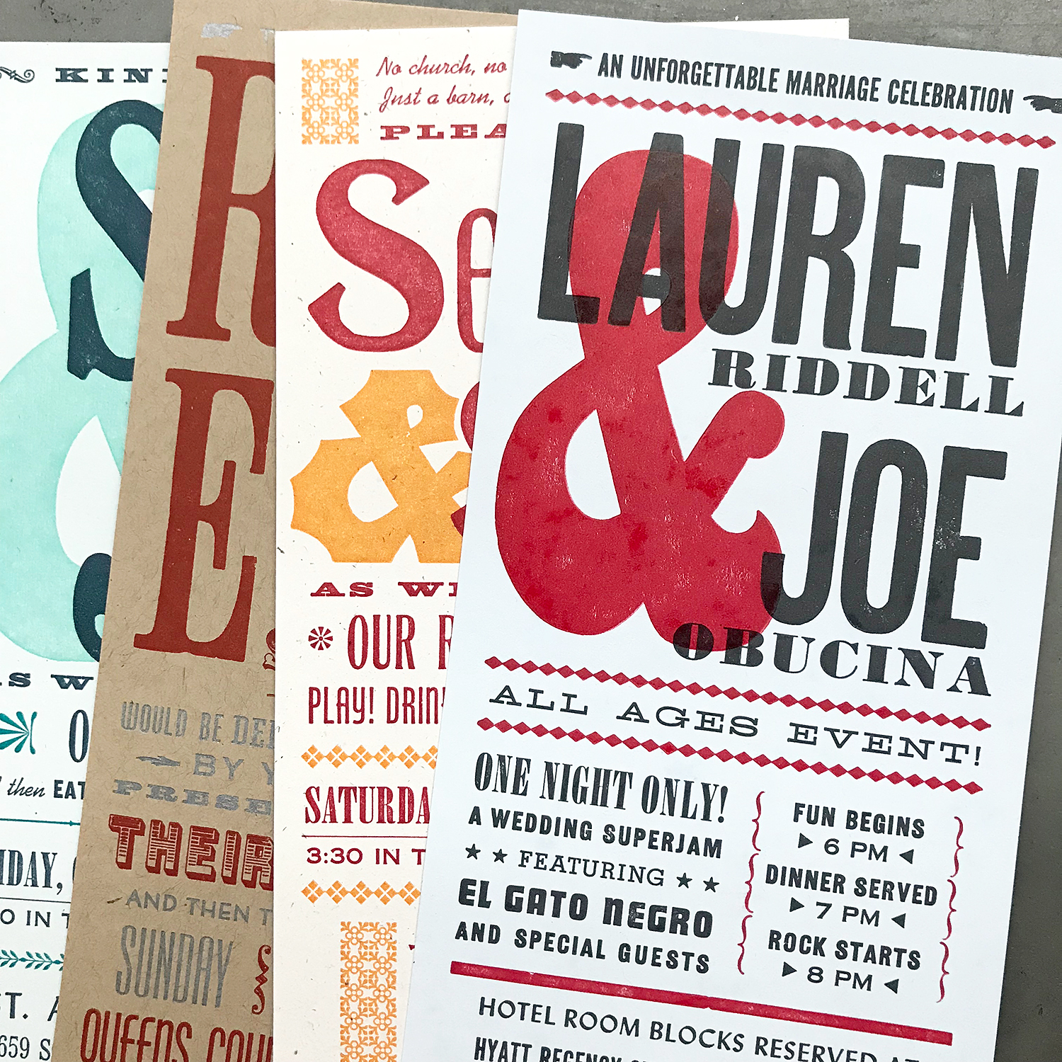
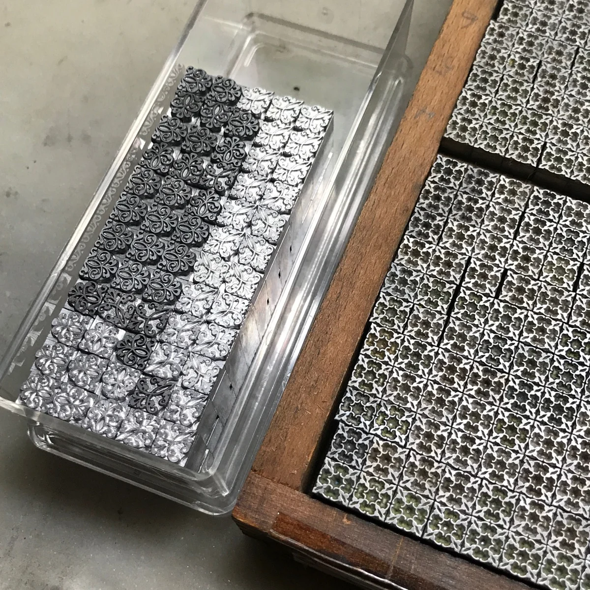
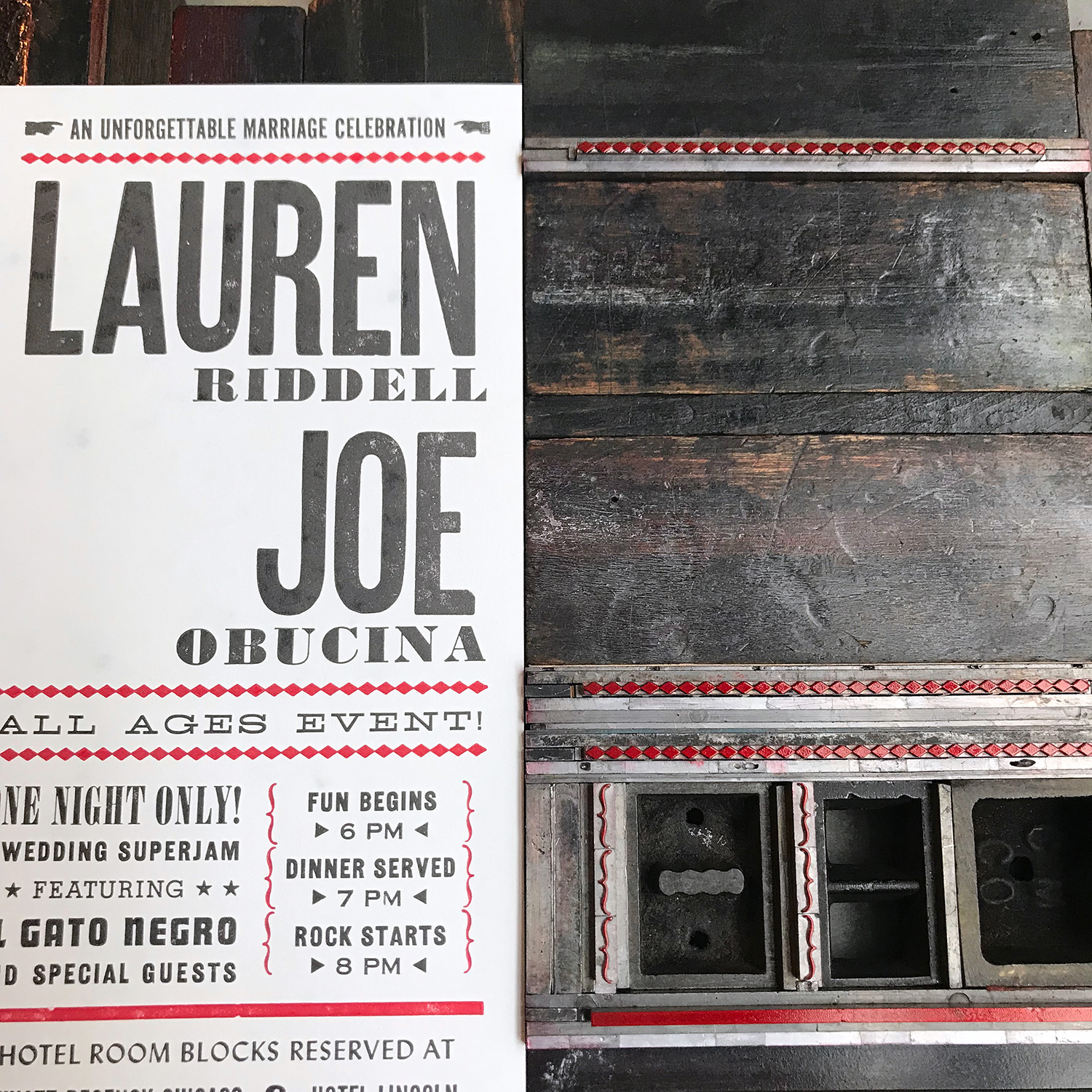
When a design calls for both wood and metal type, I find it’s best to separate them for better results, especially if the sizes are drastically different. If not, you’re often forced to choose between over-inking the metal or under-inking the wood. While many find either of these ‘effects’ to be a charming part of letterpress, I disagree. Let’s all shoot for the moon, i.e., better printing, shall we? For the following project that mixes 10-24 pt. metal type with 8 line wood type, I’ll walk through my solution for getting the best out of both.

I set up the entire first color in one form to get a decent proof on press for spacing, spelling and placement. This print is never great quality and it’s not worth trying to make it so if you’re going to print the wood and metal separately. Altering the amount of type and the surface area it covers on a platen press will affect the impression and quality of the first print, so don’t sweat it.

liningupboth.jpg

I double check the spacing with the digital proof I built for the project to make sure I’ve left the right amount of spacing for the second color.

liningup.jpg

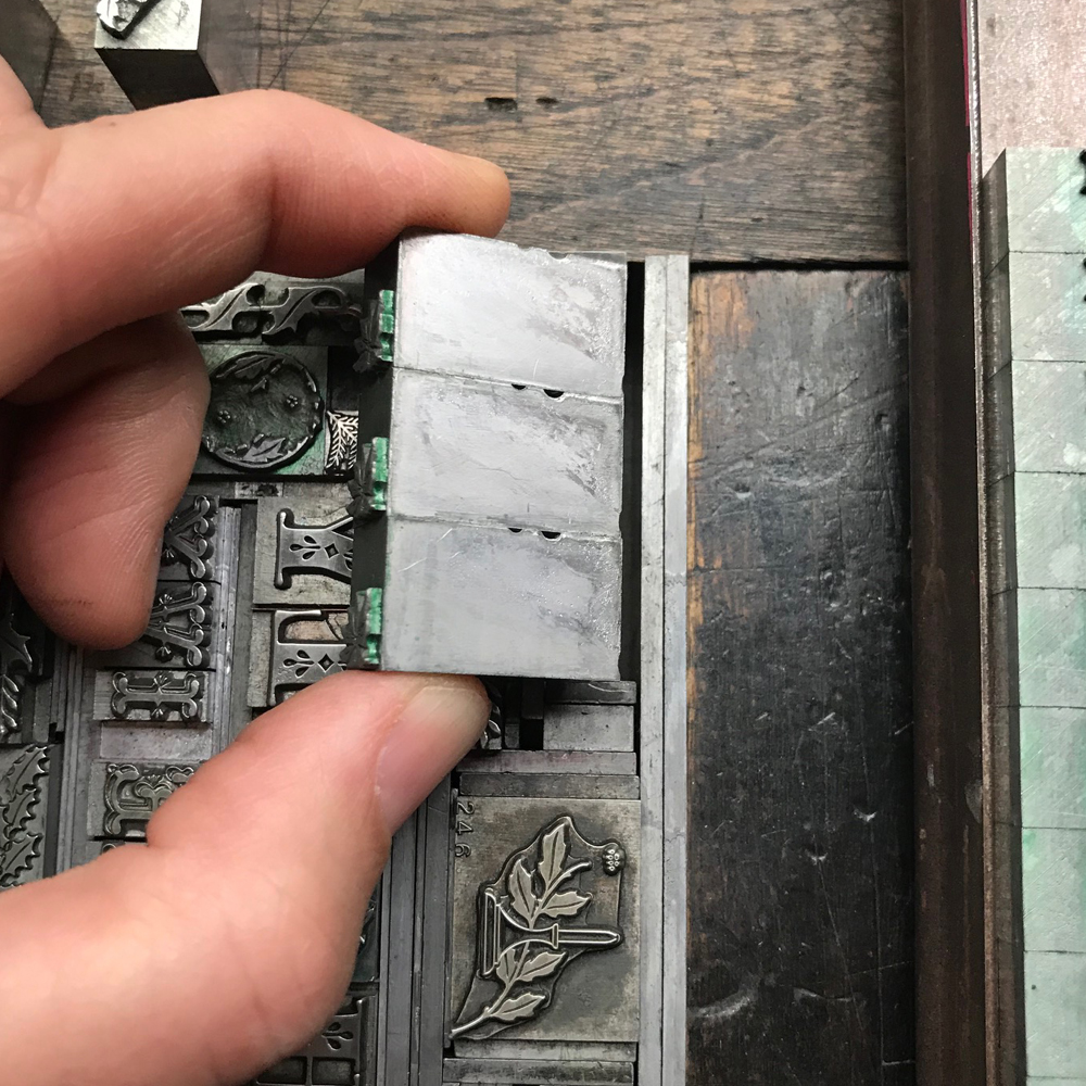
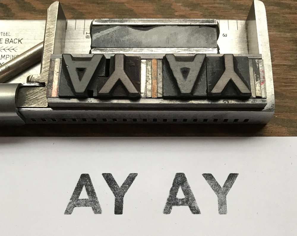
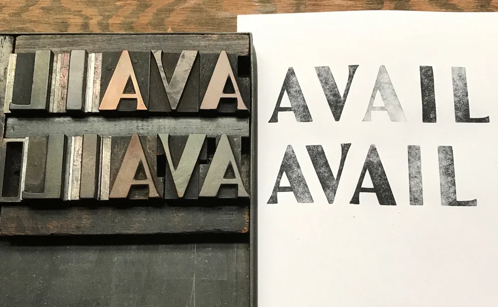
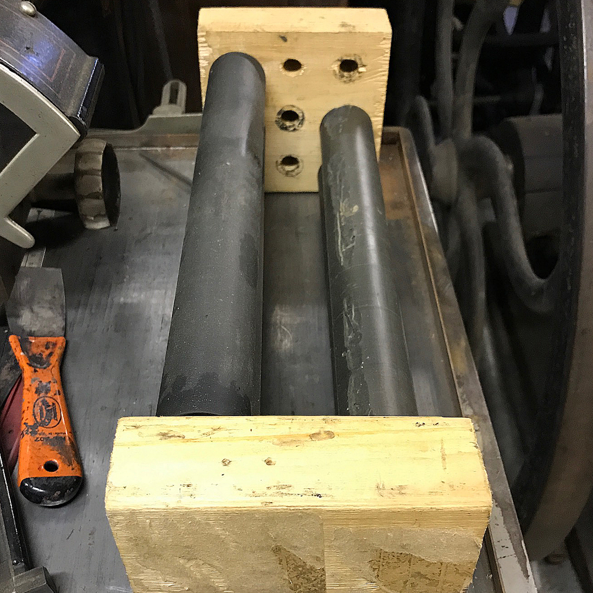
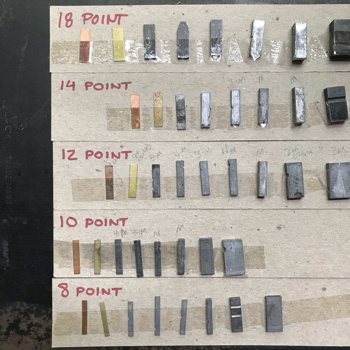
When the alignment is good, I pull out the wood type and insert furniture to take its place. Sometimes, there’s a slight discrepancy between the furniture and wood type, even if they’re labeled as the same size. In this case, my worn furniture required adding 4 points of leading to compensate for ever-so-slightly-larger-than 8 line wood type. This isn’t always the case but it’s good to double and triple check the spacing when you print again.

pulledoutwood.jpg

This is where you tweak the printing to get the quality that you want, and it’s easier to do so without the wood type. When this run is finished, return the wood to the form, removing any additional leading you may have added, and then carefully measure to remove the metal type. If you do this, you can keep the same form set up, as well as the registration pins on the press.

pullingoutmetal.jpg

When the first color is finished, I attempt to set up the second color in the exact same place within the chase. If there’s any question about your placement, or you think you may have shifted something, then remove your registration pins from the tympan and start over, just to be sure.
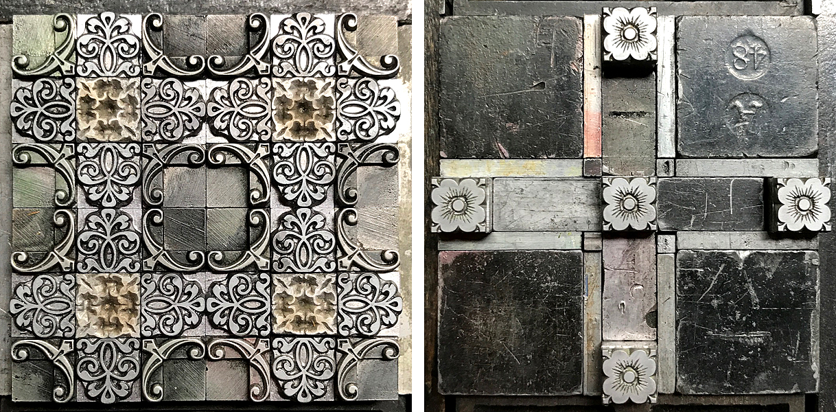
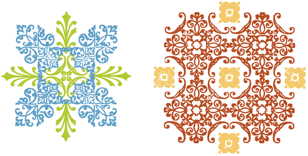
And again for the second color, like with the dark gray, I separate the thin rules and ornaments from the giant ampersand. There’s no way both would print successfully if they were run at the same time!

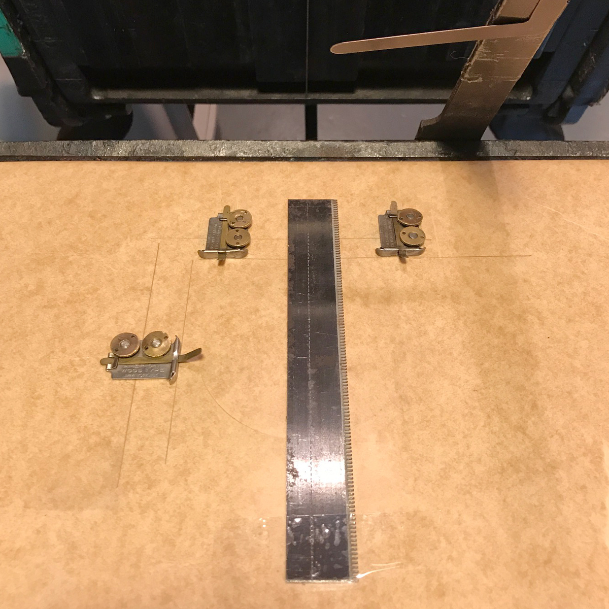
I like to build in thin leads around the rules and ornaments so that it’s easy to shift them slightly if the initial alignment is off.
This technique has been a tried and true process for me over many years. And while it would be great to think of a 2-color job as a 2-run job, especially if you’re budgeting a commercial project, the end results are what sell your printing. It may take a little longer on press, but in my opinion, it’s time well spent!

Meant-to-be-Bent Rules

I'm often asked about bending rules for curved print projects and I have to say, it's a lot easier than it looks, assuming you can work with a 'gravity assisted' press (thanks to Springtide Press for the term) such as a Vandercook. Locking them up in a chase for platen presses is possible but is much more difficult.
Do you need special tools? No. Here are a few options I rely on in the studio; you'll never guess which gets the most use.

rulebendingtools.jpg

Both of the official rule benders are on loan from the Platen Press Museum but it's the needlenose pliers I use the most.
The biggest concern when bending type metal rules (brass is different) is using a good quality rule. It can be difficult to tell the good from the bad but the older they are the better they tend to be (perhaps more recent rule makers haven't been as picky with their type metal?) When bending, they can easily crack and break. Heck, I can cut 2 pt rules cast with poor metal with scissors.
Here's how the official 'big guy' works. A rule is placed within the cylindrical drums and the left side wheel can adjust how tightly it's held (the tighter it is, the smaller the curve.)
PLEASE NOTE: I'm left-handed so I use both of the rule benders in a way that my left hand is in control of guiding the rule and the curve. These work in the other direction just as well.

ruleinrulebender2.jpg
ruleinrulebender.jpg

Then it is cranked through and you can carefully remove it by loosening the drums. It's possible to adjust what part of the rule goes in and how tight the curve is. There's a video of me doing this here.

rulebenderrule.jpg

The smaller rule bender is fitted with a series of brass curves at different diameters so you can choose the best for your rule. After placing it in, the top closes and the small crank on the right tightens it.

2rulebender3.jpg
2rulebender2.jpg
2rulebender.jpg

Just for fun, here's a page from a Marder & Luse (Chicago!) specimen book that shows both of the above. I discovered this while researching specimen books at my favorite place, The Newberry Library.

marderluse.jpg

These tools are required if you're bending brass which is considerably harder. If not, then you can easily bend rules without fancy equipment. I have a series of pliers that get the job done. The rules can be gently coaxed, bit by bit, until you get the curve you're looking for.

bendwithpliers.jpg

Remember to check if you're working with rule or leads. Sometimes you'll need to bend leads as well to help support a rule or type and it's the same process. Rules are type high, leads are not.

leadandrule.jpg

I keep all of my bent rules and leads in a box separate from the rest of the rules and leads in the shop. Once they've got a kink or curve in them, they're virtually useless for straight line setting again, unless you're working with large type.

bentrulegraveyard.jpg

These little boxes are treasures in the studio and house sets of brass curves for similar printing. However, they're from France, which means they are slightly higher than our .918" type height. They can certainly be used alone for printing, but check any European curves first before combining them with American/British type & ornament.

frenchrules.jpg

When it comes to setting up curves to print, your efforts are as good as mine. I like to build out a framework of furniture first and then fill gaps with the biggest spacing possible. Then I work down from there and occasionally combine angled and curved furniture as well. Below is a form built with Tina of Arquoise Design; we combined ornaments, mortised flourishes and bent rules.

mothersform.jpg

In this 'wave' you can see how a framework of bent leads gave structure to the ornaments I then placed inside of it. Not every single space around the curve needs to be filled.

tide.jpg

Are you bending the rules with your printing these days? Please share! And for more inspiration, please visit Naomi Kent's instagram feed (@inksquasher) for some incredible setting as well as her experiments with using jeweler's equipment to achieve many of these effects.

It's Simple Mathematics

As THAT nerd in design school who did all the sketching and planning that you're supposed to do, I've got a stash of vellum, sketchbooks, chart and grid paper and all sorts of drawing implements. As a letterpress printer, I've longed for paper gridded to the pica. Tired of wishing for it, I finally made it happen with new pica paper pads that are available here.

picapaper1.jpg

Every time I teach a class, I try to mercilessly beat into the heads of students that doing the math is key to successful layouts. If you're just starting out or trying to improve your metal type setting skills, remembering to measure is the thing that will help your speed. And as you get printer math burned on your brain, you'll need to map it out a little less and less over time. That said, I still sketch out ideas for 90% of my projects as seeing it first helps me determine if it's possible and what the challenges will be.

picapaper3.jpg

The beauty of pica paper is that it perfectly matches up with composing sticks and line gauges. You can map out a layout where text will fit a certain block and then determine the ornaments that might fit with it.

picapaper2.jpg

I often build forms right on top of a sheet of graph paper that's placed on a galley. This way I can use it as a guide and slide it out when the form is built.

ornonpaper.JPG

Here's a quick sketch to show how easy it is to build simple ornamental forms and how to consider both design and spacing options. As per this post, working with ornaments that 'play well' together is a great way to start. I've sketched out a plan for ornaments here by size and you can easily see how sizes divisible by 6 match up perfectly. I also marked in color areas that could be spacing instead of ornaments to create a visual flow. And you can also see exactly what size slugs you need to round out the outer edges of the piece to square it up. Measuring everything insures you'll have a tight form; being off as much as 1 point can throw off the whole thing when it comes to locking it up!

picapaper1.jpg

Do you need specific pica paper to create the above and sketch your ideas? No. But if it'll help improve your speed then give it a go! And remember... sketch those ideas and forms! Your printing will be stronger for it.

Double Your Fun

You've probably come across these fantastic two- and three-color ornaments in spec books and don't they look like fun?

1specbook.jpg

But often, the second and third color blocks can be separated from the first and once that happens they are usually rendered useless. If you come across blocks that look like blobs or have a series of random dots, you might not understand what the point is. Take a look at these matched pairs and you can see how the secondary color might not be much fun on its own.

2twocolorornaments.jpg

When I proof two-color ornaments, I do both black and color so that I have a set to scan to build digital designs and one showing off how they look when printed together. You can see how the holly berry dots might not make sense or be appealing on their own.

3twocolorholiday.jpg

I set up a holiday card that uses a LOT of these ornaments to show how to build the form and plan for the second color. I started with the green because in this case, these are the dominant or key images and will give me the best picture of how the card will look. To the side, on a galley, are the secondary sorts.

4form1.jpg

Obviously, it's good to do a count to make sure you have enough of both to create the design you want.

5print1.jpg

After the completion of the first color, LEAVE THE REGISTRATION and makeready set up on press for the second color. When swapping out the blocks in your form, pay attention to the nick marks so that you replace the first color with the second in the same orientation.

6insertingsecond.jpg

While most two-color ornaments are made precisely to match in registration, occasionally some are different in one orientation. If that's the case, do the printer math and fill in the remaining space to make up the difference.

7twocolorcandle.jpg

The second form will look something like this... a little more abstract, but with everything in the right place.

8form2.jpg

If you left your makeready, then you can place the chase right back where it was and the registration will be nearly spot on, give or take a point or two that can be adjusted with the gauge pins.

9print2.jpg

And obviously, change the ink color in between the runs! The more two-color ornaments you're working with, the greater the probability that they won't all line up perfectly. For this card, I've found the best possible outcome I could, understanding that some might be off by a hair. Toss that up to the inherent charm of a hands-on process.
If you've got cool two-color ornaments in your arsenal, pull them out to print and share!

10finishedcard.jpg

Alla Famiglia

A type family refers to all of the fonts within a typeface, i.e., Bernhard Gothic is the family name while all of the attributes (weight, roman vs. italic, size, etc.) make up individual fonts. As you can see, I have a large collection of this typeface, though not a complete family.

typespec2.jpg

The wonderful thing about having a full or nearly full type family is how much flexibility it gives you within your design work. It doesn't have to be fancy type; in fact, I find the more basic it is, the better. By keeping my type proofed on these 'family' cards, I can easily carry them to type sales to see what 'members' of the family are missing. If I've got 8, 10 and 14 pt. News Gothic, I know it would be great to find 12. Looking at boring old 12 pt. News Gothic amidst a sea of type might not grab me, but if I know I could complete a family with it, I'll snatch it up.

If I have a family for which a digital version has been made then I lay out a cheat sheet to be able to design quickly with my type family in InDesign.

handsettodigital.jpg

This is a screen grab of a file that has scans of my proof sheets on the left and a digital fake-out on the right. The digital versions are hardly ever exact, and as you improve with typesetting you'll be able to spot the differences immediately. However, if I want to push some type around on a screen before setting it, this is a really great way to select the family, set them as character styles and go for it. Having different weights and sizes makes it easy to add visual interest and hierarchy to your design without being overwhelmed by so many possible typeface choices.

Here are a few examples of projects that work within the Bernhard Gothic family. This stationery set uses 8 pt. Medium and Light, with 12 pt. Bold popping out the name. Helpful hint? If you're working in email addresses, go down a point size with the '@' sign. This one here is 6 pt. They were not designed to read nicely with a line of type so they often appear heavy and ridiculous unless you tone them down in size. Add a brass above and below it and you're good to go.

jeffstory.jpg

This invitation uses 12 Medium, 10 Medium and 8 Light and Italic. Keeping it simple allows for the more fun type at the top to shine.

millers.jpg

The back side of this cd sleeve has it all in tiny sizes. There is 6 pt. Italic, Medium and Light in each line; this is easy to set and still provides a visual break between each piece of info. The lowercase credits at the bottom are in 8 pt. Light.

cdsleeve.jpg

I also keep a spreadsheet handy to find this family of type as it is spread out all over the composing area of my studio. I don't need to know what it looks like for this spreadsheet, just where to find it.

typespec.jpg

Having a book of proofs of the type as well as the spreadsheet is a great way to double check your collection. Every once in a while a new typeface comes in and gets on to one but not the other. Eventually we find it and remedy the problem so that typeface can get to work asap.

Working within a type family is a great exercise, both digitally and in letterpress. It's an easy way to communicate effectively but with class and purpose. And it helps you develop a stronger eye for how your type works together, which makes you faster and more competent with setting.

The Exception that Proves My Rule

The use of line work, or in this case, rules, is a wonderful tool to have in your design arsenal. But it can be downright tricky to get these to print well and consistently so here are a few things to think about when you break into your rule case.
If you dig into the 19th century samples here, you'll notice the number of rules all coming together as well as how they don't always quite line up. I find this charming in the 'no computers were harmed in making this print' way.

msjrules.jpg
rules1.jpg

Rules can be used to create design work and borders as above, but can be even simpler, like with the flowers below. Note how the lines forming boxes don't meet up in the corners. It's okay! I find that it's better to get the lines straight than perfectly matched up, i.e., no bends within the line length, which usually means the spacing is off.

ruleflowers.jpg

There are a few little things that can help you set rules if you want to create a border, like these L-shaped corner pieces that make it easier to put two rules together. They are pretty unassuming and easy to miss at letterpress sales but are worth picking up.

cornerpiece.jpg

These brass corners are also swell to combine with 2 pt brass or lead rules. This one is curved but you can find straight or decorative, too. There is mortised space below the printed area to butt furniture and slugs when setting.

roundcorner.jpg

Point is, don't overlook these little guys when you visit letterpress sales in person or online.

Rule is a really excellent design tool and is thankfully easy to find. Here are a few suggestions.
If using brass rule, a harder metal, you can achieve some debossing effects that you can't with softer metal rules (see back to this post for the differences in printing rule vs. scoring rule.)

debossedbrass.jpg

Here I've used a few different thicknesses, combined with a few simple metal ornaments and a decorative slug cast on a linotype (at the bottom) to create the idea of the Brooklyn Bridge.

bridge.jpg

These two color monograms look swell with a piece of rule extended from the side. When setting like this, just do the math (I know, I harp on about it...) The monogram is 36pt. The rule is 2pt. That means you need 34pts of spacing (I prefer leads & slugs in this case) split above and below the piece of rule at the same length as the rule. The dot at the end is 6pt; again, do the math to see you need to split 30pts above and below it to even out the section.

monogram.jpg

I love finding linotype slugs that can be cut to any size on a slug cutter. This is a collection of some, meant to resemble a small cityscape. Some are capped with small ornaments.

studsprint.jpg

With a little practice and math, it's easy to add rules to your work. They may never have the exact precision of digitally-set borders given their age and the fact that it's a modular process to assemble them, but that can add charm to your print, the way it did 80-100 years ago. And looking at old spec books to spot these can be fun. It also helps you discover how printers of the past built forms that combine rule and ornament, and that kind of archeological research gives your own typesetting a leg up.
We'll cover mitering rule in an upcoming post.

allcorners.jpg

Let's Hear it for the Kern

The big fail of metal and wood type is that the physicality of each letterform can work against best practices of typography, in particular when it comes to kerning. To kern type is to set each sort so that it forms visually pleasing words and sentences that don't distract the viewer from the message they convey. Before the digital age, this was painstakingly done (though very often NOT done) by hand, though I would argue it should still be done by hand/mouse on the computer as well.
I'm looking specifically at wood type capital letters from my collection that came to me with evidence of this practice.

kernedletters.jpg

Notice the cuts within the base of each letter and then notice the letter itself. What do they have in common? These letters have a great deal of negative space that doesn't print. A large part of improving your typesetting is developing a sense of what part of your sort will print and what part will create a space on the page. These forms have been cut so that they can snuggle next to a letter that has also been trimmed.
Good examples of this are capital letters that have extreme angles like A, V, Y and W.

AYkerns.jpg

Above you can see two sets of the AY combo, as well as the kerning cut into the letters on the left. Without this there's a ridiculous amount of space between the two.
But this is my favorite example:

nokern.jpg

While still not quite right, the kerns cut into the bottom letters are a step in the right direction. With a little more effort, I kerned the rest of the word to improve it.

withkern.jpg

Here you can see that in order to make the letters feel like a word at the top, the rest of them have to be spaced to a ridiculous degree. The bottom is more reasonable but could be a little tighter, and I could trim out more space on the middle A to make this happen.
My preferred method of 'surgery' is a bandsaw because of the detailed cut I can get. I don't like cutting down the long side of these diagonal letters as you never quite know what will be next to it in the future and if you leave it 'squared' then it'll still butt nicely to its neighbor. And if it's too close then you can insert leads/slugs to space it out.
I can often tell if a piece is printed from wood type vs. digitally-set-to-look-like-wood-type because of the kerning. A computer allows for easy kerning pairs and eliminates much of the pains of hand setting type (though not all.) If you are printing wood type and wish to fool me into thinking it's digitally set (ha!) keep tweaking your kerns to make those awkward spaces disappear.
AND... consider this permission to cut/trim your wood type to improve typesetting!

Book It!

Chances are, if you're reading this you already love books. And type specimens are the finest; even the simplest ones offer so much typographic goodness that it's hard not to love them.

books.jpg

Sure, some specimen books are rare and quite expensive. But you don't need to have the originals! I have a number of Dave Peat's facsimiles that are just as helpful.

facsimiles.jpg
johnsonborders.jpg

Beauties! Take note of the bottom rectangle above that shows the various sorts that are used to create the border on display. This is exactly what I go for when looking at ornamental specimens. Many 19th century borders and ornaments are so complex and intricate it can be difficult to fully grasp what the designer had in mind in terms of how they fit together. When I acquire sets or even single sorts I attempt to discover first who the foundry was (this is often on the pinmark) and secondly how many pieces make up a set.

bookwithornaments.jpg

Here I've tracked down some of my collection in the MacKellar Smiths & Jordan specimen. There's no doubt they produced some of the finest examples of detailed 19th century ornament and borders and I recommend bugging Pinwheel Press for more details (Laura is the champ on this front!)
One of the first things I do when acquiring new ornaments is to proof them in black on white stock. Then I have a record and can easily cross reference them with books.

proofs.jpg

Not only does it make it easier to see the detail but it helps me organize my storage, find them in books and scan them to do basic layouts on a computer. I can also keep track of how many of each sort I have.
I don't always have the books I need so I spend time where they do exist. I've got photocopies of pages from books at The Platen Press Museum, where I've been known to sit on the floor for hours digging for ornaments I have and those I wish I had.

copieswithornaments.jpg

More contemporary books are great as well and have helped me understand how disparate ornaments come together to create borders. When I first found this, I didn't know they were billed together by ATF:

matchingorntobook.jpg

The beauty of this is that I now know what ornaments I might like to track down or will purchase if I ever see them in the wild. Then I can complete a set, or at least look for something similar to achieve the same effect. It also makes me wonder about the thought process of printers of yesterday... how did they decide which size to buy? The solid or outline? A whole combination or just one element? When I consider my own desires for type, it makes me feel connected to the past.
I spend a lot of time at the Newberry Library as they offer a large selection of specimen books and single specimen sheets. I find it difficult to know how some pieces work together, these word ornaments in particular. After studying samples in the Marder & Luse specimen books, I started playing with my own to see how to build with them.

wordornaments.jpg

Word ornaments are very Tetris-like but not in the easy way that more modular, mid-century sorts are. And look at some of those tiny little squiggles! If you didn't know they were part of a larger group you might think they are just... squiggles. These specimens help me determine where all those tiny, frustrating pieces go.

wordup.JPG

I can't recommend specimen books, facsimiles or reprints enough. Also, if you find cheap ephemera (postcards, needle packets, etc.) from the late 19th century, check the typography on the 'boring' side of the piece to see how printers worked in ornamentation. Chances are they bought it new and used it exactly as it was shown in the original books. And seek out your closest source (library, museum, university) for their collection of specimen books (share your favorites in the comments!) Word up, yo.

Roll With It

There are many different ways to store rollers when they're not on press, inked up and printing away. I've come across a few clever options while at the Platen Press Museum. One of the simplest is a set of matching blocks with holes drilled slightly larger than the roller cores. Measure accordingly so the rollers don't touch each other.

roller1.jpg

These plastic pieces work pretty great as well and could be mounted to a wall.

roller4.jpg

One of Paul's favorite options is this, made from pvc pipes. The end caps with holes provide support for the cores so that the roller doesn't touch the pipe.

roller2.jpg
roller3.jpg

Most of my presses have a second set of rollers. This way the press is never down; one set is in action and the other is in storage or can easily be shipped off to be recast. We've built custom boxes with wood sections that fit inside.

roller6.jpg

Since we can't all have these pristine roller cabinets, give some of the above options a try. Got solutions that you've implemented in your shop? Share 'em!

rollerstorage.jpg

We Go High, Type High

The next few weeks will feature the unique micro collections housed at the Platen Press Museum in Zion, Illinois, my second printing home.

Paul Aken, the magic behind the Museum, suggested looking at type gauges this week, given that Monday was Type High Day, or 9/18 (September 18th.) Type High, or height to paper, refers to the standardized height of each piece of type, which as you may already be aware, is critical to maintain for correct, properly functioning lock ups. American (and British) type high is .918" or .9186" if you're really into splitting hairs.
At the Museum, Paul has an incredible collection of type high gauges used for measuring type as well as cuts and plates that can also be part of a form.

typegauges.jpg

Wowser, what knolling, right? As you can see, gauges come in all shapes and sizes with just one critical measurement consistent between all.

typehigh1.jpg

And here's how it works. It's really this simple:

typeistypehigh.jpg

And for cuts!

cut.jpg

And it's a quick way to find out if European type has found its way into your collection (.928".) Often, Euro type for the American market has a little machining done to its feet to shave it to .918". I don't have a handy sample of this but you can see that my collection of French brass curves are too tall (.928") to fit in the gauge. They can, of course, be printed but not combined with type that's .918" or the impression will be uneven.

928.jpg

Type high gauges are a fun find! Our printer's devil wears hers, a gift from The Arm, as a necklace so she can 'check to see if stuff is type high.' Start 'em young!

IMG_2295.JPG

So Hip it's Not Square

You may occasionally stumble onto metal type that looks a little different. Many modifications have been made in the process of creating type to accommodate the shortcomings of the medium. Here are three of them, direct from the foundries.


Angled Body Type
Italic or heavily slanted (often script) typefaces present many kerning issues, and one way to combat this was to actually angle the body of each sort so that it fits together on an angle instead of the traditional square/rectangular body. This type generally came with it's own spacing as you can see here:

angled2.jpg

There are thin spaces up to quads on angles and then end pieces that fit with them (the triangular shaped piece) to finish the line and make it flush. Here you can see all of the angles. It is possible to letterspace with coppers and brasses; when I do this, I tend to work in a smaller size so that they fit along the longest part of the angle. The top and bottom of the angled spacing has a slight curve to it.

angled.jpg

Wing Body Type
Another way to cope with type on extreme angles was to keep the body size regularly while altering the top section of the sort, with the letterform itself at a slant in a way that couples together with the letters next to it.

wing1.jpg

Wing body type also often comes with its own spacing. Here you can see how the face of the 'g' extends past the rectangular body. The angled nature of the spacing also provides support for these extended sections. The 'W' and 'i' also extend to the left in the above photo.

wing2.jpg
wing3.jpg

Normal spacing also works, though not always in between letters or right next to them, given the angles at which the letters are cast.

Mortised Type
Another option for kerning metal type was to mortise it so two sorts could fit together like a puzzle. I've seen a few samples of these mortised pairs in metal (more common in wood... we'll get to that eventually) but I'm showing an initial cap here because they're much more common.
Mortised type has square/rectangular sections cut from it so that it can fit closely to other letters. This is popular with alternate and swash characters, like this M:

mortised1.jpg

In this instance, 18 pt type fits above the swash at the bottom of the 24 pt 'M.'

If you want to read more about it, I highly recommend owning a copy of American Metal Typefaces of the Twentieth Century. There is a great section that breaks down some of these components:

metaltypefaces1.jpg
metaltypefaces2.jpg


Don't be afraid of type you might find that's a little off the norm, such as these examples. With some research and understanding, they can add so much variety to your typographic vocabulary and can offer many more options for improved kerning.

Don't Break the Rule

Leads, slugs and rules... usually this strip material is pretty straightforward but I'll do a quick recap in case any stragglers in your shop end up somewhere they don't belong.
Here's a handy guide. We've been over leads and slugs but you may have come across high slugs that aren't type high (so they don't print) but are taller than normal leads & slugs.
Rule, meant for printing, comes as both lead and brass. I prefer brass for it's strength; the actual printing line is less likely to sustain nicks and holds up better. However, lead rule can be easily cut on a trim saw or with a slug cutter (brass requires more chutzpah.)
Perforating (sharp!) and scoring rule are made of steel so they can withstand a little more press action. Perforating rule comes with various teeth lengths. Steel is also not to be cut on a trim saw unless you have the appropriate blade.

So what are those pesky high slugs for? These provide a little extra support for sorts that have overhanging ascenders/descenders. Case in point with this Q. These delicate parts of the letterform break very easily when printing and high slugs are one way to guard against this.

q.jpg

I keep these alongside the leads and slugs in the rack; a type high gauge will tell you if it is/isn't meant to be printed (if it's type high put it in the quarter case of rule.)

Lino slugs (cast on a linotype) offer a ton of great potential for designs and patterns. And they're easily cut with a slug cutter or trim saw.

linoslugs.jpg

Scoring is best done with a platen press, though I've carefully used the rule on a Vandercook. If you're printing a large run of greeting cards, etc., then you'll definitely want to score on a platen. Make sure to remove your rollers from the press before starting!
After locking up your rule in a chase, use a piece of creasing/channel matrix cut to size and push this onto the rule. It's plastic and has a sticky back that you need to peel off.

creasingmatrix1.jpg

Put the chase in the press and pull an impression on the tympan; this will leave the sticky-backed matrix on the tympan paper.

creasingmatrix2.jpg

Now peel the plastic top part off, which reveals the metal channel section underneath.

creasingmatrix3.jpg

The exposed line down the middle of the channel is perfectly lined up with the scoring rule. You can now adjust where your card is going and add the gauge pins.

creasingmatrix4.jpg

Perfect score every time!
The matrix can also be used for perforating. But! if you haven't got any, there's another quick down-and-dirty option. Pull one impression on the tympan with scoring or perforating rule. Then tape down another spare piece of steel rule over that line, remembering to compensate for the added thickness by removing some of your packing. It's not glamorous, but it sure works.

perf1.jpg

Perfing rule wants to pick up your card with it after making an impression. I remedy this by including bearers and fingers that help to hold the paper down when the perfing rule meets it.

perf2.jpg

Perfing and scoring on a press are a great addition to your printing arsenal! And printing decorative rules adds so many options to your design work.

urbs6.jpg

Huzzah for Curves

So you want to set type on curves and break out of the Tetris-esque grid? You can! Get yourself a set of circular quads for the easiest options. These aren't horribly hard to find so keep an eye out when you're shopping for letterpress goods. They are generally made of metal but occasionally you can find wood (which you can also make yourself!)

quaddiagram1.jpg
quaddiagram2.jpg

Here are a few sets. You'll notice that they tend to be in separate pieces so that you can mix and match to create various diameters as well as serpentine lines of type.

quads.jpg

Of course you can also grab some Daredevil Furniture from Springtide Press! This is both wood and plastic and offers a number of circular ideas.

daredevil.jpg

I start by determining line length then setting slugs in a stick. You can easily add lines above and below the quads. You'll notice that they have stair-stepped areas you can fill with either slugs or spacing material.
I place thin strips of paper cut to about the height of leads at the top and bottom of the quads. This serves to cover the gap that can be created between the two opposite sides of quads (you can see a little white paper to the left of the D below.)
Set your type along the curve and space accordingly. Don't sweat the tiny triangular shapes created at both ends of the line of type. This rarely affects the lockup and if you put too many smaller spaces in there they can squish the line of type and now allow it to neatly follow the curve.
You can also see here that it's possible to add type right below the curve given the space created by the curved quads.

weekendprinter.jpg

Don't have circular quads or furniture? No problem! You can get creative on your own. Slightly hand-bend two 2pt leads to fit within your stick and carefully fill in around them with spacing or slugs. The lockup can be slightly trickier given that you don't have the graceful quads but it can definitely be done. You can also cut curves out of rectangular pieces of wood (3/4" is perfect) and have a little more control over the angles.

huzzah.jpg

In no time, you'll be taking off with curves!

welltraveledmain.jpg

Accent the Accent

Once upon a time, in the magical era of purchasing brand new type direct from a current specimen book, you could acquire popular metal faces for various languages that included 'special' characters unique to that language. If you didn't want to invest in a full typeface then you could purchase accents to add to your current faces. I have not seen too many typefaces in the wild that include the special character set (my only font that does is Typewriter, and I'll spare sharing that monospaced dog) but I've seen my share of accent handy boxes.

typoaccessories.jpg
typoaccents.jpg

I've stumbled across various handy boxes containing different styles and sizes of accents.

handyboxes.jpg

While it's rare to add these to text in my studio, the need has arisen over the years. It's not difficult to do, though lowercase adds a challenge. I'll show a few options for uppercase here.
In the first example, I set the line first then scooted it down slightly to have about 2-3 points of space above the line. Then I inserted the accent above the appropriate letter. It's not a bad idea to write the word with an accent first, so that you have a visual of how NOT to set it; remember to continue thinking in reverse when adding accents.

entreewithspace.jpg

See the gap above the spacing and next to the accent? Now measure that based on where you want the accent to be and also take note of what size it is. In this case, the accent is 4 pt and the type is 12 pt for reference.

entreemeasure.jpg

Because this accent is only 4 pts I fill in on either side with leads that are the correct length (or close to it; when you lock up this form the pressure from top to bottom will most likely hold the accent and type in place, even if there's a slight gap.) The less wiggle room the accent has the better, as it can shimmy away from being exactly where you want it to appear in print.
The other option is to work with standard size accents. In the bottom word, the cédille is 8 pt which is much easier; I only had to put 8 pt spacing on either side and set it solid to the word above (no leading between the two.)

entreefacade.jpg

Using piece accents with lowercase is a little more challenging because of the obvious space about the letterform. I have been known to let an 'e' 'take one for the team' and get trimmed/filed down to just the raised letter so that an accent can sit directly above it. Not recommended for small sizes.
Remember, too, that accent boxes can be a whole lot of fun as design elements! I've used them in various projects, so don't pass them up.

preissigdetail2.jpg
frutiger4.jpg

Agitate! Educate! Organize!

Before you start a revolution in your print shop, you need to get your house in order. Raychel (my right hand woman) and I recently tackled proofing the ornaments acquired over the last year to document and inventory everything in the Starshaped collection. If you don't know what you have, it's that much harder to approach a design project. Over the years we've taken care to proof everything that comes into the studio in order to have a handy reference guide. This is the basic collection of typefaces in the studio, made up of about 50 sheets showing type families and styles:

And this is the giant, well-worn stack of borders and ornaments:

Are they meticulously categorized, researched and labeled correctly? No. Do we know what's in the collection? Yes.
All of the metal typefaces are recorded on a spreadsheet by name, size and location. This alphabetical list stays near the typecases so we can quickly find what we're looking for. It doesn't matter if you have 5 or 500 typefaces; starting the list immediately not only saves you time in the future but is a handy reference when you go to letterpress sales. You can bring it along to remember exactly what you already have and what you might need to complete a family.

Each type bank (the cabinet that holds the type cases) gets a letter and each case a number, starting with 1 at the top. This way you can find 8 pt Bernhard Gothic Bold in A7, the 7th case down from the top of the A bank. I stole this system from Paul at the Platen Press Museum because it's simple and works well.

Quarter cases are so wonderfully ideal for ornaments and it's how the majority of mine are stored. Four will fit in a blank California job case (hence the 'quarter') or you can luck upon a rack for them. I also have a few homemade shelves that fit these cases. They're compact and useful!

After making simple proofs of your type and ornaments (and ours are just 5.5x4.25" on whatever scrap white stock is sitting around) you can then use them for labels on cases and quarter cases.
Rules for printing (not to be confused with perforating and scoring rule which is made of steel) are also kept in quarter cases. I have one for type metal rule and one for brass.

Ornaments and initial caps that don't see a lot of use or are rare go into these blank wood boxes that you can find at most craft stores (though often through their websites and not necessarily in store.) I cut strips of chipboard to put between rows then label the boxes. They are small and compact and easy to move around the shop as needed.

Recently, a gift of never-used borders from the Damon Type Foundry were sent my way. They are on deck for proofing right now so that we can get a look at them and figure out where they'll end up in the studio.

I started proofing type when I had about 10 faces and a handful of stars and brackets and I'm grateful to have started right away as it's a daunting task if you have a considerably larger collection. But the benefits are immense; seeing what you have in right-reading print helps your brain make faster decisions when starting a design. It also allows you to make connections between disparate typefaces and how they might work together and with ornaments. And it's great practice for setting tidy forms and doing proper makeready on press. They don't have to be perfect and you don't need to create the most incredible specimen book of all time. Getting comfortable with your collection and organizing it in a way that speeds up your process and gets those protest flyers out there faster is the goal.

Gimme a Hand(y box)

Sometimes the best ornamental experiments come from the simplest pieces in your collection. No doubt you've seen countless small handy boxes at various letterpress events and sales. Sold as auxiliary sorts for your existing type collection, they range from dots, lines, mathematical figures, parenthesis, and foreign accents. Don't pass them up! You can create a range of work with very few pieces and the bonus is they take up so little space.

I pulled out squares, dots, brackets and parenthesis from my collection.

Here are two quick forms set directly in a composing stick, using just sorts from these four boxes. To keep it even simpler, I used only those that broke down to 6, 12, 24 or 36 point.

I put the sticks on press for a quick, down-n-dirty carbon proof to see what the pattern revealed.

So much potential with even the simplest shapes! So when you come across these handy boxes, don't pass them up; just think of the repeating patterns and illustrations waiting to be printed.

Easy Ornaments

While attending the 2017 APA Wayzgoose in Los Angeles, I was inspired by the beautiful and simple ornamental work of Richard Hoffman and by the students in the workshops I taught. I also studied samples of patterns designed by Monotype using their own type:

It doesn't take much to create showstopping ornamental combinations. For the following samples I've chosen ornaments cast by the Bixler Letterfoundry, Three Ton Bridge Foundry and Skyline Type Foundry, all of whom currently offer these or similar pieces.

If you don't have a lot of experience building with ornaments, I suggest working with sizes that are divisible by 6 (6pt, 12pt, 18pt, 24pt, 30pt, 36pt) as they play well with each other and require minimal spacing.
I set 4 different sections showing what you can do with both 1- and 2-color options. Most of the sorts are 18 point, with a few 24 and 30 thrown in.

Note how corner pieces can be mixed with other ornaments and turned in different directions to create a new look or give dimension to blockier pieces.

If I'm not sure how sections will look together, I make a quick carbon proof (run a sheet of carbon paper through your proof press with whatever paper you use to proof) and scan it for digital manipulation. While the quality isn't great, it allows me to see a rough sketch of what it'll look like as well as colorize it for ideas. This is the carbon proof, scanned as a 600dpi black and white tif, with contrast adjusted. The bottom sections would function well as repeating patterns in 1-color.

I use InDesign to alter the images and play around with the color. It also shows me if I got the math right on combining elements for 2-color patterns.

This screenshot shows how the grid breaks down for the layout. I could go in and remove sections to change the design (such as taking out four 18pt pieces and putting in one 36pt sort, etc.)

Easy, breezy beautiful! Here are a few shots of Hoffman's work for inspiration. Be sure to share your experiments!

Left! Right! Center!

Without a doubt, typesetting is all about what you DON'T see on the printed page and this invisibility can be the hardest thing to learn when setting. So many parts of your brain have to be firing at the same time that I get tired just thinking about it.
When you start to set a new block of type, consider sketching out what you want it to accomplish. Will it be left or right justified? Centered? Staggered? Drawing this out can be very helpful so you know exactly what direction you're headed in and what size spacing you need to have.
If you followed the tip in the last post to organize your spacing by size, grab the box that coordinates with your type. I'll be working with 24 pt. because it's easy to see.

IMG_3721.JPG

You probably already know that each line of type needs to be solid and flush in the composing stick. Run your finger along each line to see if anything stands out; occasionally you may run across thin spaces that were possibly cut by hand and they are a point too wide. Years ago I received what I thought was 12pt brasses and coppers. They were actually 13, and are now the bane of the 12pt spacing box. As I am able, I move them to the 14pt box where being a little under is no problem. But a point over and you could spend all day wondering why your form won't lock up. It's very much a princess and the pea situation.
I rely on my Blatchford guide for measuring spacing; a similar guide is available from Paul Aken at the Platen Press Museum.

IMG_3723.JPG

If you are left or right justifying your form, determine what amount of spacing will be consistent on the leading edge; I like to have at least an em-quad. If you put the largest spacing material to either edge your form will be so much easier to work with because tiny spacing on the ends will certainly fall over when you remove the form from the stick.

IMG_3727.JPG

If you think you will want to hang punctuation in your form, you can build this in ahead of time, allowing an easy space to remove for it. This is the beauty of sketching a plan first! Below the quote mark hangs into the right justified space; I added a little extra to all of the lines so it would be easy to include this.

IMG_3729.JPG

When setting a lot of text, I first pull all of the type and then go back to space it. This way your brain is focused on one thing at a time: first, you quickly spell out what you're trying to say and second, you focus on having the same spacing between the words.

If you don't have a design background, consider purchasing a book of simple typographic norms. Setting metal type is the best way to learn because everything you're working with is a physical object vs. the unseen in design software! It is commonplace to letterspace all caps, or 'give them a little breathing room' as I like to say. It is not considered good practice to letterspace lowercase, though occasional pairs will give you fits. More on that in the future.

IMG_3716.JPG

Start to look closely at the visual space between letters and you'll begin to understand why kerning is a thing. If you set all of the spaces the same, the print may look very wrong, given the limitations of the material (metal.) And the more you set type, the easier it becomes to see these potential problems. Below I added 2 points of spacing between the O and U and T to compensate for the additional visual space created by pairing W and A and Y together. This is a quick carbon paper proof to test the kerning; I often do this before taking the time to ink a press.

IMG_3738.JPG

Give it a try; set a few lines and try to see the things that won't be seen when you print. Below is a line that has been letterspaced and you can see how the largest spacing is to the outsides of the centered line and it's flush between the slugs. Always set in a composing stick and don't leave gaps to be held in place with magnets; nothing wounds my soul more than seeing sloppy typesetting that relies on other materials at hand to make it work. If you do the work ahead of time and set a solid form your makeready time on press will increasingly diminish over time.

You got this!

Leads and slugs and spacing... oh my!

Leads, slugs and spacing are the mortar to all well-built type forms. And just as in construction, incorrect usage can bring otherwise solid bricks crashing down.
Leading is the space between lines of type, and it is commonly found at 2 points thickness. It is also possible to find 1, 3 and 4 point thicknesses (tip: I've been known to use 80lb cover weight paper as 1 pt. leads.) When leading is 6 points or above, it is then called a slug. Lead and slug racks often have divided space for each, with leads on top and slugs beneath. Slugs can also be found in thicker sizes; I keep these in a drawer so they don't take up all the space in the rack.

leadsslugs1.jpg

Leads and slugs can be trimmed by hand or with a saw. Both work great; they need to fit within a composing stick snugly at your desired length, but not so tight there is bowing. The top stick below shows hand cut leads and slugs (using a slug cutter, a staple all shops should have) and the bottom ones were trimmed on a saw.

leadsslugs2.jpg

If you plan to add leading to your form after removing it from the stick, be sure to test that it fits within the SAME stick before you then add it to the form on a galley. There can be slight variations in old sticks, especially if the knee (the movable piece) and main section do not have the same serial numbers.

I've often said that spacing is what separates us from the animals. Understanding it is the secret to excellent typesetting. Before breaking the bank on 19th century eBay type, consider investing in spacing. Otherwise, that glorious type won't be put to use! I recommend ordering from M&H Type Foundry, after checking your collection to figure out which sizes will be most useful. Or hit those letterpress swap meets and buy a coffee can full!
Creating down-and-dirty cheat sheets for type can be very helpful. This is what ours look like, one for each point size:

spacing1.jpg

We'll save letterspacing for another day! In the meantime, don't be lazy; get the correct spacing in a range from thin coppers and brasses to em quads and 2-em quads for each size you plan to use or based on what size type you have in your collection. I have found it very helpful over the years to consolidate all spacing into separate containers by size instead of storing it within the type cases. This way you can easily move it to wherever you are setting type and you don't have to dig through all the 12 point cases to find a handful of coppers. Ours are in old wooden boxes but new-fangled plastic dividers work great, too. So do those small, metal hardware containers found at hardware stores.

spacing2.jpg

When you have the correctly-sized leads and slugs as well as spacing prepped and ready to go, your typesetting speed will increase exponentially.