
While attending the 2017 APA Wayzgoose in Los Angeles, I was inspired by the beautiful and simple ornamental work of Richard Hoffman and by the students in the workshops I taught. I also studied samples of patterns designed by Monotype using their own type:

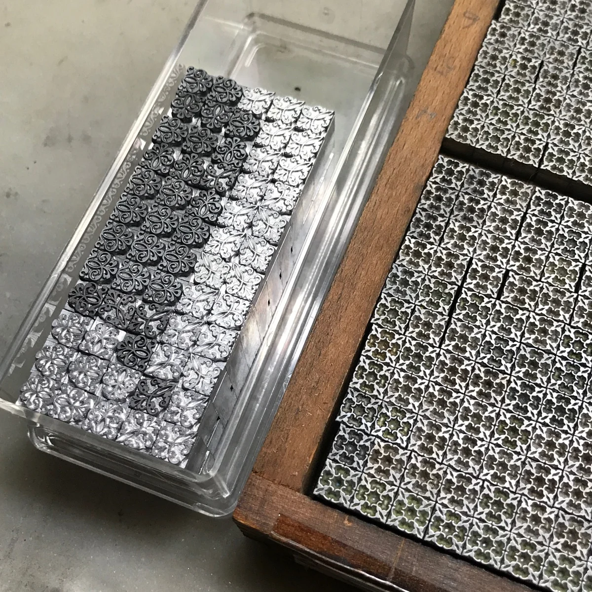
It doesn't take much to create showstopping ornamental combinations. For the following samples I've chosen ornaments cast by the Bixler Letterfoundry, Three Ton Bridge Foundry and Skyline Type Foundry, all of whom currently offer these or similar pieces.
If you don't have a lot of experience building with ornaments, I suggest working with sizes that are divisible by 6 (6pt, 12pt, 18pt, 24pt, 30pt, 36pt) as they play well with each other and require minimal spacing.
I set 4 different sections showing what you can do with both 1- and 2-color options. Most of the sorts are 18 point, with a few 24 and 30 thrown in.

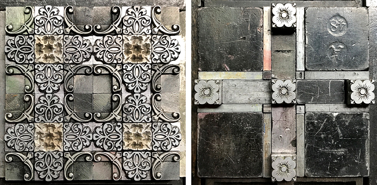
Note how corner pieces can be mixed with other ornaments and turned in different directions to create a new look or give dimension to blockier pieces.

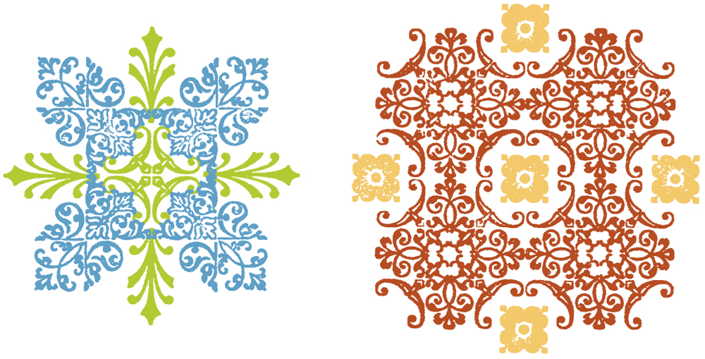
If I'm not sure how sections will look together, I make a quick carbon proof (run a sheet of carbon paper through your proof press with whatever paper you use to proof) and scan it for digital manipulation. While the quality isn't great, it allows me to see a rough sketch of what it'll look like as well as colorize it for ideas. This is the carbon proof, scanned as a 600dpi black and white tif, with contrast adjusted. The bottom sections would function well as repeating patterns in 1-color.

I use InDesign to alter the images and play around with the color. It also shows me if I got the math right on combining elements for 2-color patterns.
This screenshot shows how the grid breaks down for the layout. I could go in and remove sections to change the design (such as taking out four 18pt pieces and putting in one 36pt sort, etc.)

Easy, breezy beautiful! Here are a few shots of Hoffman's work for inspiration. Be sure to share your experiments!

