A Wild Rose

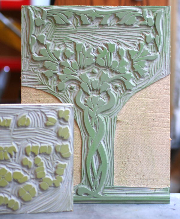
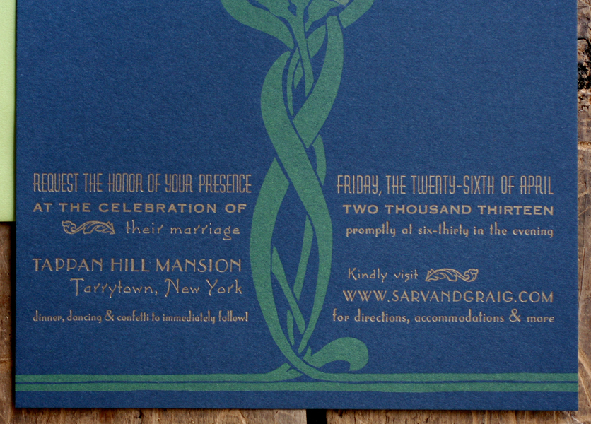
Every so often we get to pour a lot of effort into creating a single, special print, and it's usually commissioned as a gift from one spouse to another. In November I was approached for a project like this, using a poem that was read at the couple's wedding. The wife wanted something blocky, bold and straightforward with a little bit of ornamentation and ample white space. This is the result of the collaboration: kathy1
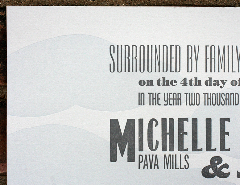
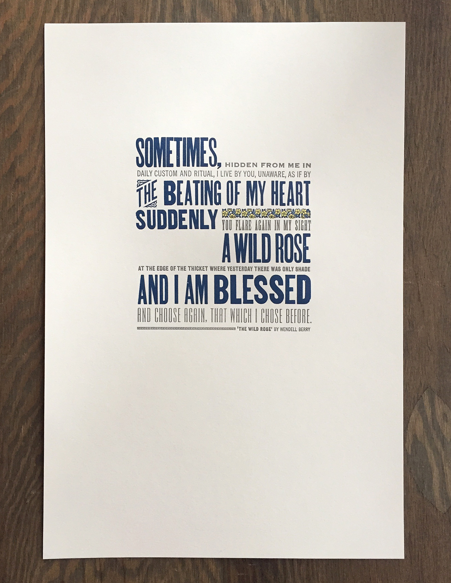
Here's a close up of the 12x18" print, done in 3 colors on soft white cotton paper. It's a nice mix of both metal and wood type that, while slightly beaten up and rustic, mostly keeps to a straightforward sans serif diet.

kathy2
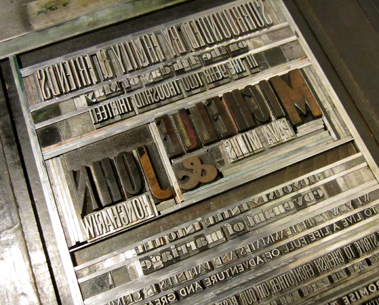
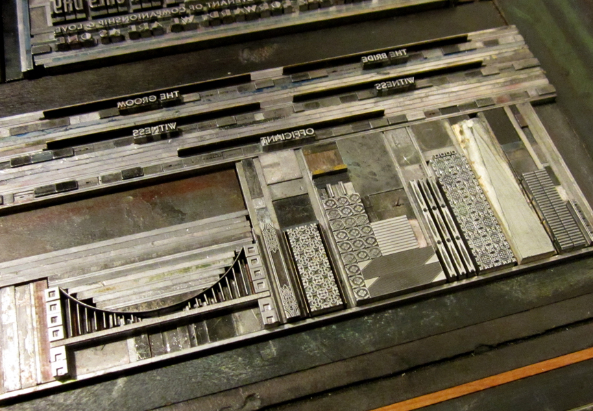
The is the type in the final lock up. We usually set up the entire print if possible then pull a proof. If everything is spaced accordingly and looks well together, then we can go in and separate individual colors and print just one at a time.

kathytypeform
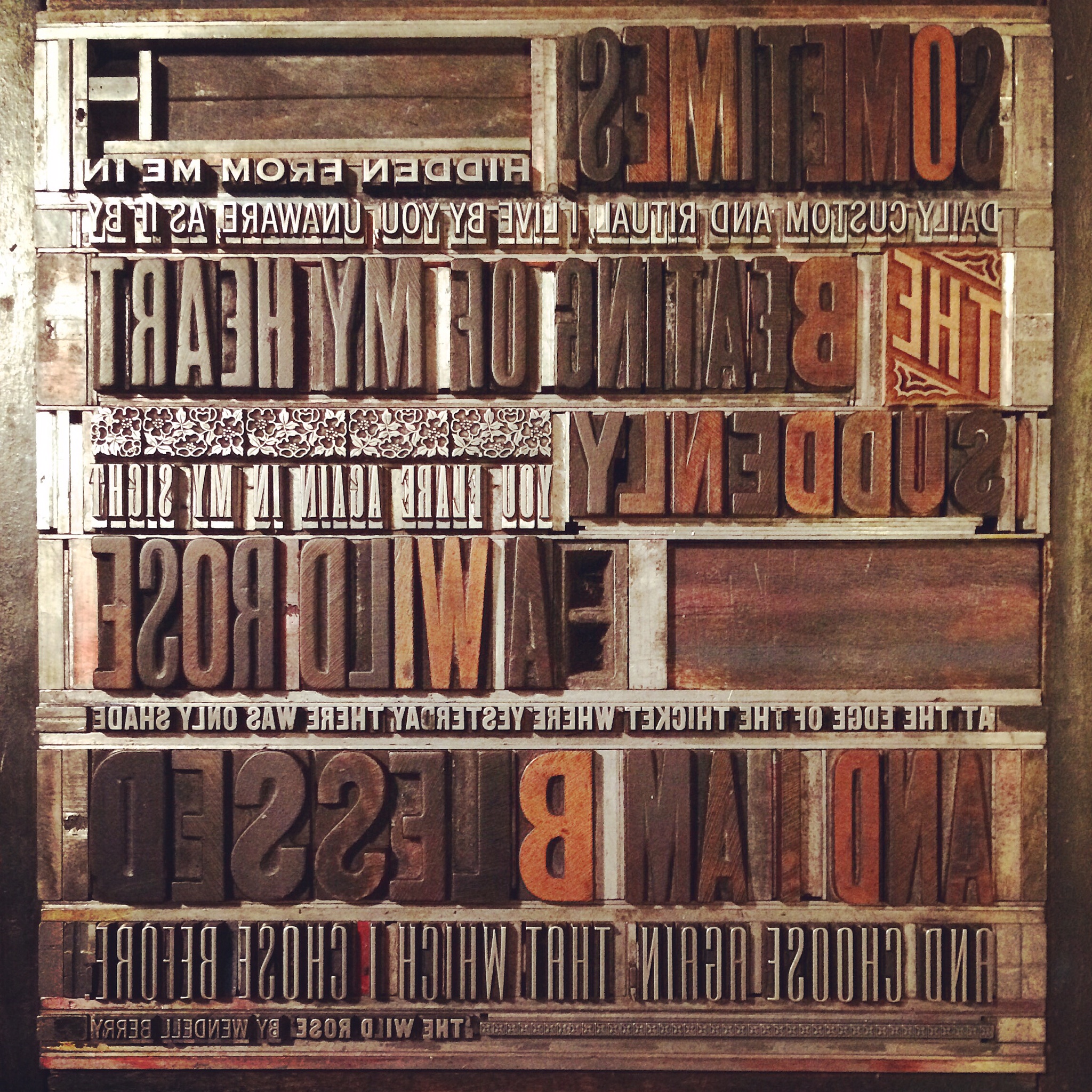
Some of the wood type for this piece is pretty rough, as noted in the uneven and speckled forms. The catchword 'THE' is new, however, and is one of Moore Wood Type's laser cut pieces.

kathy3
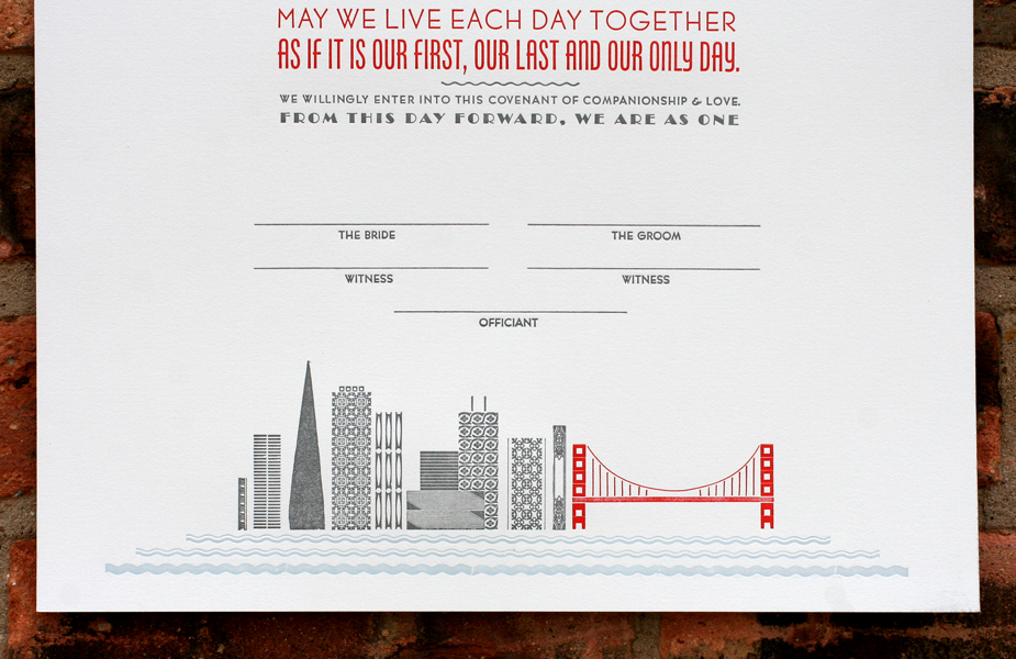
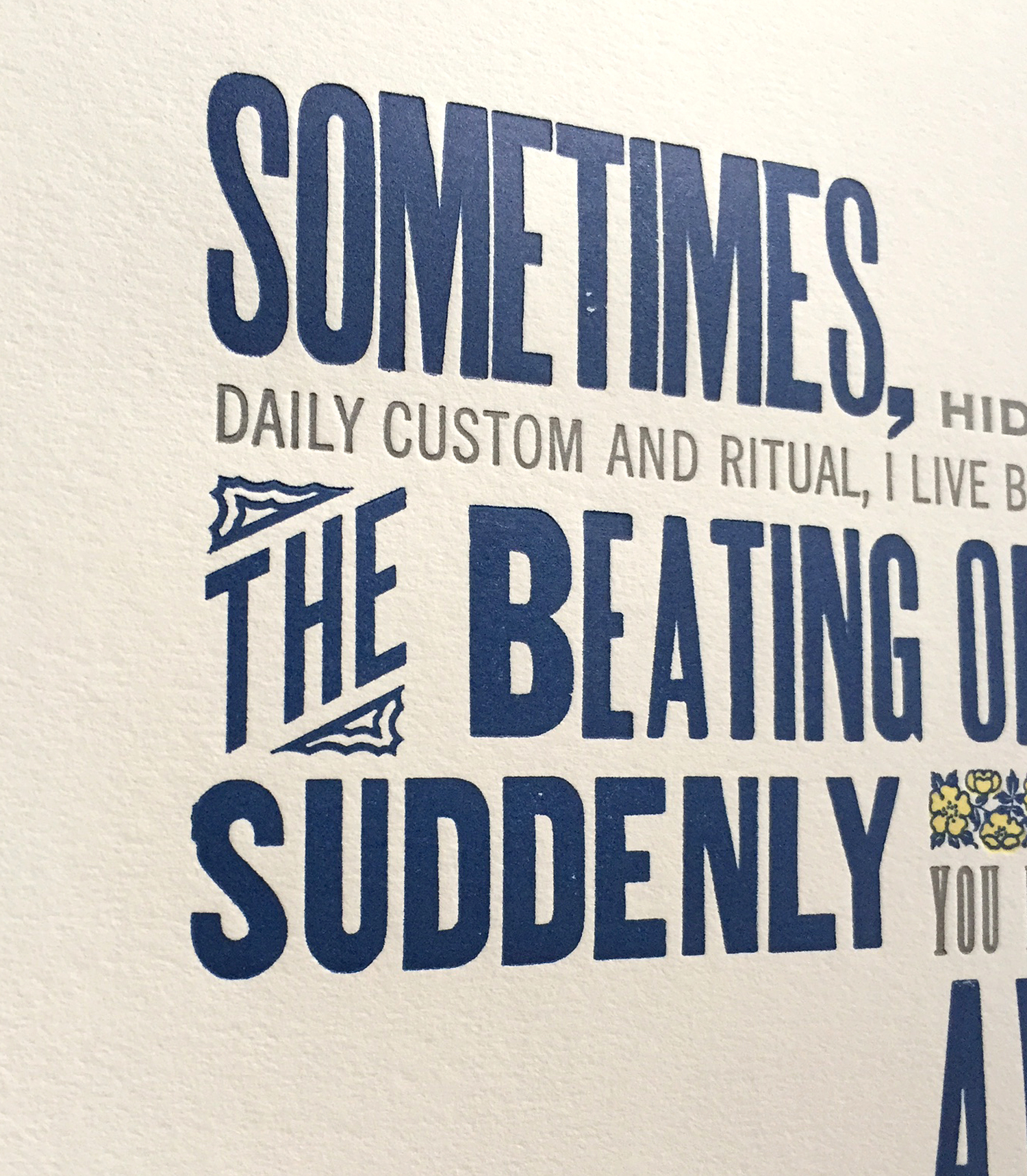
The print features two-color ornaments from the Keystone Type Foundry known as 'wild rose' ornaments. It's not every day that named ornaments tie in directly to the words being printing, but they sure did here. These are beautiful in their detail and include two different sized sorts, making it easier to fit them into any line length. I'm certain this charming print was a touching Christmas gift.

kathyornament

It's Beginning to Look a lot Like...

...Holiday card season! Sure, it's not even Halloween, but our presses are running nonstop and we want to make sure you've got a chance to place custom orders in time for the holidays. holiday2013bOrders start at quantities of 25 and run as little as $2 a card for 100+ cards. Letterpress personalization is also available for an additional flat $50 up to 200 cards. Check out our designs to choose from, and contact us (below) for more specific details. We're always happy to reinvent the wheel, so if you'd like a completely new design catered to you, we can do it. Orders placed by November 4th ship before Thanksgiving. Just need a handful of cards without any personalization? You can shop our Holiday selection here.

[contact-form subject='I need holiday cards!'][contact-field label='Name' type='name' required='1'/][contact-field label='Email' type='email' required='1'/][contact-field label='Comment' type='textarea' required='1'/][/contact-form]

Partners in Crime

This year has seen many specialty prints in the studio, including ketubahs, or Jewish marriage certificates, and this was one of our favorites. Michelle and John wanted something that was very typographic for their ketubah, and if it could reference their location and love of the ocean, all the better. Here's the final piece: michellejohn1

The very pale clouds were printed with a hand carved linoleum cut and add just a soft touch of sky behind the text.

michellejohn3

Tlino2

Typographic enough?

michellejohn5

The form for this piece was particularly impressive. Their names and the ampersand are wood, while the rest is metal, with a hint of deco to it. Force justified type presents a few challenges, given that the spacing has to be done by hand. There are hundreds of little brass and copper thin spaces in between most of the letters in this form.

Tmichellejohn1

Tmichellejohn3

Cityscapes are always fun, and San Francisco is no exception. We've had a little experience with the Golden Gate Bridge, so it was a bit easier this time around. The city and text are printed in steel gray, with a red that mimics the bridge alongside the pale blue sky and ocean.

michellejohn4

Tmichellejohn2

Congrats to Michelle and John! Enjoy your new life together in your beautiful city.

Going to Tarrytown

Like Marissa and Ned, Sarv and Graig were keen on wedding invitations that would resemble mini posters and they had great inspiration in the form of this vintage book cover: ramona

Given that letterpress printing doesn't have the opaque vibrancy of screen printing, we ran a few tests to see if we could successfully achieve two light colors on dark blue paper and were happy with the result; the colors were muted in a faded, old fashioned way. We decided on creating a piece that was 7x10", so that it would fold to 5x7" and mail in a standard A7 envelope. The image worked perfectly as a two-color linoleum cut after a little adjustment to the overall size and placement:

Tsarv6

The type is set in a mix of deco-meets-nouveau styles to pull the overall design into a more cohesive and streamlined form. It is printed in gold to pop out from the navy paper. The typesetting was very particular to achieve a subtle curve along the artwork.

sarvgraig6

sarvgraig5

Tsarv4

I loved having an opportunity to use our DeVinne type for their names; it's a lovely and quirky typeface from the turn of the century that sadly doesn't get enough play in the studio.

Tsarv3

sarvgraig3

The invitation folds in half, and on the front panel (what you see when you pull it out of the envelope) is a snippet of the overall artwork with their initials rendered in our mortised initial caps and an ampersand from the 19th century typeface, Dakota.

sarvgraig8

Tsarv1

The envelopes are sour apple green, and the reply cards are pale yellow to give a little pop to the color palette. We continued the abridged image on the envelopes in gold (the return address is on the back flap) and carried through the multiple typefaces on the reply.

sarvgraig4

sarvgraig7

Here's a shot of the final suite. I intentionally did not score a few so that Sarv and Graig would have some unfolded ones as keepsakes or to frame.

sarvgraig1