
On June 28th, 2016, I sped through the suburbs from the hospice where my husband would soon meet death. I’ve no memory of the exact location, only that it was in the vast all-cars-no-sidewalks suburban terrain I can’t stomach. Politely manicured lawns and strip malls on both sides, with no signs of live humans. I sobbed because my city-loving husband had to die there.
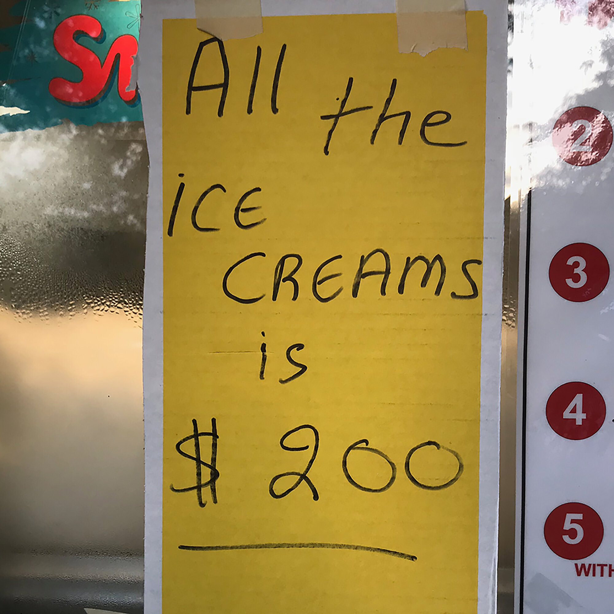
Maneuvering back into Chicago, I drove down Kedzie Avenue and immediately stopped at an intersection to allow a woman to cross while pulling a child’s wagon. It had a precariously balanced dresser sitting on top, with its normal occupant in the street behind it, pushing energetically as his mother heaved it through the crosswalk. I chuckled at this scene from my neighborhood. I was back where my environment glowed and all the ice creams is $200.
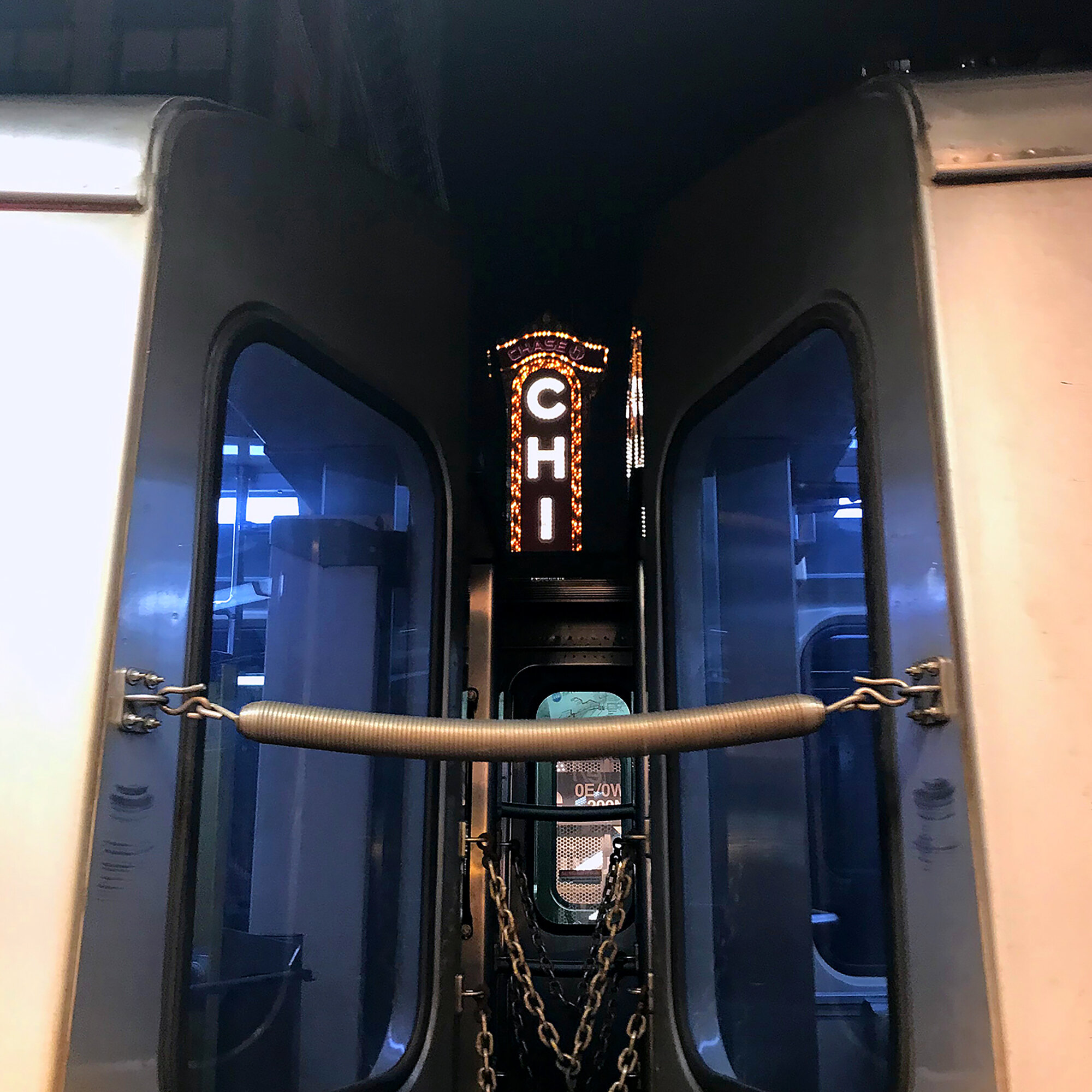
In the midst of end-of-life discussions involving religion to which I did not subscribe, I realized the city fulfilled that role for me. Pacing the streets, seeing my people at the shops and carrying on in an immediate, embracing environment provided the solace that many, I suppose, get from a religious life. Circumstance told me a page must be flipped to a new life chapter I wasn’t ready to read. Could I look to my first 20 years in Chicago, examine their foundational structure, then create a memoir in print to both honor the past and provide a scaffold for the future? The work of my hands is and always has been, free therapy.
I applied for and was granted the Arthur & Lila Weinberg Fellowship at the Newberry Library, for research to develop my idea of what this project could be. The steady rhythm of searching titles, laying out one’s pencils and notes, receiving beautiful objects on little cloth futons, then getting lost for hours in what is, for the bibliophile, consecrated ground, was both a balm and a directive.
I examined the definition of a type specimen book to explore if it could function as a memoir as opposed to its more traditional role either documenting type for sale or satisfying the vanity of a printer. Because I am not a foundry or reseller of type, and because my collection is anything but stagnant, a specimen could be freed to take on the life I choose to give it. As Russell Maret recently wrote, “In the absence of new types, then, a specimen book that fails to present old types in new ways brings its own existence into question. Why bother?” I couldn’t agree more.
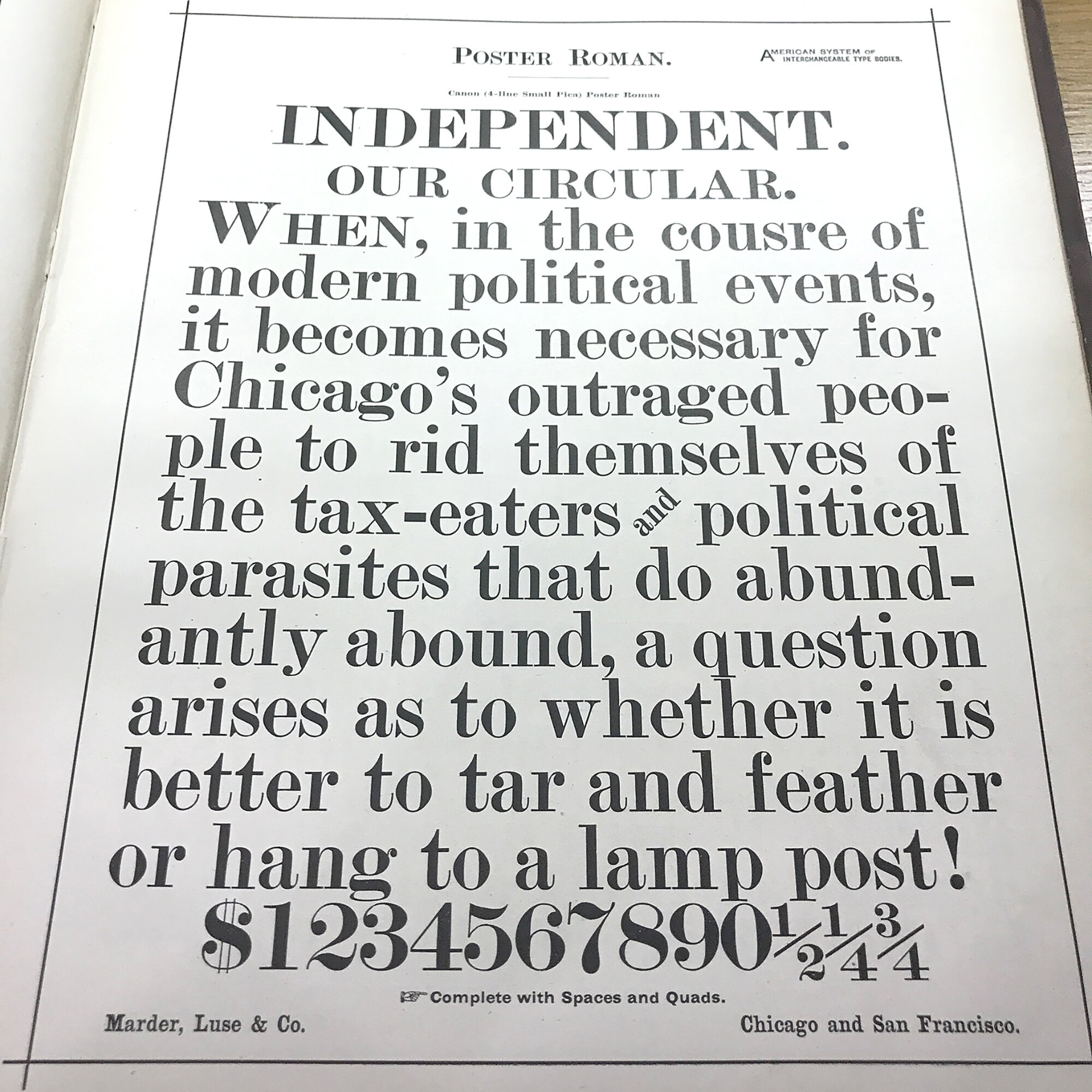
While perusing 100 year old specimens in the Library, I particularly enjoyed finding typos and mistakes as a reminder that a human hand built the form.
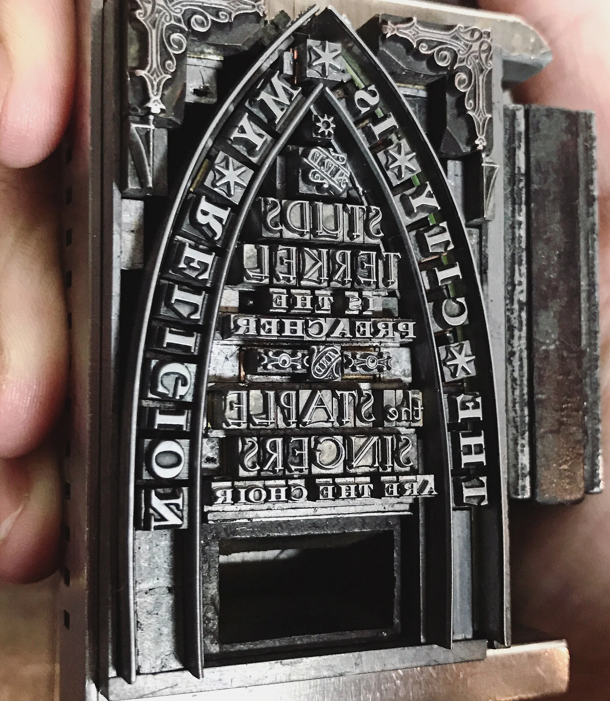
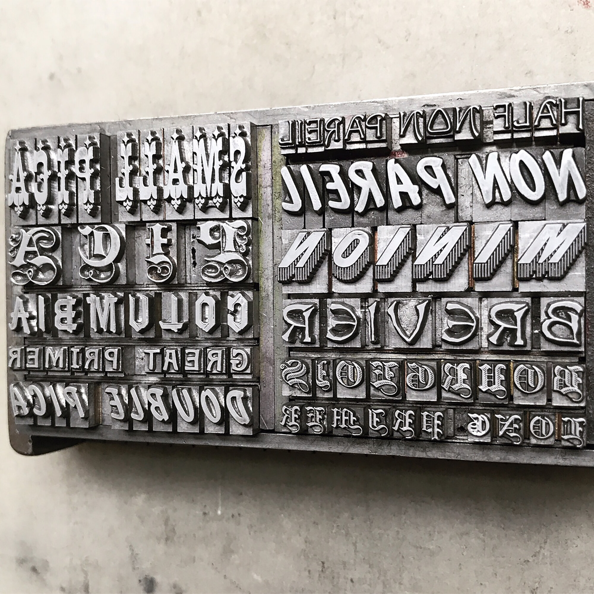
Of particular interest were these word ornaments from the Marder, Luse & Co. books, a Chicago-based foundry prior to 1900. This is because I own many of these sets but wasn’t sure how they were designed to work together.
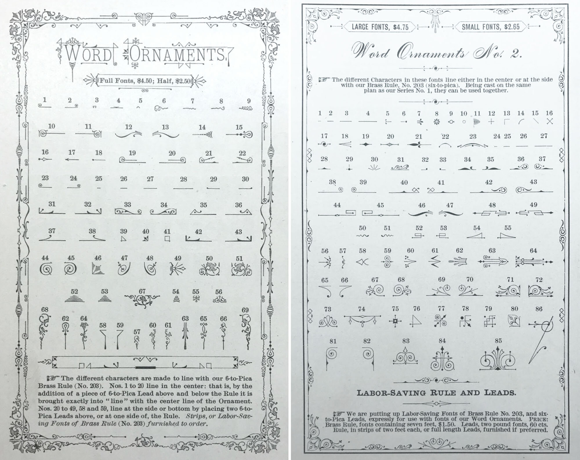
Studying these helped flesh out what would be the first of 10 themed prints, this one focused on the definition of perseverance.

The text for the print was pulled from diverse definitions of the word, from the dictionary itself to Curtis Mayfield and Sesame Street. The largest within it is my own; it is a nod to early morning sightings of bread trucks all over the city. This singular vision reminds me life is going on and that whatever happens that day, I can always get a hot dog at the end of it.

All of the typefaces used for this print are generally hated by both type enthusiasts and casual armchair designers. Let’s hear it for Murray Hill and Park Avenue! How ya doing, Brush Script and Typewriter? Never enough of you, Cheltenham, old friend. Groan all you want, few typefaces have persevered liked these champs.
With this print, I established the three design tenets each subsequent print would follow:
Typefaces grouped by theme of my choosing
Historical component connecting print to specimen books, printing, etc.
Personal story, reflection, connection to the city of Chicago


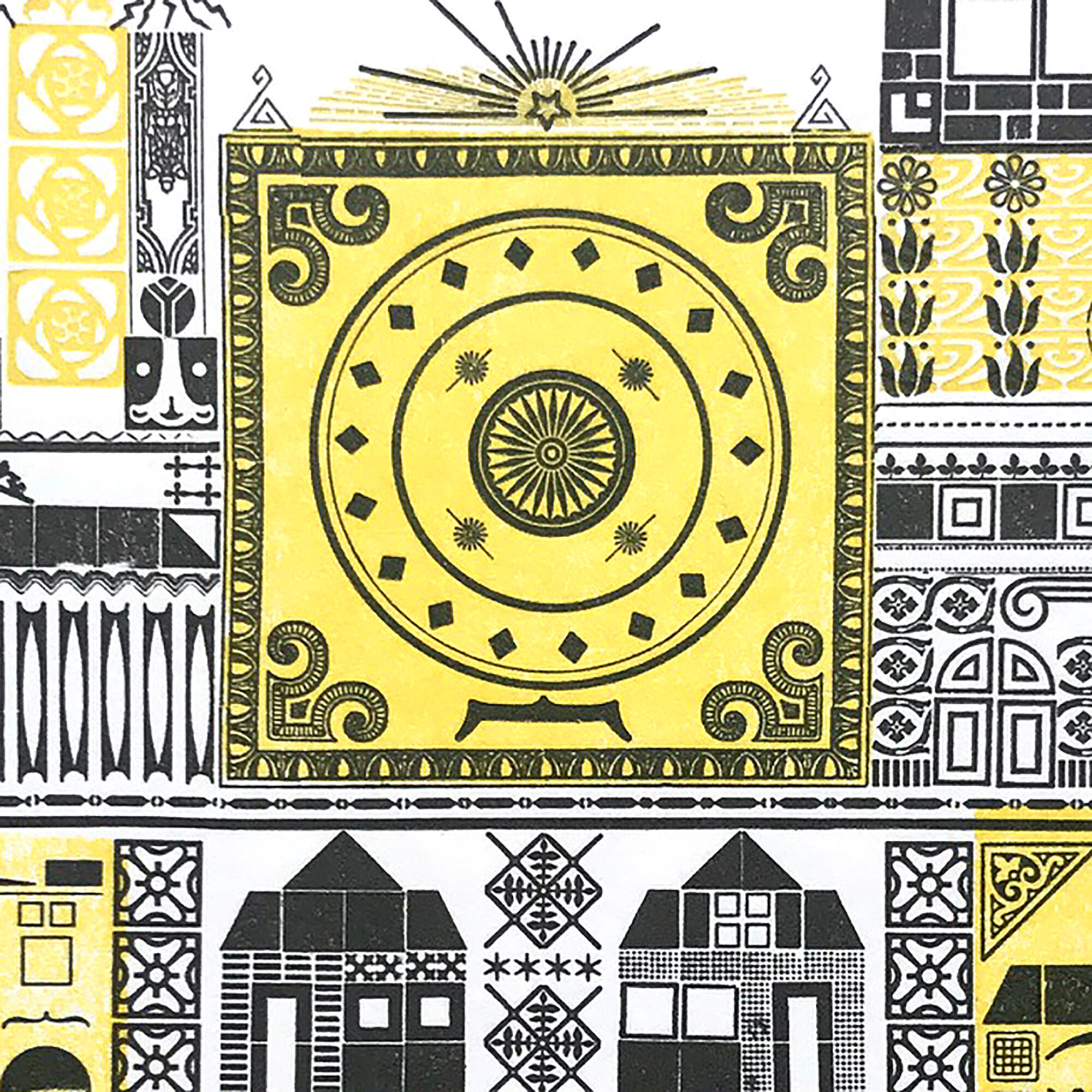
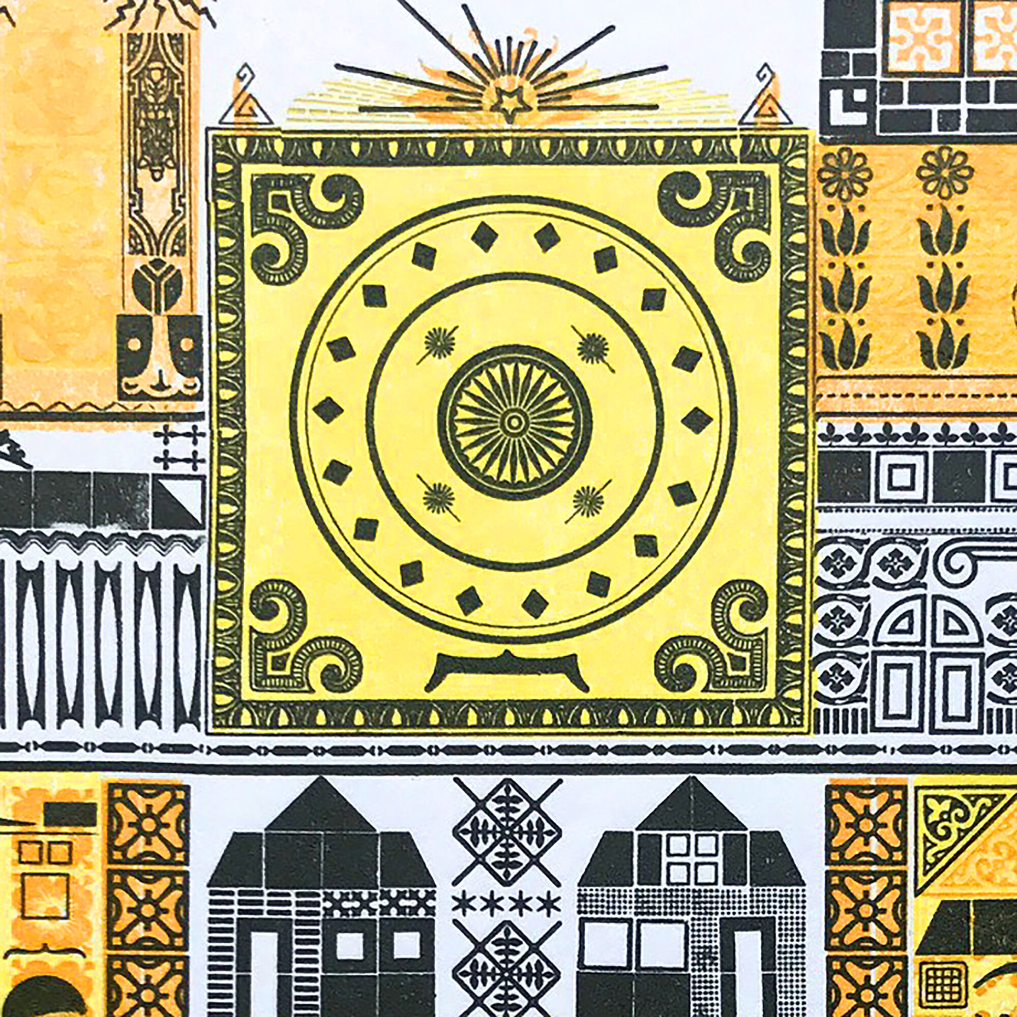
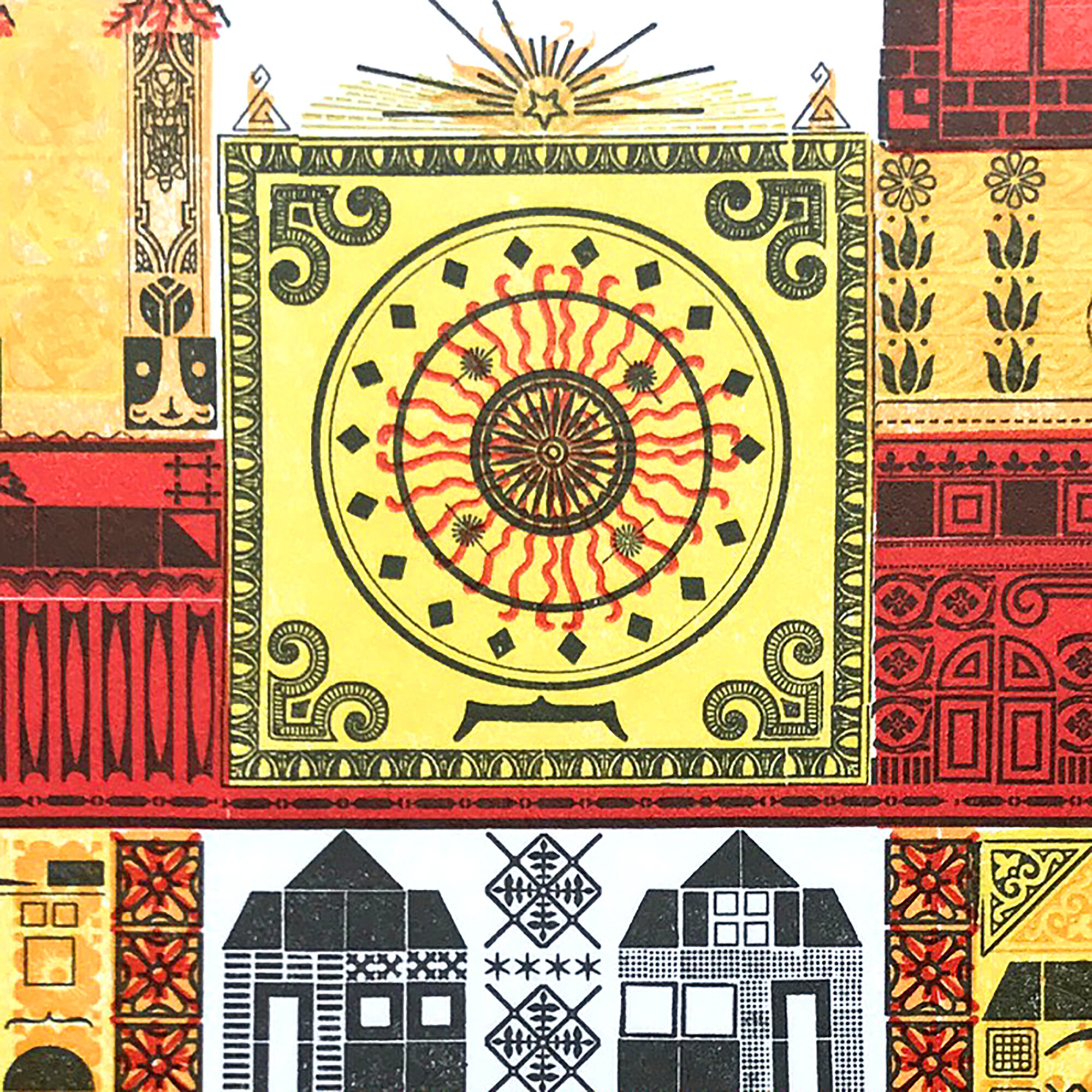
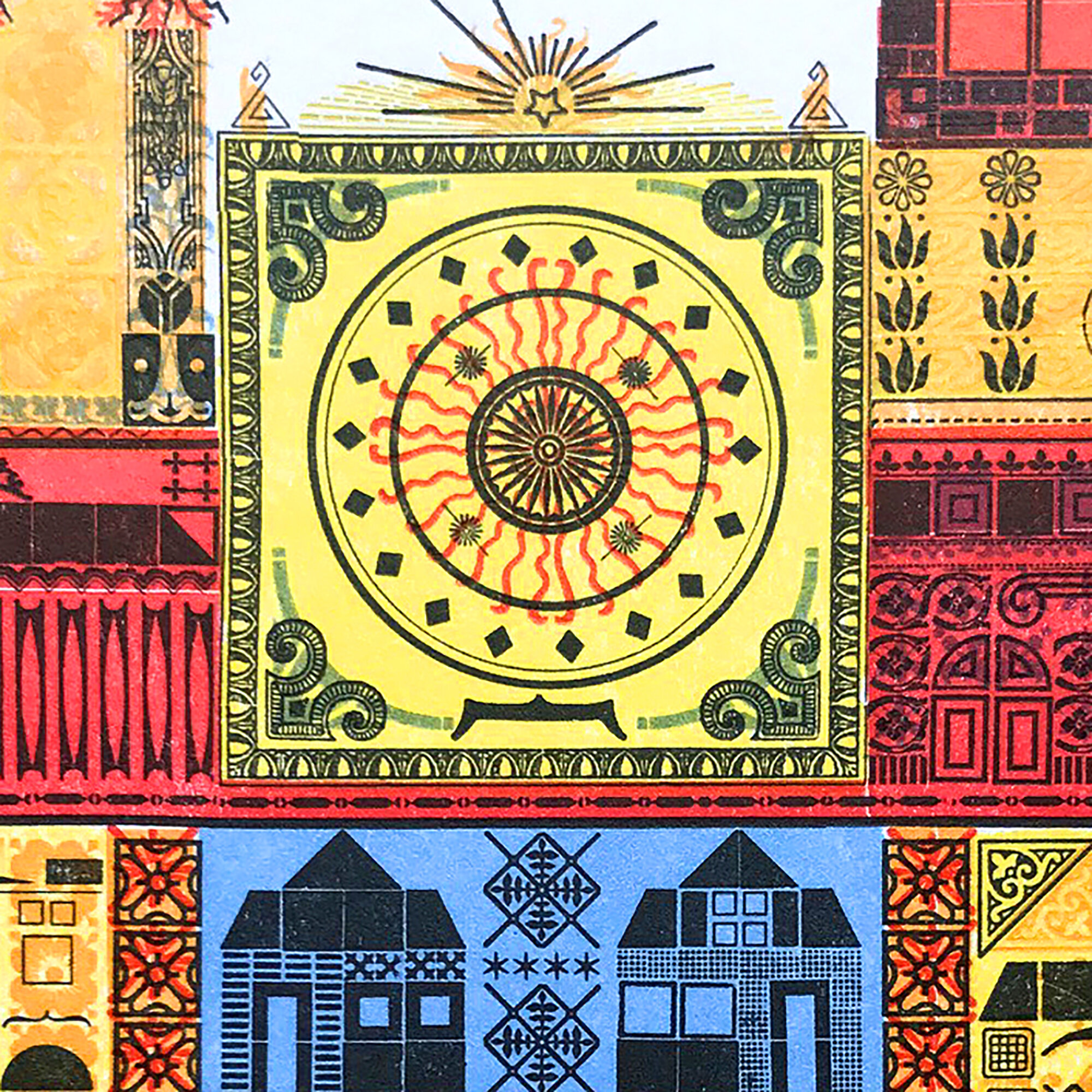
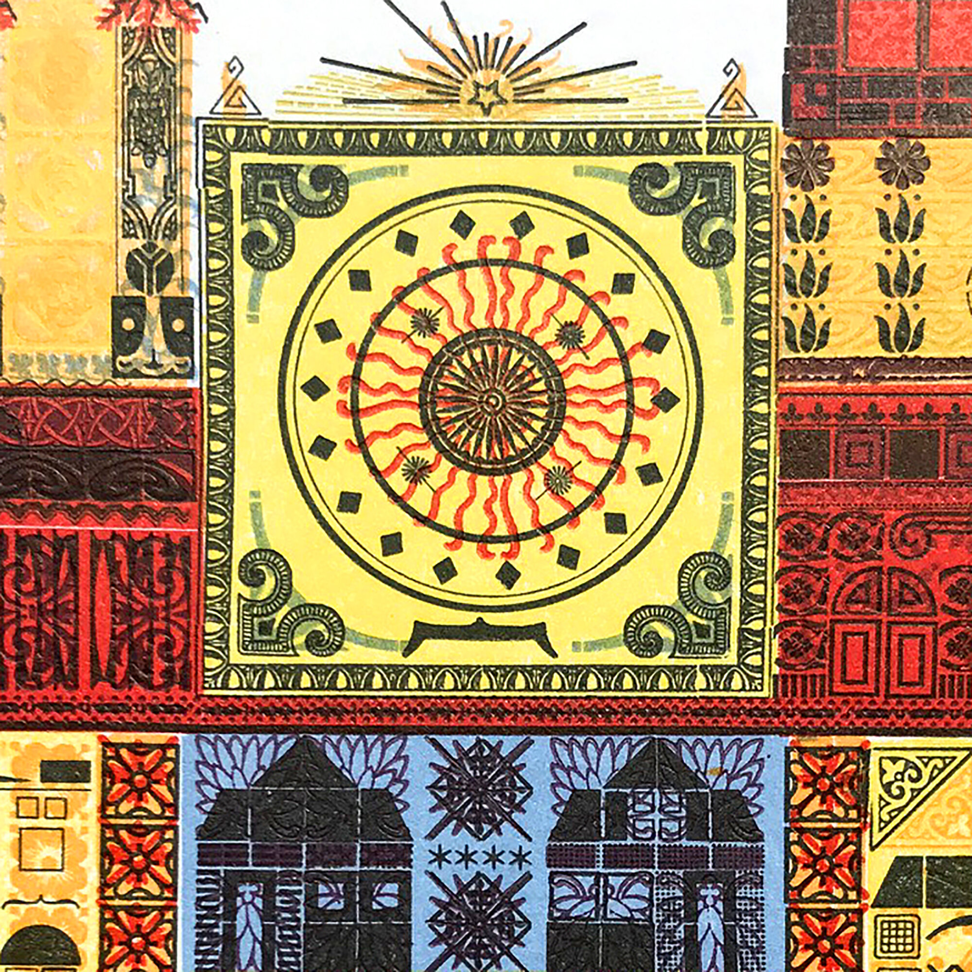
The second print would ultimately become the cornerstone of the project as I compiled the tools to build a church. But this would be a monument to the places that shaped me into a Chicagoan and set me on a path to collecting a ridiculous amount of metal ornaments, many of which were designed, cast and used in Chicago for decades prior to my tenure as owner.

While at the Newberry I studied a book on Chicago-based ecclesiastical architecture for stained glass palettes. Below is the direction I went in for my church, with solid and definitive black lines functioning as the key plate. The vibrancy of images from a French type specimen also resonated as color existed in this use of metal type in a way that it does not in early Chicago type specimens.


The final form is comprised of individual layers representing buildings, homes and locales in the city. While setting this I developed the second guiding principle of this project. For each of the 10 prints, or ‘elevations,’ there would also be 10 ‘construction drawings.’ Following the memoir theme of building a life that celebrates both the public and ‘pretty’ side alongside the mundane, this would allow me to present supporting information in the form of drafting, a skill I learned in the pre-CAD days. This part of the project, which will offer all the minutiae of my research and form development, will follow the completion of the prints.

After the black was printed, five more colors were added to build out a range of visual texture in the print.

I printed a simple starter prospectus in order to share it with others and forward my internal dialog about what the project would be. There’s a shocking lack of organization going into it; I do not have all of the specs hammered out, don’t know exactly how it will be presented, not quite sure what each print will look like. This is scary for someone whose shop is organized with a precision that satisfies preservation librarians.
That said, when a print begins to take shape it is not unlike giving birth; I struggle to breathe, scream for an epidural, go to war with all of the little metal soldiers and when it is finished, I am exhausted, exhilarated and sad. I did not hit my initial deadline because of the emotional space needed between producing each print.

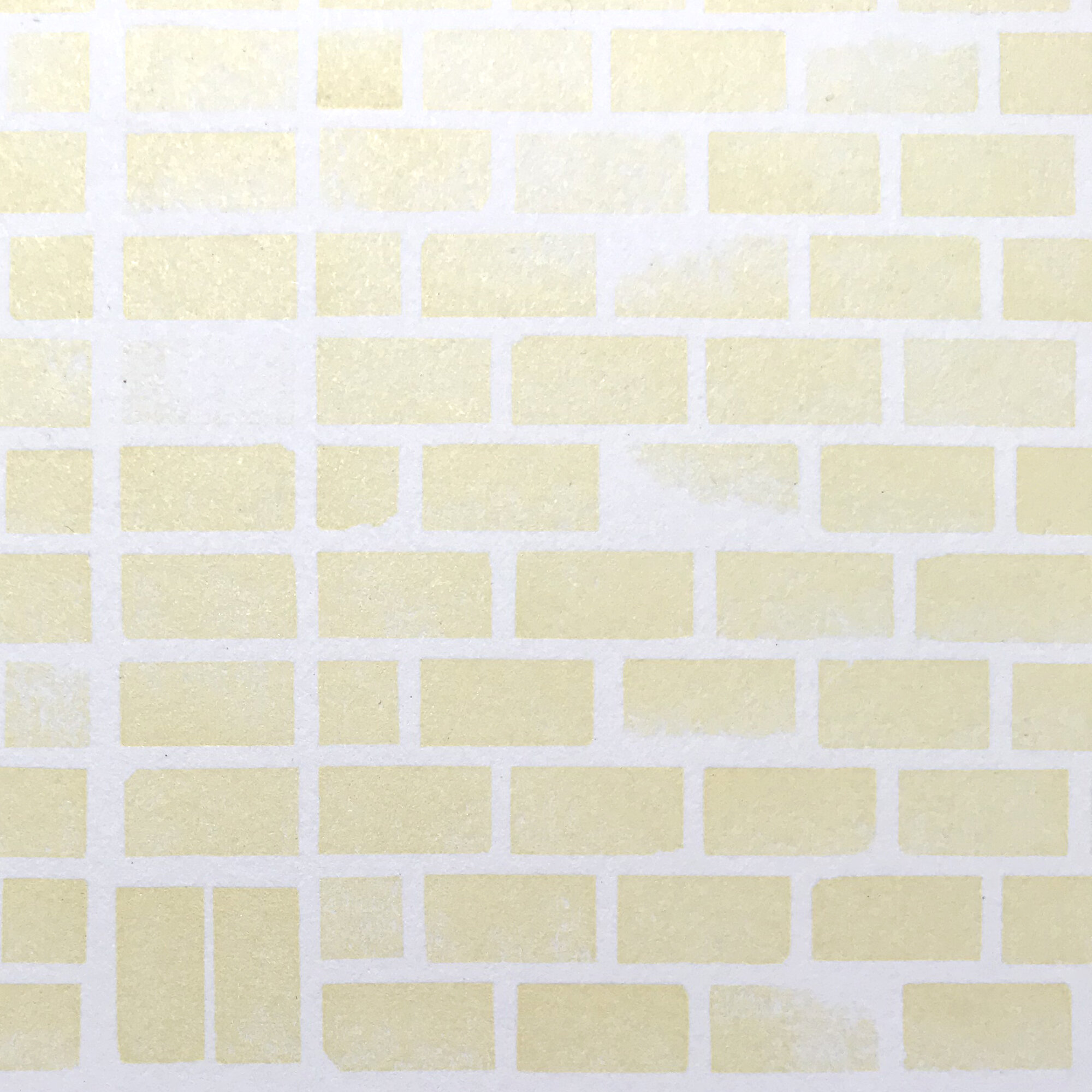
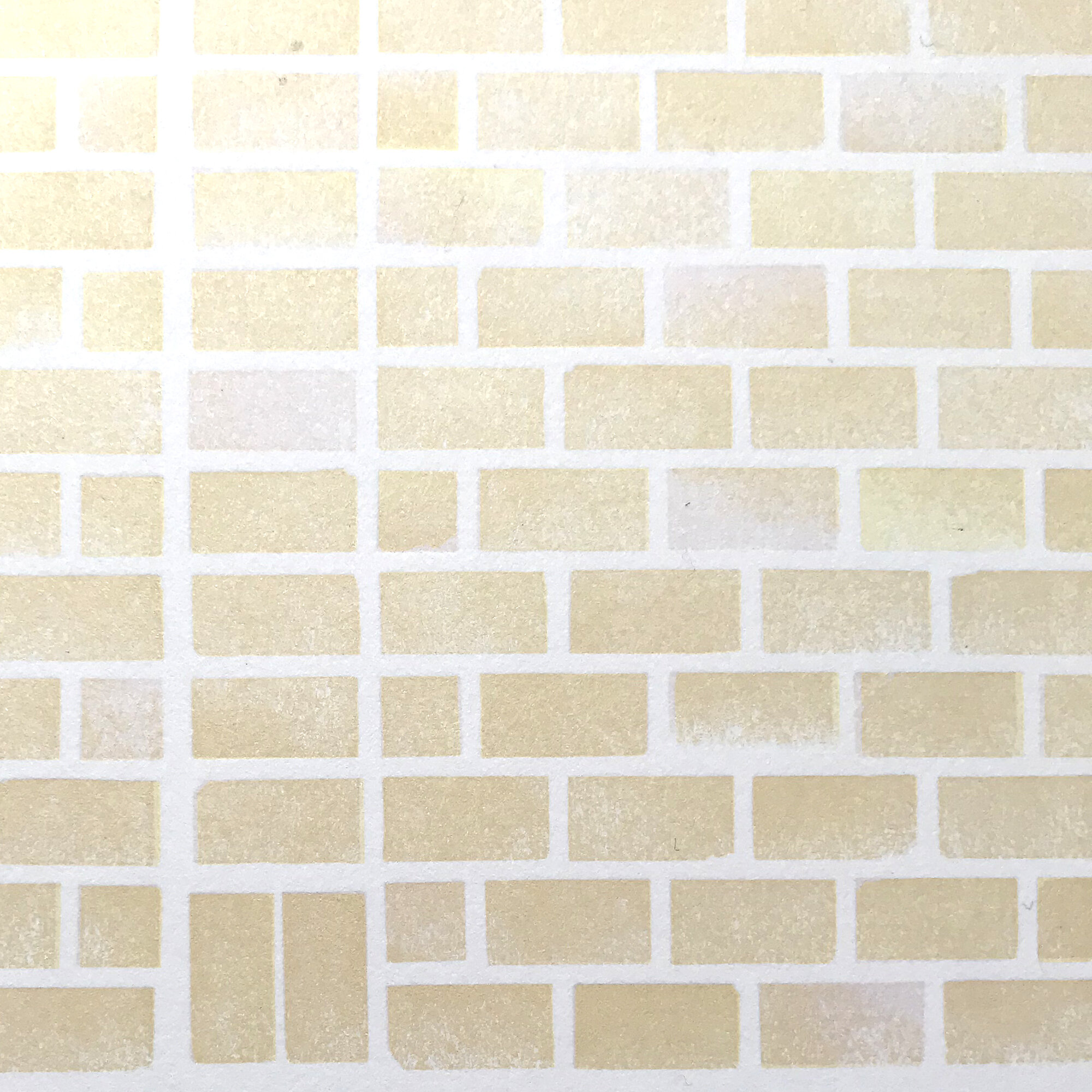
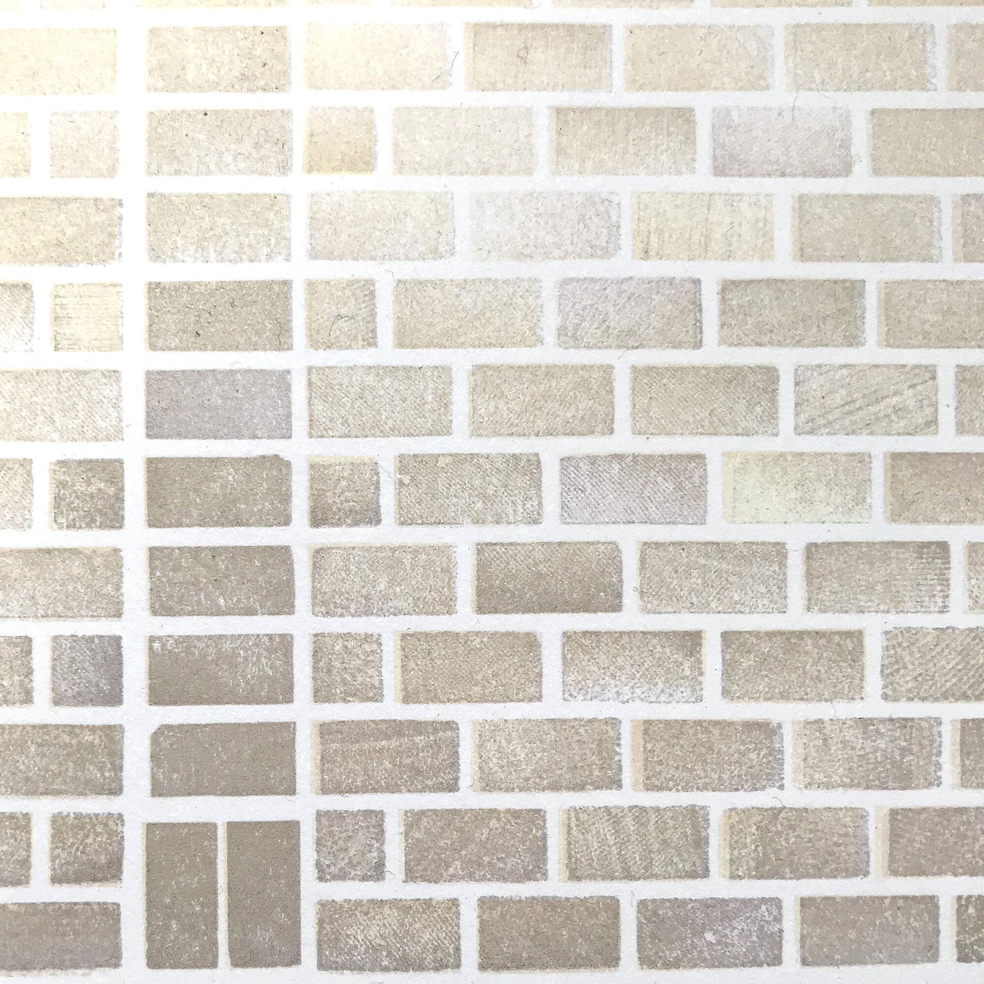
Brick is the foundation of Chicago. In the 1920’s, brick manufacturers were turning our clay into 700 million ‘Chicago Common’ bricks a year. This continued into the 70’s when EPA regulations would drastically alter manufacturing capabilities and the demand decreased. But the ubiquitous brick is everywhere, on the backsides of buildings and as a major component of construction you can’t see. This includes the below exposed bricks at the Newberry during the renovation of the Library’s first floor. These ones were obviously not meant to be seen.

Years ago, there was a city initiative with accompanying signage that said ‘Rebuilding Chicago’ and it was posted at every construction site. For some reason, and I could conjecture over a Chicago Handshake with fellow citizens, these were changed to ‘Building a New Chicago.’ But prior to that change, the original campaign left an imprint on my thought pattern for a print.

I built a brick wall of type high wood scraps to serve as the backdrop for a collection of typefaces that I grouped because they best represented the kinds of handstyles I see scrawled in the alley.

Chicago Commons fired to a range of yellows and pinks that made them unique in the world. To achieve this, I printed my wood bricks in three passes, altering which side of the wood printed and how they were inked.
I kept ‘Rebuilding Chicago’ after the signs disappeared because every time we saw one, Jo would exclaim ‘But I liked it the way it was!’ The irony of this is that my child hit on something key to construction in the city; it is largely focused on the areas of privilege that need it the least. Like our neighborhood.

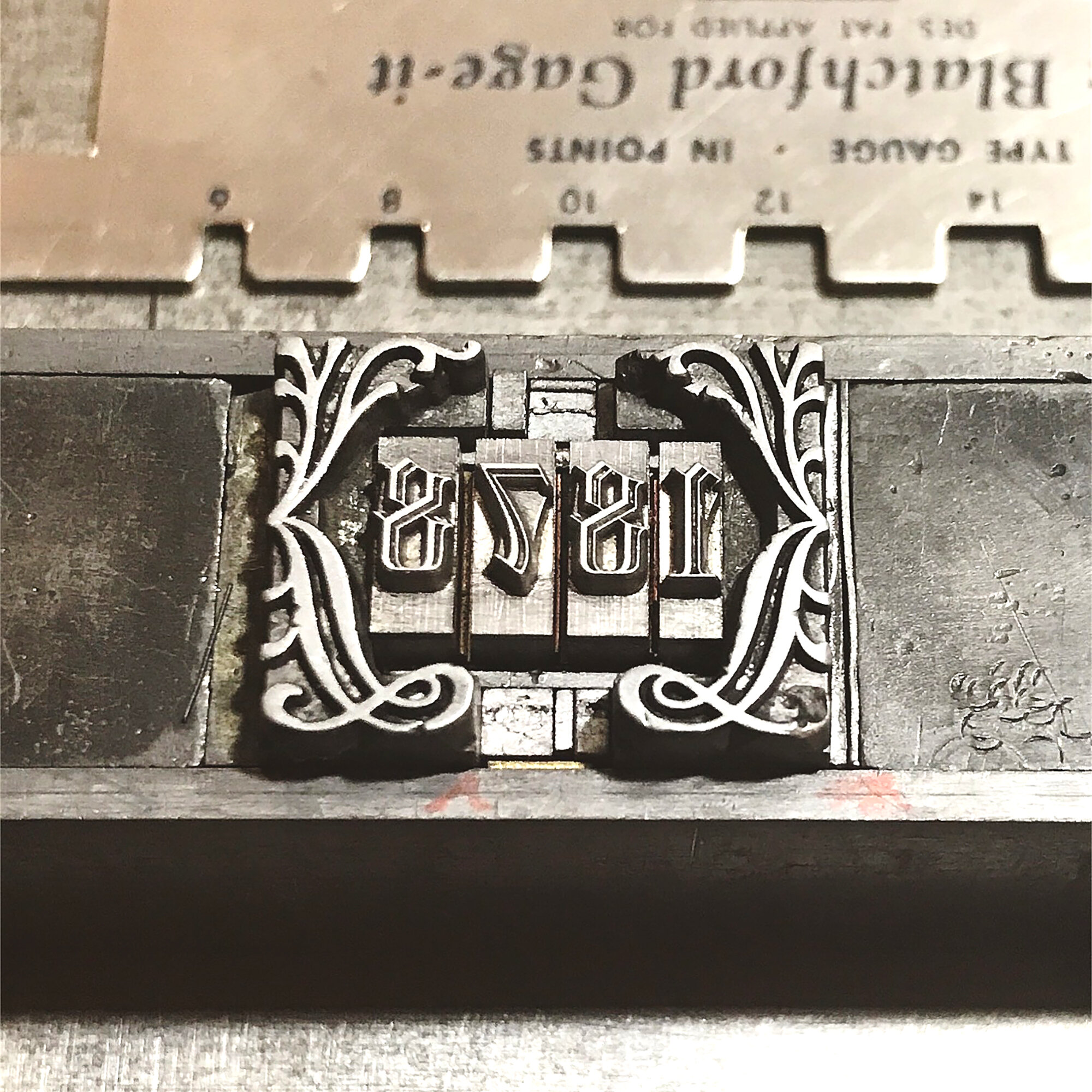
The historical component of this print is the inclusion of clues about the development of the type measuring point system we use today. Chicago’s Marder, Luse & Co. took the lead role in this standardization.

The year mimics the way a cornerstone is engraved with the founding date of a building. And the names previously used to reference type sizes are also included, as they can appear as nonsensical to the uninitiated as graffiti writers’ tags.

As I dive into the final four prints of the series this fall and polish my thoughts and scribbles on the three that are the subject of my next post, I am cautiously optimistic about the direction of the project. The varsity team of printers, binders, thinkers, librarians, children and weirdos I have assembled for support have a shocking capacity for confidence in me to present something that feels representative of my life thus far.
More photos can be seen here and for all the ‘epidural!’ moments, follow me on instagram.