Within most letterpress shops you will find both small and large collections of what's affectionately coined 'job shop gothic'. These basic sans serif faces pull a lot of weight and often see quite a bit more action than the most decorative, fanciful wood type faces because of their versatility. At Starshaped, we have a ton of great examples of gothic type, ranging from the worn but well made Hamilton variety, to the less-than-perfect mid-century styles made for basic sign presses. I've been thinking for a while about how to dress up these gothics, and have had some success with past greeting cards. Looking at the run of condensed 15-line type in the studio, I started sketching ideas for adding a layer of ornamentation or texture. Here are the four final cards.
 My first step was to proof the actual type that would be the base layer. These are basic carbon paper proofs of the type, with notes about leading for future reference and reprints. Down and dirty, carbon proofs are an easy way to get a glimpse into how the type looks without spending the time of inking up the press.
 After that, I laid a thin sheet of marker paper on top of the proofs to start sketching ideas on how to add something to the type. I looked at a lot of Deco-era type treatments for inspiration.
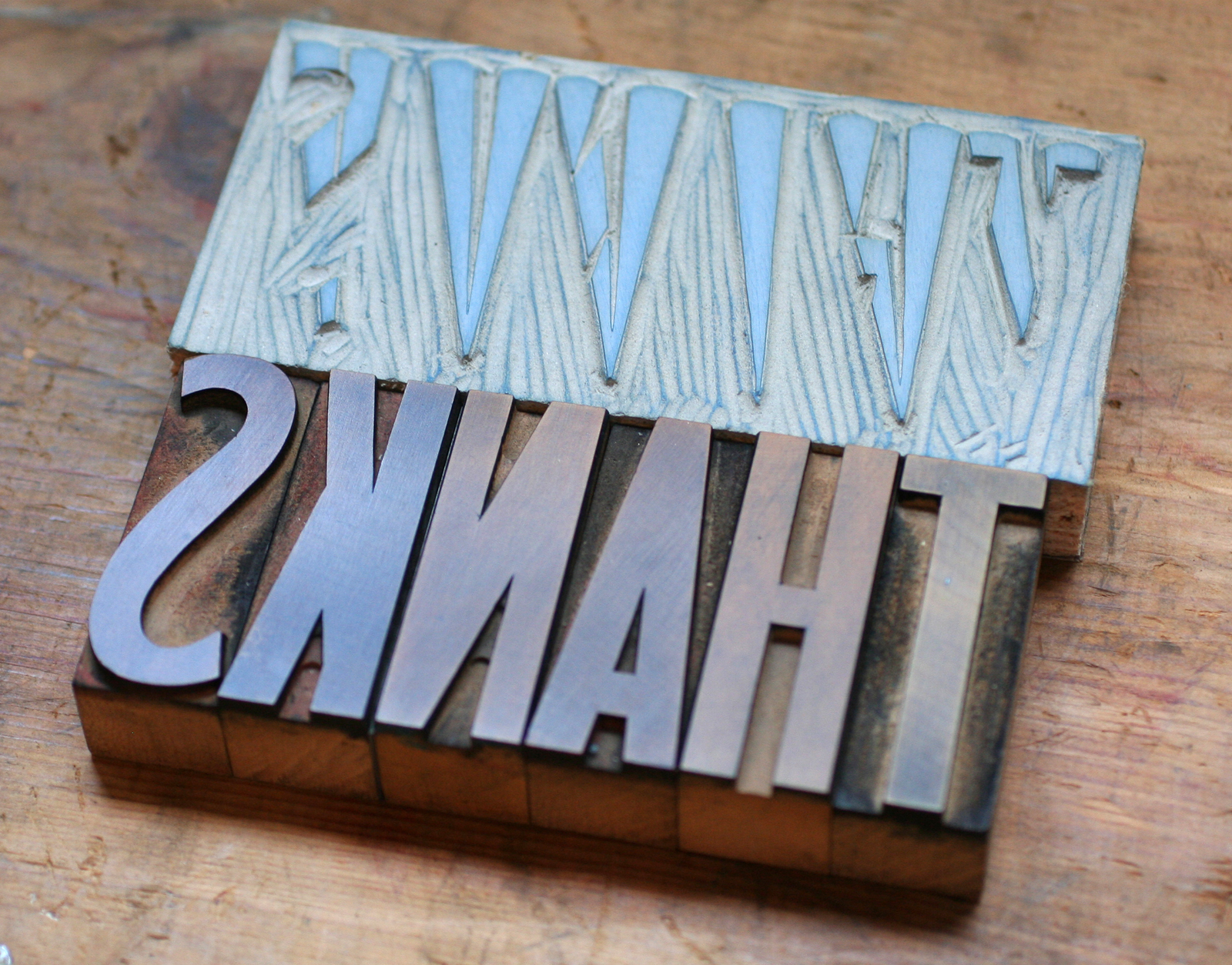
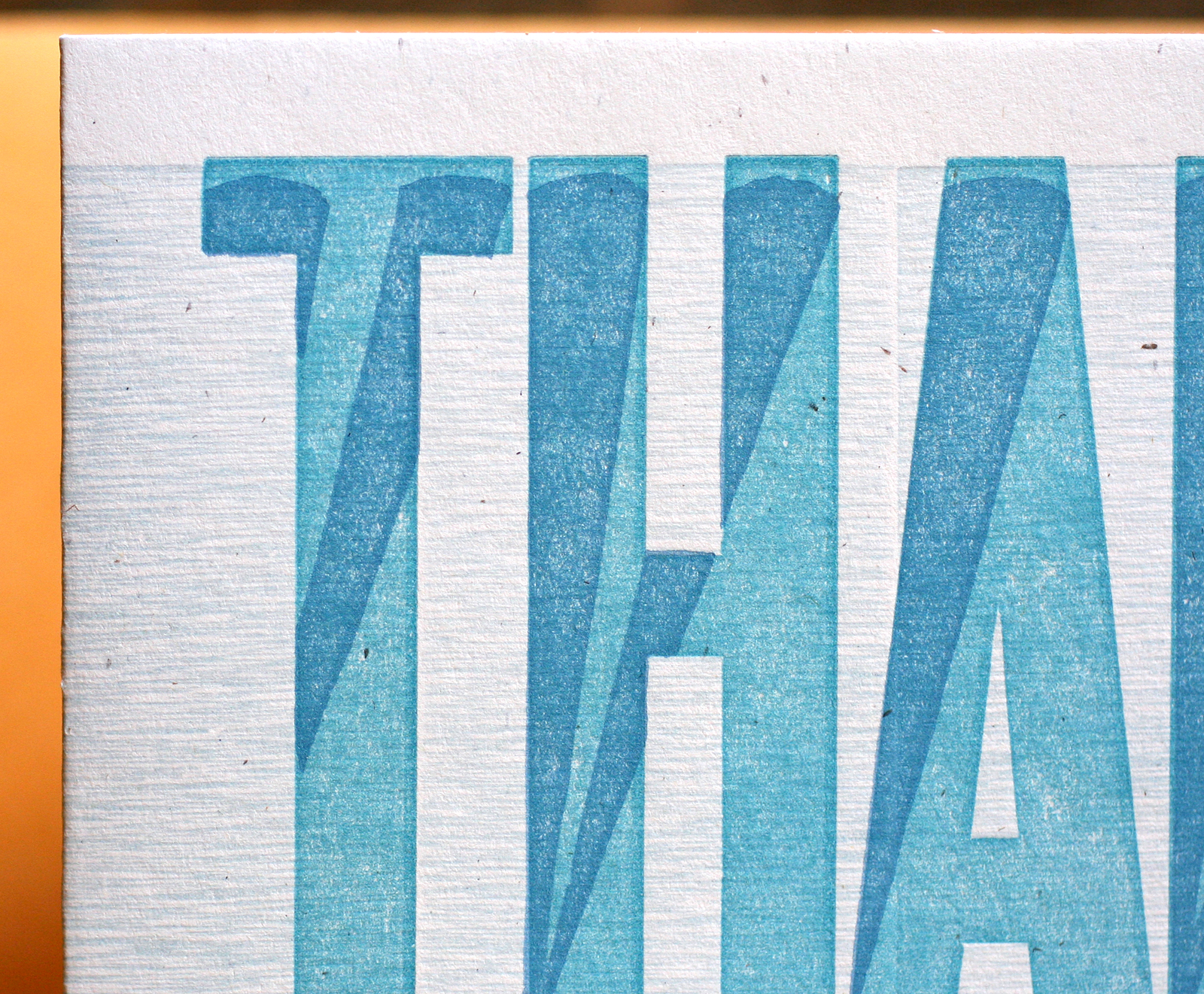
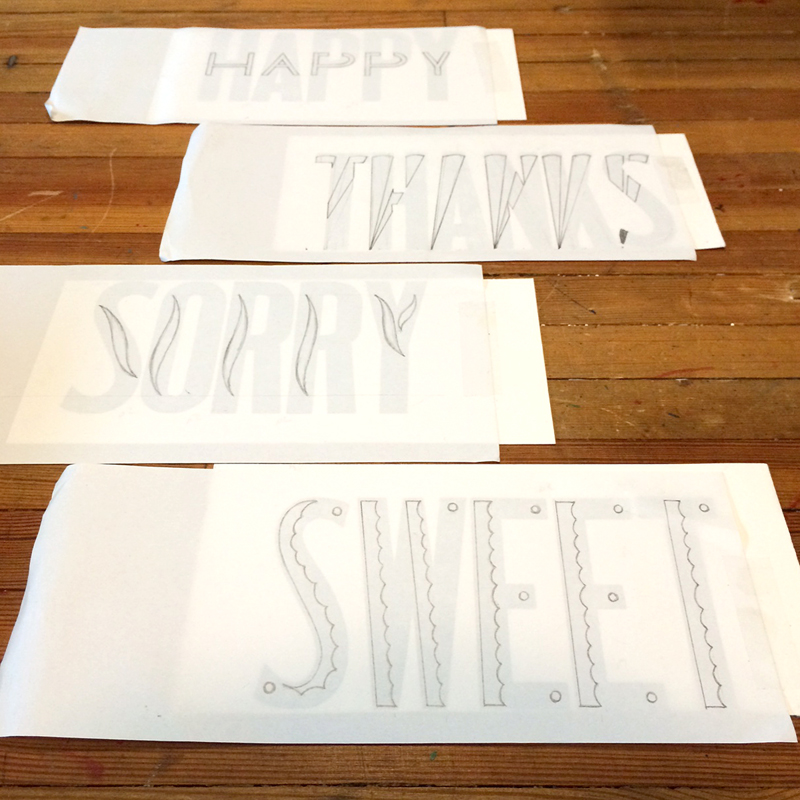 For 'Thanks', I played off of little spotlights in the bottom corner of each letter and how they would look projected upwards.
 Each image was then flipped and carved in linoleum. I like to work this way instead of having a printing plate made, as it hones my carving skills and gives the final image an imperfect look. This is perfect for these cards, as I wanted all of the layers to have texture and quirkiness.
 As you can see here, I also printed a background texture, which was simply the back side of 15-line wood type.
 Seemed like 'Sweet' should have a candy shop feel, hence the scalloped detail and bubble gum pink.


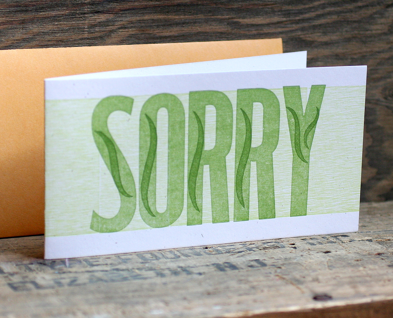
 'Sorry' was a simpler affair, and I opted for a subtle wave in each letter.

 'Happy' has twice as much happy, as I worked a squat gothic version into the larger one. I really love the orange on this one.

 All of the cards are now available in our etsy shop; each comes with a coin envelope for a slightly vintage feel. If you need a little color, look no further than our jazzed up gothic workhorses.