Years ago we distilled our wedding invitation offerings into four distinct collections. The purpose of this was to streamline our rather time consuming process in a way that left room for customization but would speed up the design and typesetting. Each collection focuses on a specific style and era of typography that gives us parameters in which to work while maintaining flexibility of papers, colors and overall tone.
Of all the collections, the City of Big Ornaments is near to my heart because of its ties to the city and the challenges of creating a representational work with the ornamentation in the studio. It's also one of our most popular invitations and we've done versions of Phoenix, New York, Philadelphia, Seattle, Houston and of course, Chicago.
Emmy and Ira came to us desiring this style for not one but two invitations, both Chicago and New York. They planned to have two wedding celebrations with slightly different guest lists, so we had the fun of altering the skylines and colors to accommodate both places. We like to cater the skylines specifically to buildings or places each couple prefers, even if it is only a rough representation. Emmy and Ira had two such requests for their New York invitation: Here they are in ornamental form, along with a shot of the final print:

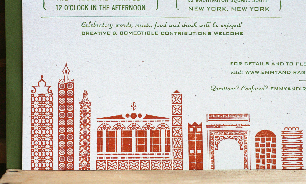 These are the final invitations for both locations. We used heavy kraft and white paper stock, both 100% recycled with speckles. Mossy green envelopes worked for both sets, and we flipped the color palette for ink on each.

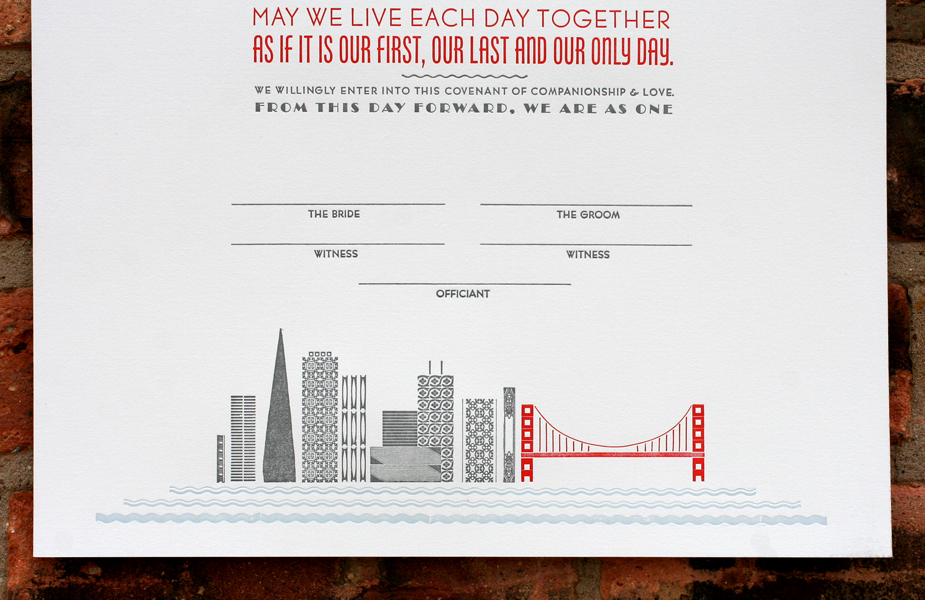
 This style works best with simple typography that projects a mid-century vibe. It's not too overpowering or stylized so as to compete with the ornamental cityscape. Emmy and Ira liked the idea of the type looking like business forms from the 50's.


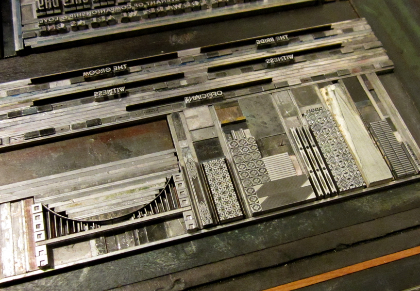
 Our collaboration with soon-to-be-married couples often ends with the invitations, but we had the pleasure of working with Emmy and Ira on a number of additional pieces to coordinate with their invitations. Skipping a guest book, they decided to print two large pieces that could be signed by all of their guests and then framed in their home. Again, we designed these to mimic the invitations with some different elements between the two. These cityscapes were created with wood type and ornaments given the 18x14" size of the prints, and they are a little more generic so they could be easily flipped and repeated.


 Cds as wedding favors are a popular choice and we created simple pocket sleeves for these here. Years ago I designed this custom die for pocket sleeves to resemble vintage LP sleeves; we've used it for hundreds of projects.
 Last but not least, Emmy and Ira needed little placecards for their Chicago event. These are simple tented cards with just a piece of the skyline in miniature form. Individual names are handwritten... can you imagine setting type to print each individual one?!
 As we acquire more type and ornaments, I look forward to creating new, varied and more complex cities and representational images in the spirit of clever letterpress printers of the past. But we can't accomplish this without the enthusiasm and imagination of our current and future clients.

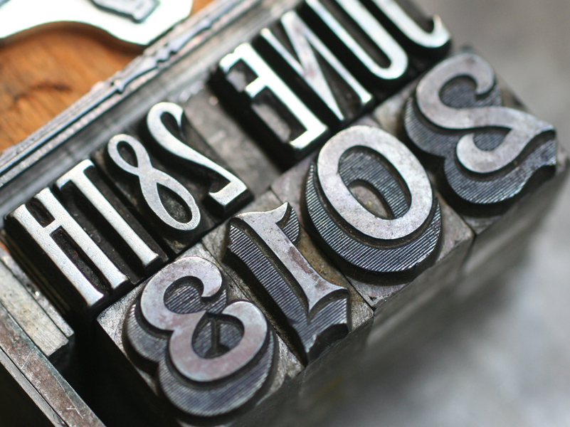
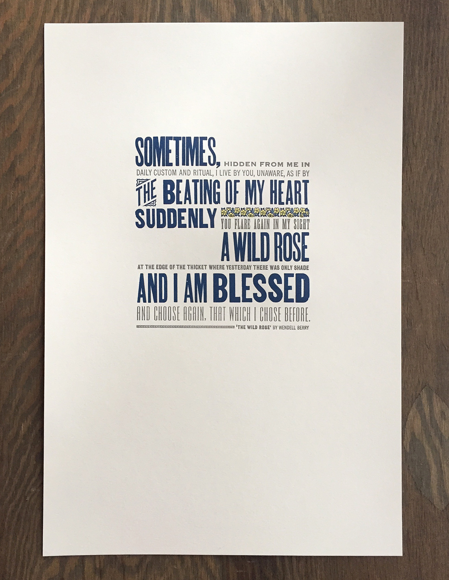 Here's a close up of the 12x18" print, done in 3 colors on soft white cotton paper. It's a nice mix of both metal and wood type that, while slightly beaten up and rustic, mostly keeps to a straightforward sans serif diet.
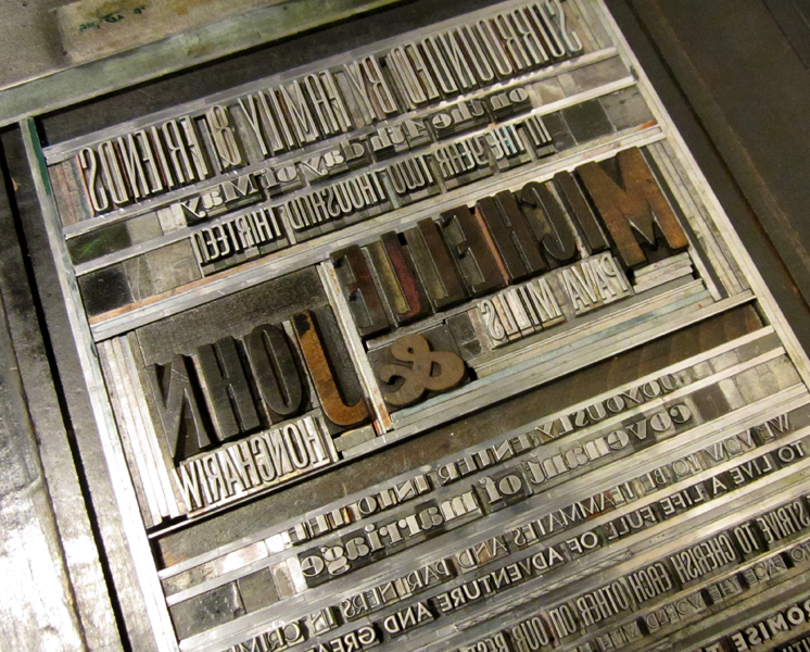
 The is the type in the final lock up. We usually set up the entire print if possible then pull a proof. If everything is spaced accordingly and looks well together, then we can go in and separate individual colors and print just one at a time.
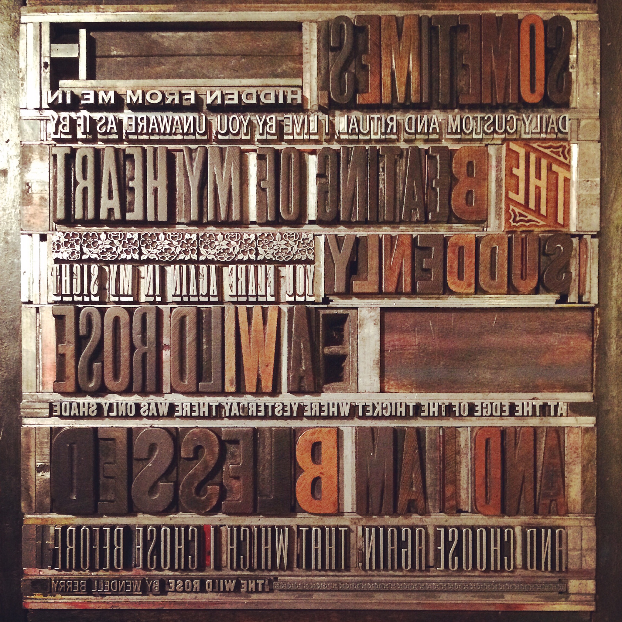 Some of the wood type for this piece is pretty rough, as noted in the uneven and speckled forms. The catchword 'THE' is new, however, and is one of Moore Wood Type's laser cut pieces.
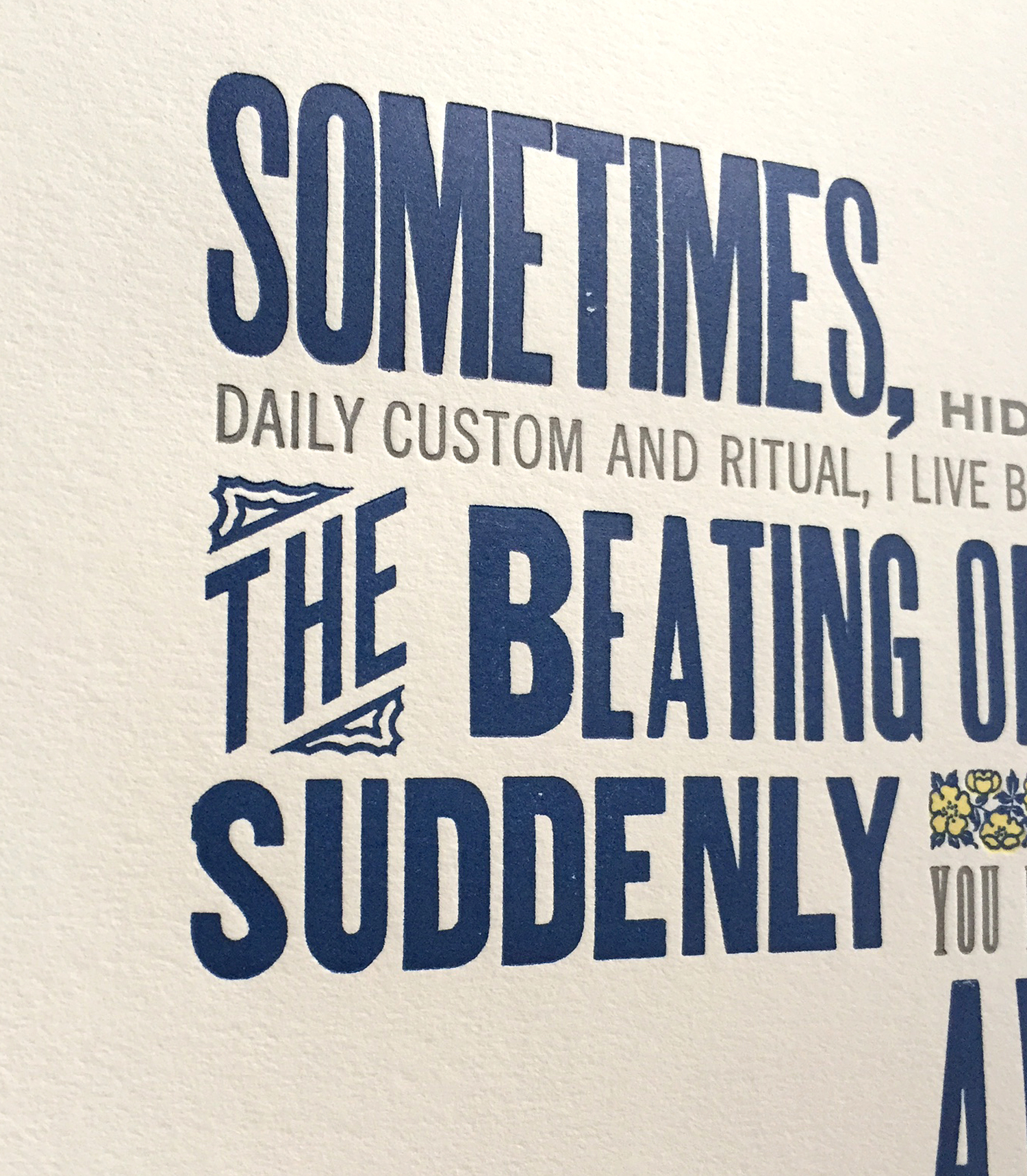 The print features two-color ornaments from the Keystone Type Foundry known as 'wild rose' ornaments. It's not every day that named ornaments tie in directly to the words being printing, but they sure did here. These are beautiful in their detail and include two different sized sorts, making it easier to fit them into any line length. I'm certain this charming print was a touching Christmas gift.