
Death and the act of dying are such a huge component of living that it always surprises me when people deny it, refuse to discuss it or fear the fact that it will, indeed, happen to all of us. If anyone could write about death as a companion to life in all of its true and metaphorical senses, it was Charles Dickens. And of his novels, Bleak House remains my favorite. Death comes to its characters from all classes of life, from sources as simple as bad genes to the inequities of a ridiculous legal system.
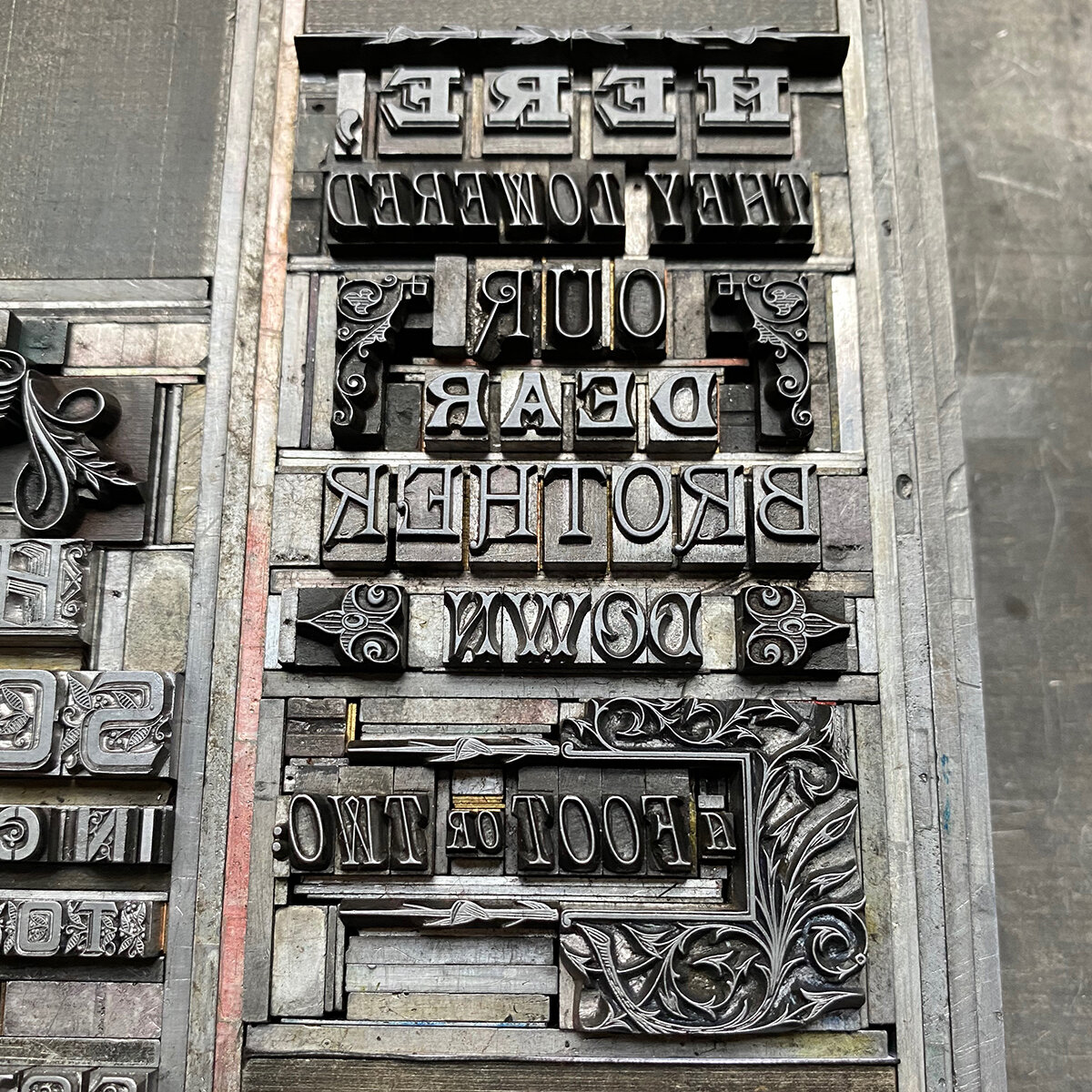
Early on in the novel, the death and subsequent burial of a character known as Nemo (Latin for ‘no one’) is rendered poetically in a paragraph that describes this final act while, at the same time, pointing out we’re classless in death. It is only later, as the novel traipses on, that we see how this character was the artery tying together all of the remaining characters, from all stations in life. And so I chose this as the text for a new print, with the intention of alluding to the graveyard mentioned.

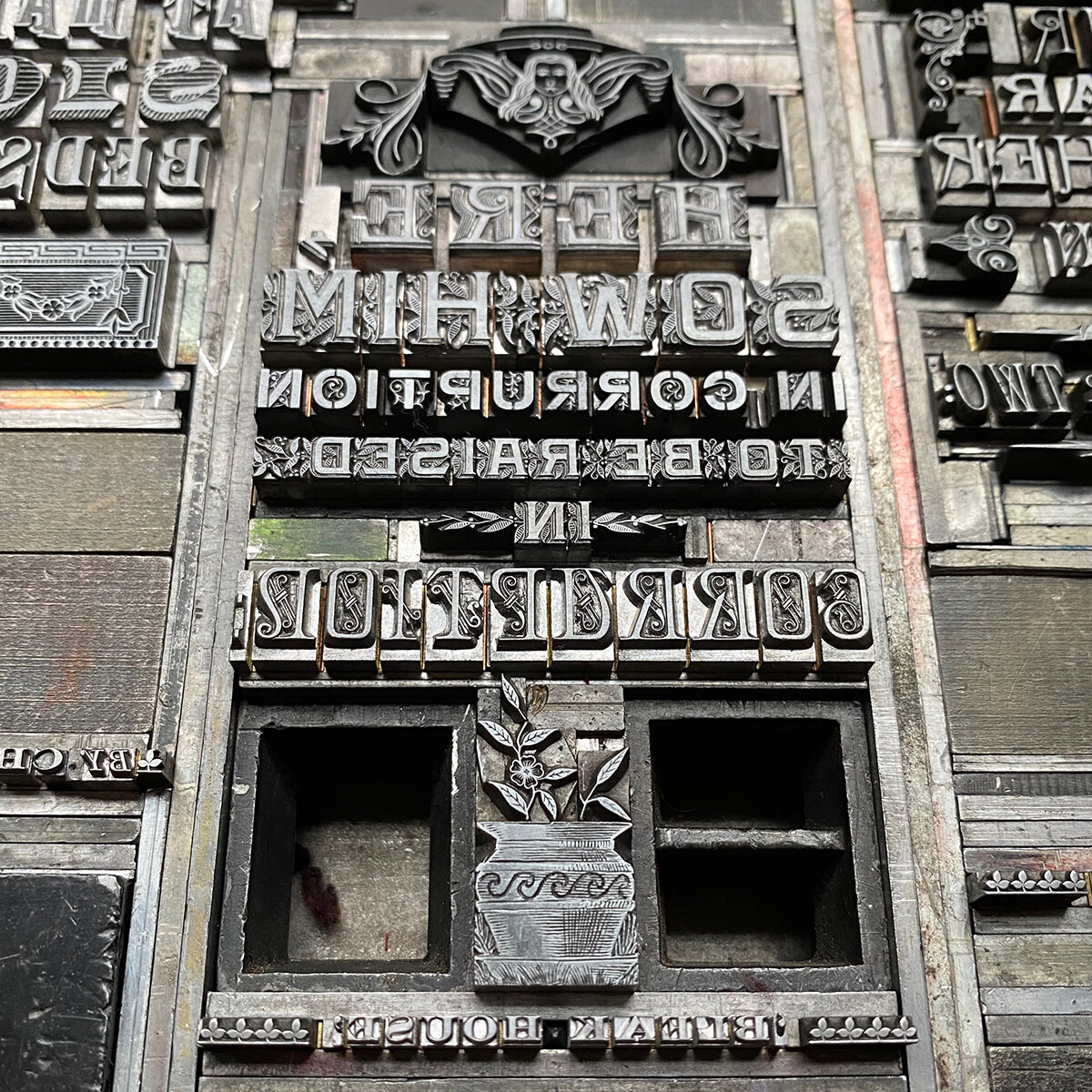
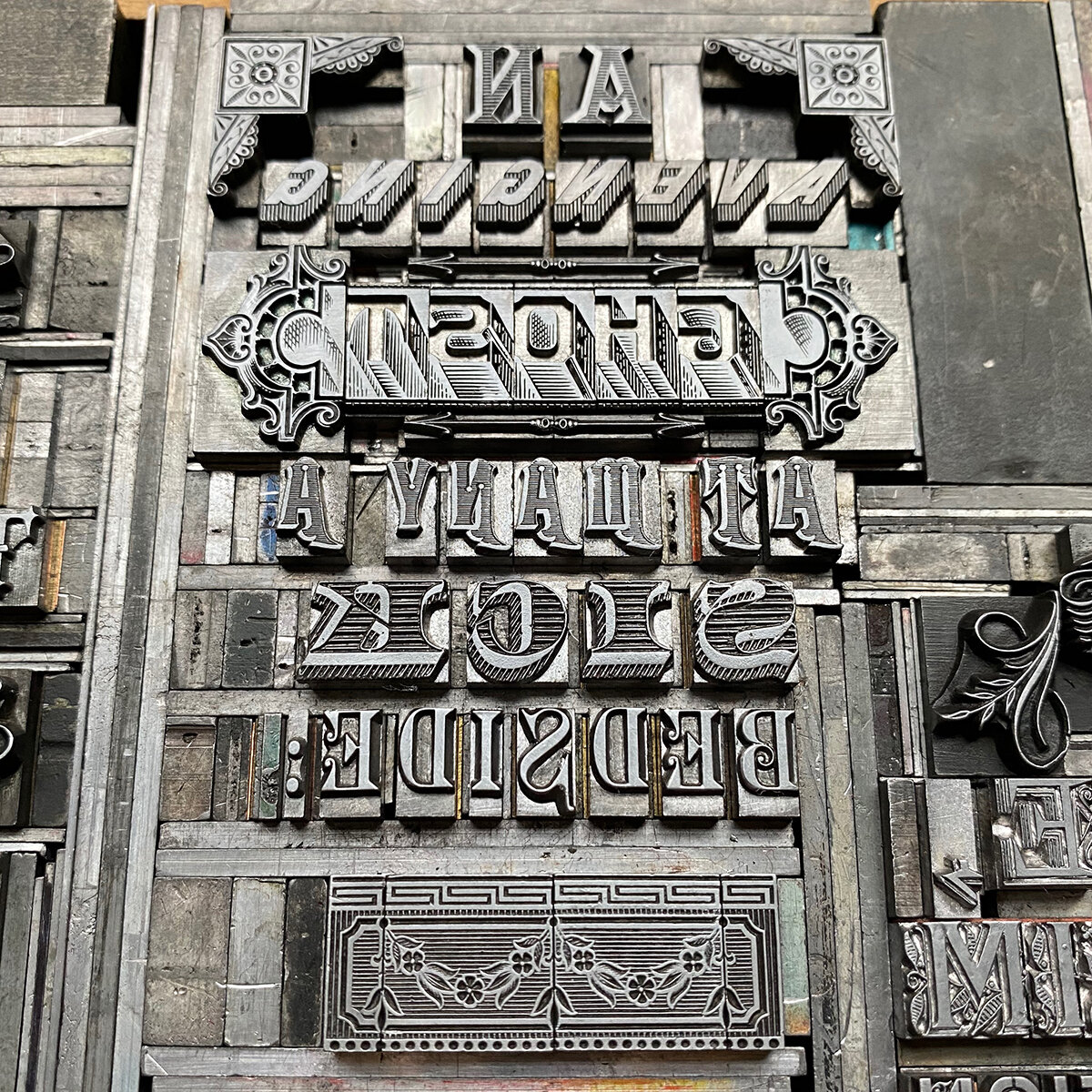
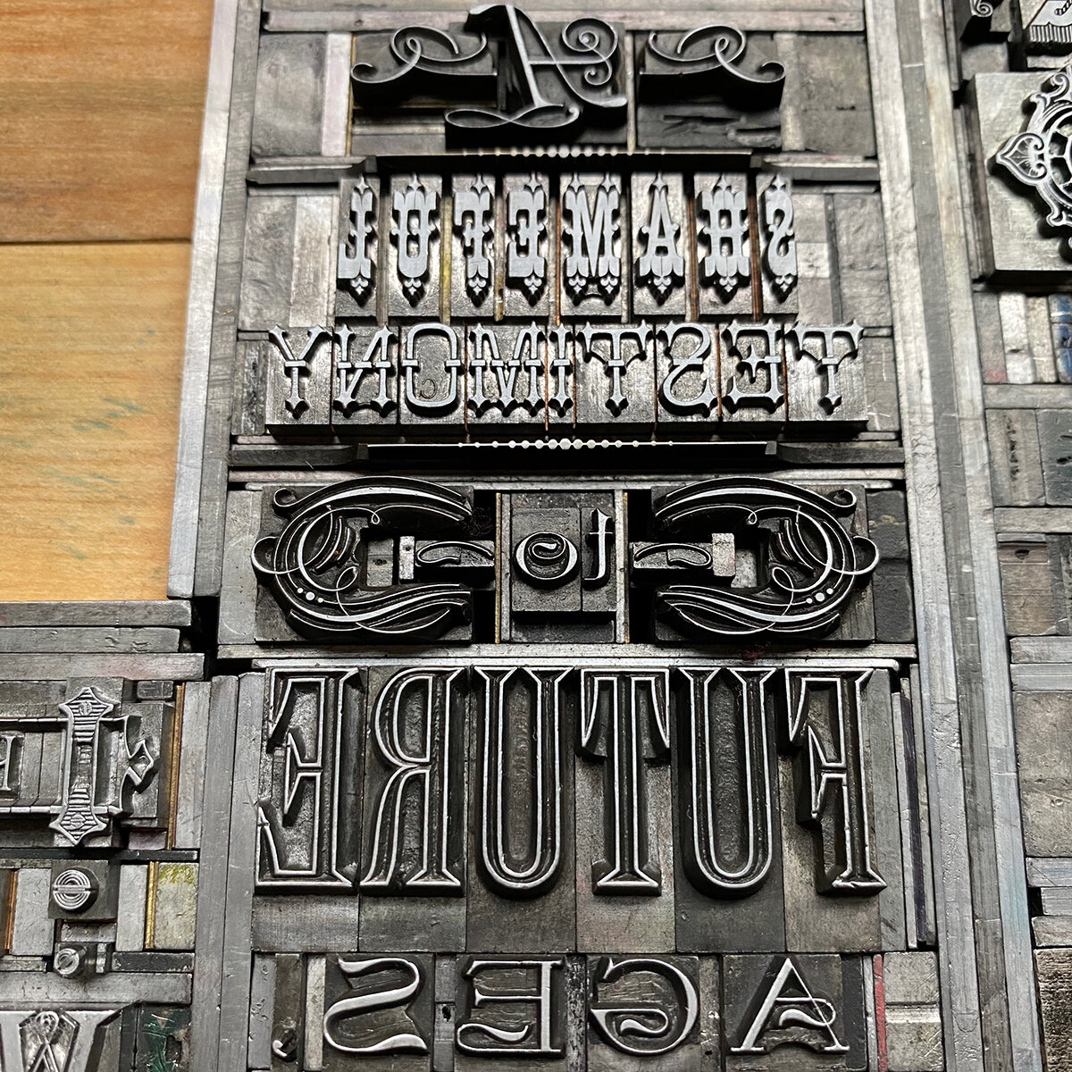
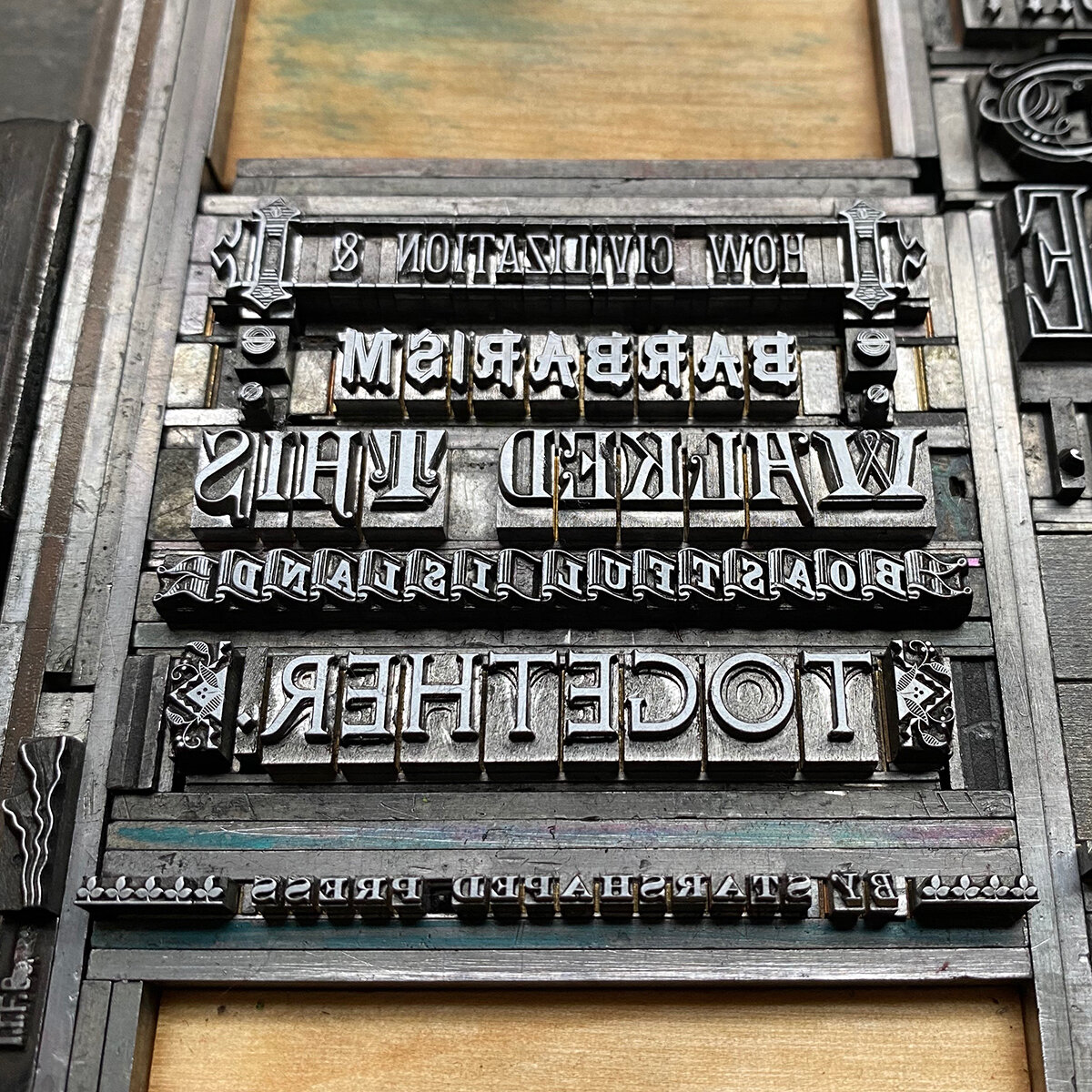
It felt appropriate to dig into my 19th century type collection, some extant of that period with others cast in recent decades from historic matrices. The ornaments needed to have a stately feel that matched the type but also could have been carved on the headstones.

Many of the ornaments used are the most beautiful in my shop in terms of their detail and complexity. The art of typecasting was definitely at its height in the late Victorian period in this respect. These collections come largely from Barnhart Brothers & Spindler and MacKellar, Smiths & Jordan.

Nemo’s death in the novel casts a long shadow and sparks a series of events that lead to revelations and… you guessed it, more death. When another character hears of his passing after not knowing he had even been alive so recently, she asks at his burial site, in a lamenting tone, ‘Is this consecrated ground?’ It’s clear this knowledge would bring peace more to her than the deceased. I set this text in wood type to resemble a shadow stemming from the gravestones.

To give structure to the gravestones, I carved a simple linoleum cut after tracing the shapes from the final print. I almost always print largely transparent color blocks after the darker type, knowing it won’t compete with the black ink. And the type, had it been printed over the transparent base, won’t pool on top of it at different rates given the various opacities of ink. Given the texture of the paper, I wanted the linoleum to print darker at the base of the gravestones and fade upward, both to allow the type to pop more and to tie the base of the stones to the shadow text.


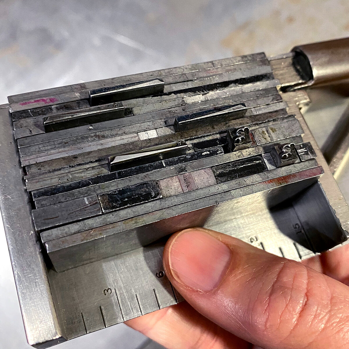
Below is the final type form, followed by detailed shots of each grouping. I try to allow 19th century type to guide me, given that it was designed to create intricate forms.

The final print is on Fabriano Tiziano Charcoal-colored paper to set the mood. The inconsistencies in the linoleum along with the subtle variation in ink tone created exactly the aged-stone look I was hoping for.


‘Together’ is the only decidedly 21st century type, having been designed by Russell Maret and cast in 2016. But it fit the tone and is a stately end to the excerpt.
The print is now available here in a limited edition of 40 copies. 2020 marks the 150th anniversary of Dickens’ death and having a moment, in print, to honor this while contemplating those lost over the past few years is the perfect cap on the last decade.