
One of the best collections in the studio is the 19th century typefaces I've been acquiring over the last 15 years. Most of them are pre-1900, and some were created before the standardized point system (it can be pretty annoying to space 13 point type when the spacing doesn't exist!). Luckily, Skyline Type Foundry is creating new casts of some of these typefaces, using the original matrices but with new metal. The beauty of these is that we have access to antique typefaces but in the form of new type.
I wanted to spend some time with these typefaces and ornaments to create new pieces that mimic 'artistic printing' of the 1890s and challenge my typesetting abilities. I immediately sketched out a bunch of ideas for text and layouts based on actual print samples from the time (for inspiration, check out the incomparable Stephen Saxe's photo feed).
The series is open ended; the first three are completed, and two more are just about set and ready to go. Then there are other ideas still on paper, waiting for the chance to pull out more of this gorgeous type and get it on press.
The first print celebrates our home state of Illinois. The inspiration actually came from receiving a new wood block of Illinois from Moore Wood Type. This is combined with an antique copper cut (love the line detail in this), a mash up of typefaces and two simple curves. In this image you can also see the Illinois woodblocks.
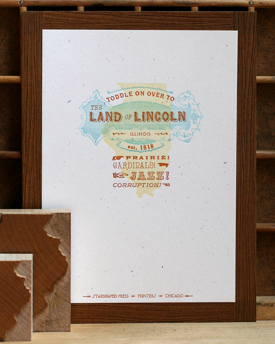
And here's a close up of the detail in the copper cut and type. Rustic, the type for Land and Lincoln, is so kitschy and great.

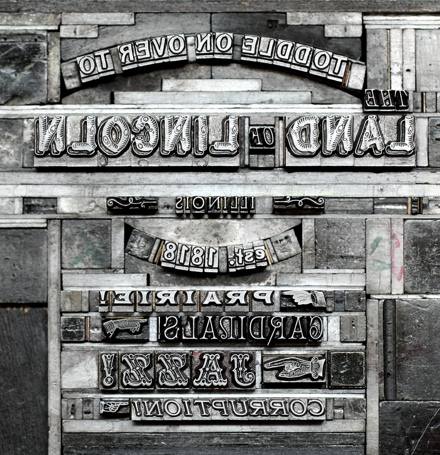
Each print for sale also includes an ink jet print of the form, or type set up, so that the viewer can appreciate just how the print was put together, and understand that it wasn't done digitally. Here's the form for the Illinois print:
The second print in the series is pulled from the song 'Deed I Do, a big favorite. This one works in a brand new cast of Arboret, a lovely and complex typeface (in 12 and 24 point), along with a set of ornaments to mix and match. So beautiful.

My favorite thing about this print is the little line of ribbon type. This was a real find back at the Wayzgoose in Phoenix, as it is not only awesome, it includes a second set of solid background sorts so that you can print it in two colors. The pale purple ornaments are wood, and the yellow is a linoleum cut.

Here you can see the various elements of Arboret to create all the floral ornaments.

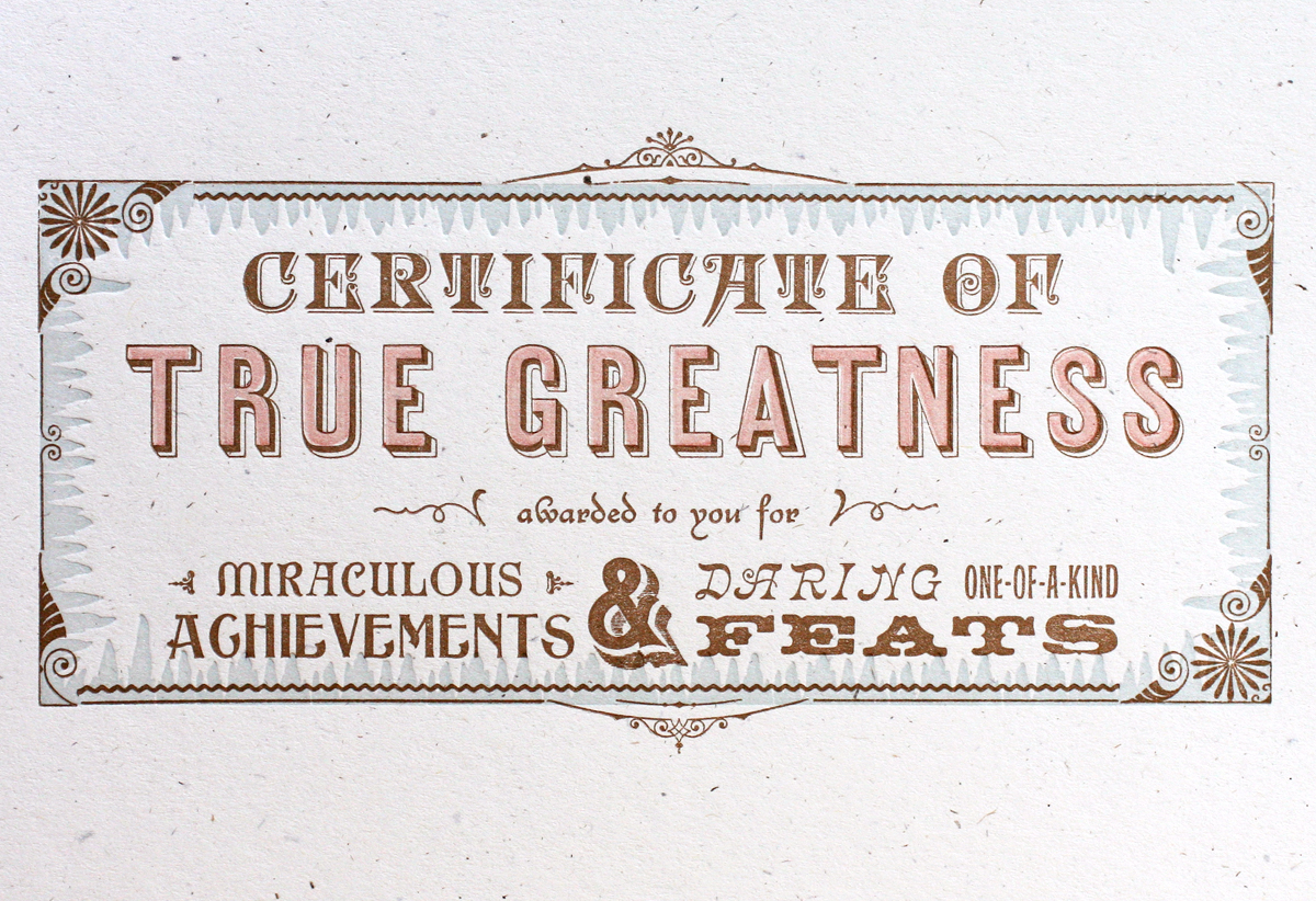
The third print is really fun and is perfect as a gift for someone that just accomplished something great.

The border is made up of detailed ornaments and decorative rules (lines), set in a rectangular shape. There's a funky blue background around the edge made up of what we like to call 'icicle border'. This is also one of the best ampersands in the studio. The second light color for 'true greatness' is a linoleum cut; it's not perfect, but then again, very few artistic prints are.

All of the prints are available for sale in our etsy shop. Over the next few weeks (years?) we'll be adding more prints as great ideas strike and more type makes its way into the studio. I make an effort to curate what typefaces find a home at Starshaped so that we can be sure that they are getting used and pulling their weight, so to speak. There are still many that haven't gotten their chance to shine, so they will be getting a stage soon.