
In September 2016, I had the pleasure of listening to Lin-Manuel Miranda in conversation with Chicago theater critic, Chris Jones. While discussing his collaborators, he emphatically stated, 'Find the people who can make your work better.' The comment struck me as it gets to the heart of collaboration; your own work is validated and strengthened by honoring the work of your collaborators.
I've been fortunate to call Geri at Virgin Wood Type a friend for some time. While the craft of making wood type in the 21st century is not one pursued by many, there is little doubt in my mind that Geri's acute attention to the details of the process and commitment to creating the finest quality wood type is unmatched. The unfortunate fact that our personal lives share many sad roadblocks has brought us even closer and the friendship only wanted a project to highlight our creative strengths.
I started drawing ornaments that would stray from The Chicago Collection in all its rigid architectural influence but retain the subconscious effects of prairie-style design on my work. These ornaments would be organic in form but cut to mirror each other, giving the user the opportunity to create symmetry, if desired.

The semi-final round of choices
From here I chose six designs that would be cut as reflecting pairs. Then Geri and I decided to create two collections that would contain four sets each of three designs, meaning printers could get one or both sets to mix and match. Here are the final patterns, notes for cutting and a sneak peek of the pantograph cutting, courtesy of Matt Rieck:


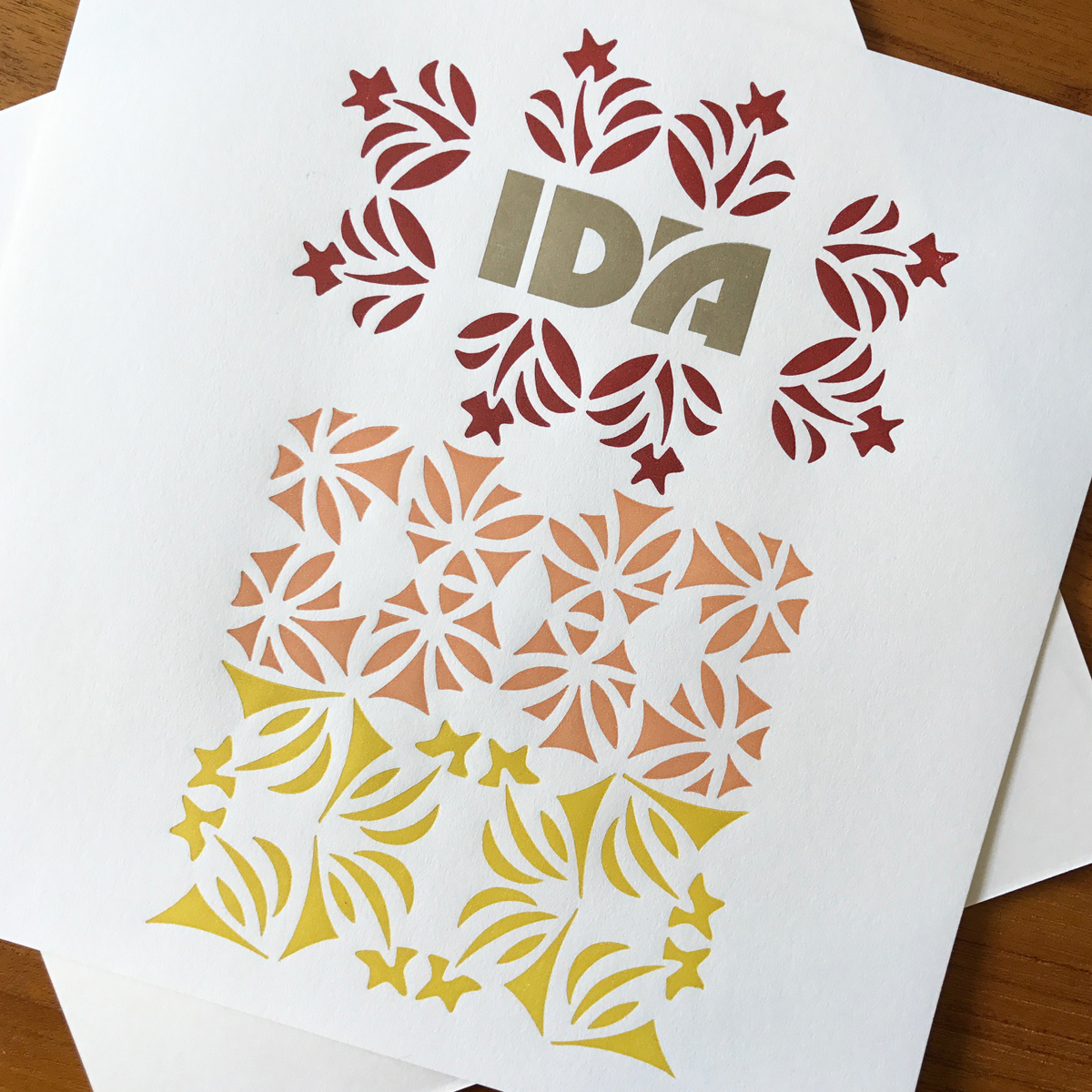
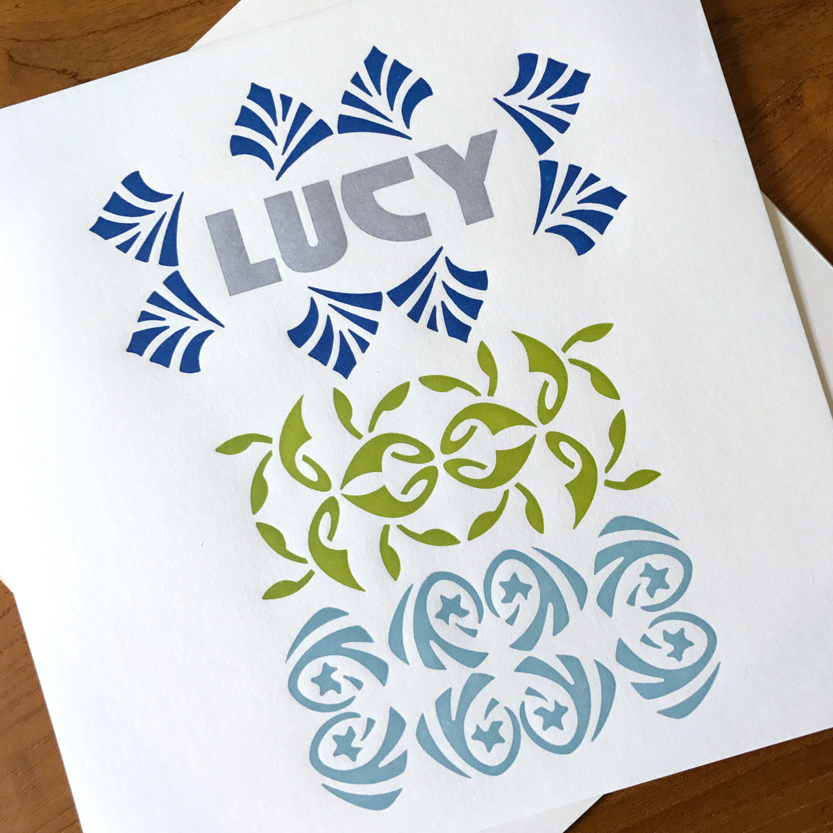
They are so beautifully made that it was only right they be named for two very different Chicagoans I admire: Ida Terkel and Lucy Parsons.

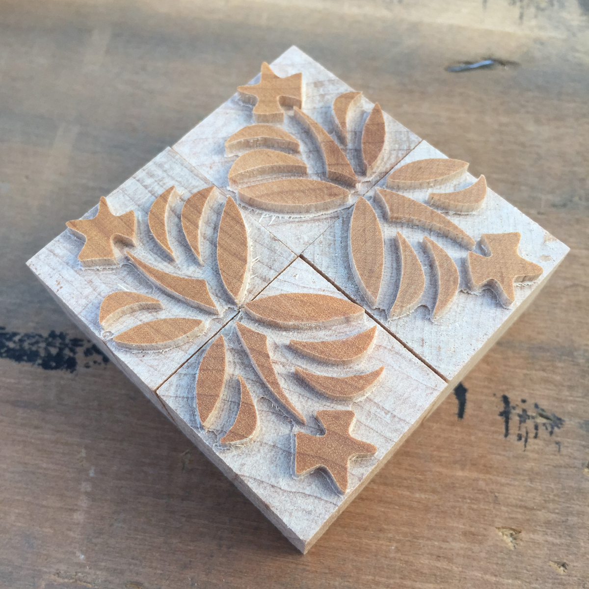
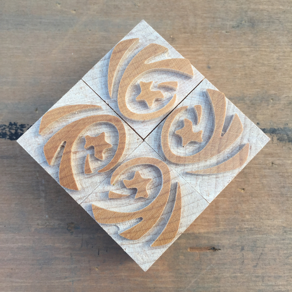
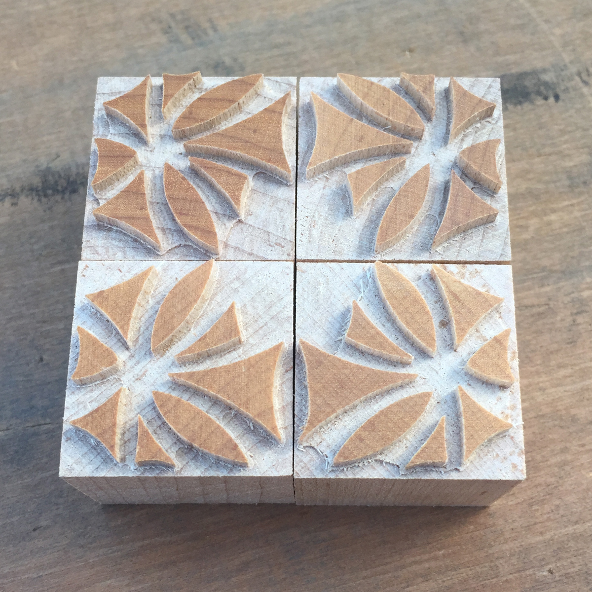
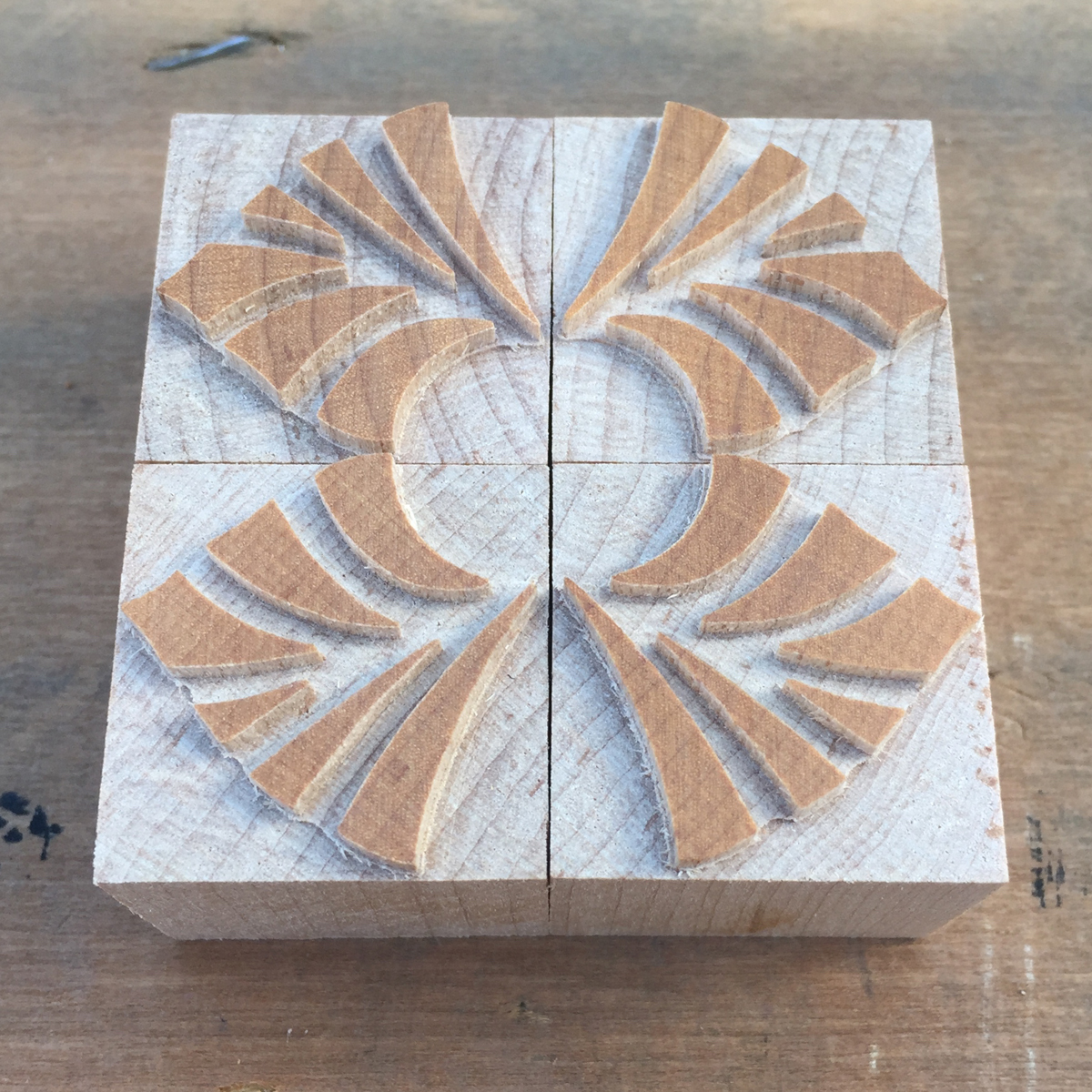
Another goal of the project was to create something outside of the traditional vernacular of wood type ornament. Sure, we all love the stars, rules, pointers and manicules, but what if wood type ornaments could reflect the aesthetics of a time period in which its production was declining? What if these ornaments could help printers push their design work in new directions and interpret existing type collections in different ways? I was certainly anxious to try, and so began a specimen book to put them through the ringer. It started with simply combining four of the same ornament together to create larger designs and progressed to multi-color, overlapping pages.
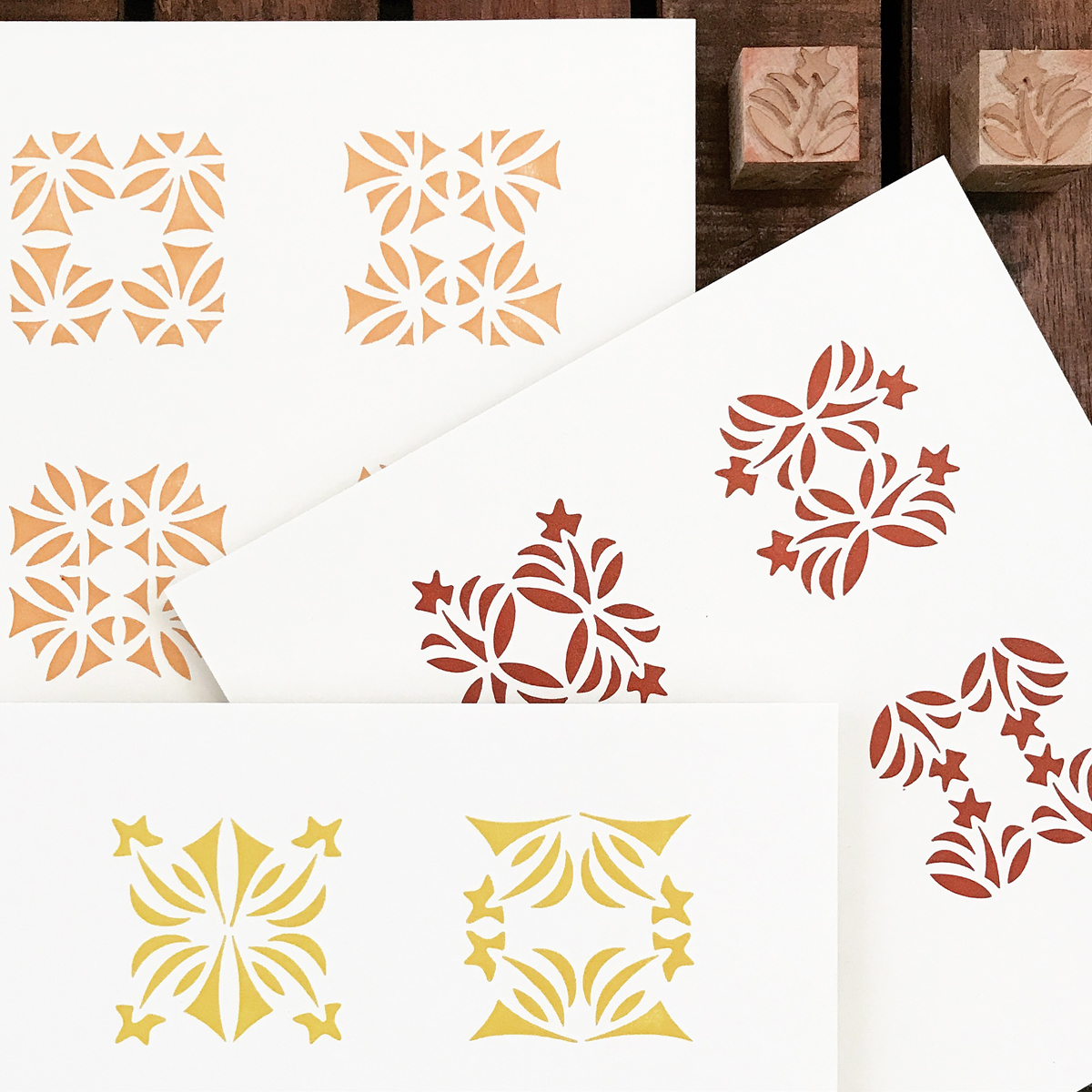
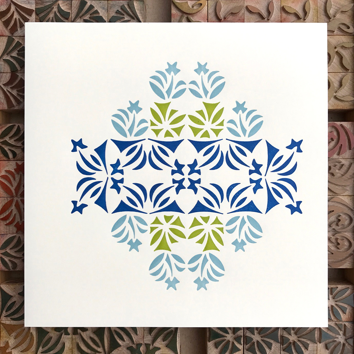
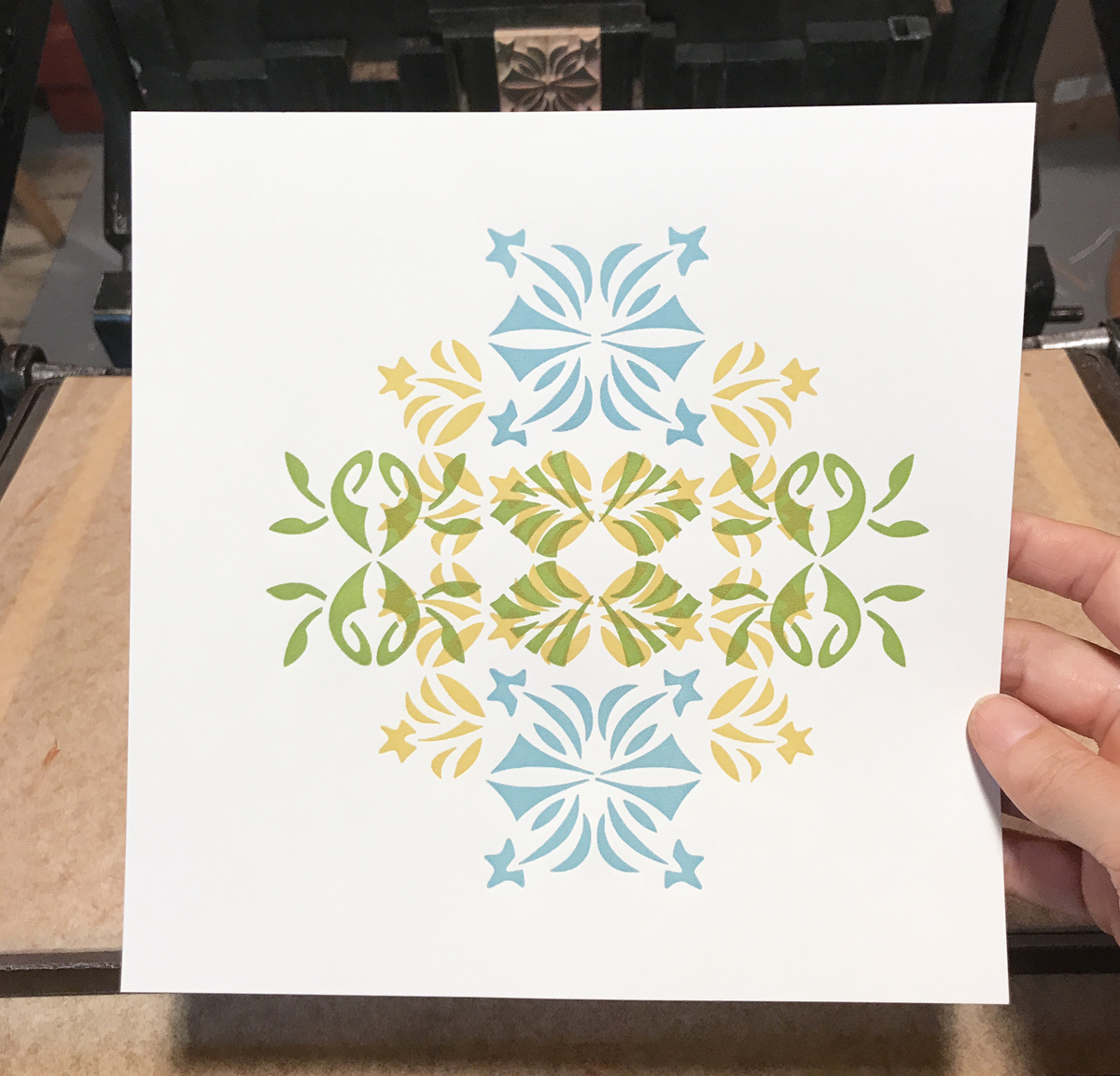
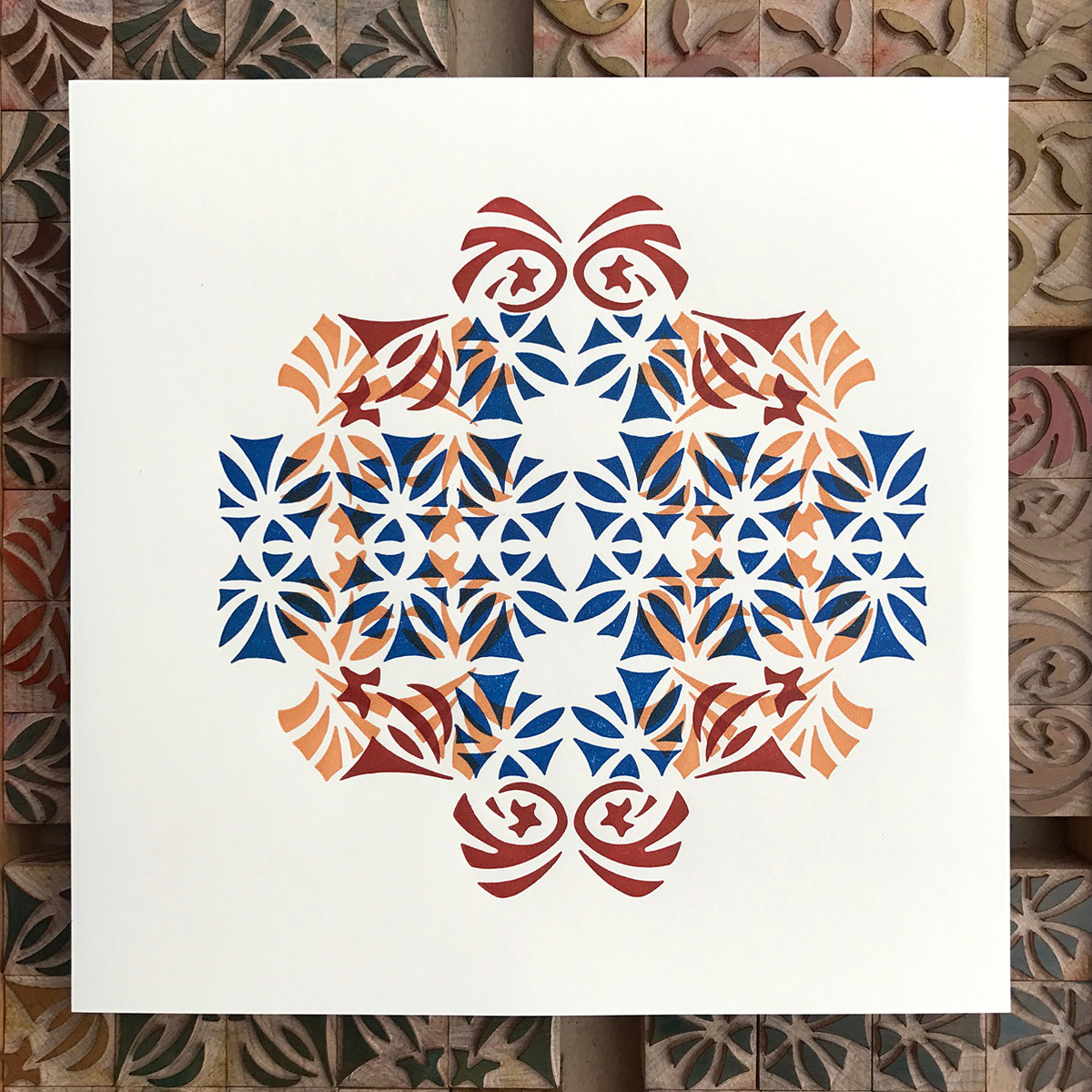
I felt color would best serve these ornaments and went for it with a full-on rainbow, albeit it one woven through an Arts & Crafts sensibility.

All of the designs held a certain charm for me, but it wasn't until printing that I fell head over heels. The final version of these ornaments added two somewhat unexpected layers: the living nature of the wood itself and the skilled hands that cut and trimmed each one. Some may consider this a residual loss through production; I will fiercely defend this as a rooting the designs required in order to thrive on the page.

The final books are bound and available here in a limited edition of 65. The ornaments themselves are made to order via Virgin Wood Type, alongside a stunning roster of beautiful wood type faces that pair perfectly with them (Craftsman Gothic, Preissig and Rugged.) I cannot wait to see how they are interpreted by other designers and grow beyond the initial sketches. Louis Sullivan said 'the building's identity resided in the ornament.' At face value, this is a guiding principle of my most self-fulfilling work. As metaphor, the buildings I raise are given their true identity when layered with the kind of collaborators who make my work better.