Well Spoken

A while back, Mr. Starshaped shared the story of meeting a Russian man in a coffee shop, downtown Chicago. This man lamented that he hadn't seen the cafe culture in the city that he longed for: the camaraderie, the discussions, the sharing, excellent coffee. My response was that he was in the wrong part of town, as all of this exists in a tiny, magic corner of Ravenswood, the neighborhood Starshaped calls home. For years we've visited the shop formerly known as Beans & Bagels, situated next to the Montrose Brown Line stop. We've witnessed many exciting and positive changes happen during this time, not the least of which included a makeover of both the interior and the menu. And when Will & Sido, the tireless leaders behind the counter, took over as owners, it was time for a name change as well.

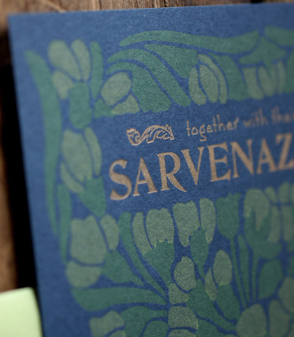
I was honored to be asked to contribute a print to commemorate this grand reopening, with the only art direction being to retain the new logo (with its hint of a Cypress tree and nod to Will and Sido's home state, Louisiana) with the name.

fullprint

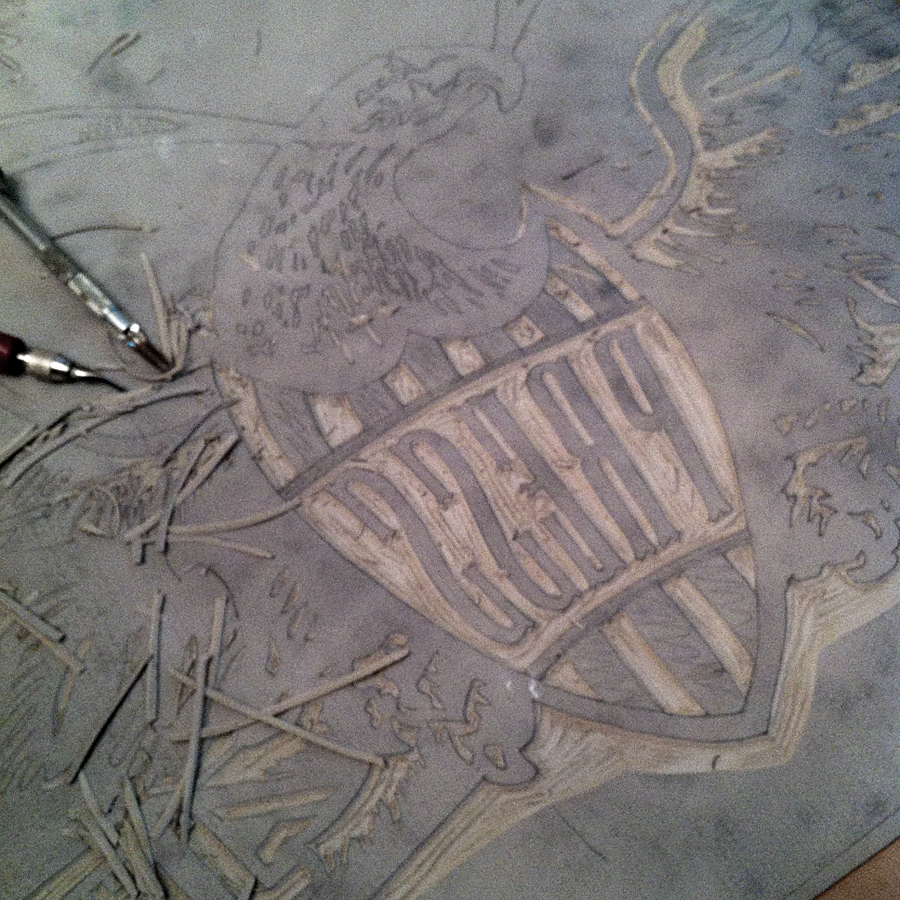
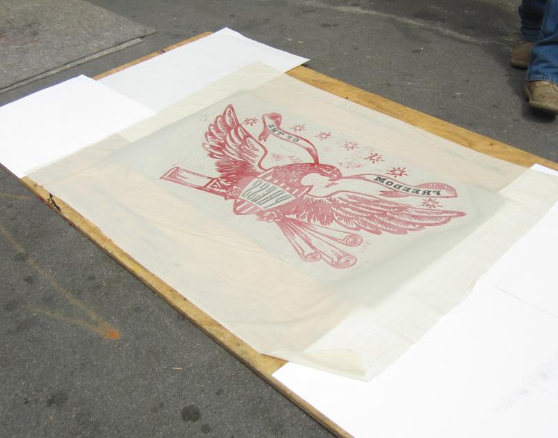
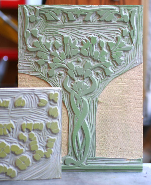
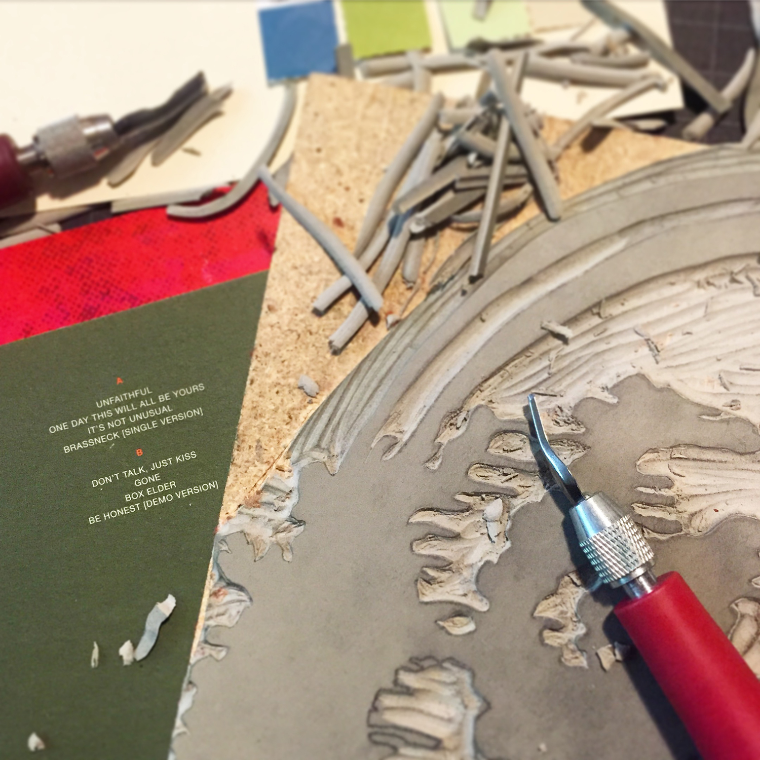
The print was actually planned as 4 colors but became 5. After laying down a light texture of wood as the first layer, I started what would be a 3-color reduction linoleum cut, meaning it would be carved then printed, then carved and printed, then carved and... you get the idea. The first was solid and printed in the same very pale brown as the wood type to give it more depth. There were a few late nights of carving alongside my Wedding Present albums. It's a good way to work.

lincutting

The second run of the linoleum cut was a deeper moss green.

closeup

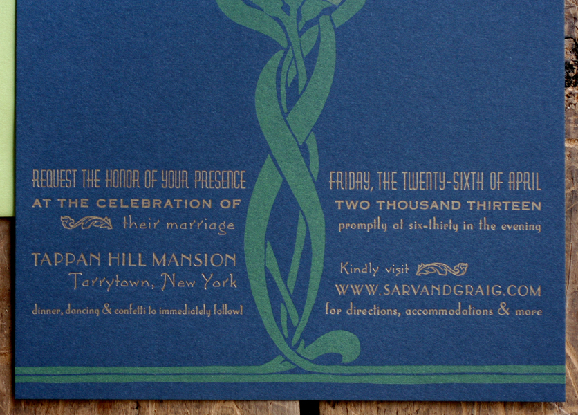
I brought in a pop of blue to tie the elements together.

colors

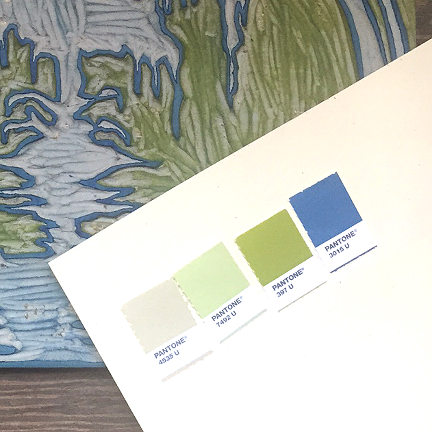
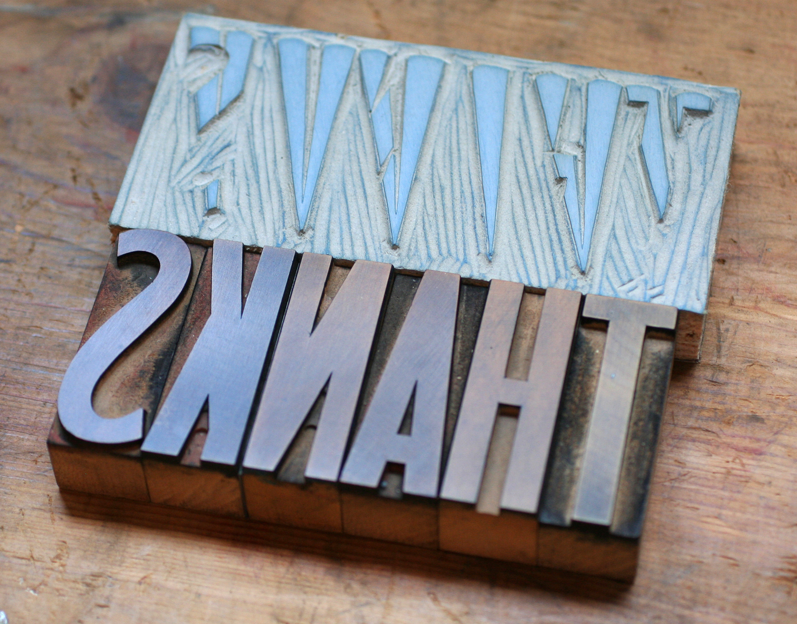
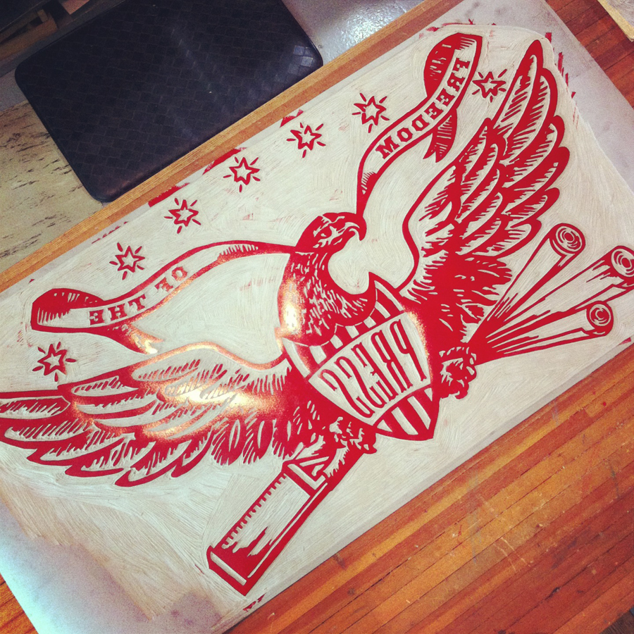
The linoleum cut, carved down to its final color.

linocut

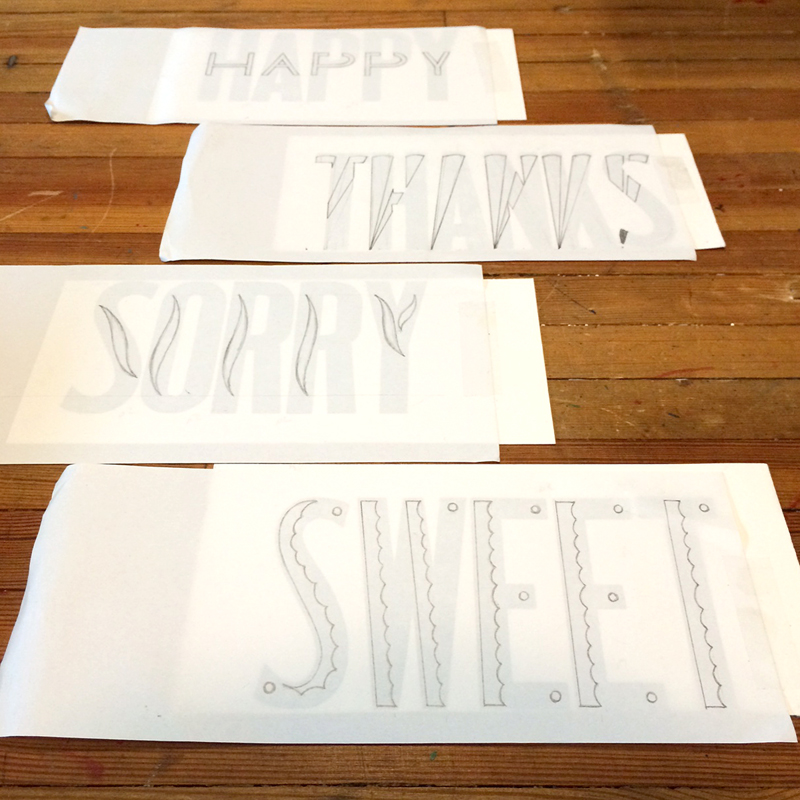
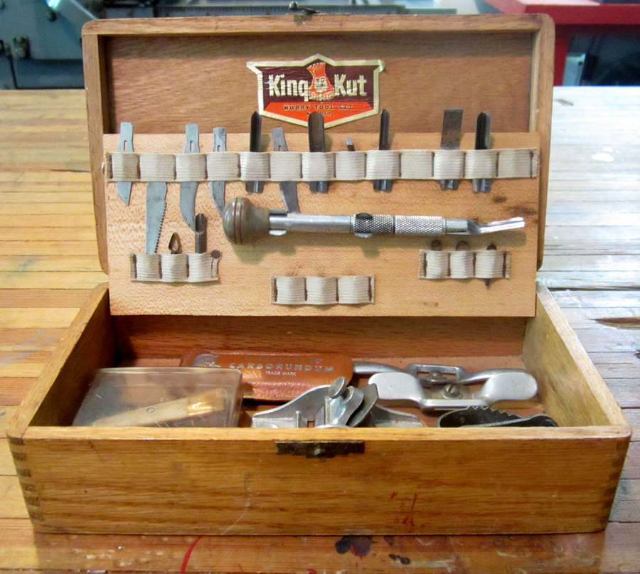
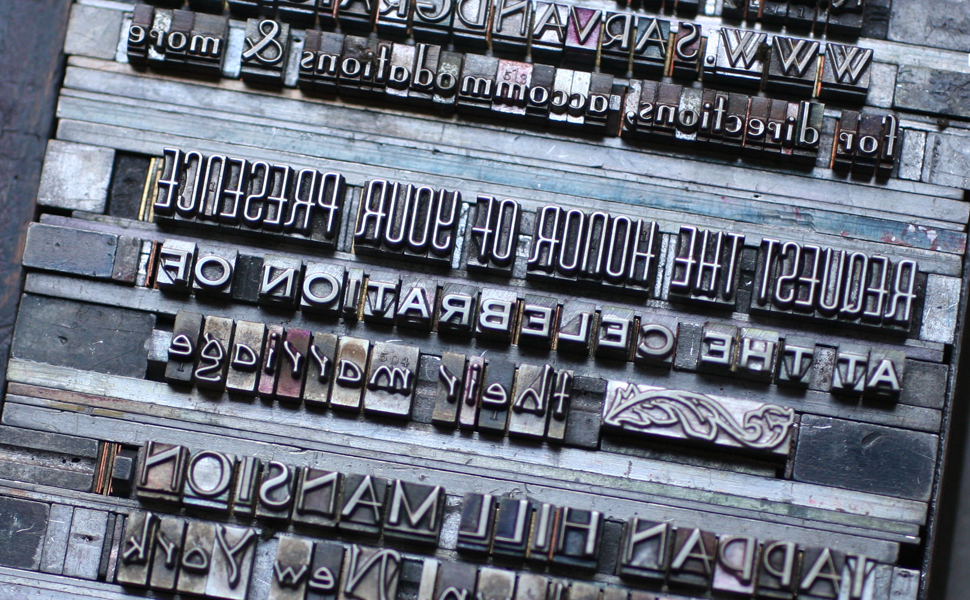
I wanted to create a modular type for the title so I wouldn't have to carve it or find something similar to the logo type. This took a few different arrangements to get right. These are just a few of the carbon paper proofs done while testing out what I set.

proof

type

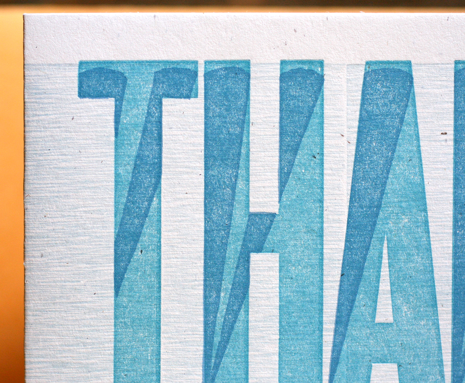
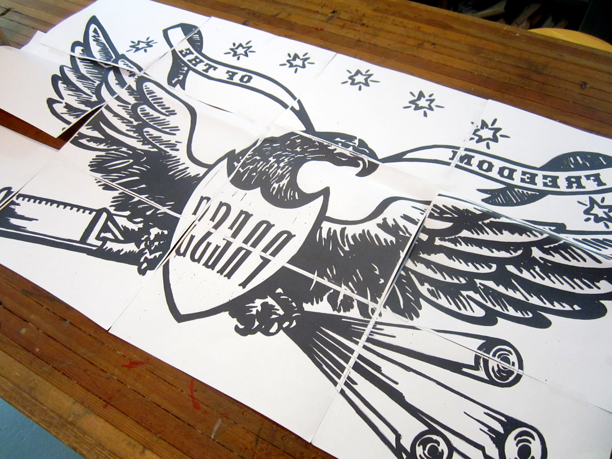
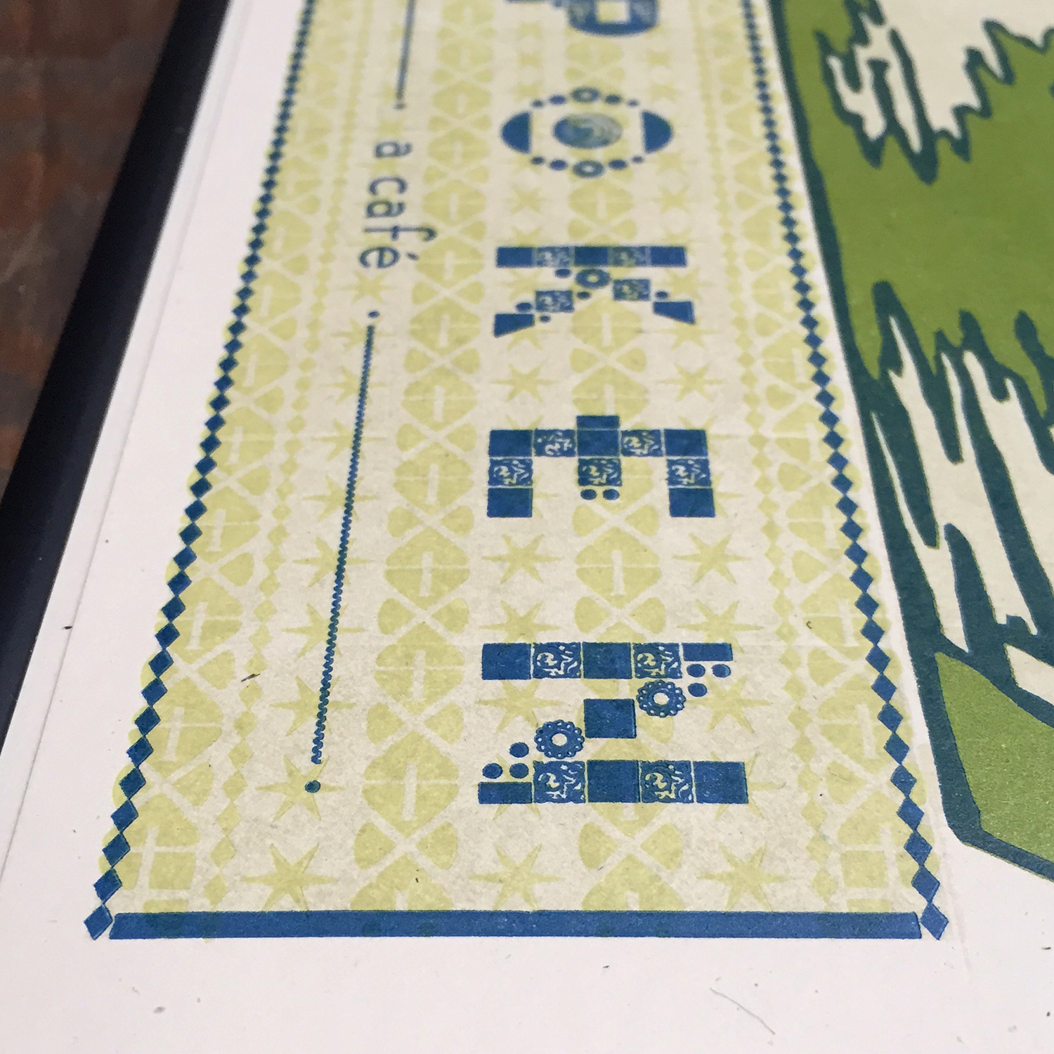
The 4th color, before the final blue, was a slight texture of ornaments that included Chicago-style 6-pointed stars. The first plan was to print this the same as the green for the logo but that was too deep to live behind the text and not clash. So it became another run through the press.

typecloseup

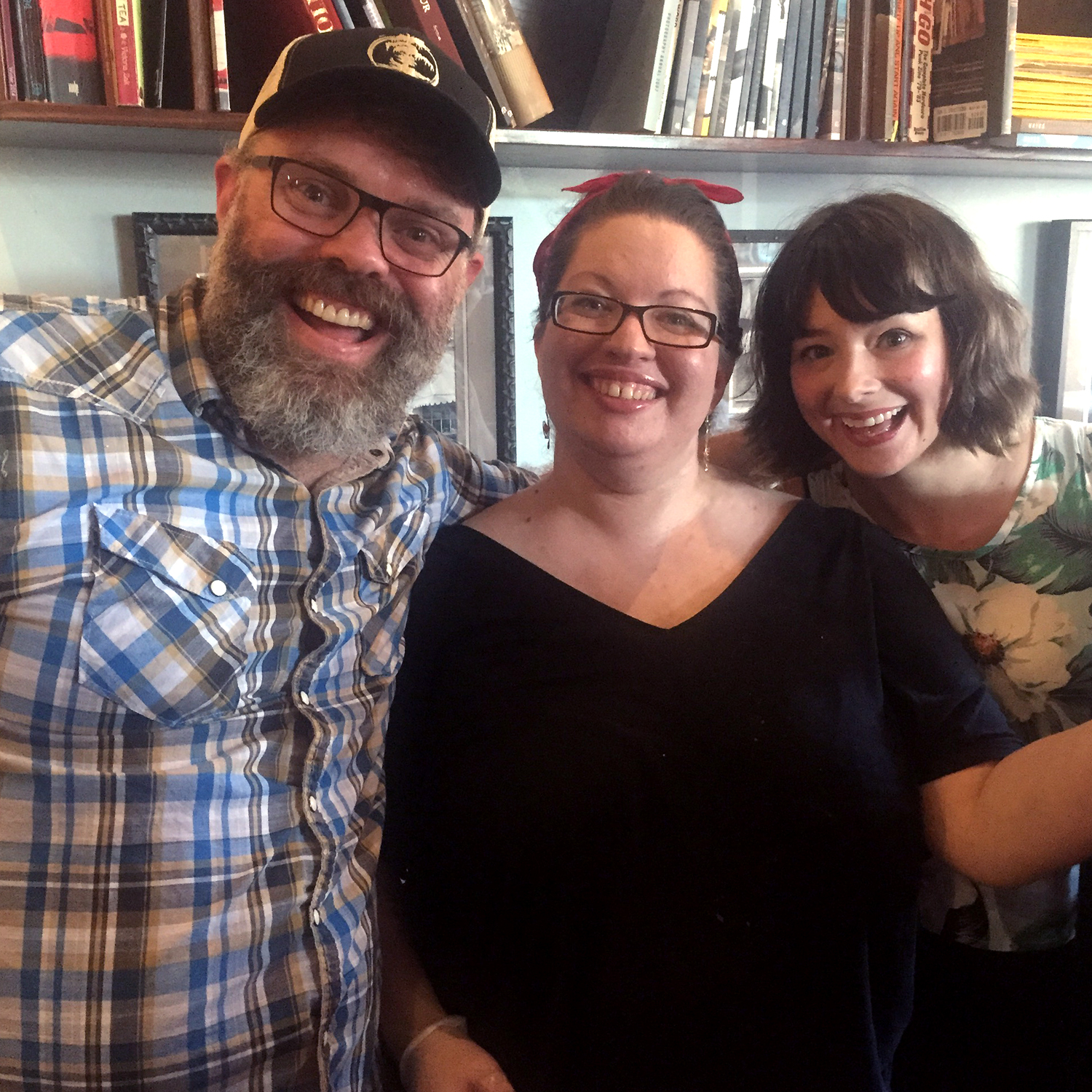
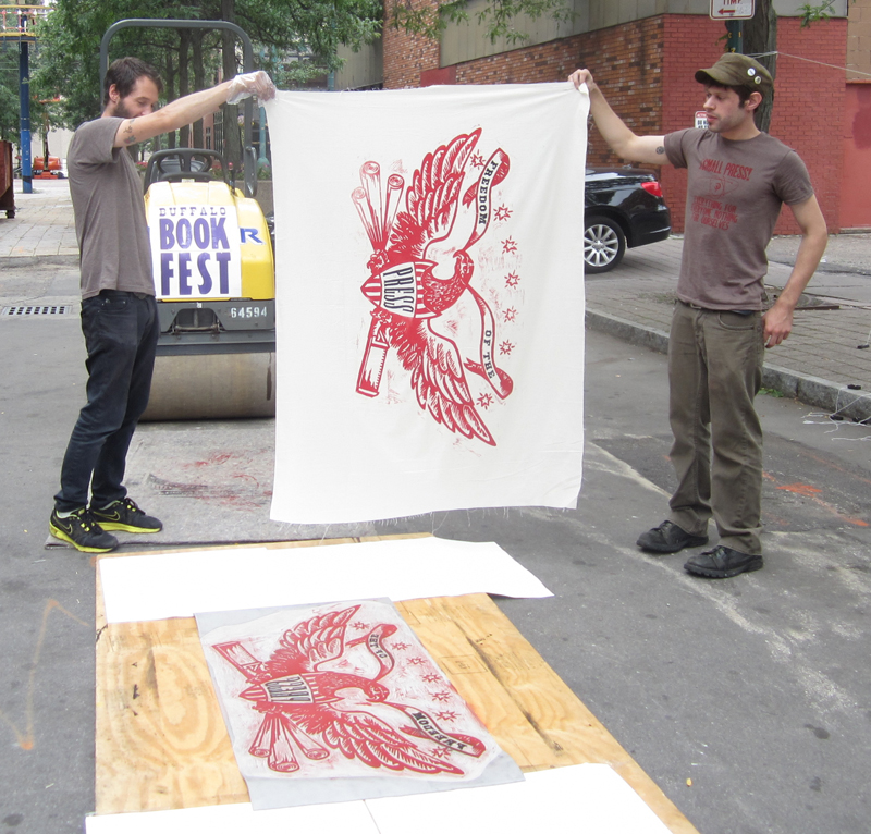
It was such a treat to see one of the final prints framed and out the night of the grand re-opening. Everyone that came through the door to enjoy a drink and some cajun-style cooking was invited to sign. Seeing a Starshaped print at the center of this outpouring of support from the community was a humbling moment I will always remember.

finalprint

When you're in Ravenswood, go and visit Will, Angela, Sido and the rest of the gang. Get some coffee. Meet a friend. Make some plans to conquer the world or just your tiny corner of it. Whatever your agenda you'll get solid service with a smile. Tell 'em Starshaped sent you.

willangelasido

Just Add Color. And Linoleum.

Within most letterpress shops you will find both small and large collections of what's affectionately coined 'job shop gothic'. These basic sans serif faces pull a lot of weight and often see quite a bit more action than the most decorative, fanciful wood type faces because of their versatility. At Starshaped, we have a ton of great examples of gothic type, ranging from the worn but well made Hamilton variety, to the less-than-perfect mid-century styles made for basic sign presses. I've been thinking for a while about how to dress up these gothics, and have had some success with past greeting cards. Looking at the run of condensed 15-line type in the studio, I started sketching ideas for adding a layer of ornamentation or texture. Here are the four final cards.

finalcompiledsmallMy first step was to proof the actual type that would be the base layer. These are basic carbon paper proofs of the type, with notes about leading for future reference and reprints. Down and dirty, carbon proofs are an easy way to get a glimpse into how the type looks without spending the time of inking up the press.

proof1After that, I laid a thin sheet of marker paper on top of the proofs to start sketching ideas on how to add something to the type. I looked at a lot of Deco-era type treatments for inspiration.

proof2For 'Thanks', I played off of little spotlights in the bottom corner of each letter and how they would look projected upwards.

proof4Each image was then flipped and carved in linoleum. I like to work this way instead of having a printing plate made, as it hones my carving skills and gives the final image an imperfect look. This is perfect for these cards, as I wanted all of the layers to have texture and quirkiness.

TthanksAs you can see here, I also printed a background texture, which was simply the back side of 15-line wood type.

thanks3Seemed like 'Sweet' should have a candy shop feel, hence the scalloped detail and bubble gum pink.

proof3

Tsweet

sweet2'Sorry' was a simpler affair, and I opted for a subtle wave in each letter.

Tsorry

sorry2'Happy' has twice as much happy, as I worked a squat gothic version into the larger one. I really love the orange on this one.

Thappy

happy3All of the cards are now available in our etsy shop; each comes with a coin envelope for a slightly vintage feel. If you need a little color, look no further than our jazzed up gothic workhorses.

compiledinsta

WNYBAC Book Fest

As you may recall, I've got a weak spot for the Western New York Book Arts Center since Rich and Carima of P22 fame got it going years back, and I've had the pleasure to print there in the past. This summer I was asked to contribute a linoleum cut for steamroller printing at their annual Book Fest. bookfestposterThe cut would have to be a large one, and mine is 4x2', officially the largest linoleum cut done at Starshaped. While thinking about what the image would be and what it would say, I wondered if I could potentially use my grandfather's recently inherited wood carving tools. My grandfather was an avid woodworker, churning out all manner of projects that would commonly be referred to as folk art. He loved Americana and patriotic imagery, and of these, his favorite was eagles. They were everywhere I looked when growing up, and to this day one watches over my grandmother's home. Finding and carving the appropriate eagle with grandpa's set of tools would be a tangible homage to the love of craft that he instilled in me.

woodcuttools2

woodcuttoolsI looked at vintage eagle cuts and started to find a form that would work best in the size of linoleum I had. This is the first clean sketch.

eaglesketchThough I do love stars, there were too many here, and I felt it would be awesome to pull in imagery pertinent to what I do. This led to altering what the eagle carried to a composing stick for setting type and rolls of paper.

eaglesketch2

After this, I scanned it to piece it together and add the text. Then it could be printed out in tiles to its accurate size and traced onto the actual linoleum.

eagletransferThe type used was HWT's American Chromatic and Antique Tuscan no. 9, which seemed fitting and appropriate, not only stylistically, but because they were digitized by Rich Kegler, WNYBAC founder, for The Hamilton Wood Type Museum. That's how we tie it all together, folks!

The cut took many nights.

roughcut

roughcut2

When it was largely finished, I roughly inked it in to see if any glaring problems popped up, and if anything else needed trimming. This was my first 'it's glorious...grandpa would be proud!' moment. And right after that, it was rolled and sent off to Buffalo.

eagle

wnybacfront

Printing via steamroller was not only more successful than I imagined, it was a lot of fun as well. Here's a little of the action, thanks to many great volunteers and a donated steamroller (at bottom). Prints were all done on dampened muslin:

eagleprint9

eagleprint6

eagleprint4

eagleprint1

eagleprint8

Here's a little video of the whole thing:

[wpvideo amJwpn1I]

Major success! There were 3 other talented printmakers represented under the steamroller that day, including Keegan Onefoot-Wenkman, Tom Rooney and Jodi Hamman & Christine Gallisdorfer:

keegan5

tomrooney

christine1

And looks who's parked behind our prints blowing in the breeze...

eagleprint10A little skeptical of the food truck phenomenon, I gave Lloyd's Tacos a spin, and they were hands down amazing.

lloydMeanwhile, there was also an artisan market, paper making and many other demos going on throughout the day including linoleum cutting.

linocutting2And Jo had her own Letterpress For Kids demo; more about that here.

joadampressAnd while the city of Buffalo hasn't always been amenable to local upstarts and the arts, they did fork over for some No Parking signs so that WNYBAC didn't have to print their own as they surely could have (another story):

noparkingAll in all, a fantastic day of printing and making new friends. WNYBAC is a beautiful facility that's still very much on a path toward finding itself and working at its full potential. You can help keep them vibrant by visiting their Indiegogo campaign.

Going to Tarrytown

Like Marissa and Ned, Sarv and Graig were keen on wedding invitations that would resemble mini posters and they had great inspiration in the form of this vintage book cover: ramona

Given that letterpress printing doesn't have the opaque vibrancy of screen printing, we ran a few tests to see if we could successfully achieve two light colors on dark blue paper and were happy with the result; the colors were muted in a faded, old fashioned way. We decided on creating a piece that was 7x10", so that it would fold to 5x7" and mail in a standard A7 envelope. The image worked perfectly as a two-color linoleum cut after a little adjustment to the overall size and placement:

Tsarv6

The type is set in a mix of deco-meets-nouveau styles to pull the overall design into a more cohesive and streamlined form. It is printed in gold to pop out from the navy paper. The typesetting was very particular to achieve a subtle curve along the artwork.

sarvgraig6

sarvgraig5

Tsarv4

I loved having an opportunity to use our DeVinne type for their names; it's a lovely and quirky typeface from the turn of the century that sadly doesn't get enough play in the studio.

Tsarv3

sarvgraig3

The invitation folds in half, and on the front panel (what you see when you pull it out of the envelope) is a snippet of the overall artwork with their initials rendered in our mortised initial caps and an ampersand from the 19th century typeface, Dakota.

sarvgraig8

Tsarv1

The envelopes are sour apple green, and the reply cards are pale yellow to give a little pop to the color palette. We continued the abridged image on the envelopes in gold (the return address is on the back flap) and carried through the multiple typefaces on the reply.

sarvgraig4

sarvgraig7

Here's a shot of the final suite. I intentionally did not score a few so that Sarv and Graig would have some unfolded ones as keepsakes or to frame.

sarvgraig1

Emily + Frank

It's not every day that I get excited to print flowers, and our wedding invitation collections are decidedly devoid of them. But when Emily approached me about working from vintage Wizard of Oz book designs, these ones fell into place:

The flowers are actually from a border known as Wild Rose, which was originally produced by the Keystone Type Foundry around 1903. The studio has the two color variety, meaning that there are two sets of sorts, one for each color, in this case gold and warm red. With the success of the save the date cards, we moved on to the invitations. We tried options using the ornaments as is, and then considered enlarging the pattern to see how that would look. I would carve the two color image out of linoleum to give the invites a block printed feel.

The first set of linocuts went well, until I realized the trapping between the gold and red was sloppy. I carved the red color again to match it better, using a proof of the gold color as a stencil for this second set.

Then they were set to go, as was the type, a considerably simpler forme for us this time around!

Here is the final set, continuing the theme of warm red, gold and muted blue. The type is Canterbury, Della Robbia and Caslon.

Congrats to Emily and Frank, and a big thanks for being open to experimenting with our vintage type and linoleum cutting!