
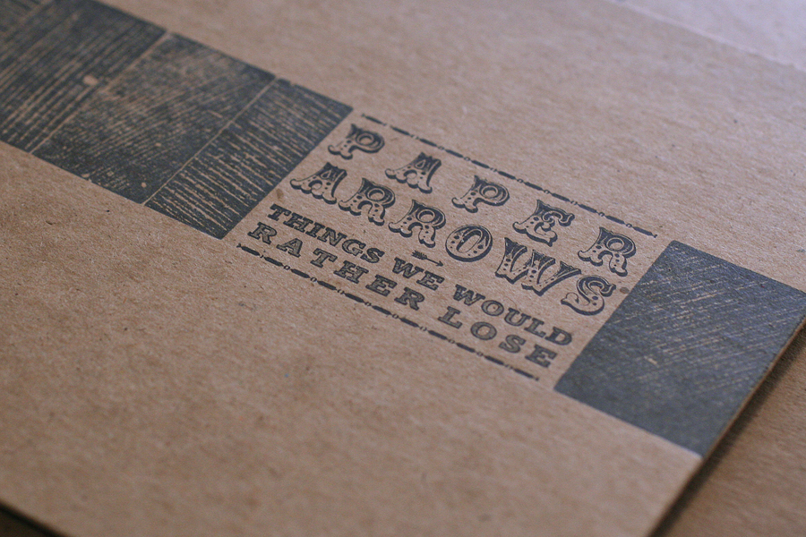
Years ago, I designed and printed a cd package for the band, Paper Arrows. An enjoyable collaboration, it featured some of the elements that make working with antique type a unique challenge.
 Recently, the studio was tapped to produce a new EP sleeve for the band. They wanted something that was simple and could easily be mailed for promotional purposes. We've printed a number of different formats for music packaging, and have two dies for simple pocket sleeves; we decided on the Tab N Slot sleeve, which has a tab at the top that tucks into the back of the sleeve. I usually recommend working with a color palette that wouldn't be easily achieved with cheaper methods of production: dark papers with metallic inks, varnishes, textures, etc. Something that's not just black and white, since a variety of color choices aren't any pricier. Get more bang for your buck!
The band liked charcoal paper, which means using a metallic ink; a light ink alone will not read when letterpress printed on a dark paper. I thought we could bring in texture in a subtle way, as this ties into the sleeve we did before, as well as provide a simple background element. These two-color hearts really grabbed us, so they made it into the form as well.

 Because we print most work on platen presses, it's easy to diecut the flat sleeve first and then print. The first layer is dark blue, which definitely reads as blue; printing dark colors on dark paper don't always perform the way you think they might. The metallic ink is a sort of champagne color that's not quite gold or silver.
 This gothic type is in pretty rough shape, but works hard on many Starshaped projects, including this one. You can see here the end result of the two color heart.
 Here's the final front, followed by the back.

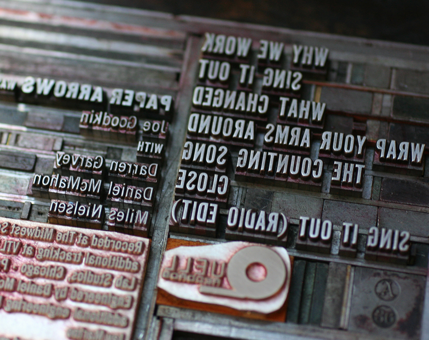
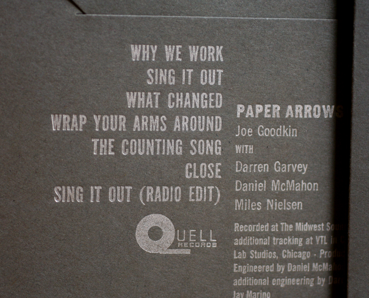 We had a plate made for the logo and the small text. This text was designed to work with the type we have in the studio, but the last line had a pesky Publishing symbol, which we sadly don't have and haven't been able to frankenstein from something else. Yet.
 Another factor to consider was how these would be mailed. Certain clear sleeves are post office safe, so I suggested adjusting the final design so that they could ship in clear sleeves that would not only save the cost of purchasing separate mailers, but would allow the art and important details to show clearly to the receiver. Mailing labels and stamps can be applied directly to the outside.
 And so our little heart is a surprise when the cd sleeve is pulled out of the mailer! Give Paper Arrows a listen, and keep an eye out for the Good News For Love release.