Every year, Starshaped is asked to create a calendar in any form, and while we all love the idea of putting together such a piece, the timing has never gelled with the custom print schedule. This year we've done it ahead of schedule and have two great calendars to offer! I loved the idea of a wall calendar that can hang to display one large image throughout the year. One of the other driving forces for this decision was to be able to use a complete font of calendar type, purchased last year from Virgin Wood Type, meaning that even the individual pages of the calendar would be printed.

As you can see, each date is cut to be on the same size block of wood so that it's easy to interchange them and keep the same form when you move from one month to the next. Their beauty is that they aren't perfect; there are many quirks from the routing and carving process which gives them more character than if the pages were to be output digitally. I added the month and ornamentation at the top to round out the print, also leaving a bit of room at the bottom on which users could write notes.
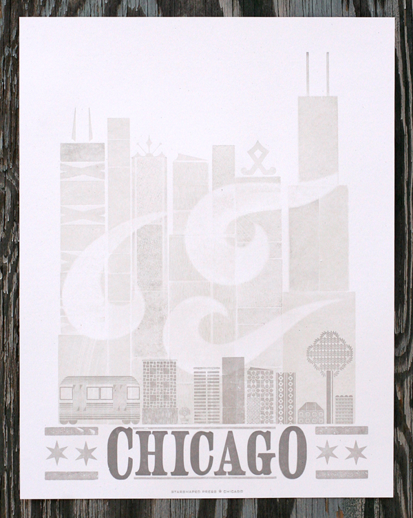
One of our most popular prints has always been one titled The Stars All Lead Me Home, which is currently sold out with no plans for reprints. So I took that theme and recreated the city and stars for the first calendar which you can see here:
Each calendar was printed in four colors. The first for this one was a white linoleum cut to provide a base for the rest of the colors. Then came the cityscape in a bright, happy blue.


The star setup was a bit tricky; I had the drawing for the linoleum cut done, so I used that as a base for laying out the stars in their various size. Then spacing and leading needed to be filled in around them to keep the block solid and easily locked up for printing.

They are printed in a soft champagne metallic ink and finish off with a little moon in the corner.

One of the hazards of the trade is the presence of work ups in a type form. You can see below that one of the thin spaces between the R and S has literally worked its way up to printing between the two letters. We all have to be vigilant in checking prints to keep this from happening on multiple prints.

Here's that pesky little space:

Because one is never enough, there's a second calendar as well, in the same format as the first. This one is a mash up of various wood types to spell the months of the year, coupled with a beautiful '2014' and corner elements, all printed in four colors.

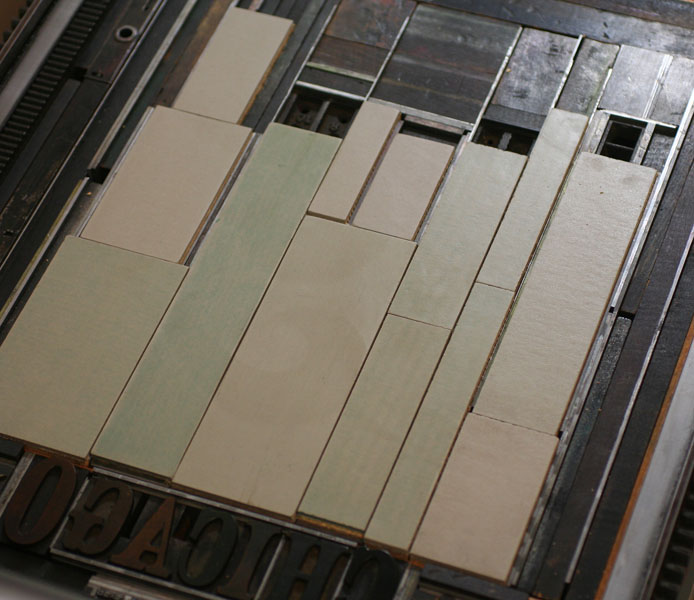
Here are the forms for the months as well as the '2014'. Some really incredible wood type all in one place!


The detail shows a little more of the great effects of overlapping and subtle colors. The corner pieces are printed in both dark brown and gold.


Printing the calendar pages was no small task, given that we did an initial run of 100 of each calendar and there are 12 months in the year (you do the math, and allow for the overrun of misprints!). These were done on the platen press for speed and the corners were rounded afterwards.


The final step is collating the months and assembling them with padding compound at the top. Then they are attached to the calendar and are set to go! If you're feeling like an early bird this year, we've got them for sale on our etsy site now: here for The Stars All Lead Me Home and here for 2014. And cheers to a new year!


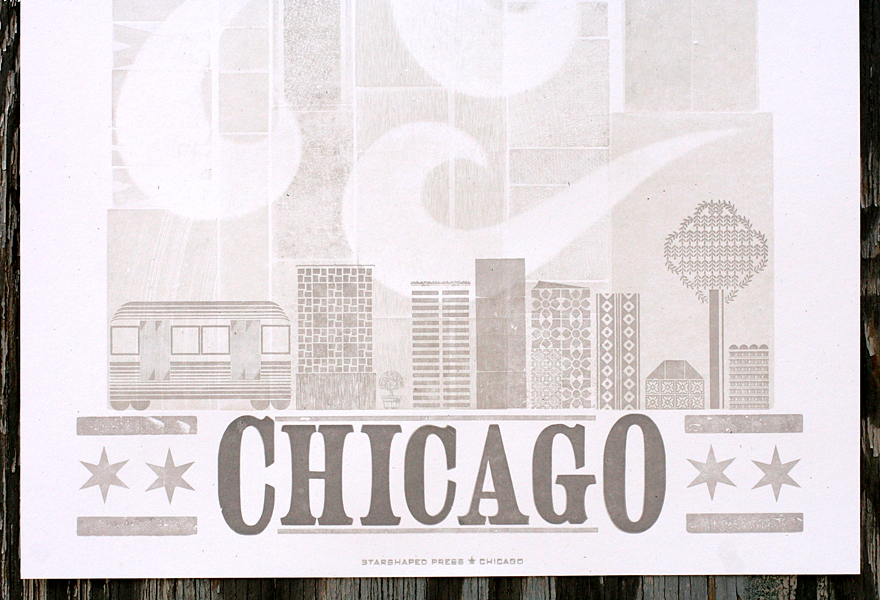
 You can see the lovely texture and overlapping effects in this close up. The inks are all translucent enough to show the different layers of print.
 2015 is set in Gothic Round, a typeface we have in limited quantities and that doesn't often see the light of day. Here it is coupled with the borders.
 The calendar pages are not letterpress printed (sorry), though they are built from scans of the type in our collection. Printed on text weight paper, there's room for writing little notes before tearing off the page as the month comes to an end.
 The second calendar features a Superchunk quote that often pops into my brain when driving the Starshaped Fiat. So it combines both of those things (though the Fiat here is an original 500....someday).
 The image started as a sketch that was then resized and transferred to linoleum to be cut. This was a tiny one!
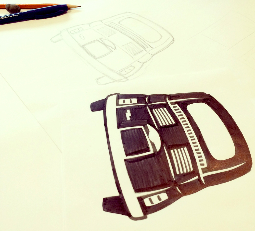
 Here you can see it sneaking through the wood type city on its way out of town! This calendar also features tear off months.
 Both calendars measure 8x18" and are printed on heavy gray chipboard in four colors. They are currently available in our etsy shop. We printed a limited run of both, so get one while you can... no reprints on these!