Maria, Dan, Butterflies

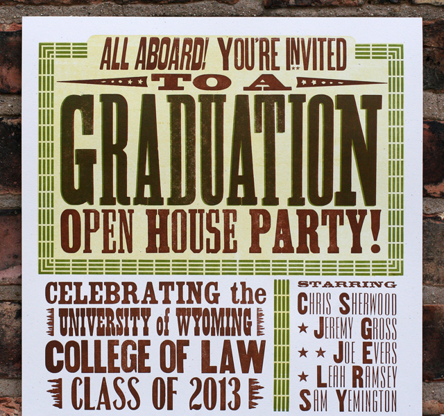
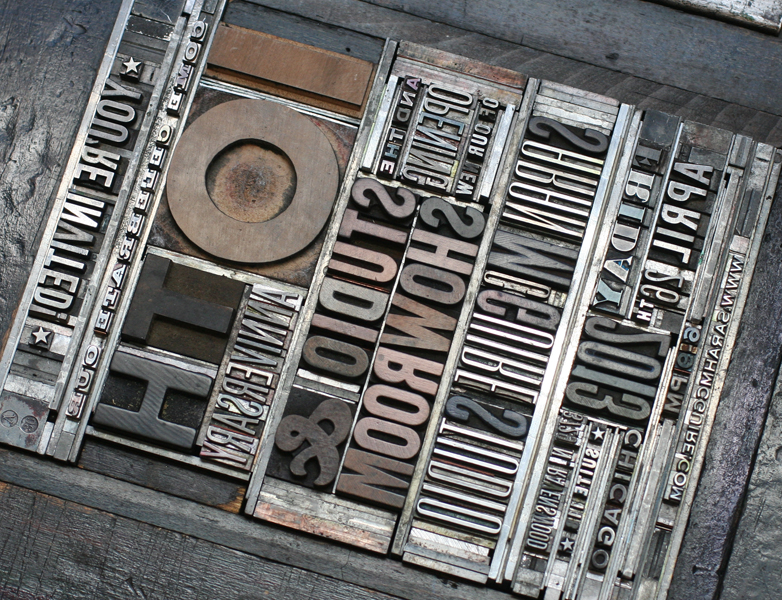
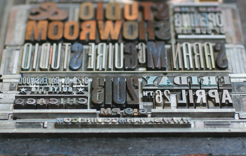
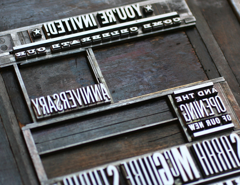
We're pretty lucky to have had some great clients looking for wedding invitations. This Spring I met Maria and Dan, fellow Ravenswood dwellers and fans of working with local sources for their wedding planning. Maria definitely wanted to include floral images and liked our 19th century inspired collection. Here's the final invitation: mariadan4
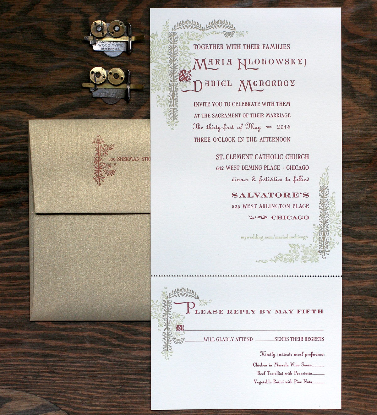
This was the perfect project to work in a new cast of Arboret, courtesy of Skyline Type Foundry. This lovely set includes both 12 and 24 pt of floral type as well as ornaments that can be set in endless configurations to make the type look like it is part of an arbor. And while I didn't use any of the type (apart from two characters, including the ampersand), the ornaments created plenty of ways to add floral elements to the invitations.

arboretornaments
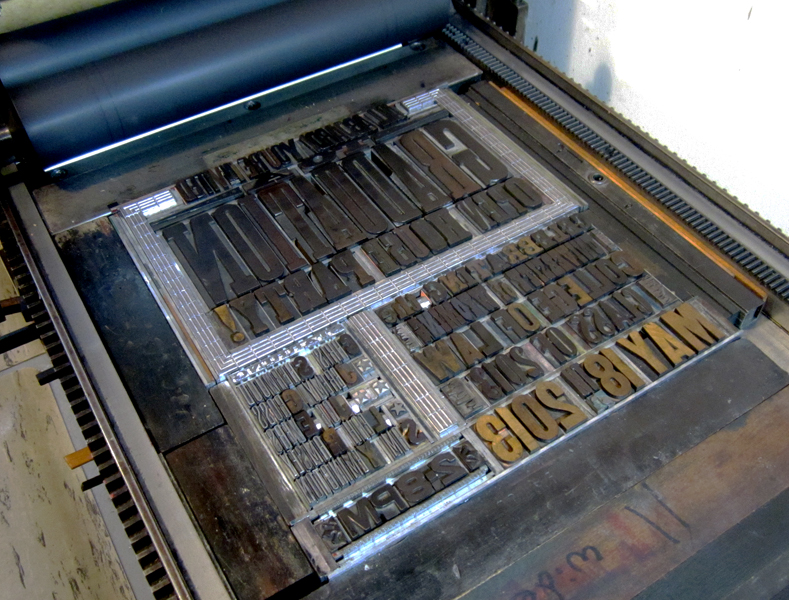
Here is the lockup for the green and gold at the top of the invite. Both are set together to make sure they will line up appropriately, and then each color is swapped out for spacing when the other color is ready to print. Worked into the Arboret ornamentation are a few actual 19th century pieces from our collection (the flowers and right side stems).

Tmariadan1
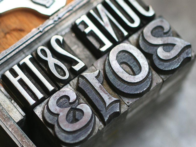
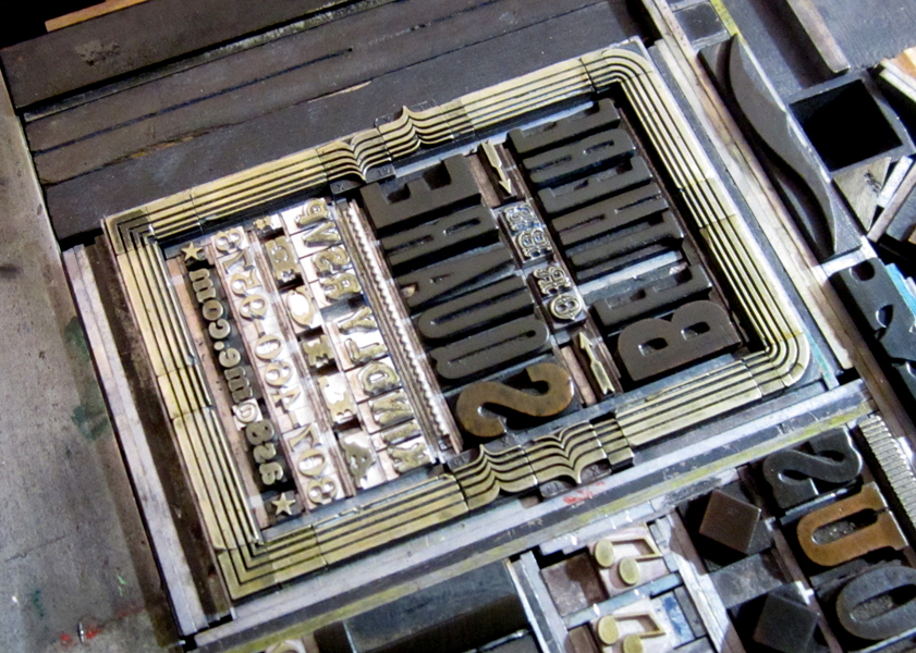
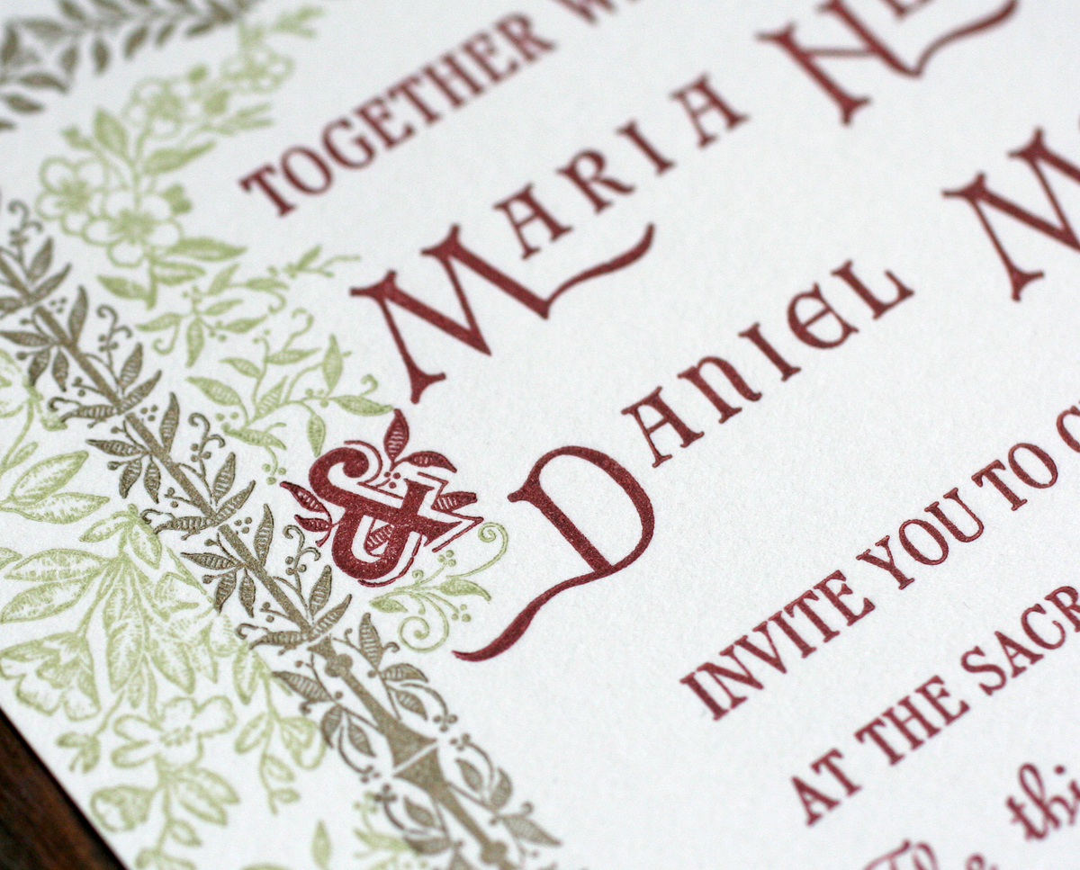
Here is the Arboret ampersand, printed with the rest of the main text. Maria and Dan's names included 100 year old initial caps, mortised to include a 20th century typeface.

mariadan8
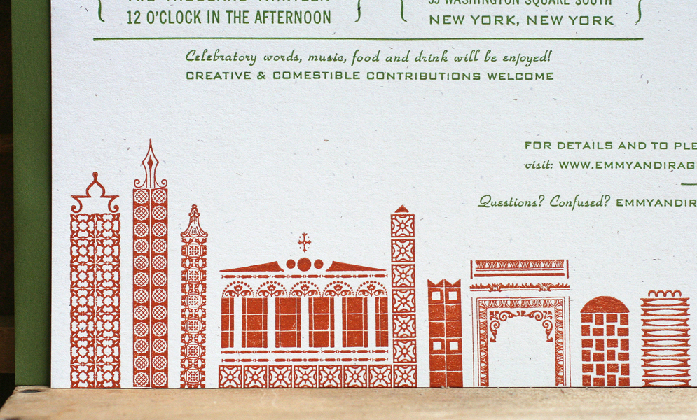
Here are a few more of the ornaments at the bottom of the invitation. Their website was printed in green so as to be a little less prominent than the important text.

Tmariadan2
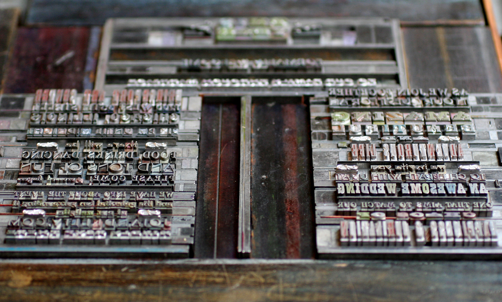
This is the second character worked into the reply card text. A great shot of all of the elements coming together.

mariadan6
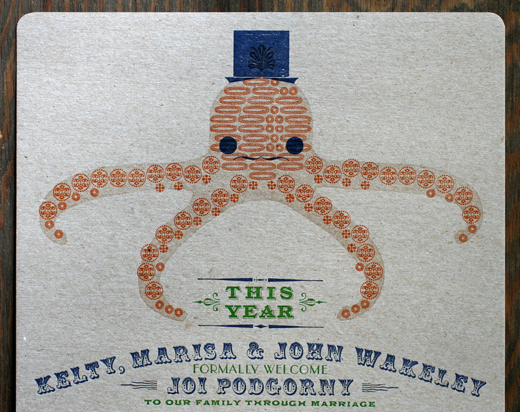
Maria's family does a lot of work for butterfly conservation, and she was hoping to work this into the invitation. No problem, thanks to Skyline and a recent cast of this little guy:

mariadan7
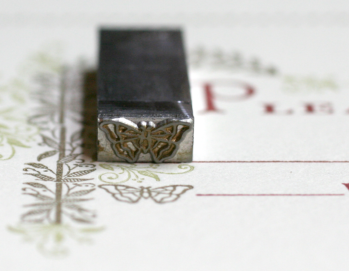
He also makes an appearance on the envelopes, which were a shimmery gold to tie into the gold ornaments on the invitation. It's remarkable that such detail holds up with metal type, much more so than digital type converted to plates for printing. And we're lucky to have an opportunity to work these historic typefaces into our everyday projects.

mariadan9


A Tale of Two Invitations

Years ago we distilled our wedding invitation offerings into four distinct collections. The purpose of this was to streamline our rather time consuming process in a way that left room for customization but would speed up the design and typesetting. Each collection focuses on a specific style and era of typography that gives us parameters in which to work while maintaining flexibility of papers, colors and overall tone. Of all the collections, the City of Big Ornaments is near to my heart because of its ties to the city and the challenges of creating a representational work with the ornamentation in the studio. It's also one of our most popular invitations and we've done versions of Phoenix, New York, Philadelphia, Seattle, Houston and of course, Chicago.

Emmy and Ira came to us desiring this style for not one but two invitations, both Chicago and New York. They planned to have two wedding celebrations with slightly different guest lists, so we had the fun of altering the skylines and colors to accommodate both places. We like to cater the skylines specifically to buildings or places each couple prefers, even if it is only a rough representation. Emmy and Ira had two such requests for their New York invitation:archjudsonHere they are in ornamental form, along with a shot of the final print:

Temmyira3

emmyirainvite7These are the final invitations for both locations. We used heavy kraft and white paper stock, both 100% recycled with speckles. Mossy green envelopes worked for both sets, and we flipped the color palette for ink on each.

emmyirainvite1

emmyirainvite4This style works best with simple typography that projects a mid-century vibe. It's not too overpowering or stylized so as to compete with the ornamental cityscape. Emmy and Ira liked the idea of the type looking like business forms from the 50's.

emmyirainvite2

emmyirainvite6

Temmyira1Our collaboration with soon-to-be-married couples often ends with the invitations, but we had the pleasure of working with Emmy and Ira on a number of additional pieces to coordinate with their invitations. Skipping a guest book, they decided to print two large pieces that could be signed by all of their guests and then framed in their home. Again, we designed these to mimic the invitations with some different elements between the two. These cityscapes were created with wood type and ornaments given the 18x14" size of the prints, and they are a little more generic so they could be easily flipped and repeated.

emmyiraguestlog1

emmyiraguestlog3

emmyiraguestlog2

Temmyiralog1

Temmyiralog2Cds as wedding favors are a popular choice and we created simple pocket sleeves for these here. Years ago I designed this custom die for pocket sleeves to resemble vintage LP sleeves; we've used it for hundreds of projects.

emmyiracdLast but not least, Emmy and Ira needed little placecards for their Chicago event. These are simple tented cards with just a piece of the skyline in miniature form. Individual names are handwritten... can you imagine setting type to print each individual one?!

emmyiraplacecardAs we acquire more type and ornaments, I look forward to creating new, varied and more complex cities and representational images in the spirit of clever letterpress printers of the past. But we can't accomplish this without the enthusiasm and imagination of our current and future clients.

Amazing, Beautiful and Adventurous

When a client comes to you and says they want an invitation with an ornamental octopus and a frog with a waistcoat, you don't turn them down! Such was the case this Spring when we were approached to do an invitation celebrating a woman never interested in marriage and a stand up guy with two kids. Have fun with it, they said, as the wedding would be a celebration on many fronts. So we did: joikelty1The octopus definitely gave us a run for it, as it stylistically couldn't be too far off from the frog image and the delicate typefaces. So instead of using larger wood type elements that seemed out of place, the whole thing was created using 3 different border ornaments.

Tjoikelty5Before printing the ornaments, I carved a simple linocut of the octopus shape and laid that down first in transparent ink for guidelines.

joikelty6The invitation was printed in four colors, one at a time. After the transparent ink (this is usually used to create lighter tints of saturated inks) was done, the green came next, followed by the orange. Both are set up at the same time for the initial proof to make sure the leading and spacing would all be correct. Then the orange is taken out so the green can be printed. When the green is done, the orange is put back into the form and the green is taken out.

joikelty5

Here you can see all but the blue set up and ready to proof.

Tjoikelty1Blue was the final color. There were a number of elements to get right here, from the top hat and face of the octopus to the curved type and plate of the frog. It was a joy to use some really beautiful type on this one, including the 2013. The studio only has this in figures, so it was a treat to finally have a good use for them. The June 28th is set in Headletter, a Chicago-designed typeface from Barnhart Bros. & Spindler.joikelty2

Tjoikelty7

Tjoikelty2And here's the full octopus in all of its glory.

joikelty3The invite was printed on gray chipboard and scored so that it would fold into a 6x9" envelope, which was navy blue to match the ink. This was such a treat to design and print; we love a unique challenge! And all the best to the happy family.

All Aboard!

This past winter, I had the pleasure of printing graduation announcements/party invitations for the University of Wyoming College of Law graduates. They celebrated in style at the charming Laramie Depot Museum, a must see for vintage train enthusiasts. The location drove the direction of the design, right down to the muted color palette, as you can see here: wyoming1

This poster was a long one, at 12x22", a bit long for our press to print comfortably, and so it was done in separate passes for the top and bottom. The top went first as you can see here, followed by the bottom section for each color (three altogether).

Twyoming1

I thought it would be fun to throw a curve into the layout to break it up a bit and mimic some of the vintage train posters in the Starshaped collection. This involved a little creativity in the form, as you can see from the diagonal leads and furniture. The small train is a copper cut I found years ago.

Twyoming2

One of my favorite bits is the Ombree border around the reply and contact info. It requires a bit of tricky manipulation but with a little effort you can come up with all sorts of combinations to create square and curved corners as well as 'dips' in the middle of any line. Sadly, my collection of Ombree has seen a lot of love in its lifetime and has many damaged spots. However, I recently tracked down a brand new set (well, not new, but never used), so it'll be making many more appearances in the near future.

Twyoming3

Here you can see both the curved type and the beaten up Ombree border:

wyoming3

I also found a new cast of this track-like border that seemed perfect for the occasion. Graduation is printed in both the brown and green to give it a little more emphasis. The All Aboard type is actually cut on a diagonal and has it's own spacing to make it gel with everything else. There's always a lot of improvising going into posters; there is no N to fit with Invited, so I had to find a smaller one that would work. These are the joys of working with hand set type as opposed to digital; problems you never imagined pop up and need to be solved, which keeps the process from getting stale and takes the design in a direction that you may not have anticipated in the thumbnail sketching phase.

wyoming2

Congrats to the Class of 2013! Hope the party was as swingin' as the poster.

Celebrating our Neighbors

Every once in a while, the stars align and we can sneak jobs on press during our busiest times. I was recently contacted by Sarah McGuire, a local jewelry artist, about her upcoming 10th anniversary open house, with the hope that we could come up with a great invitation in a short period of time. Yes! Here's what we did, photographed with one of Sarah's lovely necklaces. sarahmcquire1

Sarah wanted a broadside-styled card with blocky, simple typefaces in various sizes, and definitely printed in silver.

sarahmcquire2

This is the form, showing the combination of metal type, wood type and rules (used for printing lines).

Tsarahmcquire

Tsarahmcquire3

Here's the form in the press, inked and ready to go.

sarahmcquirelockup

After the basic setup, I've found that large wood type often doesn't print as well combined with small type on a platen press. I took out the larger wood elements and filled them with spacing (called furniture) in order to run the small type first. After that, I put the wood back in and replaced the metal type with furniture. Two runs for one color seems like a pain, but the result is that much better and two runs on the platen are still faster than one on the Vandercook, where everything could be printed at the same time.

Tsarahmcquire5

Here's the studio address, in our own lovely Ravenswood neighborhood! We will be celebrating with Sarah in her lovely new space on April 26th, and hope to see you there, too.

sarahmcquire5