
Like Marissa and Ned, Sarv and Graig were keen on wedding invitations that would resemble mini posters and they had great inspiration in the form of this vintage book cover:

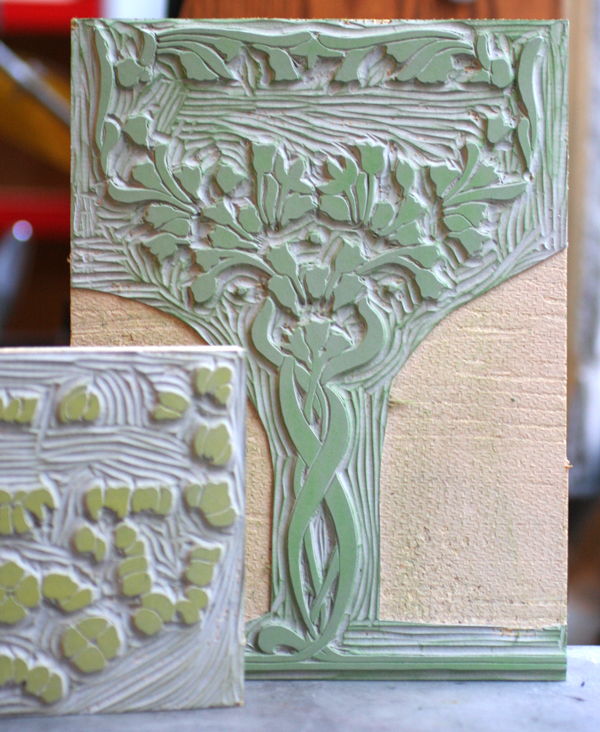
Given that letterpress printing doesn't have the opaque vibrancy of screen printing, we ran a few tests to see if we could successfully achieve two light colors on dark blue paper and were happy with the result; the colors were muted in a faded, old fashioned way. We decided on creating a piece that was 7x10", so that it would fold to 5x7" and mail in a standard A7 envelope. The image worked perfectly as a two-color linoleum cut after a little adjustment to the overall size and placement:
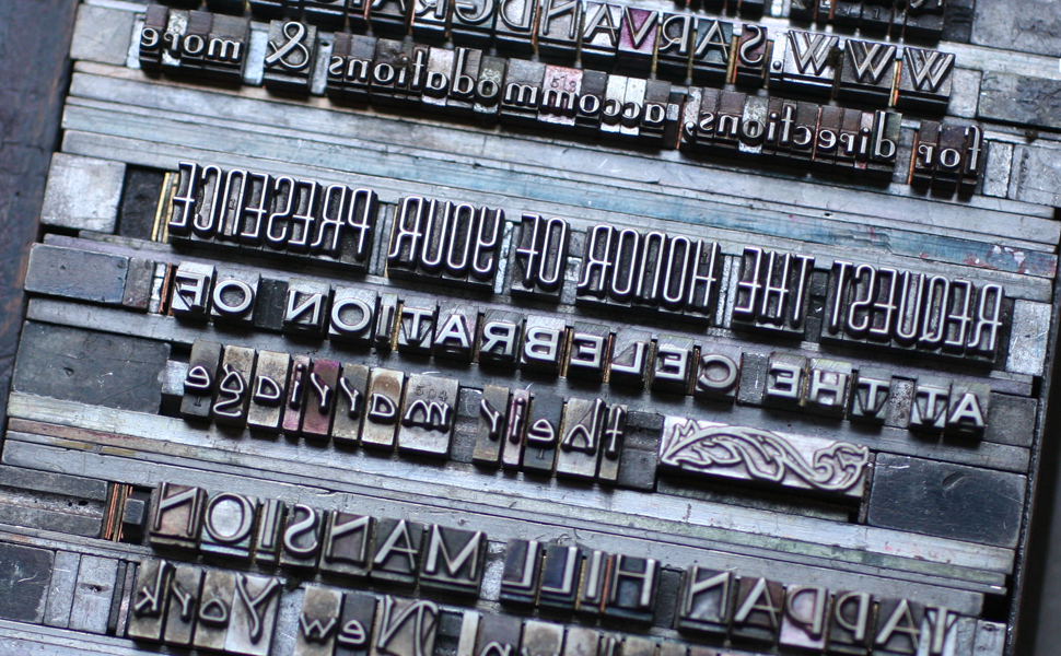
The type is set in a mix of deco-meets-nouveau styles to pull the overall design into a more cohesive and streamlined form. It is printed in gold to pop out from the navy paper. The typesetting was very particular to achieve a subtle curve along the artwork.

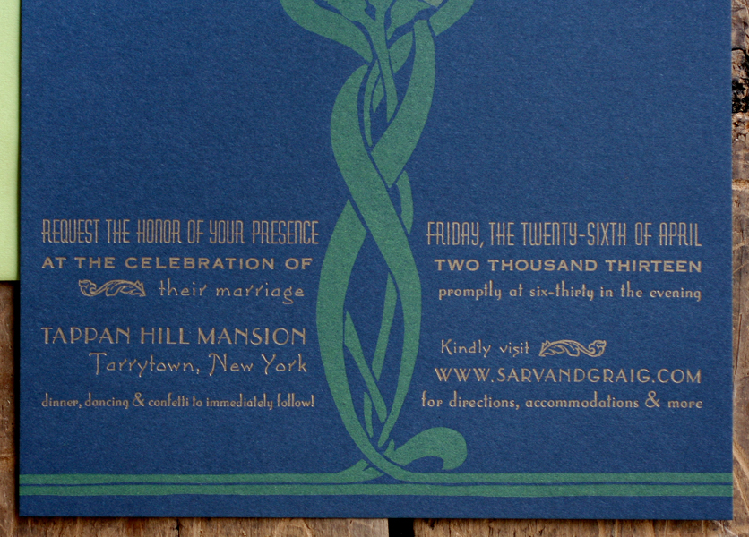
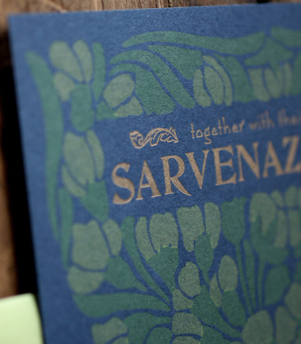
I loved having an opportunity to use our DeVinne type for their names; it's a lovely and quirky typeface from the turn of the century that sadly doesn't get enough play in the studio.

The invitation folds in half, and on the front panel (what you see when you pull it out of the envelope) is a snippet of the overall artwork with their initials rendered in our mortised initial caps and an ampersand from the 19th century typeface, Dakota.


The envelopes are sour apple green, and the reply cards are pale yellow to give a little pop to the color palette. We continued the abridged image on the envelopes in gold (the return address is on the back flap) and carried through the multiple typefaces on the reply.


Here's a shot of the final suite. I intentionally did not score a few so that Sarv and Graig would have some unfolded ones as keepsakes or to frame.
