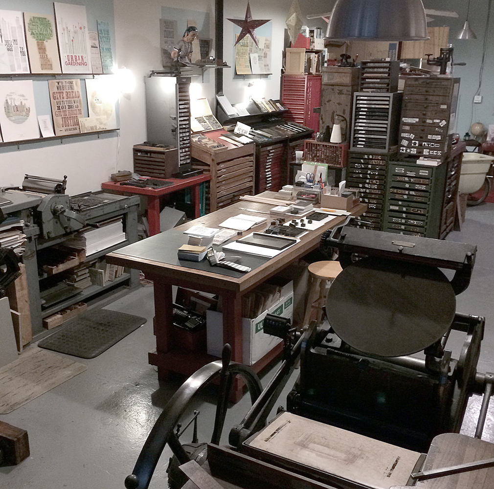
Way back in 1996, I started working at Fireproof Press, run by John Upchurch and Matt McClintock, known for producing music packaging, posters, business cards and other oddball print pieces, mostly for Chicago-based artists. The third floor workspace, shared with Screwball Press, was hot in the summer, cold in the winter, scattered with press bits and flying sheets of paper. I loved every minute of my time there (almost). Everything was made better with root beer.
John closed Fireproof in the winter of '98, and I like to think that had he not done so, I'd still be there today. Forced out into the world, I got one press, and then another, and in the summer of '99, Starshaped Press was born, at least in name. I took over a number of jobs that had been intended for Fireproof, and then began a two-year stint at Columbia College, alongside John in his new position. During that time I grew the business and set up our first studio, about 385 sq ft in the lovely Ravenswood area, where I worked exclusively for two years after leaving Columbia. In the summer of 2003, the studio moved to a bigger, brighter space also in Ravenswood, where the work continues today. Here's what an average day look like:
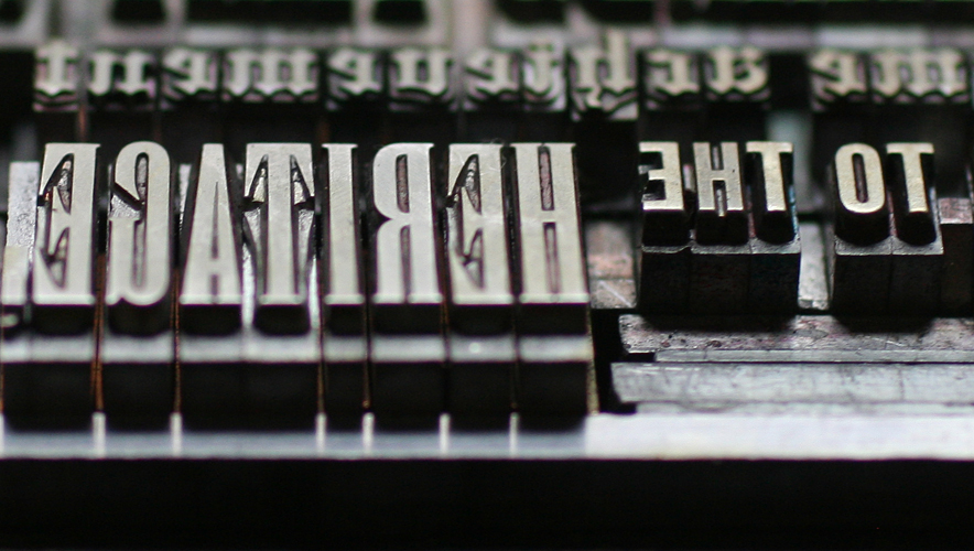
 To celebrate the 15th year of the studio, I've planned a series of prints to showcase some of the fine type in the studio as well as the ideals that have guided the work of Starshaped over the last 15 years. The first print pulls a quote from the Barnhart Brothers & Spindler type specimen book of 1923 and is printed in three colors.
 The first layer is printed using the back sides of wood type, allowing the texture of the wood to come through.

 The border elements are composed of ornaments from different collections, mostly cast at Skyline Type Foundry.
 'Tradition' and 'Progress' were printed with wood type that's in pretty rough shape. But I wanted to contrast the rustic aspect of this 100-year-old type with some of the newest metal type; 'typographic art' is set in Runic, a brand new cast and not used before this project.


 Where did the time go? These four typefaces (Railroad Gothic, Onyx, Engravers Old English and Stymie Bold) have all come to the studio collection from different sources over the years.

 Here is a full shot of the final print. I wanted to deconstruct the traditional text-heavy broadside of the late 1800s while maintaining the 'more is more' approach to typesetting of that time. I felt this quote was particularly forward thinking, especially given that it appeared in print in 1923.
I am sending the print (along with ones to come this year) to the printers and designers that I admire, and that have championed Starshaped over the last 15 years, as well as folks that have a passing interest in letterpress and typography. There are still many copies left in the studio and I'm happy to send one to anyone that would like to have it! Just email with your info. And thanks for the support. 2014 is going to be a great year in the studio.


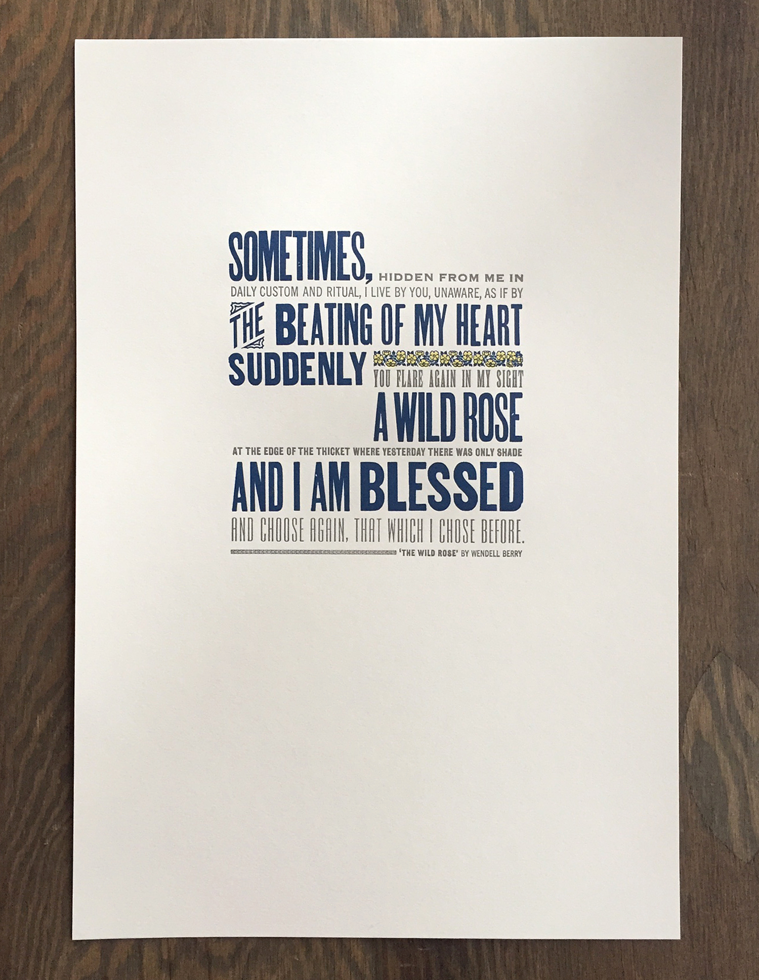 Here's a close up of the 12x18" print, done in 3 colors on soft white cotton paper. It's a nice mix of both metal and wood type that, while slightly beaten up and rustic, mostly keeps to a straightforward sans serif diet.
 The is the type in the final lock up. We usually set up the entire print if possible then pull a proof. If everything is spaced accordingly and looks well together, then we can go in and separate individual colors and print just one at a time.
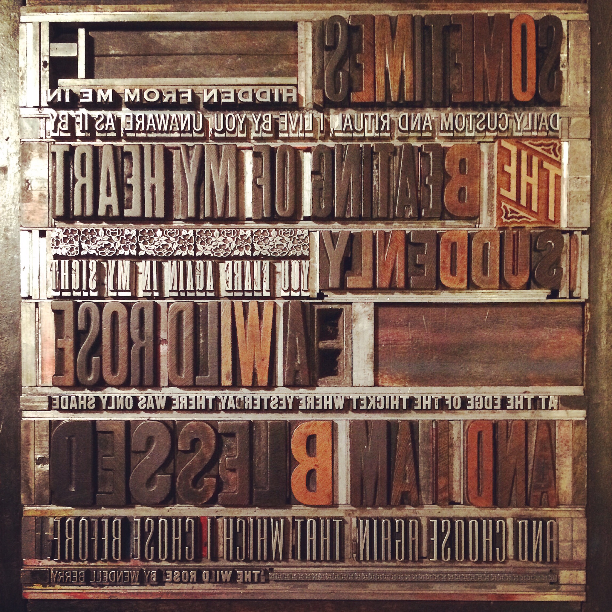 Some of the wood type for this piece is pretty rough, as noted in the uneven and speckled forms. The catchword 'THE' is new, however, and is one of Moore Wood Type's laser cut pieces.
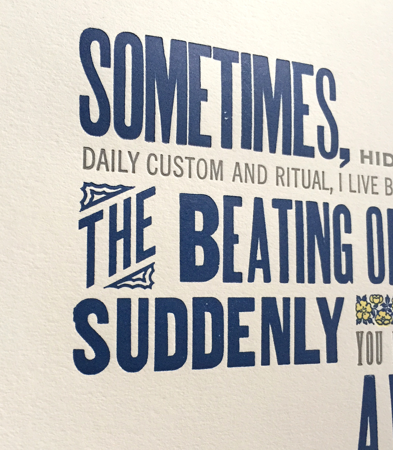 The print features two-color ornaments from the Keystone Type Foundry known as 'wild rose' ornaments. It's not every day that named ornaments tie in directly to the words being printing, but they sure did here. These are beautiful in their detail and include two different sized sorts, making it easier to fit them into any line length. I'm certain this charming print was a touching Christmas gift.