San Francisco, Chicago, Vancouver, Siena, London, Two Rivers, Aurora, Prague, Vienna... The Well-Traveled Ampersand series has made one loop around the globe and is about to embark on a second. I'm using this layover to show a little more behind-the-scenes as to how each ampersand is created. While the process for building each is similar, the drastic differences in form means tweaking how the structural elements are cut and stabilized.

The first step is choosing what ampersand to tackle and why. Does it tie in well with a region or city? Was it designed by someone I admire? Will it challenge me to set type in a new way? Is the form ridiculously incredible, and will that give me the fuel to work day and night to elevate it through the use of metal ornaments?

Russell Maret cleaning up his Cancellaresca Milanese before the pattern was made.
About half of the ampersands were chosen before beginning the series. I left the remaining open so that there would be flexibility in case something surprising presented itself, and if I found contemporary collaborators to contribute. The caliber of folks jumping in to provide a character is overwhelming and inspiring.

The pattern for Wien, by Frances MacLeod.
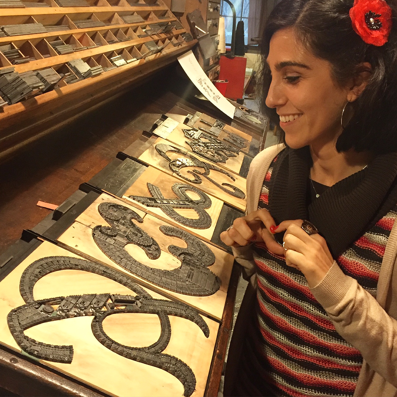
After the pattern is sketched out, I trace it onto wood and trim it in sections with a bandsaw to fill the galley. Some of this custom made furniture, the non-printing wood supports, is sanded and refined, then double stick taped onto the galley. If needed, I run a paper strip around all seams to smooth the joins.

Cooper Black, awaiting its destiny with metal ornaments.
Then I'm off and running! I pull together research for each ampersand, examining how to represent its region or city. Are there specific structures that are recognizable? Is there an overarching ideology that encompasses the area? Does the city offer something specific that no other city has? What ornaments in the Starshaped collection will best represent this?
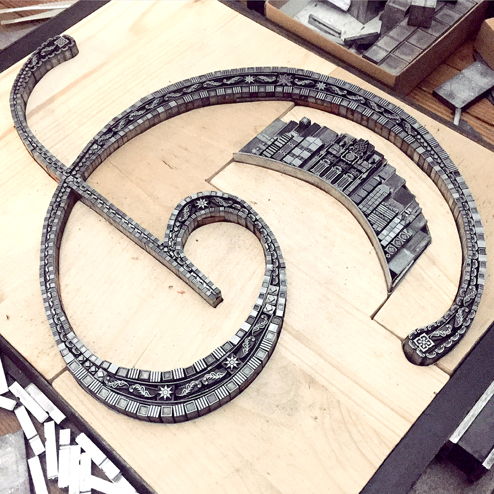
Building out the structure is a bit like Tetris-meets-Operation. Like all letterpress work, the type and ornaments must be held in place firmly to print successfully. But unlike normal typesetting, the elements of each ampersand must work around curves instead of straight lines. So while I attempt to set them solidly in place, they occasionally fall over and out come the tweezers.

Filling in Californian.
The hardest two ampersands thus far, for entirely different reasons, have been Preissig (Prague) and Cancellaresca Milanese (Siena).
For Preissig I wanted to create a little snapshot of Prague, keeping the vantage point straight while building on an extremely angled ampersand. It took days to get it right and many, many proofs of the sky area to develop the 'magical winter night' feel I wanted.

Preissig detail with tweezers, extra sorts and an etching needle for pushing down errant spaces.

Late night workspace.

Every ampersand has an entirely different form; this is probably why it is such an attractive character to both type junkies and those who couldn't tell you what 'stem' and 'counter' mean. I fell hard for Russell Maret's Cancellaresca Milanese, with it's sleek and sweeping curves. Having had the fortune to discuss it together in the studio, we considered how some aspect of Siena could be included that was outside of the form itself, given it's narrow curves.

Detail of Cancellaresca Milanese.
The final form, with many thin copper and brass spaces along the edges to help keep the curve true.

Since writing this post about the first four ampersands there have been these additions to the series:
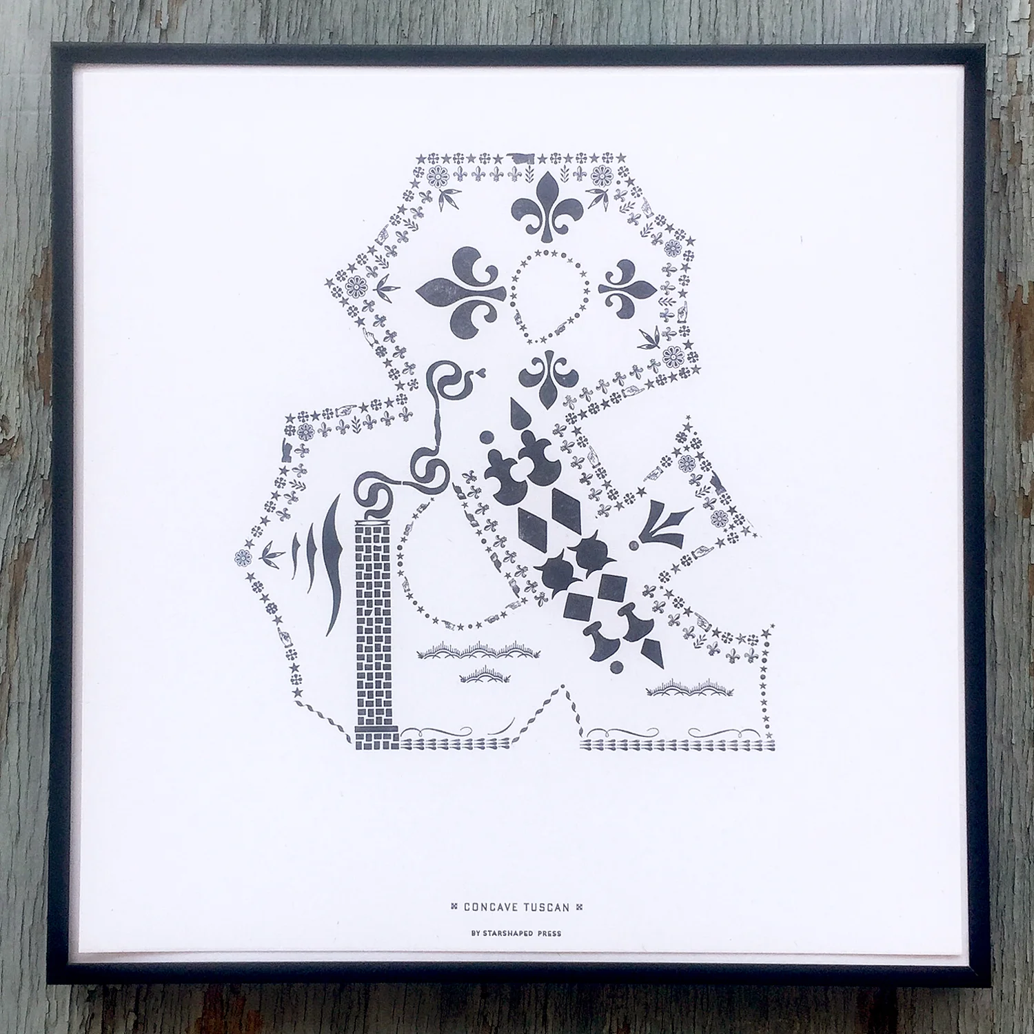
Concave Tuscan
Concave Tuscan is a chunky nod to a well-known wood typeface and represents Two Rivers, Wisconsin, home to the Hamilton Wood Type & Printing Museum. I chose ornamentation that is popular in both wood and metal form and used wood type from Hamilton as well as Virgin Wood Type and Moore Wood Type to recognize today's practitioners of the craft.
Wien, by Frances MacLeod, pulls in architectural styles for which Vienna is known, including Romanesque, Baroque and Workstatte.
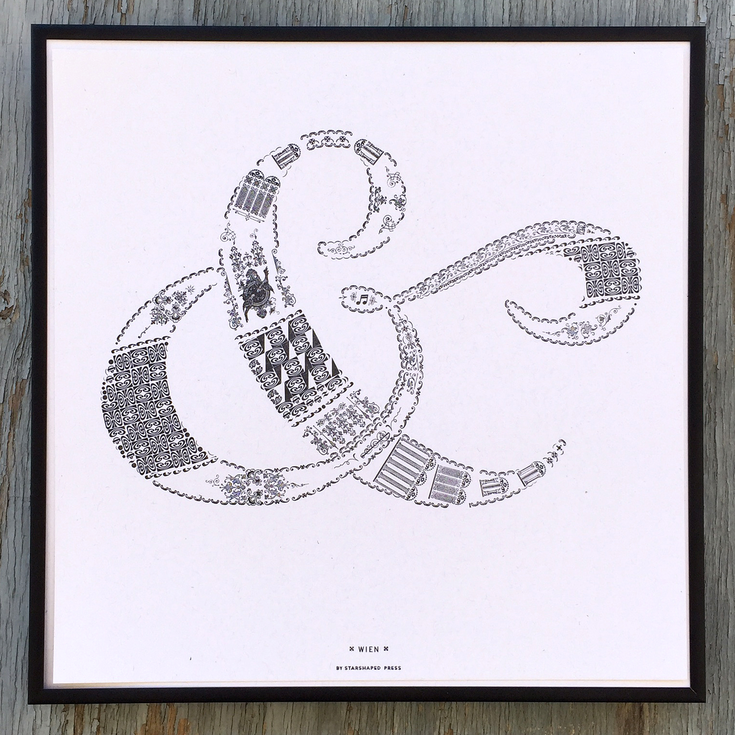
Wien
The most recent ampersand is Totemic by Jim Rimmer. It features bold, graphic elements indicative of the totem poles of Vancouver and was downright fun to piece together.

Totemic
I've selected some glorious additions to the series to be printed over the coming months. While some are historical by designers no longer with us (Adrian Frutiger and Dard Hunter are on deck), a few are brand new, never-before-seen characters by women I am so pleased to have on board. Jenna Blazevich will be creating an ampersand based on her upcoming design intensive in Rome while Nadine Nakanishi, one half of Sonnenzimmer, those international design world game changers, will no doubt be drawing something unlike all ampersands ever known.
Limited sets of the entire portfolio are available at the presale price through the end of June. Individual prints are also for sale as the ampersands are created. The portfolio includes a digitally printed 12" colophon with photos of all of the type forms. All are housed in a printed sleeve.
Show a little love for the 27th letter, like my Spanish sister-in-type Eva of Familia Plomez, who came to visit this Fall.