I can probably trace my fascination with magic hour, the first hour of sunrise and last before sunset, back to George Lucas' commentary about the urgency of shooting scenes of American Graffiti at these times of day. Living in the city doesn't prevent one from experiencing the soft and radiant light that occurs at this time, whether you're on the beach of Lake Michigan or in the alley behind Starshaped, as I often am. This Spring, magic hour has come at the conclusion of a 12 hour day, at the break before starting a second shift, or at the end of an all-nighter. In all cases I am physically and most likely emotionally exhausted, pondering how to cope with what follows this stretch of work (usually parenting or housekeeping and seldom sleep). Standing in my alley and seeing the baby blues mixed with copper golds, reflecting on the buildings surrounding mine gives me a momentary sense of calm and clarity. This moment is something I've wanted to capture in print.
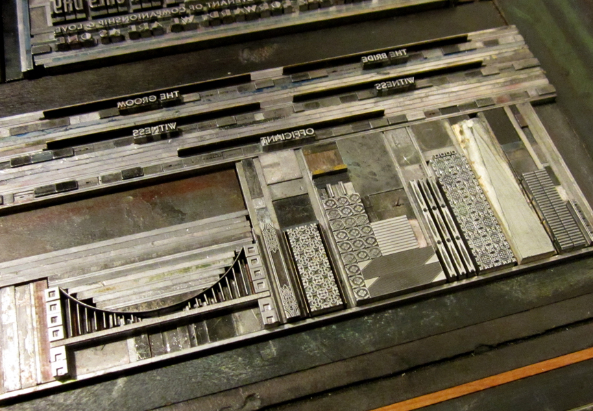
 With type and ornament, not imagery, my strong suit, I stalled, as no single typeface in the studio seemed right for the two words making an appearance on an otherwise graphic print. Maybe creating some type of geometric blackletter would provide me with the next challenging set of letterforms. This seemed like it might be appropriate for capturing... something, in the print that I couldn't quite nail down. So I started with the type and settled on lowercase as it was more appropriate for the size and, well, easier. I found a digital version that was relatively straightforward and started drawing over it, making changes to suit the geometry of metal type.
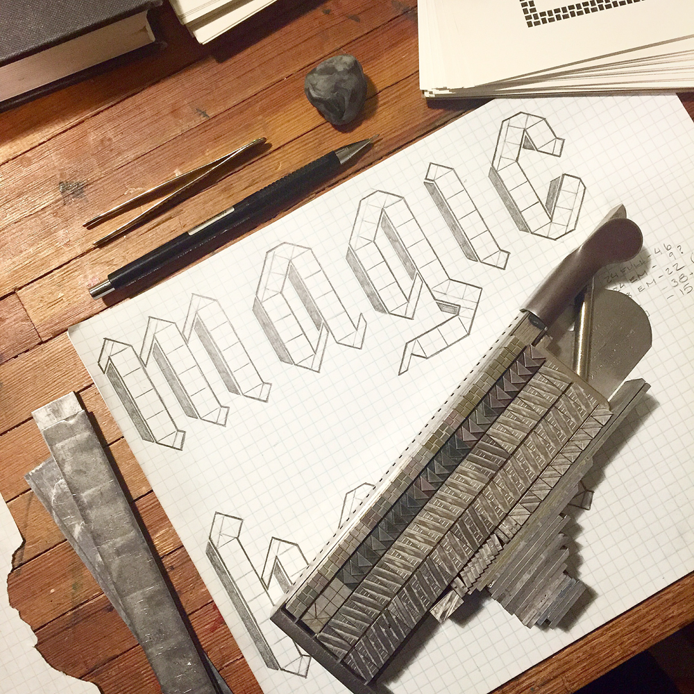
 Then I narrowed down the sizes of potential ornaments to something I could find in the studio. The 'i' does not have a dot here as I planned to reflect the shape of it off of the 'h'. You'll see why.
 I compiled ornaments and rules that felt like a good fit, knowing that I would need to miter the edges off of many sorts to make it happen.
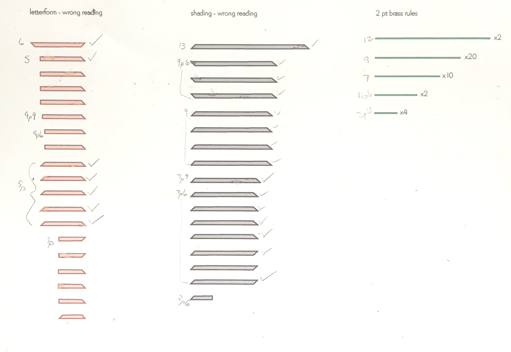
 I was concerned that my hand drawing wasn't true to ornament dimensions (can someone please make graph paper that's measured in picas!?), so I drew it on the computer, with each box and triangle representing the true size of the ornaments. This allowed me to put together an accurate cut list of rules, including the correct miters and quantities.

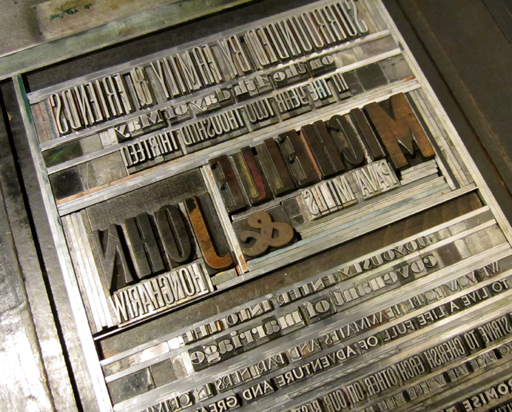
 After collecting everything necessary I printed out a wrong reading guide on which to build. Slowly. But surely.


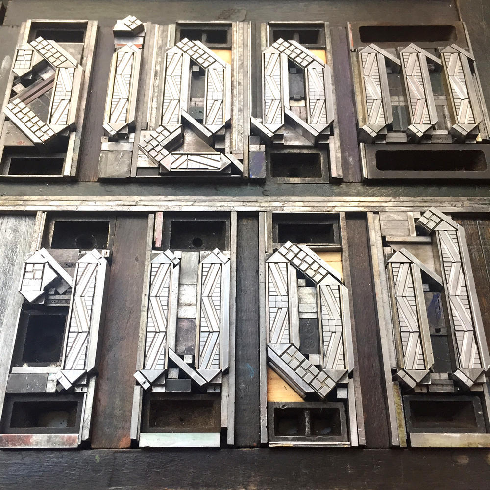
 And then, there it was. Kerning issues waiting to be corrected.
 This is a large portion of the shavings I mitered off of the rules and triangle ornaments to make them fit together. These scraps go back to the Platen Press Museum to be melted down and saved for future typecasting.
 And then... how will the type play with the rest of the print? I pulled series of ornaments that fit my ideas of sky and started to build arcs. My handy rule bender saw a lot of action, creating leads and slugs that would shapes these curves.
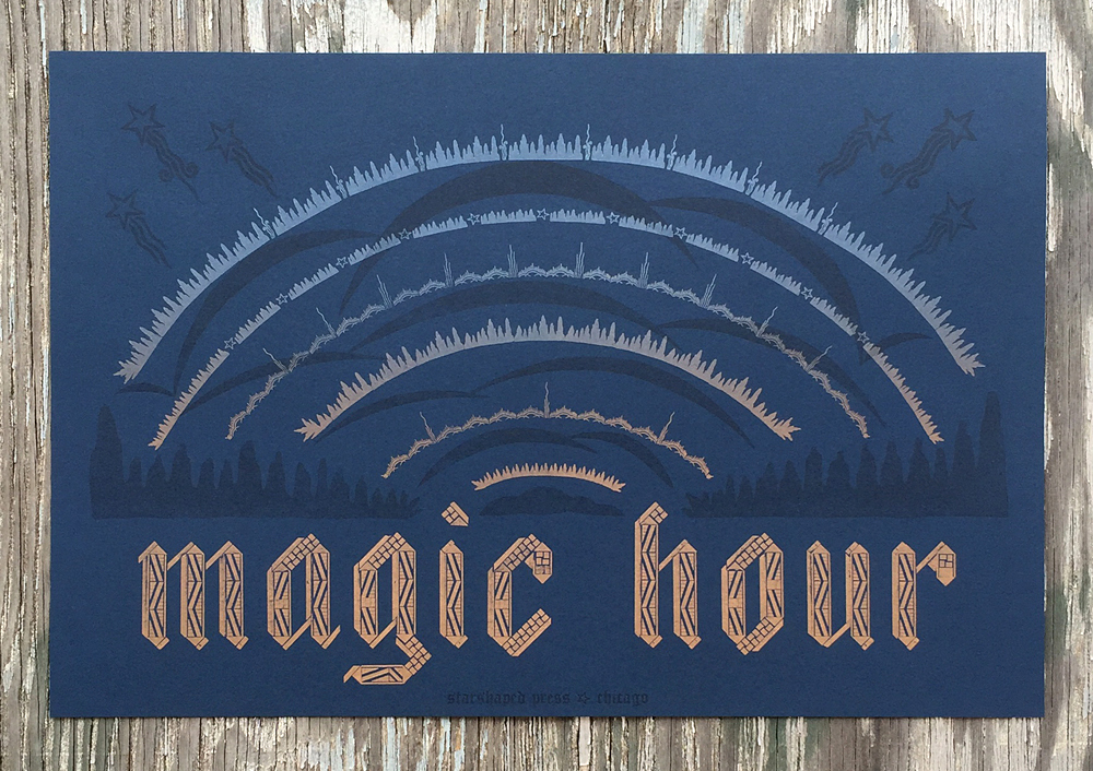
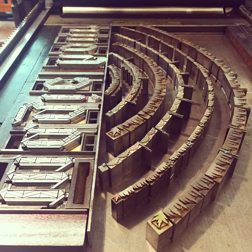 The final form is attractive, mixing standard square and rectangular furniture alongside custom made angled pieces. This photo was taken after pulling a hand inked proof in copper gold on navy paper.


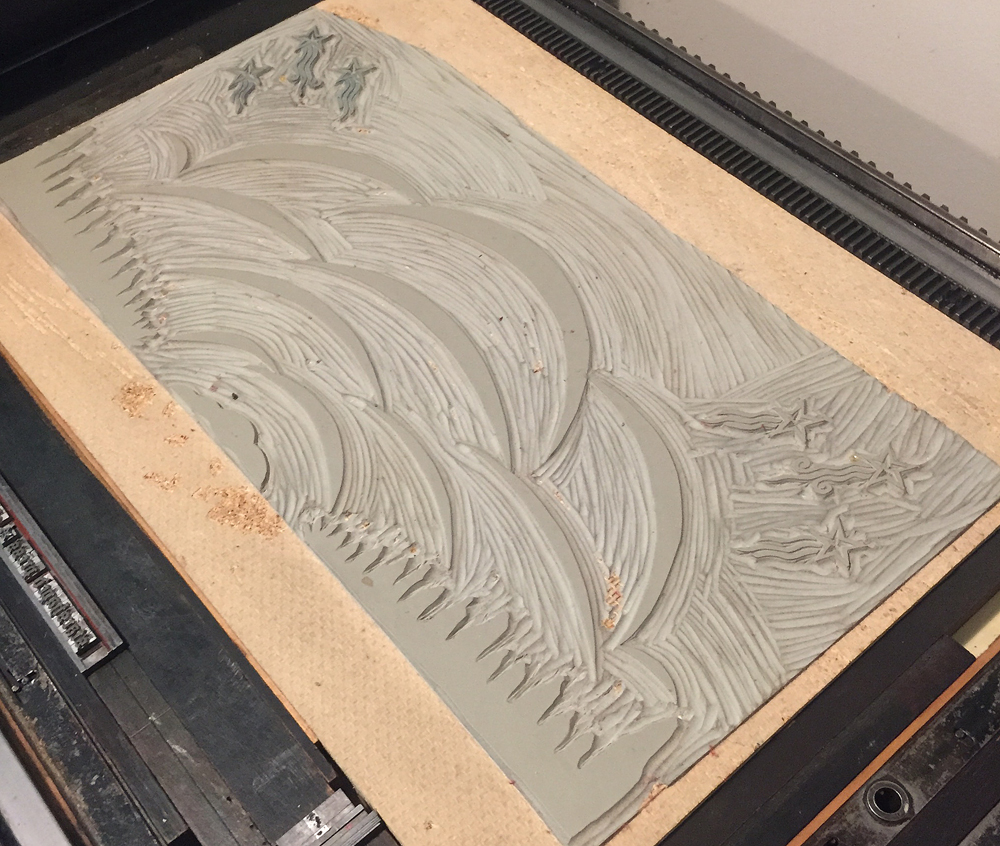
 The first black and white proof looked great but I felt strongly that something was missing. I walked away from it for three weeks to stew. But I was still stuck, so I did what I do every time this happens. I ran to 'my' Sarah, former Starshaped Girl Friday, for another opinion and a life line. Together we brainstormed a linoleum cut with subtle nods to the ornaments in play but in a more abstract way. How I miss her in the studio.
 This drawing, done on top of the black and white proof, was the final inked version I did before transferring it to linoleum.
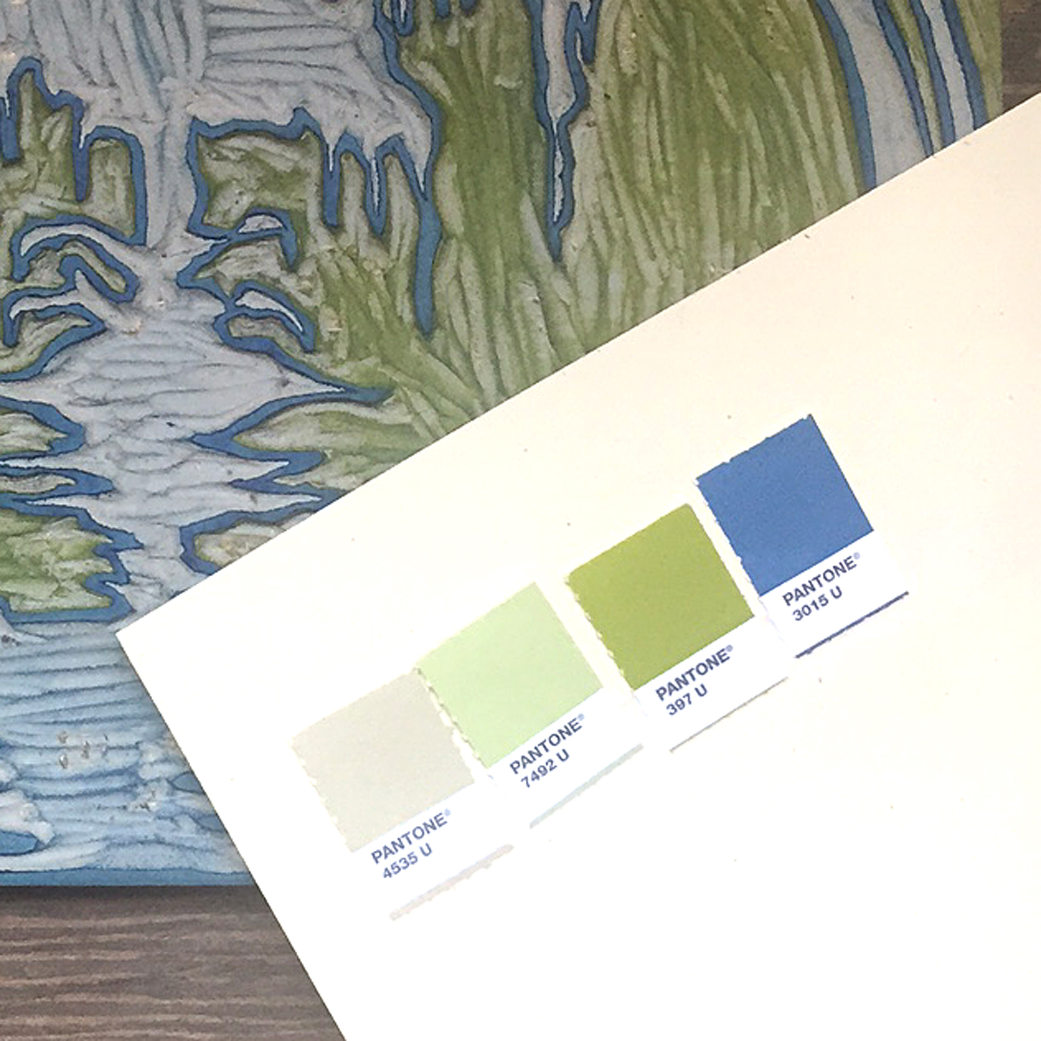
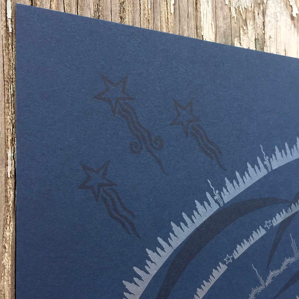
 I first printed the brightest colors as a split fountain that began with copper gold and faded up to pale blue.
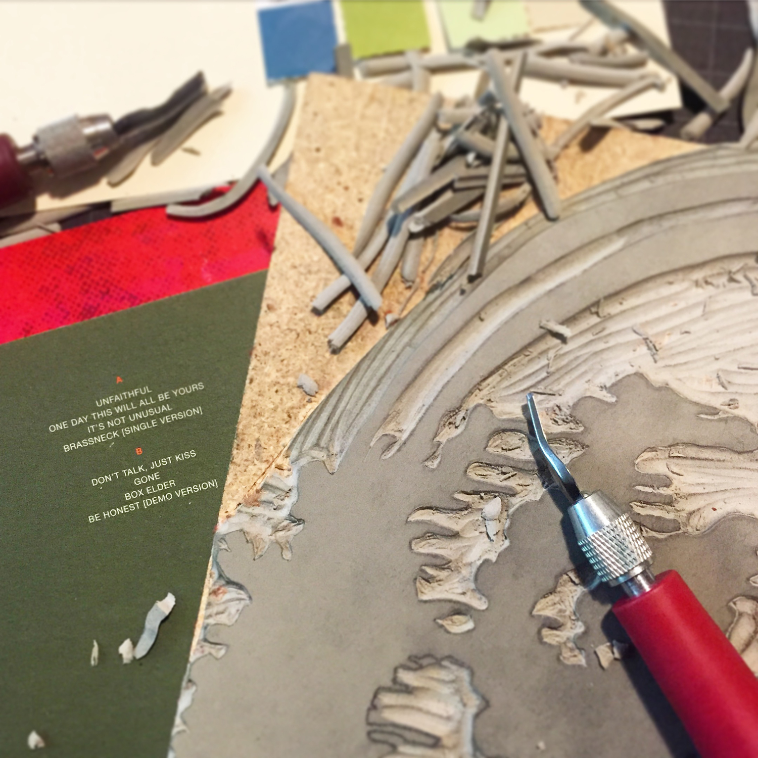
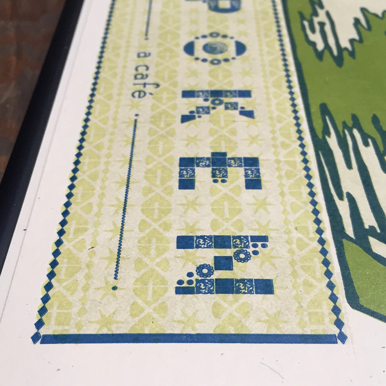
 Following that I printed a slightly tinted transparent white for the linoleum, which has a varnish-like look. It's just enough to give depth to the print while not competing with the more delicate ornamentation. You can see in the detail the mirroring of larger, linoleum versions of the tinier elements.
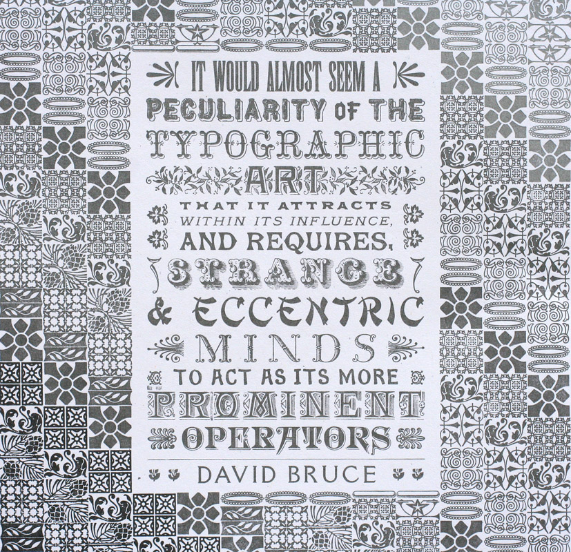
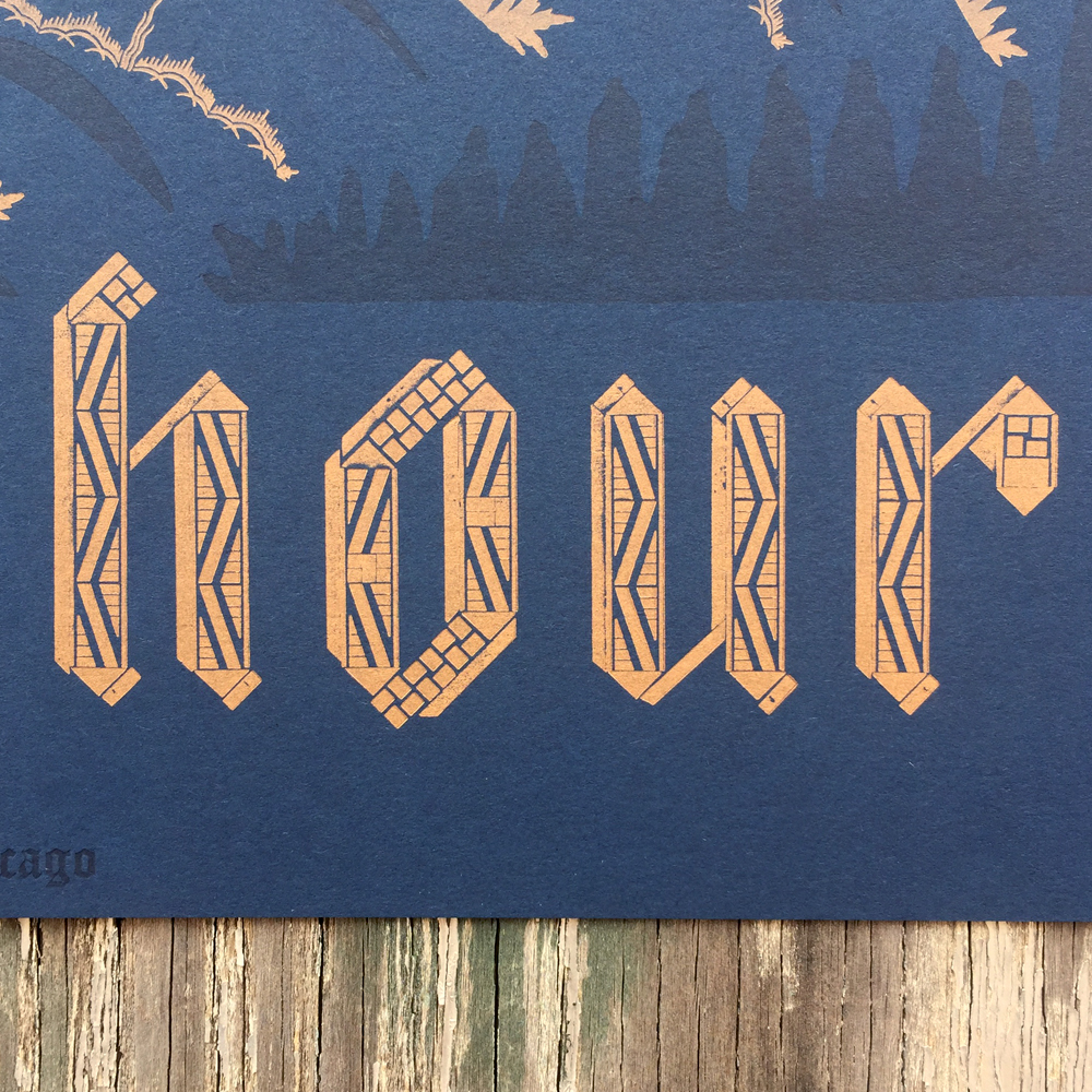
 I have stared at this blackletter. Probably for hours. Assembling this has been the hardest typographic work I've ever done and it's still so far from perfect. The miters aren't all spot on. Some rules are very beaten but were all I had. Printing was a challenge and it's not the finest I've ever done. None of these things bother me; if anything I'm glad that I used very geometric border pieces to give a bit of rigidity to what has somehow still retained a sense of 'hand' to it. I don't design type so my insecurities did what they always do and sought Rich for help. 'The C and O are taller by a pica... should I trim the tops down?' No... it's perfectly imperfect this way. 'Should I add a shadow to the type, printed in the transparent run, as I initially intended?' No, don't mess with the type; it stands alone. He's always right.

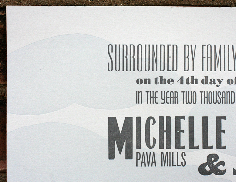
 The easiest part was setting the bottom credit. Just a simple, straight up line of type. And you can see here how the first row of curved ornaments balance between the dot of the 'i' and the top of the 'h'. Not perfect, but close.
 As I write this, I'm still uncertain about the final print. Sure, it provided me with all of the challenges I enjoy within my craft. The colors did exactly what I wanted them to do. The final piece is attractive to look at. But did it capture the sense of time I wanted to freeze? I don't know, but I am weepy when looking at it and think this reaction is a gut one stemming from the subconscious feelings I encounter at actual magic hour. The understanding that despite whatever lengthy shift has just concluded, I spent it doing something that feeds my drive and is chased with a moment of comfort, knowing this sky is there to guide me through the next 12 hours, whatever they bring.

Print is available for purchase here. And thanks.