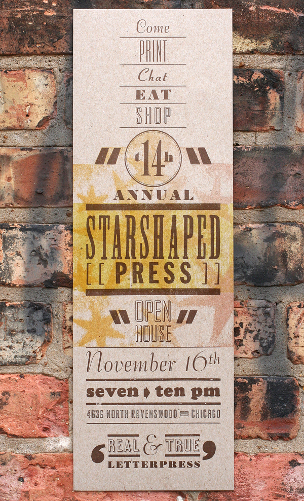
Setting up Starshaped Press back in 1999, I threw together a small open house for family and friends to come see my limited collection of printing paraphernalia. Fourteen years later, the open house has become a large annual event, where printers and printing aficionados come to eat, print and enjoy good conversation. I'm proud of the community that has built up around the studio and that continues to bolster our efforts to preserve the craft of letterpress printing. It's that time of year again when we ink up the presses, clean the floors and stock the studio with sweet treats for everyone to enjoy. And of course there's a poster to both announce and celebrate the evening:
 Inspiration for the open house posters comes from a different place every year and gives me a chance to push our type collection into a certain aesthetic. This year I revisited some of the design work done by Vaughn Oliver and v23, the longtime in-house design force behind most of the early 4AD record releases. It's an understatement to say that this design work changed the course of my creative life and showed me incredible, contemporary typographic work. I wanted to play with some of the type we have that doesn't see the light of day too often yet evokes the conscious typographic decisions made in v23's work.
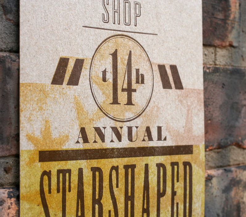
I haven't had much experience printing brass circles and this was a great opportunity. It's a bit tricky getting the type inside to stay straight, and buffer around the edges to hold it in the form. Letterspacing 'th' around the 14 was also a challenge, as the 4 needed to be mortised so that the 'h' could fit closer. Love that band saw.
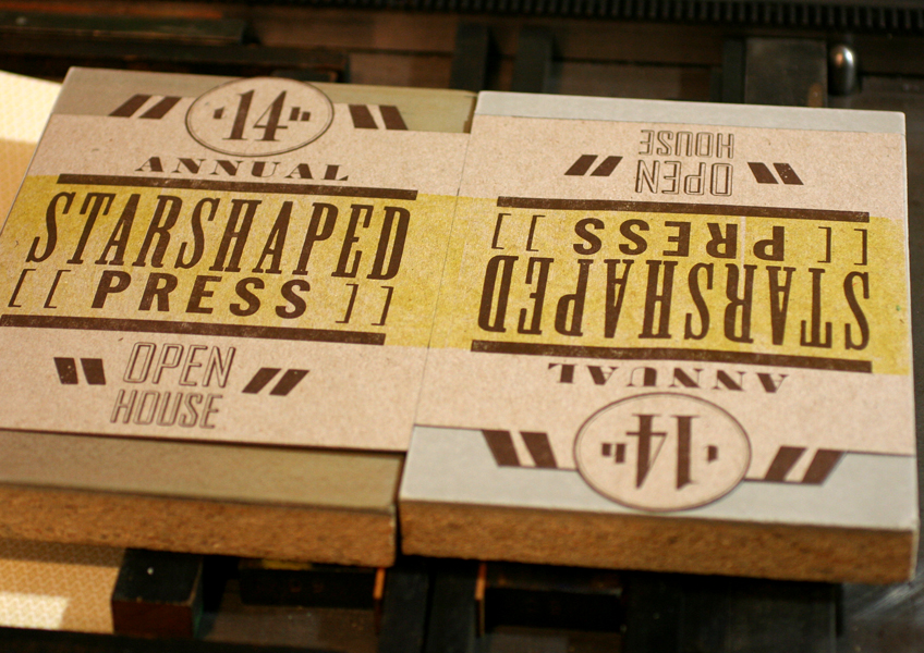
 This is one of our more attractive forms of late, hanging out on our imposing stone. The quotation marks come from larger wood type that I trimmed to size to fit comfortably and allow for maximum flexibility of placement.
 I really didn't want to carve any specific image for this print, but instead wanted a moody feel with a hint of stars.
 The best way to achieve this is with a pressure print, which means adding shapes to the makeready of the press and running the paper over them through the press. I used linoleum as the inking medium and trimmed two pieces to the outline I wanted for the poster. The dark copper brown was run first, followed by a strip of yellow printed with the back sides of wood type. It was done as a work-in-turn so that I could get two prints out of each sheet of paper.
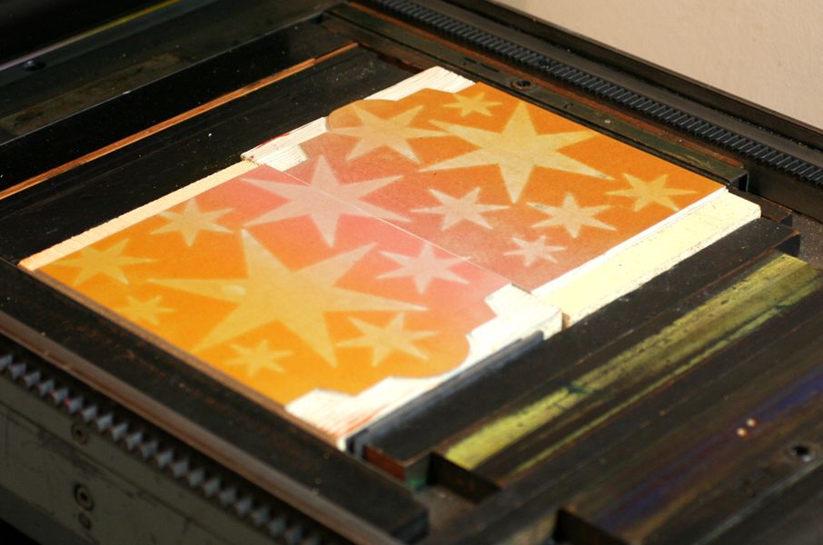
 The chipboard stars were then added to the cylinder of the press, under the poster paper. When the paper hits the inked linoleum, the areas where the stars are will hit heavier and will therefore make a stronger impression.
 Here are the linoleum blocks inked; both light orange and pink were on the press in what's known as a split fountain. The stars here are not carved in the linoleum; this shows where the paper is hitting the block hardest and picking up the ink for the print.
 All together, this achieved the exact effect I was looking for, coupled with the beautiful type.
 Real and true letterpress indeed! I'm awed by the successes, epic failures and enthusiasm I've met with over the last 14 years and love throwing the doors open for a cozy night of printing with the community. We'd sure love to see you!
Saturday, November 16th
7-10 pm
4636 N. Ravenswood #103

