
When a client comes to you and says they want an invitation with an ornamental octopus and a frog with a waistcoat, you don't turn them down! Such was the case this Spring when we were approached to do an invitation celebrating a woman never interested in marriage and a stand up guy with two kids. Have fun with it, they said, as the wedding would be a celebration on many fronts. So we did:
 The octopus definitely gave us a run for it, as it stylistically couldn't be too far off from the frog image and the delicate typefaces. So instead of using larger wood type elements that seemed out of place, the whole thing was created using 3 different border ornaments.
 Before printing the ornaments, I carved a simple linocut of the octopus shape and laid that down first in transparent ink for guidelines.
 The invitation was printed in four colors, one at a time. After the transparent ink (this is usually used to create lighter tints of saturated inks) was done, the green came next, followed by the orange. Both are set up at the same time for the initial proof to make sure the leading and spacing would all be correct. Then the orange is taken out so the green can be printed. When the green is done, the orange is put back into the form and the green is taken out.

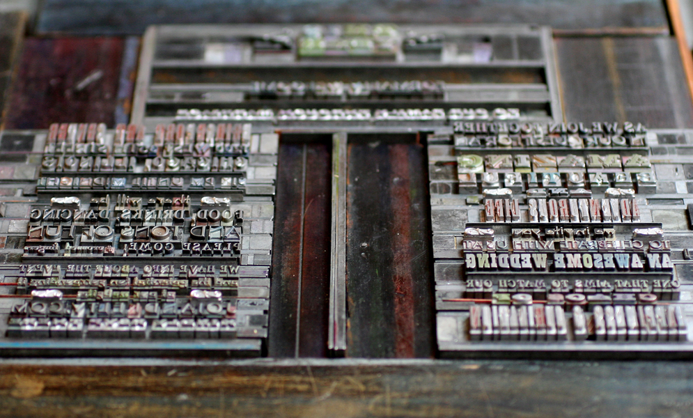
Here you can see all but the blue set up and ready to proof.
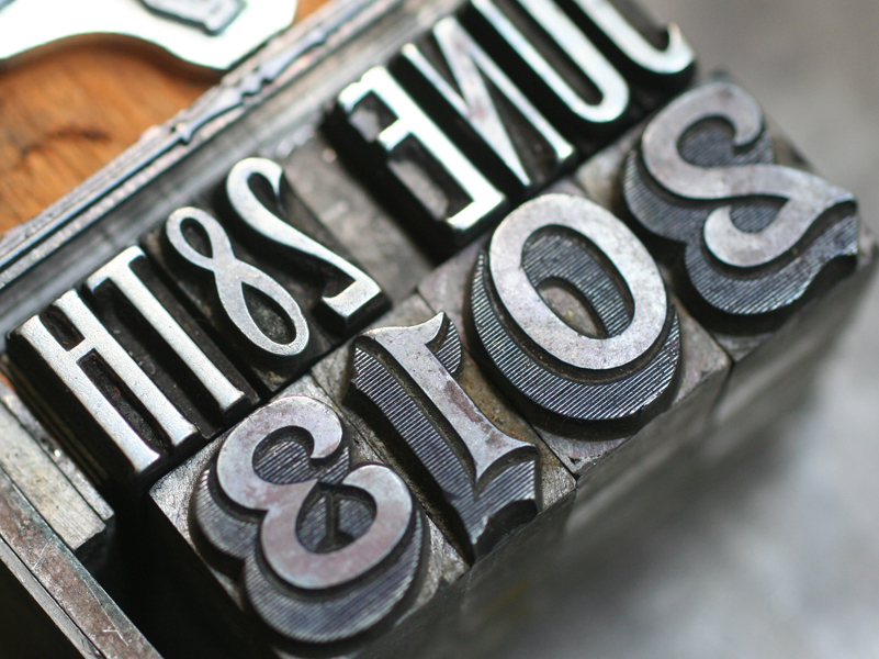
 Blue was the final color. There were a number of elements to get right here, from the top hat and face of the octopus to the curved type and plate of the frog. It was a joy to use some really beautiful type on this one, including the 2013. The studio only has this in figures, so it was a treat to finally have a good use for them. The June 28th is set in Headletter, a Chicago-designed typeface from Barnhart Bros. & Spindler.
 And here's the full octopus in all of its glory.
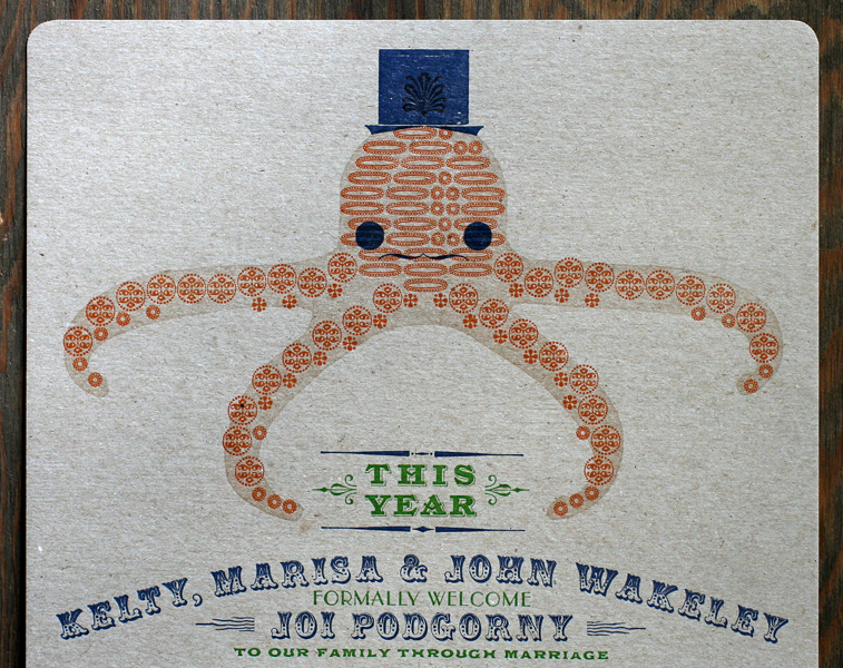 The invite was printed on gray chipboard and scored so that it would fold into a 6x9" envelope, which was navy blue to match the ink. This was such a treat to design and print; we love a unique challenge! And all the best to the happy family.