The Letterpress Trail 2015 part 3: Redemption

We made great time getting from Columbus to Buffalo and I safely deposited Jo at my parents' home before leaving shortly after to get to Wells Book Arts Center. I wasn't in the best frame of mind for embarking on a week of teaching. It was hot and I was tweaked, rednecks with confederate flags were everywhere (don't know where to start with this, New York) and I had to find a happy place in which to shift from traveling with an eight year old to successfully communicating with a group of adults I'd see all week. Me and Tsunami worked out a lot of issues on the way to the Finger Lakes. The Summer Institute is a unique opportunity at Wells. Over the course of three weeks instructors in all mediums related to book arts descend upon the place to impart knowledge and high fives, cementing Wells in a place of prominence in many fields. It's an honor to have been included in the line up this year.

Look at this place. It's beautiful and it's full of everything you need to do anything at all related to book arts. My last trip there was so incredibly productive and blissed out that trying to recreate that experience and its sweet pop soundtrack like Right Here seemed like it could be a futile exercise akin to Pet Sematary. Maybe that's a little extreme.

IMG_1541

Because then I met the rest of the students that I didn't already know and it became apparent that this group was really special. All seven had experience printing before which was a real novelty and allowed us to move pretty quickly. The first project was to create a pattern that could work as 1- or 2-color. These were exceptionally ambitious and the results were almost unbelievable. It bode well for the rest of the week, which was good since I missed Tuesday morning dealing with kidney stones. This was when Mr. Starshaped texted 'stop saying it can't get any worse.'

IMG_1508

IMG_0821

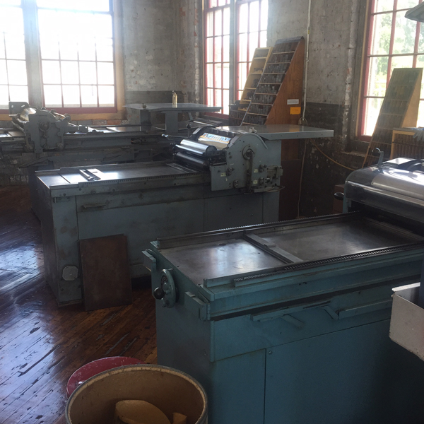
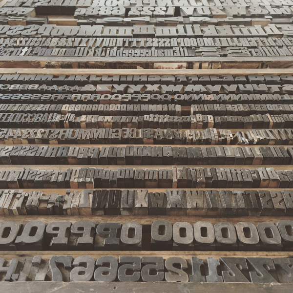
We had 24/7 access to the studio and I can vouch for activity between at least 8am-midnight every day. It was a luxury to work until we all fell over with a group of people that constantly pushed the envelope of what was possible with the ornamental collection at hand. It is a stunning and vast collection which definitely aided in speed of production.

IMG_1509

My first project was to set a type specimen for newly acquired German type. It's 14 point Didot which is fancy speak for 'pain in the ass 15 point type'. Thankfully it came with its own spacing.

IMG_1517

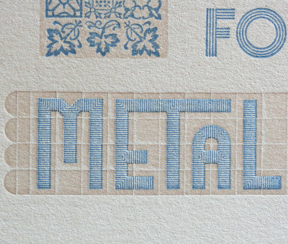
The second student project was to create a letterform out of ornaments. Why do one when you can do two? Most found ways to print their forms in multiple ways or created more than one character. Too bad there wasn't any grading as this group would seriously have earned extra credit. It was completely inspiring to work in the same shop with them and it snapped me out of some of the frustrations I held going into the week, compounded by being in the middle of nowhere and carrying a torch for the Windy City.

DJ Jen's Musical Interlude of Chicago sound: Typesetting Jets, Albini-produced Carolyn, Four Corners

IMG_1518

IMG_1519

IMG_1521

IMG_1520

I took a little time to show a few advanced skills like setting type on curves, mitering rule and using a rule curver, much of which students worked into their projects.

IMG_1527

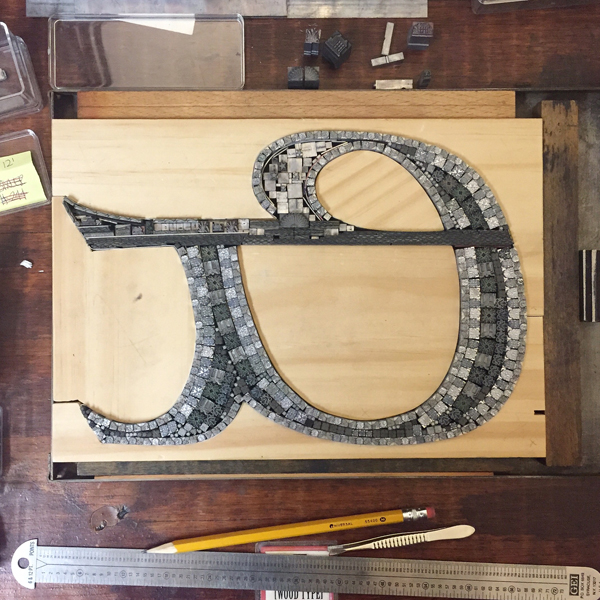
I started work on my own project, the second in an upcoming series I'm calling the Well-Traveled Ampersand. This seeks to combine ampersands with the geographic region they were design in/for. Victor Hammer, founder of the Wells College Press, designed this Uncial while at Wells. I added the idyllic Cayuga Lake scene. A handful were left at Wells and included the American Uncial title, set in said typeface.

IMG_1526

IMG_1533

IMG_1535

IMG_1536

IMG_1540

I found the most boring press in the world, too! All you do is push a button and there's literally time to have a dance party in between prints. No thanks, automatic Vandercook.

IMG_1528

First prints, looking good.

IMG_1539

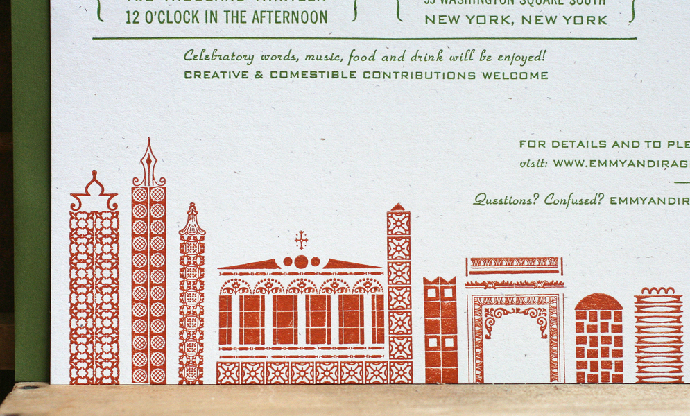
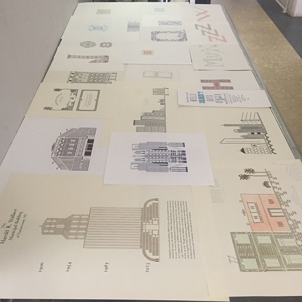
Student work continued to collect as the week went by and my help was barely required. I cannot believe the results of the third and final project that involved creating a structure or something architectural. Some were real buildings, some imagined, some were made up cities, one was Boston. The variety and detail surpassed all expectations. I have not had a chance to photograph and document them all yet but am so honored to have come home with a set of everything.

IMG_1550

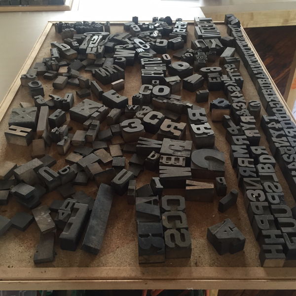
A few sexy details from student type forms.

IMG_0944

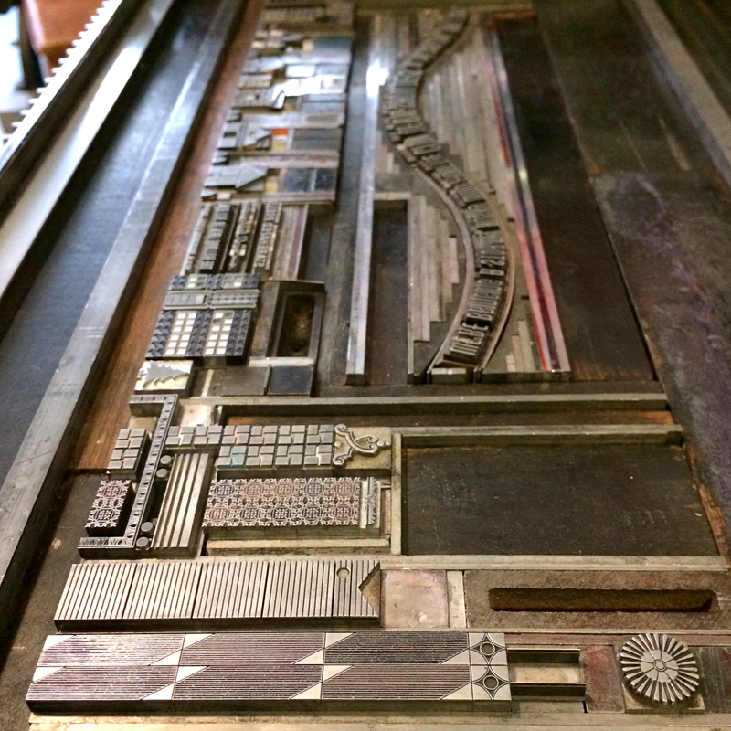
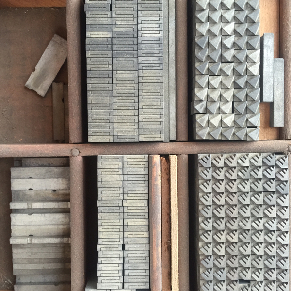
The print shop looked like this all week... piles of spacing and ornaments and tools and limitless possibilities. Hopes, dreams, aspirations.

IMG_1549

Friday night was a showing of all student work produced throughout the week and my class represented well. We even grabbed pedestals so we could show off the type forms used to create many of the prints. This was definitely a highlight.

IMG_1552

IMG_1551

We had an (un)welcome visitor one night and student Marie took it upon herself to set and print this little 'yearbook'. Everything about it makes me happy and it will always have a special place in my heart. I was in Love with WBAC again.

IMG_1553

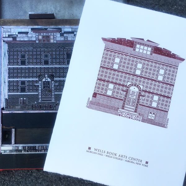
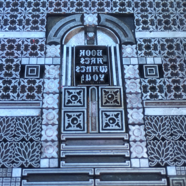
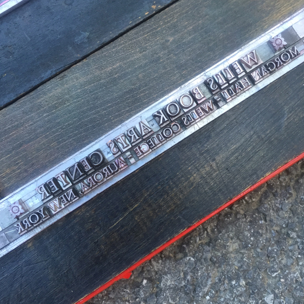
By about 11am Saturday morning the Center was deserted and I had the place to myself. I wanted to create my own architectural print and threw together this love note to Morgan Hall. Every day I came from my quarters to enter the Book Arts Wants You door. There isn't a lot of 6 point type at Wells but I did my best.

IMG_1557

IMG_1542

IMG_1554

IMG_1555

Sunday morning was my last on campus, and I had a lovely post mortem breakfast with Rich Kegler, director of the Center. It has been a year since we first discussed turning my ornamental alphabet into a book and set off a strong partnership between Wells and Starshaped built on mutual respect and a desire to see each succeed with whatever the future tosses our way. Starshaped has had a very rocky year and I have been very close to selling out the studio in recent months. Sometimes the universe sends the right friend to talk you through it, one that inherently knows your own ideas for your work better than you do. Rich has been that person for a long time and his 'you HAVE to keep fighting; Starshaped is YOU' is the fuel I needed to develop a new plan of attack. Former record store nerds always recognize other former record store nerds and I was gifted this mix tape, the early 80s version of the 90s peanut butter and jelly sandwich in terms of cementing friendship.

RKtape

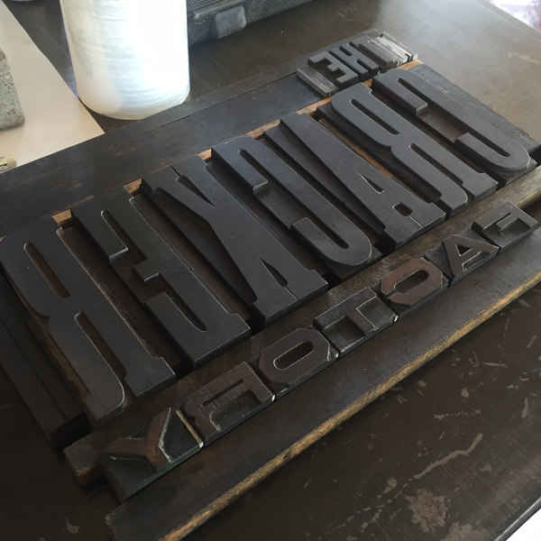
There's no rest for the wicked, though, and I headed over to meet good friend and Wells grad Jessie at the Cracker Factory. This place has real potential as a thriving letterpress studio and Jessie is working hard to whip it into shape. Everything needs scrubbed and organized so we got right to it, moving type around and cleaning the wood type, of which there is a LOT.

IMG_1563

IMG_1558

IMG_1561

IMG_1562

IMG_1560

IMG_1567

IMG_1568

IMG_1564

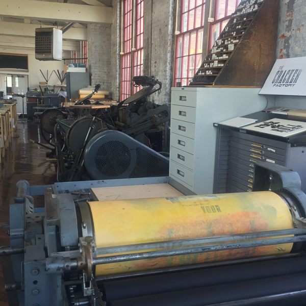
Mindless but methodical and important work was just what I needed. We hit it hard for hours, listened to great music, giggled about secrets and generally enjoyed each others company the whole day. I also found a few exciting metal ornaments that I'd love to work with. Looks like I'll be back.

IMG_1565

IMG_1570

IMG_1571

IMG_1572

IMG_1573

IMG_1574

After a break with family, Jo and I popped by a perennial favorite, the Western New York Book Arts Center. It was bustling with a teen workshop so we didn't stay long. The plan was to print there but plans changed and it was time to head back to Chicago. I can't pretend to be sad about this. I missed my city, the environment, my sweet house, my studio, good cappuccino and Mr. Starshaped. It was time.

DJ Jen's Bringing-It-Home Musical Finale: Almost With You, Stormy Weather, Star Shaped, A Million Miles, Going Home

IMG_1576

IMG_1575

Here's our completed Letterpress Trail map! It only took a year. I'm proud of this and our adventures as we've gotten to see some incredible shops and meet some even more fantastic people. The letterpress community is so supportive and open to sharing and embracing all types of people and skill sets. A huge thanks to everyone listed here and to those that went out of their way to make us feel at home during some dark moments of exhaustive travel. And a giant hug for the best traveling companion anyone could ever ask for. Jo barely complained, was open to every experience, respected the people and places we met and overall had a great time. She steadied me when at my worst and reminded me that everything was okay. Her random, absurd questions that peppered our conversations (i.e., 'can you scare an insect to death?') took me out of myself and I laughed. She is my heart walking around outside of my body.

Spanning the entire country is not in the cards for next summer. Maybe the East Coast? Give me ten months to stew on it first.

finalmap

Letterpress Trail 2015 part one

Letterpress Trail 2015 part two


Two Cities That Never Sleep - NSS 2014

It's been a while since the last post, but the studio has been caught up in attending the National Stationery Show for the first time, which was a stellar success. On top of our normal work load of custom projects, I designed our 10x10' booth, painted it, printed countless new products (more on those soon), created our first ever print catalog and brought to life numerous promotional pieces in advance of the show. As we expand our reach outside of custom work, NSS is a great opportunity to get work in front of wholesale buyers. The first piece we created specifically for the show was a contribution to the annual Legion Paper scavenger hunt. A number of small shops participate, and this year the theme was alphabet flash cards. Luckily, I got letter M, which was perfect for this theme:

metaltype1Legion supplied the paper, and I chose Stonehenge Fawn, which is a soft, American made cotton paper. The card is printed in two colors and of course uses all metal type, including the fabulous two-color Alphablox.

metaltype3The card was, I'm happy to say, popular, and will be the basis for a series of letter cards in the near future. The form is really wonderful; we can create modular letterforms out of very ornate pieces.

Tmetaltype1The type for the colophon on the back of the card:

Tpromo12While we printed by day, we painted by night. Mr. Starshaped graciously built all of our hard booth walls, as well as the crate in which they shipped to NY. Some truly talented friends came over in the evening over the course of a week to help lay down the highly detailed ornamental cityscape that was the theme. It was entirely painted by hand, including the booth number. I didn't want to let our sign painter friends down by using vinyl!

boothpainting3

boothpainting2I also printed up new cards, note pads and stationery to have on hand, also matching our booth and studio. This was a great excuse to work with the Virkotype initial set that's been screaming to be used. Three colors!

newstationeryWhile busily printing away, I was pleased to find that our cityscape note card sets were accepted as a finalist for Best New Product at the show, which required putting together this board. We now offer 5 other options besides Chicago, including New York, Seattle, Philly, San Francisco and a Small Town version if city living isn't your thing.

bestnewproductThe swan song of printing for the show was the pre-show mailer. This went out to a selection of stores that I wanted to meet in New York as well as other printers I was anxious to meet face to face. It was printed in an edition of about 100, and included an outer wrapper and accordion fold insert featuring many of the popular sections of our cityscape collection. And how about that sexy typographic curve?

promo2 copyI pulled in bits of Carl Sandburg's 'Chicago' poem because he sums it up so well. Even the envelopes have little 6-pointed Chicago stars.

promo2

Tpromo9

promo4

promo

promo6

promo7

Tpromo6

promo5

Tpromo10At last! The Bulldog Lock Co. Building we have enjoyed residing in for the last ten years made an appearance on this piece.

promo3 copy

Tpromo5

Tpromo3One of the final touches for the booth was piecing together the sign. I'm particularly excited about this, as I had commissioned the laser cut right-reading type from Moore Wood Type last summer and it now has a proper place in a large 14x20" chase with real furniture and quoins. I wanted it to be as close to the real deal as possible, given that all of our work is created with metal and wood type.

newsignTo round out our 'bringing a piece of Chicago' to New York theme, the give away piece in our booth was a small card printed to resemble the Chicago flag, with a little history of it on the back side. Glued to each is a real piece of type, acquired from Skyline Type Foundry. This proved to be a very popular item at the show!

chicagostarpromoAfter breathing a sigh of relief that our crate made it safely, Lindsey of Gingerly Press, my assistant for the week, and I went about squishing it into our space. Here she is holding onto the walls while our neighbors behind us banged on their booth while setting up lights. It was the only really scary moment of our set up!

lindseyholdingwallsOnce we were done, though, I couldn't have been happier with the look. You can see the detail of the hand painted ornaments and the sign really popped. I built the table out of a type case, a sheet of plexiglass and two legs from Ikea. All of the prints and cards fit neatly within the building structures, which made it easy to get them all in place.

booth

fullbooth

leftside

rightsideOne of the days, we had the pleasure of having Frances come and help us out, alongside her mom (not pictured here). It's so wonderful to have supportive and talented friends lend a hand!

francesjenlindseyGiven that set up went well, we had a day to walk around New York, which always means a trip to Bowne & Co. down in the South Street Seaport area. It's a worthwhile trip for disciples of metal type and 19th century processes. Lucky for us, Bowne swung into the show on the last day, and we received this beautiful little hand cut card!

bowne

bownepromoThe biggest pleasure of being at the show was sharing it with old friends and finding new ones. Amber of A. Favorite Design has been a friend and neighbor for many years and was extremely helpful in show prep. She and Tom take the cake for cutest couple!

afavoriteIt was also a pleasure to (finally) meet Kathryn of Blackbird Letterpress, who makes beautiful, quirky cards, including one of her dog. You can see his large cut out in this picture.

blackbirdI am also a huge admirer of Katharine Watson, who keeps it old school in a different way, creating all of her beautiful pieces with hand carved linoleum blocks.

katherinewatsonAnd of course the shop I have always admired, Hammerpress. Their style and attention to detail in typography is a real standout at the show, not to mention inspiration.

hammerpressThere was definitely fun, albeit the expensive variety, to be had while there. We attended Paper Party one night with our longtime friend and neighbor Emily of Orange Beautiful, and new friends from Cincinnati, Steam Whistle Letterpress.

paperpartyAnd then it was time to pack up and go. Our booth was reduced to a pile of flats ready to be packed away until early next Spring when we bring them out for repainting and repurposing. I've already got ideas for next years adventure! Overall, the experience made the trip worthwhile, not to mention the number of orders we received, especially from new stores, as well as feedback on a number of our projects.

flatsreadyforcrateBut it's always good to be back in the studio, designing and printing the day away.

studio May 2014

A Tale of Two Invitations

Years ago we distilled our wedding invitation offerings into four distinct collections. The purpose of this was to streamline our rather time consuming process in a way that left room for customization but would speed up the design and typesetting. Each collection focuses on a specific style and era of typography that gives us parameters in which to work while maintaining flexibility of papers, colors and overall tone. Of all the collections, the City of Big Ornaments is near to my heart because of its ties to the city and the challenges of creating a representational work with the ornamentation in the studio. It's also one of our most popular invitations and we've done versions of Phoenix, New York, Philadelphia, Seattle, Houston and of course, Chicago.

Emmy and Ira came to us desiring this style for not one but two invitations, both Chicago and New York. They planned to have two wedding celebrations with slightly different guest lists, so we had the fun of altering the skylines and colors to accommodate both places. We like to cater the skylines specifically to buildings or places each couple prefers, even if it is only a rough representation. Emmy and Ira had two such requests for their New York invitation:archjudsonHere they are in ornamental form, along with a shot of the final print:

Temmyira3

emmyirainvite7These are the final invitations for both locations. We used heavy kraft and white paper stock, both 100% recycled with speckles. Mossy green envelopes worked for both sets, and we flipped the color palette for ink on each.

emmyirainvite1

emmyirainvite4This style works best with simple typography that projects a mid-century vibe. It's not too overpowering or stylized so as to compete with the ornamental cityscape. Emmy and Ira liked the idea of the type looking like business forms from the 50's.

emmyirainvite2

emmyirainvite6

Temmyira1Our collaboration with soon-to-be-married couples often ends with the invitations, but we had the pleasure of working with Emmy and Ira on a number of additional pieces to coordinate with their invitations. Skipping a guest book, they decided to print two large pieces that could be signed by all of their guests and then framed in their home. Again, we designed these to mimic the invitations with some different elements between the two. These cityscapes were created with wood type and ornaments given the 18x14" size of the prints, and they are a little more generic so they could be easily flipped and repeated.

emmyiraguestlog1

emmyiraguestlog3

emmyiraguestlog2

Temmyiralog1

Temmyiralog2Cds as wedding favors are a popular choice and we created simple pocket sleeves for these here. Years ago I designed this custom die for pocket sleeves to resemble vintage LP sleeves; we've used it for hundreds of projects.

emmyiracdLast but not least, Emmy and Ira needed little placecards for their Chicago event. These are simple tented cards with just a piece of the skyline in miniature form. Individual names are handwritten... can you imagine setting type to print each individual one?!

emmyiraplacecardAs we acquire more type and ornaments, I look forward to creating new, varied and more complex cities and representational images in the spirit of clever letterpress printers of the past. But we can't accomplish this without the enthusiasm and imagination of our current and future clients.