Fortune has always favored me in the form of friends that are true go-getters. From the family I found at Fireproof Press, to the Chicago Printer's Guild and Chicago Printmakers Collaborative, to the talented stream of interns at Starshaped and the new friends I discover at the Hamilton Wood Type and Printing Museum Wayzgoose every year, there's never been a dearth of inspiring artisans and designers in my life. Not the least of these is Erin Beckloff, who reached out years ago looking for a proof of one of our wood typefaces so that her father, Scott Moore, could create a set of patterns to pantograph cut a few replacement characters. We hit it off immediately and I have always been impressed with her enthusiasm for all things design and letterpress. She has never faltered in her quest to understand the craft and the people behind it, so when she mentioned this past Fall that she felt a documentary was in order to showcase the stalwarts of the print community, I knew immediately she was the person to make it happen.A long while ago, I heard an interview with an actor talking about working with the Coen Brothers on a film and he said, 'Some people just don't suck. And when they call you to work on a project, you say YES.' This is how I've always felt about Erin and her projects because she thoughtfully sees them through to a fully realized end. She asked if I could contribute in two ways to help get this off the ground. The first is in the form of a print to be offered as a reward for supporting her Kickstarter campaign.
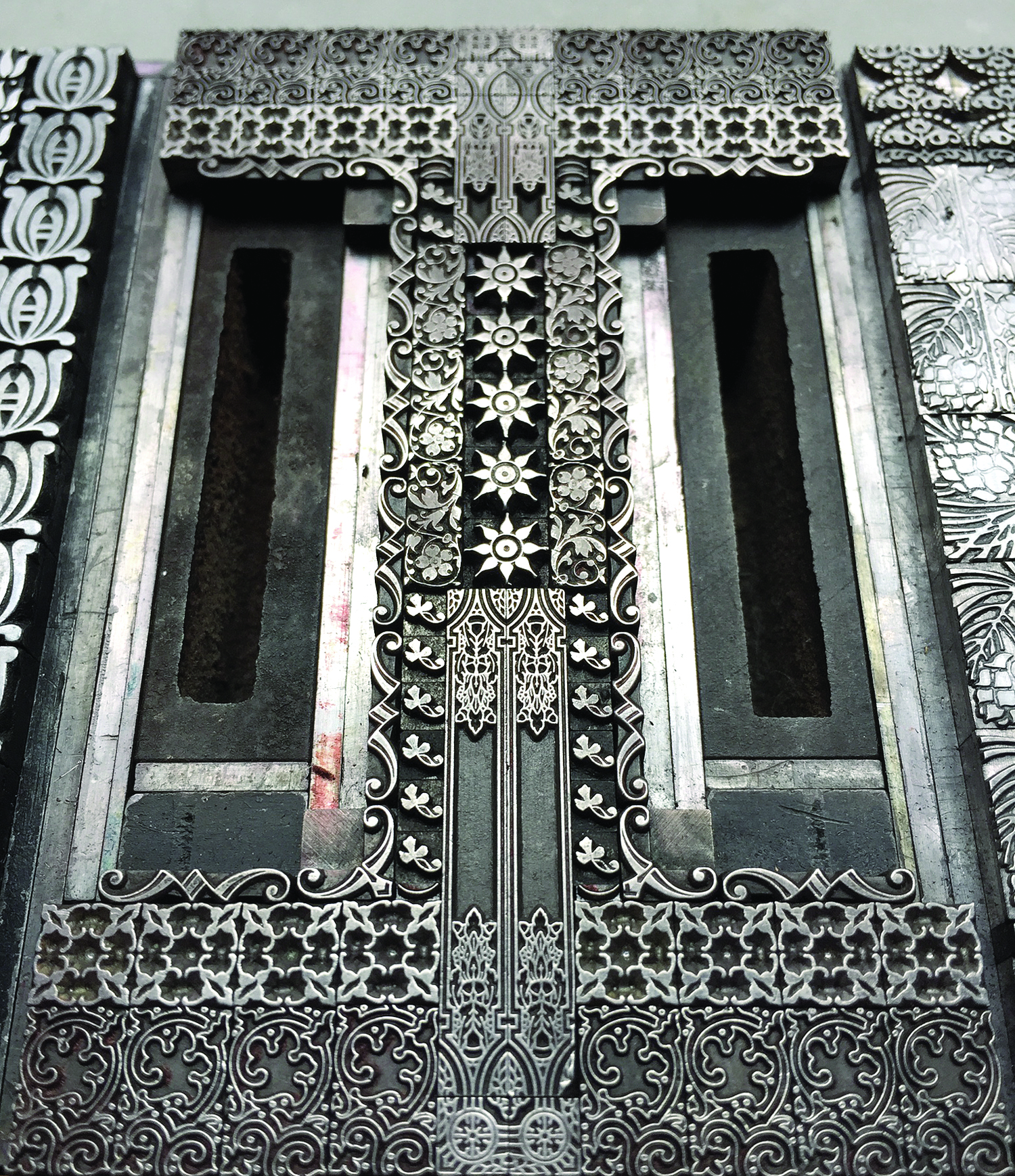
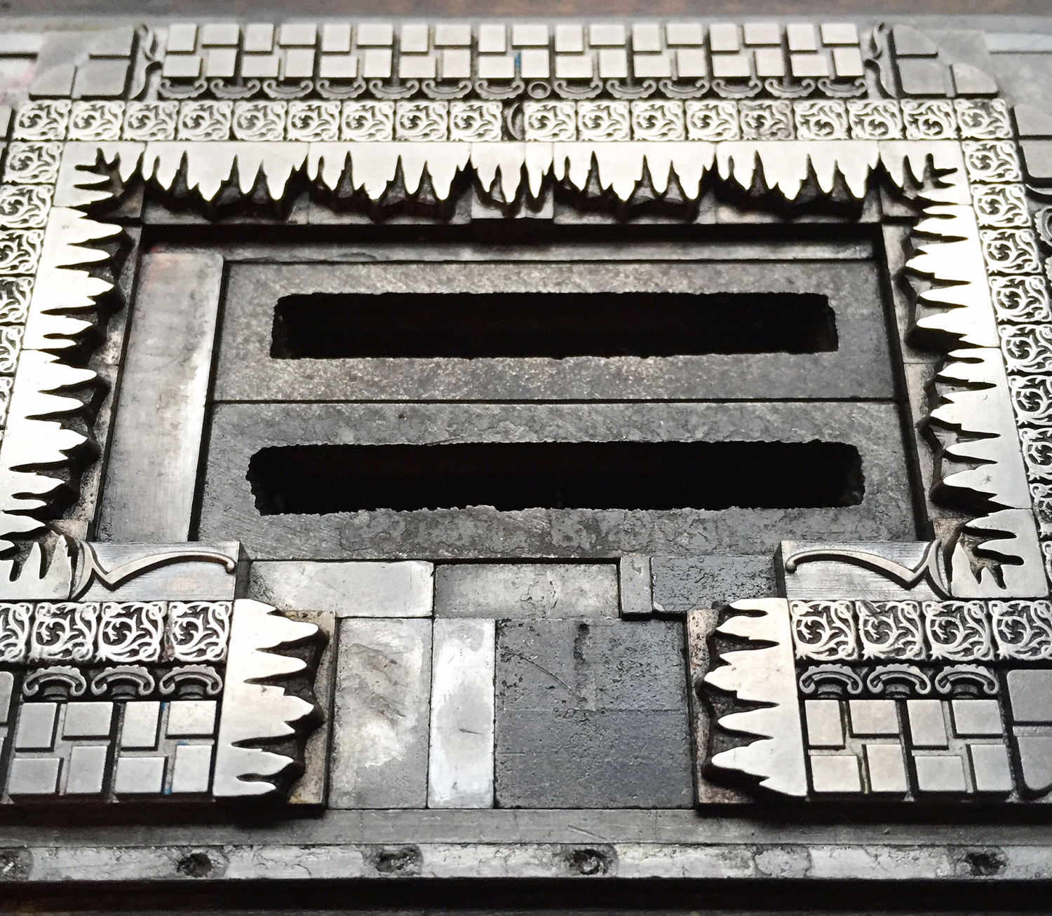
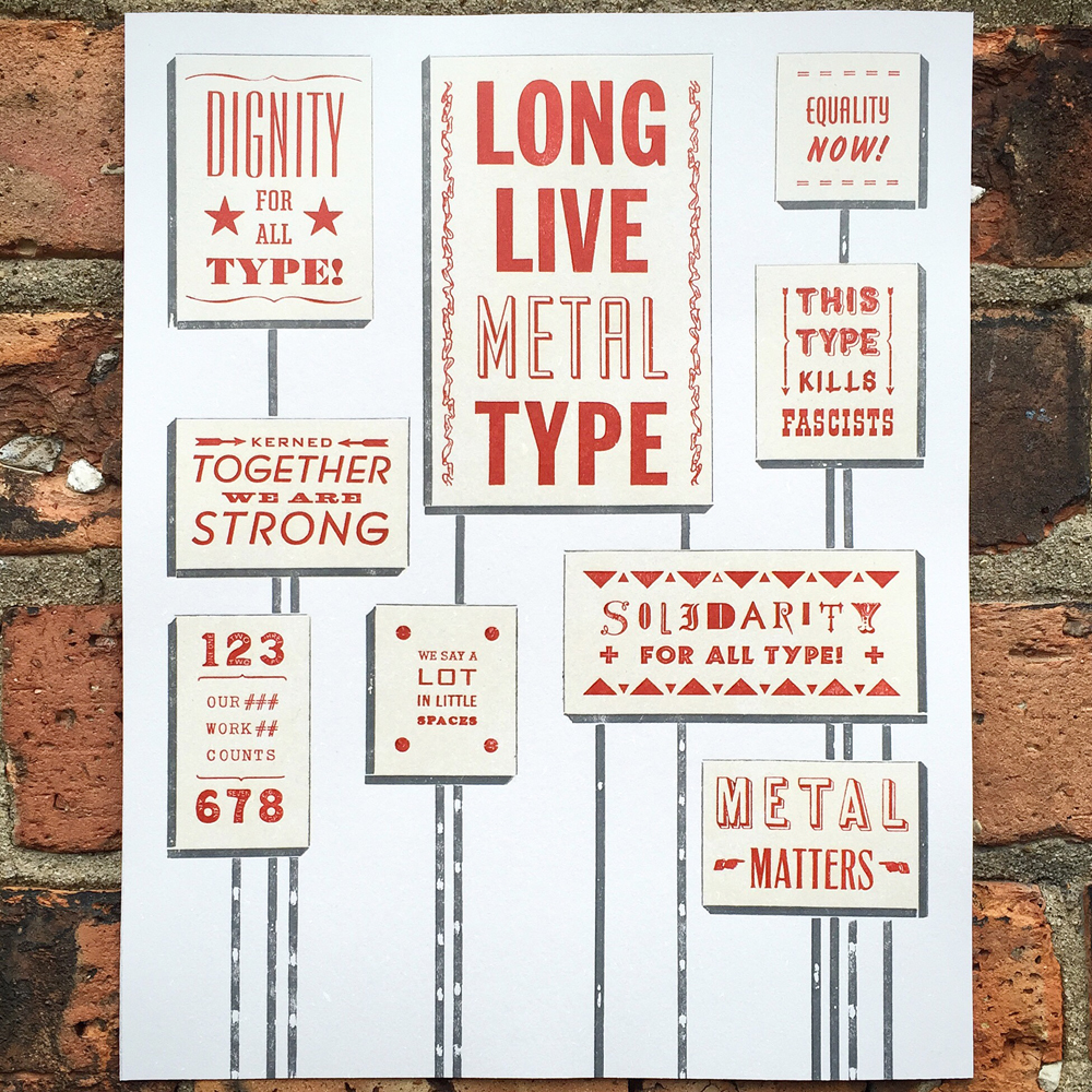 I have always felt that promoting metal type has been an uphill battle as wood type, in all of its textured, meaty glory takes center stage. Metal type requires more patience and a solid understanding of the medium in order to get stellar results. Starshaped creates most projects with metal type and given our past of printing propaganda, it seemed like time to mix the two. I began by sketching out what would look like a mass of protest posters with slogans altered to be typographic in nature.
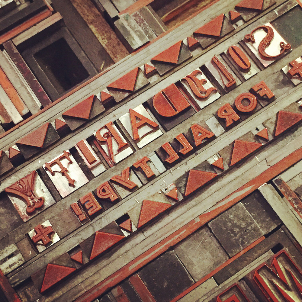
 Then each 'poster' started to take form in various sizes with a mash up of different typefaces.
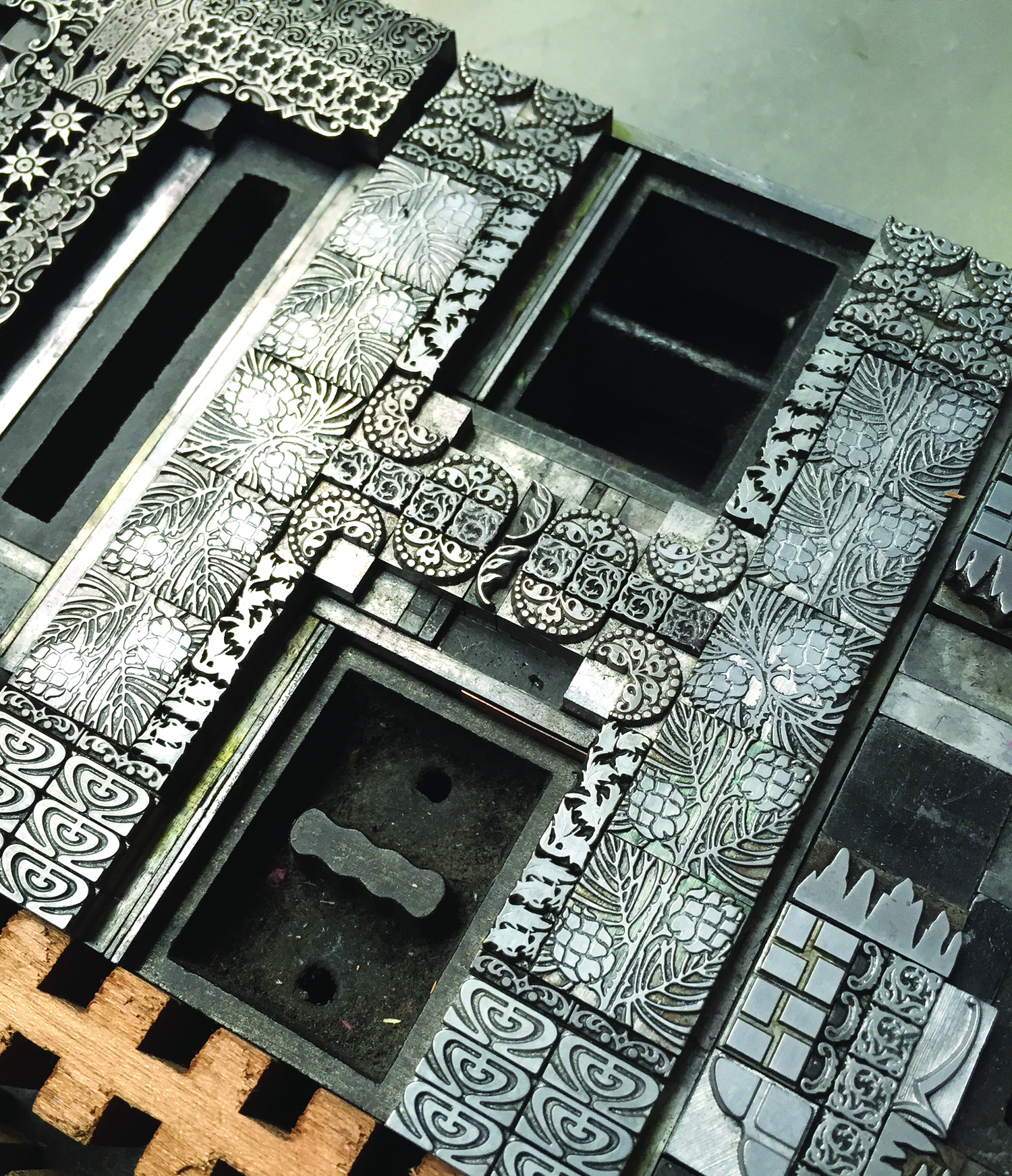
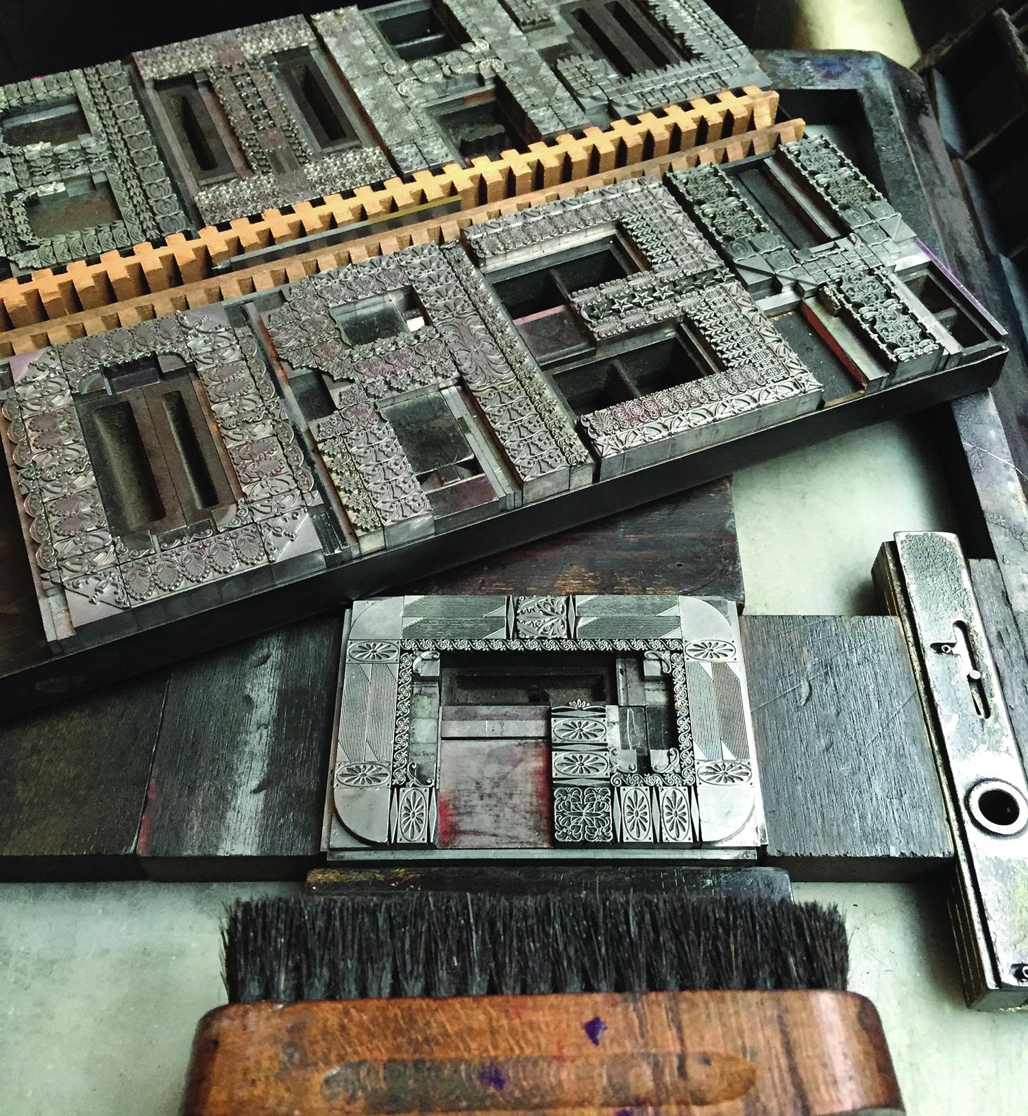
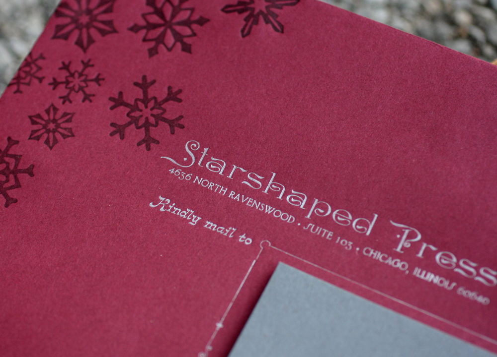
 I added rules to give dimension to the edges as well as those that would look to be supporting the posters. This is the first good carbon paper proof of the form.

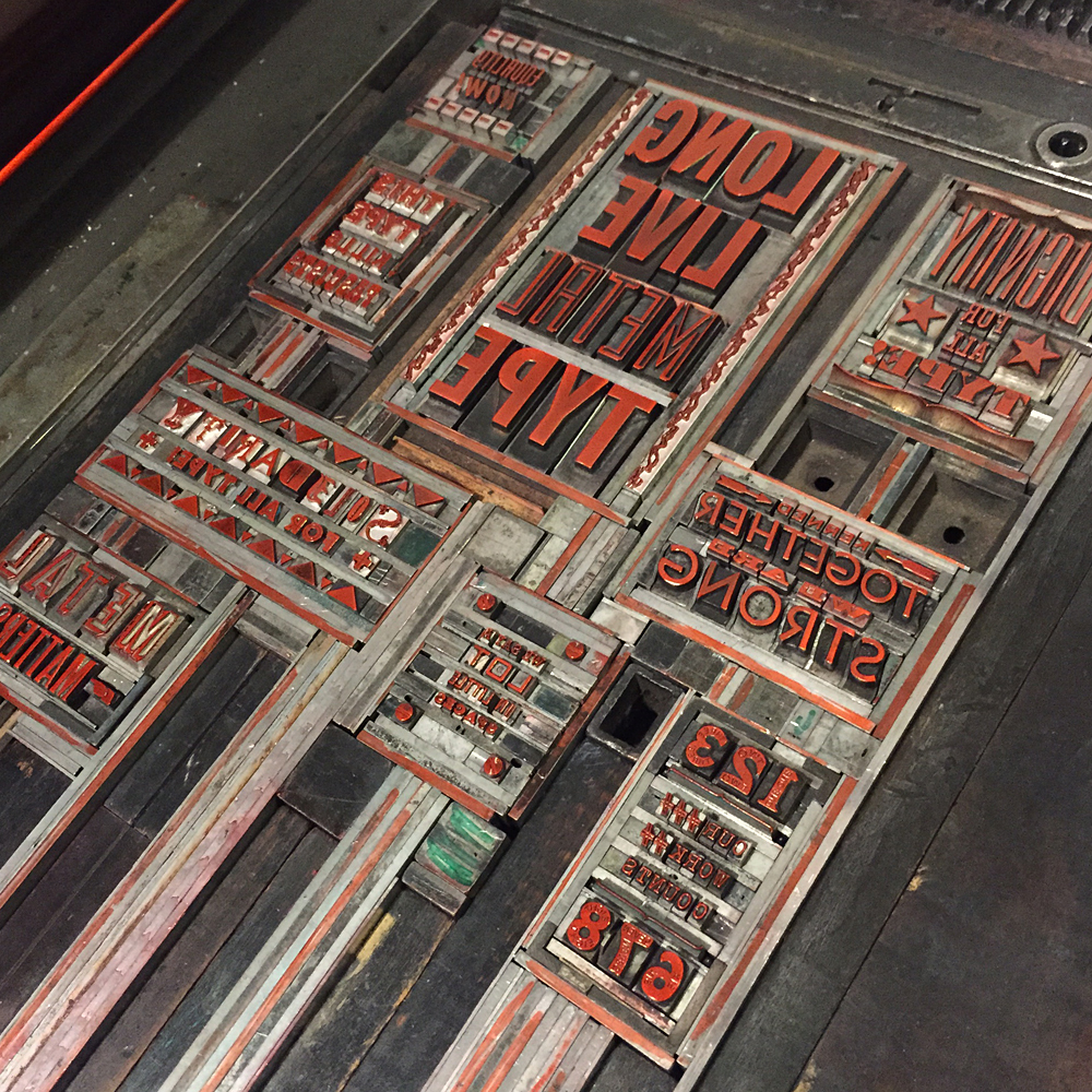
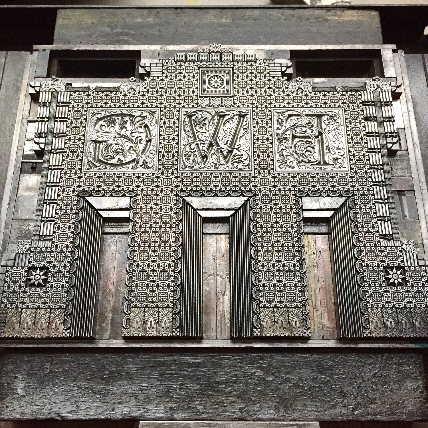
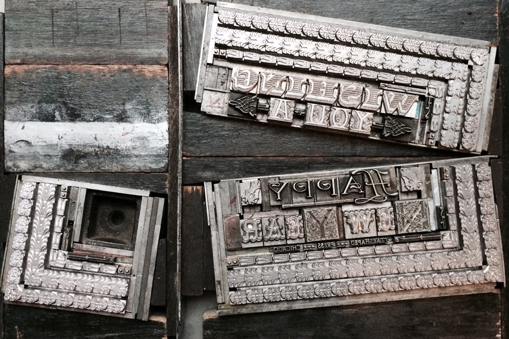
 When all looked good, I removed the rules as they would be printed in a different color. Here they are sitting on a proof so that I remember what went where.
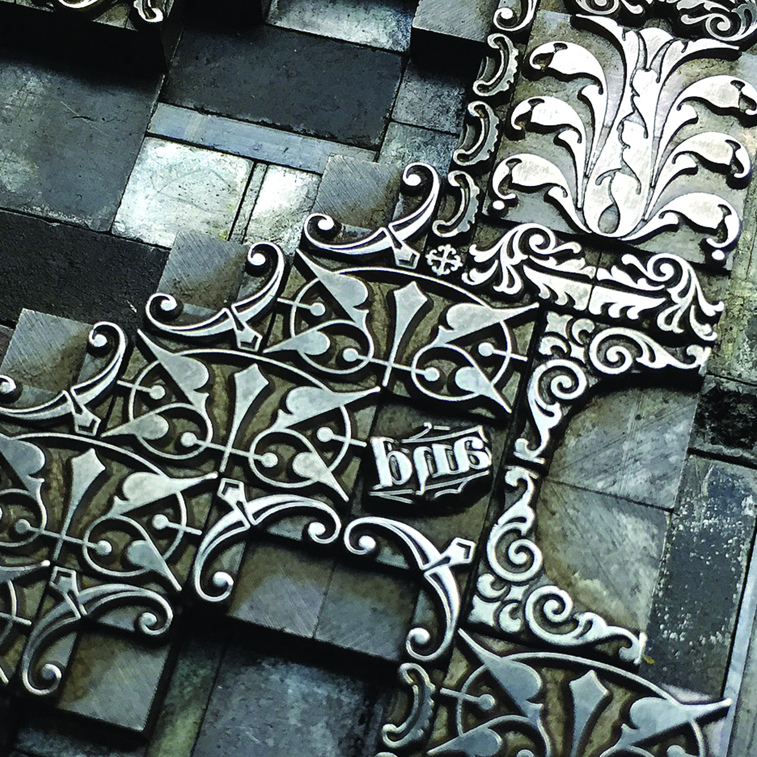
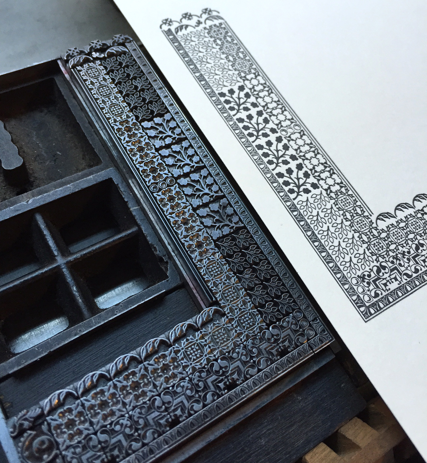
 After printing the red I replaced the rules and took the type out.
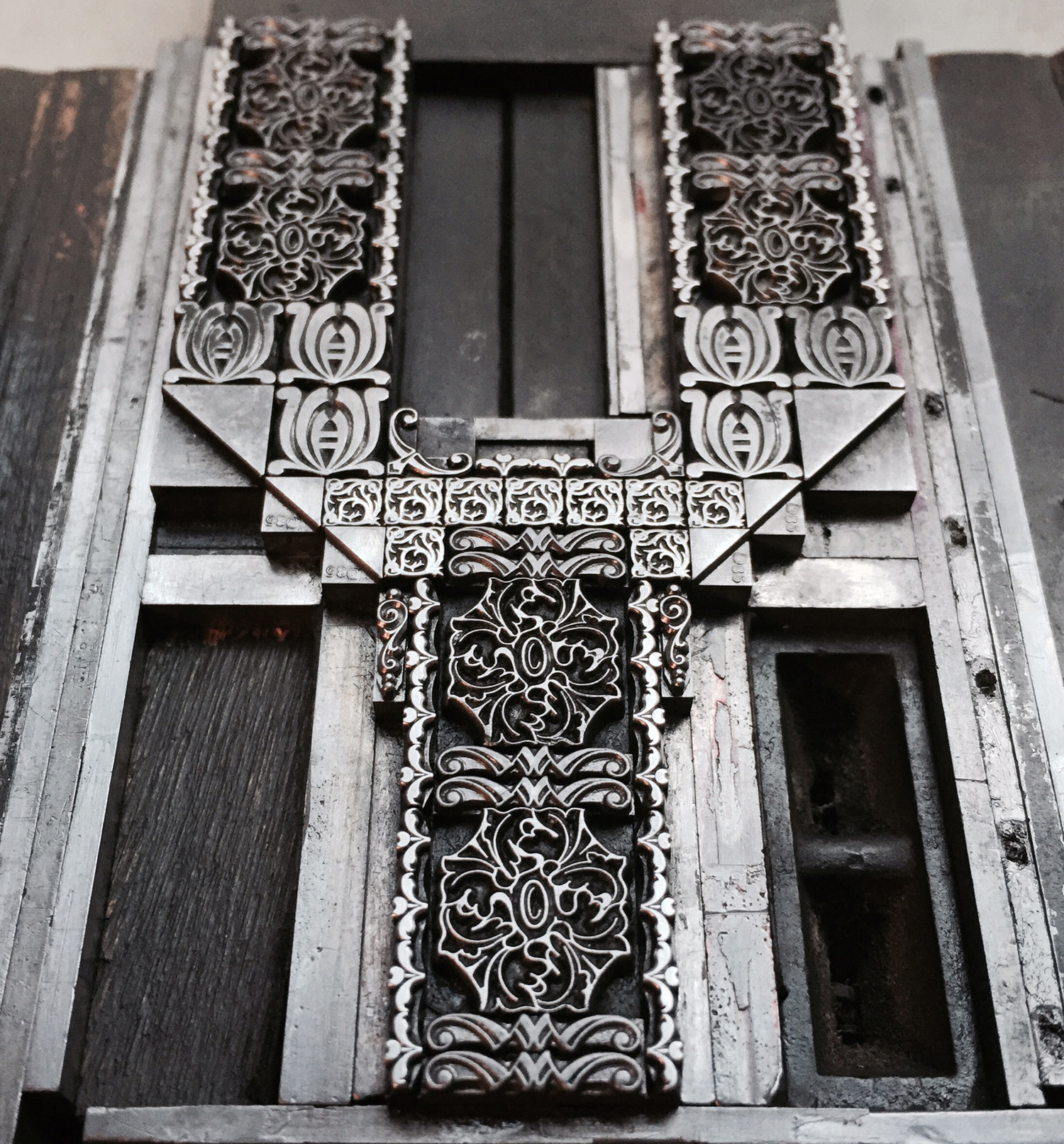
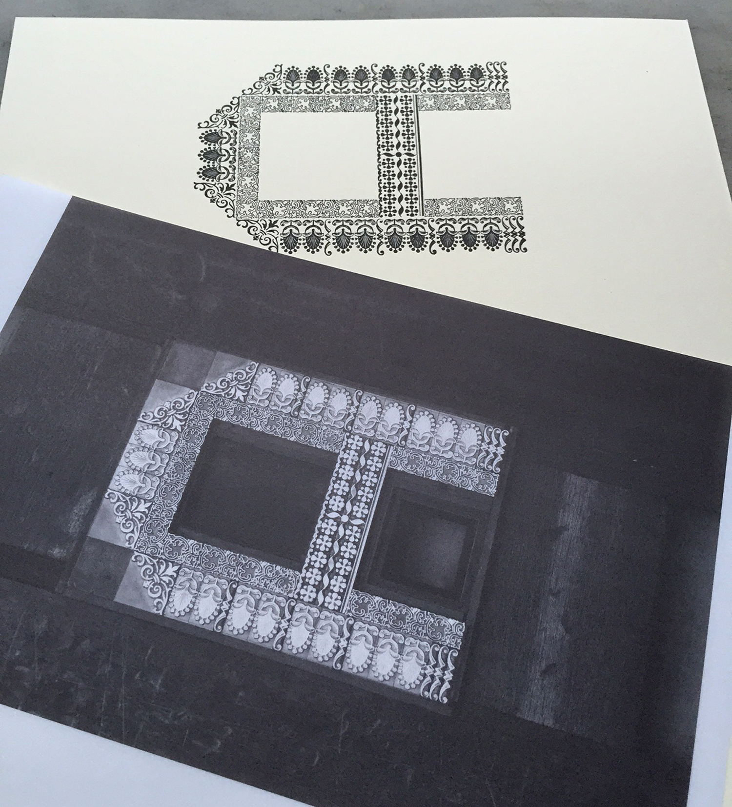
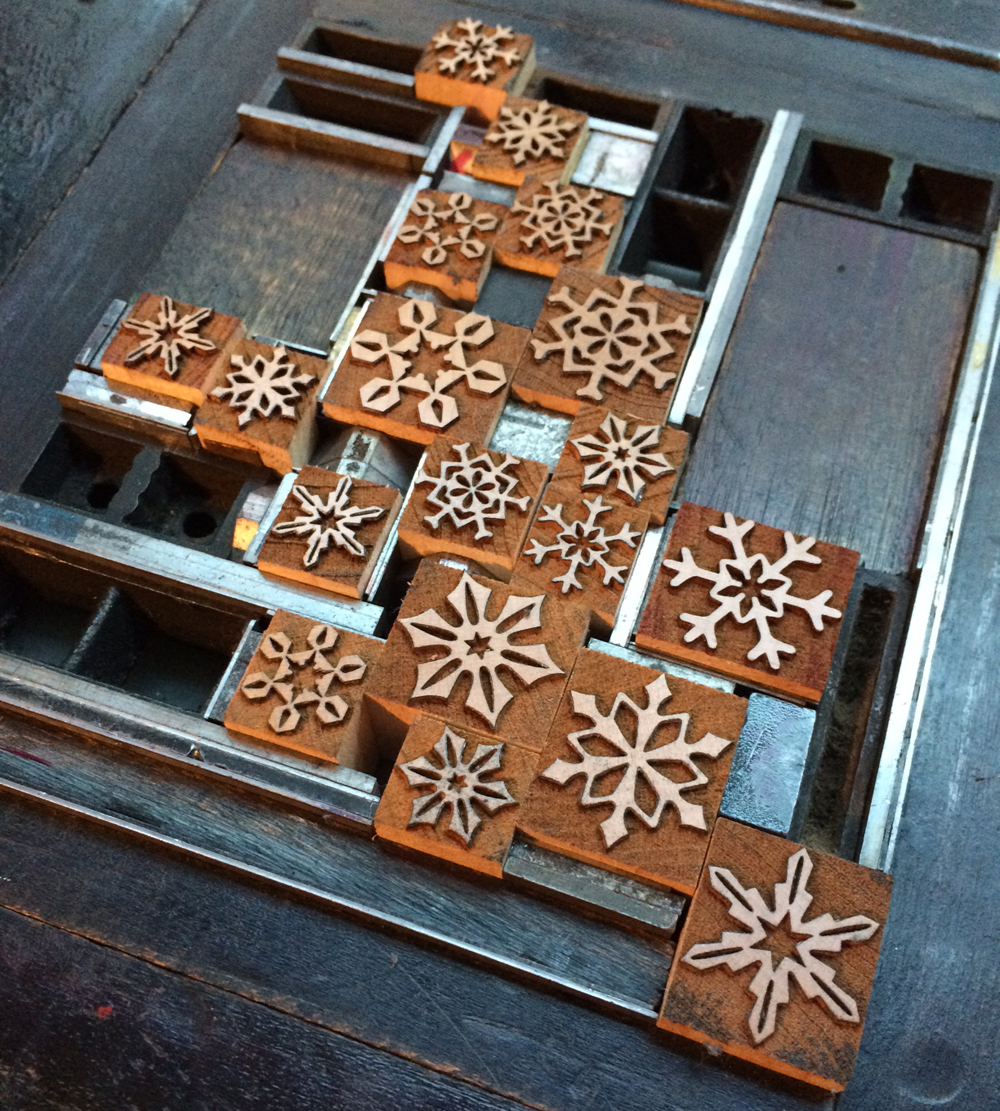
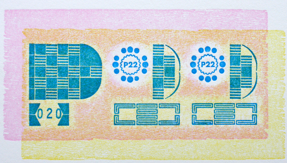
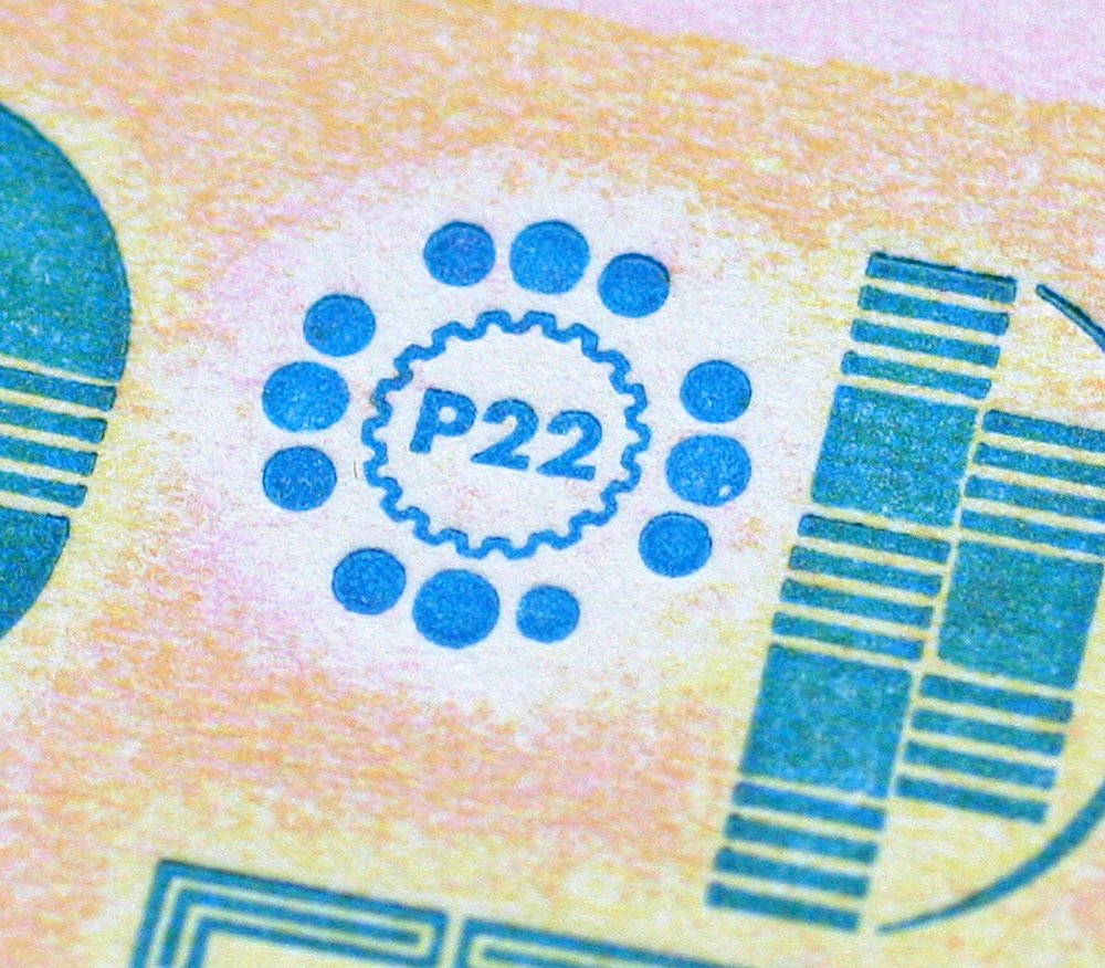
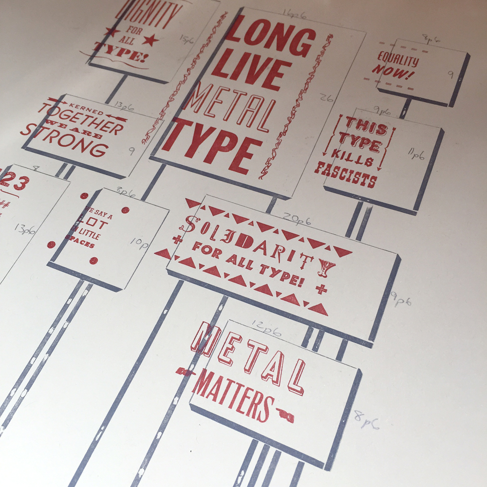
 It never fails that I sense a third color would really 'bring a print home'. So I took a misprint and labeled the dimensions of each poster so that I could cut linoleum blocks to print over them in a transparent-based ink. This helped them pop from the paper quite a bit, despite the subtle effect.
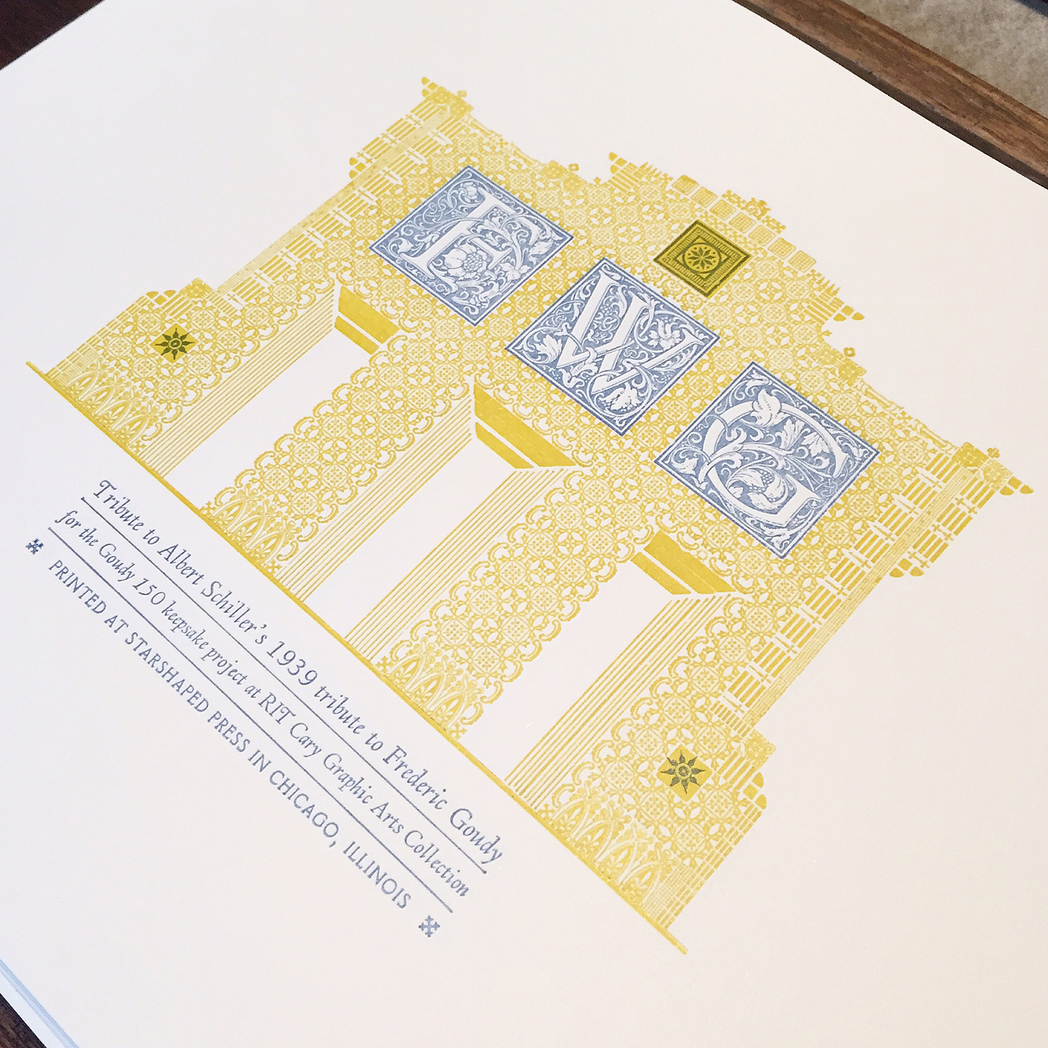
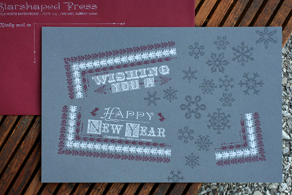
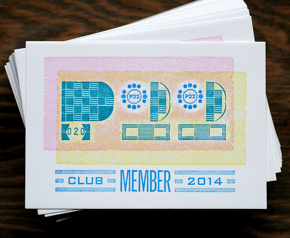
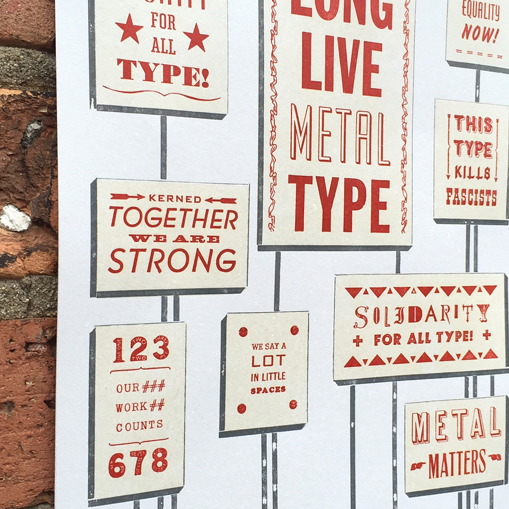 The prints, offered as part of the fundraising effort, measure 8x10" and are printed on paper generously provided by Appleton. I also ran a short edition on 11x14" paper to give the type a bit more breathing room. These will be available eventually; invest in the documentary first!
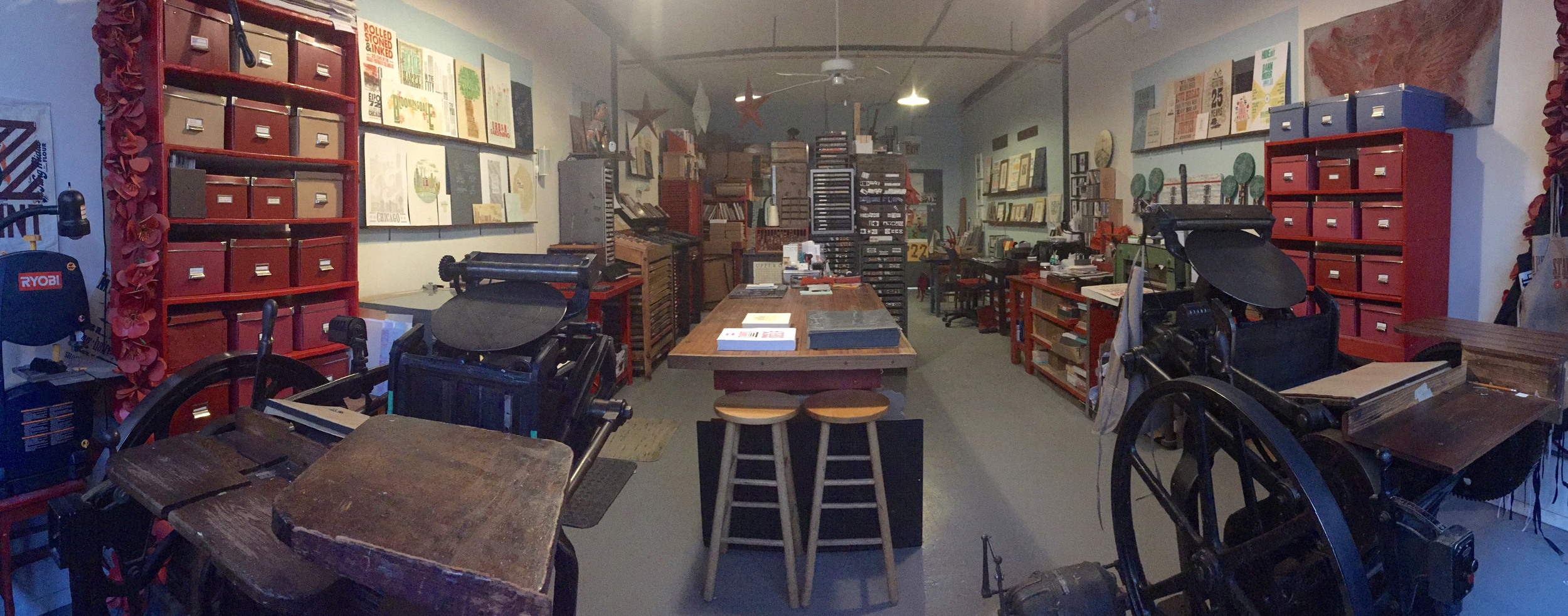
 The second way I am contributing to this project is in the form of teaching one lucky (or unlucky?) person as much as I possibly can in one day about metal type. In this 12+ hours of grueling type setting, proofing and printing, we'll discuss the history of metal type, look at how issues were dealt with by previous generations of printers and how to best work in the medium now. Plus, that person will have access to the Starshaped collection and the opportunity to create something special. Are you up for it? Check out the entire campaign and get updates on the facebook page.
Erin is in the middle of this photo, surrounded by students that she has inspired both in design and letterpress. It is incredible to see her grow and overlap both fields while taking the time to teach everything she knows to the next generation of aspiring printers. The fact that Jo and I will both be a part of the final documentary is such an afterthought to the bigger picture of how the craft is recorded and passed on. And pulling in Mark from the Mayfair Workshop, a longtime close friend of both Fireproof and Starshaped, to create the perfect background score brings this project full circle for me. Everything about it feels right. Will Erin be the Alan Lomax of the letterpress world? It's early to speak to that, but she is well on her way, supported by those of us who understand the importance of retaining and collecting history before it vanishes. Go get 'em, lady.