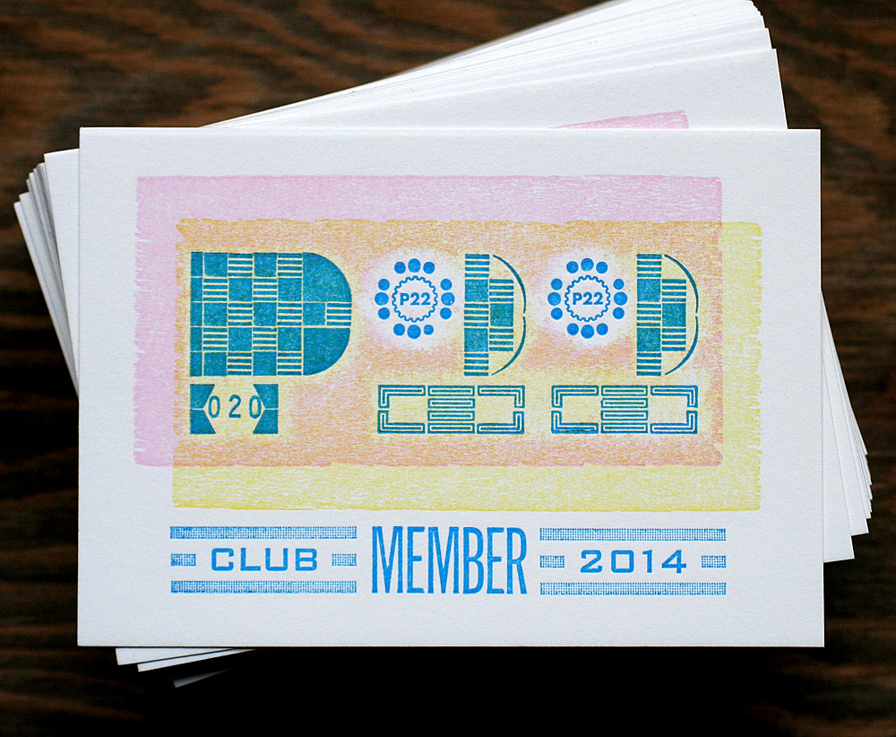
Back in the early days of my design life, before my typographic attention span was largely limited to 100 year old typefaces, I acquired a lot of digital type. A lot. And no type foundry crossed my screen as much as P22, partly because of my Western New York upbringing and mostly because of the high quality and delightfully quirky nature of the faces themselves. And while I've had the pleasure to work with the foundry from time to time, the recent creation of P22 Member Club cards was finally the perfect project to combine the digital and metal forms.
 My first P22 font was Constructivist, of which these great letters are a part:
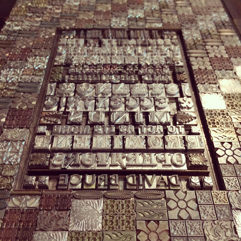
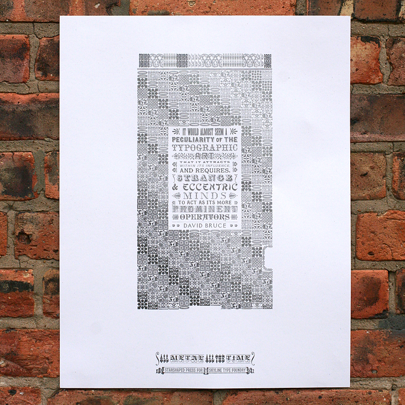
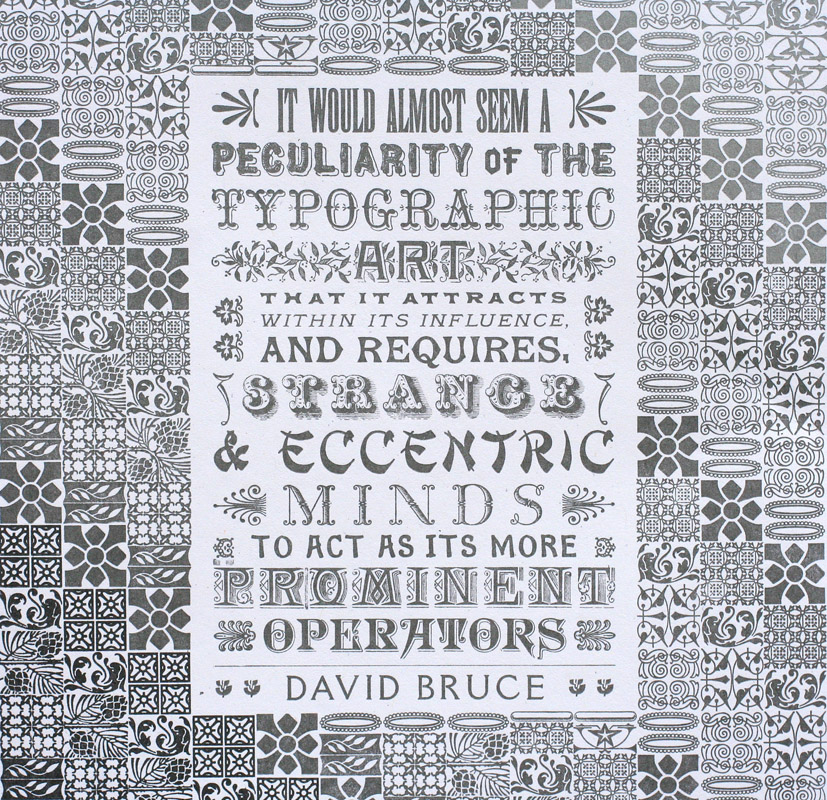
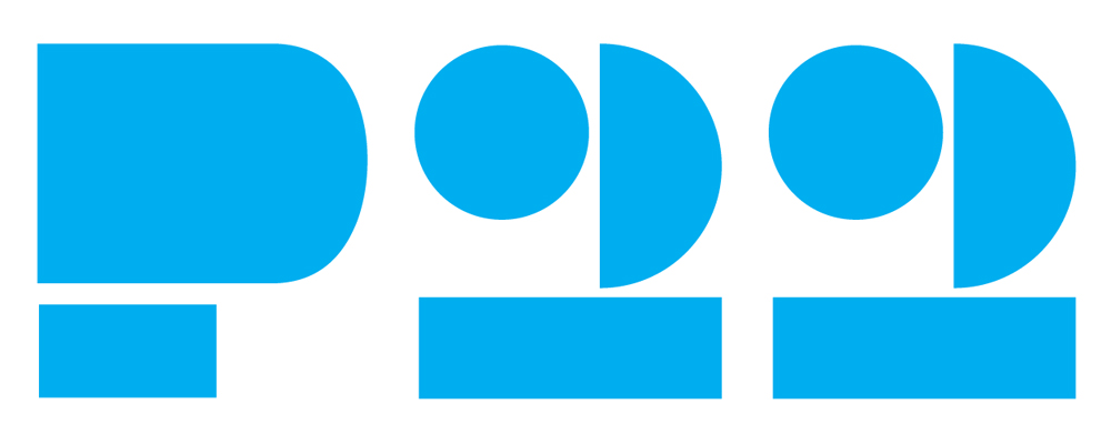 Absolutely perfect shapes into which our little metal ornaments can be placed. The foundry commissioned the logo sorts from Jim Rimmer, meaning there's a little new metal type here mixed with our old.
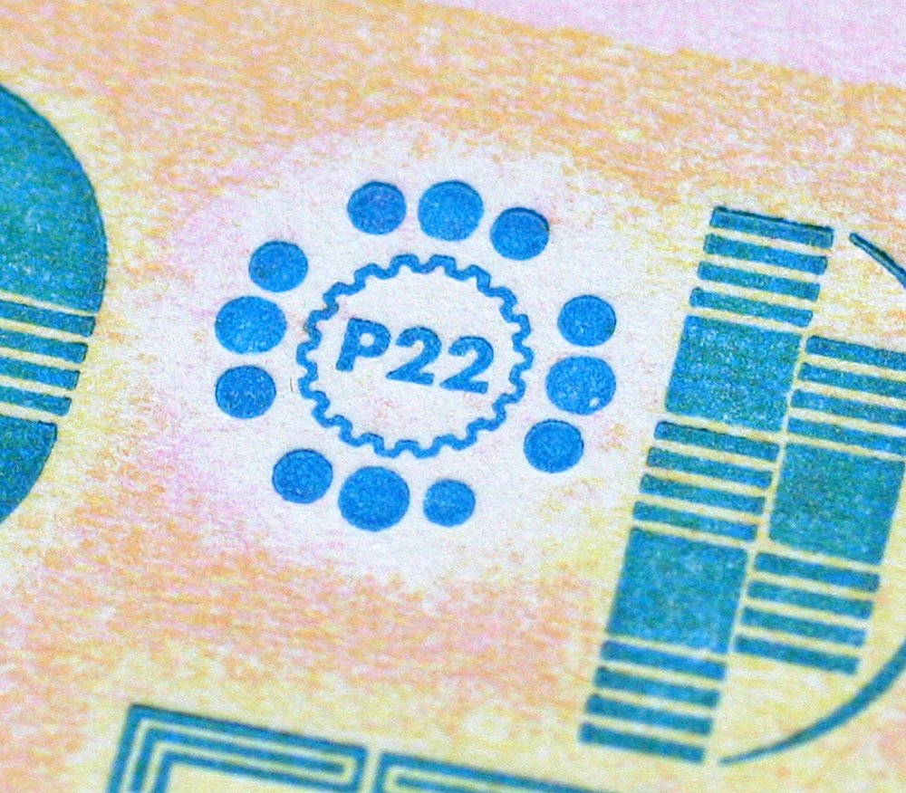
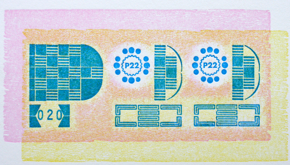
 The subtle base layers of the card were pressure printed with the back side of a piece of wood type; by adding a cut piece of chipboard (or two) to the makeready on the press, the print area varies accordingly. I adjusted the chipboard layers so that just the round areas for the logo would remain mostly white.
 The magenta and yellow were mixed with transparent ink so that they'd remain light and would create overlapping colors and even more texture.
 The main text was printed in process blue, which took on a greenish tint over the pressure printed areas. The space in the bottom of the P was left open so that they could be numbered, which I also did so that the ink matches.
 A small but mighty project, these cards are Starshaped's little love note to P22. If you're already a member of the club you'll get one. If you're not... what's wrong with you?!