The Letterpress Trail 2015 part 2: Bloodier Than Blood

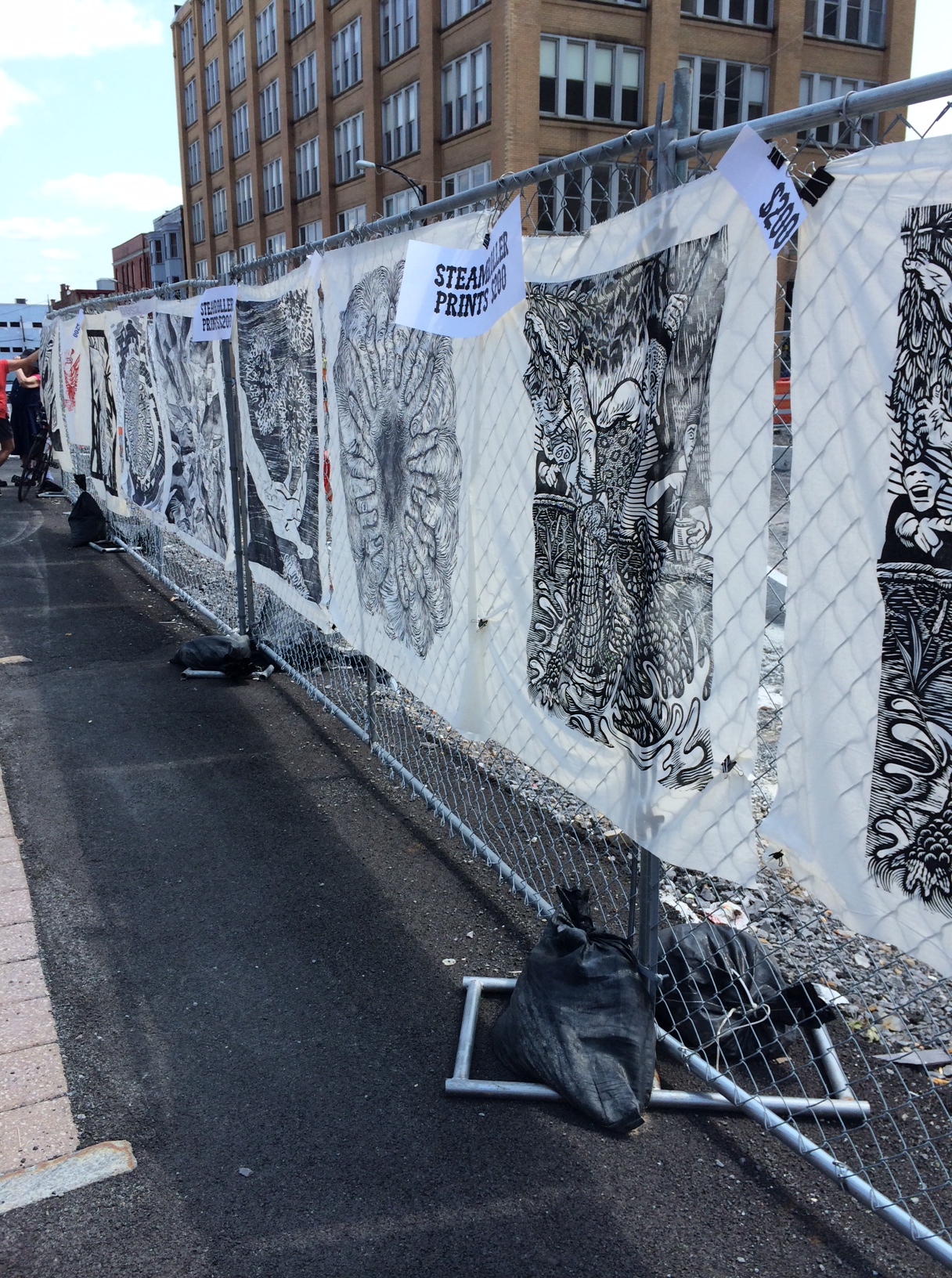
Renegade was devastatingly bad. If we'd had a 'bad' Chicago show, we still would have made enough money to cover the bulk of our entire trip. As it stood, we broke even. This meant throwing everything (and Jo) into the car right after the show ended Sunday night and white knuckling it to Lake Tahoe to sleep before moving on. I had to figure out how to move money around to cover the next week, how to make the car function as so little product sold and it was packed (now with sand dollars and crab legs) and how to not sob continuously in front of Jo. We found a Motel 6 at 11pm and I tried to settle into sleeping before Monday's 12 hour drive. I won't lie; I felt pretty desperate and angry and trapped on the wrong side of the country. IMG_1369

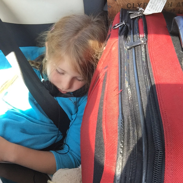
I left each morning as early as possible so that Jo would fall asleep in her tiny back seat. It made the ride faster for her and gave me a few hours to think and listen to angry songs. The angry songs gave way to acceptance, and by the time Kegler sent Endless Grey Ribbon I mustered the patience and sense of purpose to get through the rest of the morning.

IMG_1370

We spent quite a bit of time on 50, grabbing gas wherever we could just to be prepared. That said, our mouse of a car gets extremely good mileage and it was my own paranoia that made me stop every time we saw GASOLINE. This route is the traditional Pony Express route and there are many tiny towns that haven't aged in 100 years. I don't have pictures of these; while the worn, hand painted signs and once-stately buildings hold a definite charm, the unfortunate deterioration of an economy to support the humans trying to manage them is not. We soaked up what we could to avoid partaking in 'ruin porn'.

IMG_1371

DJ Jen's Musical Interlude: Plenty Times, Wide Eyes, Box Elder, Mother of God

When Jo woke in time to enjoy southern Utah (and it was beautiful) she was ready to rock the rest of the afternoon.

DJ Jo's Musical Interlude: The Party Line, No Cities to Love (this one always makes you feel better, Mom), Nanny Nanny Boo Boo, Stars 4-Ever, Your Cover's Blown

IMG_1372

Right about when we stopped for a break and shot this photo, a rock hit us hard. When we got to Grand Junction we had a cracked iPad, iPhone and now windshield. The Sound of Breaking Glass is very expensive. I had the phone repaired in Denver as it was a lifeline for navigation.

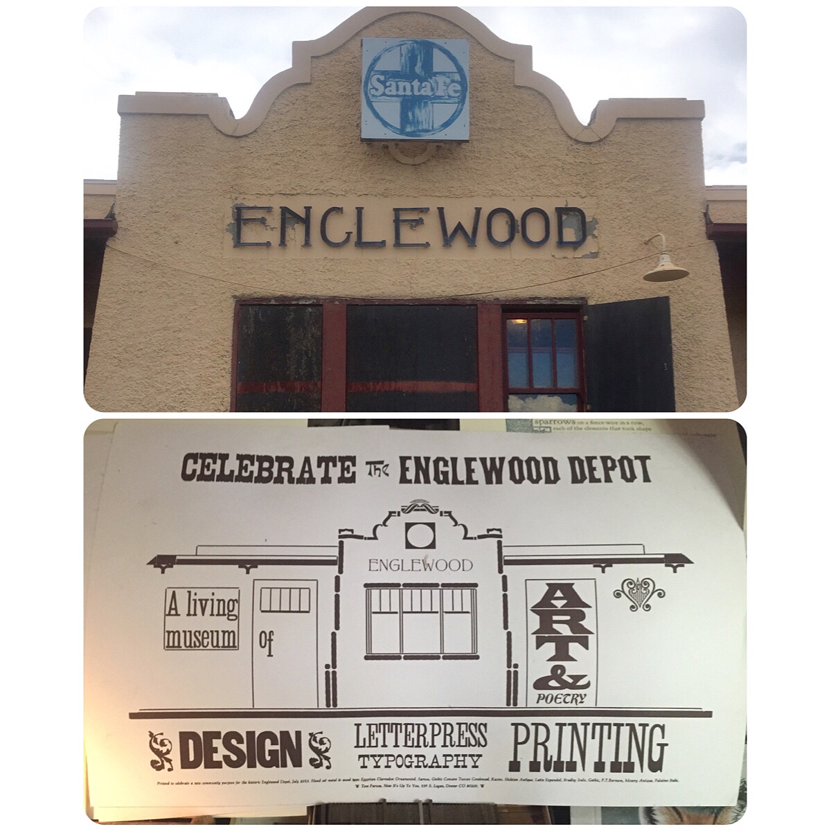
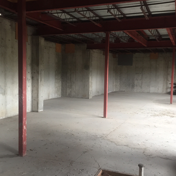
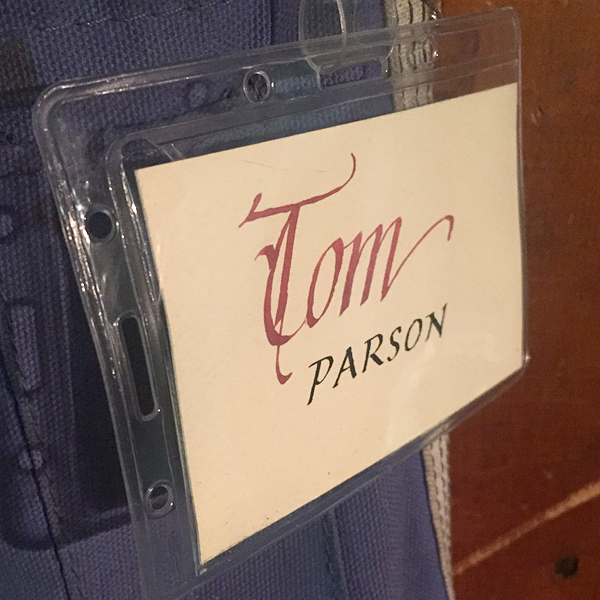
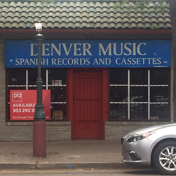
We met up with kind and welcoming Tom Parson who toured us around the Englewood Depot, a former train station he's turning into what will be a fantastic print and book arts center. While in its early, rough stages, there is a full basement with easy access to what will be garage doors for loading in presses and an upstairs for small presses, a library and workspace.

IMG_1420

IMG_1378

Then we visited his home and were blown away by his collection of books and everything related to printing.

IMG_1381

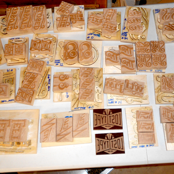
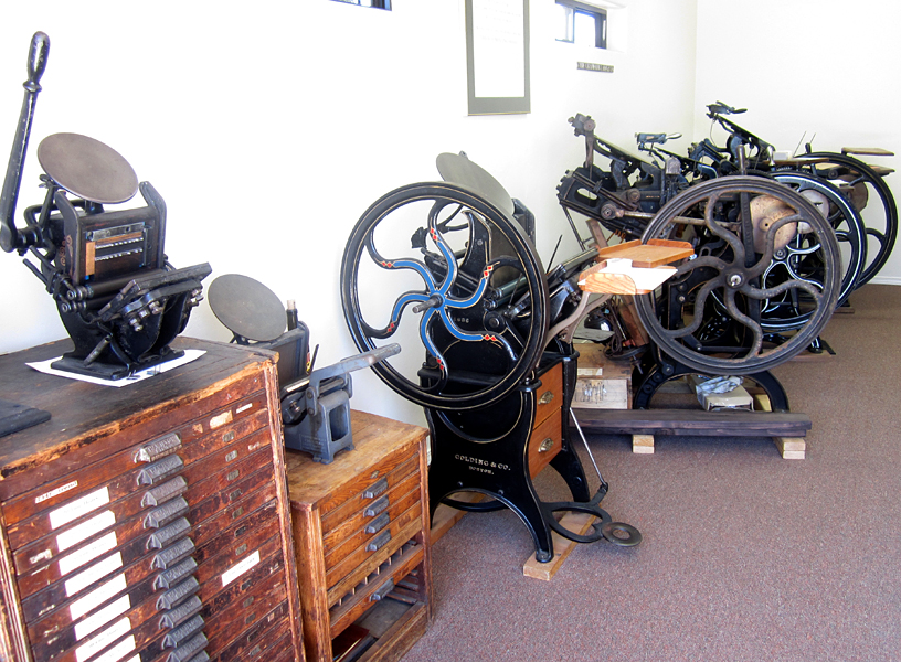
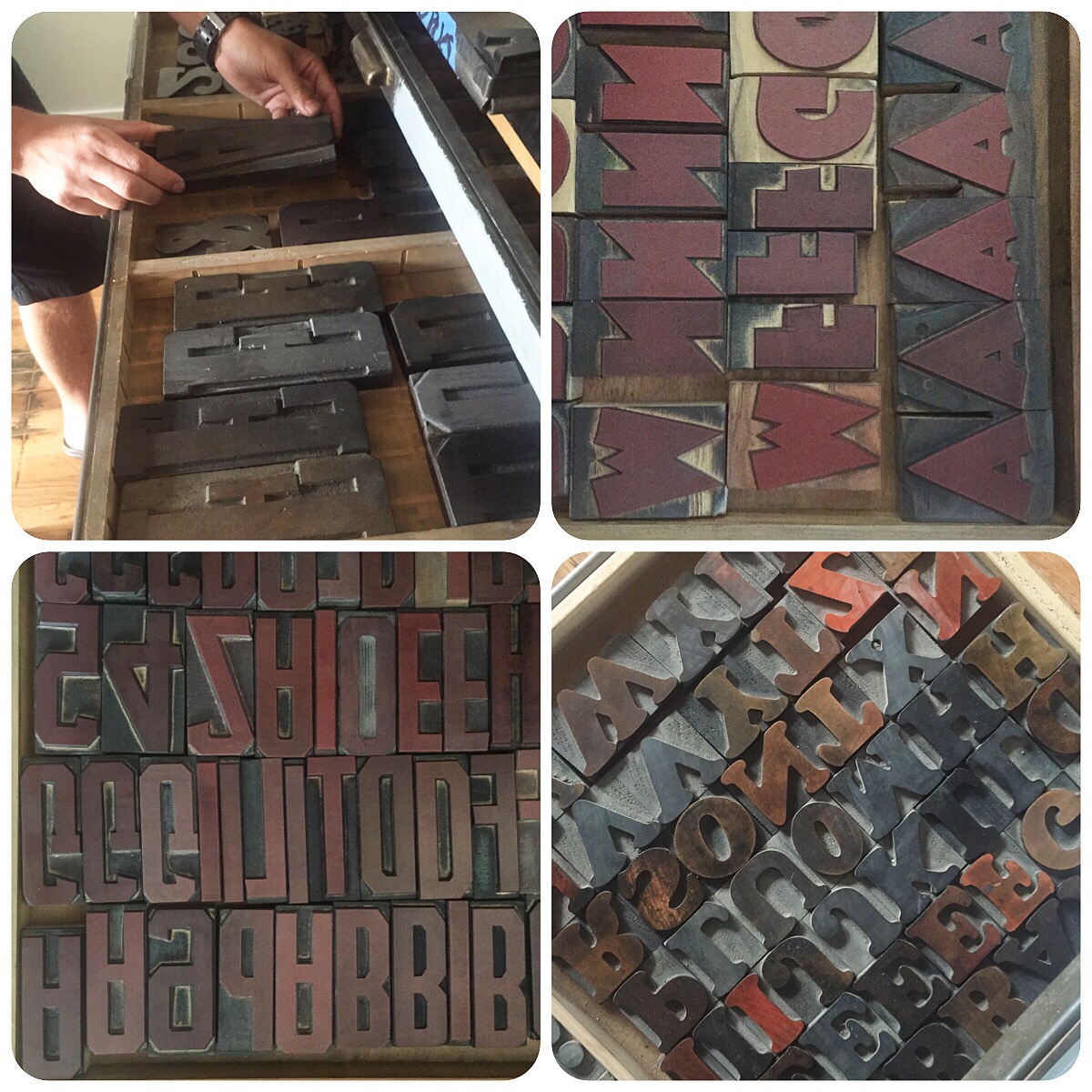
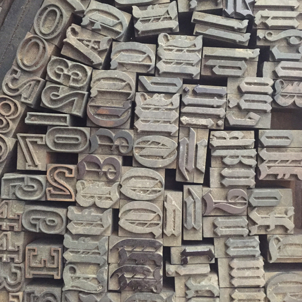
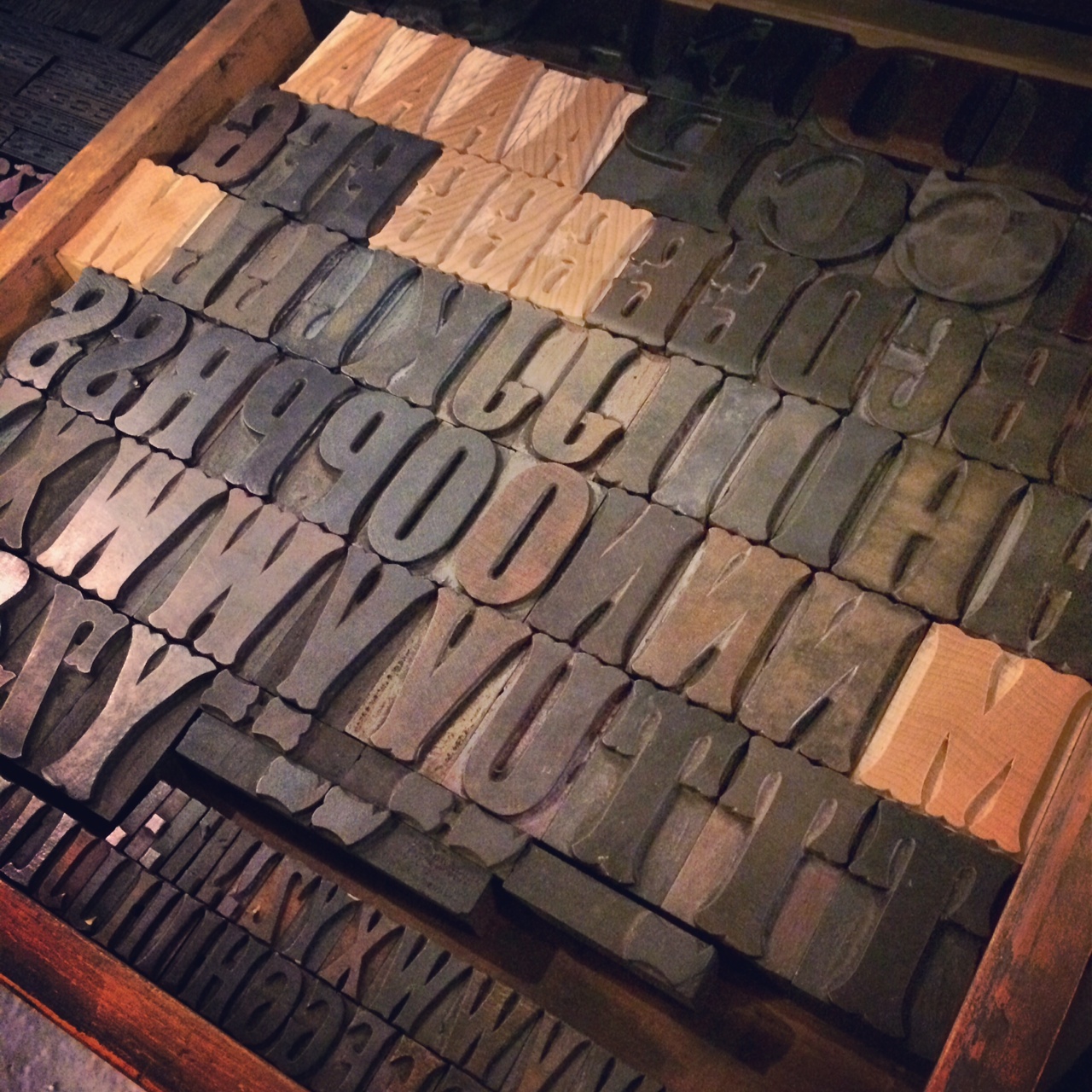
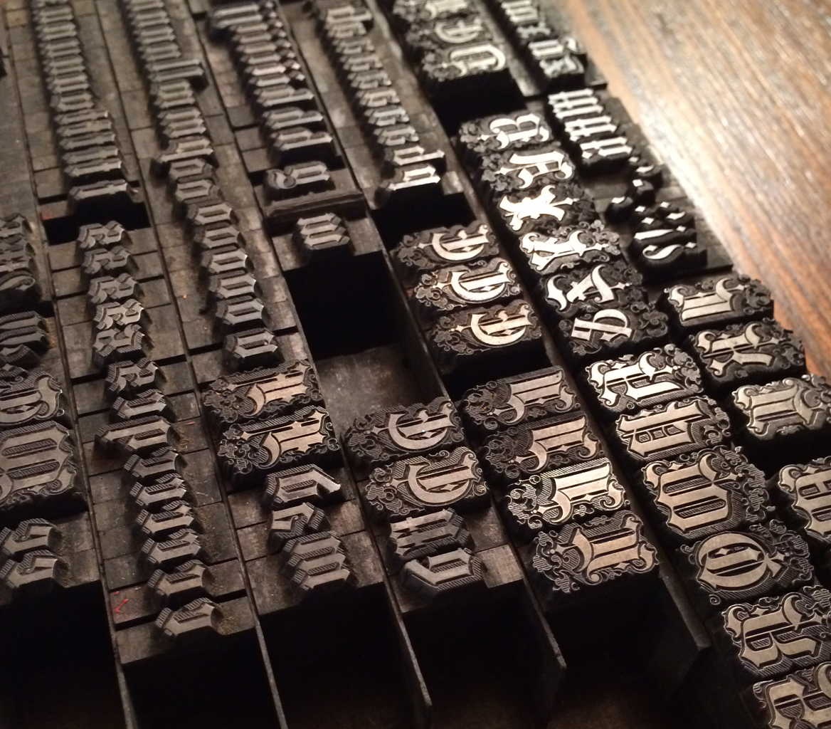
A slightly trepidatious Jo heads into the garage to check out the print shop. Every square inch of this place is covered, mostly with type.

IMG_1382

IMG_1405

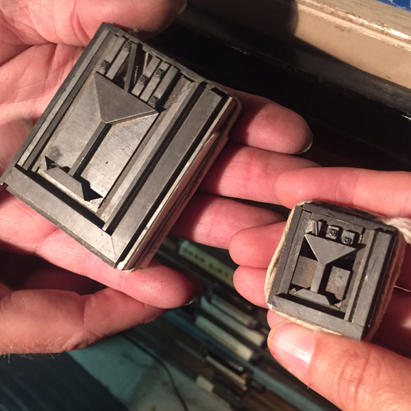
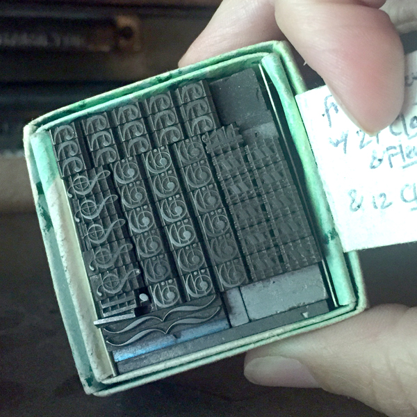
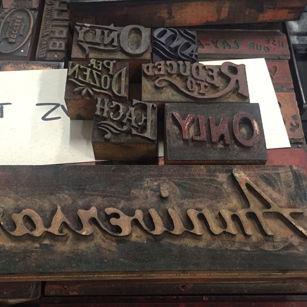
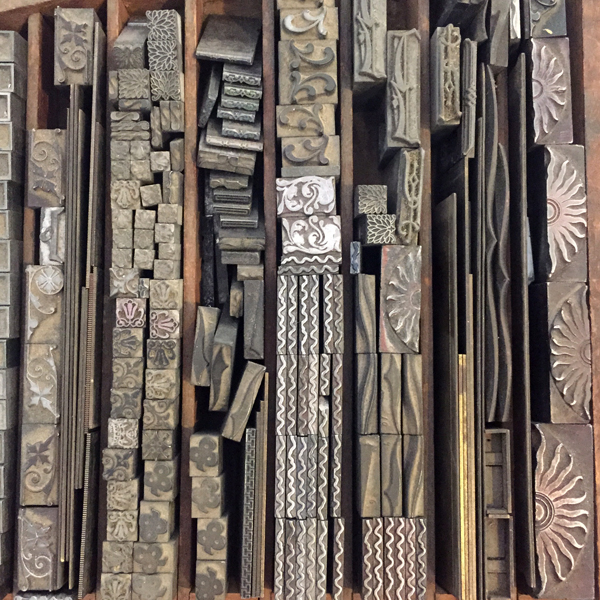
Tom pulled out a lot of treasures to share.

IMG_1395

IMG_1390

IMG_1384

IMG_1385

IMG_1391

IMG_1392

IMG_1399  IMG_1402

IMG_1403

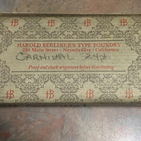
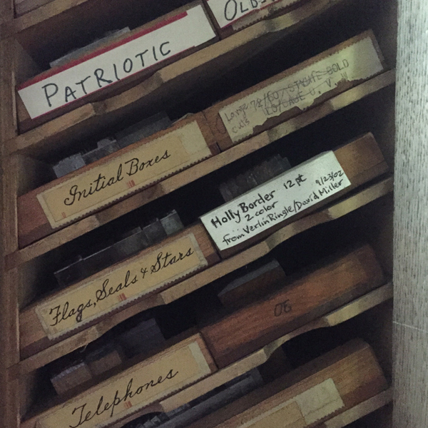
He's been slowly proofing and cataloging his extensive collection in a few ring bound booklets to keep track of what's there. He's excellent at making notes about whatever he can learn of the type, as well as where he found/purchased it.

IMG_1421 IMG_1422 IMG_1423

IMG_1398

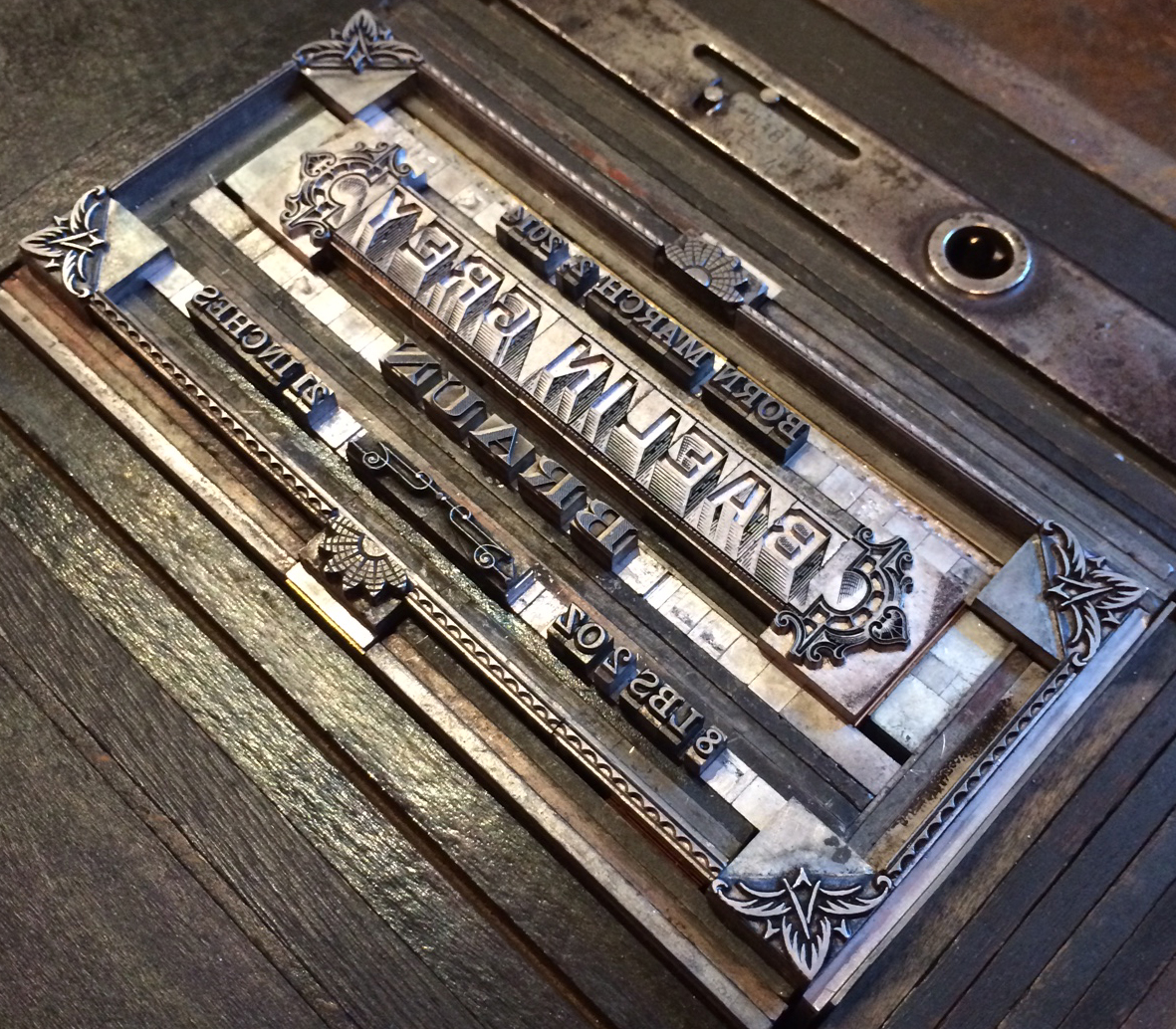
I am coveting these things:

IMG_1406

IMG_1407

Then we rode over to visit Jason Wedekind at Genghis Kern, who has just acquired a building he is setting up as a co-working space. This place is right next door.

IMG_1408

The print shop is in the back of the new space and is really coming along.

IMG_1417

IMG_1411

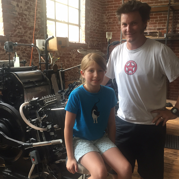
Visiting print shops can get old when you're eight, but the payoff was worth it; Jason taught Jo how to always win at tic tac toe. I only wish we'd had room to bring some Old Style.

IMG_1416

IMG_1424

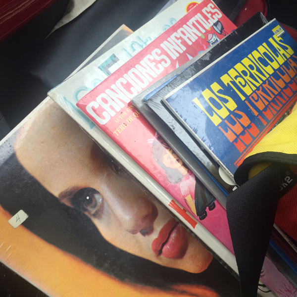
There were a few (and by few I mean hundreds) of records left from the former store next to the co-working space which Jason snagged. No longer lonely LPs, these were headed to good homes, including mine.

IMG_1418

From there we went to the home of a former Chicago friend and librarian I had the pleasure to work with a long time ago. It was wonderful to meet little Bea, born about a year after Jo following their move to Denver. Getting a chance to relax, we reminisced over wine and revisited a birth announcement I did for Will. Charles, the older boy on the announcement, celebrated his 15th birthday the day we were there.

IMG_1425

IMG_1419

Off again to Kansas City, Missouri.

IMG_1426

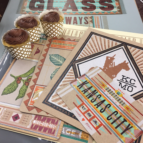
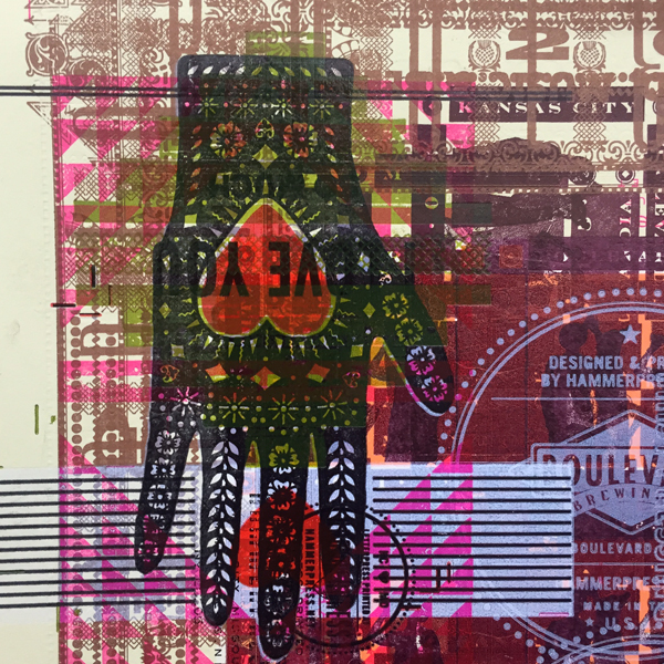
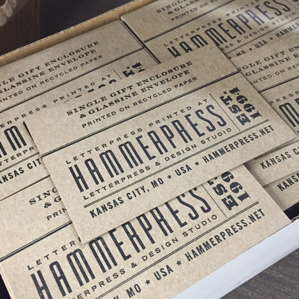
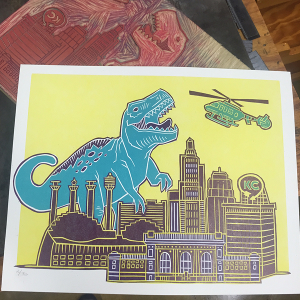
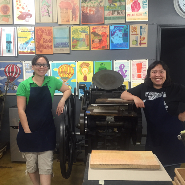
Being welcomed in KCMO with a set of gorgeous Hammerpress prints and cupcakes was a real treat in every sense. We chatted a LOT about the state of running letterpress-based businesses and shared stories. I knew there would be a lot of ornamental eye candy to enjoy here.

IMG_1437

IMG_1442Their new retail space is nothing short of stunning.

IMG_1444

IMG_1443Matt, Brady and Kate. Unbelievably great to see them all.

IMG_1427

IMG_1428

IMG_1429

IMG_1431

IMG_1432

IMG_1438
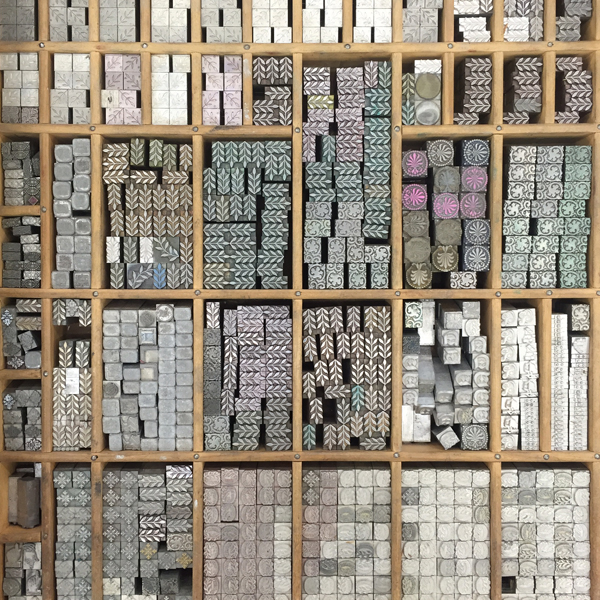
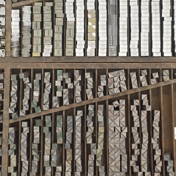
Top notch storage system.
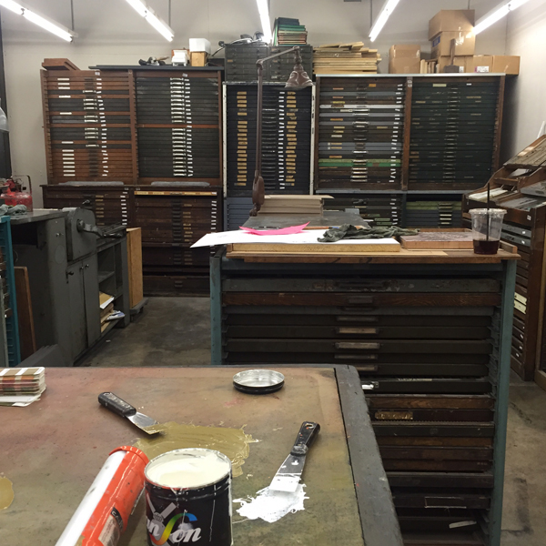
IMG_1434

IMG_1439

IMG_1440The ink drum corps.

IMG_1433

IMG_1445

IMG_1441

From there we headed to Two Tone Press to soak up the talent of these ladies. Their prints and linoleum cutting ability are out of this world. Sometimes, literally.

IMG_1455

IMG_1447

IMG_1452

IMG_1451

IMG_1450

IMG_1453

Huge thanks to Michelle and Angie for welcoming us and sharing their work!

Best Western is Jo's idea of extreme luxury (in-room jacuzzi and the Disney Channel), so we slept well in KC. The next morning we hit Little Freshie and made our way to St. Louis.

IMG_1457

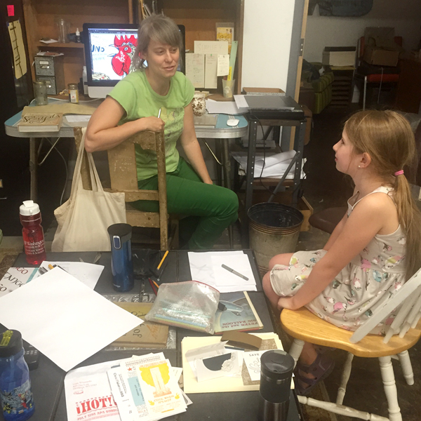
This is the home of Firecracker Press, Central Print and the Alpha Beta Club. We got in early enough to park ourselves there for the day and catch up on computer work. Greeted by the sweet sounds of Sam & Dave, this was the perfect, soul-filled balm for a long drive.

Firecracker sits on one side of the building, Central Print on the other and the Alpha Beta Club in the middle. We set up shop there in the middle to be able to see and enjoy everything that happened around us.

IMG_1471

IMG_1472

IMG_1458

IMG_1460

IMG_1459

IMG_1465

IMG_1464

IMG_1470

IMG_1468

IMG_1461

IMG_1462

IMG_1463

Deep into discussion with Kristina about designing and making zines.

IMG_1477

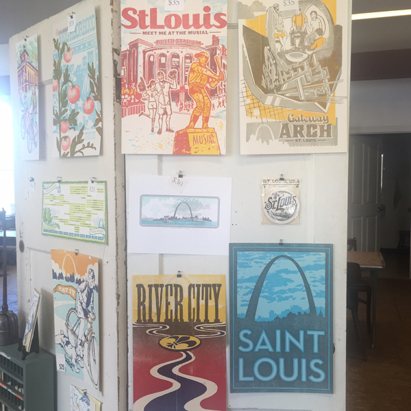
Central Print hosts summer workshops for teens and these prints are the result of one that involved pressure printing.

IMG_1473

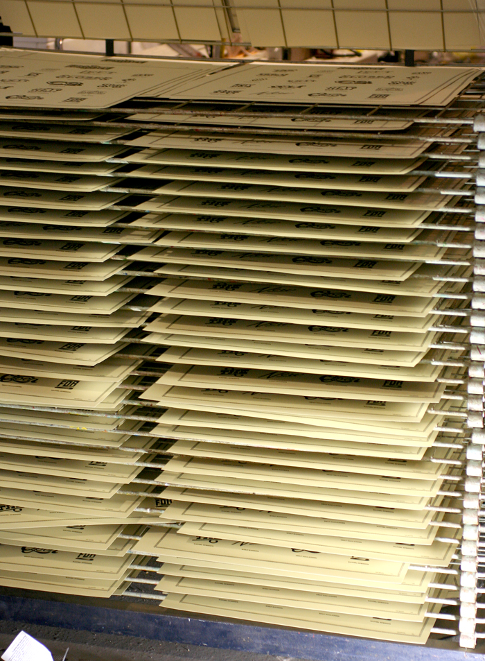
The CP side also sells cards and prints. It's a dangerous section to be in.

IMG_1474

IMG_1475

IMG_1476

Our office for the day.

IMG_1478

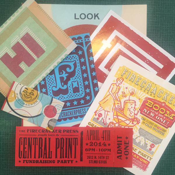
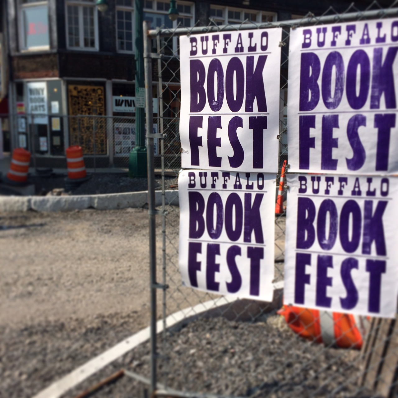
Firecracker initiated the Letterpress Trail map a few years ago (so maybe this traveling around is their fault?). Eric nearly finished ours off as only he would be allowed to, with a giant sticker. You can still get these prints and collect stamps in all the shops you visit.

IMG_1480

We left with some real gems.

IMG_1481

Huge thanks to this great gang for welcoming us and letting us be a part of the atmosphere for a day.

IMG_1482

That night we went to Perennial for a benefit where Jo and Eric's daughter made some clever cork boards and jewelry.

IMG_1489

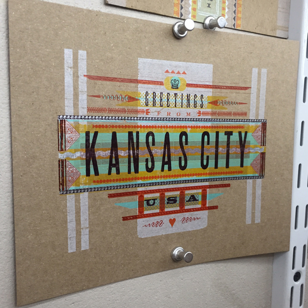
At First Light we headed out to Columbus. This sign was almost too much. So desperate for Chicago, it was all I could do to turn towards Indianapolis.

IMG_1490

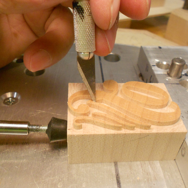
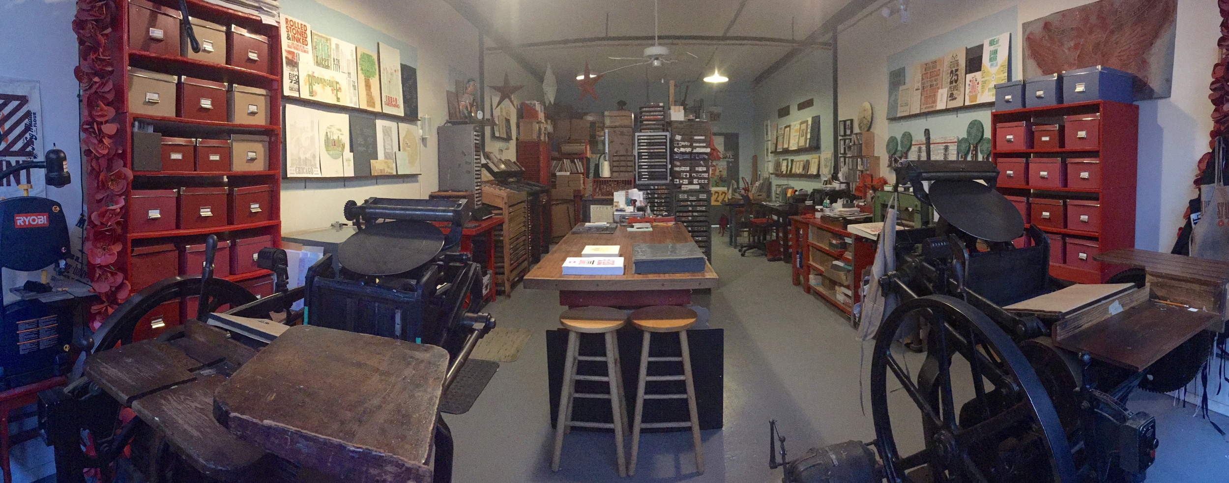
But our time in Columbus at the home of Roni and Scott Moore always feels like home. Jo got quality time at the community pool and the impressive zoo while I went at it making wood type under the patient guidance of Scott.

IMG_1491

So many patterns, so little time.

IMG_1493

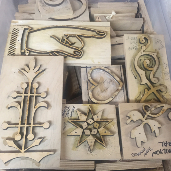
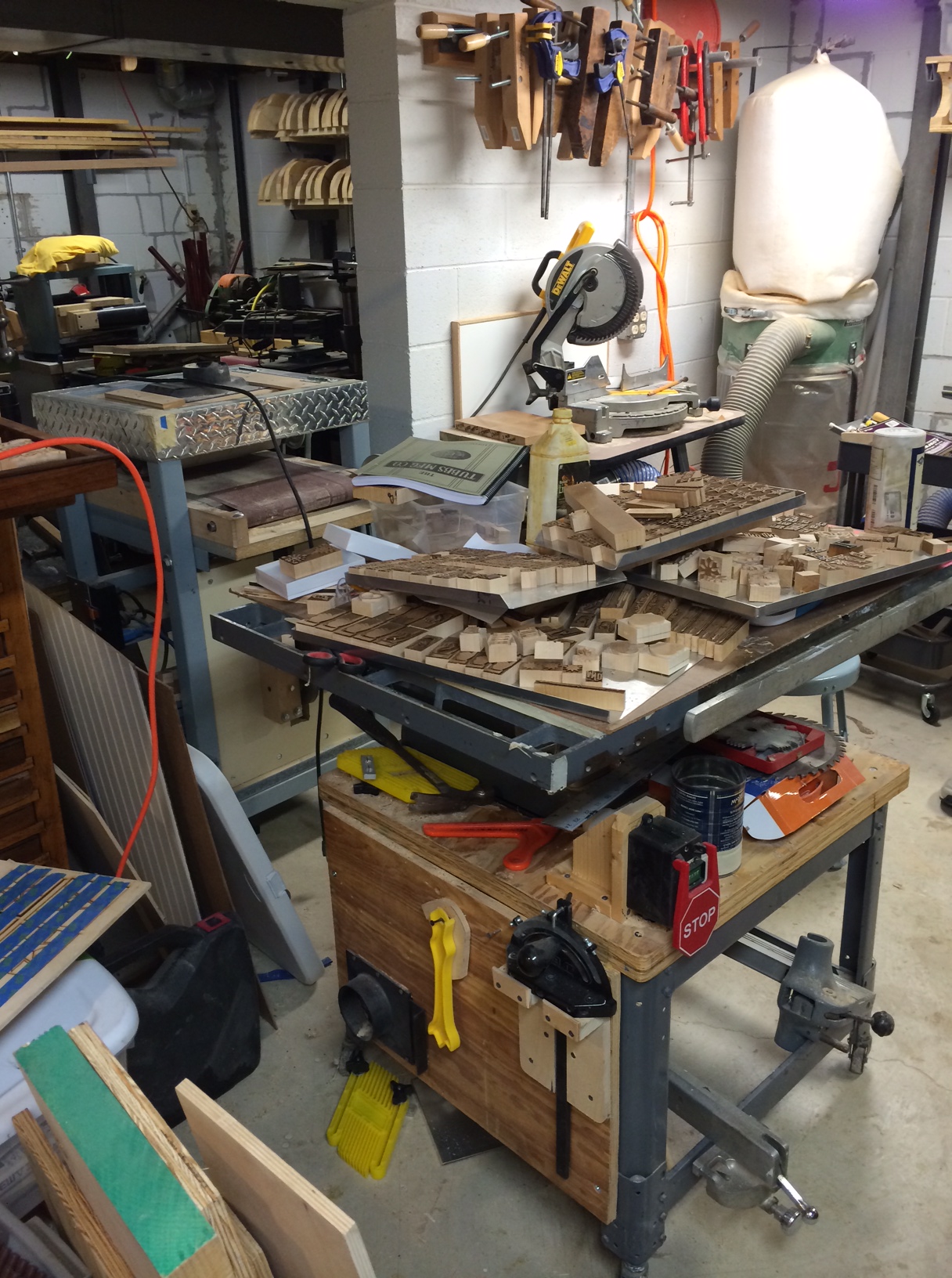
Scott has added a laser cutter to his wood type making toolbox and it was fascinating to see it in action, cutting 'new' patterns.

IMG_1494

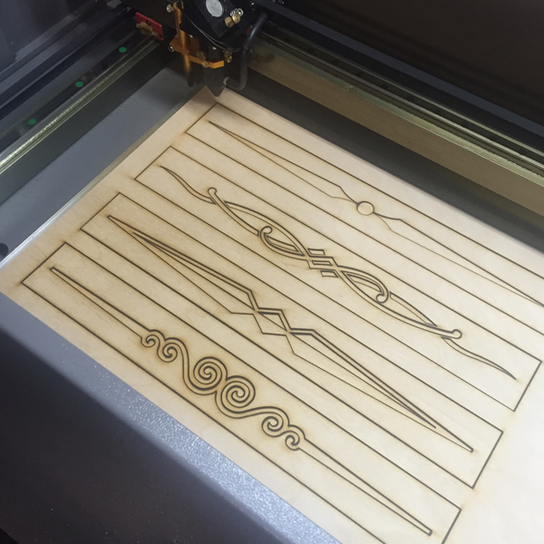
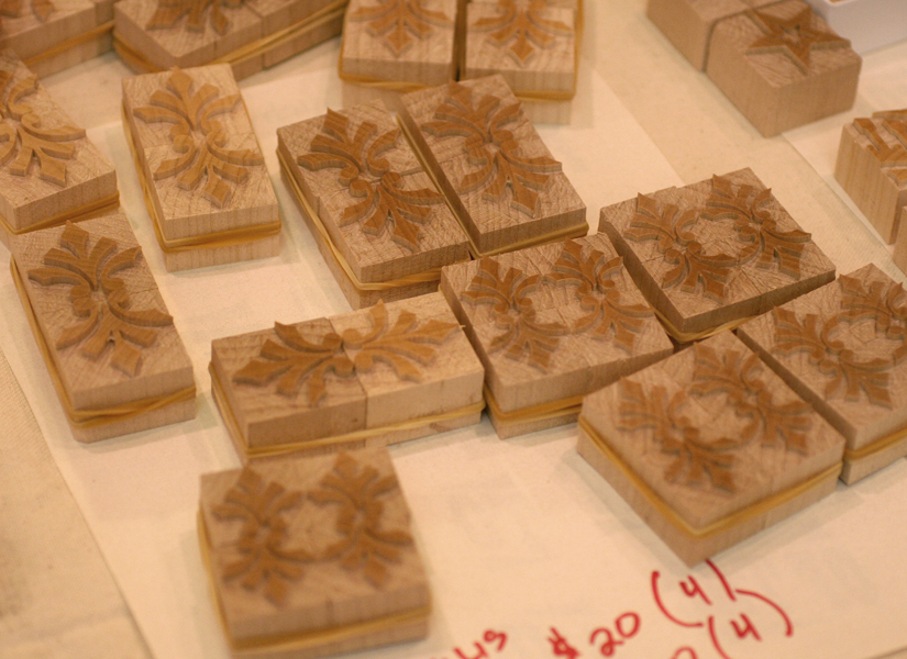
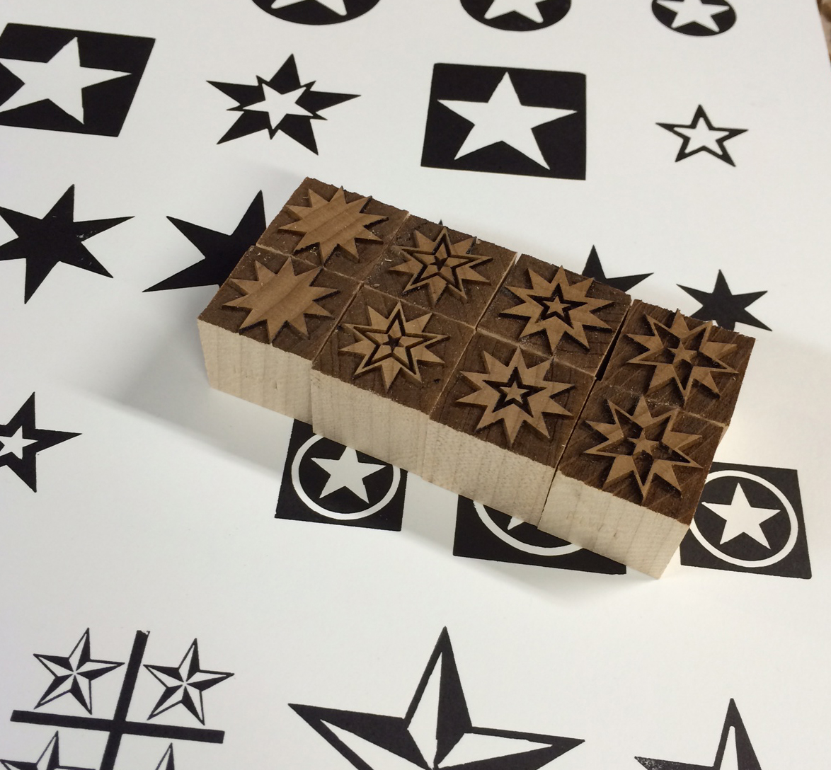
Here are the patterns for the snowflakes we collaborated on last Fall, as well as some of the laser cut versions.

IMG_1495

IMG_1504

I settled on this ornament and set out to make two.

IMG_1497

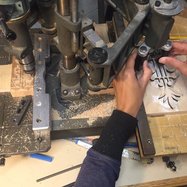
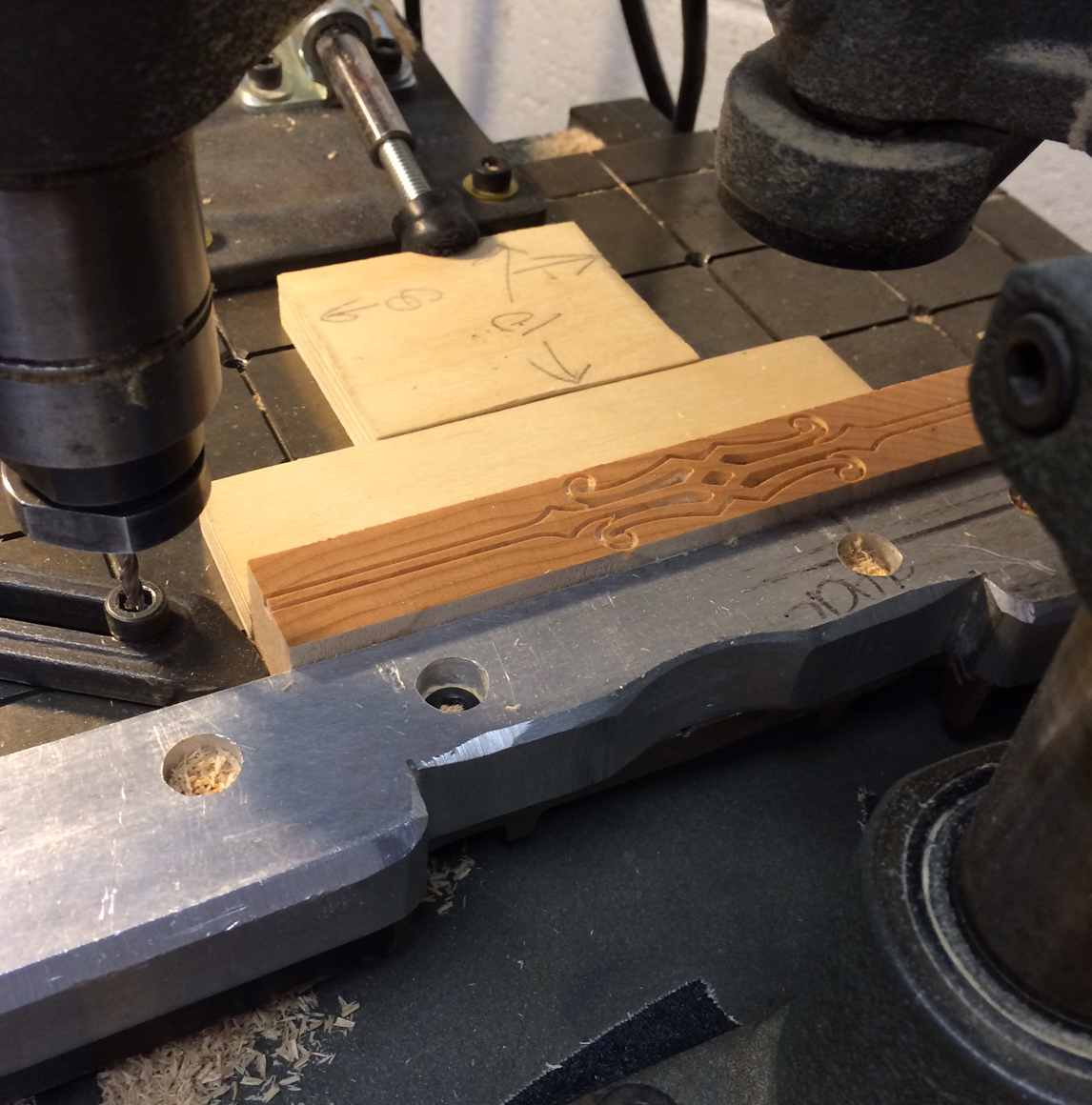
For these we started with the fine cutting before moving to the rough cut. It's a slow, methodical process that's very easy to mess up. You have to carefully trace the pattern while the cutting side takes care of business.

IMG_1501

IMG_1502

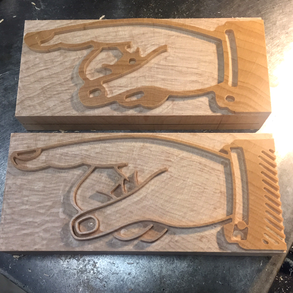
Here are the final two. Not bad!

IMG_1503

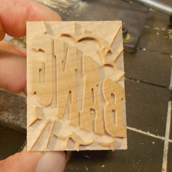
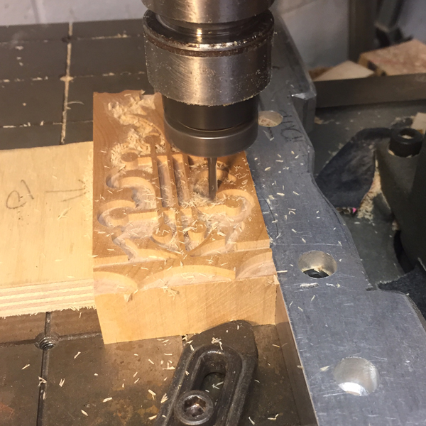
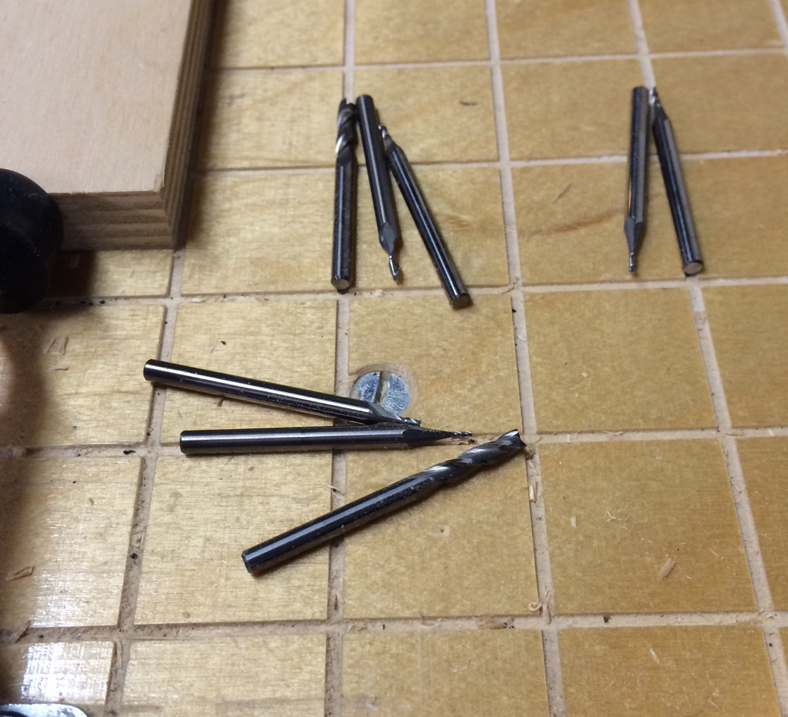
Then I moved on to the manicules as I don't have any large sets. The patterns can be used to create any size you desire with adjustments on the pantograph. I opted for a set that is 30 picas long (about 5 inches).

IMG_1505

I started with the rough cut on these as you can see on the top piece. The bottom shows the addition of the finer cut, but not the hand finishing that needs to happen to complete the job. Did I mention this is *really* a process?

IMG_1506

I made two sets so I could share one with Matt at Virgin as well as sneaking in some sunsets.

IMG_1507

We hit a huge and scary pothole on the way into Columbus that severely damaged a front tire and we needed to replace both. Of all the places for this to happen, Columbus was the best possible location. I was grateful for Scott's 'dad mode' kicking in as he found a location that could replace the tires immediately. We had to be in Buffalo the next day so our window was small. Scott and Roni are the most gracious hosts and staying with them is always a comforting pleasure. But it was time to move on again. We found a much needed Car Wash on the way to New York and we were off for the last leg Jo and I would share together.

The Letterpress Trail 2015 part one

The Letterpress Trail 2015 part three

Metal Type Presses On

Fortune has always favored me in the form of friends that are true go-getters. From the family I found at Fireproof Press, to the Chicago Printer's Guild and Chicago Printmakers Collaborative, to the talented stream of interns at Starshaped and the new friends I discover at the Hamilton Wood Type and Printing Museum Wayzgoose every year, there's never been a dearth of inspiring artisans and designers in my life. Not the least of these is Erin Beckloff, who reached out years ago looking for a proof of one of our wood typefaces so that her father, Scott Moore, could create a set of patterns to pantograph cut a few replacement characters. We hit it off immediately and I have always been impressed with her enthusiasm for all things design and letterpress. She has never faltered in her quest to understand the craft and the people behind it, so when she mentioned this past Fall that she felt a documentary was in order to showcase the stalwarts of the print community, I knew immediately she was the person to make it happen.A long while ago, I heard an interview with an actor talking about working with the Coen Brothers on a film and he said, 'Some people just don't suck. And when they call you to work on a project, you say YES.' This is how I've always felt about Erin and her projects because she thoughtfully sees them through to a fully realized end. She asked if I could contribute in two ways to help get this off the ground. The first is in the form of a print to be offered as a reward for supporting her Kickstarter campaign.

llmtgray1I have always felt that promoting metal type has been an uphill battle as wood type, in all of its textured, meaty glory takes center stage. Metal type requires more patience and a solid understanding of the medium in order to get stellar results. Starshaped creates most projects with metal type and given our past of printing propaganda, it seemed like time to mix the two. I began by sketching out what would look like a mass of protest posters with slogans altered to be typographic in nature.

firstsketchThen each 'poster' started to take form in various sizes with a mash up of different typefaces.

typeformstartI added rules to give dimension to the edges as well as those that would look to be supporting the posters. This is the first good carbon paper proof of the form.

carbonproof

formwithink

solidarity

figuresWhen all looked good, I removed the rules as they would be printed in a different color. Here they are sitting on a proof so that I remember what went where.

rulesAfter printing the red I replaced the rules and took the type out.

rules2It never fails that I sense a third color would really 'bring a print home'. So I took a misprint and labeled the dimensions of each poster so that I could cut linoleum blocks to print over them in a transparent-based ink. This helped them pop from the paper quite a bit, despite the subtle effect.

misprintmeasurements

llmtgray2The prints, offered as part of the fundraising effort, measure 8x10" and are printed on paper generously provided by Appleton. I also ran a short edition on 11x14" paper to give the type a bit more breathing room. These will be available eventually; invest in the documentary first!

llmtgreen1The second way I am contributing to this project is in the form of teaching one lucky (or unlucky?) person as much as I possibly can in one day about metal type. In this 12+ hours of grueling type setting, proofing and printing, we'll discuss the history of metal type, look at how issues were dealt with by previous generations of printers and how to best work in the medium now. Plus, that person will have access to the Starshaped collection and the opportunity to create something special. Are you up for it? Check out the entire campaign and get updates on the facebook page.

35studio1

Erin is in the middle of this photo, surrounded by students that she has inspired both in design and letterpress. It is incredible to see her grow and overlap both fields while taking the time to teach everything she knows to the next generation of aspiring printers. The fact that Jo and I will both be a part of the final documentary is such an afterthought to the bigger picture of how the craft is recorded and passed on. And pulling in Mark from the Mayfair Workshop, a longtime close friend of both Fireproof and Starshaped, to create the perfect background score brings this project full circle for me. Everything about it feels right. Will Erin be the Alan Lomax of the letterpress world? It's early to speak to that, but she is well on her way, supported by those of us who understand the importance of retaining and collecting history before it vanishes. Go get 'em, lady.

lecture2

The 2014 Letterpress Trail, part two

The next stop on our Letterpress Trail following Cincinnati was Columbus, home of Moore Wood Type, one of two wood type makers in the US and a great friend to Starshaped. Scott's humble workshop is mostly in his basement, where he has just the right set up of equipment, tools (some handmade!) and wood for production. moore12A table full of recently cut type. And a sneak peek of half rounds in the background!

moore11This is Scott's pantograph, next to a trim saw. You can see a pattern set up here.

moore16A box of patterns for catchphrases.

moore18Scott has also been laser cutting wood type, and here is an experiment with creating a border. After cutting a full sheet of finished, type high maple, he can then trim out the individual borders and ornaments. Working with the laser allows for greater flexibility of sizing, not to mention detail in the smaller sizes. And speed!

moore19These are a few new stars sitting on top of the proof sheets of our Moore collection at Starshaped. I brought them to double check our own stock against the new Moore offerings.

moore14Check out this beautiful block ready to be trimmed and carved. You can see the lovely wood grain, and well as a bit of the sheen from the smoothness of the surface.

moore21These are the cutters for carving the final pieces. You can see the range of sizes to accommodate a variety of type forms and counter spaces.

moore20Happily, I got to cut my first wood type! Scott let me choose what I wanted to do, so I picked this ornamental rule that he hadn't done yet. I even got to pick the length; the final piece can be cut to any size, which is the beauty of working with a pantograph. Scott has a notebook of configurations for each of his patterns, and also makes notes directly on them so as to remember how to set the pantograph measurements to cut accurate sizes.

moore1The first cut is the more detailed one, and you can see how the outline of the rule is taking place. After this, the cutter is swapped for a larger one to clear the solid areas that are not part of the design.

moore4Look at me go! I'm using the tracing side of the pantograph to outline the pattern.

moore2Here are the final pieces.

moore5Scott made patterns for an Antique Tuscan, a typeface that's near to my heart and one we've had the longest in the studio. Because I'm missing a few letters, we thought it would be fun to make replacement characters. Here's a box of the patterns ready to be mounted, traced and cut as new wood type.

moore6

moore8After much configuration, we were successful and I was able to make a handful of the missing letters needed to complete my set of 12-line type. It is now at home with its 100 year old siblings.

What a delight it was to visit with the Moores for two days, sharing stories, cutting type and playing with the dogs. Can't wait to see them again!

moore10

finaltuscanAfter Scott checked the fluids in the Fiat, we hit the road to Pittsburgh to visit Matt Braun of the Outdated Press. He's got a cozy shop that's enviable for its tidiness. It's the perfect collection of unique metal type and impeccably restored Pearl presses (and he's got one for sale, folks!).

outdated9

outdated

outdated7Here are a few of Matt's beautiful typefaces.

outdated3

outdated5This is the next restoration project!

outdated11Here's a fine example of Matt's talent with complex forms. Also a project near to his heart; his own newborn's birth announcement! And what a cutie he is.

outdated13Matt took us downtown to the office of Bearded, his day job. They have a fine way of mixing old and new, as web designers with a stellar letterpress studio all in the same place.

bearded9These are just a few shots of their incredible wood type collection. And you're in luck, because many of these have been digitized and are available as part of Wood Type Revival.

bearded6

bearded7

bearded8

bearded4

bearded5Four hours after leaving Pittsburgh, we made it to Buffalo to catch a few hours of sleep before participating in the Western New York Book Arts Center's annual Book Fest (read about last year's event here). I was happy to contribute another large linoleum cut for their steamroller printing, which is really a sight to see.

buffalo1Despite the construction, many folks came out to the parking lot to see the steamroller in action. And thanks to the construction, we had a lot of chain link 'walls' to fill with beautiful prints on muslin. You can see my ode to The Queen City 3x3' linoleum cut here.

buffalo7

buffalo6Everyone got into the action and it was great to engage the younger members of the audience in inking up the cuts.

buffalo3Yep, watching a steamroller print is indeed camera-worthy!

buffalo5Check it out for yourself:

[wpvideo 6e8WUFEr]

And here's the final result! All of the prints pulled are for sale at WNYBAC, and the proceeds all benefit the Center. buffalo4Sunburned and exhausted, I took a day off before finishing up our Letterpress Trail in Rochester. Given the amount of type seen that day, I'll be saving those images for their own post! Check back soon.

Lost Type... and Found

Working in a studio alone most days means that it's important to make time for collaboration. Luckily, this happens pretty regularly and these posters for Lost Type are a great example. Working with Dan Gneiding, the designer of Dude Hank along with friend Scott Moore of Moore Wood Type, the poster showcases a set of fabulous new catchphrases designed as digital fonts but cut as wood type, too, as they were traditionally produced.losttype1 
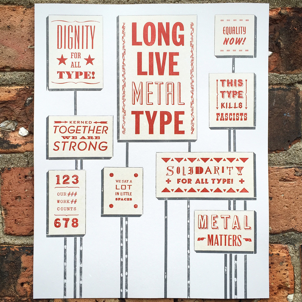
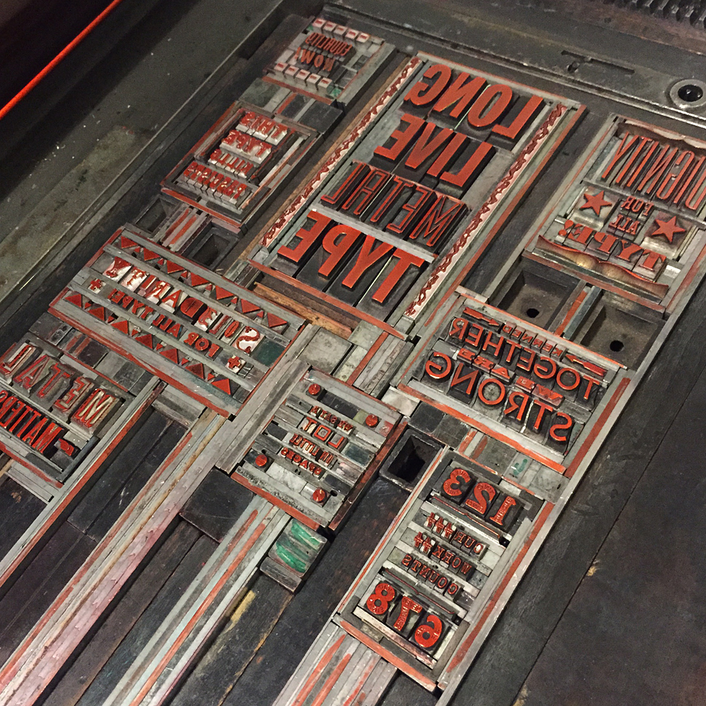
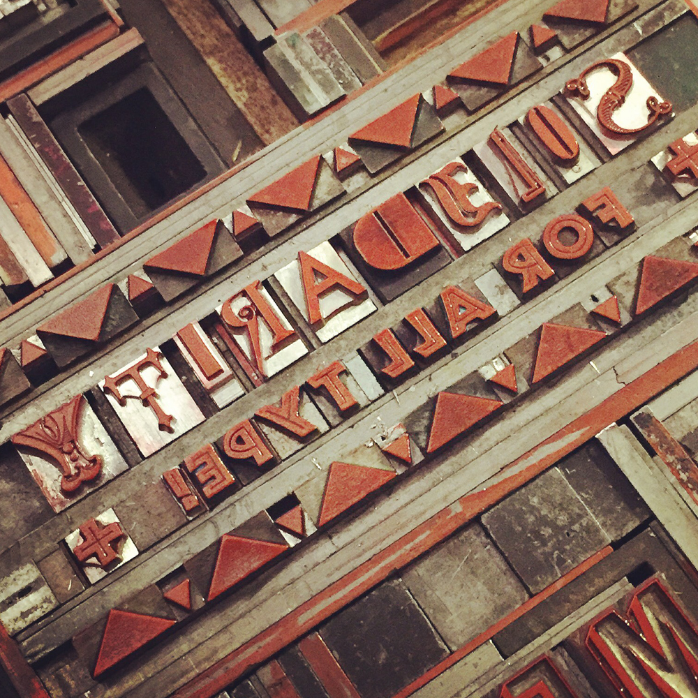
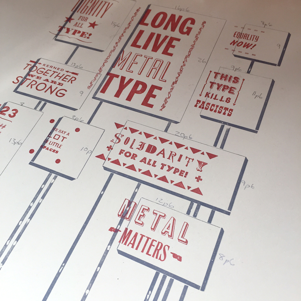
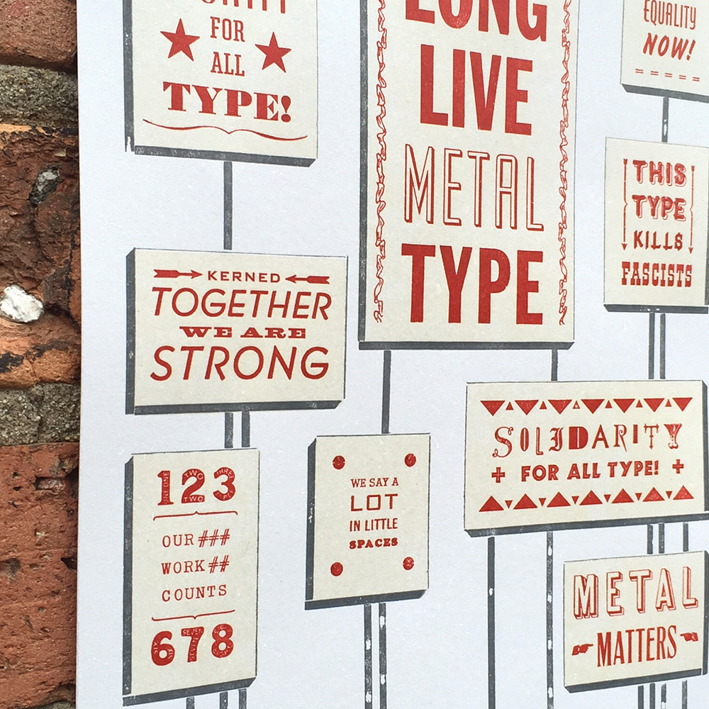
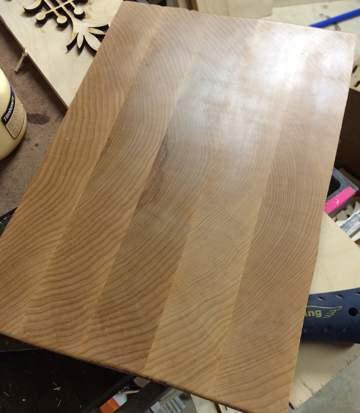
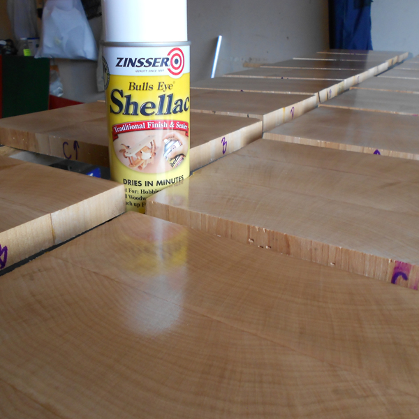
The following images are courtesy of Scott, as he documented his process of converting the files for each catchphrase into actual wood type, starting with the wood planed to type high (just shy of an inch).

scott7Stencils are created for the pantograph, which traces these while the connecting arm carves the actual wood type block.

scott4Here's a great shot of the original stencil alongside the finished piece of type.

scott3The smallest areas and details are trimmed by hand. Love the laboriousness of this process!

scott6

scott2

scott1The poster I printed was the combination of a laser cut Lost Type logo, the pantograph cut catchphrases and magnesium plates of the names of the designers underneath.

Tlosttype5I printed the posters at Jim Pollock's studio, as he owns a Vandercook 320G press, which is substantially larger than our Vandercook SP-15, and capable of printing 18x24" posters.

Tlosttype2I particularly enjoy this ampersand.

Tlosttype4

losttype4

Tlosttype3See that little POOP in there? That one was designed by new friend Frances MacLeod, which I didn't realize until well after this printing!

Plosttype5

Plosttype6The posters had their own dedicated drying rack after printing, which was handy given that there were about 300.

Plosttype2

Plosttype3The digital catchphrases are now available, so grab 'em and update your look. You can contact Lost Type about acquiring a poster, and Scott Moore about the possibility of getting the real deal in wood.


Phoenix Welcomes the Goose

The Amalgamated Printers Association (APA) is one of the great organizations that I've been a part of for the last ten years. It's a group of 150 printers that range from hobby to professional, and issues a monthly 'bundle' of print samples from members in the group. Every year they host a Wayzgoose (a traditional printers gathering) in a different location around the country. This year the Goose was held in Phoenix and I was one of the members asked to speak. The weekend features hands on demos and workshops along with lectures and hospitality (great chance to share printing tips!), as well as a great swap meet, auction and banquet. When there's time, it's possible to visit the shops and studios of members in the group that live in the vicinity. This year's Goose was packed with great events! Clearly, though, the hotel didn't ask any members to contribute signage: privatesignOn Friday, there were a number of great presentations at Letterpress Central, the home of Cindy and Gary Iverson, who kindly opened up their impressive paper and print studio to all APA'ers. One of my favorite lectures was by Kseniya Thomas, the co-founder of Ladies of Letterpress and the owner of Thomas Printers which were the topics of her presentation.

kseniyaSaturday morning is always a highlight because it starts with a big swap meet. This year was fabulous... so much type to choose from, both old and new. Below is a shot of the Letterpress Things table, and some of the type I couldn't get enough of. There's also newly cut wood type from Stan Harris and the beautiful ornaments of Moore Wood Type.

swapmeet2

swapmeet3

swapmeet1Here are some of the treats I added to the Starshaped collection:

ribbon

marbleheart

agencygothicAfter the swap meet there's an auction of even more goodies. Had to get a rough shot of Dave Peat at his finest here!

davepeatauctionSaturday evening there was a banquet for all of the members and guests and we were treated to BBQ this year. Here's a shot of our fine organizers wearing the printers caps they made for everyone. From left to right is Jeryl Jones, Mike O'Connor, Cindy and Gary Iverson.

organizersHere are the Bauders, local to Arizona. They ran a print shop together for 33 years and just celebrated their 60th anniversary. Chatting with them was a highlight of the trip.

baudersThis is the venerable Don Black of Don Black Linecasting fame in Toronto. He knows a whole lot about printing equipment, and even more about the Canadiens.

donblackOur guest speaker for the evening was a real treat. John Risseeuw outlined his fine career in printmaking and teaching and brought along a lot of stunning examples of his work and the work of his students.

johnriseeuwThese are a few of the pieces from a series on landmines and their effects on the people who live in their path. Absolutely incredible technique, layering and use of materials, not to mention the social impact of the printed word. Read more about it here.

riseeuw2

riseeuwAfter dinner there was more time for socializing in the hotel and more chatting about printing and presses.

hospitality2Here's a motley crew representing many lifetimes of printing and type knowledge!

hospitality4

stickitOne of the lucky things that came together for the weekend was that former Starshaped intern, Claire, who left Chicago for LA, was able to meet up and join in on the fun. Here she is enjoying an animated conversation with Don. You can find her work at Small Press LA and VIA.

clairedonOn Sunday we headed up to Skyline Type Foundry. If you've seen any work that's come out of Starshaped, then you've seen the results of Sky's typecasting adventures. His shop and foundry are the gold standards for organization, layout and quality in production.

skyline1Sky, along with Dave Macmillan, had two casters up and running to show everyone the process of casting metal type. The equipment is meticulously maintained and in great shape, so it goes without saying that the results are stunning. Good hard type in hard to find faces!

skyline4

skyline9

skyline10

skyline11

skyline2Sky preps the type on galleys by sort so that it can easily be fonted up into classy little boxes and sold.

skyline7

skyline6There is also a space for the press and type collection.

skyline12Shopping! All of the type options for sale were out for all to see. It was like being a kid in a candy store. So many choices!

skyline20

skyline19

There are also lots of fun bits and pieces of type history floating around the shop.

skyline21

skyline14

skyline17One of the highlights of the visit for me was picking up a complete set of Sky's newest casting, Arboret in 12 and 24 point along with a set of ornamental pieces to accompany the typeface. This is an incredible face with many options for constructing literal arbors or anything you can imagine. Below is the print Sky created to showcase the type along with the form for printing.

skyline16

skyline15

This is one of my favorite shots; two Starshaped Rock Stars in one place! Sky of Skyline Type Foundry and Scott from Moore Wood Type. The enthusiasm of these two along with that of the rest of the crew in Phoenix was really inspiring and breathed new life into forthcoming Starshaped projects. Looking forward to next year's Goose!

skyscott