Well Spoken

A while back, Mr. Starshaped shared the story of meeting a Russian man in a coffee shop, downtown Chicago. This man lamented that he hadn't seen the cafe culture in the city that he longed for: the camaraderie, the discussions, the sharing, excellent coffee. My response was that he was in the wrong part of town, as all of this exists in a tiny, magic corner of Ravenswood, the neighborhood Starshaped calls home. For years we've visited the shop formerly known as Beans & Bagels, situated next to the Montrose Brown Line stop. We've witnessed many exciting and positive changes happen during this time, not the least of which included a makeover of both the interior and the menu. And when Will & Sido, the tireless leaders behind the counter, took over as owners, it was time for a name change as well.

I was honored to be asked to contribute a print to commemorate this grand reopening, with the only art direction being to retain the new logo (with its hint of a Cypress tree and nod to Will and Sido's home state, Louisiana) with the name.

fullprint

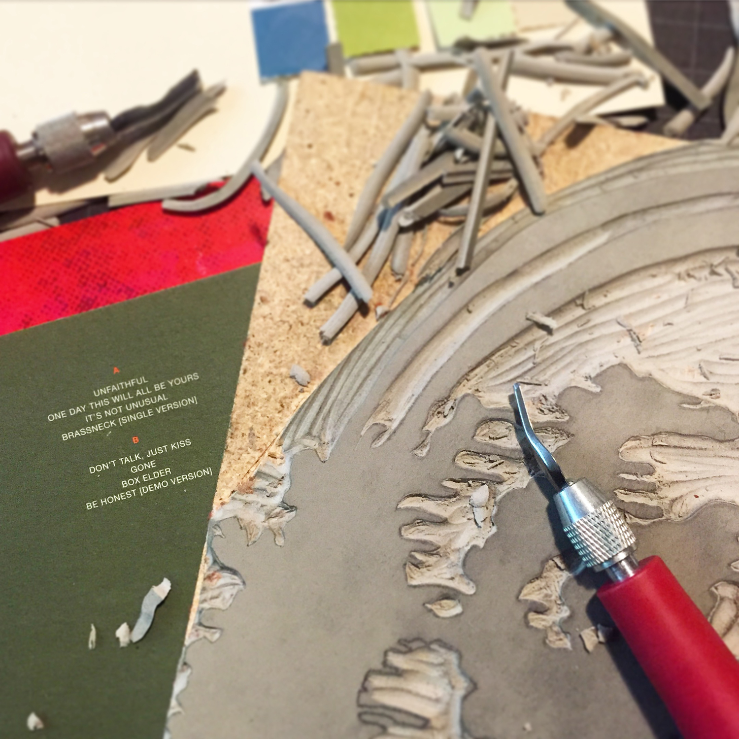
The print was actually planned as 4 colors but became 5. After laying down a light texture of wood as the first layer, I started what would be a 3-color reduction linoleum cut, meaning it would be carved then printed, then carved and printed, then carved and... you get the idea. The first was solid and printed in the same very pale brown as the wood type to give it more depth. There were a few late nights of carving alongside my Wedding Present albums. It's a good way to work.
lincutting

The second run of the linoleum cut was a deeper moss green.

closeup

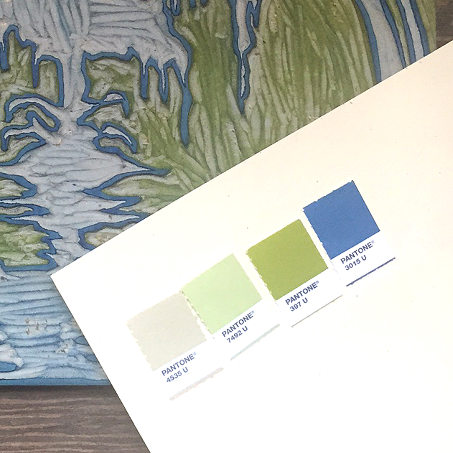
I brought in a pop of blue to tie the elements together.

colors

The linoleum cut, carved down to its final color.

linocut

I wanted to create a modular type for the title so I wouldn't have to carve it or find something similar to the logo type. This took a few different arrangements to get right. These are just a few of the carbon paper proofs done while testing out what I set.

proof

type

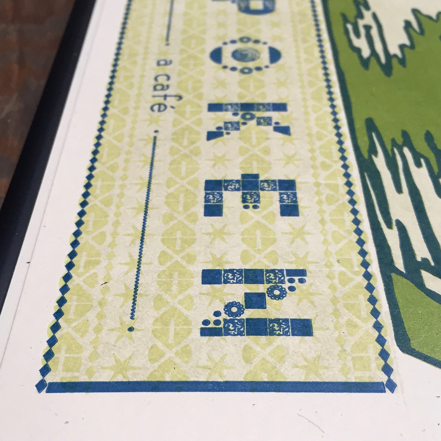
The 4th color, before the final blue, was a slight texture of ornaments that included Chicago-style 6-pointed stars. The first plan was to print this the same as the green for the logo but that was too deep to live behind the text and not clash. So it became another run through the press.

typecloseup

It was such a treat to see one of the final prints framed and out the night of the grand re-opening. Everyone that came through the door to enjoy a drink and some cajun-style cooking was invited to sign. Seeing a Starshaped print at the center of this outpouring of support from the community was a humbling moment I will always remember.

finalprint

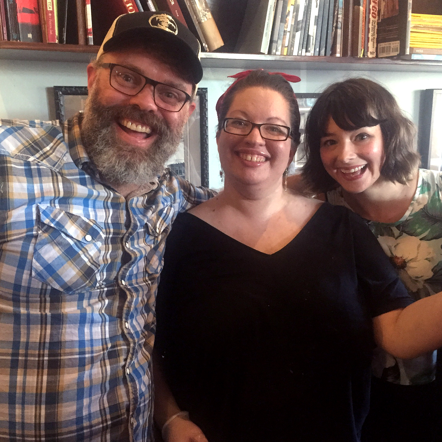
When you're in Ravenswood, go and visit Will, Angela, Sido and the rest of the gang. Get some coffee. Meet a friend. Make some plans to conquer the world or just your tiny corner of it. Whatever your agenda you'll get solid service with a smile. Tell 'em Starshaped sent you.

willangelasido

I've Got A Little Poster Here

Dann and I have been friends for... two decades? So long I can't fully recall how we met. What I do remember are all of the shows we've been to over the years, the scheming about building prints shops, bands, record labels, you name it. The hours at Dons in Rogers Park and Trevi in Lincoln Park. And the thread that's pulled us through all of these years is a simple one: Sweet. Pop. Music. So when Dann came to me in December with the direction to 'make some cool posters', I gave it a shot. Hosting a residency at the Hideout, a veritable Chicago institution, meant a whole lot of type to go with a whole lot of music. The Cooper Black was calling out for a little action, so I set the themes for each night to proof and play with digitally.

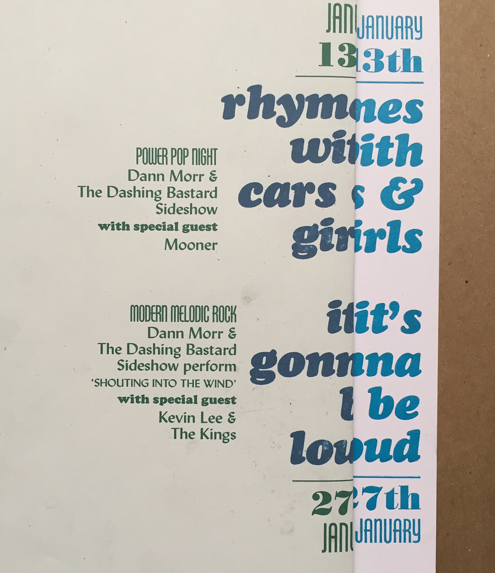
form5After scanning them into a 'fake out' file, I could then figure out how all of the rest of the type would fall into place for the design I had in mind. This is the computer print next to the first printed proof; I can line up both together to check for spacing and alignment.

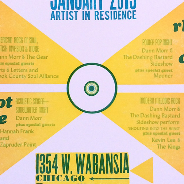
setup3I wanted to create the effect of an old 45 label with shapes reverberating out of the center. I drew what these would look like on a transparency then used it to confirm the text would fall within the proper areas.

setup2I set all of the type at once to make sure the placement was correct and then labeled what blocks would be what color (green and blue).

setup1

form3A brass circle for the center, coupled with a wood circle ornament from Moore Wood Type.

form2This is the full form, inked for the proof. It's a sexy amount of type!

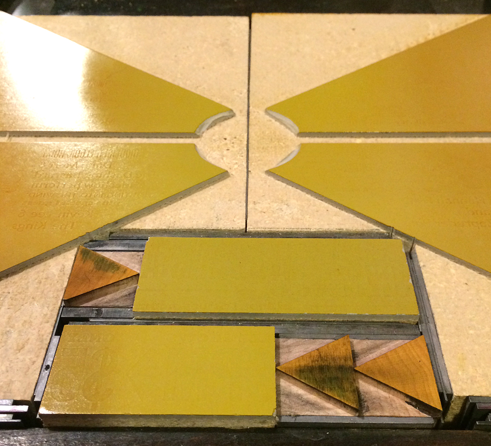
form1I cut linoleum for the shapes and printed them last given the highly transparent ink. It's a very subtle split fountain that is yellow in the center and orange on the outsides.

form4Registration was tight!

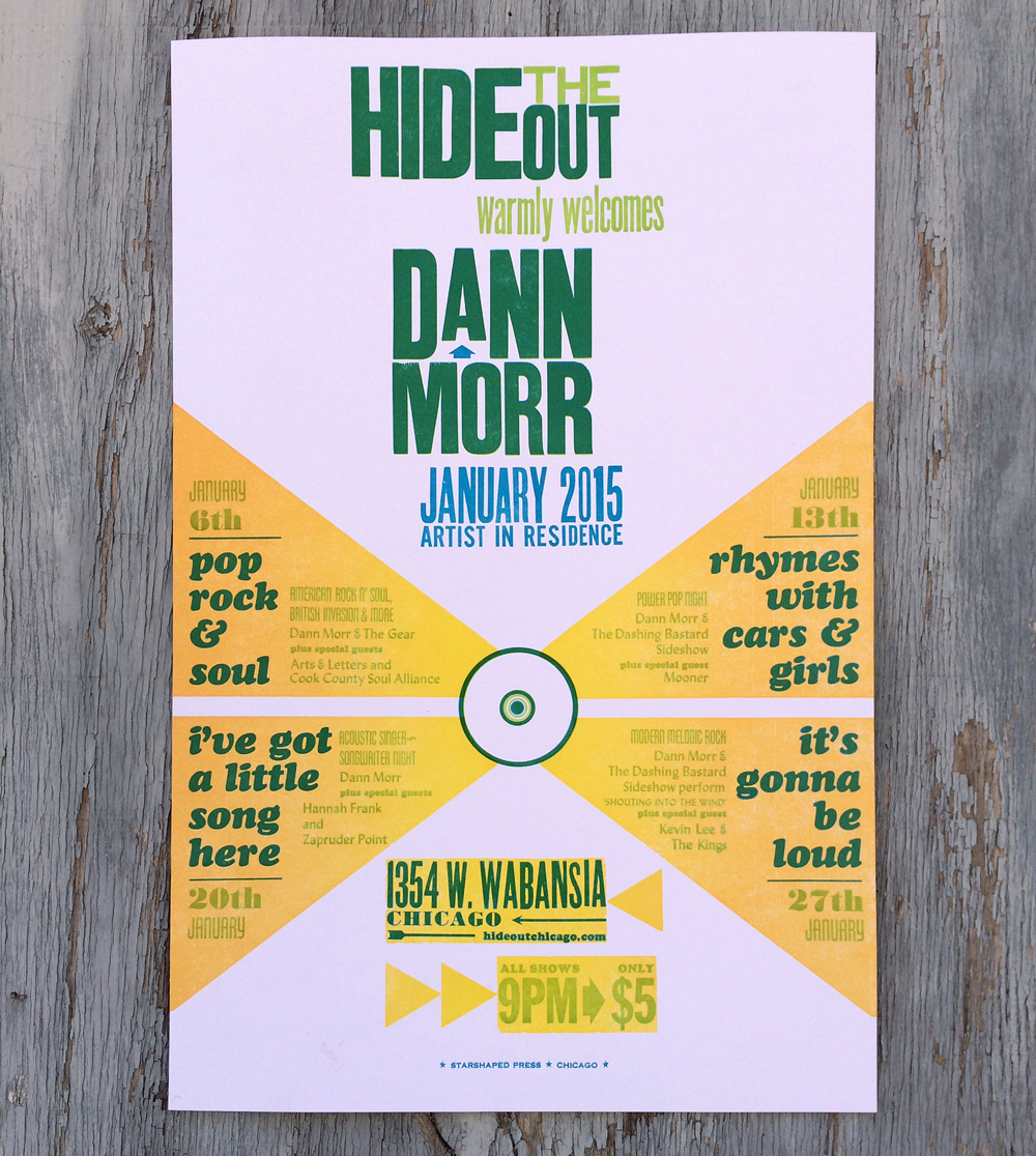
poster2Here's the final poster. The shows were intimate, entertaining and stacked with some of the best talents in Chicago. No doubt you'll witness another collaboration before long. Check Dann out here, or scroll down here to listen to his interview on WBEZ. Or damnit, just go see him play... you won't be disappointed.

poster1

Sky's the Limit

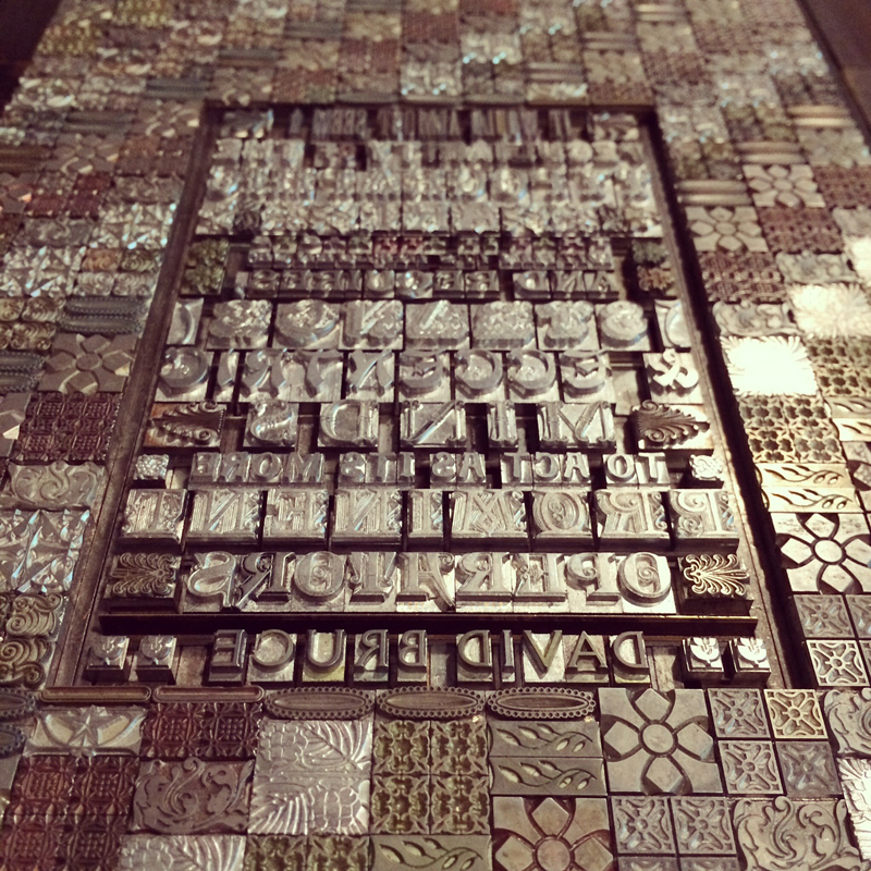
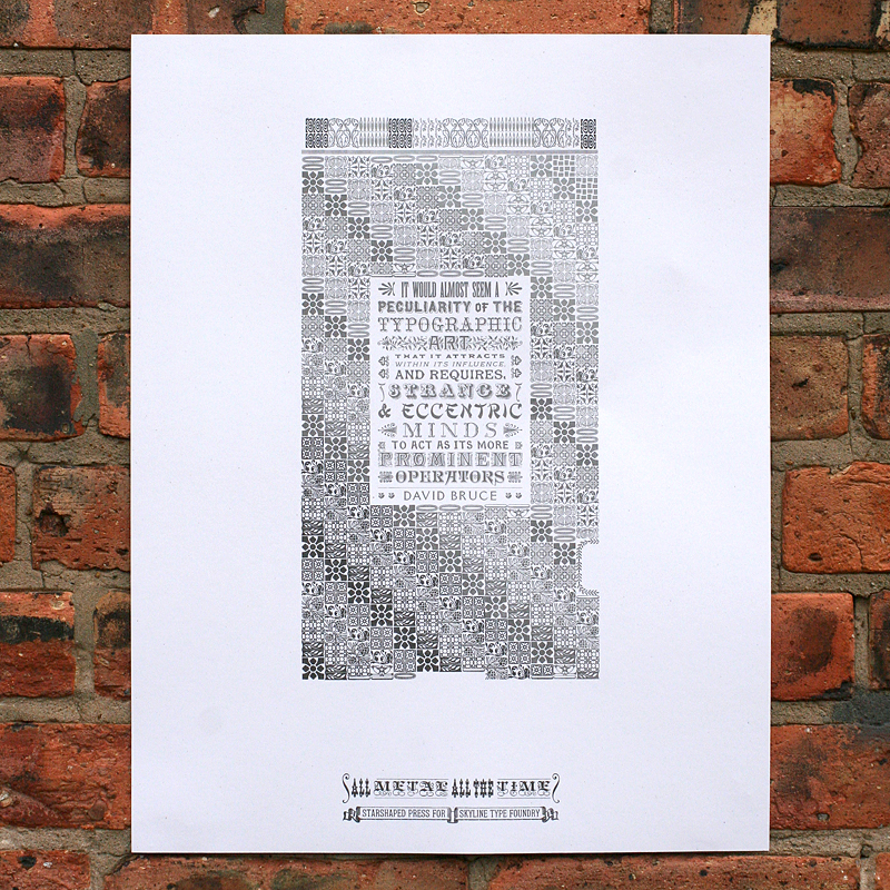
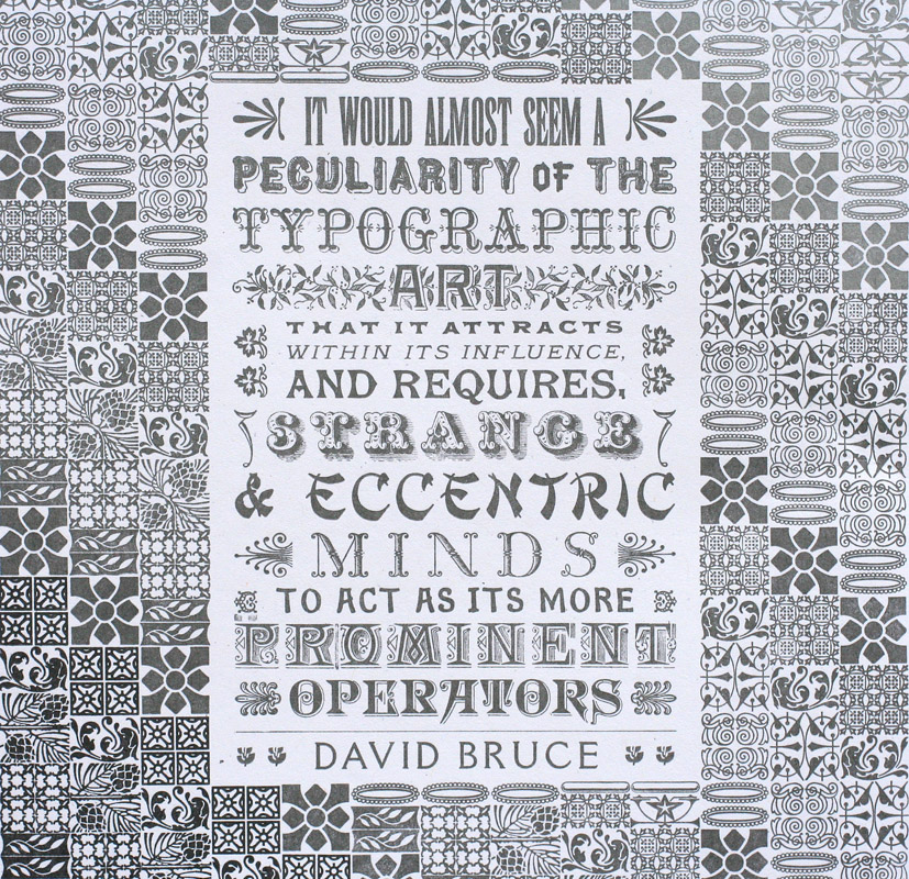
How great is it that metal and wood type are still manufactured today, albeit by a small group, and that we call these makers our friends? For years Starshaped has enjoyed a strong relationship with Skyline Type Foundry, run by Sky Shipley. Formerly in southern Illinois and now in Arizona, Sky has consistently cast quality type on his Thompson casters, and I've been buying it up almost as fast as he can create it. The time had come for a collaboration and here it is! Working exclusively with Skyline type, I built this behemoth form of ornaments and type. The quote is one provided by Sky, and one of his favorites (and did I mention appropriate?). TskylineinstaThe idea for the print was to form an actual piece of type, or sort, out of hundreds of smaller pieces of actual type, and then to print it to look like a shiny piece of type. I decided to create an angle in the design and then print in three shades of silver to give it a textured and luminous feel. After an initial proof all in one color, I subdivided it into the three color sections. Pictured here is the last and lightest silver run.

skyline5My first thought was to create the text block in a circular form to mimic a pin mark, but Sky doesn't cast his type with pin marks, so I left it rectangular and set (nearly) solid and force justified to fill the space inside the piece of type. This was also a great place to put the non-border ornaments that Skyline offers.

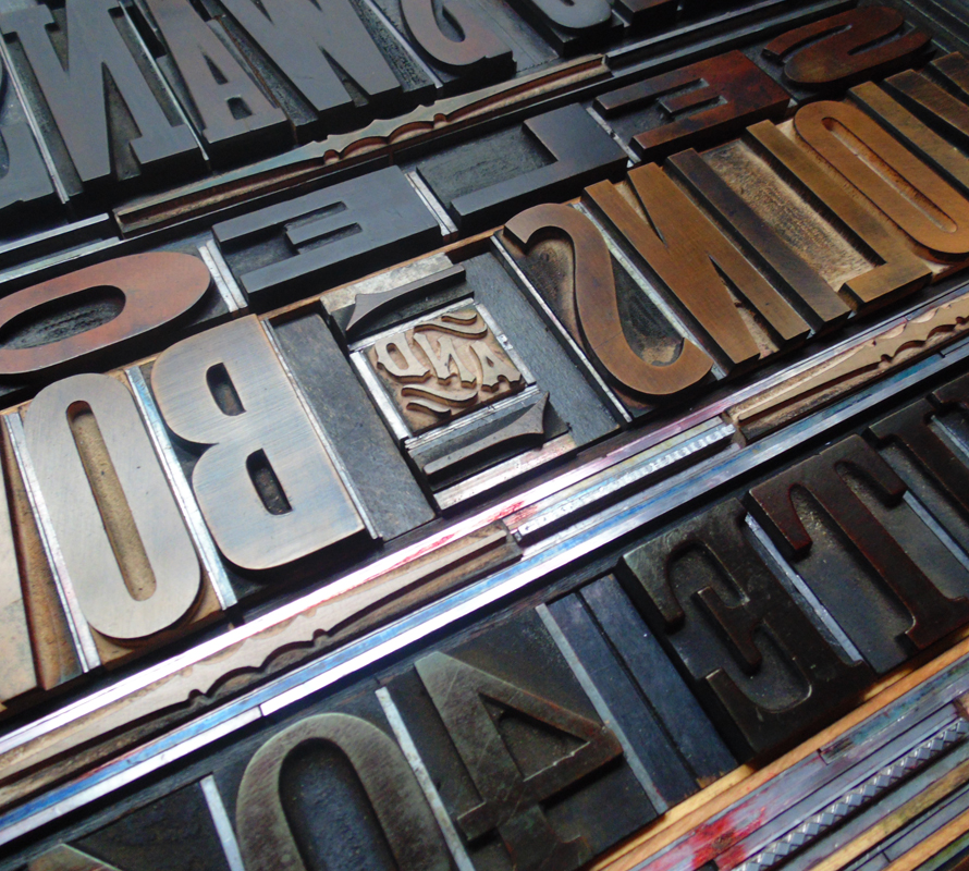
Tskyline4Sky has used many great slogans over the last ten years, including 'Set Your Byline in Skyline' and 'Real Printers Don't Use Plastic', but was always a fan of one of our favorites, 'All Metal, All the Time'. So it seemed like a no-brainer to include that one, given the nature of the project. Below are a few of the gorgeous 19th century faces cast in recent years.

Tskyline5

skyline2Here's the final print. Sky has often said that he loves to see what his 'kids' are doing at 'Camp Starshaped'. Well, this summer, camp was particularly awesome. The poster is available for purchase here, though the edition is very small and won't last. Get one today!

skyline1

skyline3

Congrats on 10 years in the business, Sky! We're all anxiously waiting to see what comes out of your casters next. Below is a wonderful group photo of my favorite makers taken at the APA Wayzgoose in June 2014, starting with Matt, Geri and Derek of Virgin Wood Type, Sky in the middle, Scott Moore of Moore Wood Type and Rich Kegler of P22 Type Foundry. Long live the type founders!

typemakers

Lost Type... and Found

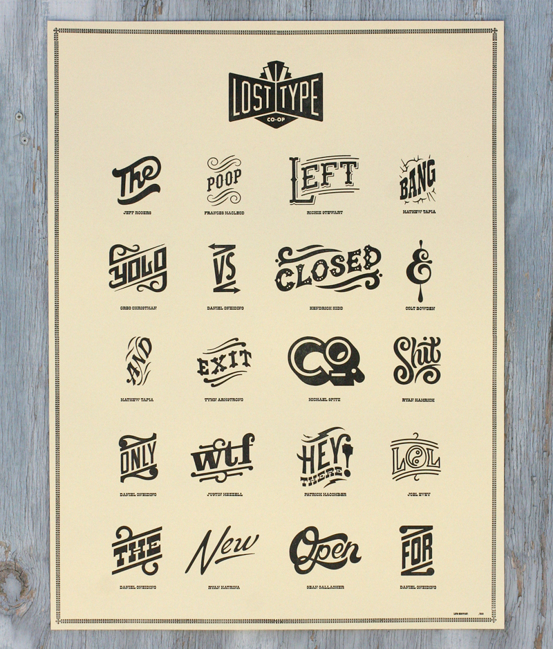
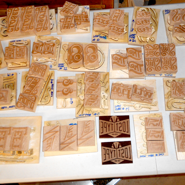
Working in a studio alone most days means that it's important to make time for collaboration. Luckily, this happens pretty regularly and these posters for Lost Type are a great example. Working with Dan Gneiding, the designer of Dude Hank along with friend Scott Moore of Moore Wood Type, the poster showcases a set of fabulous new catchphrases designed as digital fonts but cut as wood type, too, as they were traditionally produced.losttype1 The following images are courtesy of Scott, as he documented his process of converting the files for each catchphrase into actual wood type, starting with the wood planed to type high (just shy of an inch).
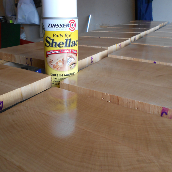
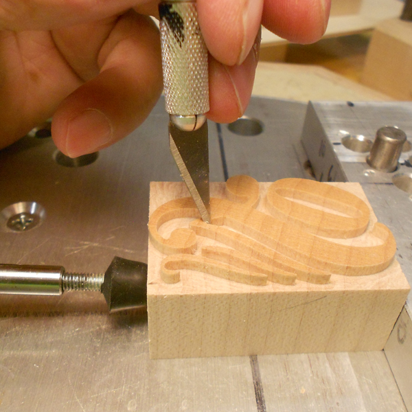
scott7Stencils are created for the pantograph, which traces these while the connecting arm carves the actual wood type block.

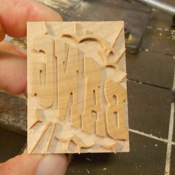
scott4Here's a great shot of the original stencil alongside the finished piece of type.

scott3The smallest areas and details are trimmed by hand. Love the laboriousness of this process!

scott6

scott2

scott1The poster I printed was the combination of a laser cut Lost Type logo, the pantograph cut catchphrases and magnesium plates of the names of the designers underneath.

Tlosttype5I printed the posters at Jim Pollock's studio, as he owns a Vandercook 320G press, which is substantially larger than our Vandercook SP-15, and capable of printing 18x24" posters.

Tlosttype2I particularly enjoy this ampersand.

Tlosttype4

losttype4

Tlosttype3See that little POOP in there? That one was designed by new friend Frances MacLeod, which I didn't realize until well after this printing!

Plosttype5

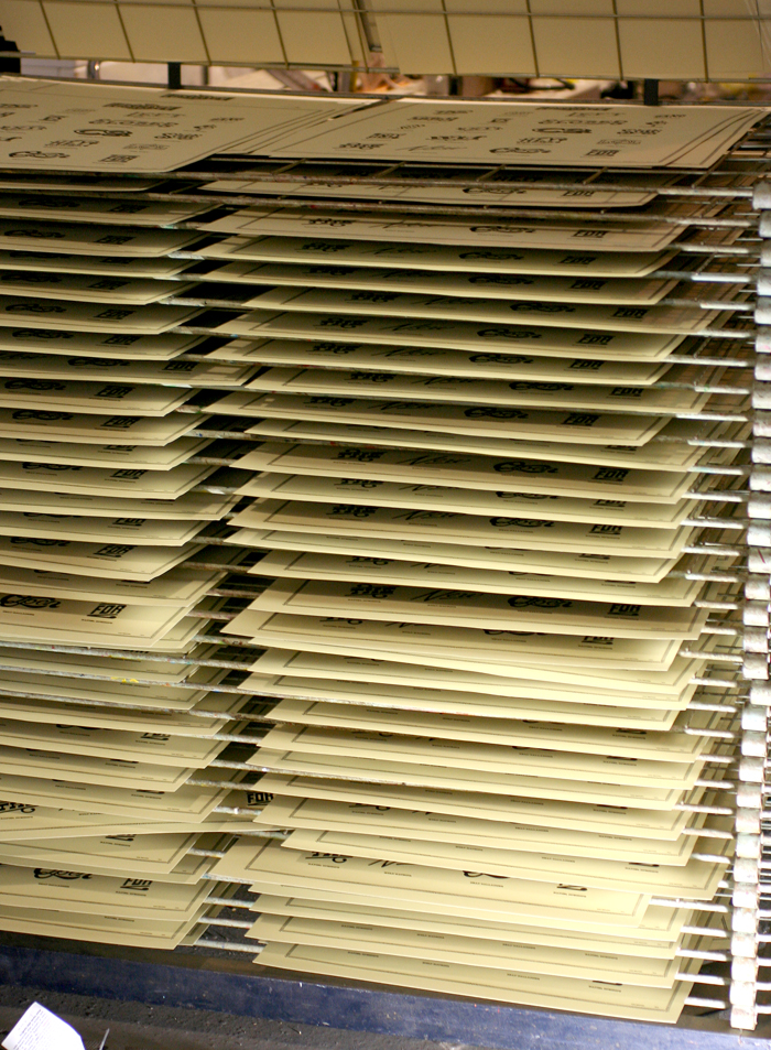
Plosttype6The posters had their own dedicated drying rack after printing, which was handy given that there were about 300.

Plosttype2

Plosttype3The digital catchphrases are now available, so grab 'em and update your look. You can contact Lost Type about acquiring a poster, and Scott Moore about the possibility of getting the real deal in wood.


Words + Music

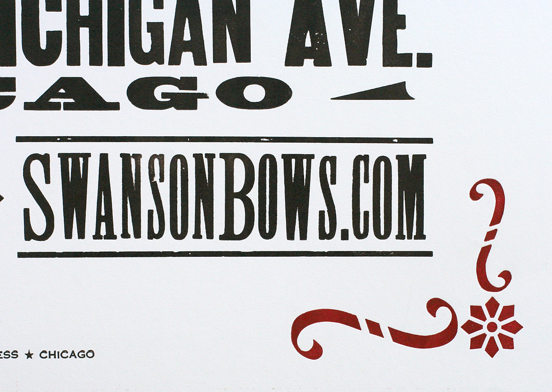
Two inspiring music projects involving violins came our way this Spring. The first was a poster for Eric Swanson's workshop in the Fine Arts Building, downtown Chicago. The historic building has beautiful brass display frames for just the sort of poster as this: ericswanson1The poster measures 18x24", which is substantially larger than what our press can handle, which meant spending a little time with our building mate, Jim Pollock. His Vandercook 320G is the perfect size for large prints of this nature. As you can see, even the form was impressive in size.

Tericswanson1

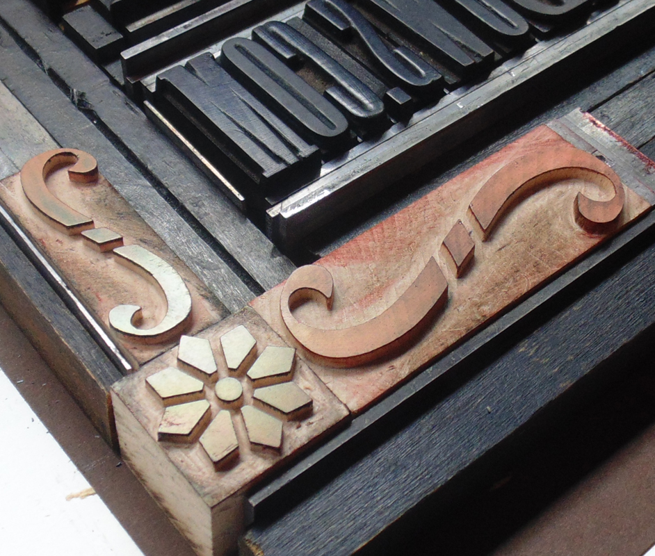
Tericswanson2Eric wanted a large print with a vintage feel, including blocky gothic type. We've got that! The corner brackets were created with three ornaments pieced together. All were produced by Moore Wood Type. Mixing old and new elements gives work produced in the studio a fresher, cleaner feel than similar projects produced 100 years ago.

ericswanson2

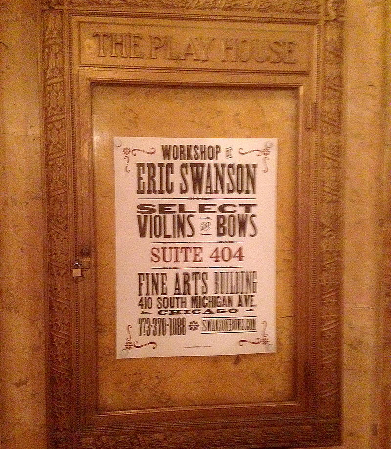
Tericswanson3Not a fabulous shot, but this is the poster in its proper place:

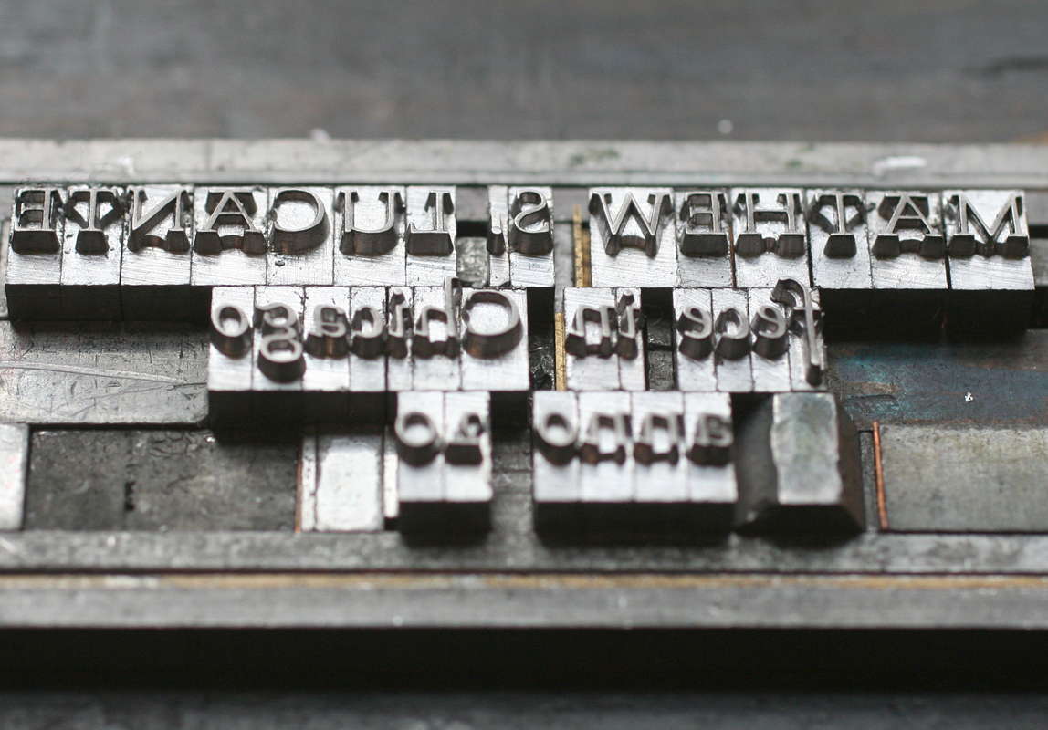
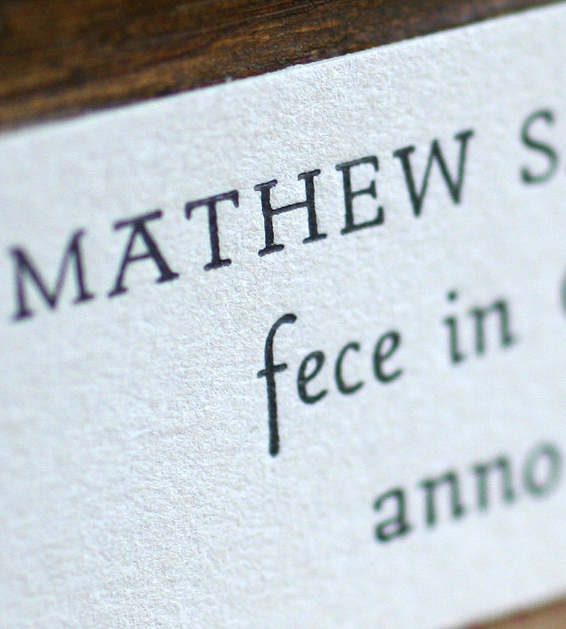
ericswansonfinalMoving from one of our largest pieces to our smallest, we were asked to create tiny labels (about 2.5x1") to go inside hand built violins. What a treat! They are printed on Stonehenge cotton paper (a very soft khaki), using a unique typeface called Stern. It was the first typeface to be simultaneously released in both digital and metal form. Right up my alley! Obviously Mathew adds the full year to each label before pasting it inside his creations.

mathew1

Tmathew2

mathew2I love the juxtaposition of these two projects destined to be seen by the same style of musicians. Creating such disparate projects is what makes work at the studio so interesting!