I've Got A Little Poster Here

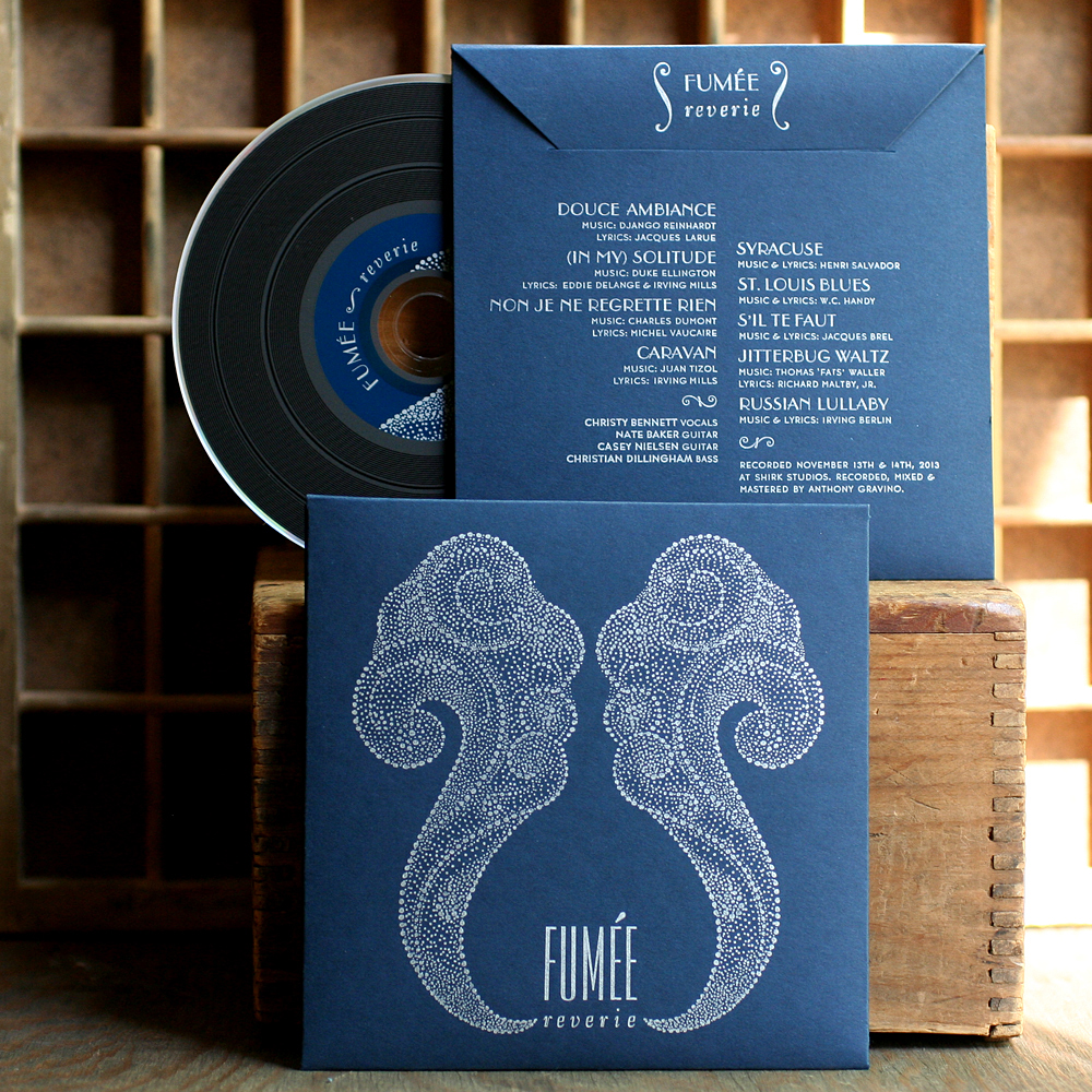
Dann and I have been friends for... two decades? So long I can't fully recall how we met. What I do remember are all of the shows we've been to over the years, the scheming about building prints shops, bands, record labels, you name it. The hours at Dons in Rogers Park and Trevi in Lincoln Park. And the thread that's pulled us through all of these years is a simple one: Sweet. Pop. Music. So when Dann came to me in December with the direction to 'make some cool posters', I gave it a shot. Hosting a residency at the Hideout, a veritable Chicago institution, meant a whole lot of type to go with a whole lot of music. The Cooper Black was calling out for a little action, so I set the themes for each night to proof and play with digitally.

form5
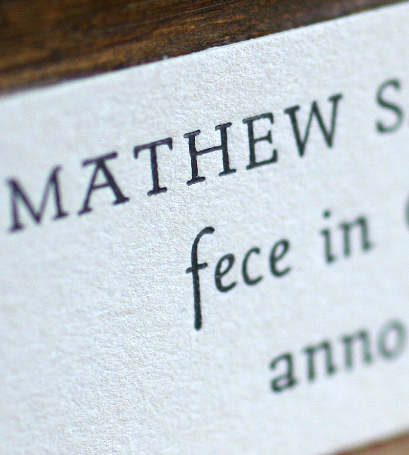
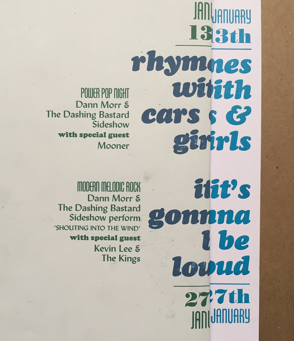
After scanning them into a 'fake out' file, I could then figure out how all of the rest of the type would fall into place for the design I had in mind. This is the computer print next to the first printed proof; I can line up both together to check for spacing and alignment.

setup3
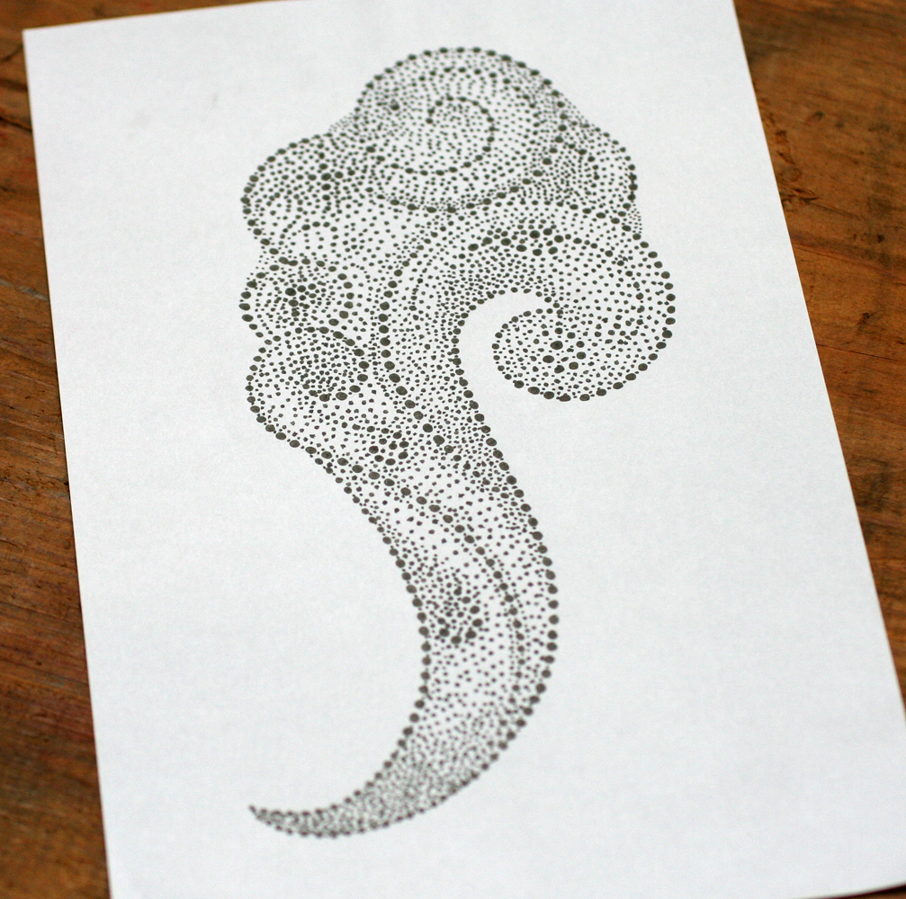
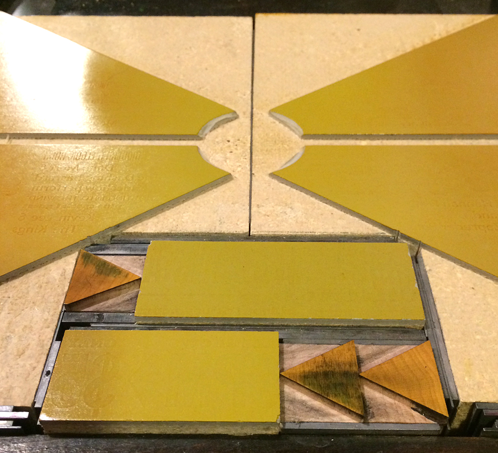
I wanted to create the effect of an old 45 label with shapes reverberating out of the center. I drew what these would look like on a transparency then used it to confirm the text would fall within the proper areas.

setup2
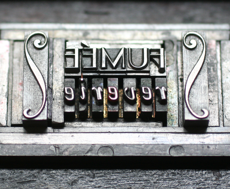
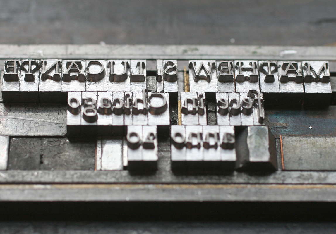
I set all of the type at once to make sure the placement was correct and then labeled what blocks would be what color (green and blue).

setup1

form3
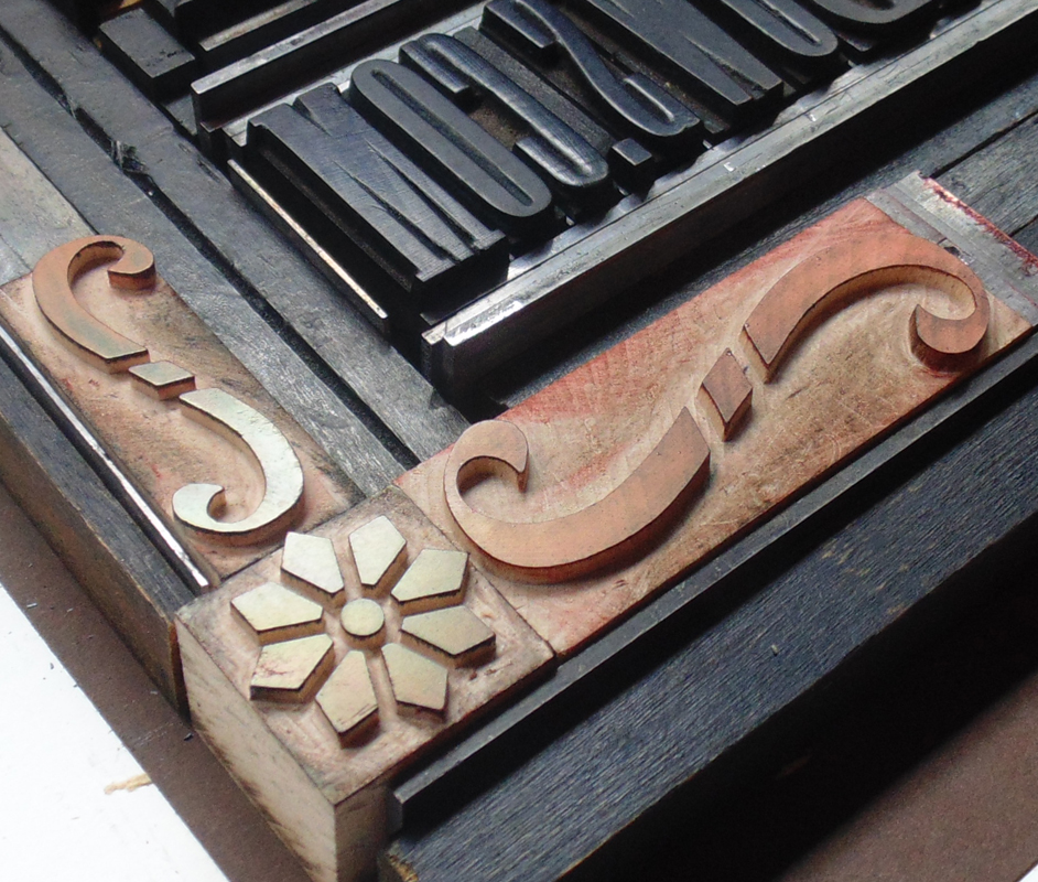
A brass circle for the center, coupled with a wood circle ornament from Moore Wood Type.

form2
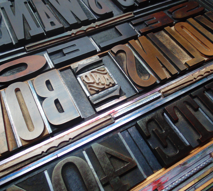
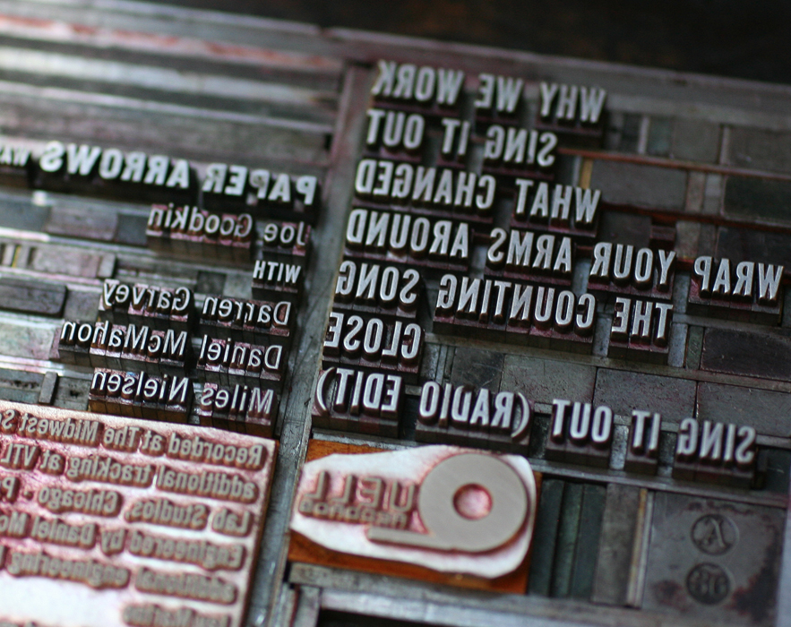
This is the full form, inked for the proof. It's a sexy amount of type!

form1
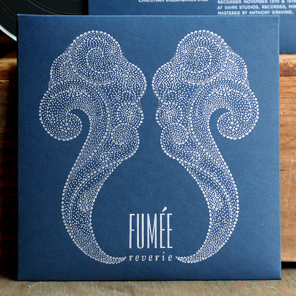
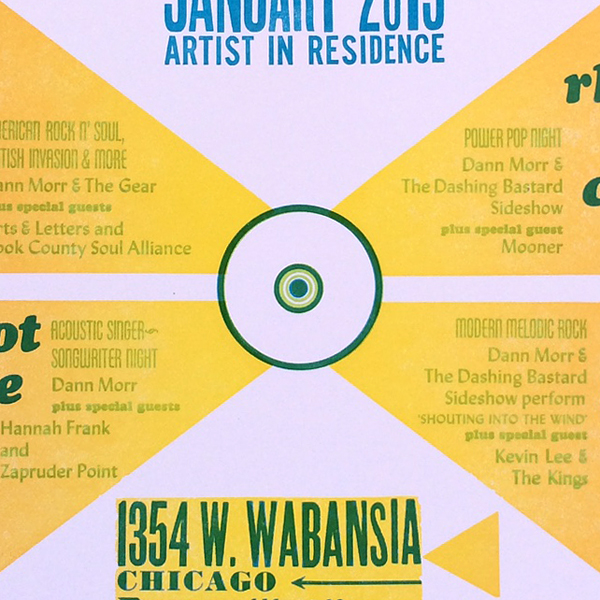
I cut linoleum for the shapes and printed them last given the highly transparent ink. It's a very subtle split fountain that is yellow in the center and orange on the outsides.

form4Registration was tight!

poster2
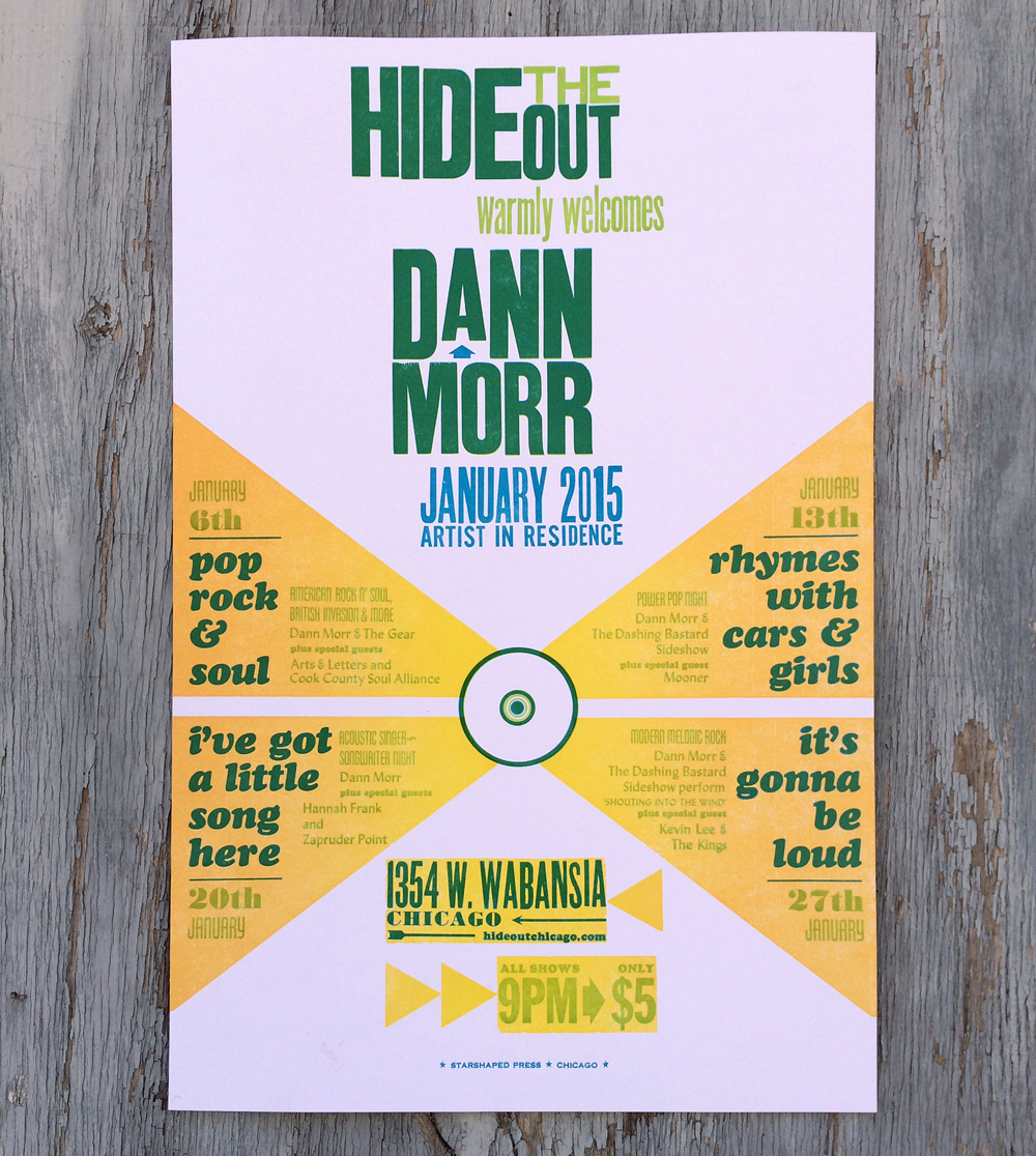
Here's the final poster. The shows were intimate, entertaining and stacked with some of the best talents in Chicago. No doubt you'll witness another collaboration before long. Check Dann out here, or scroll down here to listen to his interview on WBEZ. Or damnit, just go see him play... you won't be disappointed.

poster1

Reverie

Before hitting the road on our Letterpress Trail this summer, we designed and printed a charming little cd sleeve for the local gypsy jazz (is there any other kind?!) band, Fumée. fumee1Obviously they hoped to create something that was indicative of the style of music and built an inspiration board that included references to Erté artwork. I riffed on that and drew this smoke-like image:

Tfumee5Double it up and there you go:

fumee2Conveniently, I had just acquired a set of accent characters so we could actually set the name correctly. Since a plate was required for the artwork, I cut into it to insert the hand set text.

tfumee1

fumee5The back side of the sleeve has a smaller version of the main text, so I used a tinier accent here. These curly ornaments from Skyline Type also came close to matching the art of the front.

tfumee4

fumee4Beautiful Parisian and Bernhard Gothic, two of the studio's workhorse typefaces.

tfumee3The band found a cd duplicator that offered vinyl-looking disks, which was a perfect fit for this project. If you want to check them out, you can find more info here, or head over to Rogers Park Social every Monday night for the real deal!

fumee3

Words + Music

Two inspiring music projects involving violins came our way this Spring. The first was a poster for Eric Swanson's workshop in the Fine Arts Building, downtown Chicago. The historic building has beautiful brass display frames for just the sort of poster as this: ericswanson1The poster measures 18x24", which is substantially larger than what our press can handle, which meant spending a little time with our building mate, Jim Pollock. His Vandercook 320G is the perfect size for large prints of this nature. As you can see, even the form was impressive in size.

Tericswanson1

Tericswanson2Eric wanted a large print with a vintage feel, including blocky gothic type. We've got that! The corner brackets were created with three ornaments pieced together. All were produced by Moore Wood Type. Mixing old and new elements gives work produced in the studio a fresher, cleaner feel than similar projects produced 100 years ago.

ericswanson2

Tericswanson3Not a fabulous shot, but this is the poster in its proper place:

ericswansonfinalMoving from one of our largest pieces to our smallest, we were asked to create tiny labels (about 2.5x1") to go inside hand built violins. What a treat! They are printed on Stonehenge cotton paper (a very soft khaki), using a unique typeface called Stern. It was the first typeface to be simultaneously released in both digital and metal form. Right up my alley! Obviously Mathew adds the full year to each label before pasting it inside his creations.

mathew1

Tmathew2

mathew2I love the juxtaposition of these two projects destined to be seen by the same style of musicians. Creating such disparate projects is what makes work at the studio so interesting!

Paper Arrows Take Two

Years ago, I designed and printed a cd package for the band, Paper Arrows. An enjoyable collaboration, it featured some of the elements that make working with antique type a unique challenge. oldpaperarrowsRecently, the studio was tapped to produce a new EP sleeve for the band. They wanted something that was simple and could easily be mailed for promotional purposes. We've printed a number of different formats for music packaging, and have two dies for simple pocket sleeves; we decided on the Tab N Slot sleeve, which has a tab at the top that tucks into the back of the sleeve. I usually recommend working with a color palette that wouldn't be easily achieved with cheaper methods of production: dark papers with metallic inks, varnishes, textures, etc. Something that's not just black and white, since a variety of color choices aren't any pricier. Get more bang for your buck!

The band liked charcoal paper, which means using a metallic ink; a light ink alone will not read when letterpress printed on a dark paper. I thought we could bring in texture in a subtle way, as this ties into the sleeve we did before, as well as provide a simple background element. These two-color hearts really grabbed us, so they made it into the form as well.

Tpaperarrows1

Tpaperarrows3Because we print most work on platen presses, it's easy to diecut the flat sleeve first and then print. The first layer is dark blue, which definitely reads as blue; printing dark colors on dark paper don't always perform the way you think they might. The metallic ink is a sort of champagne color that's not quite gold or silver.

paperarrowssetup1This gothic type is in pretty rough shape, but works hard on many Starshaped projects, including this one. You can see here the end result of the two color heart.

Tpaperarrows2Here's the final front, followed by the back.

paperarrows2

paperarrows3We had a plate made for the logo and the small text. This text was designed to work with the type we have in the studio, but the last line had a pesky Publishing symbol, which we sadly don't have and haven't been able to frankenstein from something else. Yet.

Tpaperarrows4Another factor to consider was how these would be mailed. Certain clear sleeves are post office safe, so I suggested adjusting the final design so that they could ship in clear sleeves that would not only save the cost of purchasing separate mailers, but would allow the art and important details to show clearly to the receiver. Mailing labels and stamps can be applied directly to the outside.

finalpaperarrowsAnd so our little heart is a surprise when the cd sleeve is pulled out of the mailer! Give Paper Arrows a listen, and keep an eye out for the Good News For Love release.

Tonight... and every night after

Charlotte came to me with a request for a customized poster that she wanted to give to her fiance on their wedding day. Her ideas were all fabulous, and text rich, which makes for challenging experiments with type. Having lived in Nashville and being huge live music fans (Alex proposed while attending a show), she wanted something reminiscent of Hatch Show Print, but with a more urban, Chicago-y feel, given that this is now their home. We decided to go large with a poster that would be 14x18", with bright colors that would match their home. Here are a few shots of the form I put together. With a few tweaks, it was ready to print!

And here's the final print, done in three colors. The teal and bright red overlap on their names to make them pop. Little Stella is their sidekick dog.

Conveniently, this little Chicago cityscape existed in the studio collection, along with the Chicago stars and music notes.

Charlotte and Alex have lived in numerous places, many of which are listed in the style of concert tour locations. They enjoyed a lovely trip to Europe, which shows up here as a 'multi-city European tour'.

Congrats to both! If the marriage is half as fun and entertaining as this poster was to print, it's made to last.