
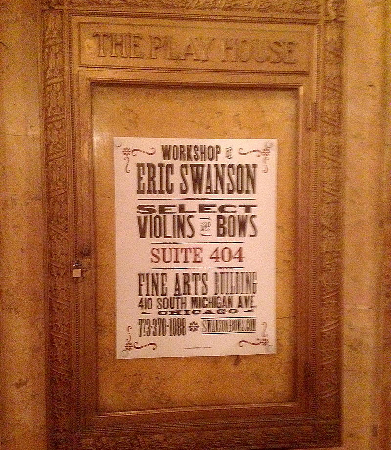
Two inspiring music projects involving violins came our way this Spring. The first was a poster for Eric Swanson's workshop in the Fine Arts Building, downtown Chicago. The historic building has beautiful brass display frames for just the sort of poster as this:
 The poster measures 18x24", which is substantially larger than what our press can handle, which meant spending a little time with our building mate, Jim Pollock. His Vandercook 320G is the perfect size for large prints of this nature. As you can see, even the form was impressive in size.

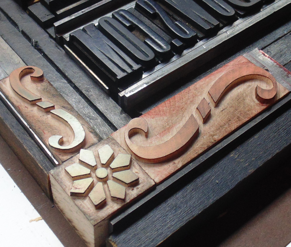
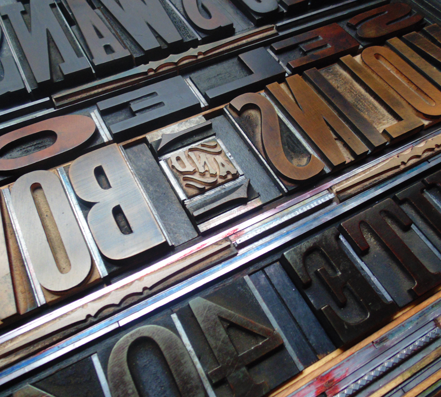 Eric wanted a large print with a vintage feel, including blocky gothic type. We've got that! The corner brackets were created with three ornaments pieced together. All were produced by Moore Wood Type. Mixing old and new elements gives work produced in the studio a fresher, cleaner feel than similar projects produced 100 years ago.
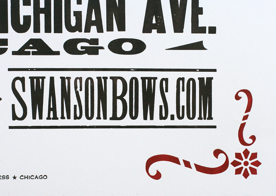
 Not a fabulous shot, but this is the poster in its proper place:
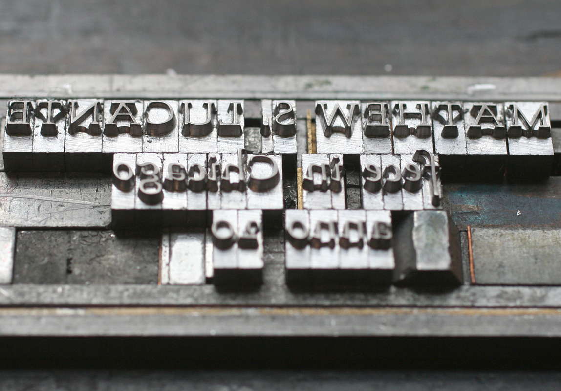
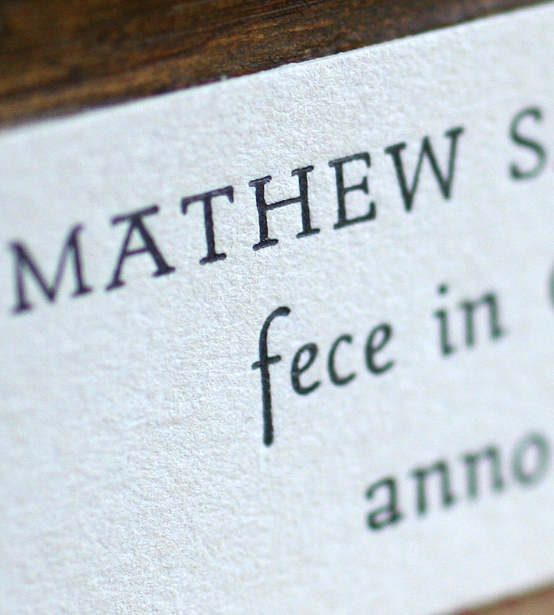
 Moving from one of our largest pieces to our smallest, we were asked to create tiny labels (about 2.5x1") to go inside hand built violins. What a treat! They are printed on Stonehenge cotton paper (a very soft khaki), using a unique typeface called Stern. It was the first typeface to be simultaneously released in both digital and metal form. Right up my alley! Obviously Mathew adds the full year to each label before pasting it inside his creations.

 I love the juxtaposition of these two projects destined to be seen by the same style of musicians. Creating such disparate projects is what makes work at the studio so interesting!