Good Wood 2014

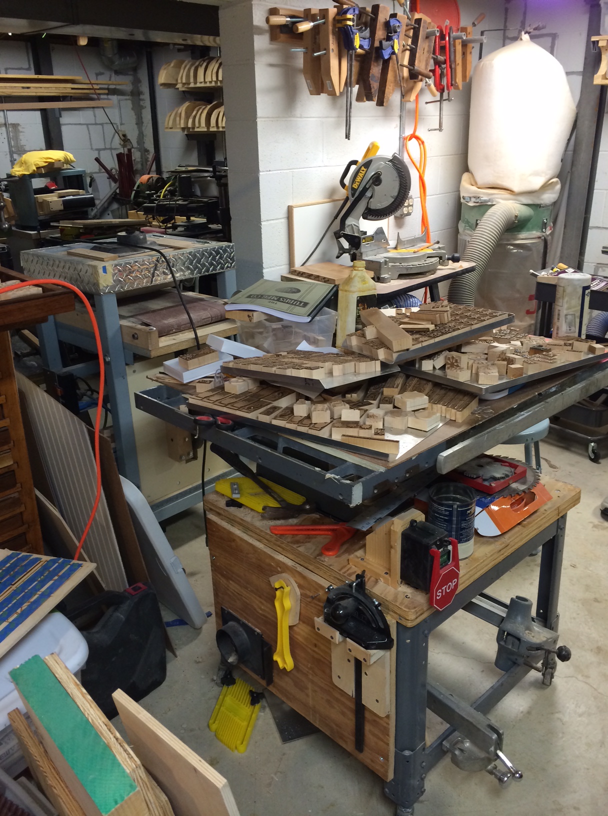
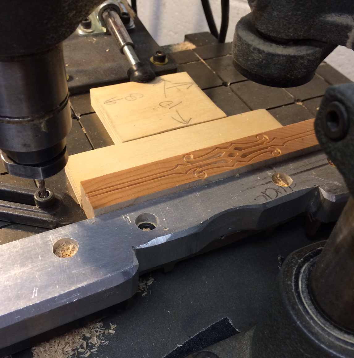
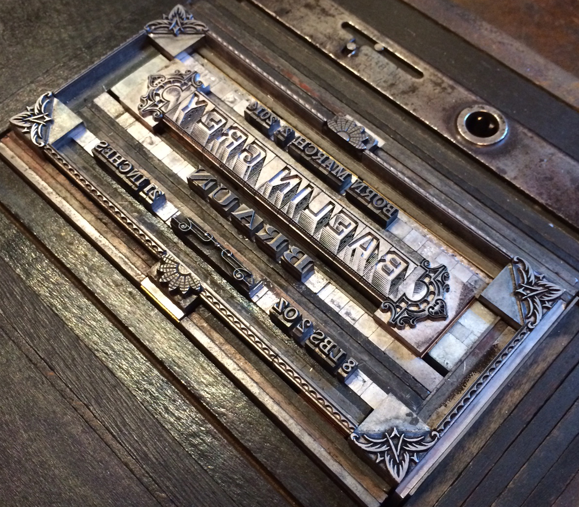
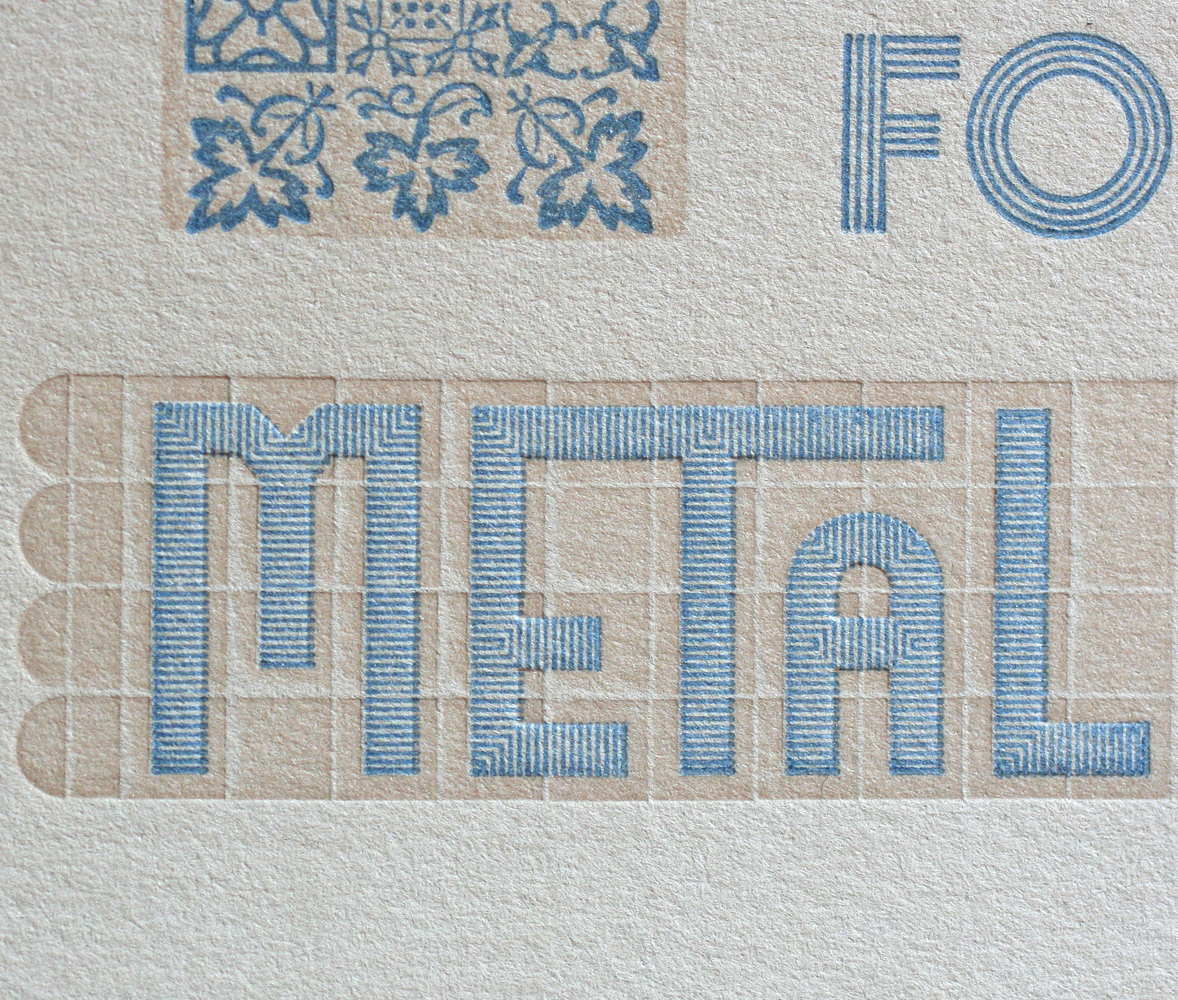
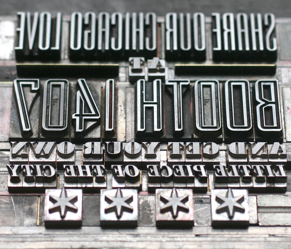
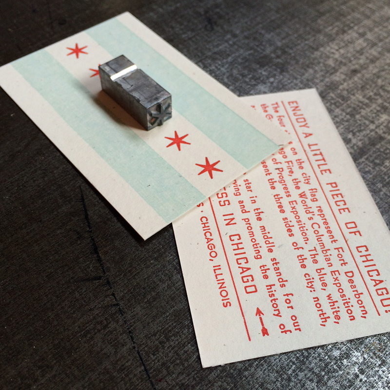
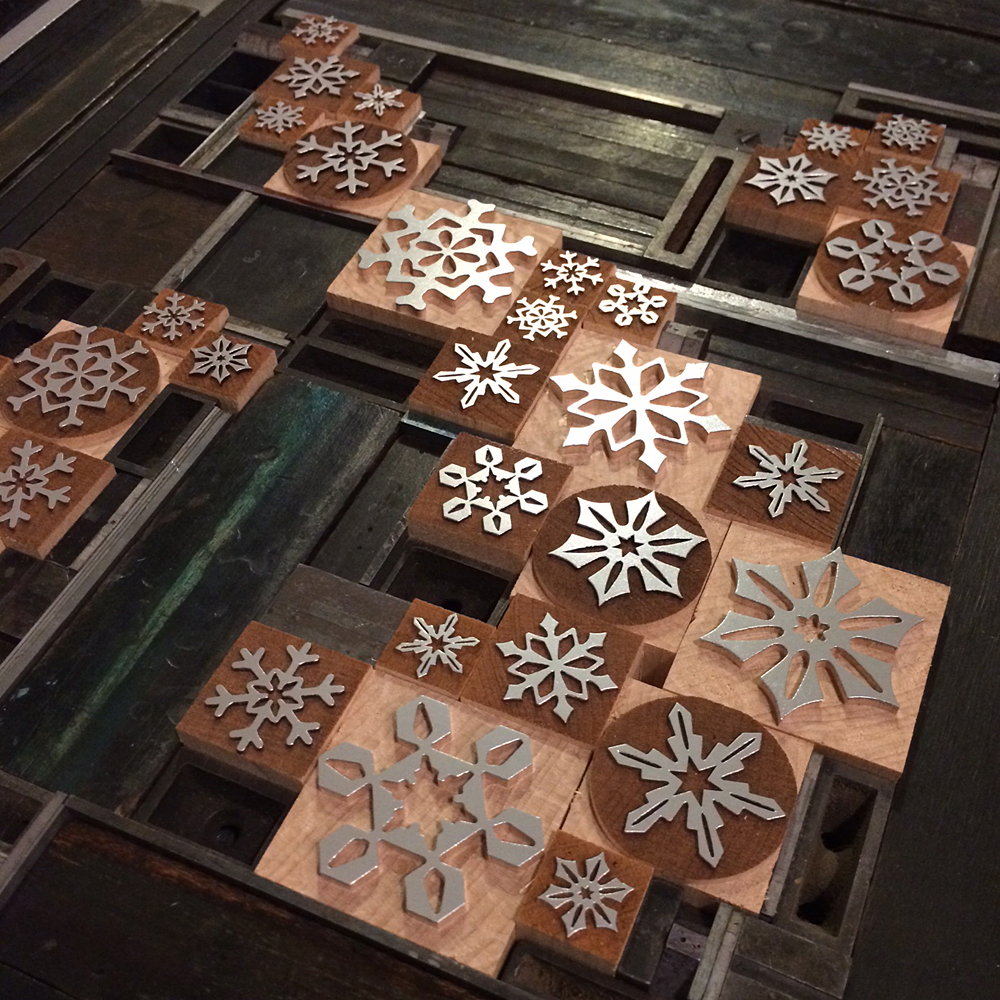
Every year we look forward to the annual Hamilton Wood Type & Printing Museum Wayzgoose, which attracts type nerds (i.e., all of our best friends) from around the world. And while the 'Goose usually only lasts about 3 days, this year, for us, it stretched to a week and spanned the distance between Two Rivers, Wisconsin and Chicago, Illinois. A few days prior to heading north, Jo and I set up and printed our pieces for the print swap (more on that later). I was thrilled to work with Moore Wood Type to design a series of snowflakes to be both laser and pantograph cut. Having just received my batch to print with, and knowing that Scott planned to take them to Hamilton to share, I put together this poster to showcase how fantastically well they look and print together. They'll be available for sale soon.

snowflakes3

snowflakes2
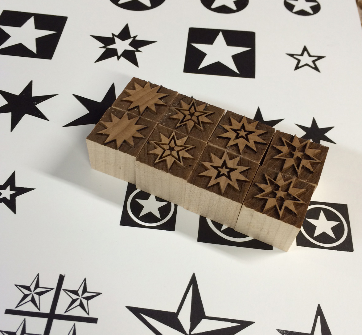
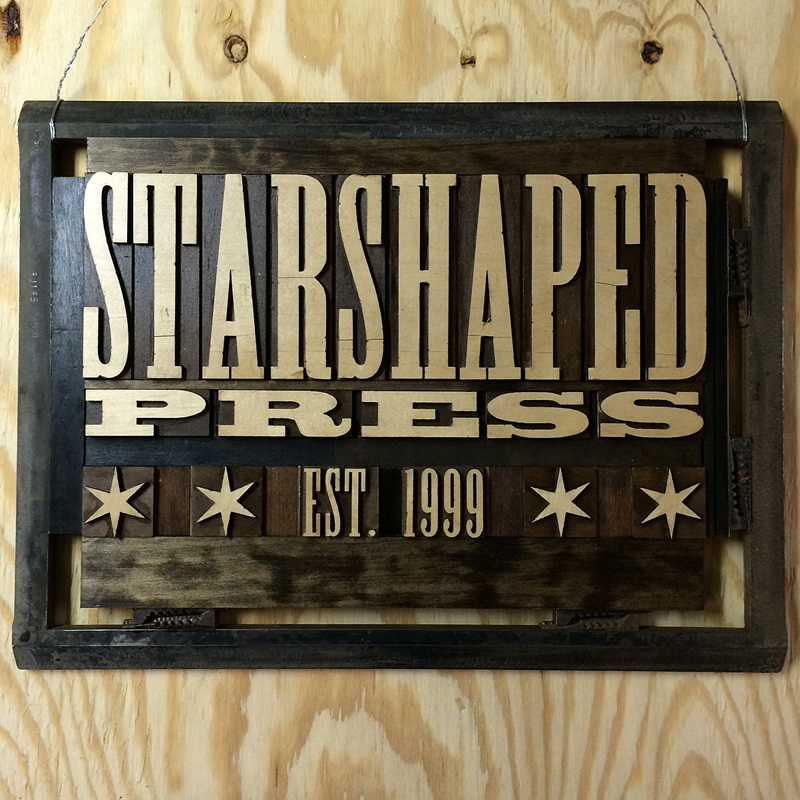
While I played around with snowflakes, Jo went straight for the stars and put together this great little number:

[wpvideo oytXOAai]

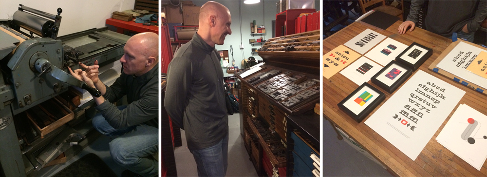
It was such a treat to have longtime friend and printer David Wolske swing by on Wednesday. I put him to work, we shared some laughs and I got a sneak peek of what he'd be presenting at Hamilton. His work is stunning in its thoughtfulness, exploration and expert technique.

david1Thursday we welcomed Geri and Matt of Virgin Wood Type. Obviously, we had some fun. These folks eat wood type for lunch, so I took them out for pizza before it got ugly. Matt wrote a great post about the 'Goose that you can read here.

virgininstudioFriday we hit the airport to pick up this guy and head up to Trivers.

airport

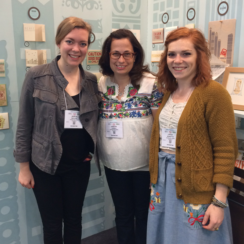
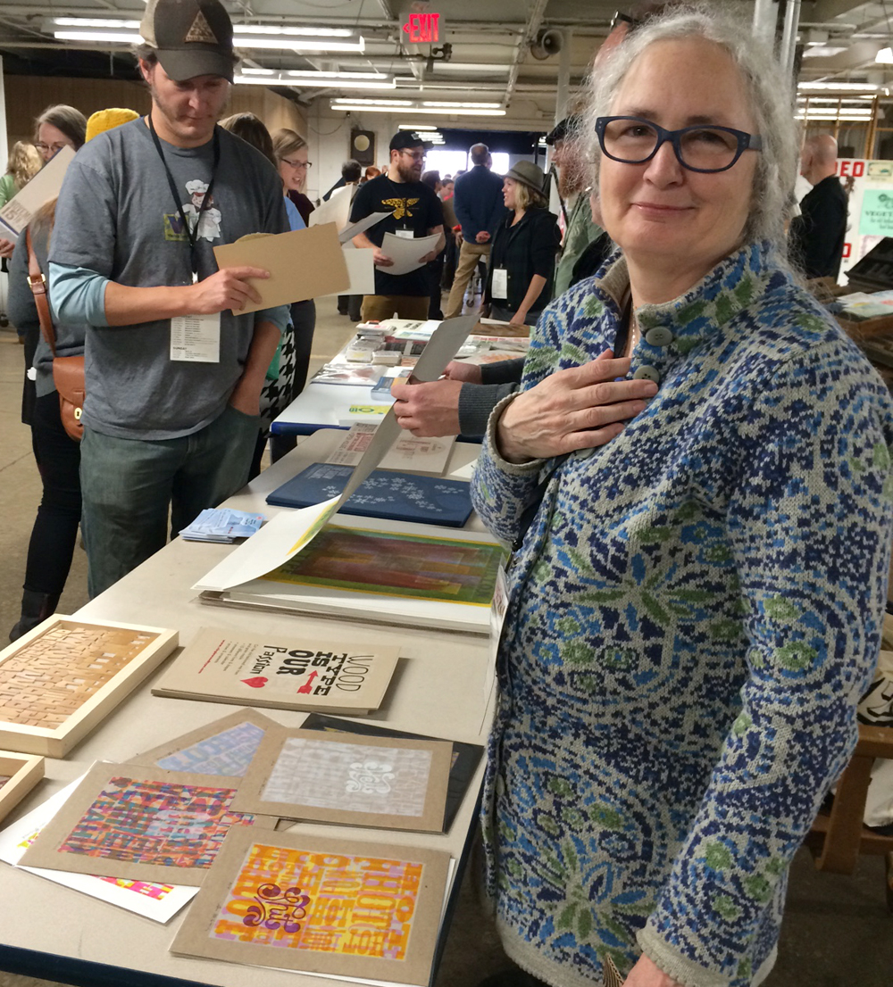
Once we made it to Hamilton, Jo immediately sought out her besties, Chelsea and Laura, who made her a very special badge this year, the only one with fancy hand lettering.

jochelsealaura

New this year is a wall featuring a mashup of Hamilton-related prints from just about everyone. Jo even found her Turtles print from the June 2014 APA Wayzgoose.

joprintwall

joprintwall2

To keep a 7-year-old going all weekend I gave Jo my digital camera and unleashed her on the museum. She had a blast documenting everything and took dozens of charmingly blurry photos.

joampersand

goose

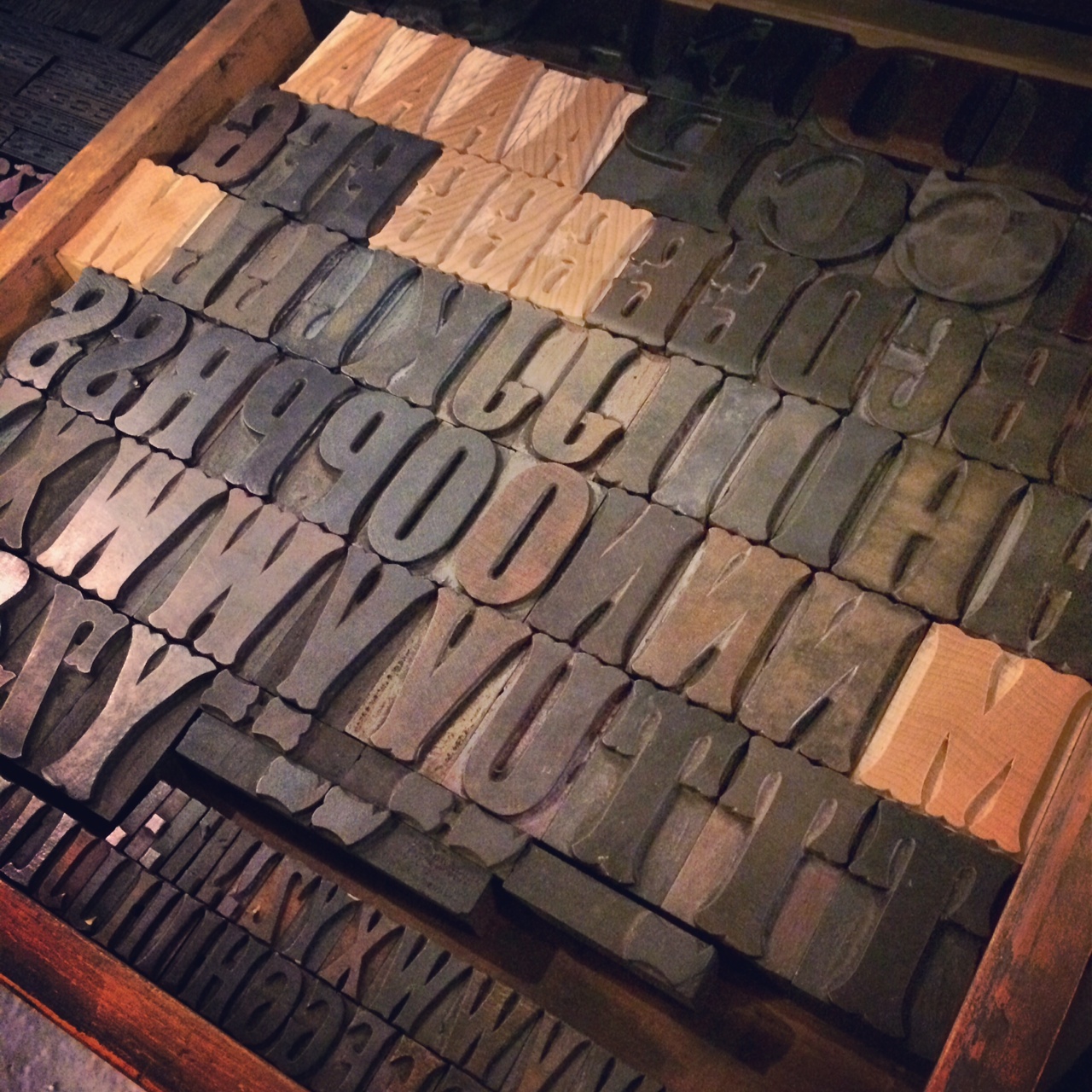
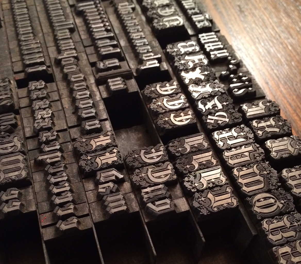
Also new this year is the substantial type wall which proved to be extremely photogenic (it's like they planned it).

typewall

I joined Erin Beckloff, mover and shaker extraordinaire as well as daughter to Scott Moore, in taking some great shots of David Shields and Rich. Wonder what their photos look like.

richerindavid1

Later in the evening we heard from the chiefs: Stephanie, Jim and Bill. These three, along with a slew of eager volunteers really knocked it out of the park this year. Screens! Lighting! Backdrops! Sound! All pro.

stephjimbill

Their intro was followed by Charles S. Anderson. If you've ever ordered paper from French Paper or pretty much just lived in the world, you're familiar with the work of CSA, so there's not much I can add!

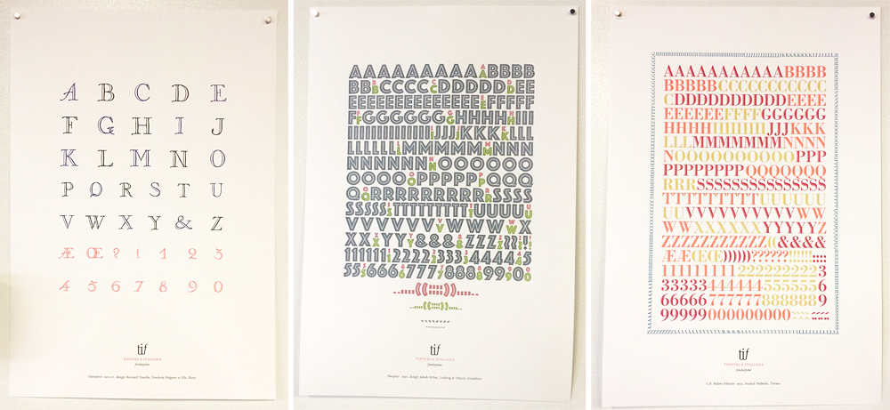
After the image overload, I got a moment with Nick Sherman to check out the new book published by Tipoteca Italiana about their incredible collection of wood type. Needless to say, one of these came home with me.

nickshermanSaturday's schedule was too packed to see and experience everything. I sat in on David's formal presentation to get a chance to see his lovely work again.

davidpresentation

Following that was a rousing discussion by Clint Harvey of Design College Australia and The Bacon Factory in Brisbane, Australia. They're doing amazing work to collect and preserve letterpress equipment Down Under, as well as present it to the next generation of designers.

clintpresentation

Clint brought a number of sample prints featuring Australian slang. Then he challenged everyone to decipher them and write their ideas directly on the prints. Did anyone get them right, CH?

clintpresentation2

Meanwhile, Jo stationed herself with our Isle of Printing buddies from Pie Town (some people call it Nashville) and their Our Town portrait project. Throughout the weekend folks could sit down at a mirror and use clever stamps to create their own likeness which is then documented.

isleofprinting

Jo's Cindy Sherman-esque self portrait.

joselfie

After an evening banquet of chicken and milk (if you were there, you know), we headed back to the museum for a presentation from Tipoteca about the creation of their museum and the collection it houses. Let's just say we were all convinced to spend some time on the prosecco farm that serves as guest quarters for visitors to the museum. More of their incredible type porn below.

The last event of the evening (given that this is the censored version of the weekend's activities), is the annual type quiz hosted by Nick and David. This year, with the addition of the Hamilton Smokestack costume, a volunteer was needed. Guess who jumped in? Jo stood on a chair for an hour and pointed out those that raised their hands to answer the somewhat dubious questions in order to win typographic prizes.

smokestack2Sunday morning brought an impressive display and discussion of artistic watermarks from Greg Walters (is there anything he doesn't collect!?), as well as the entertaining giveaway of door prizes by Dave Peat. But by far, the most popular event is the print swap. So much good work to share with everyone.

printswap3Here's Geri of Virgin Wood Type with her beautiful layered wood type prints, as well as the newest typeface set out to tease. Thanks to Virgin, wood type can be everyone's passion. Looking on is Jason, otherwise known as Genghis Kern, or #thebeerisforscale in social media circles.

printswap2Jo signed just a few of her prints and took them around to share.

joautograph
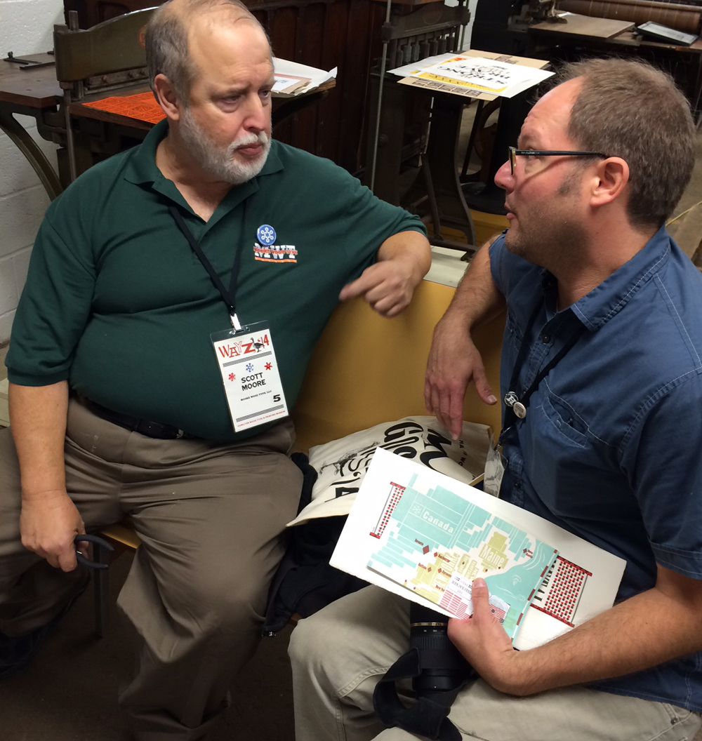
Meeting of the wood type minds! Scott and Matt, all business. What secret wood type schemes are they hatching?

moorevirginErin's print this year was so lovely. Look what you can do with her dad's beautiful type! And she made me promise to show this photo and not the one of her getting into the whiskey. Like I mentioned, this is a G-rated blog.

erin
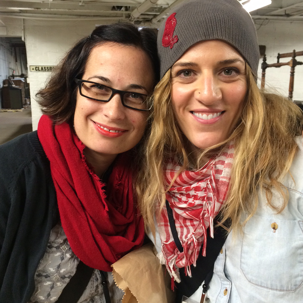
I took the opportunity to grab a few shots with others wandering around. Selfie with the Morans!

jimjenbill
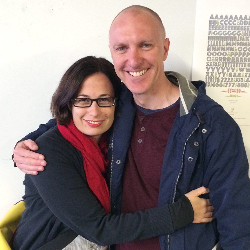
With David. So love this guy.

jendavid2And this lady! Mary is the killingest lady printer I know. New York attitude with a midwestern accent.

jenmaryJessica Spring... not content to push the boundaries of daredevil printing, she's now offering Daredevil Furniture for letterpress printers, meaning we can all create fantastically nutty lockups. A lady after my own heart, and the only one to make Hobo look brilliant.

jessicafurnitureJo got a lesson in sign painting from the incomparable John Downer, who is responsible for the sign on the front of the building. What a treat for mom and daughter, as well as everyone that looked on.

[wpvideo E5TX3MNg]

johndowner2As promised, here's Silvio from Tipoteca signing my new book. Many of their stunning prints were on display. Are you ready for the type porn?

silvio

tipocompiled

tipo3postersIt's always sad to leave on Sunday, knowing that it might be another year before we see a lot of the people that make this trip so special.

joandfriends

Before checking out we got a stamp on our Letterpress Trail map.

stamp2

But this year was different! Because of Chicago's central location, a number of printers were still around to explore the city or have a little downtime before jetting off home. So Monday welcomed the Aussies, Clint and Tahlia, into the studio. Here's CH groveling at my feet! studiomonday3

Along with Clint and Tahlia, Michael from Clawhammer Press also came for a visit, securing his status as Friend by bringing really nice coffee. We talked letterpress for quite a while before I caught them escaping with type!

studiomonday

studiomonday2
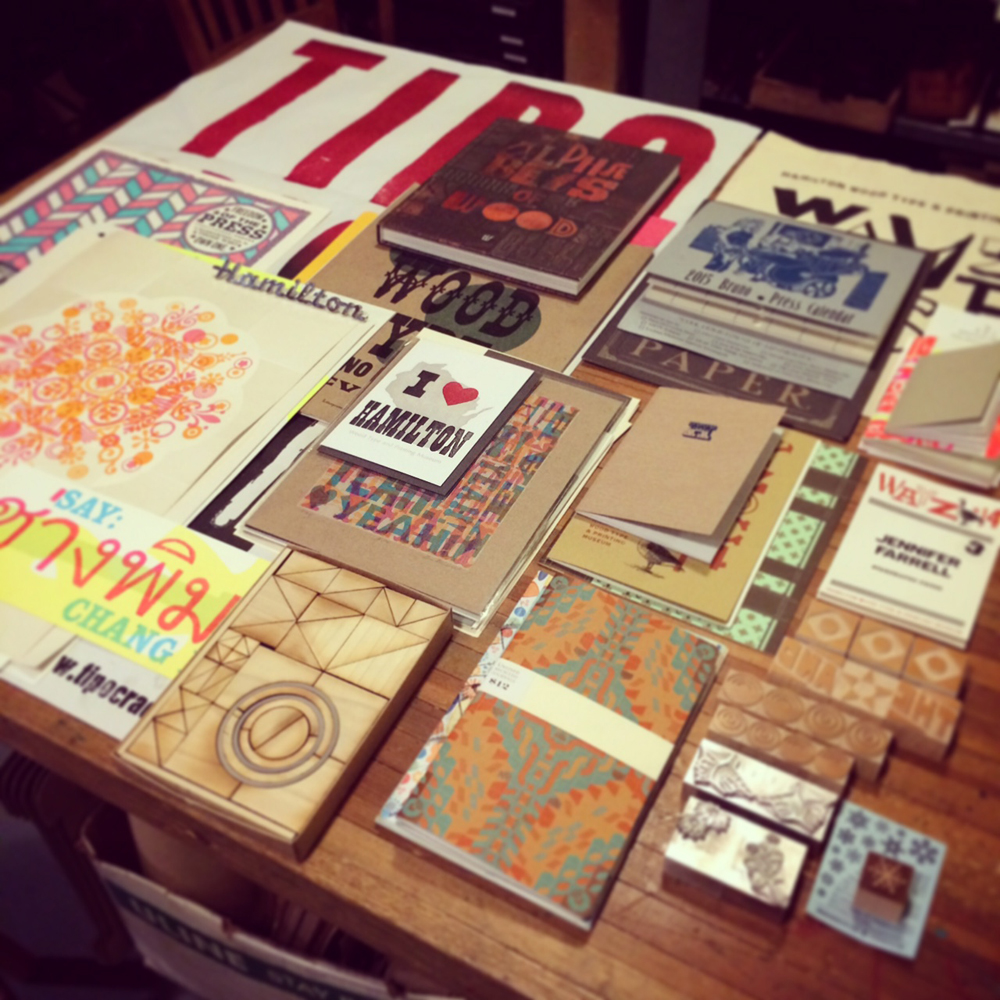
Later that evening I was able to organize the swag from Hamilton that Jo and I collected. Talented folks.

swagTuesday night, Rebecca of Rar Rar Press hosted a printer dinner and made stew for everyone. What an incredible group, and no one had to feel bad about talking type and presses all night. It's the one kind of party where print-themed alcohol shares a place on the table with actual type. And Rebecca's apartment is a veritable museum of letterpress awesomeness.

rarrarparty
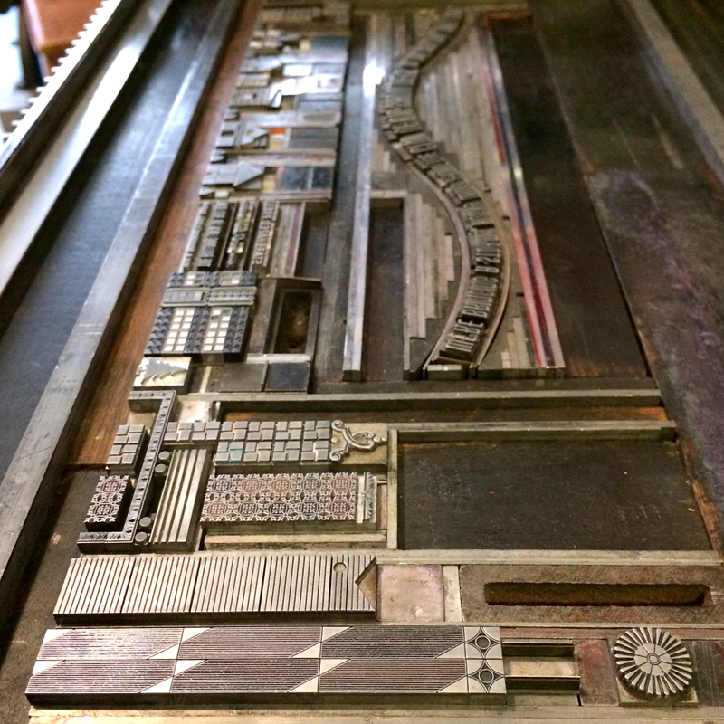
Unbelievably, I convinced new friend Jessie Reich of Punky Press to stay all day Wednesday and work in the studio. Huzzah! She set one of our cityscapes for a series of cards and learned how the platen presses function. We swapped stories, metal & wood type and fist bumps. Here's to all of our new and old friends that made the 'Goose (as well as the before and after gatherings) so memorable this year. See ya in 2015. Hopefully before.

jessie1

jessie2

15th Annual Open House

openhouseposterIt's that time of year again, when we ink up the presses, throw open the doors and invite the public to come on in to celebrate our anniversary. This is a special one, as the studio is celebrating its 15th year. Starshaped has seen a lot of ups and downs this year, and I'm looking forward to having a great night of sharing stories, pulling prints from our 15 year history and geeking out on beautiful type. Join us! Kids are most definitely welcome.

Saturday, November 15th, 7-10 pm

4636 N. Ravenswood #103 · Chicago, Illinois

The 2014 Letterpress Trail, part two

The next stop on our Letterpress Trail following Cincinnati was Columbus, home of Moore Wood Type, one of two wood type makers in the US and a great friend to Starshaped. Scott's humble workshop is mostly in his basement, where he has just the right set up of equipment, tools (some handmade!) and wood for production. moore12A table full of recently cut type. And a sneak peek of half rounds in the background!

moore11This is Scott's pantograph, next to a trim saw. You can see a pattern set up here.

moore16A box of patterns for catchphrases.

moore18Scott has also been laser cutting wood type, and here is an experiment with creating a border. After cutting a full sheet of finished, type high maple, he can then trim out the individual borders and ornaments. Working with the laser allows for greater flexibility of sizing, not to mention detail in the smaller sizes. And speed!

moore19These are a few new stars sitting on top of the proof sheets of our Moore collection at Starshaped. I brought them to double check our own stock against the new Moore offerings.

moore14Check out this beautiful block ready to be trimmed and carved. You can see the lovely wood grain, and well as a bit of the sheen from the smoothness of the surface.

moore21These are the cutters for carving the final pieces. You can see the range of sizes to accommodate a variety of type forms and counter spaces.

moore20Happily, I got to cut my first wood type! Scott let me choose what I wanted to do, so I picked this ornamental rule that he hadn't done yet. I even got to pick the length; the final piece can be cut to any size, which is the beauty of working with a pantograph. Scott has a notebook of configurations for each of his patterns, and also makes notes directly on them so as to remember how to set the pantograph measurements to cut accurate sizes.

moore1The first cut is the more detailed one, and you can see how the outline of the rule is taking place. After this, the cutter is swapped for a larger one to clear the solid areas that are not part of the design.

moore4Look at me go! I'm using the tracing side of the pantograph to outline the pattern.

moore2Here are the final pieces.

moore5Scott made patterns for an Antique Tuscan, a typeface that's near to my heart and one we've had the longest in the studio. Because I'm missing a few letters, we thought it would be fun to make replacement characters. Here's a box of the patterns ready to be mounted, traced and cut as new wood type.

moore6

moore8After much configuration, we were successful and I was able to make a handful of the missing letters needed to complete my set of 12-line type. It is now at home with its 100 year old siblings.

What a delight it was to visit with the Moores for two days, sharing stories, cutting type and playing with the dogs. Can't wait to see them again!

moore10

finaltuscanAfter Scott checked the fluids in the Fiat, we hit the road to Pittsburgh to visit Matt Braun of the Outdated Press. He's got a cozy shop that's enviable for its tidiness. It's the perfect collection of unique metal type and impeccably restored Pearl presses (and he's got one for sale, folks!).

outdated9

outdated

outdated7Here are a few of Matt's beautiful typefaces.

outdated3

outdated5This is the next restoration project!

outdated11Here's a fine example of Matt's talent with complex forms. Also a project near to his heart; his own newborn's birth announcement! And what a cutie he is.

outdated13Matt took us downtown to the office of Bearded, his day job. They have a fine way of mixing old and new, as web designers with a stellar letterpress studio all in the same place.

bearded9These are just a few shots of their incredible wood type collection. And you're in luck, because many of these have been digitized and are available as part of Wood Type Revival.

bearded6

bearded7

bearded8

bearded4

bearded5Four hours after leaving Pittsburgh, we made it to Buffalo to catch a few hours of sleep before participating in the Western New York Book Arts Center's annual Book Fest (read about last year's event here). I was happy to contribute another large linoleum cut for their steamroller printing, which is really a sight to see.

buffalo1Despite the construction, many folks came out to the parking lot to see the steamroller in action. And thanks to the construction, we had a lot of chain link 'walls' to fill with beautiful prints on muslin. You can see my ode to The Queen City 3x3' linoleum cut here.

buffalo7

buffalo6Everyone got into the action and it was great to engage the younger members of the audience in inking up the cuts.

buffalo3Yep, watching a steamroller print is indeed camera-worthy!

buffalo5Check it out for yourself:

[wpvideo 6e8WUFEr]

And here's the final result! All of the prints pulled are for sale at WNYBAC, and the proceeds all benefit the Center. buffalo4Sunburned and exhausted, I took a day off before finishing up our Letterpress Trail in Rochester. Given the amount of type seen that day, I'll be saving those images for their own post! Check back soon.

Two Cities That Never Sleep - NSS 2014

It's been a while since the last post, but the studio has been caught up in attending the National Stationery Show for the first time, which was a stellar success. On top of our normal work load of custom projects, I designed our 10x10' booth, painted it, printed countless new products (more on those soon), created our first ever print catalog and brought to life numerous promotional pieces in advance of the show. As we expand our reach outside of custom work, NSS is a great opportunity to get work in front of wholesale buyers. The first piece we created specifically for the show was a contribution to the annual Legion Paper scavenger hunt. A number of small shops participate, and this year the theme was alphabet flash cards. Luckily, I got letter M, which was perfect for this theme:

metaltype1Legion supplied the paper, and I chose Stonehenge Fawn, which is a soft, American made cotton paper. The card is printed in two colors and of course uses all metal type, including the fabulous two-color Alphablox.

metaltype3The card was, I'm happy to say, popular, and will be the basis for a series of letter cards in the near future. The form is really wonderful; we can create modular letterforms out of very ornate pieces.

Tmetaltype1The type for the colophon on the back of the card:

Tpromo12While we printed by day, we painted by night. Mr. Starshaped graciously built all of our hard booth walls, as well as the crate in which they shipped to NY. Some truly talented friends came over in the evening over the course of a week to help lay down the highly detailed ornamental cityscape that was the theme. It was entirely painted by hand, including the booth number. I didn't want to let our sign painter friends down by using vinyl!

boothpainting3

boothpainting2I also printed up new cards, note pads and stationery to have on hand, also matching our booth and studio. This was a great excuse to work with the Virkotype initial set that's been screaming to be used. Three colors!

newstationeryWhile busily printing away, I was pleased to find that our cityscape note card sets were accepted as a finalist for Best New Product at the show, which required putting together this board. We now offer 5 other options besides Chicago, including New York, Seattle, Philly, San Francisco and a Small Town version if city living isn't your thing.

bestnewproductThe swan song of printing for the show was the pre-show mailer. This went out to a selection of stores that I wanted to meet in New York as well as other printers I was anxious to meet face to face. It was printed in an edition of about 100, and included an outer wrapper and accordion fold insert featuring many of the popular sections of our cityscape collection. And how about that sexy typographic curve?

promo2 copyI pulled in bits of Carl Sandburg's 'Chicago' poem because he sums it up so well. Even the envelopes have little 6-pointed Chicago stars.

promo2

Tpromo9

promo4

promo

promo6

promo7

Tpromo6

promo5

Tpromo10At last! The Bulldog Lock Co. Building we have enjoyed residing in for the last ten years made an appearance on this piece.

promo3 copy

Tpromo5

Tpromo3One of the final touches for the booth was piecing together the sign. I'm particularly excited about this, as I had commissioned the laser cut right-reading type from Moore Wood Type last summer and it now has a proper place in a large 14x20" chase with real furniture and quoins. I wanted it to be as close to the real deal as possible, given that all of our work is created with metal and wood type.

newsignTo round out our 'bringing a piece of Chicago' to New York theme, the give away piece in our booth was a small card printed to resemble the Chicago flag, with a little history of it on the back side. Glued to each is a real piece of type, acquired from Skyline Type Foundry. This proved to be a very popular item at the show!

chicagostarpromoAfter breathing a sigh of relief that our crate made it safely, Lindsey of Gingerly Press, my assistant for the week, and I went about squishing it into our space. Here she is holding onto the walls while our neighbors behind us banged on their booth while setting up lights. It was the only really scary moment of our set up!

lindseyholdingwallsOnce we were done, though, I couldn't have been happier with the look. You can see the detail of the hand painted ornaments and the sign really popped. I built the table out of a type case, a sheet of plexiglass and two legs from Ikea. All of the prints and cards fit neatly within the building structures, which made it easy to get them all in place.

booth

fullbooth

leftside

rightsideOne of the days, we had the pleasure of having Frances come and help us out, alongside her mom (not pictured here). It's so wonderful to have supportive and talented friends lend a hand!

francesjenlindseyGiven that set up went well, we had a day to walk around New York, which always means a trip to Bowne & Co. down in the South Street Seaport area. It's a worthwhile trip for disciples of metal type and 19th century processes. Lucky for us, Bowne swung into the show on the last day, and we received this beautiful little hand cut card!

bowne

bownepromoThe biggest pleasure of being at the show was sharing it with old friends and finding new ones. Amber of A. Favorite Design has been a friend and neighbor for many years and was extremely helpful in show prep. She and Tom take the cake for cutest couple!

afavoriteIt was also a pleasure to (finally) meet Kathryn of Blackbird Letterpress, who makes beautiful, quirky cards, including one of her dog. You can see his large cut out in this picture.

blackbirdI am also a huge admirer of Katharine Watson, who keeps it old school in a different way, creating all of her beautiful pieces with hand carved linoleum blocks.

katherinewatsonAnd of course the shop I have always admired, Hammerpress. Their style and attention to detail in typography is a real standout at the show, not to mention inspiration.

hammerpressThere was definitely fun, albeit the expensive variety, to be had while there. We attended Paper Party one night with our longtime friend and neighbor Emily of Orange Beautiful, and new friends from Cincinnati, Steam Whistle Letterpress.

paperpartyAnd then it was time to pack up and go. Our booth was reduced to a pile of flats ready to be packed away until early next Spring when we bring them out for repainting and repurposing. I've already got ideas for next years adventure! Overall, the experience made the trip worthwhile, not to mention the number of orders we received, especially from new stores, as well as feedback on a number of our projects.

flatsreadyforcrateBut it's always good to be back in the studio, designing and printing the day away.

studio May 2014

A Calendar Year

Every year, Starshaped is asked to create a calendar in any form, and while we all love the idea of putting together such a piece, the timing has never gelled with the custom print schedule. This year we've done it ahead of schedule and have two great calendars to offer! I loved the idea of a wall calendar that can hang to display one large image throughout the year. One of the other driving forces for this decision was to be able to use a complete font of calendar type, purchased last year from Virgin Wood Type, meaning that even the individual pages of the calendar would be printed. Tcalendartype

As you can see, each date is cut to be on the same size block of wood so that it's easy to interchange them and keep the same form when you move from one month to the next. Their beauty is that they aren't perfect; there are many quirks from the routing and carving process which gives them more character than if the pages were to be output digitally. I added the month and ornamentation at the top to round out the print, also leaving a bit of room at the bottom on which users could write notes.

One of our most popular prints has always been one titled The Stars All Lead Me Home, which is currently sold out with no plans for reprints. So I took that theme and recreated the city and stars for the first calendar which you can see here:starscalendar

Each calendar was printed in four colors. The first for this one was a white linoleum cut to provide a base for the rest of the colors. Then came the cityscape in a bright, happy blue.

Tstarscityscape

starsonpress

The star setup was a bit tricky; I had the drawing for the linoleum cut done, so I used that as a base for laying out the stars in their various size. Then spacing and leading needed to be filled in around them to keep the block solid and easily locked up for printing.

Tstarsetup

They are printed in a soft champagne metallic ink and finish off with a little moon in the corner.

starscalendar4

One of the hazards of the trade is the presence of work ups in a type form. You can see below that one of the thin spaces between the R and S has literally worked its way up to printing between the two letters. We all have to be vigilant in checking prints to keep this from happening on multiple prints.

workup

Here's that pesky little space:

stars1

Because one is never enough, there's a second calendar as well, in the same format as the first. This one is a mash up of various wood types to spell the months of the year, coupled with a beautiful '2014' and corner elements, all printed in four colors.

2014cal1

Here are the forms for the months as well as the '2014'. Some really incredible wood type all in one place!

calendarform4

calendarform1

2014b

The detail shows a little more of the great effects of overlapping and subtle colors. The corner pieces are printed in both dark brown and gold.

2014cal3

2014cal4

Printing the calendar pages was no small task, given that we did an initial run of 100 of each calendar and there are 12 months in the year (you do the math, and allow for the overrun of misprints!). These were done on the platen press for speed and the corners were rounded afterwards.

presscalendar2

calendarpages

The final step is collating the months and assembling them with padding compound at the top. Then they are attached to the calendar and are set to go! If you're feeling like an early bird this year, we've got them for sale on our etsy site now: here for The Stars All Lead Me Home and here for 2014. And cheers to a new year!

starscalendar5