15 and Counting

It would be hard to believe that Starshaped is celebrating 15 years if it weren't for the mounds of printing equipment and type I'm surrounded by in the studio every day. And while I don't often remember where it all came from, I can say that most of it has been incorporated into the flow of work on a daily basis and earns its keep. Below you can see the italicized, angle bodied Bernhard Gothic that made its way to the studio by way of the Platen Press Museum. prints7

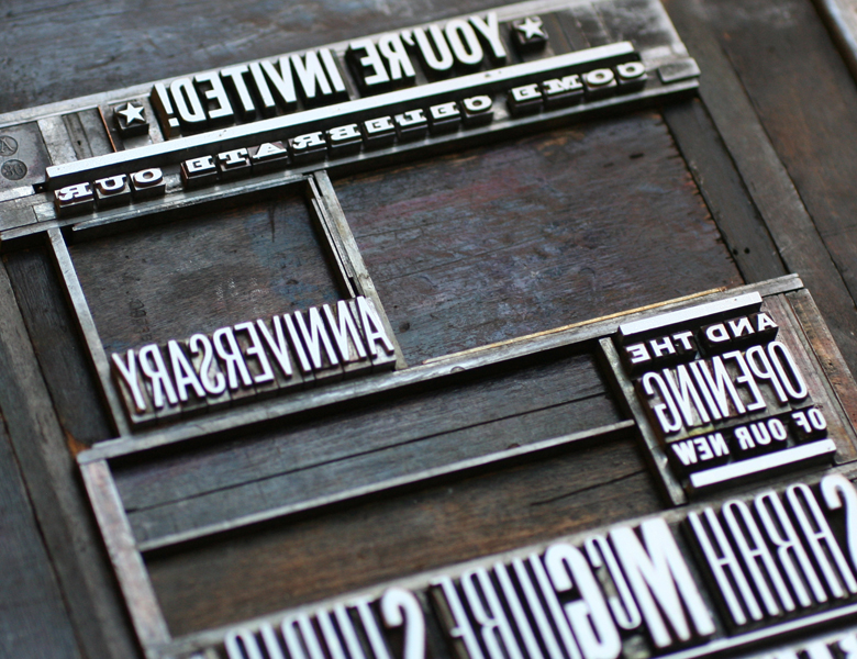
Given that it's been the year of creating ornamental letterforms, I thought I'd try my hand at figures too, hence the '15' on both the postcards (below) and posters for the annual open house. Postcards don't always make it onto the schedule, but this year they did so that they could be included in the swag bags at the Hamilton Wood Type & Printing Museum Wayzgoose.

prints3

This is a nice, chunky typographic '15' that I was very pleased with. It may be the start of something...

prints1

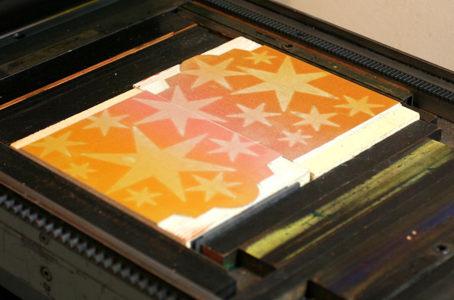
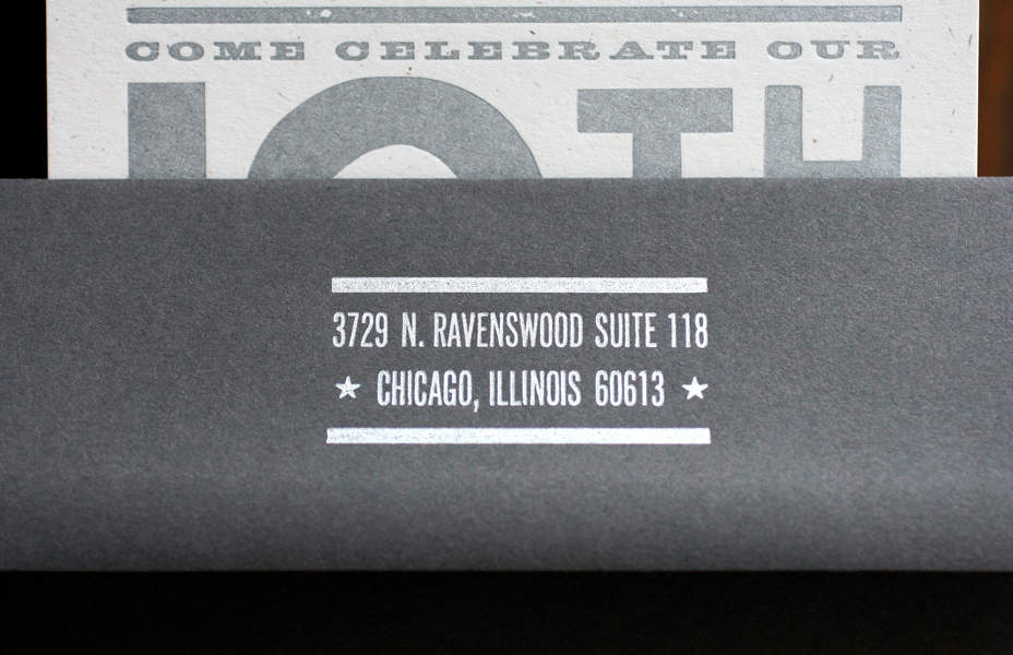
For the poster, I wanted to create a circular seal-like image with a subtle pressure print. The chipboard '15' was added to the makeready. I cut a piece of linoleum for the round base; you can see the ghosting of the ink on the linoleum since I printed the red and gold before the final transparent white.

prints8

I also made a pretty weak attempt at setting larger type on a curve with this hackneyed piece of plywood. But it worked.
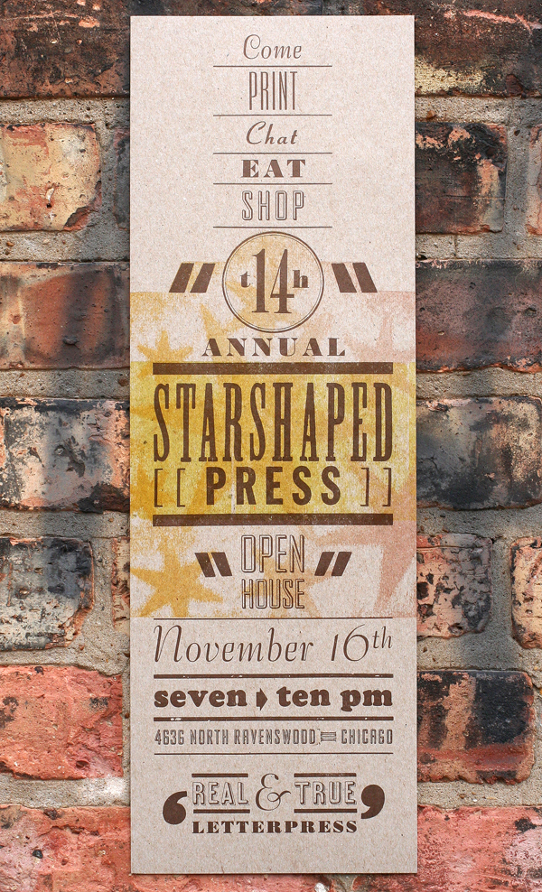
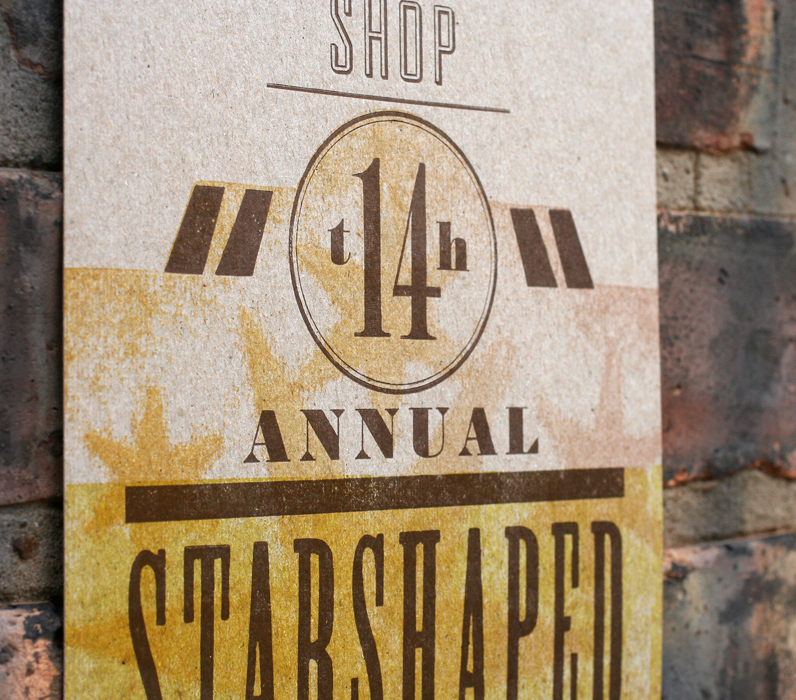
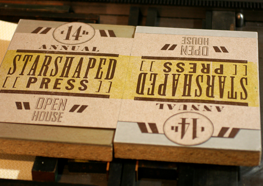
prints10The final poster!

openhouseposter

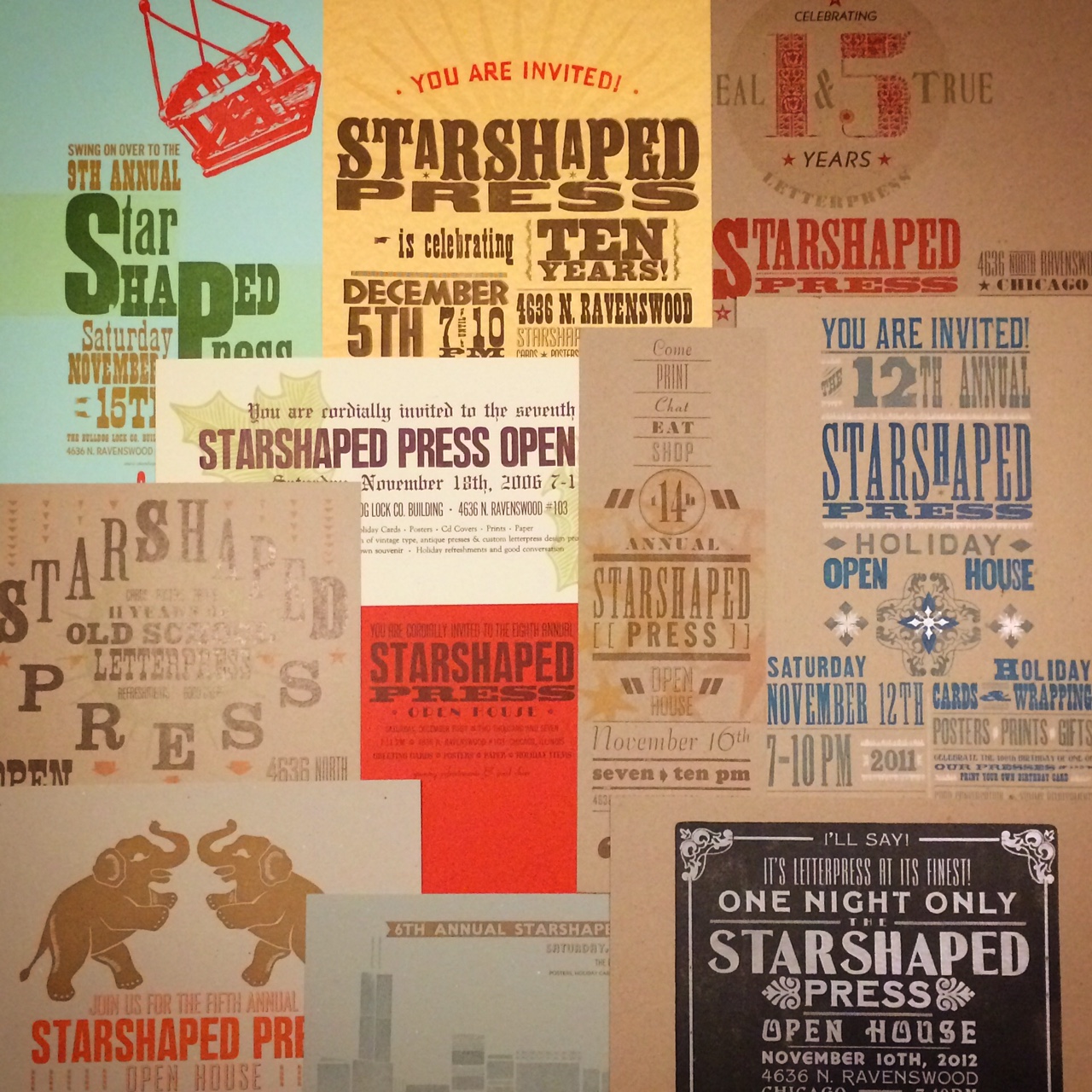
The annual open house has happened since filing for my dba back in 1999; the first few years at the old studio were more of a gathering for friends and family and took place during the day on a Saturday or Sunday afternoon. After moving to our current location in 2003, the open house turned into an extremely well attended event on a Saturday night in November. That's when I started creating posters to advertise; below are the last 11 years worth of prints.

posters

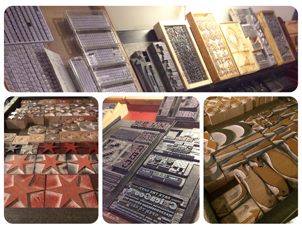
While there is always a bit of type out for every event, this year there was a LOT of type out, both because of so many recent acquisitions as well as just not having the time to get things organized and distributed. So everyone was able to see beautiful new and unused metal and wood type, as well as many forms from recent jobs.

typeoutAll the presses are rolling for the open house, and this is the form that everyone could print this time around. It's the start of a series of fantastic Chicago quotes that I intend to set with some of the finer wood type in the studio.

makenoplansform

We also set up some of the new tiny snowflakes done with Moore Wood Type so that everyone could print a wintery greeting card.

snowflakes

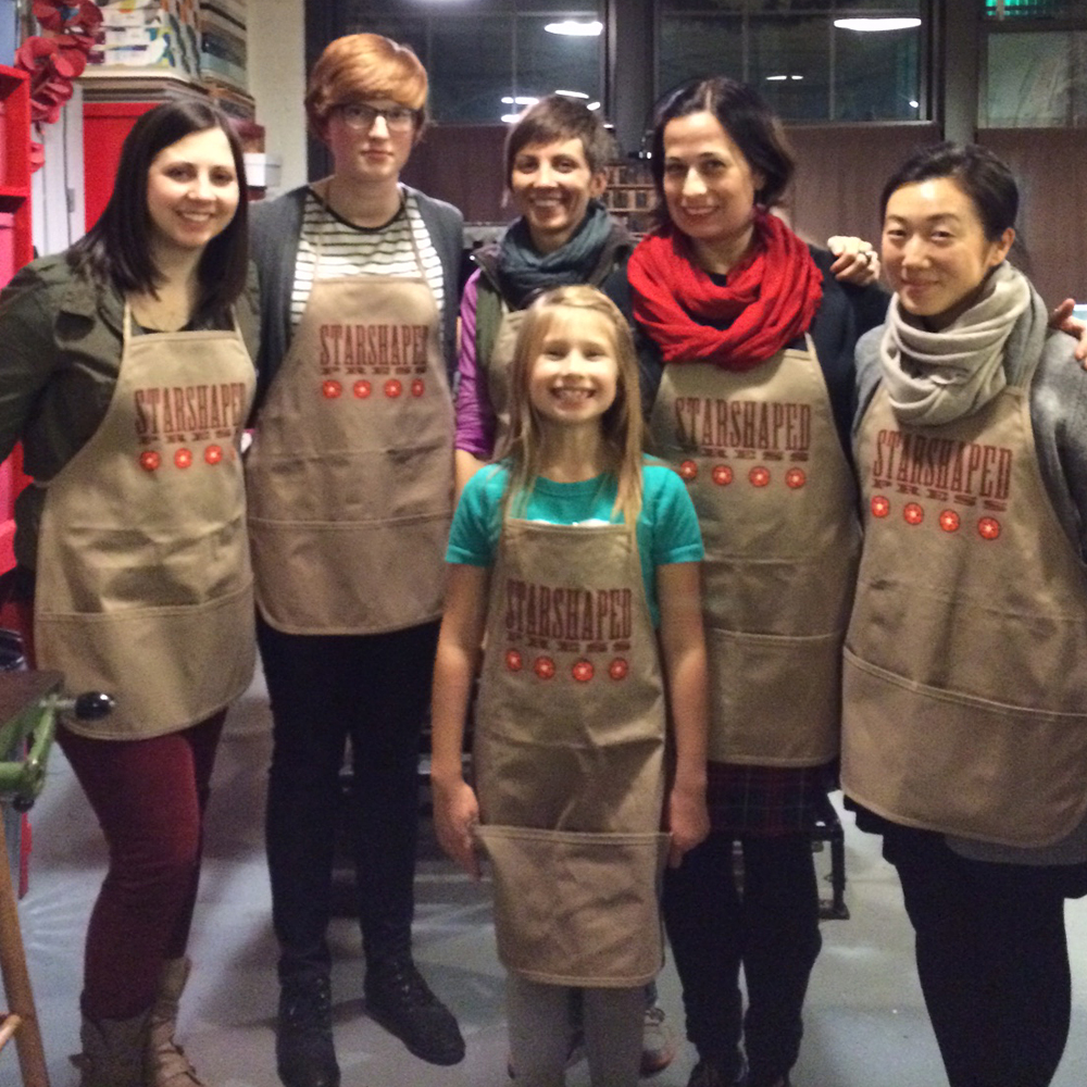
Prior to the mob scene, my incredible interns all showed up to get things moving. Cathy and Emily came with these amazing new aprons! What a sweet surprise. Now we all look like a force to be reckoned with. Because we are.

apronsLook at Emily go!

emily

Fine ladies representing the School of the Art Institute! Janice, Cathie Ruggie Saunders (an incredible instructor that everyone in letterpress should know), and Cathy. They do letterpress right at SAIC.

oh16

Jo also set up a print for the kids to do on her little galley press.

josprint

And after printing the kids went bonkers, running around the studio and hall like wild banshees.

oh4

It was very humbling to have so many talented folks from the neighborhood come by. Here we have the Favorites, Amber and Tom, snuggling in with Emily 'anything less than the best is a felony' Orange Beautiful. A few of my favorite designers.

oh10

For all the time we spend in Beans and Bagels, it was wonderful to have Sido and Will come by. Two others that spend a lot of time there are screen printer and illustrator extraordinaire Dan Grzeca and fantastic photographer Jookie Jill.

oh12

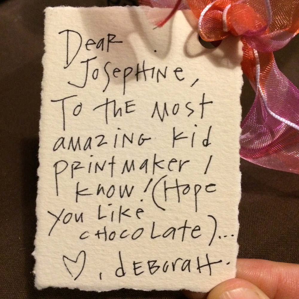
Also got a visit from my hero Deb of the Chicago Printmakers Collaborative. They are celebrating 25 years of awesome printmaking and I was thrilled to be a part of this in the form of creating their show posters. These were then turned into wine labels, which Deb brought by. And of course she brought a little treat for our printers devil.

oh15

jonote

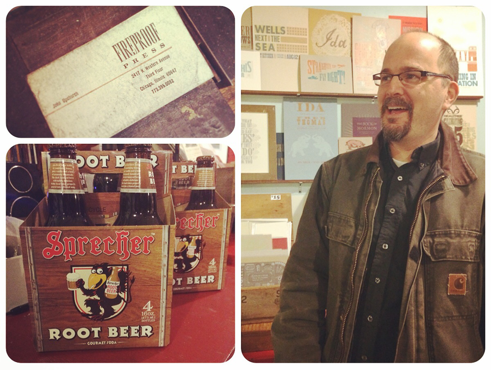
A real treat was having the Upchurch family come out. One of the best times of my life was working at Fireproof Press... all the printing, fun and fellowship without the hassle of running the business! Lori and John have always been family to me, supporting Starshaped throughout the last 15 years.

oh17

And of course John showed up with the traditional Fireproof Press offering of root beer.

john
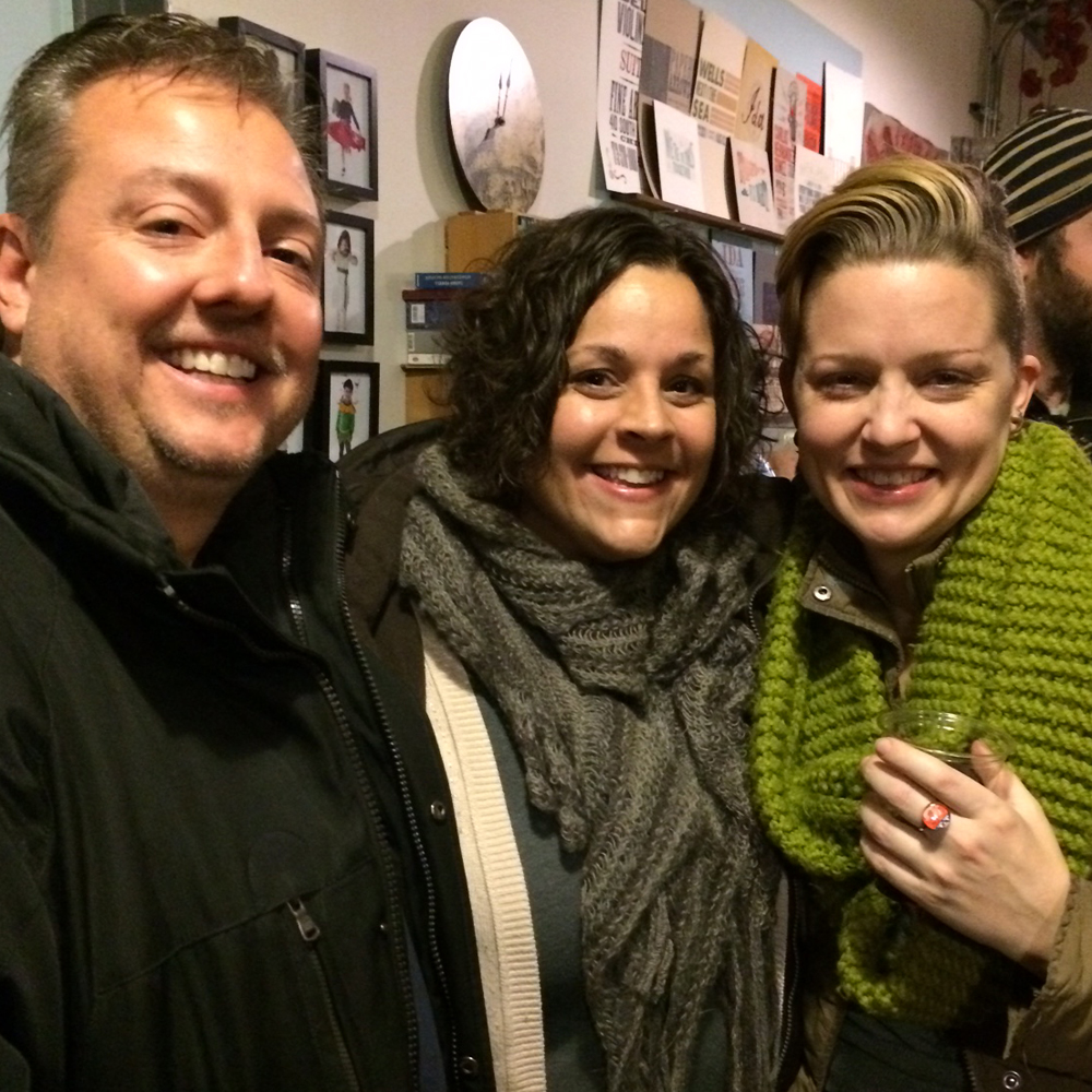
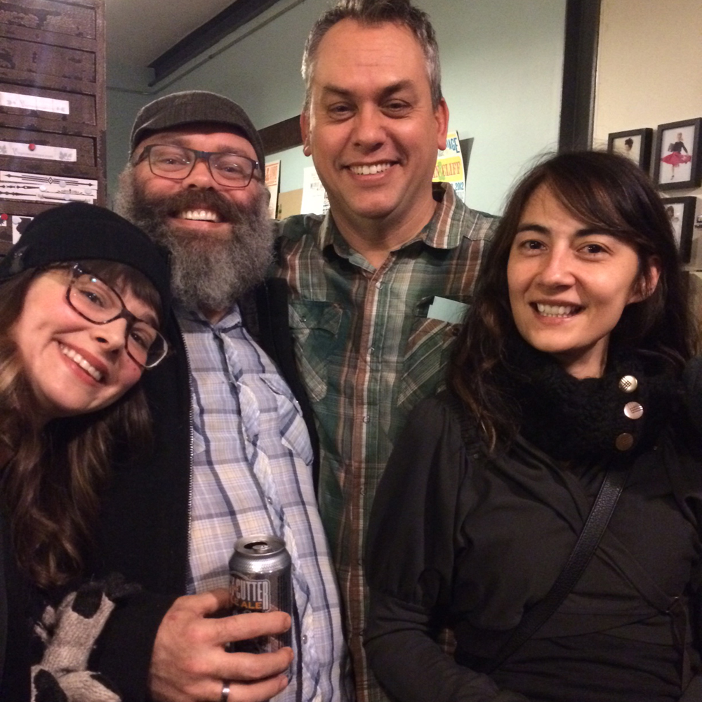
Just a few of the many faces of friends, old and new, that made it through the studio.

compiledimage

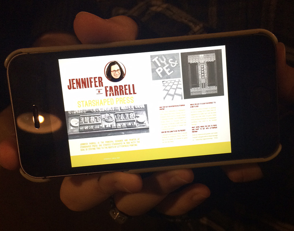
Also had a nice visit from Abby Woods, a current Columbia College student, who's working on a project about... me! Here's a sneak peek of what she's up to.

oh11

It was both an exhausting and exhilarating evening. I came in Sunday to clean up the fall out and found this guy hanging out by the typecases. I suppose the mess that was left behind was a good sign that the party was a success. I made no little plans when starting the studio 15 years ago and given the support of the community I feel confident the studio has another 15 in front of me.

makenolittleprint

15th Annual Open House

openhouseposterIt's that time of year again, when we ink up the presses, throw open the doors and invite the public to come on in to celebrate our anniversary. This is a special one, as the studio is celebrating its 15th year. Starshaped has seen a lot of ups and downs this year, and I'm looking forward to having a great night of sharing stories, pulling prints from our 15 year history and geeking out on beautiful type. Join us! Kids are most definitely welcome.

Saturday, November 15th, 7-10 pm

4636 N. Ravenswood #103 · Chicago, Illinois

14 Years and Printing

Setting up Starshaped Press back in 1999, I threw together a small open house for family and friends to come see my limited collection of printing paraphernalia. Fourteen years later, the open house has become a large annual event, where printers and printing aficionados come to eat, print and enjoy good conversation. I'm proud of the community that has built up around the studio and that continues to bolster our efforts to preserve the craft of letterpress printing. It's that time of year again when we ink up the presses, clean the floors and stock the studio with sweet treats for everyone to enjoy. And of course there's a poster to both announce and celebrate the evening:

openhouse1Inspiration for the open house posters comes from a different place every year and gives me a chance to push our type collection into a certain aesthetic. This year I revisited some of the design work done by Vaughn Oliver and v23, the longtime in-house design force behind most of the early 4AD record releases. It's an understatement to say that this design work changed the course of my creative life and showed me incredible, contemporary typographic work. I wanted to play with some of the type we have that doesn't see the light of day too often yet evokes the conscious typographic decisions made in v23's work.

I haven't had much experience printing brass circles and this was a great opportunity. It's a bit tricky getting the type inside to stay straight, and buffer around the edges to hold it in the form. Letterspacing 'th' around the 14 was also a challenge, as the 4 needed to be mortised so that the 'h' could fit closer. Love that band saw.

form5This is one of our more attractive forms of late, hanging out on our imposing stone. The quotation marks come from larger wood type that I trimmed to size to fit comfortably and allow for maximum flexibility of placement.

forminwindowI really didn't want to carve any specific image for this print, but instead wanted a moody feel with a hint of stars.

openhouse4The best way to achieve this is with a pressure print, which means adding shapes to the makeready of the press and running the paper over them through the press. I used linoleum as the inking medium and trimmed two pieces to the outline I wanted for the poster. The dark copper brown was run first, followed by a strip of yellow printed with the back sides of wood type. It was done as a work-in-turn so that I could get two prints out of each sheet of paper.

linocutsetup2The chipboard stars were then added to the cylinder of the press, under the poster paper. When the paper hits the inked linoleum, the areas where the stars are will hit heavier and will therefore make a stronger impression.

starsetup1Here are the linoleum blocks inked; both light orange and pink were on the press in what's known as a split fountain. The stars here are not carved in the linoleum; this shows where the paper is hitting the block hardest and picking up the ink for the print.

linocutsetup3All together, this achieved the exact effect I was looking for, coupled with the beautiful type.

openhouse2Real and true letterpress indeed! I'm awed by the successes, epic failures and enthusiasm I've met with over the last 14 years and love throwing the doors open for a cozy night of printing with the community. We'd sure love to see you!

Saturday, November 16th

7-10 pm

4636 N. Ravenswood #103

form1

Open House!

julysaleimage2013Ten years ago this week, Starshaped Press moved into our current location in the charming Bulldog Lock Co. Building in Chicago's Ravenswood neighborhood. Since then we've had the privilege to work with many great folks both in the city and around the world. It's time for a little change, and Starshaped is getting a studio makeover! This Saturday we'll be having an Open House and Sale to clear out the old and make room for the new. All of our prints and cards will be out for sale, and most will be heavily discounted; many are set to retire so now is your chance to grab them at crazy low prices. We also have lots of old typecases for sale and blank paper that's free to a good home.

Come and Visit!
Saturday, July 13th, 2013
10am - 2pm
4636 N. Ravenswood #103
Chicago, Illinois
773-728-6359

Celebrating our Neighbors

Every once in a while, the stars align and we can sneak jobs on press during our busiest times. I was recently contacted by Sarah McGuire, a local jewelry artist, about her upcoming 10th anniversary open house, with the hope that we could come up with a great invitation in a short period of time. Yes! Here's what we did, photographed with one of Sarah's lovely necklaces. sarahmcquire1

Sarah wanted a broadside-styled card with blocky, simple typefaces in various sizes, and definitely printed in silver.

sarahmcquire2

This is the form, showing the combination of metal type, wood type and rules (used for printing lines).

Tsarahmcquire

Tsarahmcquire3

Here's the form in the press, inked and ready to go.

sarahmcquirelockup

After the basic setup, I've found that large wood type often doesn't print as well combined with small type on a platen press. I took out the larger wood elements and filled them with spacing (called furniture) in order to run the small type first. After that, I put the wood back in and replaced the metal type with furniture. Two runs for one color seems like a pain, but the result is that much better and two runs on the platen are still faster than one on the Vandercook, where everything could be printed at the same time.

Tsarahmcquire5

Here's the studio address, in our own lovely Ravenswood neighborhood! We will be celebrating with Sarah in her lovely new space on April 26th, and hope to see you there, too.

sarahmcquire5