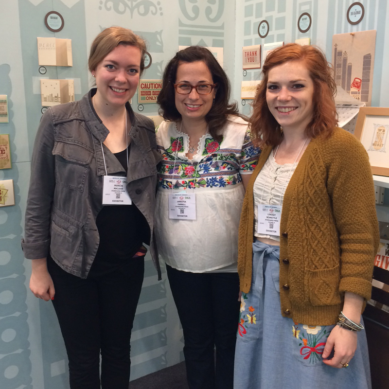
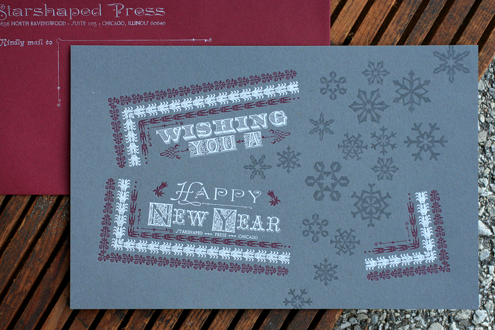
Starting a new year with a printed homage to great type is always a good idea. Starshaped scored a great deal of new metal and wood type this year and it's time it pulled some weight. So this year's New Year card features type from a few different metal type foundries alongside the snowflakes from our collaboration with Moore Wood Type.
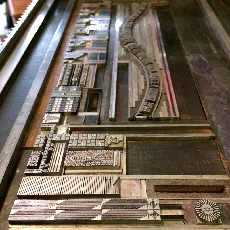
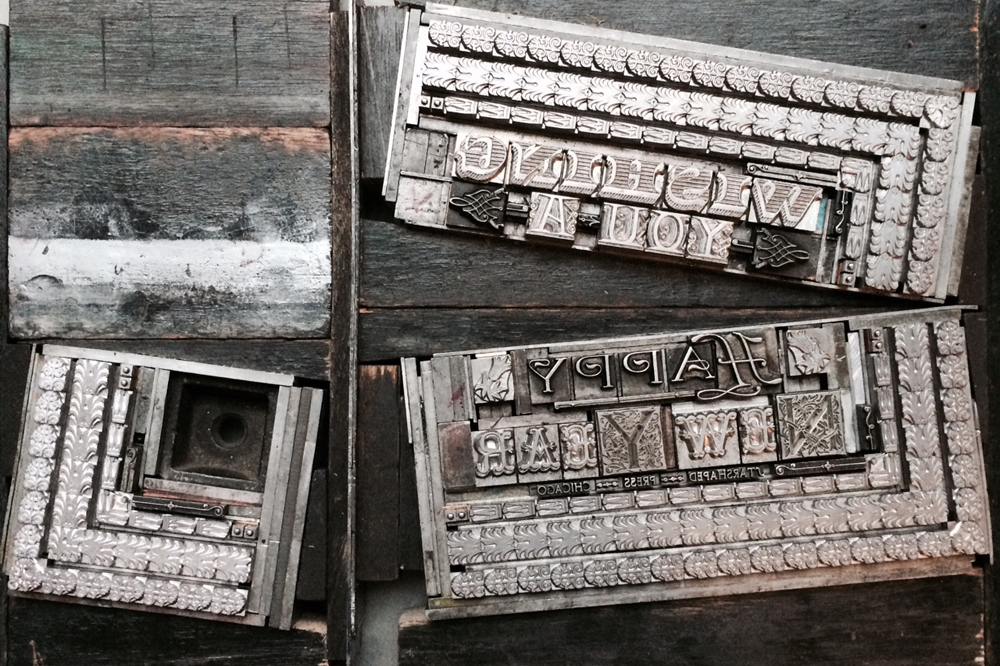
 The idea was to take a standard rectangular form and make it appear as if the snowflakes were swooping in to break it apart. Below is a reversed image (so it's easy to read) of the main sections of the type form before separating them.
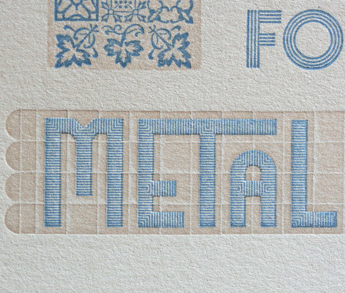
 How about a typographic rundown? 'Wishing' is a new cast of Ray Shade by Hill & Dale Type Foundry in West Virginia. 'You A' and 'ew ear' are Latin Ornate and Tuscan Graille, both from Skyline Type Foundry. 'Starshaped Press Chicago' is 6pt Camelot and the N and Y initial caps have yet to be identified. 'Happy' is a mortised initial cap with Dakota. The three main borders are from Bixler Letterfoundry, courtesy of Punky Press, coupled with tiny bits and pieces from our collection.
After a quick carbon paper proof of the forms, I scanned them so that I could figure out the best angles and build the rest of the piece digitally. This is the cheat sheet printed out with the placement of the sections and snowflakes. It is marked up to determine the measurements of the angled furniture I needed to cut to square up the sections.
 Here you can see the angled furniture that holds the sections in place and keeps them flush with the rest of the form.

 I first pulled a few proofs on the actual paper with the entire form to set up placement and look for any wacky spacing issues. After that was established, I took out all of the second color, leaving just the sections to be printed in burgundy. I marked the spacing with a sharpie so I would remember what I added in place of the type that was there.
 The burgundy read well on Wrought Iron, dark gray stock from Neenah's Environment line. It matched the Paver Red envelopes from French Paper. Printing dark inks on dark papers can always be a bit of a crap shoot but this worked well. Silver is a no-brainer. The registration is pretty tight, and given the angles in play here, that's impressive.

 Next up were the snowflakes. I trimmed most of mine to be as close to the edge of the design as possible so that they could almost sit on top of each other.
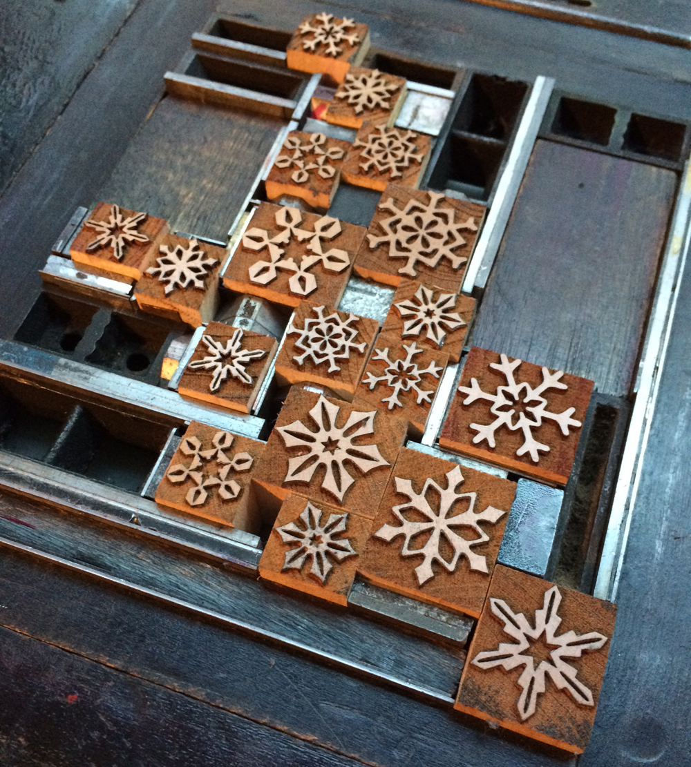 Figuring out what ink they'd be printed in was more challenging. My first thought was opaque white so I could test how this would perform on the gray paper. But the white competed with the silver and the type receded, which was definitely not desirable. So I tried transparent white as well as variations on this with differing degrees of silver and black mixed in. The final was a combination of all of these.
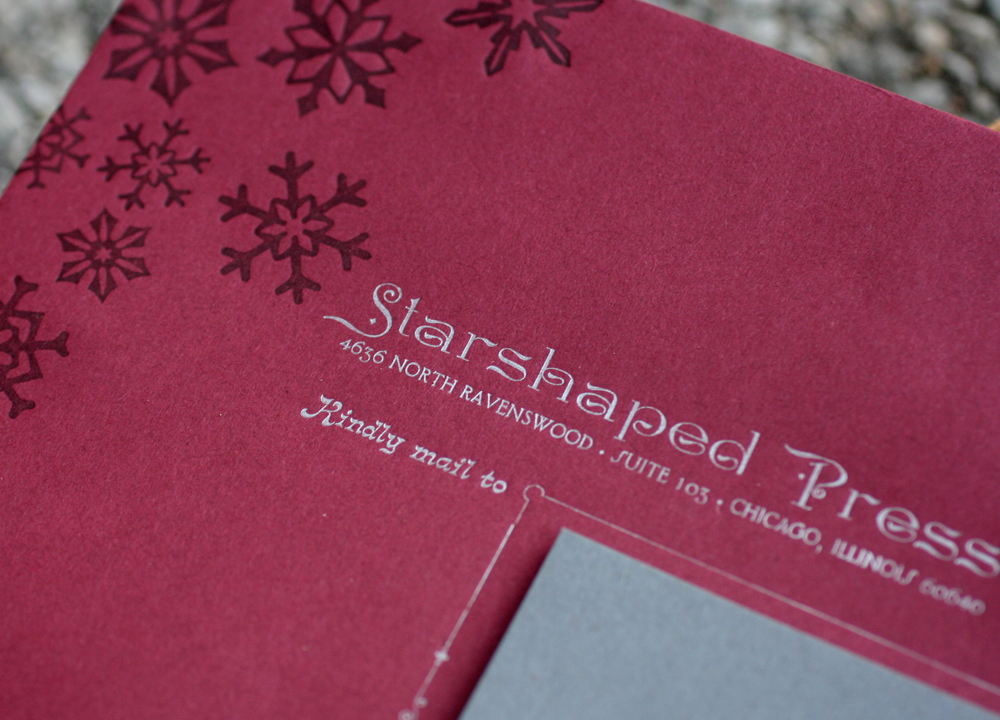
 While the snowflakes were set up on press, I used them to print the front of the envelopes as well, where they appear a little darker on burgundy stock. The silver on these is particularly striking. More great initial caps.
 I was very pleased with how the cards turned out, as they hit all of my bases for typography as well as great paper and ink combinations. The challenges of setting this form were also very pleasing and it's great to see both old and new type functioning on a heightened level. One of the plans for the studio this year is to really highlight some of the gems of the Starshaped collection and use them in similar ways to how they would have been used 100 years ago, but with (hopefully) a modern breath of fresh air.