
We recently finished a broadside project for the Society of Typographic Arts, located right here in Chicago. Obviously, typographic was the way to go! The broadside is intended as a welcome gift to new members and for promotional purposes, so it's scaled to 8x10" to fit in a mailer. It's printed simply in just one color on each side.

I created a circular shape without actually putting any of the type on a curve. There are about 9 different typefaces of historical importance, combined with 19th century ornaments forced into a more modern configuration. Here's a little close up:

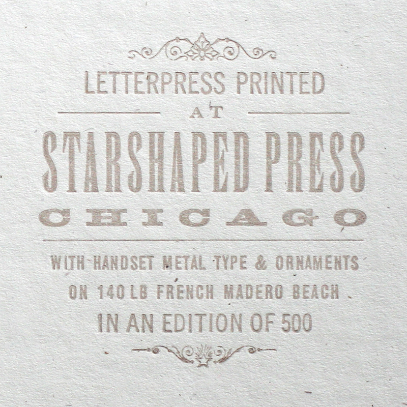
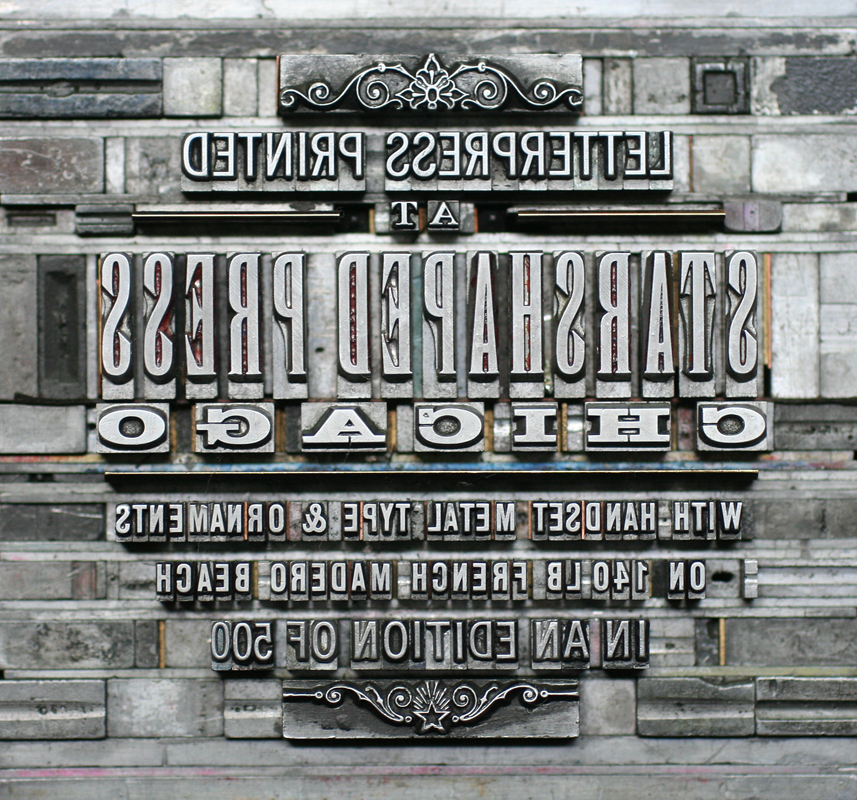
The backside of the print has a small and subtle colophon that's directly behind where the front circle of type is.
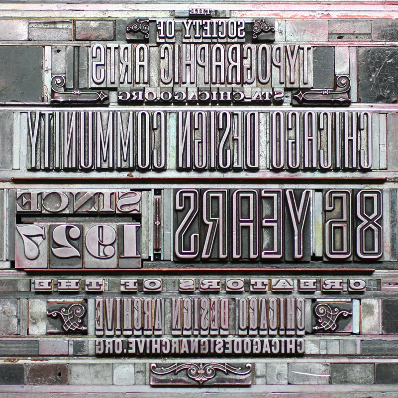
For this piece, the form images are just as beautiful as the actual print:
It's always great to work with folks that love type as much as we do!