
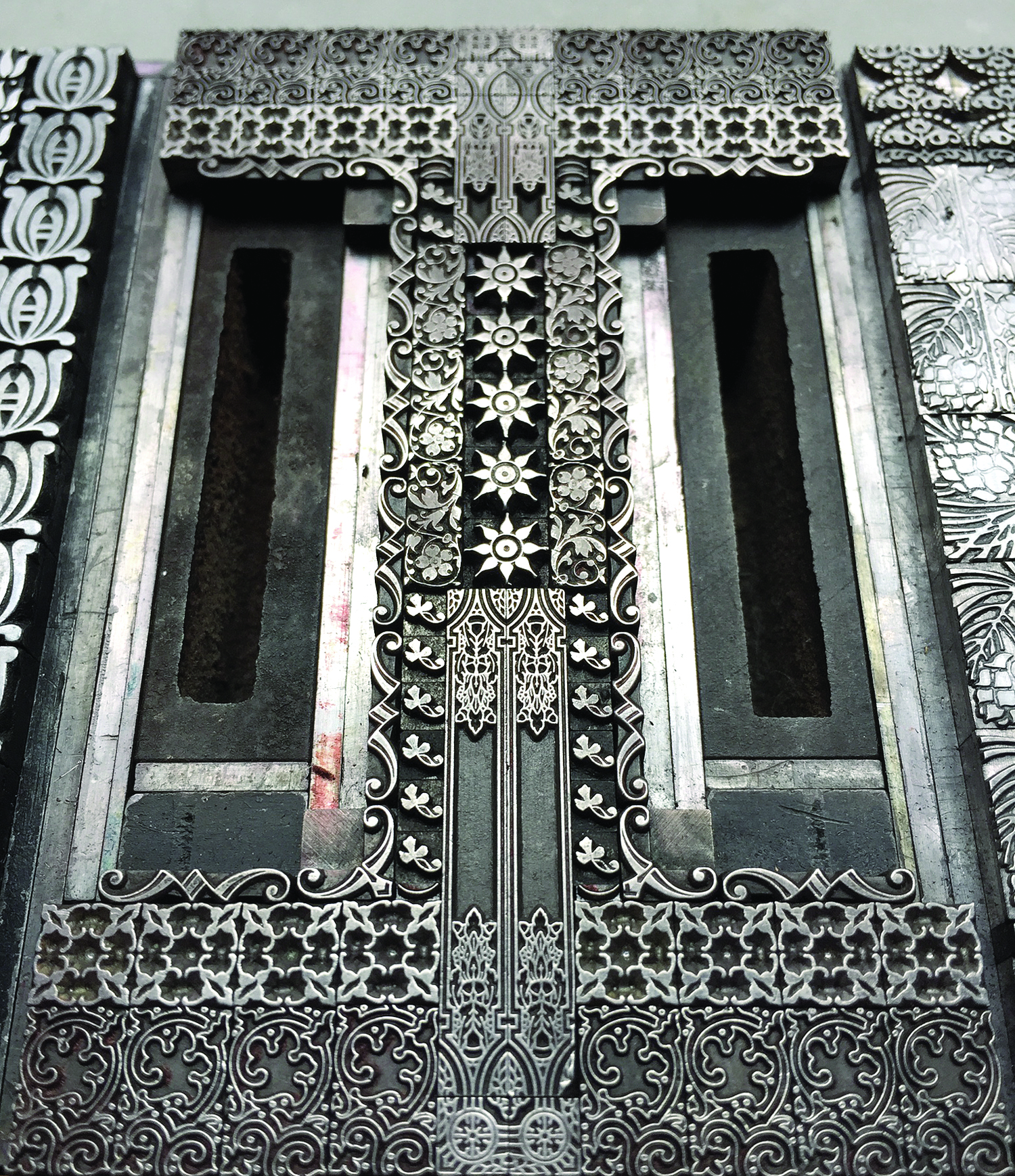
If you've followed along with Starshaped's typographic adventures over the last six months, then you already know about An Alphabet of Sorts, my forthcoming book with Wells College Press. As of this weekend, the book is completely printed and is headed to Wells for binding! I thought I'd share some shots of the printing process and a sneak peek of both the cover and the interior pages. But first, a few images of some of the glorious type forms. The 'I' is one of my favorites as it includes some of the very first ornaments I acquired.
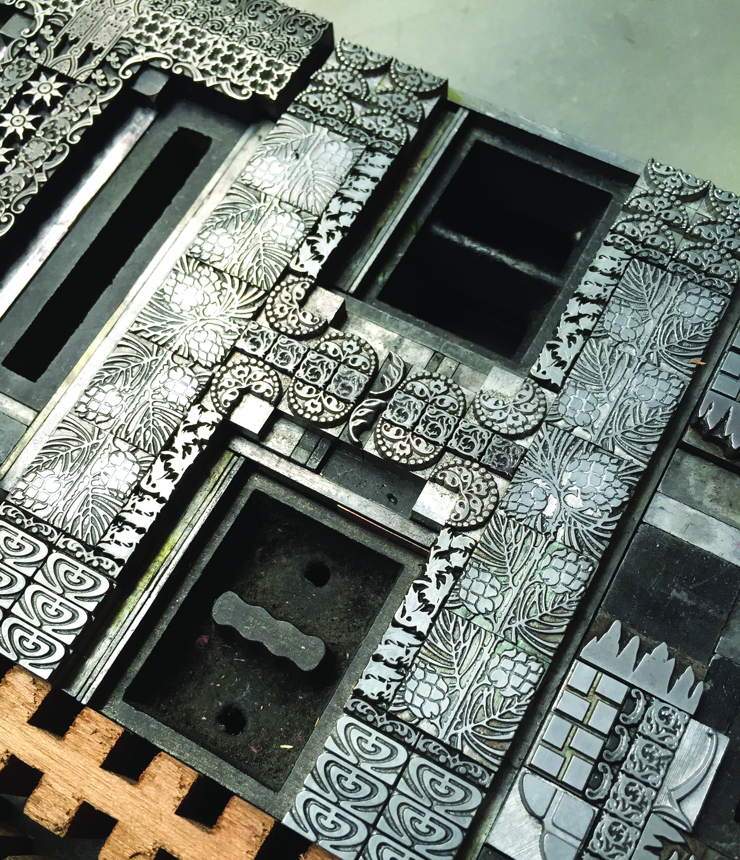

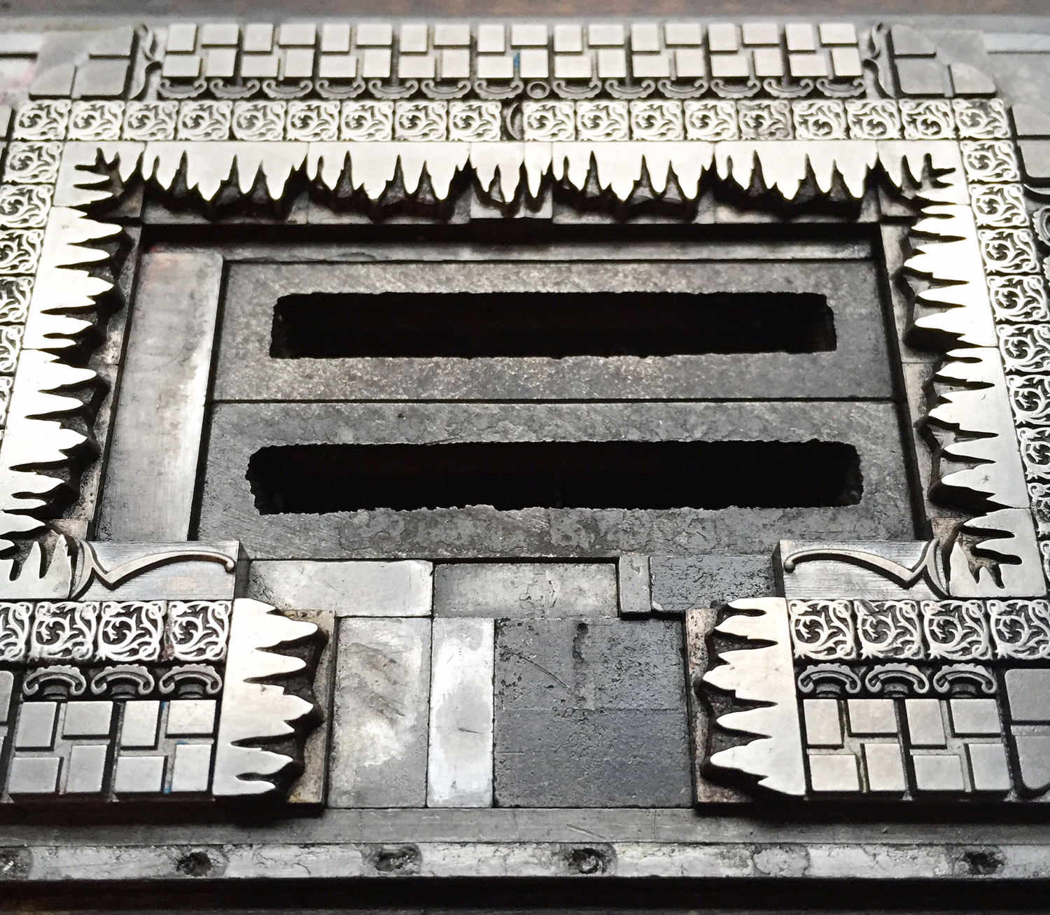
In this section of the 'N' you can see the beautiful, angled sorts, pieced together to create a diagonal shape. These were made in Chicago by Barnhart Bros. & Spindler.

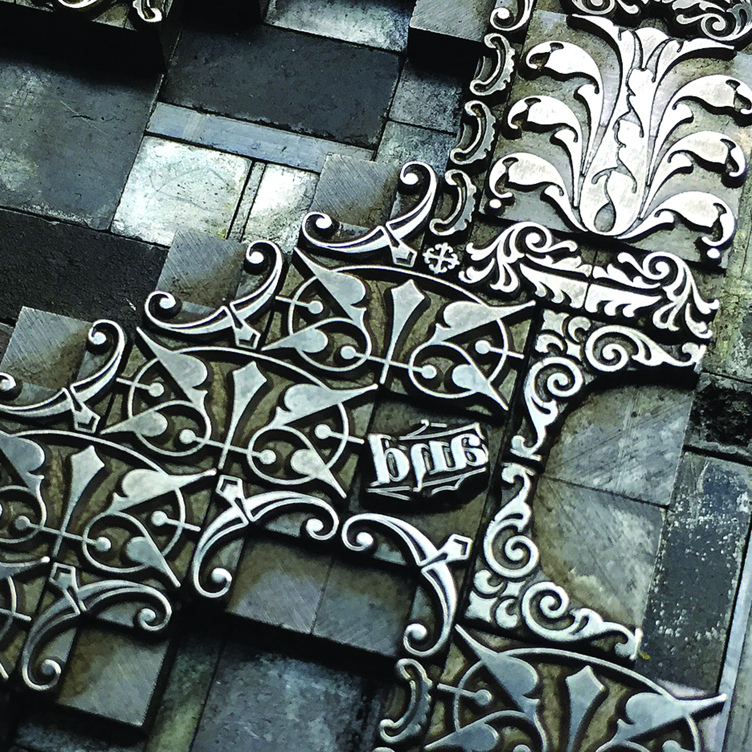
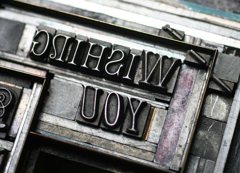
I call this catchword the tattoo of the ampersand, as it sits right in the middle and is the only discernible word included in the alphabet.
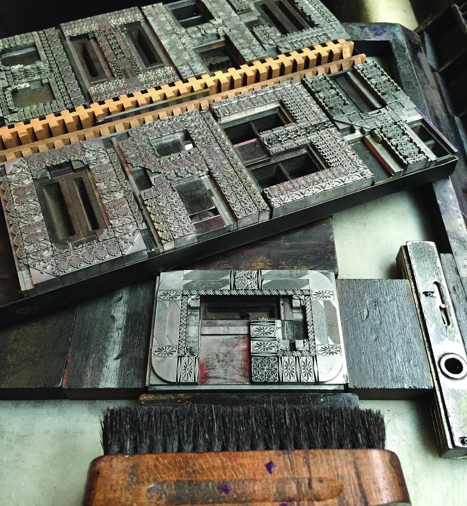
This was the first galley of letters to go on press. The 'G' is locked and ready. I brushed many of them with a little oil and wiped them down well to remove old ink and any dirt that might affect the print quality.
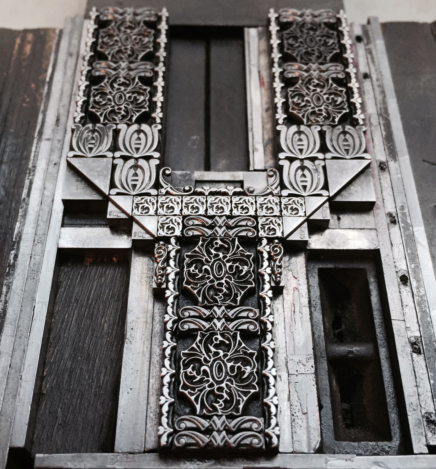
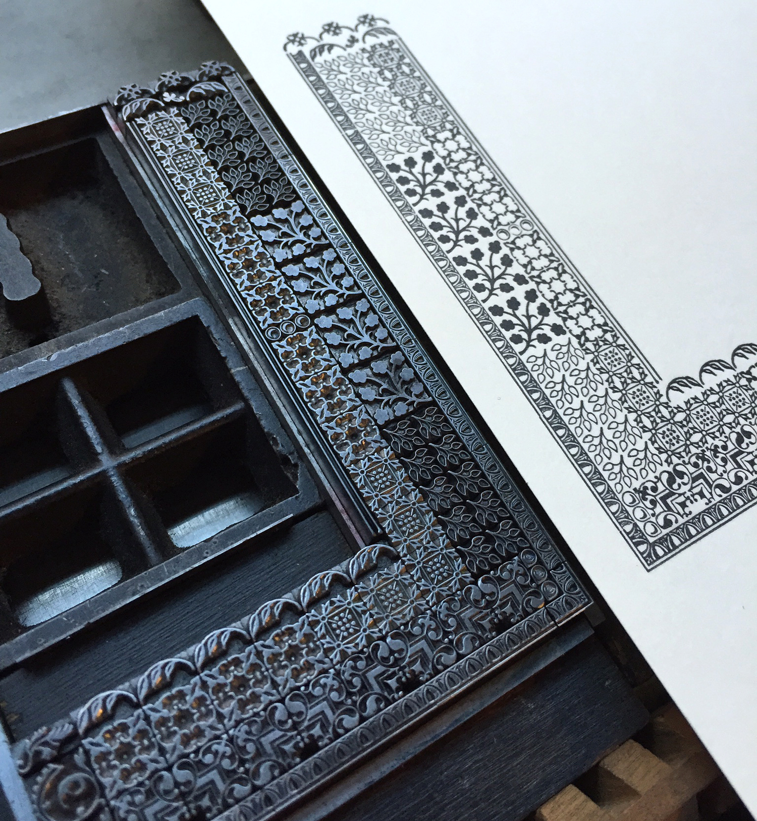
The 'L' is the only themed letter in the set; it is entirely made up of ornaments from the Lanston Type Company.

First on deck were the end papers for the book. These reversed letters, along with patterned ornaments were printed with red ink on Red Tartan stock from Gruppo Cordenons.


I liked the idea of the mirrored type above, so it carries through to the covers as well. And it was fun to set 'SORTS' twice... right reading and wrong reading!

The covers are printed in red, gold and pewter. I couldn't be happier with how these turned out, even though it's tough to photograph this lovely red paper.


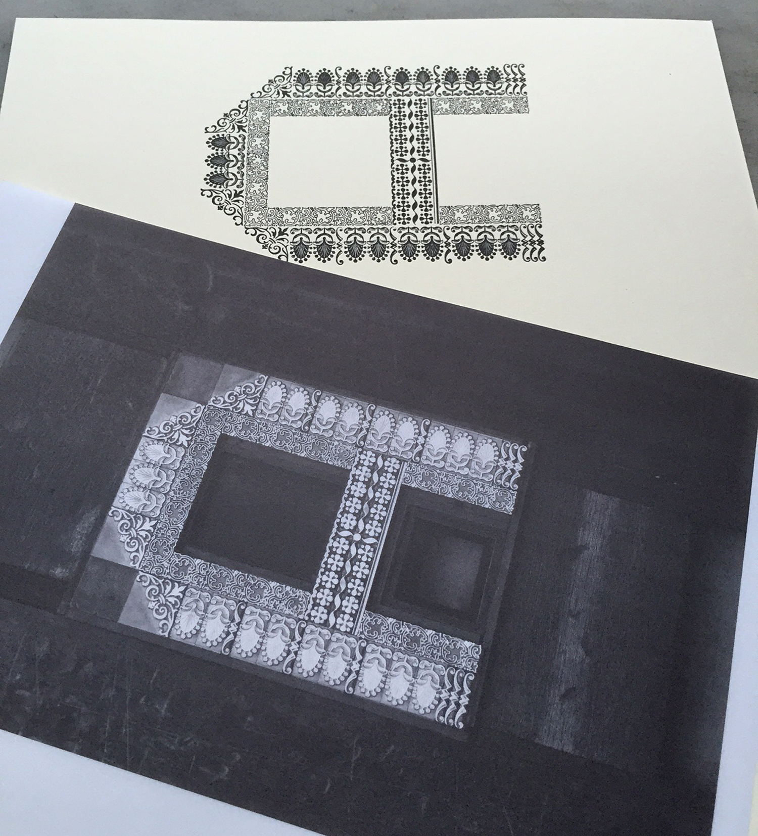
One of the treats in the book is the inclusion of two vellum pages with digitally printed images of the type forms. Here's a peek at the A that will sit right on top of the printed 'A' page.
My elaborate organizational system involved a piece of masking tape on the drying shelf. The book is made up of 4 signatures, each with 4 folded sheets. I labeled what was on each of the 4 and checked them when they were printed. I did not go in any order, but instead printed whatever letter was next to slide off the galleys.

Typesetting the intro note by Paul F. Gehl at The Newberry Library was a challenge; it's a lot of tiny 6 and 8 point type with 1 point of leading. Luckily, it printed well. It's an honor to have Paul as part of this project.

The last to print was the colophon, appropriately enough.

I assembled and trimmed one set of pages to confirm that all of the imposition was correct. Thankfully it was. 'F' starts the second signature.


I'm anxious to see all of the pieces come together in their final form. I'll be putting together another blog post about the binding when that starts, along with images of the completed book. The edition is already over half sold, so don't miss out!


