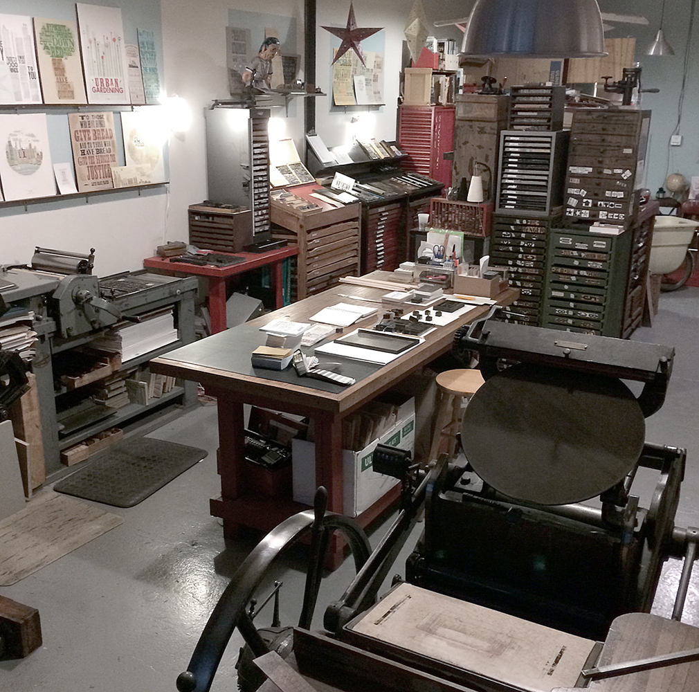
Early in 2012, I decided to put together a comprehensive collection of pieces that would showcase the absolute best typesetting and printing that Starshaped was capable of, largely inspired by the gorgeous print samples featured in The Handy Book of Artistic Printing. The studio has many of the bits and pieces used to create fanciful designs without the aid of lithography (or the modern equivalent of digital typesetting), and I wanted to show that this type of work was still alive and thriving.
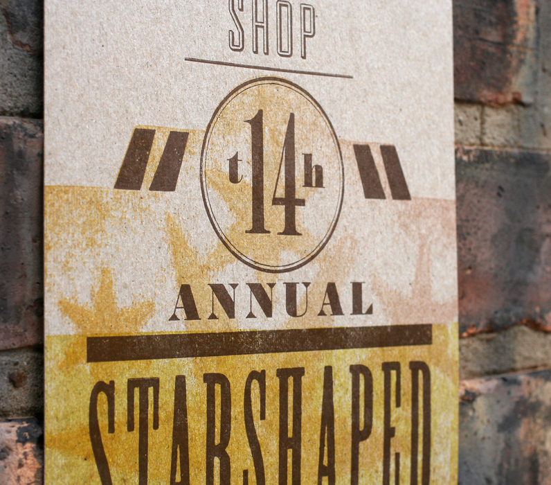
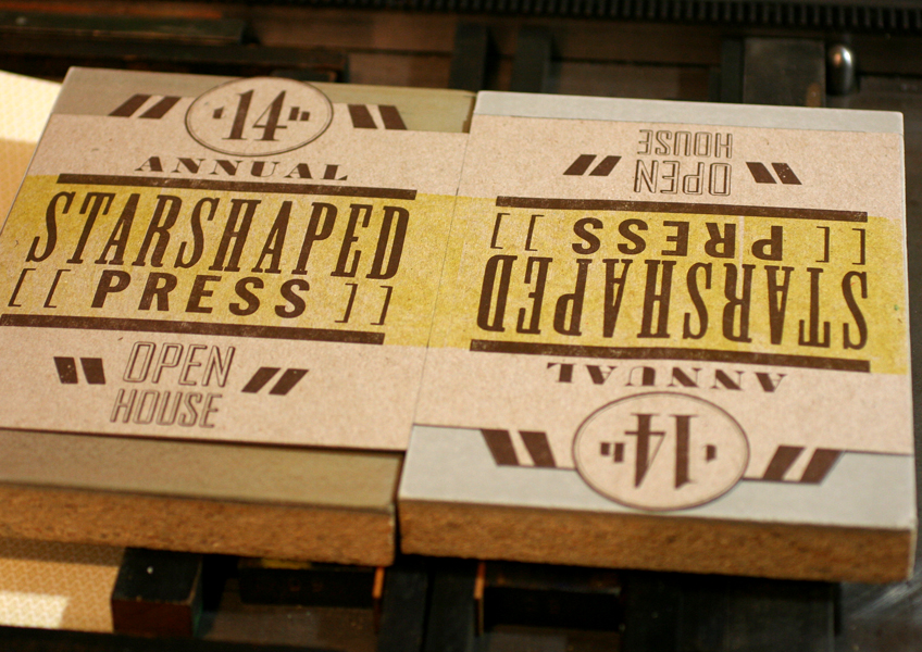
Because our design work for various projects breaks down into 4 aesthetic collections revolving around stylistic periods in typography, it was easy to establish there would be 4 pieces and a folder to hold them all. Because the one image that really spoke to me in Artistic Printing was an image that showed how the printers broke down the piece to be set and printed, I knew immediately that I wanted to have beautiful images of the forms (the lockup of type for printing) offset printed on the back side of each piece so that viewers could see exactly what went into creating it.
The subject matter came easily as well; I chose 4 things that both fascinate me and inform decisions I make everyday in regards to my design work.
The first piece was to focus on our nineteenth century type collection and needed to be something that would run a lot of type together in the style of an advertising broadside. I happened to purchase the audiobook of Shadow of the Titanic and often found myself staring into space as the survivor's stories were so engaging and well written. An ad for the Titanic was the obvious choice, and fit the period of typography I wanted to explore, and would also give me an opportunity to draft an image of the ship. After devouring numerous books on the subject I felt that while the print would be traditional in appearance, the writing would encompass details that became relevant only with 100 years of hindsight. The 1912 'deadline' helped me research which typefaces could be used and which could be eliminated. Here is the final form in black and white for the offset run (a single spot color), along with a snippet of the top:


Some notes on the text:
- Many phrases were used to describe the ship, given that it was the largest to be built. Queen of the Ocean and Floating Palace were quite popular. The Latest... line was lifted directly from an ad for the maiden voyage.
- Olympic and Gigantic were to be the sister ships to Titanic, with the Olympic completed just before Titanic. The name Gigantic was changed to Britannic in light of the tragedy, though there was denial this name was ever planned.
- The ports of call are listed here, but instead of New York, the coordinates of the sinking complete the run.
- Titanic was a triple screw ship (three propellers), so instead of listing this there are three screw images.
- White Star never claimed the ship was unsinkable, only 'practically'. But the sheer size of this marvel excited hyperbole with the public and its crew.
- Newsreels were just coming on the scene at the time of the sinking. Enterprising folks put together as much footage as they could, and the first film about Titanic was released a month after the tragedy and featured one of its survivors.
- The print presented the opportunity to use some type and ornaments that don't often see the light of day in the studio. We don't have much call for using the British Pound symbol so I worked in fares, and as luck would have it, we had the smaller ship cut that gives a bit of pop at the bottom.
Here's the final print: 


The unfolded print is available for purchase here.
The second print in the series would be a nod to Chicago, the city that literally feeds life into Starshaped. Building skylines out of ornaments is not only an enjoyable challenge (give us a city and we can make it cool), it's one of the most popular styles with our clients. This was a great opportunity to look at type that was decidedly modern by letterpress standards, most of which was created between 1930-1960.
I blogged about this piece back in September and you can read (and see) more about it here. The unfolded print is also available for sale. Here is the form shot:


Additional notes on the text:
- The buildings represented here are recognizable to the city, but also leave a few for interpretation. The Shubert Theater is there not only as a nod to the thriving theater community but has a very personal connection as the major employer of Mr. Starshaped and home to IATSE stagehands that make up the muscle behind the studio, when muscle is needed.
- I love the little representation of the train and its track, connecting the loop area with the neighborhoods and stockyards; it links both downtown commerce with residential living, as well as linking the past, present and future together.
- For some reason, I can't stomach the phrase The Windy City. Luckily, Chicago native Common has switched it to a cooler option, which seems more palatable.
- Urbs in Horto, or City in a Garden, appears on the official city seal, and was the basis for our award winning poster of the same name.
- The colors are meant to evoke the midwest, prairie and wheat fields.
- Studs Terkel would have been 100 in 2012. Greatly missed.

The third print is officially the hardest typesetting to ever be sweated over in the studio. Silent films and ragtime songs are the little pieces of solace into which I escape both at the studio and in the city, which boasts several historical theaters showcasing silent films to a dedicated audience. In July and August I listened almost exclusively to Reginald Robinson all day, every day. It felt so encouraging to enjoy the work of someone that was so incredibly dedicated to preserving a very particular form of music, and I wanted to create a piece that showed that same dedication to my craft, even if it meant not creating 'cutting edge' work. There is an art to preservation, as well as using it as the basis of a commercial operation. The inspiration to rise to a new level of typographic work resulted in this form:


I wanted a piece that proved we could work within a time period (in this case, 1920s), set type in small spaces, on curves, on lines, with mortised initials... every trick in the book. After working through about half of the snippets, I had to take a break and move on to another piece for a month, as I hit a wall in bringing it all together. But alas, it came together. And it worked.
Some notes on the text:
- I wanted the piece to have a nightclub/theater feel, so that it would be scored to literally open onto the text inside. This meant running curved type at the top in the manner of Chicago's own Portage Park Theater, and adding a diecut to emphasize the shape.
- The Exotic Locales sphinx cameo is in tribute to Jo, the studio's printers devil and ardent Egyptologist.
- Most of the text is pulled from songs of the time, as well as silly slang that should make a comeback. The reference to Frankie and Johnny is in honor of my grandmother. We played this piano roll endlessly together when I was a child. It's still a favorite.
- The type for Leave All Your... and TONIGHT is set in Pastel, a Chicago-designed typeface that was very popular in silent films. We have 4 fonts of it and are always on the lookout for more. It forms the basis for our silent film-inspired greeting cards.
- Can You Spare A Dime not only references that song as well as Pennies from Heaven, but specifically 5 Pennies, which was the name of Red Nichols band.
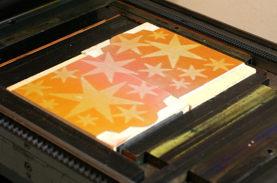
- It is printed in silver ink, while the accents are a linoleum cut printed with a transparent ink for just a little pop.
I borrowed a rule bender from the Platen Press Museum to help set the spacing for the curves at the top:

Here is the final piece:


The fourth print would be a nod to Labor, Labor history and its place in Chicago. For this piece I wanted a looser feel that would incorporate as much of our wood type as possible, pulling from our smaller faces and mixing them with the styles of typography that have graced labor prints and posters for the last 100+ years. The overall aesthetic would be more rustic and would give the appearance of a sea of posters at a rally, where no one image takes center stage in the ultimate show of democracy.
Here's the form:


Some notes on the text:
- Many phrases are pulled from songs. My favorite is from Woody Guthrie's Union Maid: married life ain't hard when you've got your union card. I can attest to this.
- City of Hands refers to Chicago as a city of hands, i.e., workers. It was a great opportunity to play off the text with our manicule collection.
- I felt it was important to represent diversity in the labor movement, even if labor history didn't necessarily do this. The spanish text here means solidarity knows no boundaries. And as a feminist, it was also important to include a nod to the fight for equal rights. My childhood snowsuit was labeled as 'proudly made by the Women's Garment Union'.
- There is both a list describing the workers of Chicago courtesy of Carl Sandburg, but also a list of just a few of the benefits fought for and won by unions.
- I felt that the cause of human brotherhood is more sacred than labor organizations was an important statement, made by an individual that could see both sides of the labor coin. If we valued human brotherhood above all, there wouldn't be a need for unions.
- The background is printed by reversing wood type and ornaments to create a subtle texture of wood grain. Rules are used to give the impression that each snippet is a poster raised overhead.
Here is the final piece:


We make every effort in the studio to work exclusively with American companies, especially midwestern paper manufacturers. All of the paper for the four pieces here came from French Paper in Niles Michigan, one of our favorites. The offset printing was all done by the talented Gary and his staff at Accucolor Plus here in the city. And of course the overwelming majority of our type collection was manufactured by American type foundries. The copper Titanic plate and the two linoleum blocks were the only new materials used besides the paper, which is all at least 30% post consumer recycled stock. Printing with existing materials is definitely the most eco-friendly approach to letterpress.
Now that the pieces were finished, a cover had to be designed and produced. After testing out more complicated folders, diecutting, etc., I settled for a very simple folded cover with a sewn pocket. For this I used our standard shop gray chipboard. It's 100% recycled, durable and it fits my aesthetic. The cover text references a favorite song, and sums up my approach to design and printing, which focuses heavily on preserving an antiquated process. It combines metal type, antique copper cuts and linoleum blocks.


And here's the final piece together! This was an exceptionally challenging project that turned out better and more comprehensive than I had hoped when I first had the idea. It shows the absolute best typesetting that we are capable of at Starshaped given the materials we have at present (maybe I'll tackle another project of this magnitude in five years when we've acquired even more). There's a wide range of design styles and typography, and the beautiful type and ornaments themselves are present to help viewers understand how each piece was created. I have a number of kits available and am happy to send one upon request.


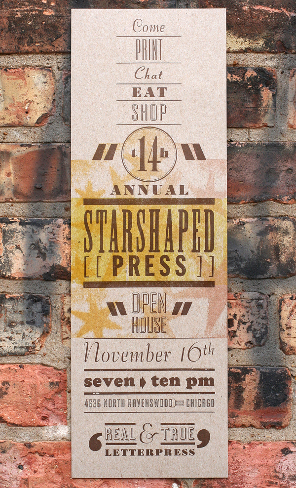
 To celebrate the 15th year of the studio, I've planned a series of prints to showcase some of the fine type in the studio as well as the ideals that have guided the work of Starshaped over the last 15 years. The first print pulls a quote from the Barnhart Brothers & Spindler type specimen book of 1923 and is printed in three colors.
 The first layer is printed using the back sides of wood type, allowing the texture of the wood to come through.
 The border elements are composed of ornaments from different collections, mostly cast at Skyline Type Foundry.
 'Tradition' and 'Progress' were printed with wood type that's in pretty rough shape. But I wanted to contrast the rustic aspect of this 100-year-old type with some of the newest metal type; 'typographic art' is set in Runic, a brand new cast and not used before this project.

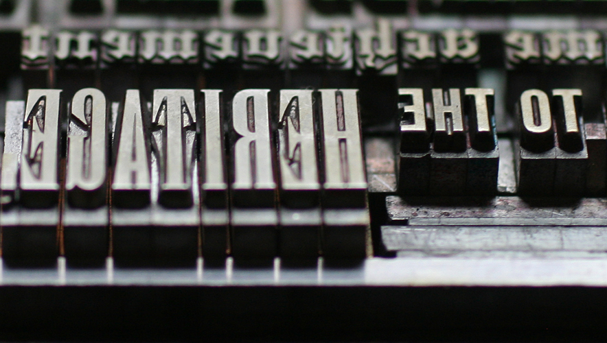 Where did the time go? These four typefaces (Railroad Gothic, Onyx, Engravers Old English and Stymie Bold) have all come to the studio collection from different sources over the years.
 Here is a full shot of the final print. I wanted to deconstruct the traditional text-heavy broadside of the late 1800s while maintaining the 'more is more' approach to typesetting of that time. I felt this quote was particularly forward thinking, especially given that it appeared in print in 1923.