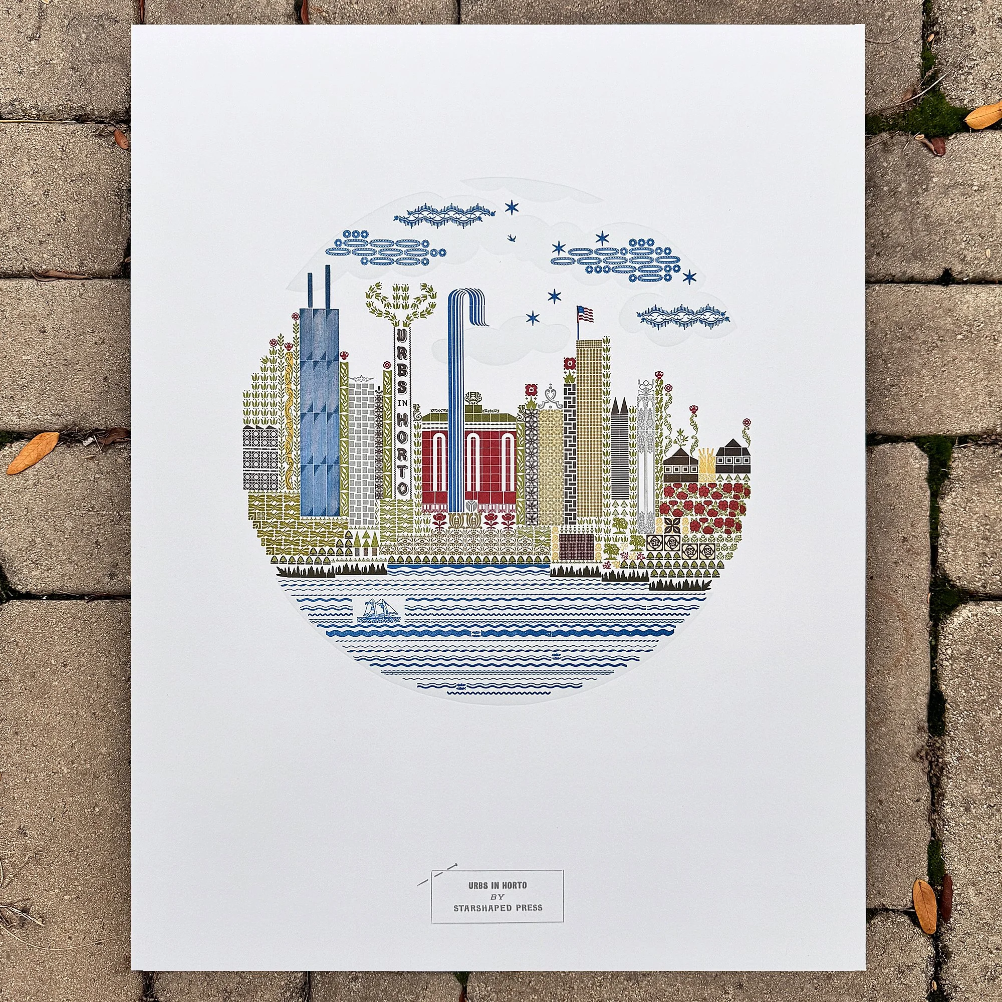
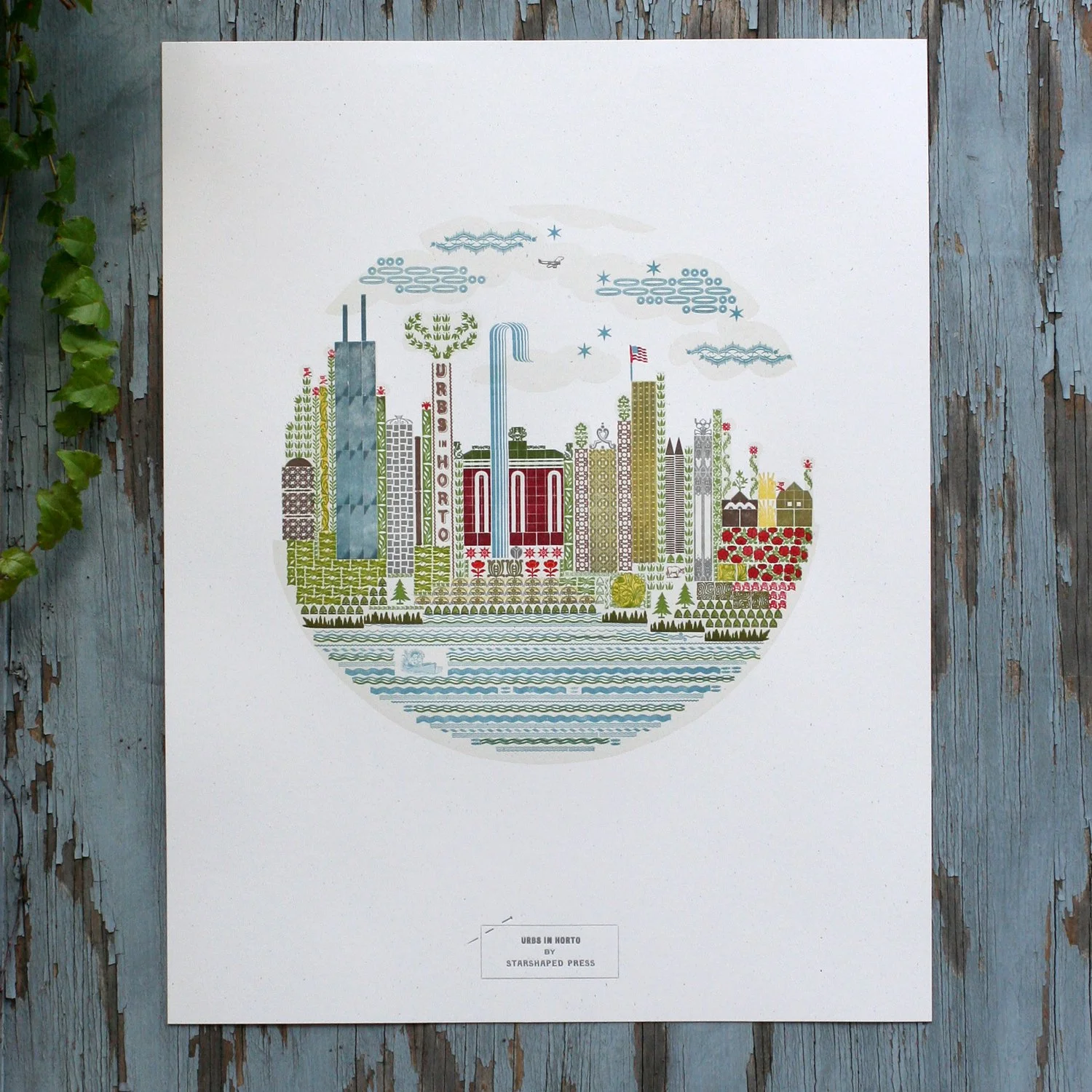
Many years ago, the Design Museum of Chicago hosted a show for local artists called The Flag and Seal Revisited. They invited folks to re-interpret the city flag and seal imagery. I thought I’d try to create something in a circular form like the seal but with nods to the city itself formed from metal type. What followed was the hardest print I’d done at that point in time. The type was set solid with very little spacing material, and was 7 colors, requiring super tight registration. Urbs in Horto is Chicago’s motto and means City in a Garden. If you live here, you know it’s true.
The first run sold out immediately so I printed a second, which also sold out. I said I’d never do it again because it was so difficult. Then I started planning for the 2025 Open House Chicago weekend, our biggest event of the year. I stared at the print for a while, knowing it would be a great seller. When I dug into what it would take to reprint, I realized that it’s no longer the hardest print I’ve done and that my skill has improved significantly over the past 8 years. So I began the process of recreating it with what I know now.
The first decision was to use a better paper that would hold the detail of the ornaments. The second was to retool it through a digital layout. I now design everything on a pica-based grid (the unit of measurement for letterpress work) and doing so significantly speeds up the accuracy and typesetting time.
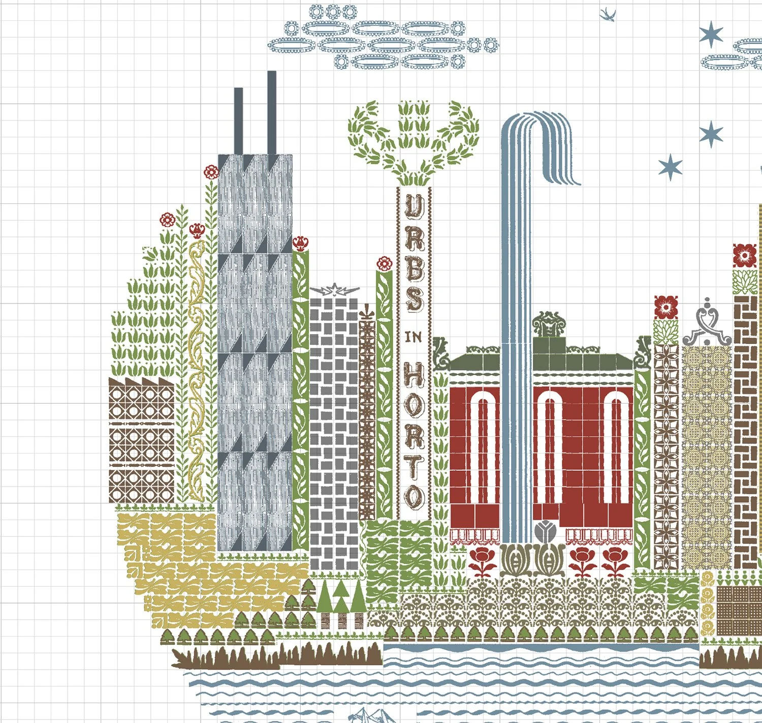
Most of the ornaments and type in the shop are scanned so I can build imagery with the aid of a computer if I need to. This also helps me start to figure out what the color breakdown will be; the digital is an approximate interpretation as I pick inks once the job is ready to go. I can also easily separate the colors so I know what needs to go where for each press run. This print is six metal type colors and one linoleum cut, printed last. These are the separation cheat sheets:

Then the setting begins! I set everything together in one form, knowing a few areas will swap out for overprinted ornaments (overprinting multiple colors creates additional colors!) Because it was laid out digitally, I used a reversed printout of the design to build on for speed. I often make changes while doing this as reality doesn’t always align with digital and that’s the fun of the process. Here’s a little progression via still shots:


The last image includes a message left from shop assistant Raychel of Current Location Press, who often leaves notes of encouragement! And here’s the final form:
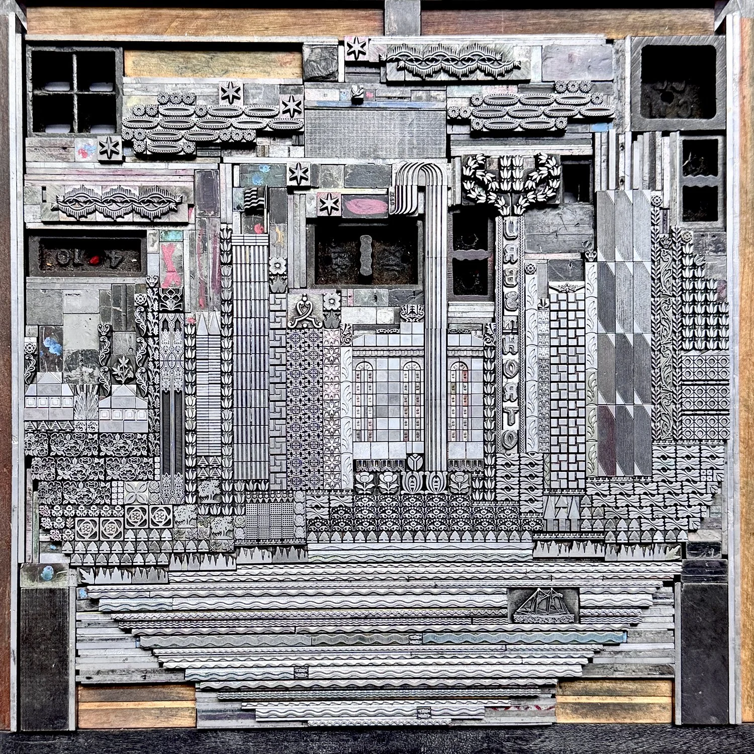
I ran a quick proof of the entire form to make sure the placement was correct and that I was happy with everything. A proof is not perfectly printed, just a reference going forward. It also allowed me to check the circle to aid in the sketch for the linoleum cut.

For each color run, I needed to pull out the non-printing sorts and replace them with spacing material, which holds its place and doesn’t print. I often mark spacing with a paint marker so I know what needs to be swapped out for the next color on a project. And I tried to keep the rough idea of the shape while pulling the ornaments not being printed. It’s not a hard process but is frustrating as type doesn’t like to stand upright on its own.


And here’s the final! I used Fabriano Rosapina paper in two different shades to see how the colors would perform on multiple papers. The new linoleum cut is a little more understated this time, only covering the water areas and the clouds in the sky. Overall, the design is much tighter and more detailed. I’m pleased with my registration this time around. The ‘look how much you’ve improved over time!’ experience was exactly the encouragement I needed. Find the prints here.