Thanks for checking in with the Fourth edition of Extra! Extra!
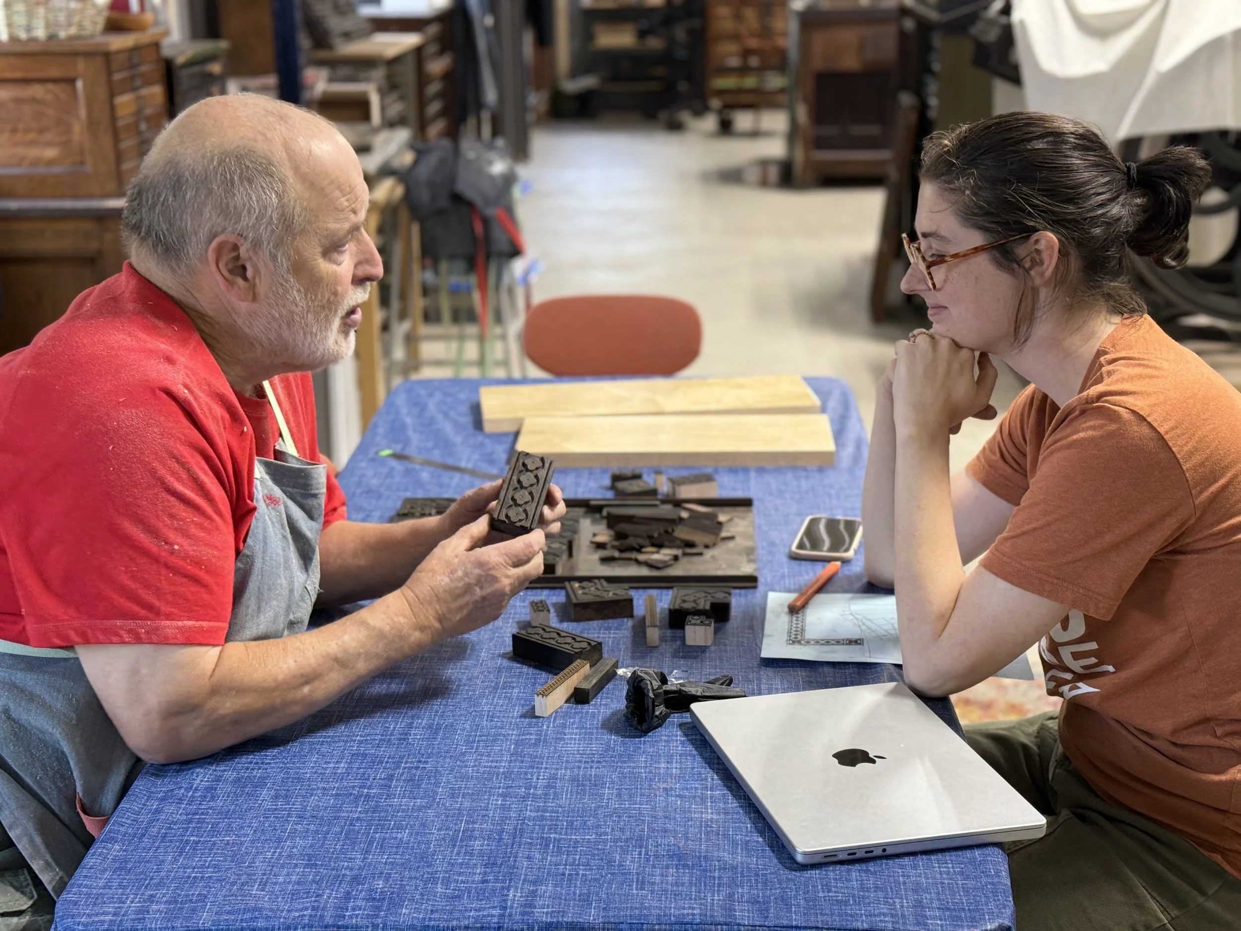
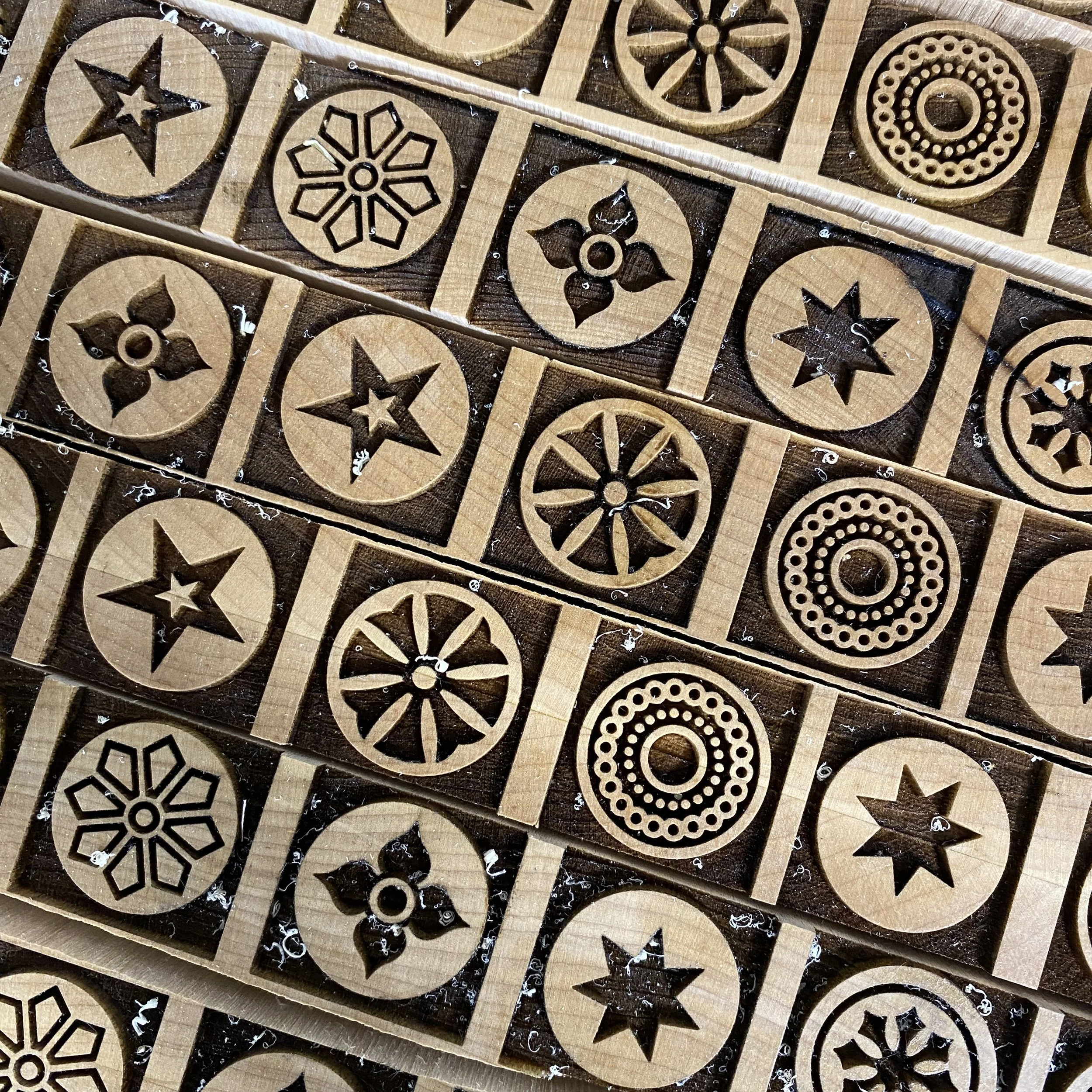
I met Scott Moore many years ago through his daughter, Erin Beckloff, whose film, Pressing On, celebrated the cross-generational relationships formed in the world of letterpress printing. Scott taught himself to make wood type using both the traditional method of pantograph cutting (with the help of former Hamilton employee Norb Brylski) and with a laser cutter. This year, printer/designer and former Starshaped intern, Brea Frey, joined Scott to continue the legacy of wood type production to bring a fresh, new voice to the process.
This wonderful collaboration is a huge boon for printers as it combines Scott’s production expertise and Brea’s spot-on design sensibility. And it’s a win for us printers as we now have a growing catalog of beautiful type to add to our collections. Scott and Brea are a huge part of the community and willingly share their insights as well as historical connections they research to bring ornaments to life.
Check out the NEW Moore Wood Type shop and stock up on your favorites today.
Sometimes I’m asked where I get certain supplies in the shop. I’ve been getting a handful of products from EcoEnclose and am really happy with their options in the realm of packaging. I use their custom stickers on packaging as well as their mailing labels for most orders. The sticker liners are made from 100% post consumer waste and are easily recyclable. EcoEnclose is also one of the friendliest businesses to work with!
If you’re not familiar with The Newberry Library, I’m here to sing its praises! The Newberry Library is a wonderful, closed stack research library that’s open to ALL, not just researchers! I first visited when I was in design school as their collection of print ephemera is incredible, as is the staff that’s happy to help you find what you need.
I’ve developed a wonderful relationship with the Library that goes beyond research. In the past I’ve created both prints and drawings that have been used as fundraisers for the Library.
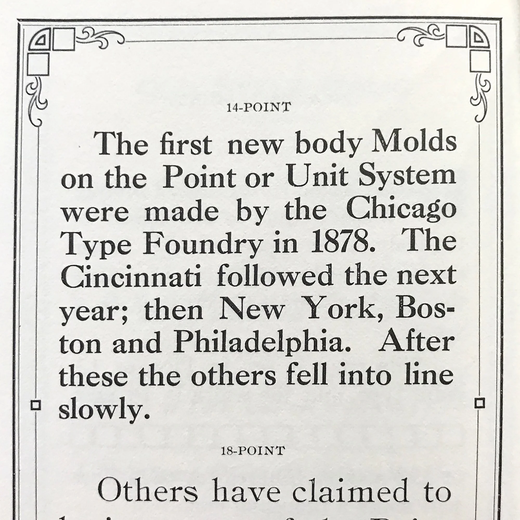
In 2017, I was the Weinberg Fellow for independent research, spending days at the Library looking at historic print specimens and studying Oswald Cooper for this portfolio project. One day, some of my type when to visit the books as well. And yes, Chicago can take credit for the establishment of the point system of measurement for type!
Below are some of Cooper’s sketches for local institutions as well as his eponymous typeface, Cooper Black. The letter is from Richard McArthur from the type foundry Barnhart Bros. & Spindler to Cooper with LOTS of notes on designing display faces for the foundry.
I’ve also been tapped to print multiple broadsides for exhibitions. The Newberry and its stellar book shop work hard to connect with local artisans and vendors to add depth to their shows and collections. It’s always a recommended stop for those wanting to see print in the city.
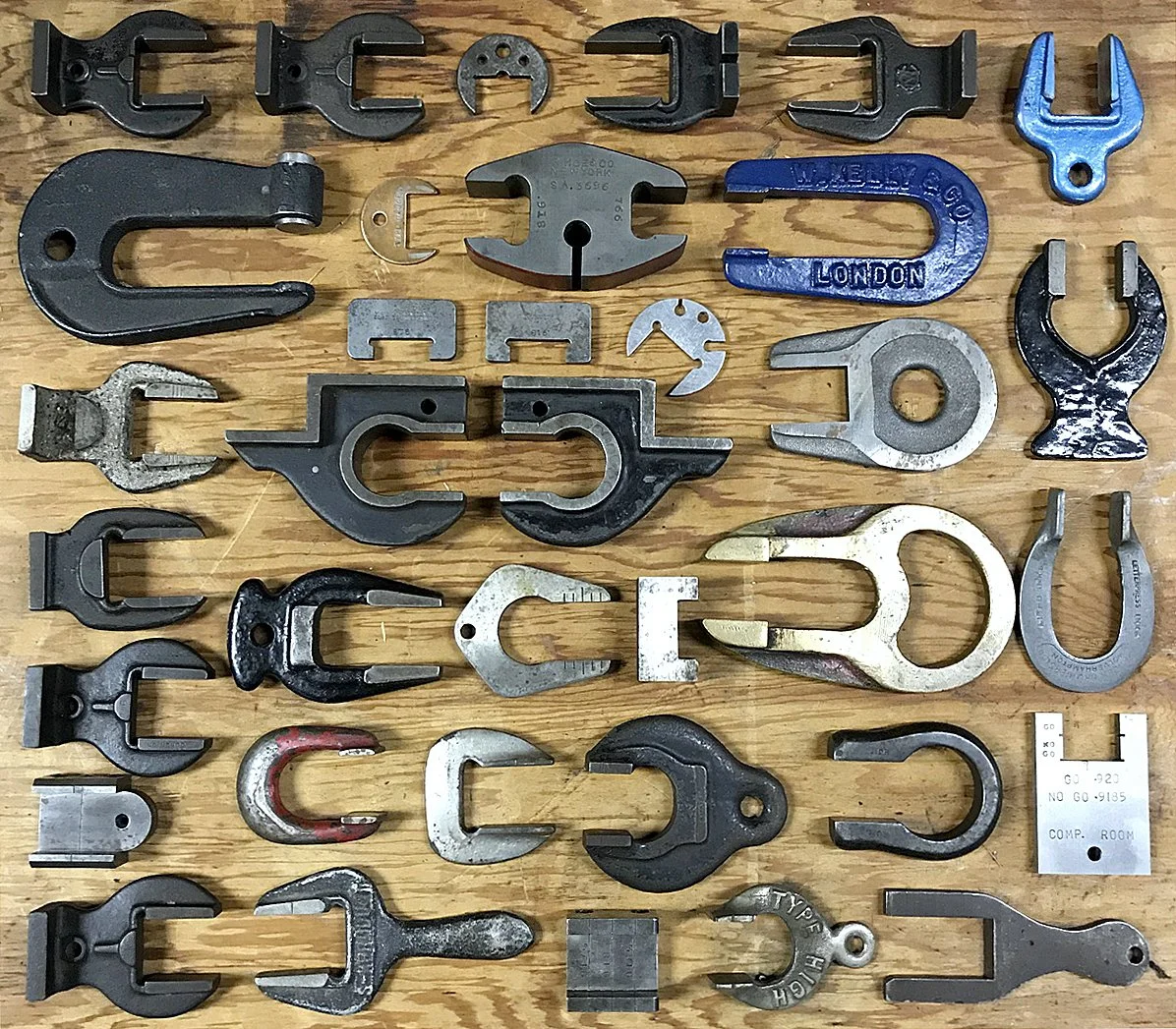
September 18th has long been known as Type High Day for print enthusiasts, as .918” is the height measurement for American metal and wood type. There are many type height gauges and this collection below is from the Platen Press Museum in Zion, Illinois (note: we lost Paul Aken last year and the museum is currently closed while we determine the futures of the collection).
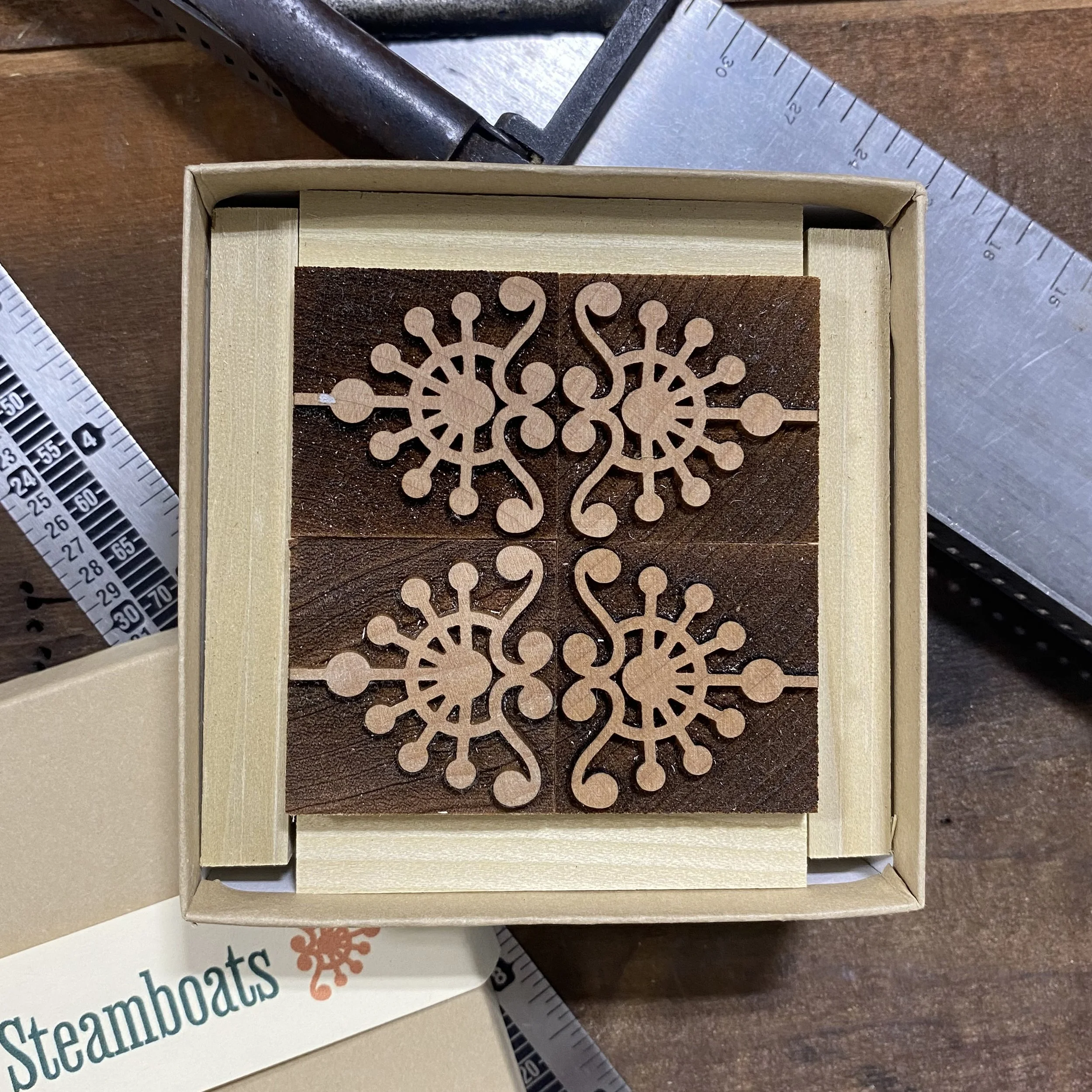
To celebrate the longevity of the Print Club, all members that are in the Club for a year (September to September, to honor Type High Day) receive a Type High Prize. This is an ornament designed by me and produced either in wood or metal. For the wood type projects, I’ve worked with Moore Wood Type and for metal, with Val from Bowerbox Press. I’ve always loved the idea of a little surprise bonus, going back to the days of toys in cereal boxes and flexidisk records in magazines. These designs are fun to do and it’s a chance to collaborate with other makers while thanking subscribers for being in the Print Club.
Two popular floral prints are back in stock. Flower Specimens was printed years ago after acquiring a set of floral ornaments and it’s been popular ever since. This time, I used gorgeous handmade paper from Porridge Papers in Nebraska. Their stock is so wonderfully delicious and they sell to the public so anyone can enjoy it!
Urban Gardening has existed in some form for the last 15 years and in various sizes. This time, the art is reduced to some of the tiniest type in the shop and combined with ‘growing’ linotype slides (the stems).
Both prints are 5x7” and easy to frame.
Flower Specimens is built from beautiful ornamental cuts in the studio and features floral images that don't get a lot of play on a day to day basis.
Printed in dark green on gloriously textured handmade Porridge Papers.
Measures 5x7".
This print is a mini version of our popular Urban Gardening poster and is letterpress printed in 4 colors (orange, watermelon, chartreuse and pale grayish teal) on 100% recycled card stock. It uses all antique metal type and ornaments, as well as a wood type cityscape in the background. Measures 5×7".
Uppercase magazine is one of my favorite things. It’s a beautifully designed publication that even smells good when it arrives. I recently wrote an article on 19th century type, exploring how it was used then and how it applies to studio projects today. There are a number of images shared there and I wanted to reference a few more here, given how delightful the type is.
Both of the below pages from specimen books show a set of ornaments in a collection as well as how to use them to create imagery, borders, etc. The first image is from a Bowne & Co. (NY) book produced in the 80’s that shares the collection as it stood at that time. I love this image as it shows how a handful of really basic square ornaments can create larger pictures.
The second is from a Mackellar, Smiths & Jordan (Philadelphia, no longer extant) and shows a wide variety of options with just one collection. Some of these live in the studio and have been used for many contemporary projects.
These types have been popular for wedding invitations. Here’s a sample of an invite and the type used to print it. You can read more about this project here.
There’s also more to see on this post about our last New Years cards that featured 19th century type.
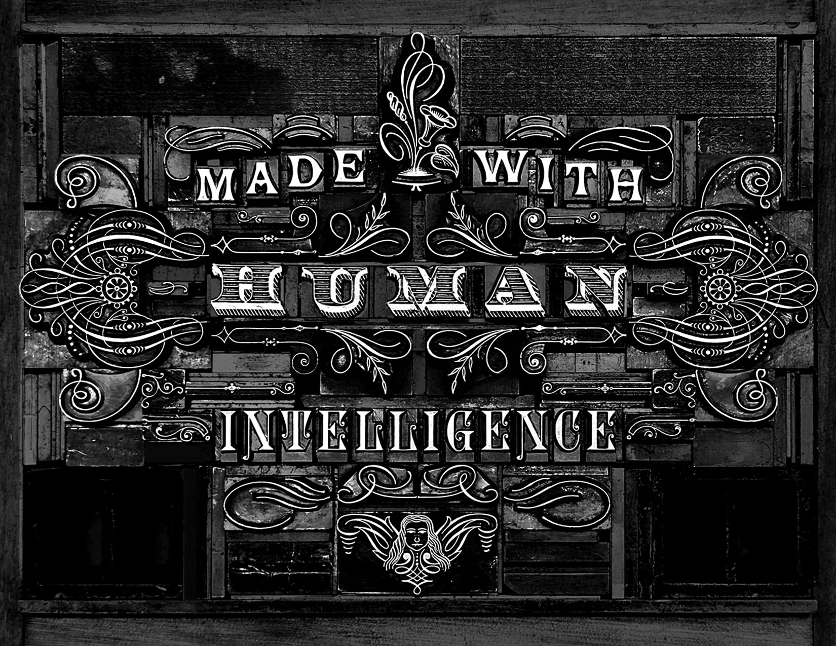
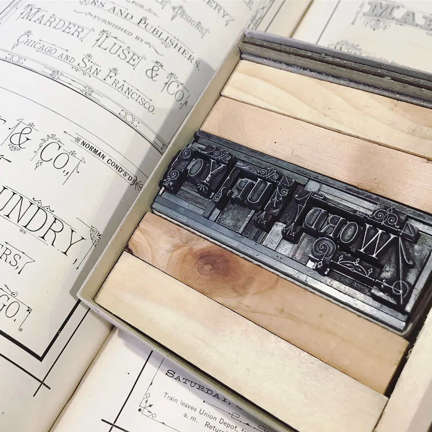
The 19th century type form used for the image of this edition of Extra! Extra! is now in print form. You can find the 7x5” version below.
The form for this print features 19th century type and ornament. It focuses on the beauty of human-made pieces that are 150 years old and the quirks that come with time. We’re also not fans of AI at Starshaped and what it’s stripping from artists… and humanity.
Measures 7×5” and printed on lovely, thick Italian paper. The bottom has a deckled edge so each is unique.

