

Thanks for checking in with the Third edition of Extra! Extra!

Recently, Jo’s favorite teacher was a well-deserving finalist for the Golden Apple Award. That made me think about apples as traditional gifts for teachers and if it’s possible to create one from ornaments. I tried messing around with a few options to create tone with just one color and hit on the below solution.
This apple appears on both the Print Club card for May and this 5x7” print available to all. Perfect for the educators in your life!

This print was inspired by all the wonderful, hard-working teachers in our lives. It’s an apple built from different metal type ornaments to create shading. It recalls the patterns of cross stitching as well. Measures 5×7” and is printed on heavy cotton cardstock.
A card version is part of the May Print Club.

At the end of 2023, I began the Free the Books project to encourage printers to use their press power to fight book bans. After taking a year hiatus to focus on Jo’s health, Free the Books is back, starting with a reprint of this poster that sold out quickly when first printed. More are on the way.
Read more about the project and download the pdf that is a starter for getting involved in your local community. Now that libraries are under attack and funding is disappearing overnight, the work is far from done. I love to share printer projects with the Free the Books email list, so if you’re a printer creating work around this subject, please reach out.


I subscribe to a handful of monthly series by different printers around the country because I love getting mail and supporting others in my field. One of these is Dan Wood’s Linotype Daily project, which I’ll let him explain:
For the past 6 years, I have been working on a letterpress printing and typecasting project called The Linotype Daily, using the machine that began the third printing/information revolution at the end of the 19th century (after Korean moveable type, and Gutenberg’s press) to sort through our current state of media overload. For 366 days beginning March 1st, 2019 (it was a leap year) I wrote, cast in hot metal type, printed, and published a new letterpress print each day. The project is not purely an art/printmaking project, not purely political commentary or personal diary, and not purely an Instagram feed, but functions simultaneously as all three, blurring the lines between them and making the work more accessible to the varied populations it reaches. It became a commentary on our own oversaturated Information Age using the very machine that started it all, in what once seemed blazingly fast but is now a painfully slow process– a pause, perhaps, to gain some insight one might otherwise miss. The project continues as The Linotype Occasionally, releasing 2-6 prints per month, with paper and digital subscribers. As a printer, aware of the hugely important social history and impact of printing, I hope to create contemporary work in a format that is relatable to the public, honest, and which can transcend and perhaps change our preconceptions of whatever the subject at hand.

Watch Dan in action!
Enjoy some snippets of projects below:


One of my favorite bits of Dan’s missives is the addendums at the bottom that often include personal anecdotes:

You can support Dan, too! Check out his site for all of the different ways to help him keep the project going.

Rules are the metal strip material used for printing lines in letterpress work. With the encroachment of lithography on printing trades in the late 1800s, letterpress printers pushed the envelope with what could be created with a very angular art form. This is when we see the advent of rule benders and other fabulous pieces of equipment. There are two rule benders in the shop, shown below. Both offer the torque needed to curve thicker rules for printing or for the spacing needed around elaborate forms.

The smaller one has a series of brass curves that can separate in order to place the piece you want to bend. Then it closes and a hand crank gently bends it.


The second, and more useful for work in the shop, involves sliding the piece in between two rollers and then adjusting the tightness of their contact to get the curvature you desire.


Some thin leads can be bent by hand or pliers but I like to start with the rule benders for a more consistent curve. I’ve set dozens of projects using curves, including this one meant to resemble a wave.


I’ve known Geri McCormick for…ever? Which is the general feeling when you meet someone who shares your passionate approach to craft and you know you want them in your life. Geri is the woman behind Virgin Wood Type, one of the very few places to get wood type made in traditional ways with a pantograph. From Geri:
I fell in love with wood type about twenty years ago after twenty years of designing on a computer. I reconnected with letterpress. It felt good to use my hands to set type. Especially the old wood type. The fanciful and sometime quirky letter forms of the Victorian era became my new fascination. The old wood type is quite rare and so I looked for a way to make wood type. My husband Bill and I came upon an opportunity to acquire wood type making equipment, and started Virgin Wood Type. The rest is history.


Starshaped has a LOT of beautiful type from Geri and her team, including a few full fonts and many ornaments. It’s such a gift to have pristine, new type in the shop that prints correctly and doesn’t involve much makeready time to prepare it (common with old type).


Back in 2017, I had the pleasure of collaborating with Geri to create two sets of ornaments named Ida and Lucy. I wrote in detail about the project here.
These sets are still available for all printers to purchase. Long live wood type!


For many years, I was a member of the Amalgamated Printers Association, a group dedicated to preserving and sharing print work with fellow members. One of my absolute favorite things that often appeared in the monthly mailed bundles was collections of index cards printed by David Greer showcasing 19th century gems from his collection. I saved them all as a reference in the shop as the original specimen books are difficult (and costly) to come by. This is an easy way to reference the past and discover what ornaments are part of a combination border. I loved when David would update cards in red with missing pieces found that complete the set.


I wrote more about working with 19th century type in this post about our annual New Years cards. They are notoriously difficult to work with, but having David’s cards helps me understand how the pieces are meant to go together.

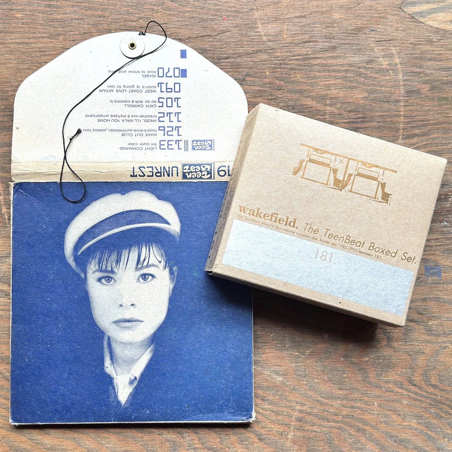
I come to printing by way of design work for 90s bands that embraced DIY aesthetics, using hands-on tech to spread messages. My first printing job was at Fireproof Press, producing thousands of CD and record sleeves for bands, as well as other quirky ephemera for independent adventures in social events and publishing. Some of this work followed me after Fireproof closed and I’ve had the pleasure to consistently print for many of the people that got me where I am today.
Two of those folks are the bands Ida and Tsunami, who toured together this spring in support of new box sets released by Chicago’s own Numero Group. The women behind Tsunami ran Simple Machines Records and put out a guide to openly share knowledge about how to do just that. This pamphlet is one of my most prized possessions as the principles of collaboration, community and indie spirit helped me start a print shop.

The posters combined some of the oldest wood type in the shop with some of the newest (from Virgin!) and were printed in three colors. I love to see this mashup of type with varying patinas based on age and use.
It’s a pleasure to have been a small part of this tour and work with people I love not just for their talent but their relentless efforts to create a better world.


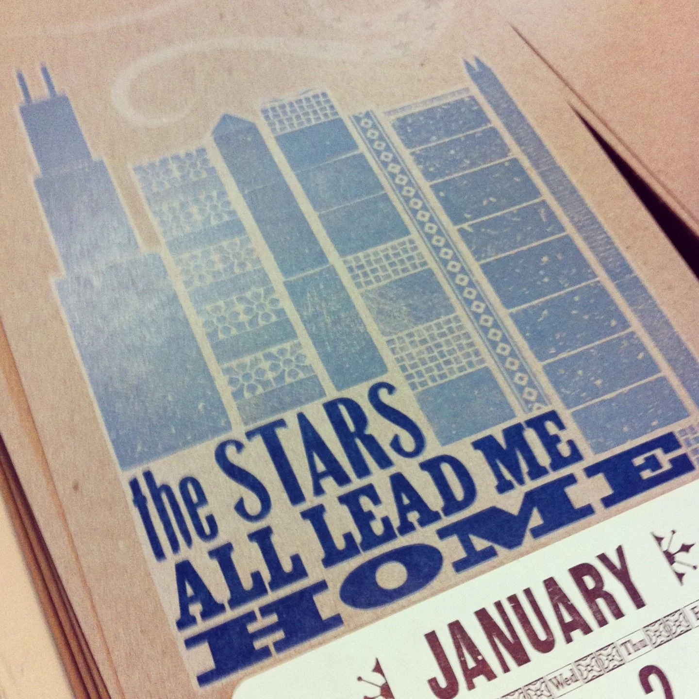
I like to photograph the Print Club postcards in sets every six months as the result is satisfying. The chipboard postcards are always my favorite thing to print for the club as they are humble while presenting the opportunity to create a tiny piece of art that can be kept or sent to a friend. Remaining postcards are available here.


Back in 2014, I created an alphabet of ornaments. These letterforms served a number of purposes, including forming this book. Only a handful of these cards are left in the shop. Grab ‘em while you can!
































Quisque iaculis facilisis lacinia. Mauris euismod pellentesque tellus sit amet mollis.