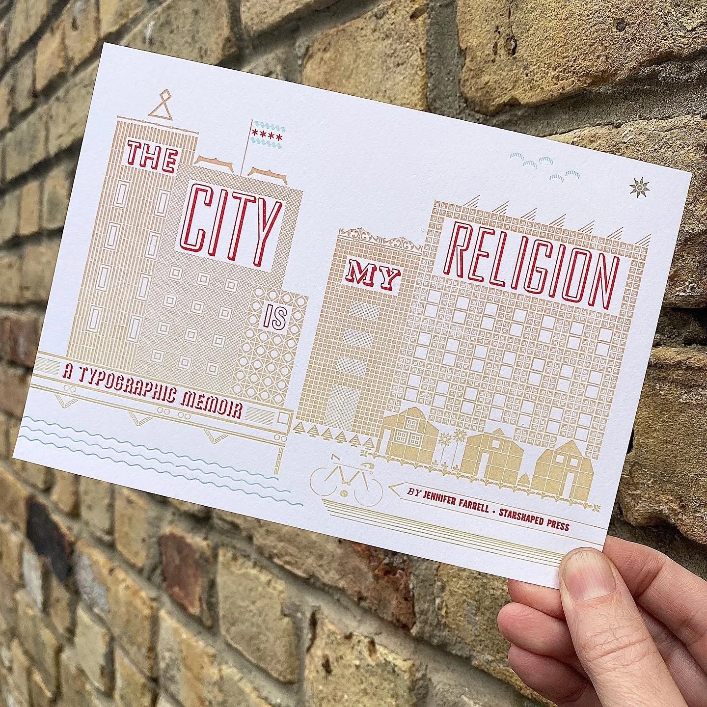
In 2020, I debuted the portfolio project The City Is My Religion at the New York Fine Press Book Fair, a week before that venerable city shut down. It was the culmination of years of research, writing, design, typesetting, printing, and eventually binding that spanned the massive life changes around the death of a spouse, a house fire, a sick kid and more.
The anchor print for this series was, at the time, the hardest thing I’d ever designed, set and printed. The idea was to create a church-like structure that was made up of Chicago locations meaningful to me. The auxiliary portfolio included a ‘draft’ that identified these structures.
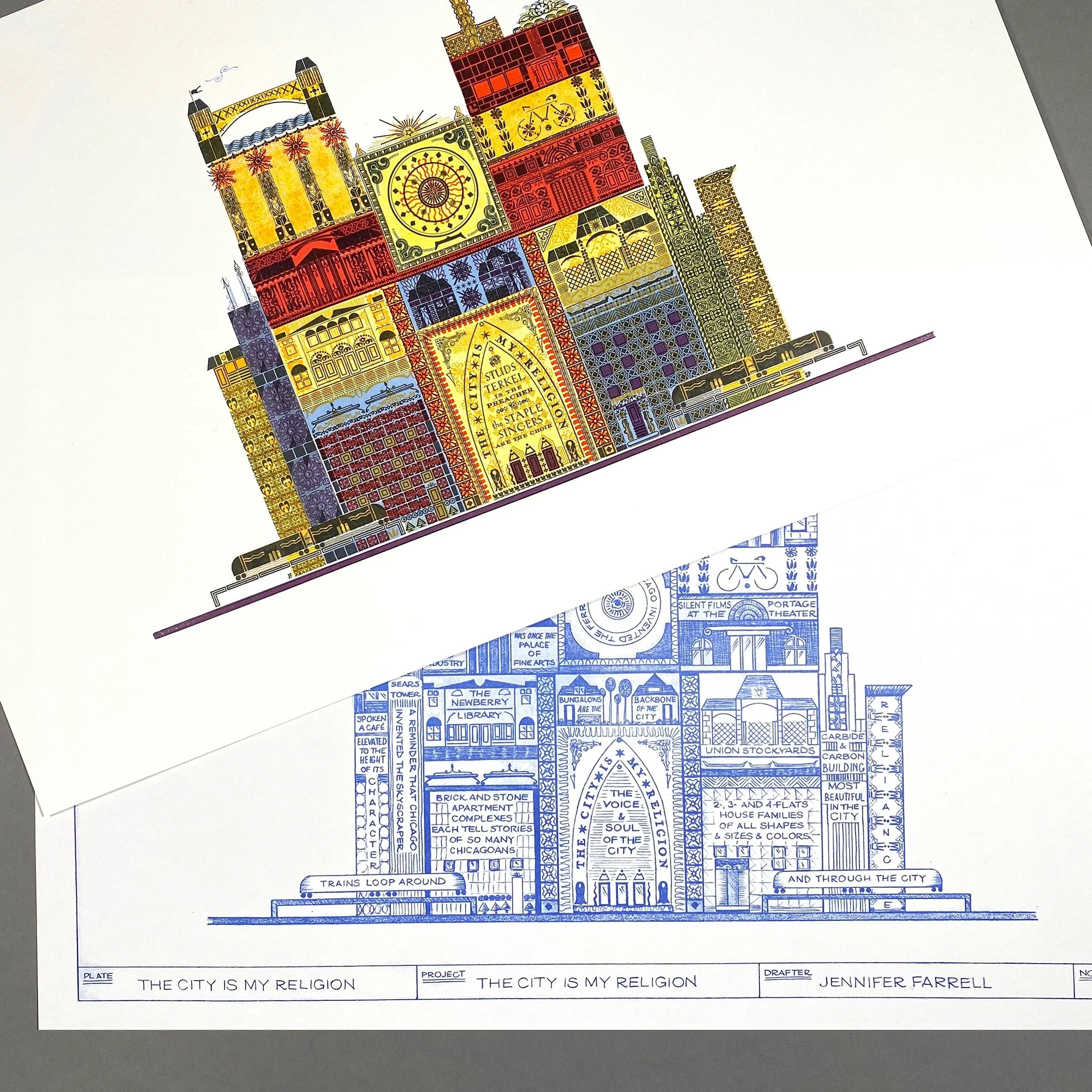
Apart from the portfolio sets in the edition of 40, a handful of extras remained, which quickly sold. Folks seemed to be drawn to it, even if some of the locations were incredibly personal to me.
So I thought this would be the year to attempt a reprint. I rarely do this, though to my relief, they get easier over time. I hope is a testament to improvements in my printing. I’m better at registration and building tighter forms. And I’m using higher quality paper that better holds the detail of the ornaments.
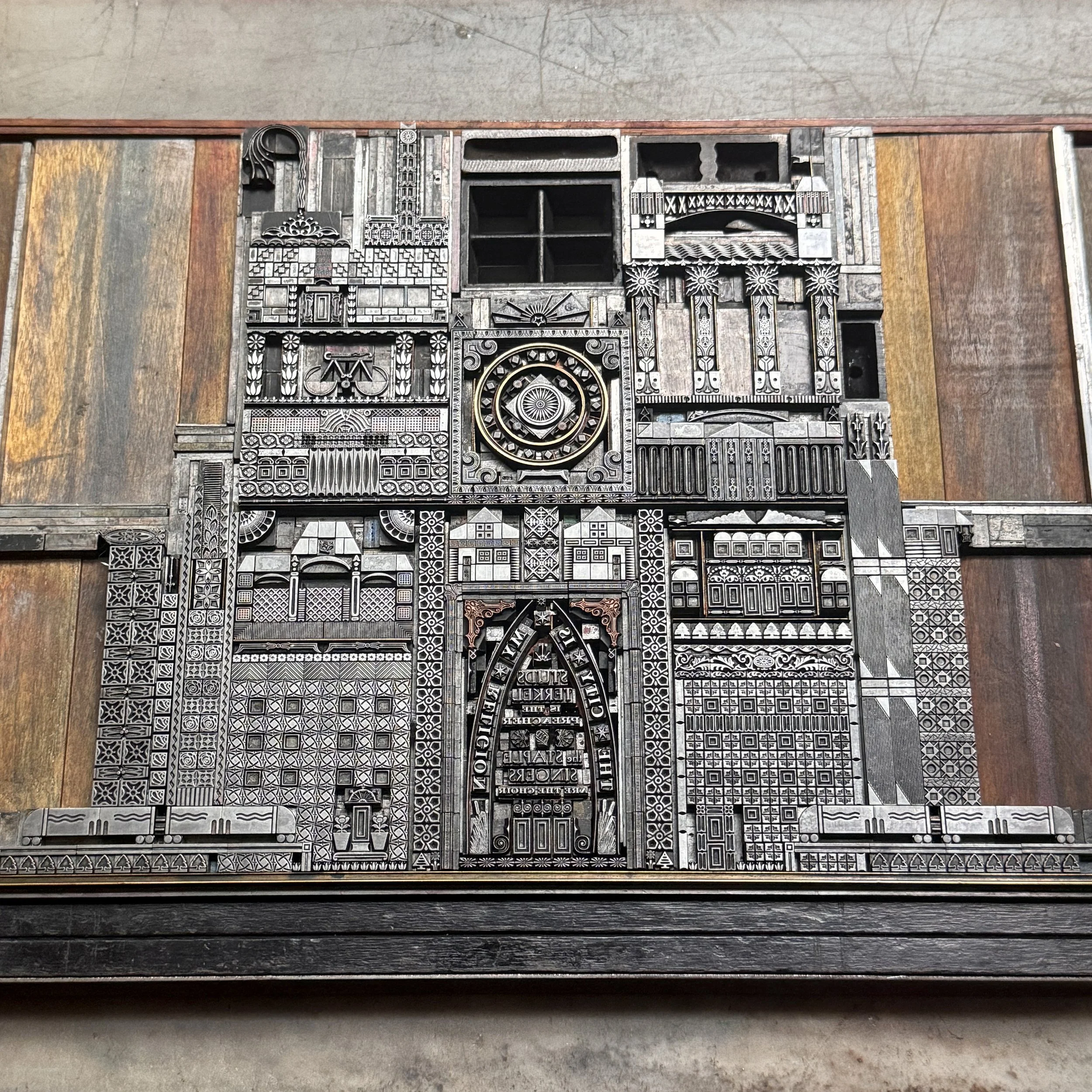
This form is a doozy, though, and didn’t get much easier with time and experience. I made some alterations to get the math to math, as the kids say, and to include ornaments that have arrived in the 10 years since I first printed it. I was also frustrated the first time around with how some of the colors overlapped (or didn’t) and wanted to tighten up the layers for a cleaner effect.
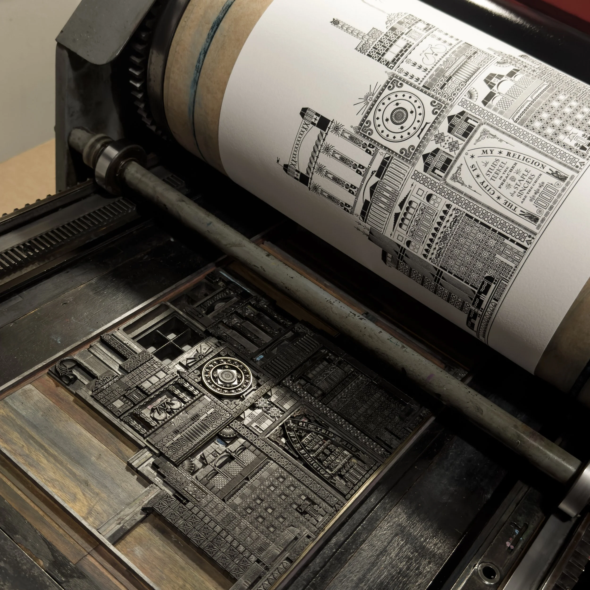
The black color was laid down first as none of the colors coming after would compete with its opacity. It’s also a chance to square up and fix layout problems in an attempt to keep it as uniform as possible. Of course many of these ornaments have seen the ravages of time; some do not print quite as well as they should and some are worn, printing just a little lighter than their neighbors. This is a hazard of the trade when you collect pieces that span 150 years of typecasting. I expect that nothing will ever be perfect, but I work to get them printing as well as they’re able. I agree with Jessica Spring that metal types should be awarded grace the same way that their wood cousins are.
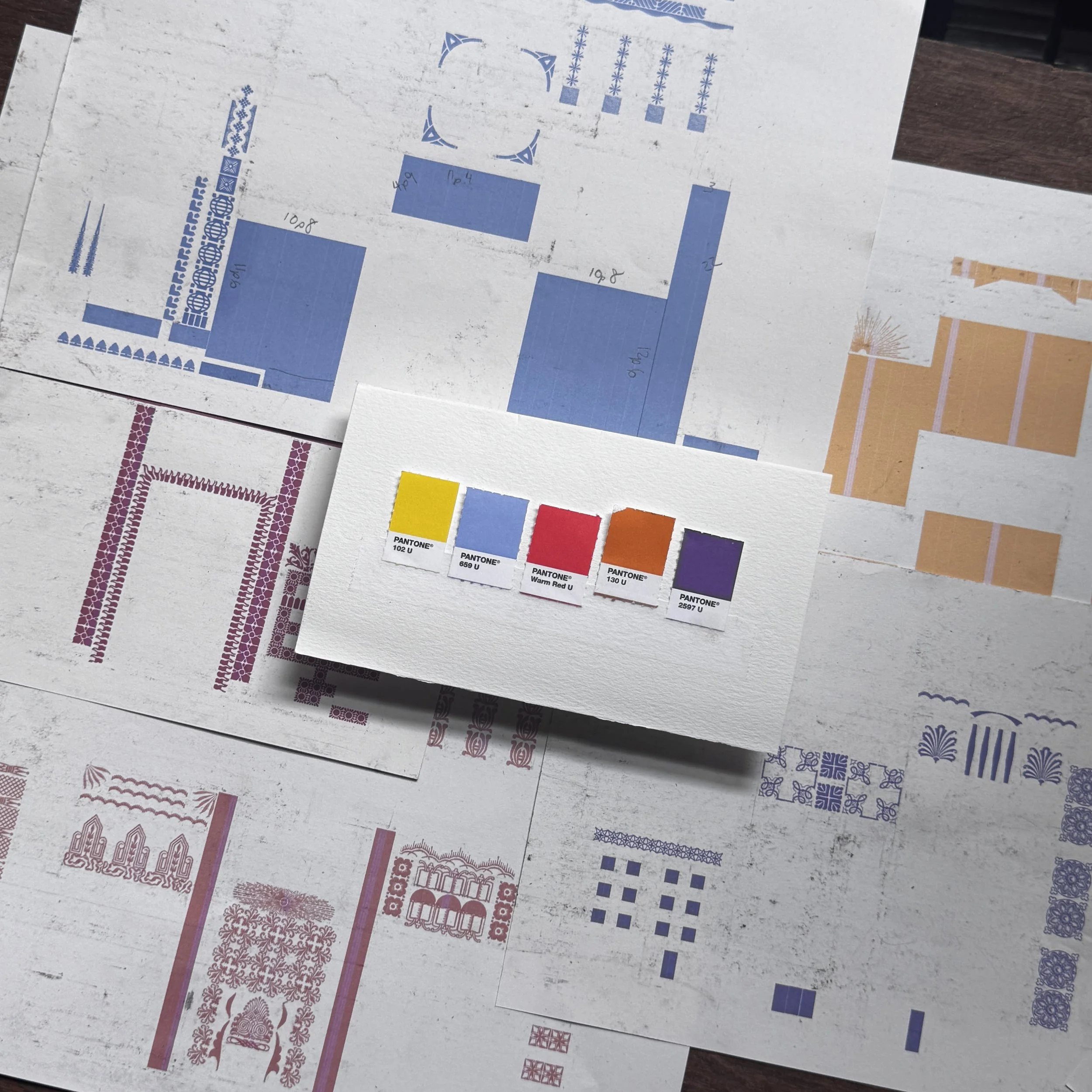
The color inspiration is meant to draw from stained glass, overlapping to create additional colors, as if the sun is hitting it. After printing the black, I scanned a print so that I could build out the colors digitally using scans of my ornament collection. This makes the layer separations a little easier and I can build forms directly on top of them, hence the dirty prints above.
Setting these forms was very complex because there are 5 different ones. Usually in a multi-colored print, I attempt to build one form that has all of the colors in it (like this one), then pull out whatever color isn’t on press at the moment and replace the ornaments with spacing. This keeps the registration tight across multiple colors. In this case that’s not possible, so each color is set with high hopes and then adjusted on press. Many of the solid shapes are either wood type scraps or linoleum blocks.
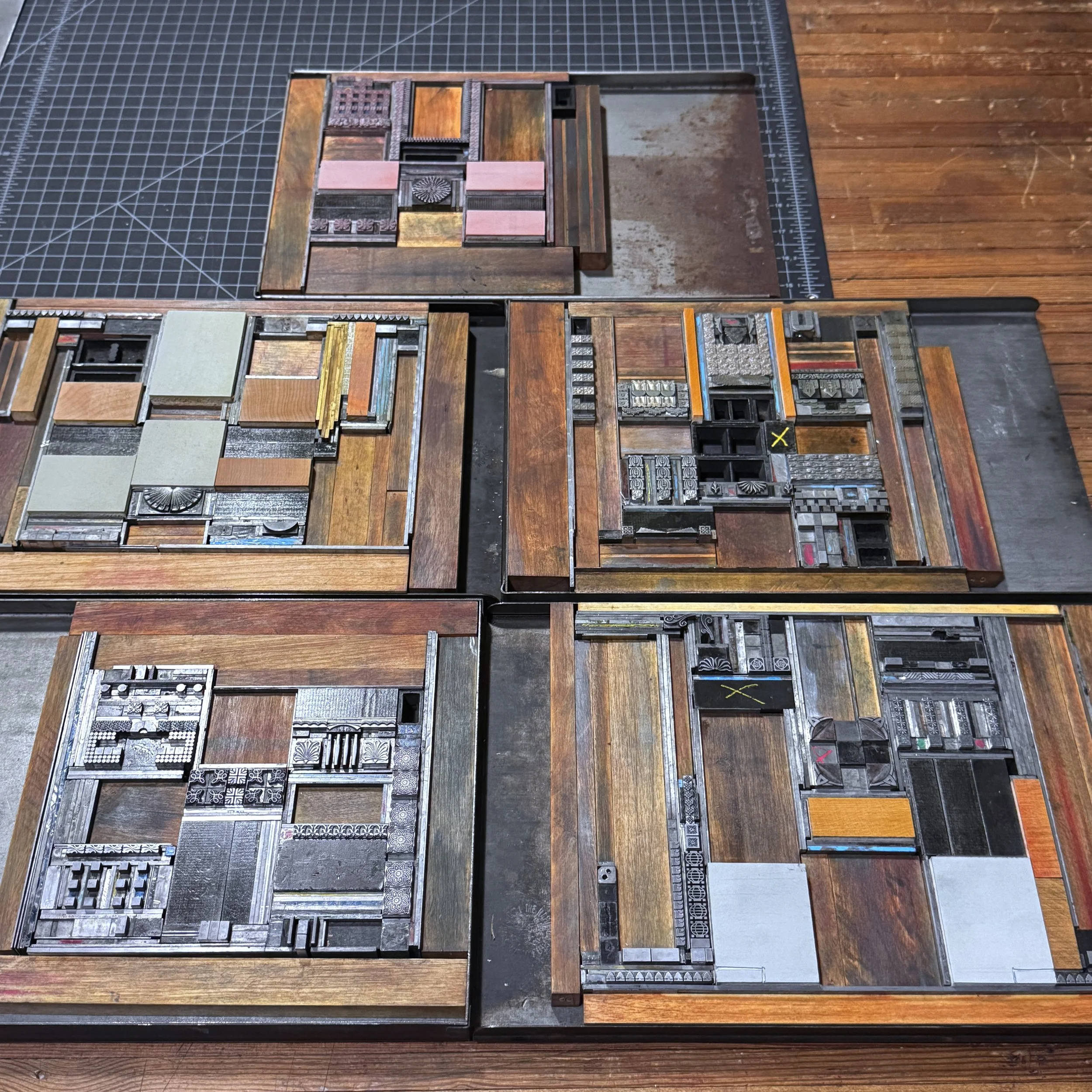
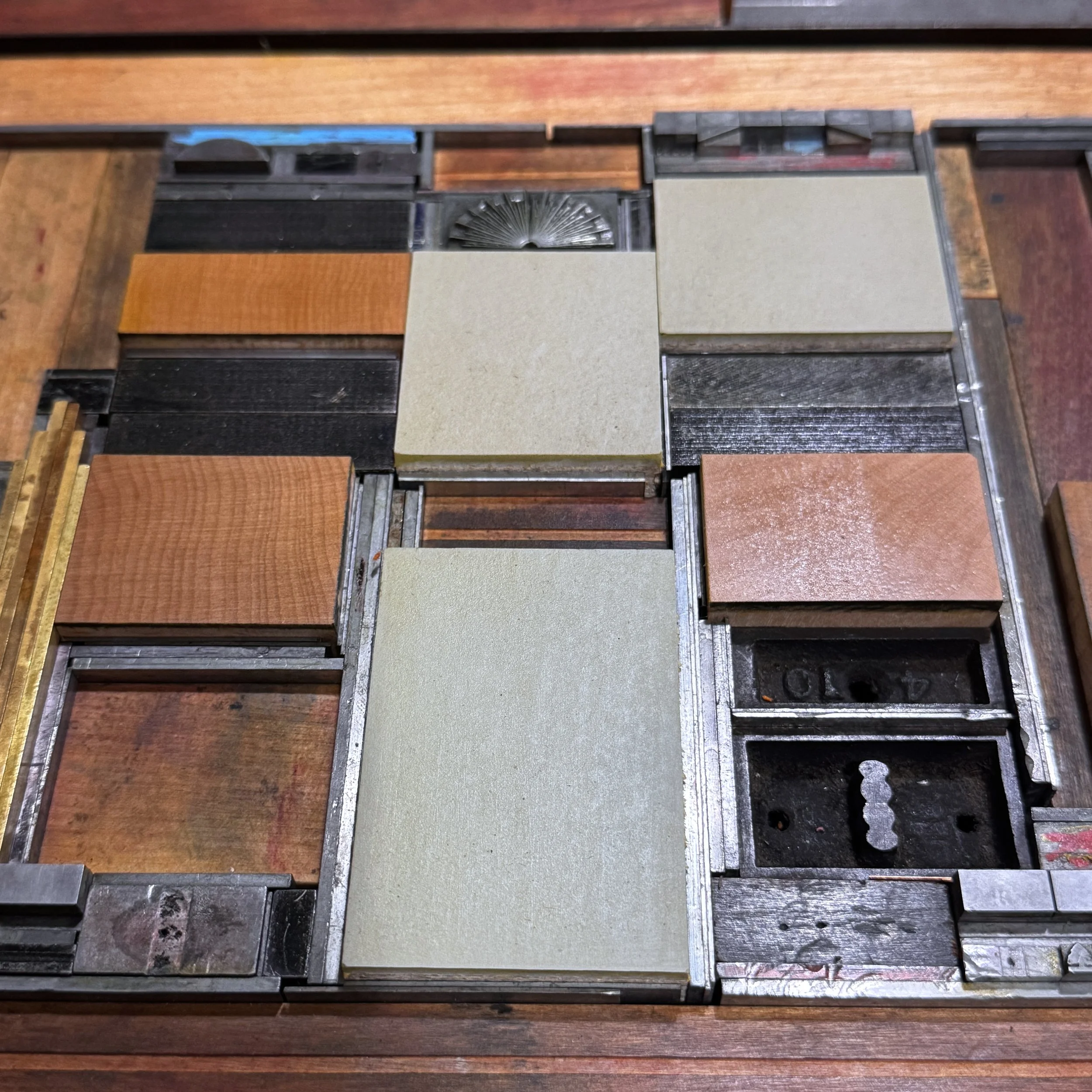
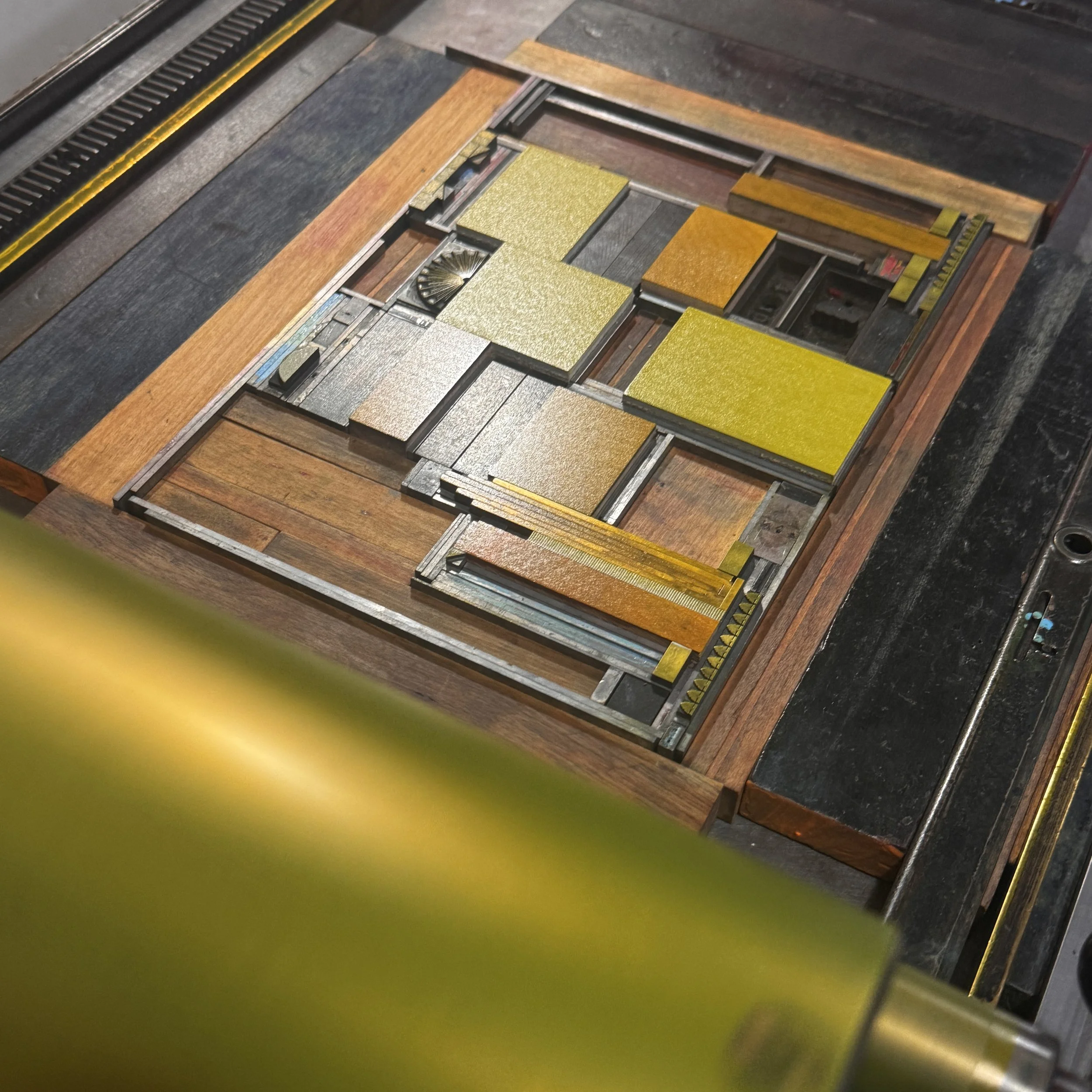
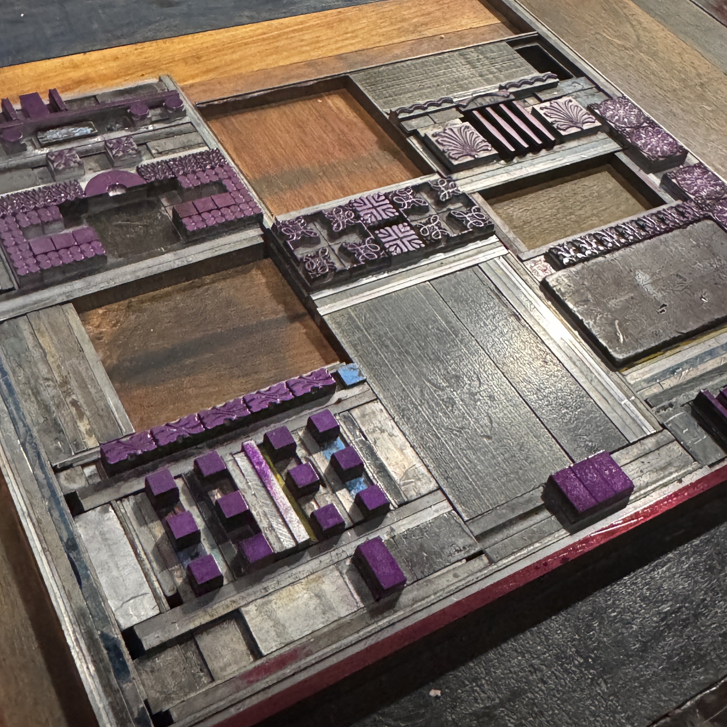
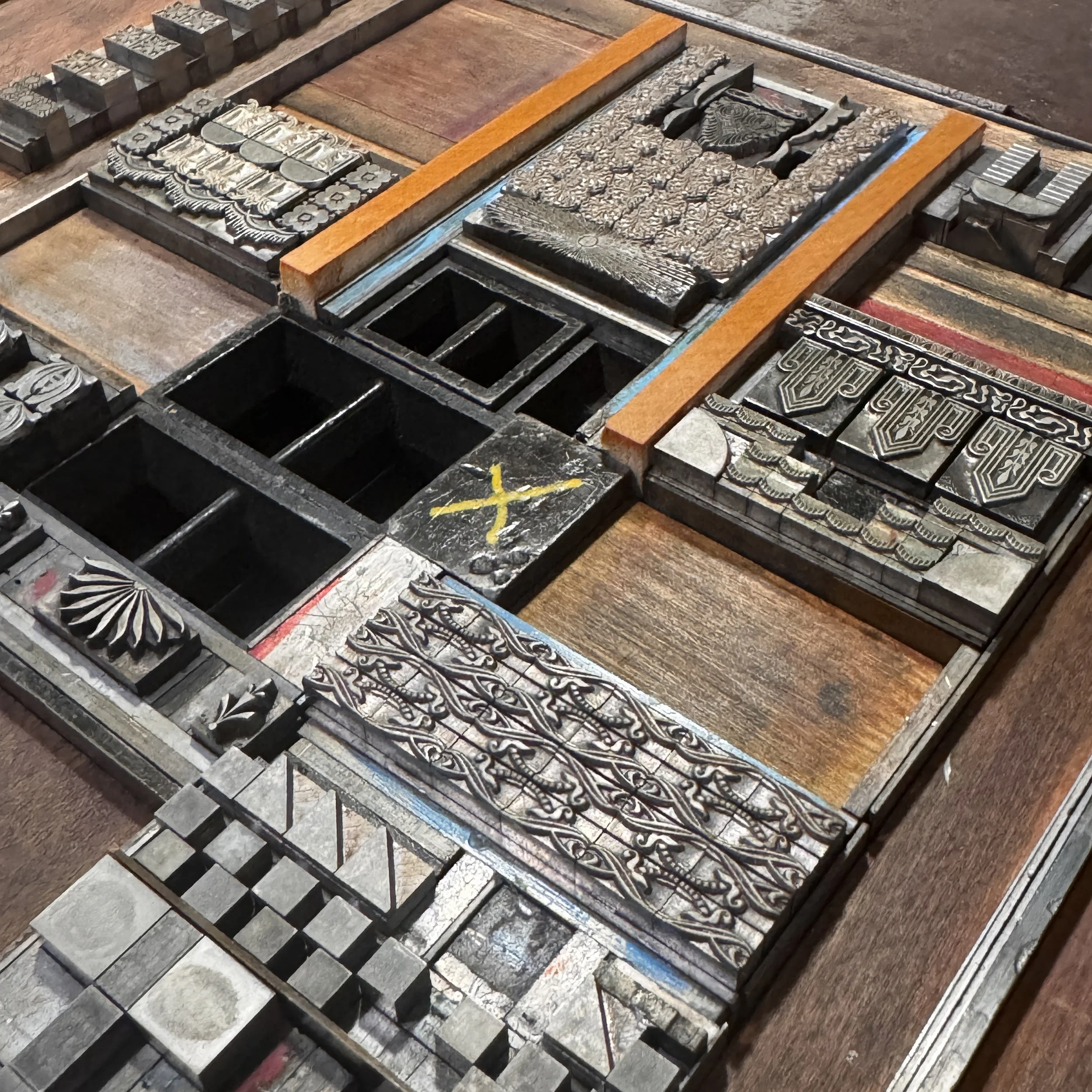
I started with yellow as it was the lightest and had the most solid color blocks. Then I moved to blue so the yellow/blue combo to create green could be tested. Then red, orange and purple followed.
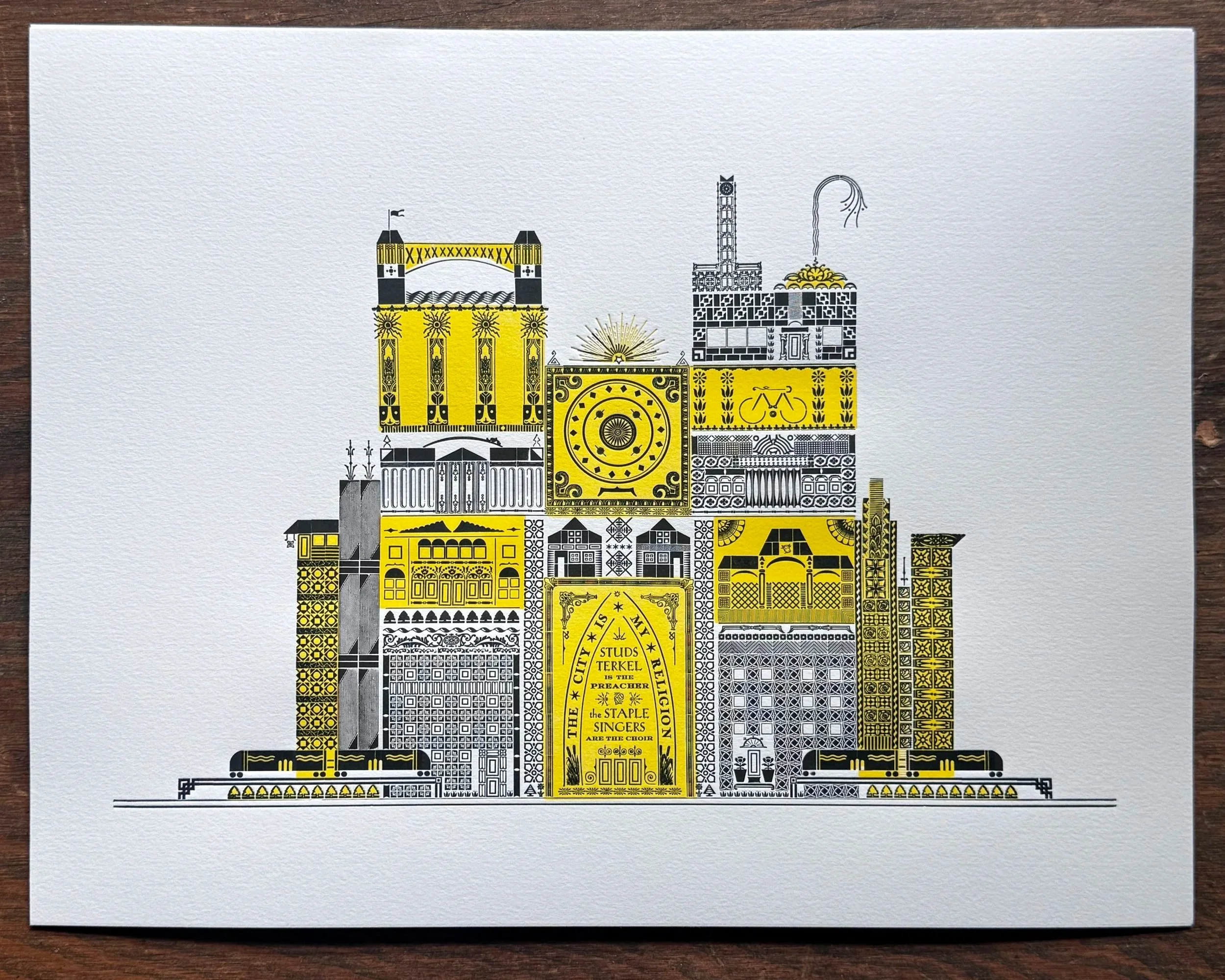
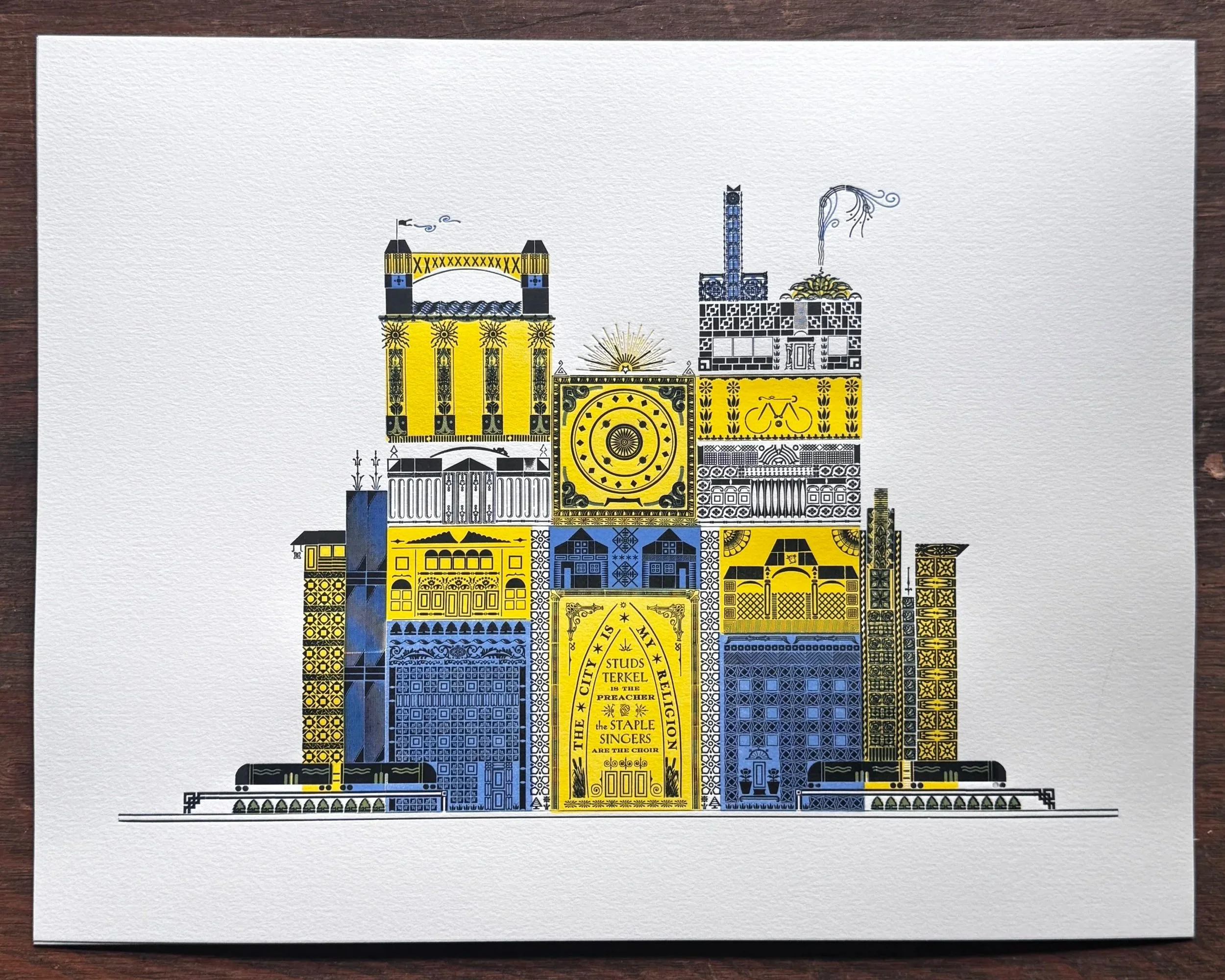
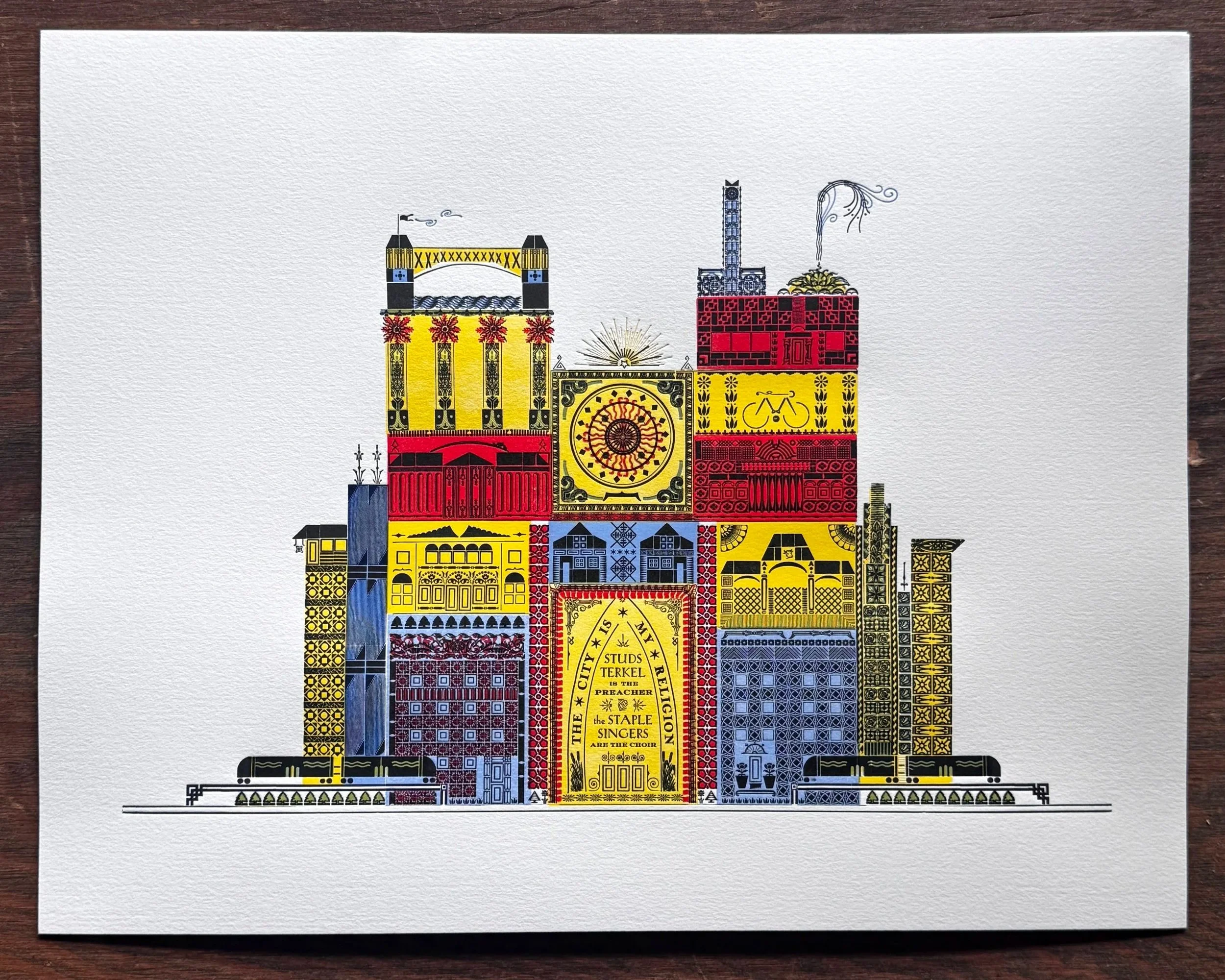
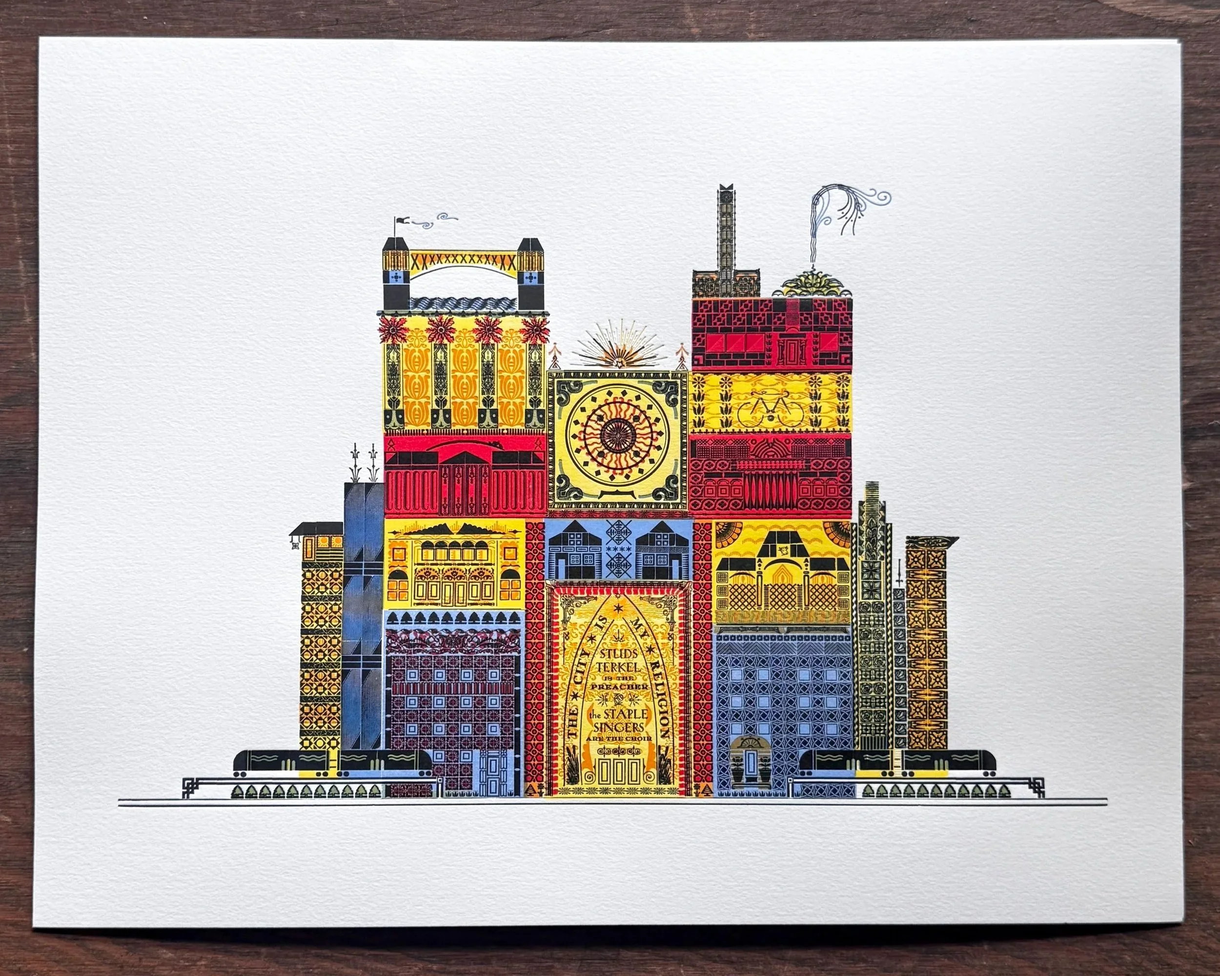
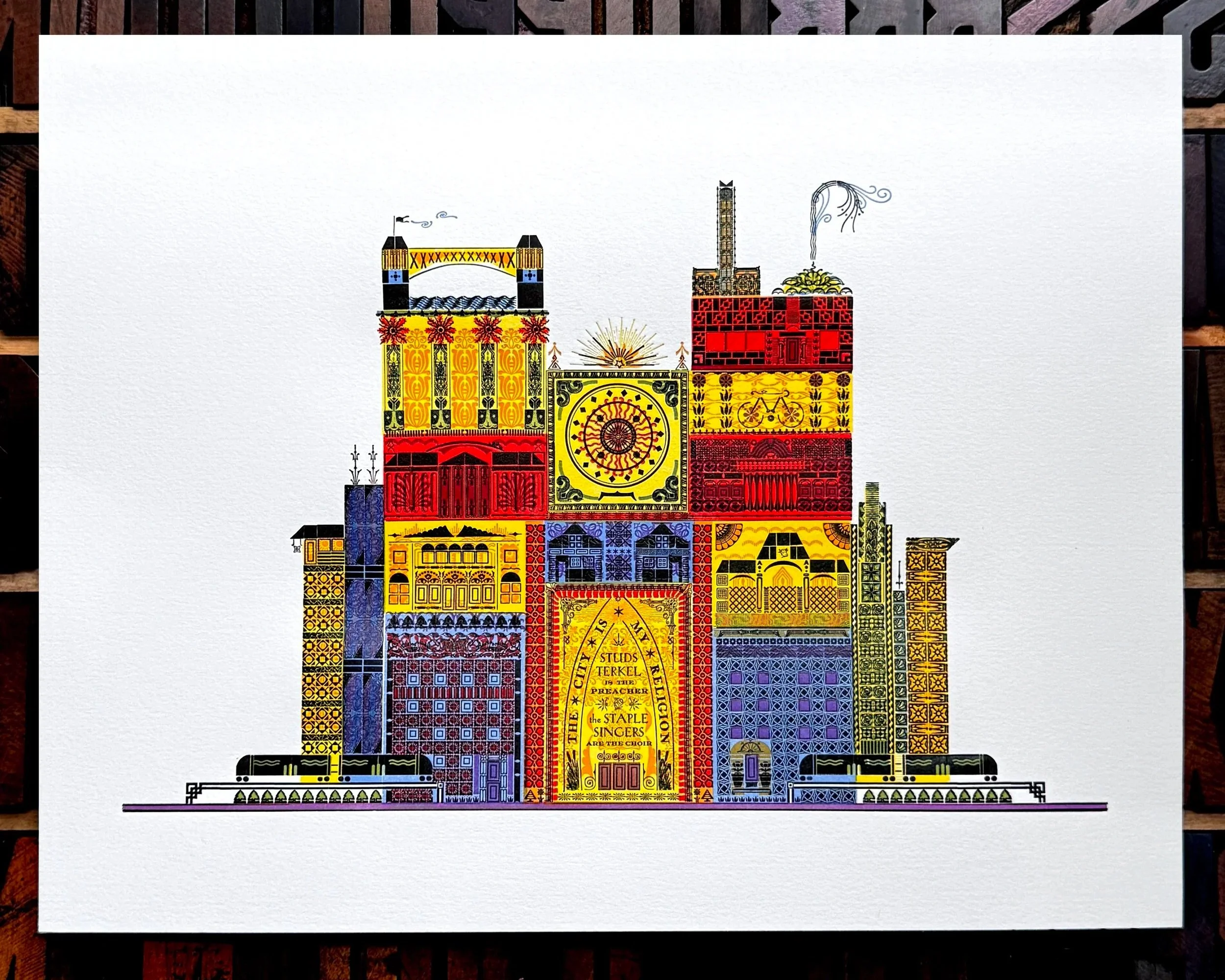
I’ve been using Fabriano’s Rosaspina paper quite a lot these days, as I love how it holds the ornaments and color so vibrantly. These tried-and-true papers are still the workhorses needed in a shop that champions type. I’ve discovered that most commercial papers made today targeting letterpress printers are designed for polymer plates and not metal/wood type.
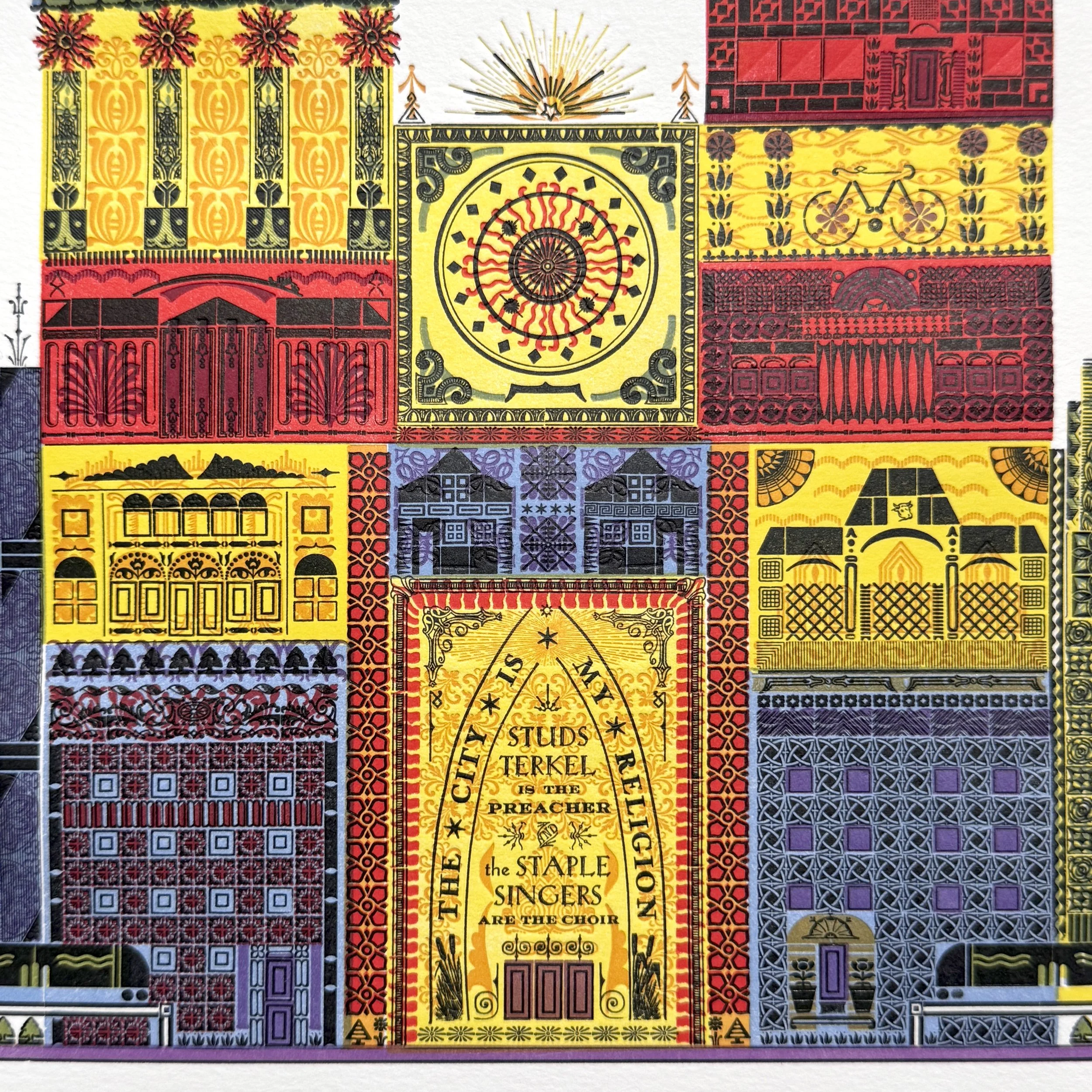
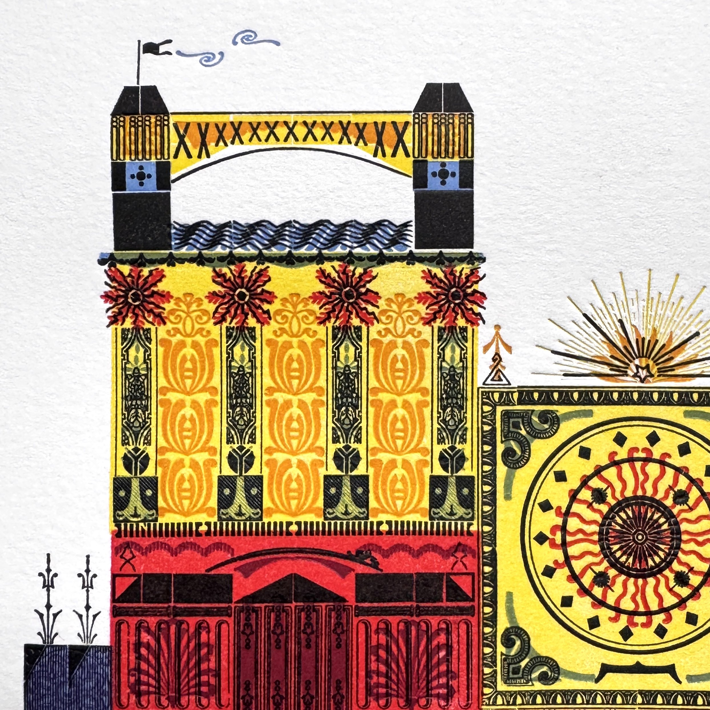
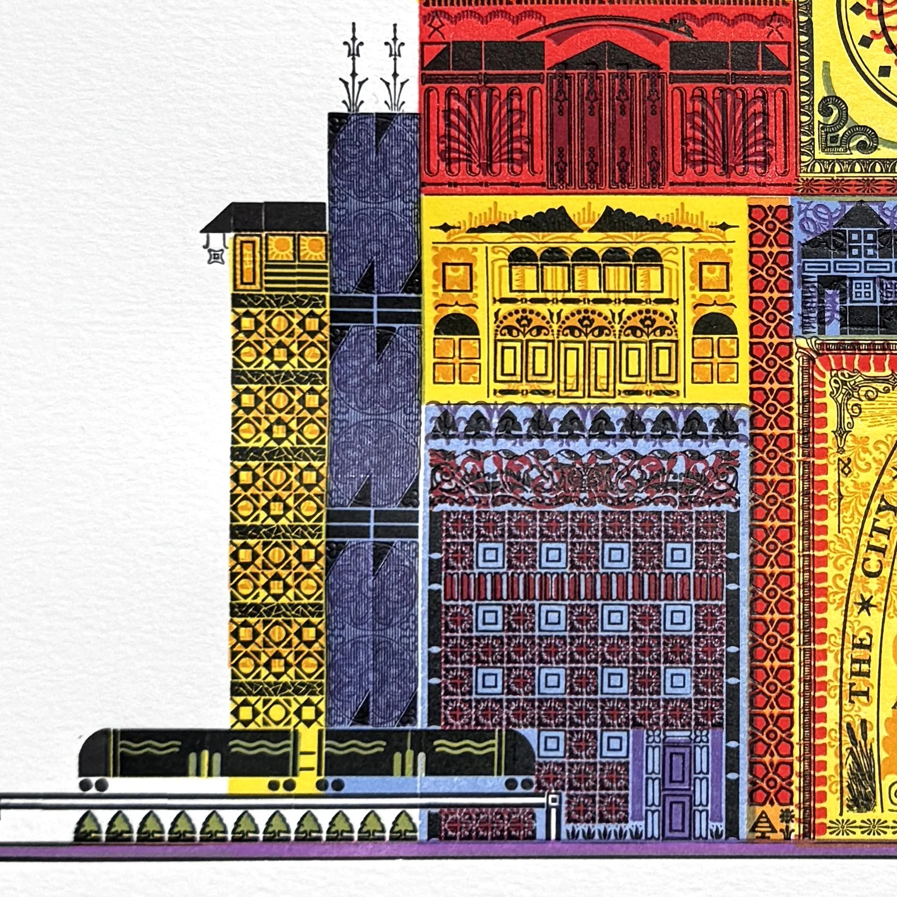
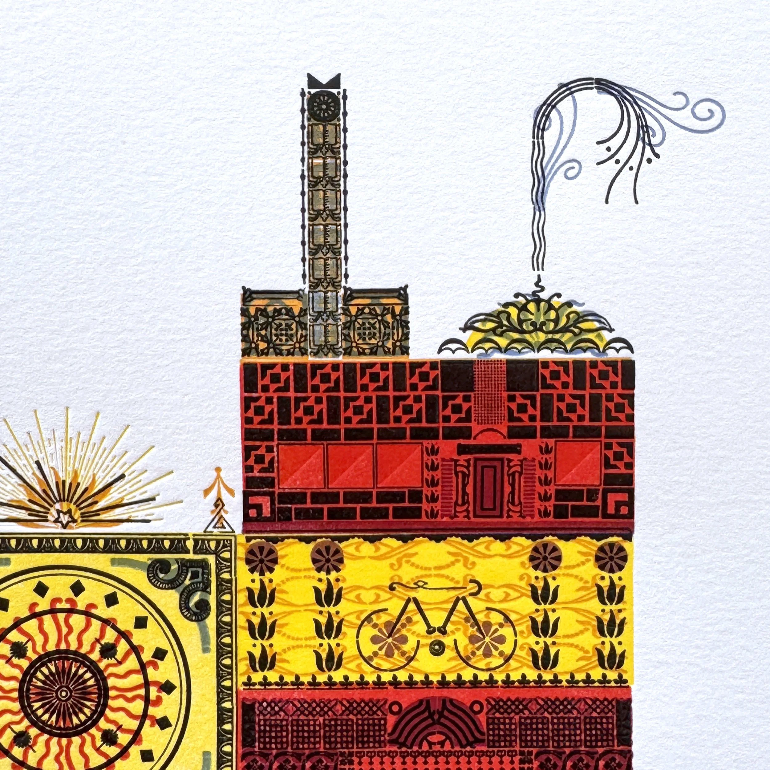
The photos don’t really do it justice (yes, ‘better camera for flat lay photography’ is on my shopping list this year). The paper has also been impacted by layers of print and has altered as a result. It’s almost a metaphor for how repeated actions mold and change us, the way my own life has changed in the 10 years since I first pulled type for this print. But the mission is still the same. The print celebrates the structural environment of the city I love and how it creates space for all who live here.
You can find it here.
The main form for the print will be available to see at Open House Chicago, October 17-18, 2026. Then it will be distributed back into the cases so the ornaments can used for future projects.
