
Thanks for checking in with the Fifth edition of Extra! Extra!

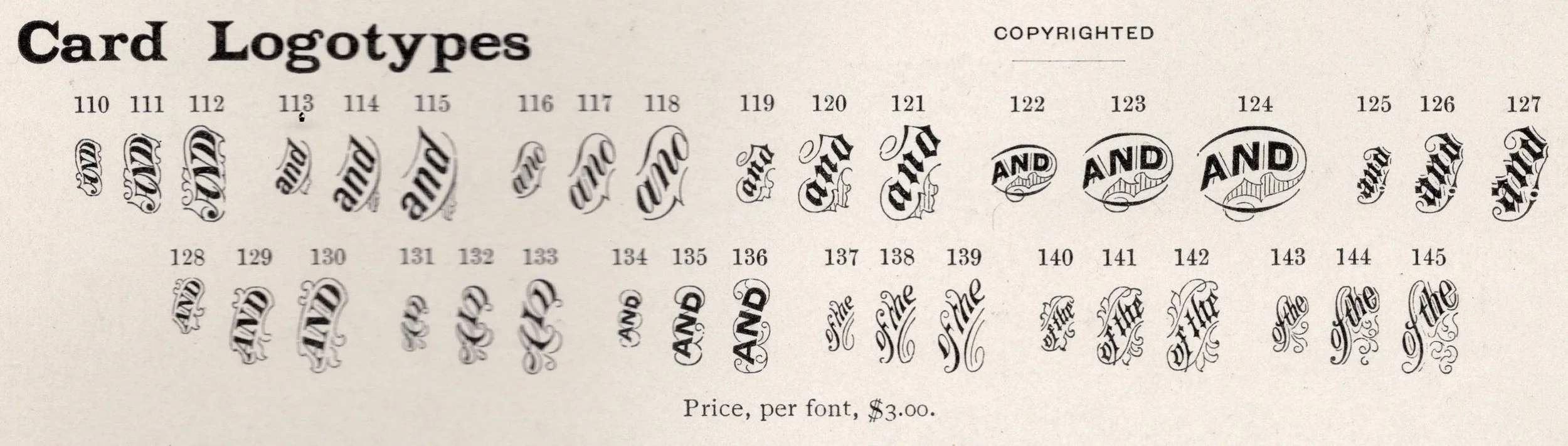
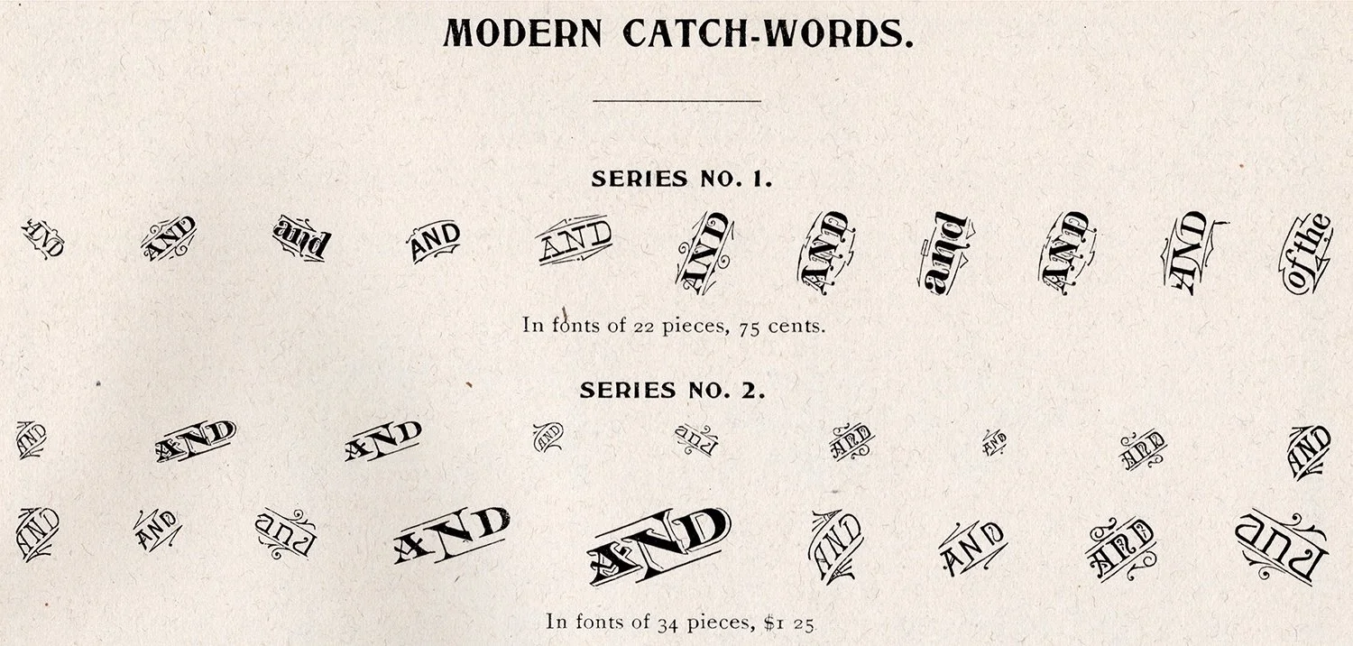
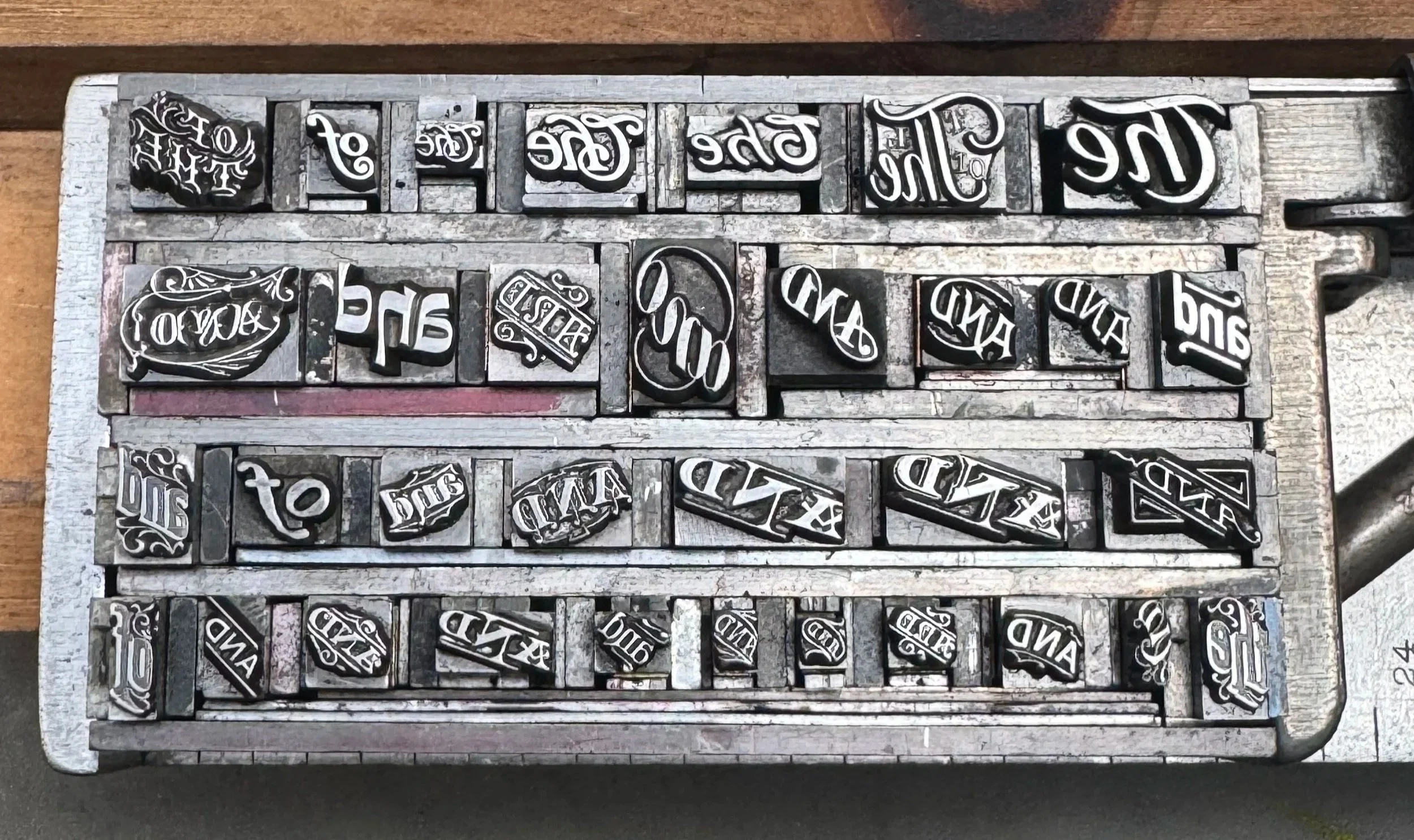
Catchwords are those delightful single-word cuts that are popular even today. For letterpress printers, these commonly take the form of ‘and’ and ‘the’ and ‘of the’. These are followed by ‘office of’ and ‘bought of’ and ‘pay to the order of’. Here are a few from specimen books by Mackellar Smiths & Jordan (Philadelphia) and Barnhart Bros. & Spindler (Chicago).
Sometimes catchwords would be designed specifically to work with a given typeface. They are often separated from this type over time and require a little more sleuthing to find in specimen books as they are proofed with their typeface and not in a separate section with the rest (like above).
I really love catchwords. Love them. Get them whenever I find them. Below are a handful from my collection as I set and proof them for future use. I also have many in wood form but these don’t get as much traction in the shop. The small ones are very useful for a wider arrange of stationery.
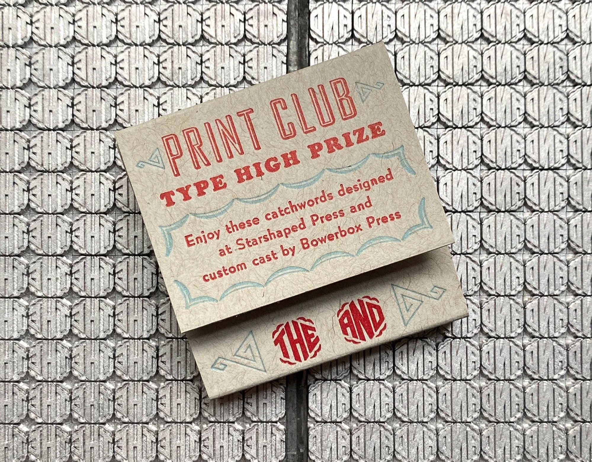
Every year, Print Club members that are in the Club for a full year starting in September receive a Type High Prize. This is a piece of wood or metal type designed by me and produced by a cast of talented type makers. A few years ago, I worked with Val at Bowerbox Press to design and create a solid set of ‘the’ and ‘and’ catchwords. These were designed to work with thicker, larger typefaces and turned out magnificently well. Val is the next generation of typecasters and working with her felt like pushing the craft forward.

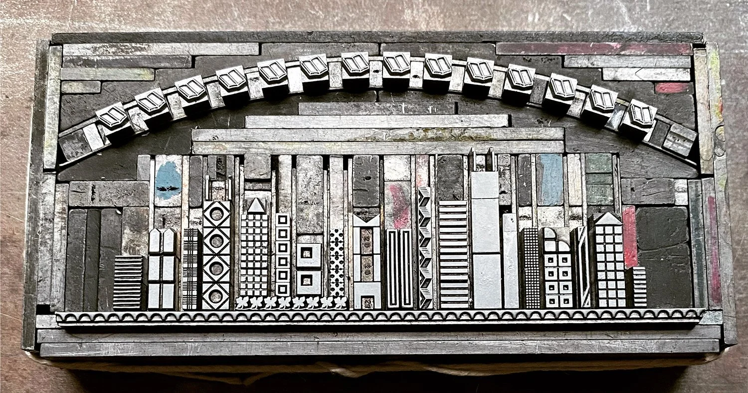
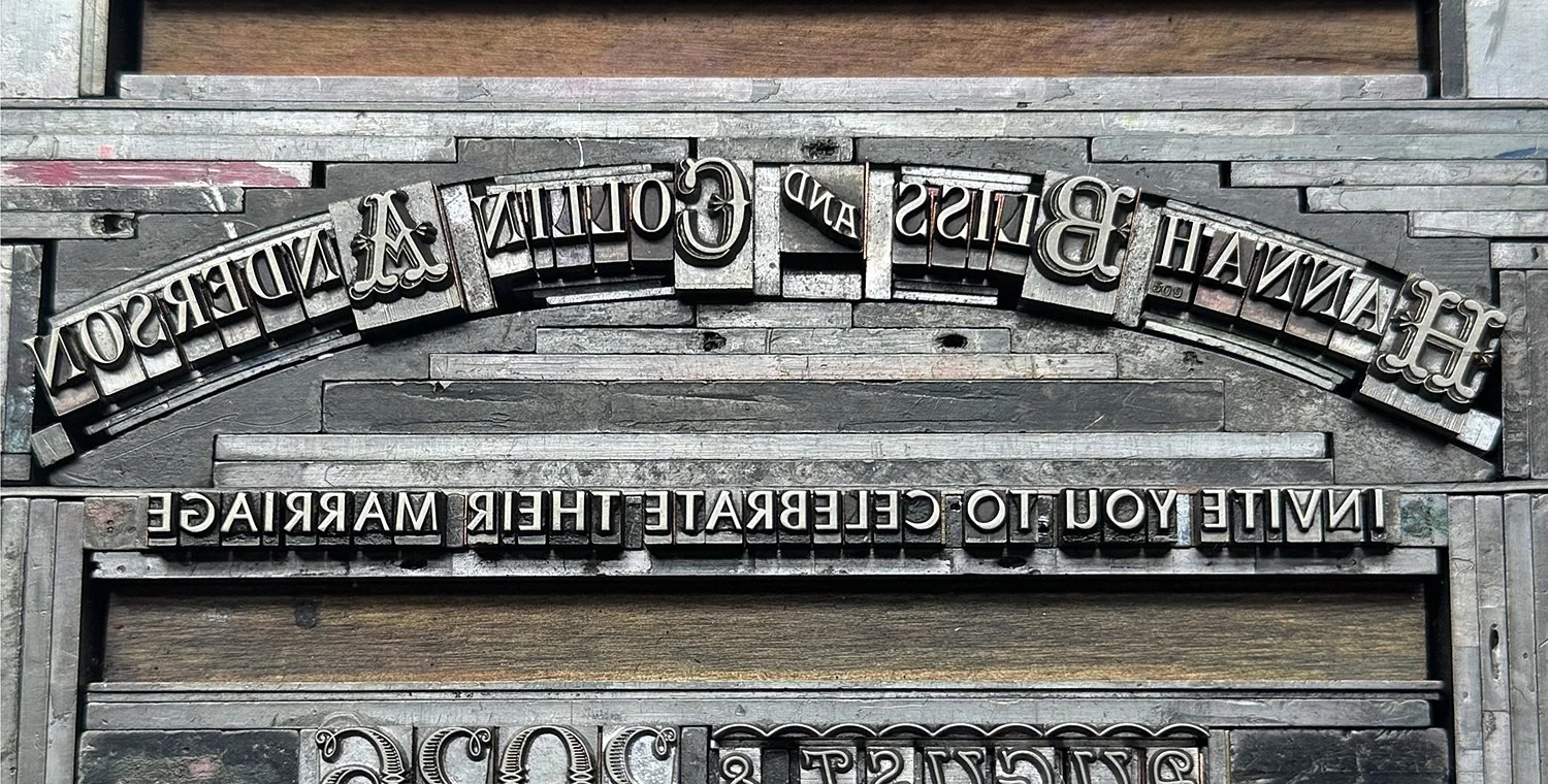
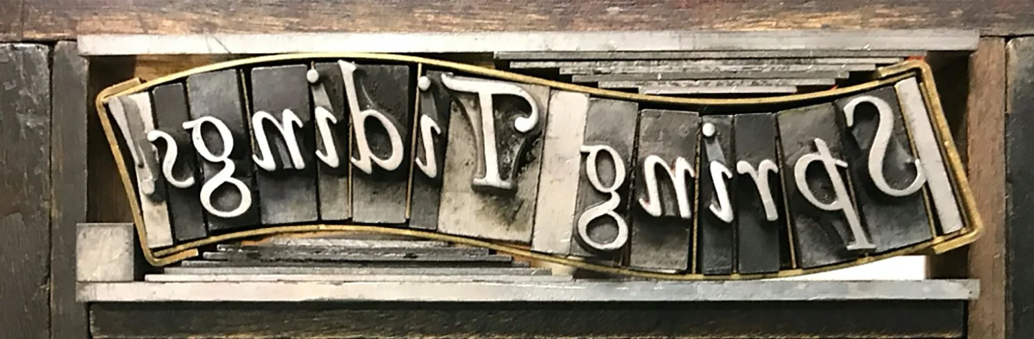
Setting type for letterpress printing is generally a very linear task, as the type must line up and be held together firmly so that it can be successfully printed on a press without falling over. Many techniques have been developed to break out of this box (looking at you, Springtide Press), and one of these was to create circular quads that you can put together in myriad configurations. Below you can see two forms that utilize these pieces to hold a curve in place alongside straight lines (and a catchword!)
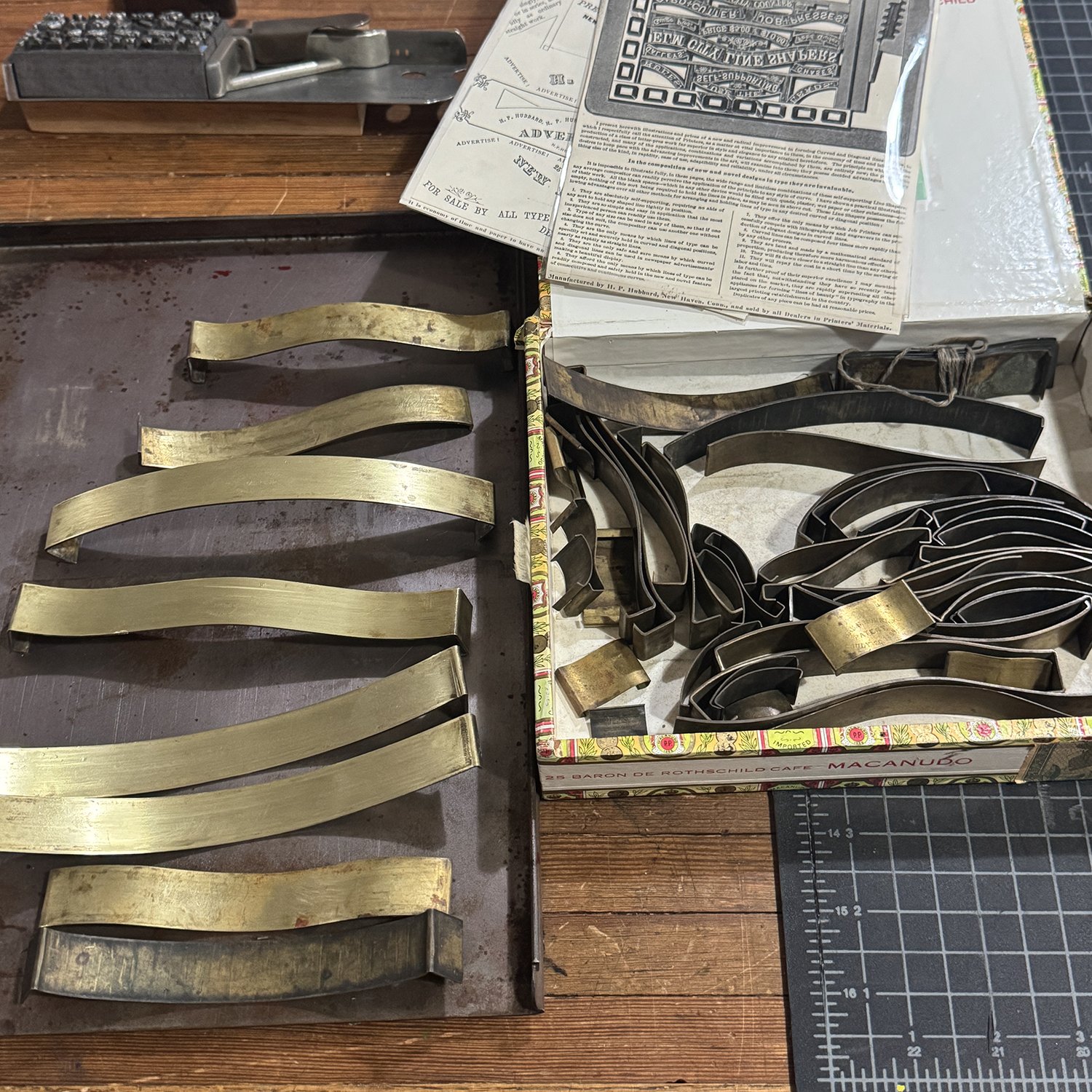
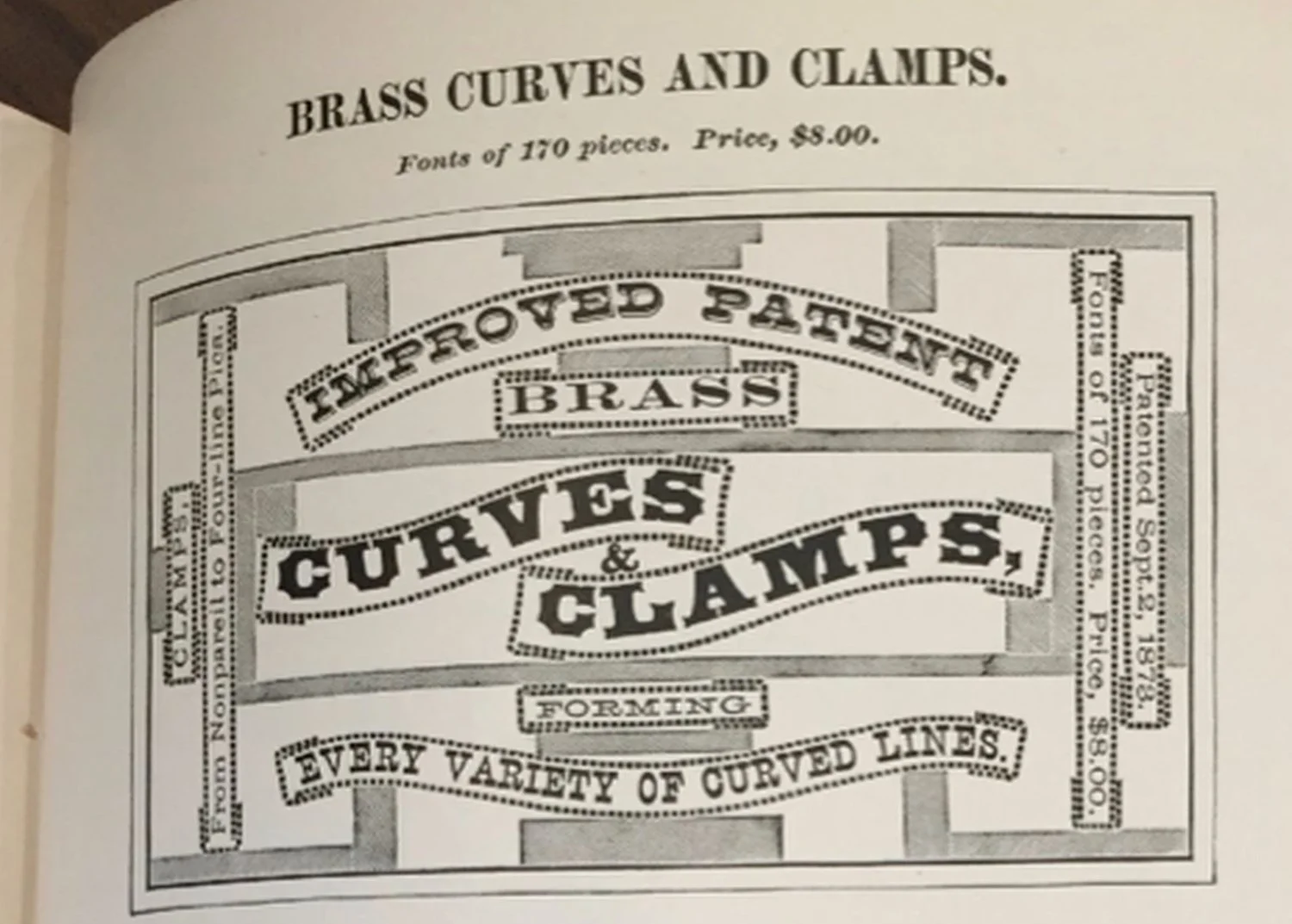
I’ve recently acquired a set of ‘Elm City Line Shapers’ that came with ads for how they work. These are curved brass pieces that can be put together to create even more elaborately shaped lines.
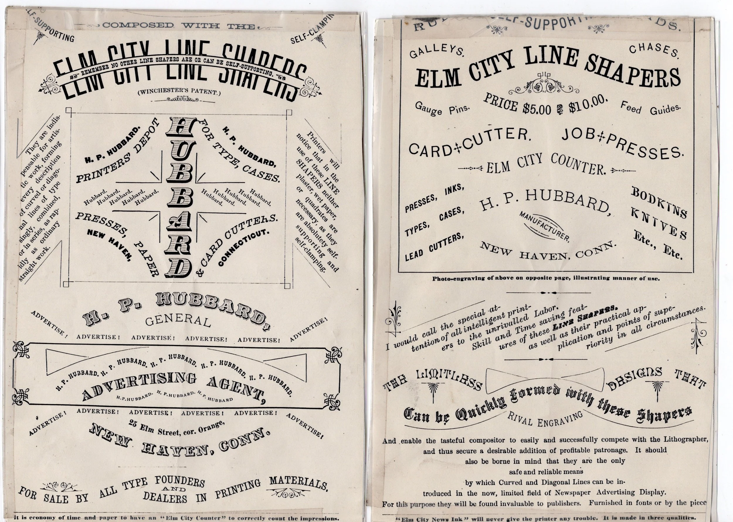
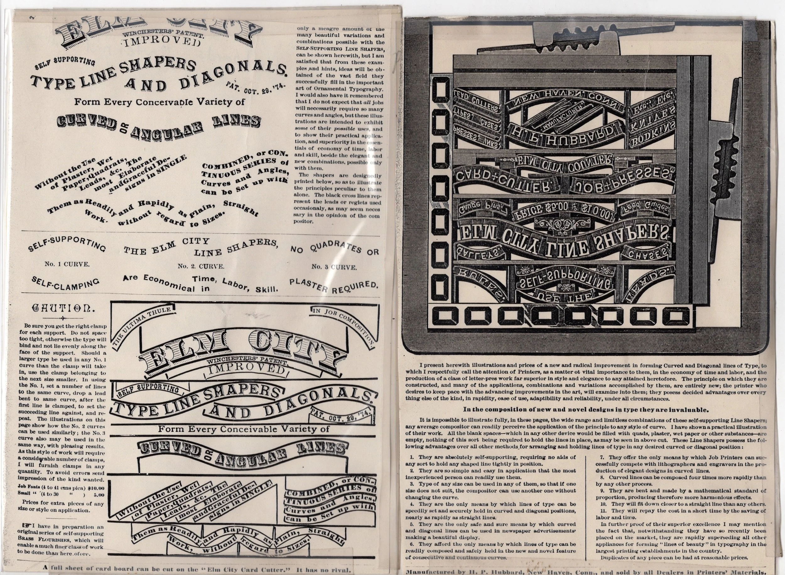
These haven’t been used in… decades? And they showed the neglect. I started cleaning and polishing them so I could take stock of what was in the box and how they would work together. The results are astoundingly good and I can’t wait to get them into print.
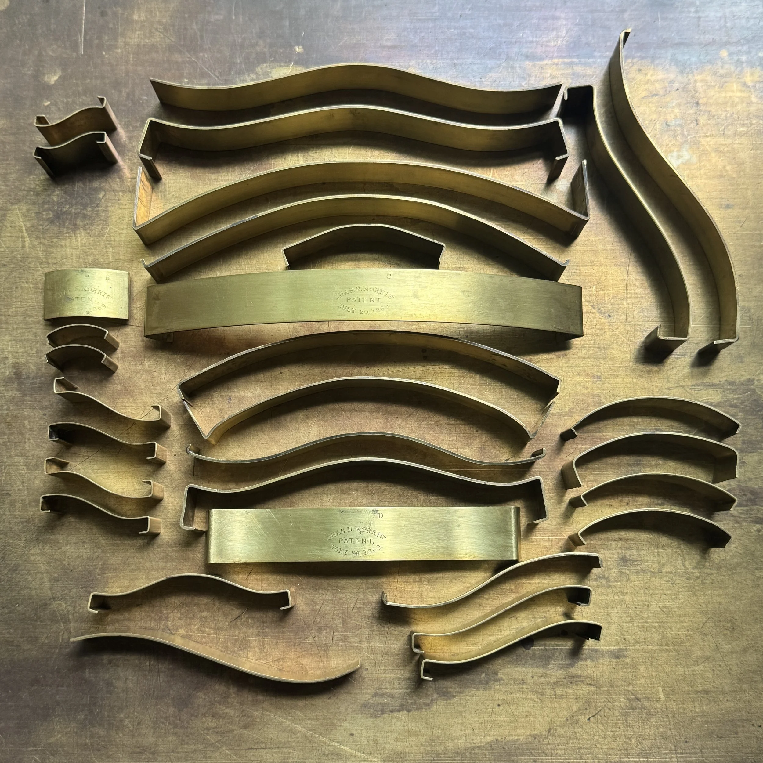
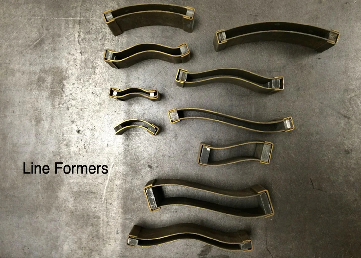
Jessica Spring has these wonderful ‘line formers’ that achieve basically the same thing. Delightful!

Vida Sacic is one of the best things about letterpress in Chicago. Her work spans continents and ideas and adds a fresh voice to how to manipulate both old and new wood type. This spring, I had the pleasure of hearing her talk about work on display at the Chicago History Museum.
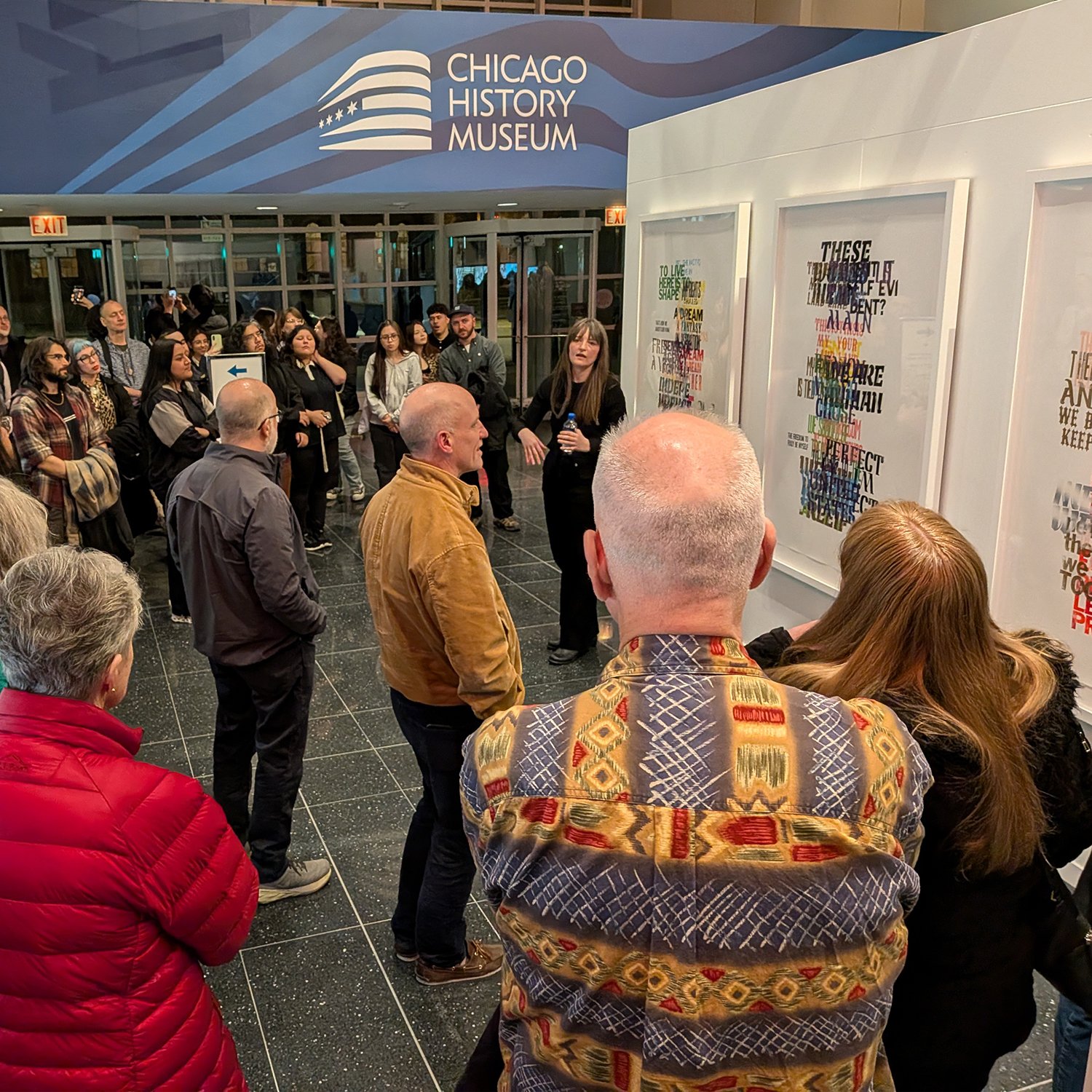
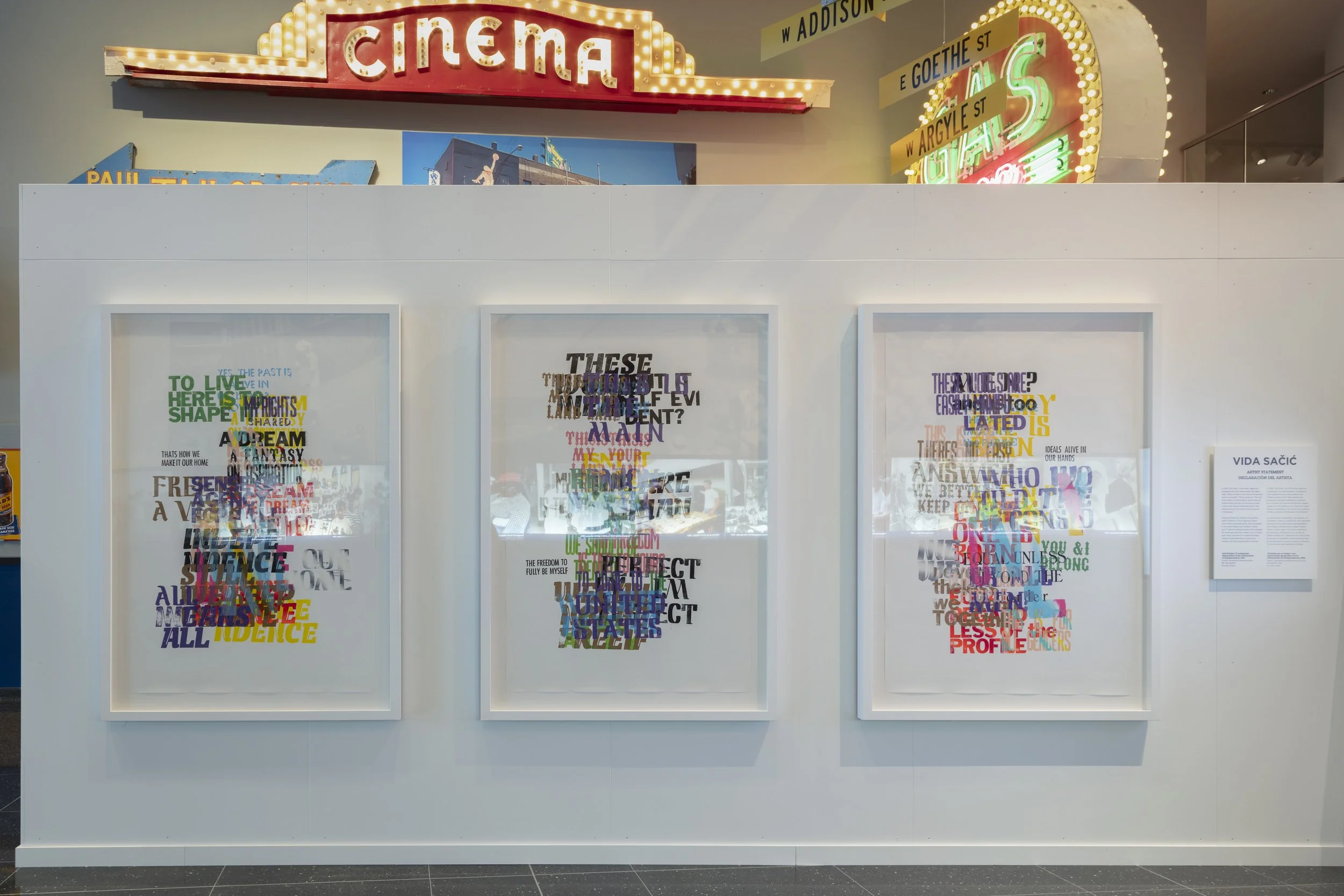
Here’s a bit more, straight from Vida:
I’m a Croatian American artist, printer, and educator based in Chicago. I moved to the Midwest from Croatia as a teenager and later earned my MFA at Indiana University Bloomington, where I first learned letterpress printing with Paul Brown.
My relationship to printing deepened later while teaching at Northeastern Illinois University in Chicago. One of the first presses I encountered there was an SP15 Vandercook that needed significant repair and attention. Spending time restoring and working with that press transformed my understanding of letterpress from simply a printing process into a way of thinking about labor, maintenance, history, and community. I became interested not only in printed language but in the histories embedded within the tools themselves and the people who keep those traditions alive.
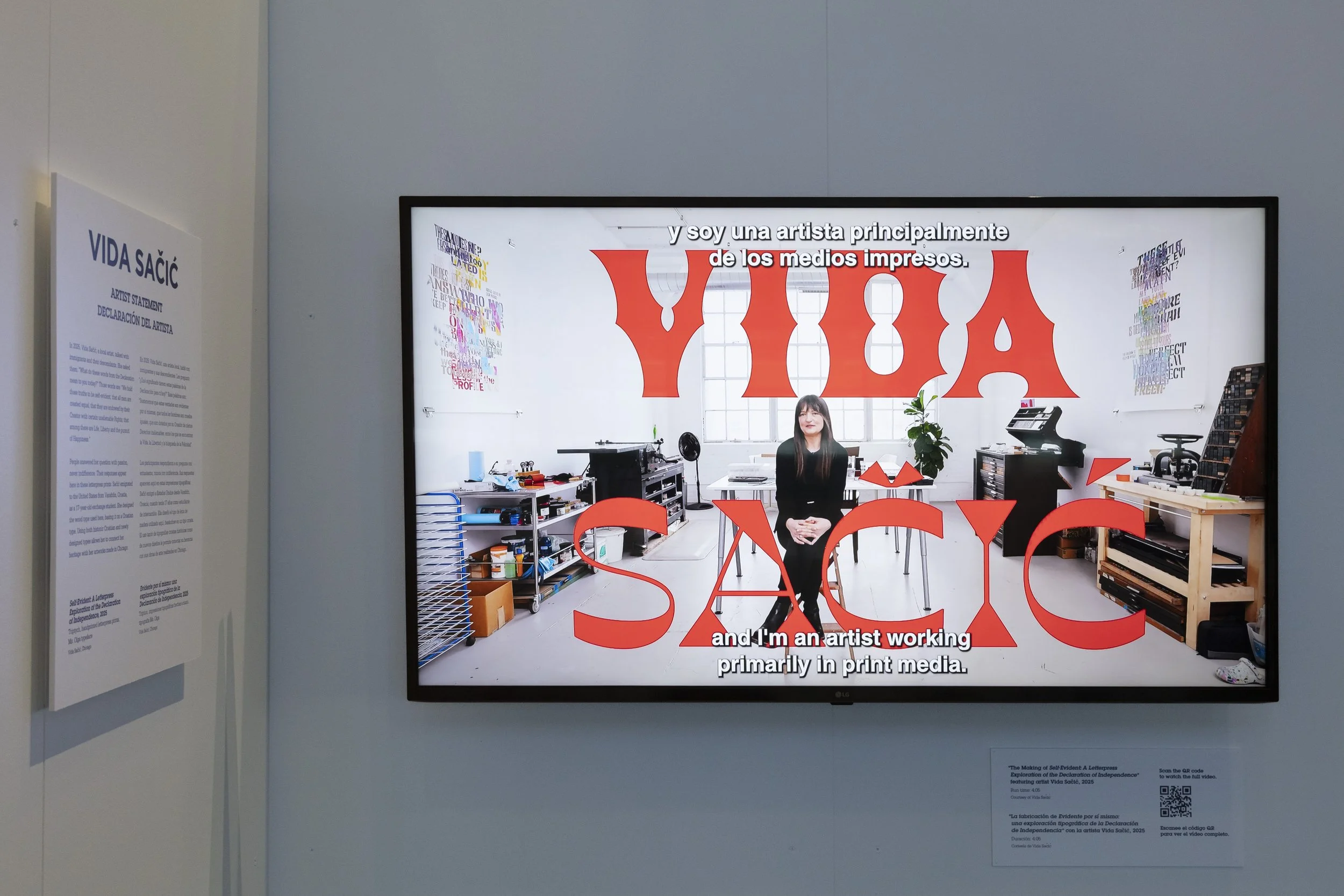
I use moveable type, wood type, handmade paper, and layered text as artistic material rather than as tools for conventional graphic communication. Although my work is rooted in typographic processes, my practice operates primarily within contemporary art, using print to explore immigration, collective memory, labor, and language. Through large-scale prints, installations, and participatory projects, I often incorporate words gathered through conversation and collaboration, treating language not only as communication, but as a physical and social material that can fragment, overlap, and create new forms of connection.
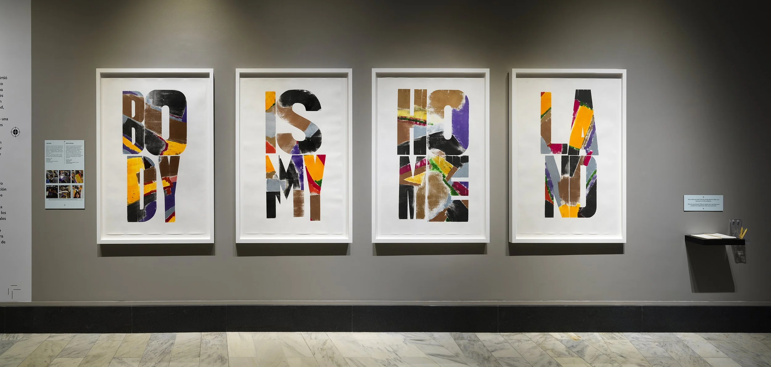
Projects such as Self-Evident, commissioned by the Chicago History Museum, and Home Body Land, featured at the Newberry Library, combine historical printing processes with contemporary voices, often centering on immigrant experiences and shared authorship.
As both an artist and educator, I see letterpress as a living and evolving medium rather than a nostalgic one. In my teaching, I encourage students to think about typography through experimentation, touch, collaboration, and process. I want students to understand that printing is not only about precision or technical skill, but also about building communities, exchanging knowledge, and finding meaning through making things together.
Want to see more? Check out Vida here: website, Newberry blog, Chicago History Museum website, including this video.

There’s a link on every Starshaped email to buy a coffee/book as a way to financially support the studio instead of buying prints. So many people do this (hey thanks!) that I wanted to share some of the books that have come into the studio over the past year. These greatly influence the work I do, support projects for other commissions, and broaden my understanding of the craft.
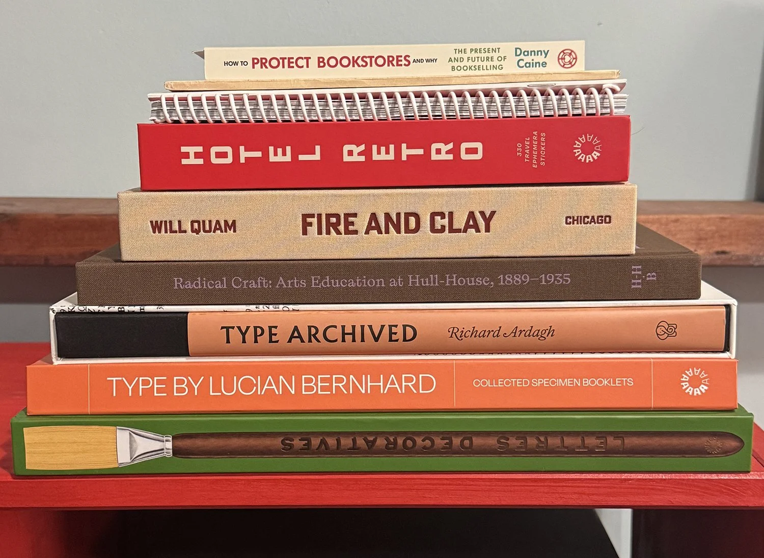
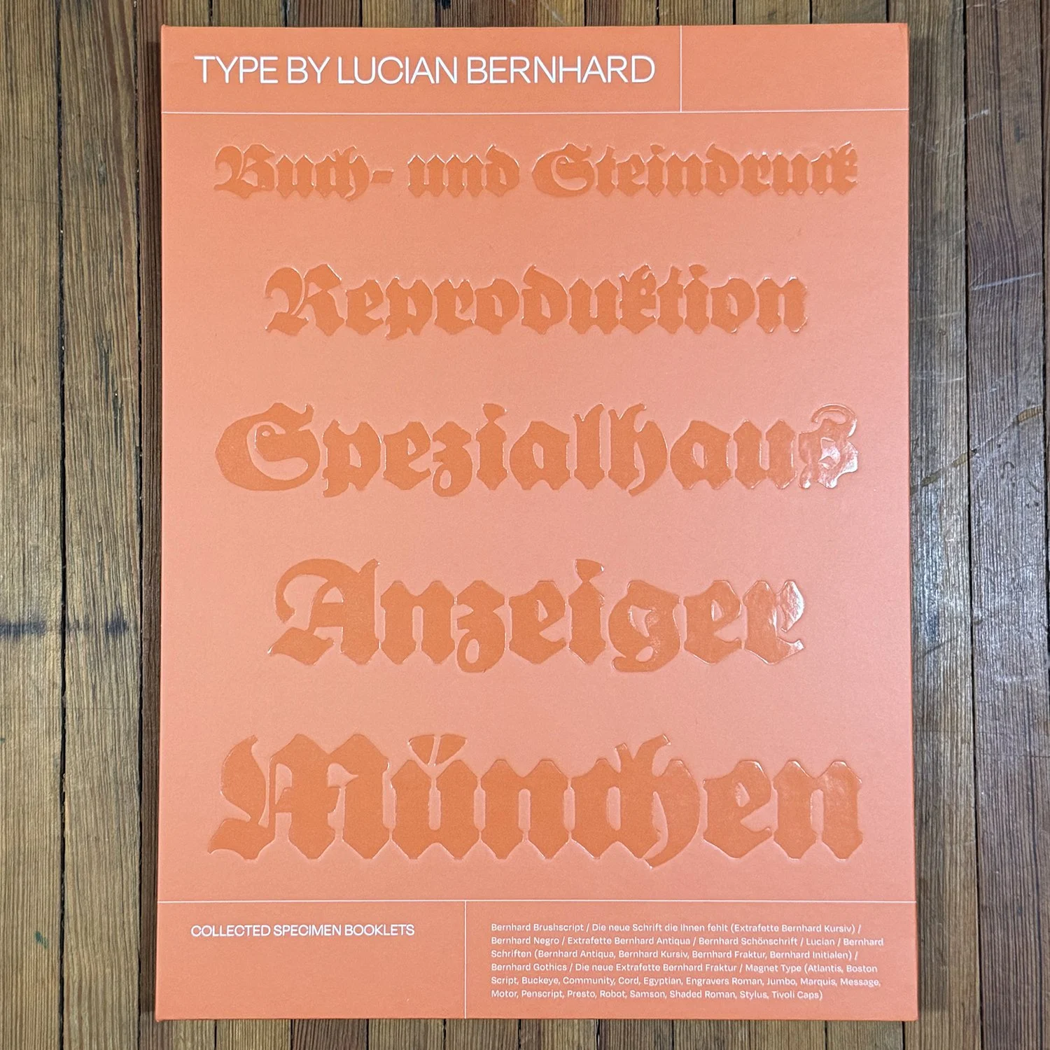
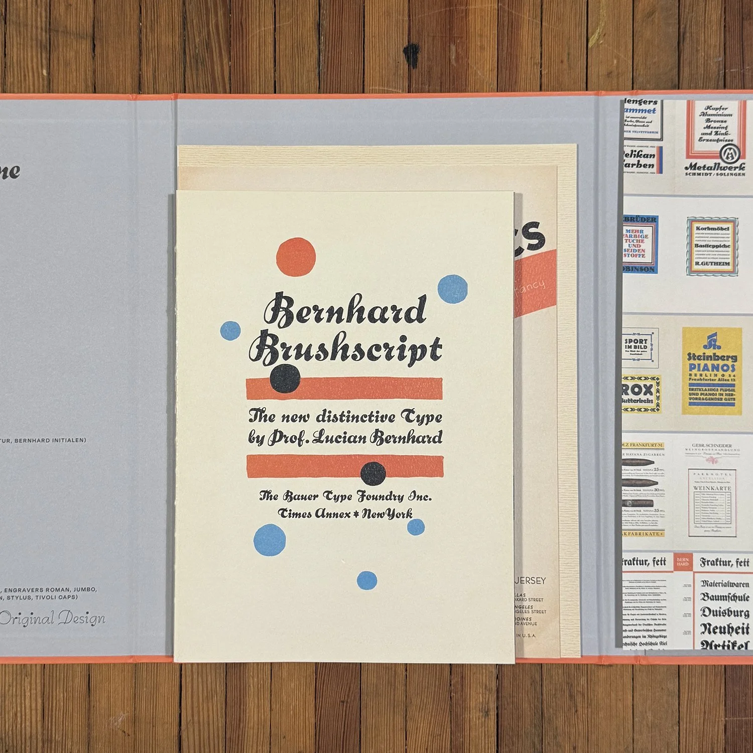
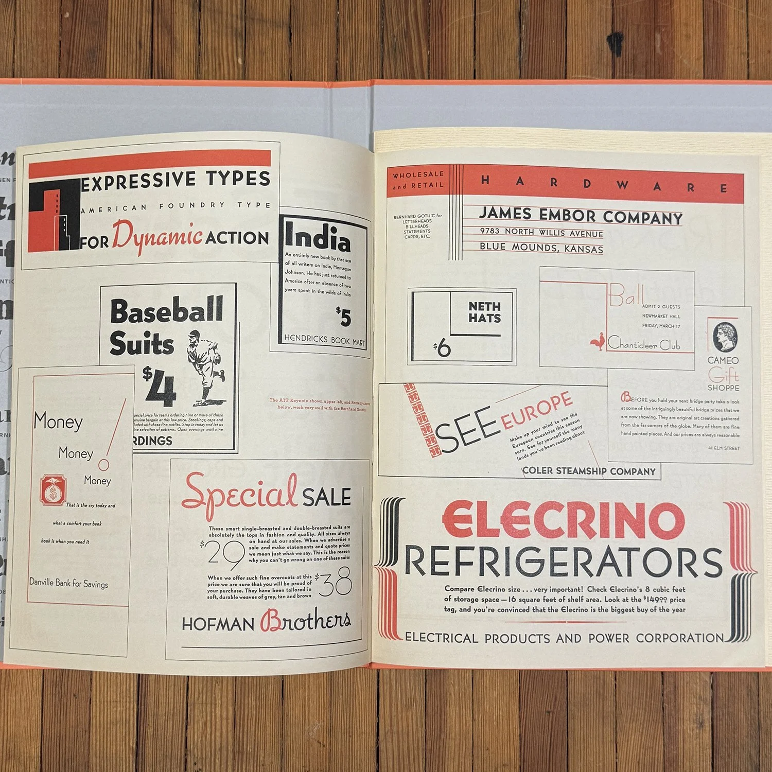
This collection of the type specimens of Lucian Bernhard is delightfully compiled by Letterform Archive and is something I’ve had my eye on for a long time. Bernhard typefaces play a prominent role in the studio and seeing these original specimens with intent for many of his designs is crucial in understanding how the type work and plays with others.
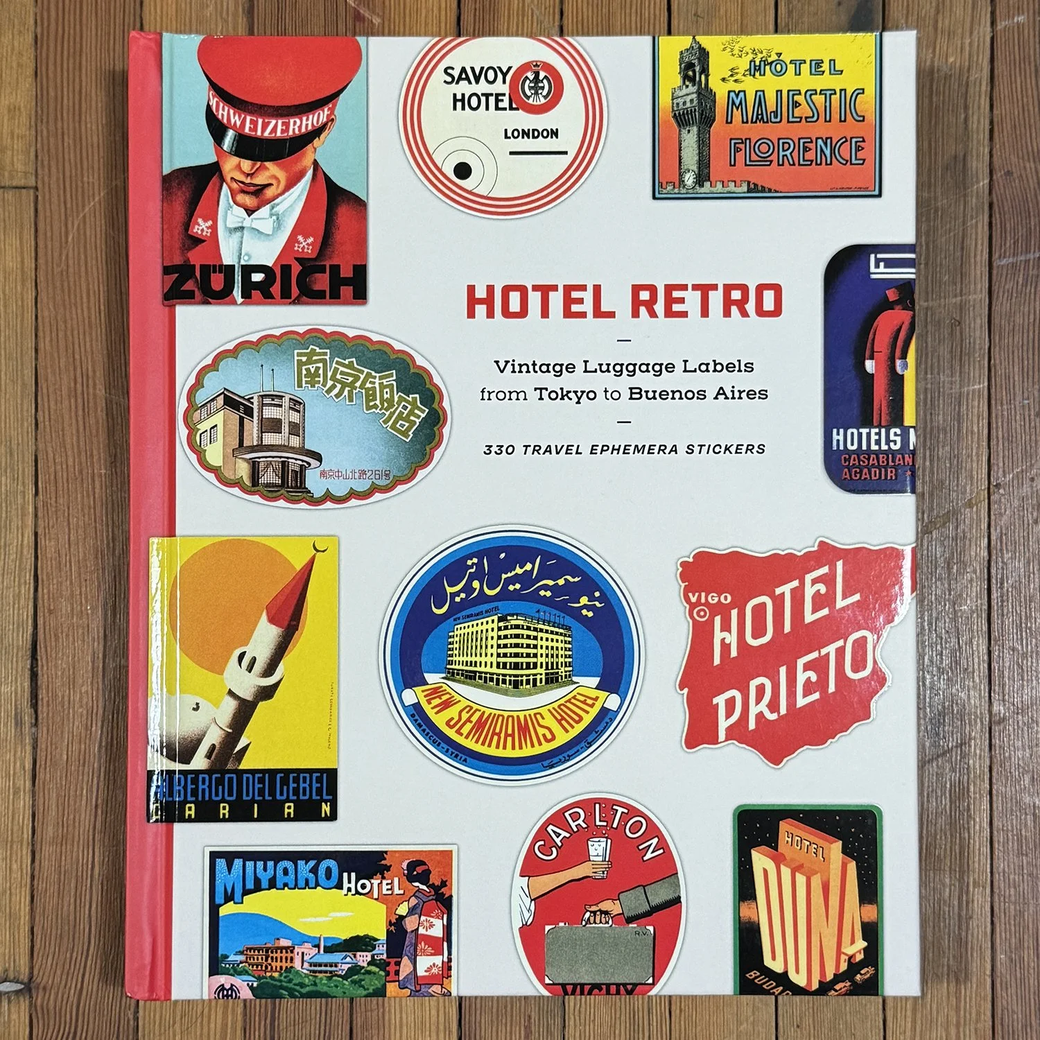
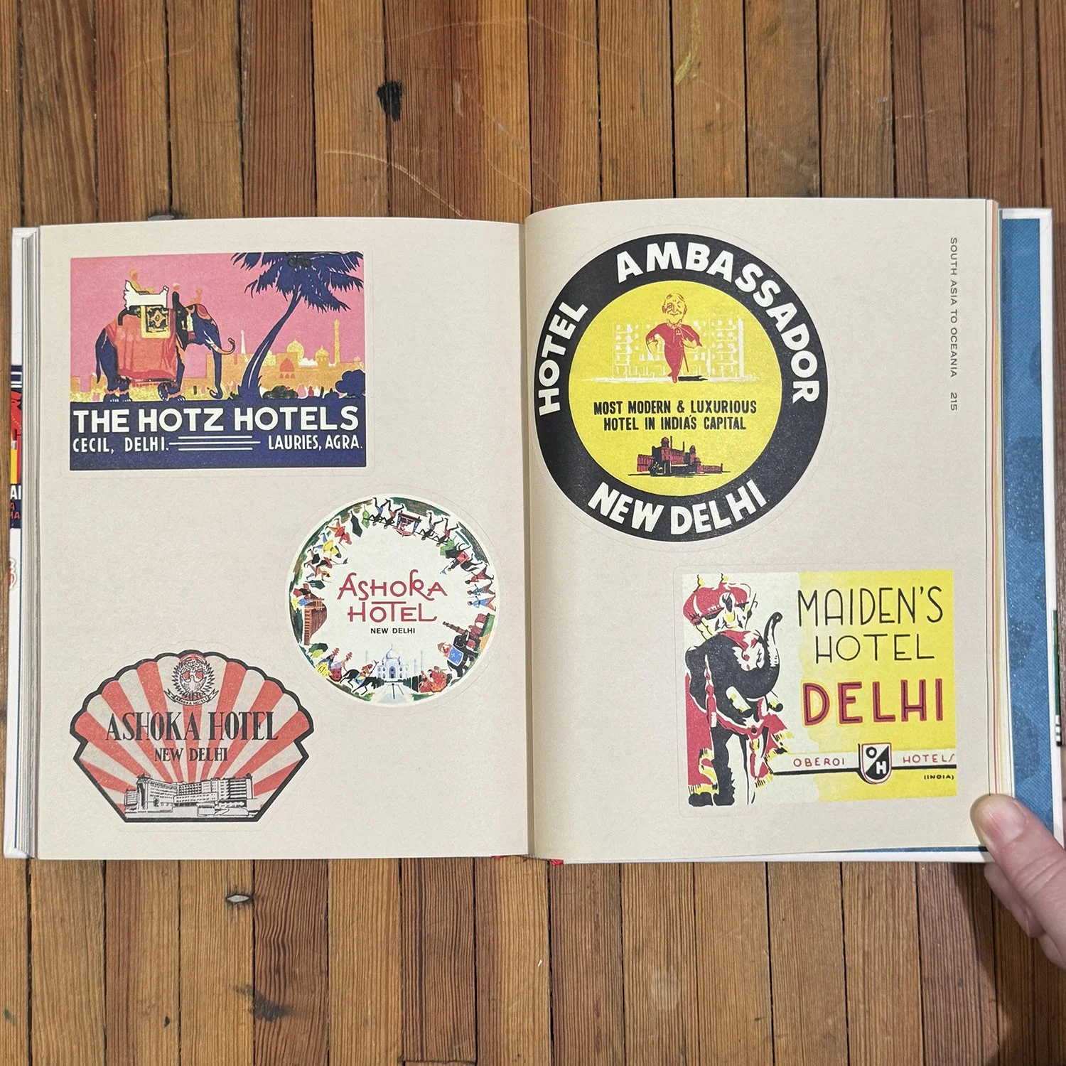
Another title from Letterform Archive is Hotel Retro: Vintage Luggage Labels from Tokyo to Buenos Aires. It’s a collection of well-designed and colorful luggage labels from around the world. These come in sticker form, but I’ll be keeping mine intact for reference.
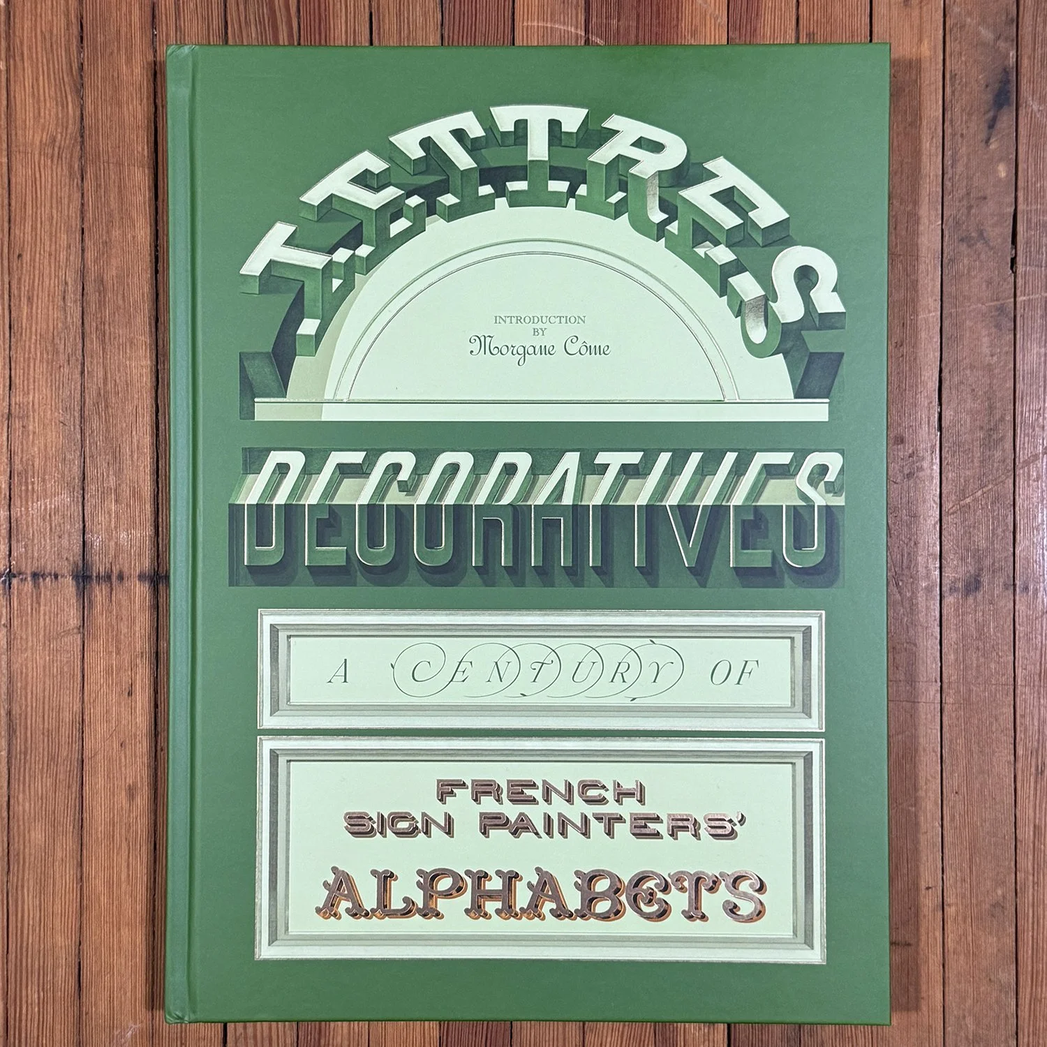
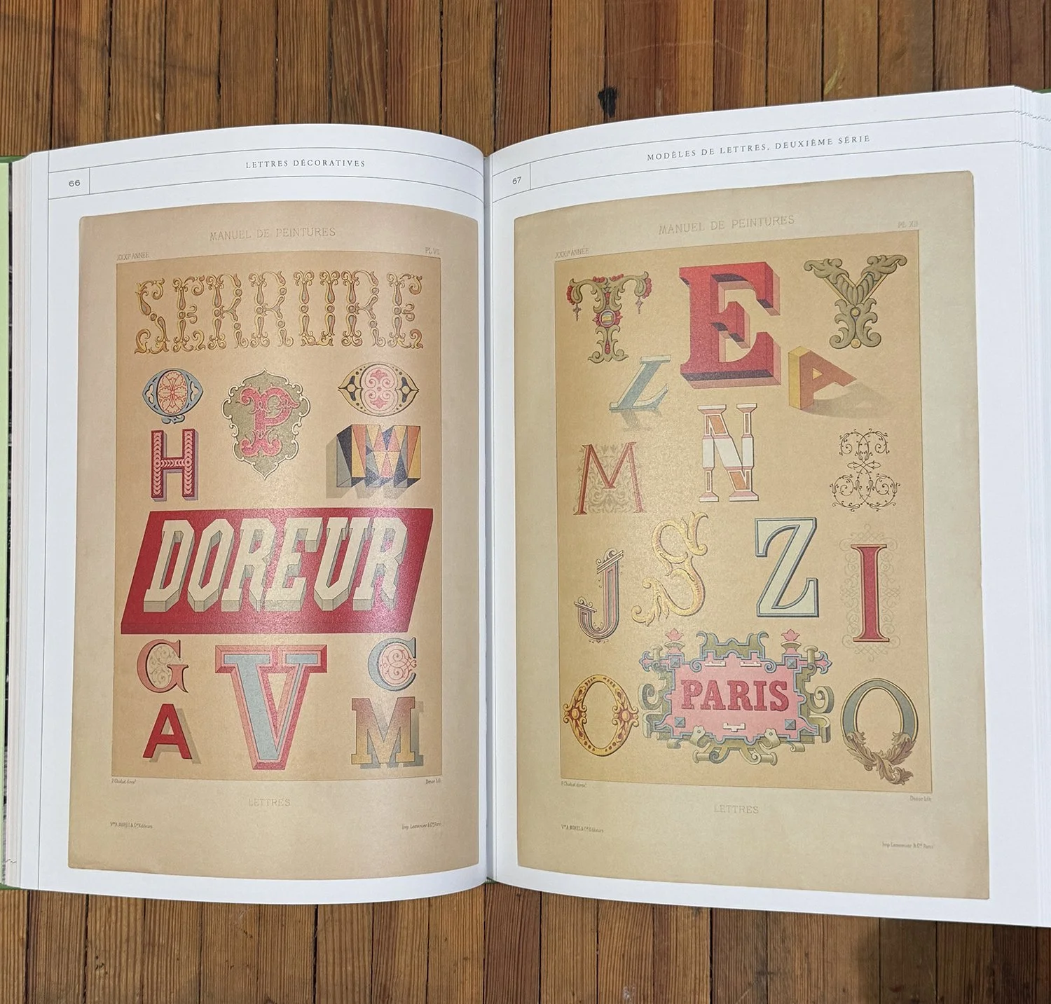
And finally, Lettres Decoratives: A Century of French Sign Painters’ Alphabets celebrates the art of decorative French letters, mostly hand-lettered and painted as a reference for sign painters. It’s an absolute delight to flip through. The letters are beautiful and the colors give me a lot of ideas for future prints.
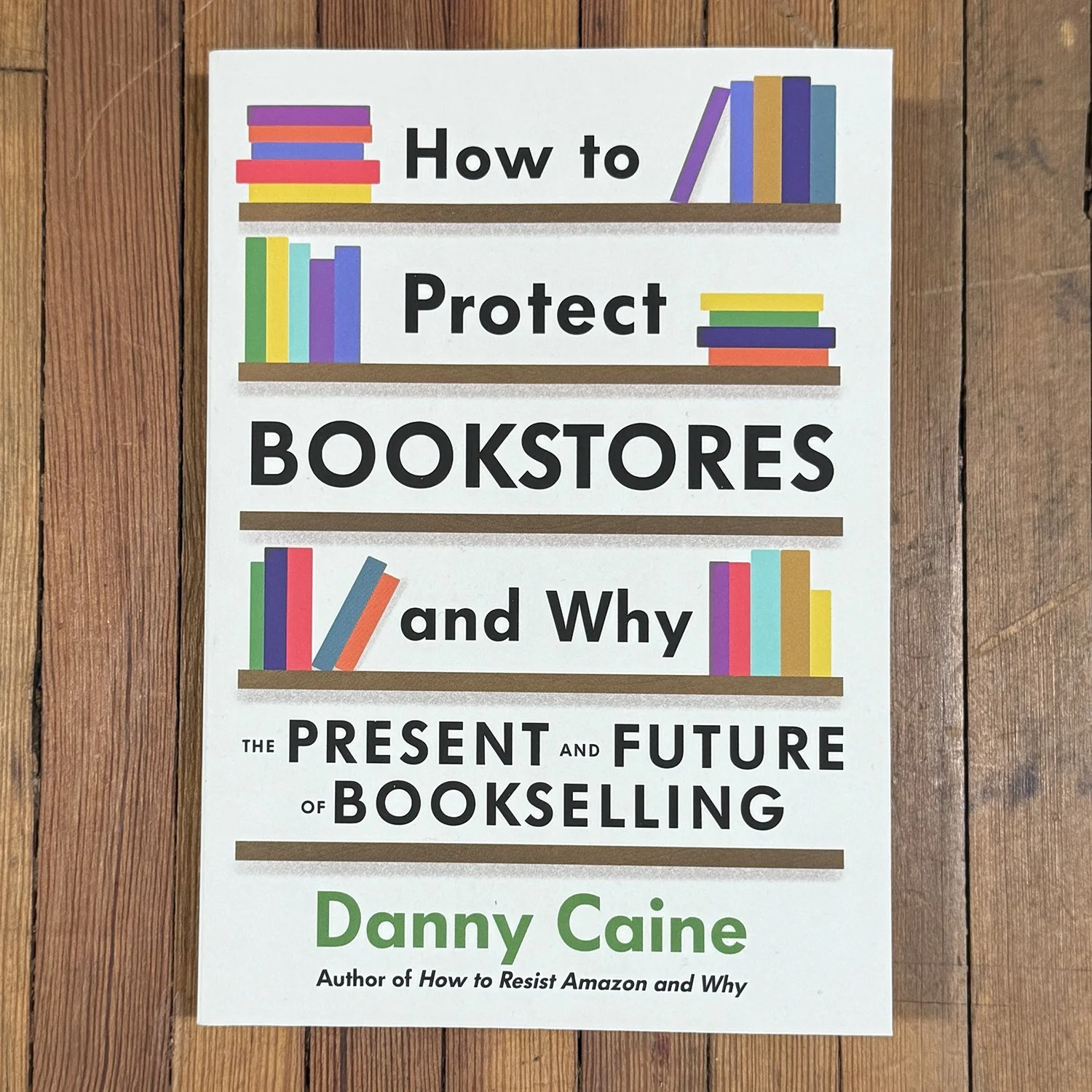
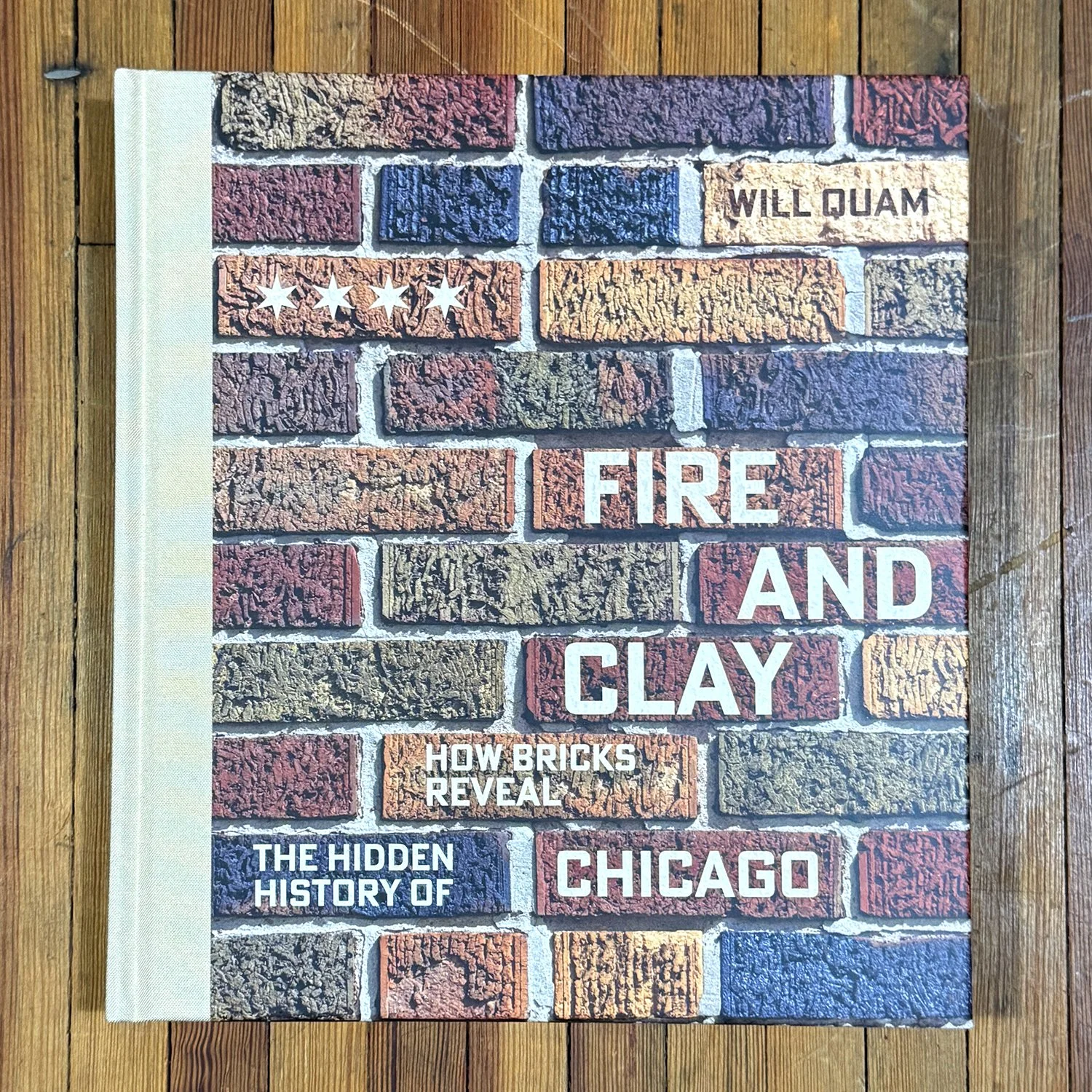
Now for a few locals. I found ‘How to Protect Bookstores and Why’ through Half Letter Press. I love how easy it to be inspired by the work book stores do to create community all across the country. It has specific examples, though I suspect you’ll find similar stories at any shop you visit. ‘Fire and Clay’ is a wonderful deep dive into the history of brick in Chicago, by Will Quam, whom you may know from his popular brick walking tours. If you’re into the history of Chicago or architecture in general, this is a huge win, beautifully researched and photographed. Will and I collaborate on his yearly calendars, available late fall.
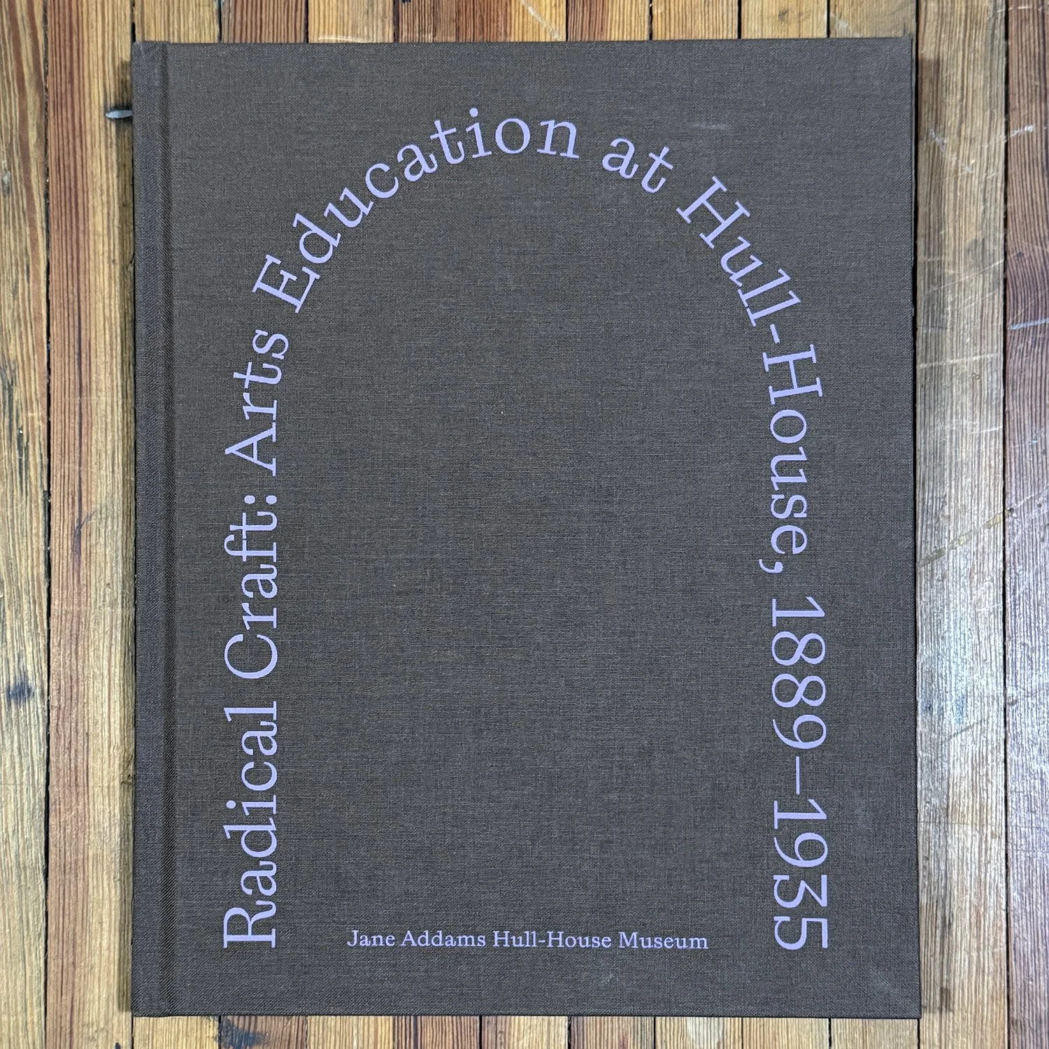
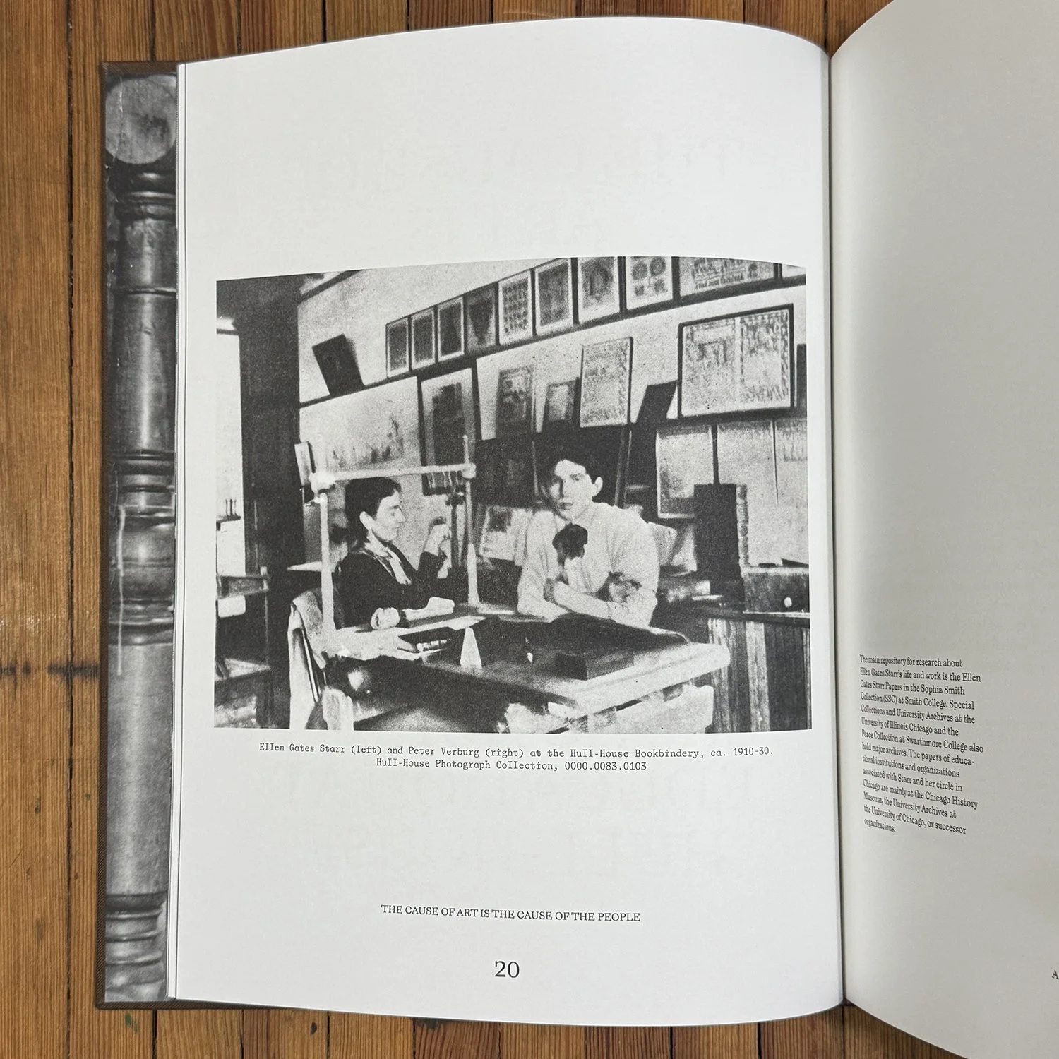
Hull House is a gem in the city. Once the home of Jane Addams and a sprawling campus designed to help newly-arrived immigrants establish the skills to thrive in the city, it is now a museum offering dynamic programming. This book in particular looks at the history of craft on the campus and how arts-based work had a place in defining the immigrant experience.
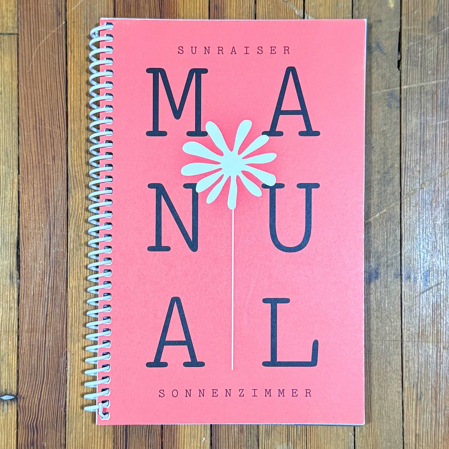
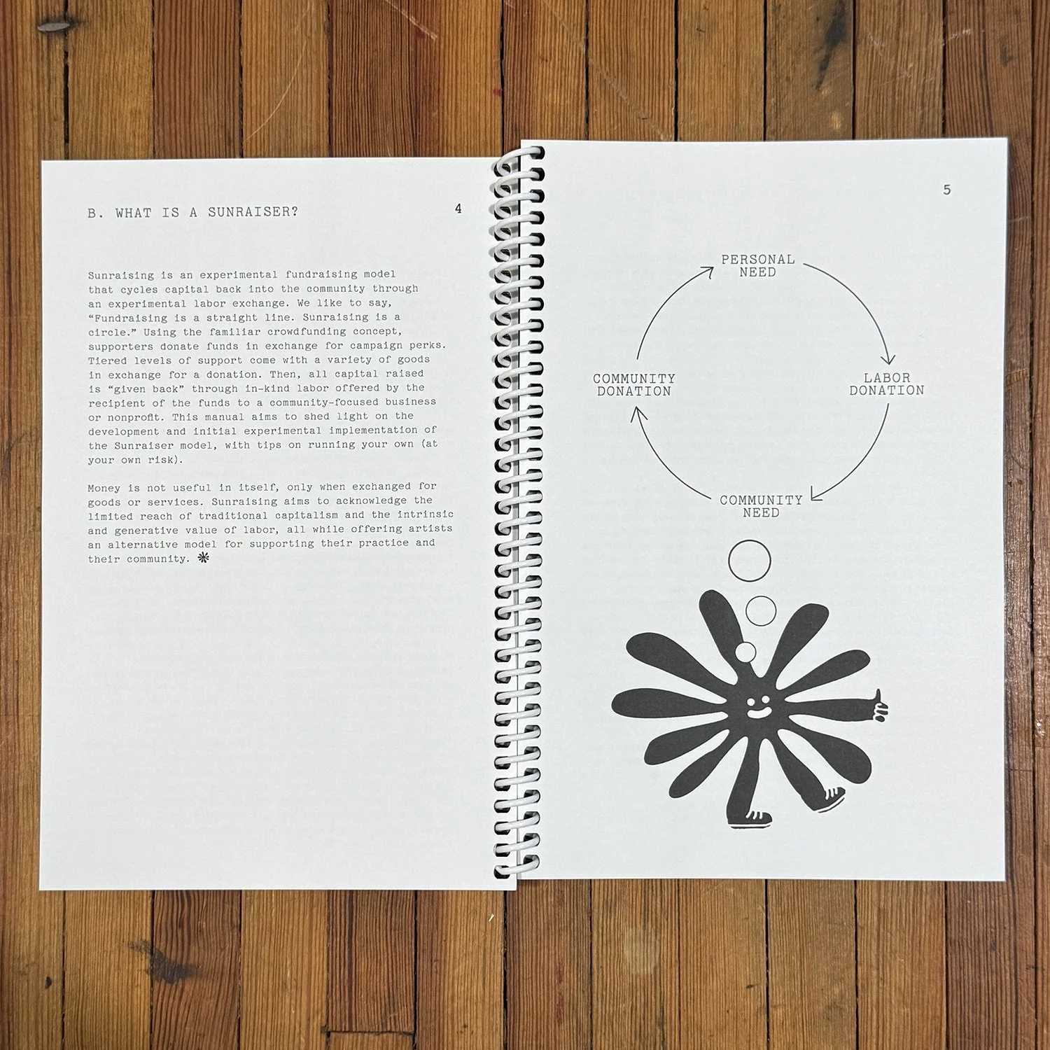
Everything that comes from our pals Sonnenzimmer is going to be a visual delight (or assault?) They recently did a ‘sunraiser’ (as opposed to kickstarter) that helped to build out their studio space while also contributing back into the design ecosphere. Read about it here.
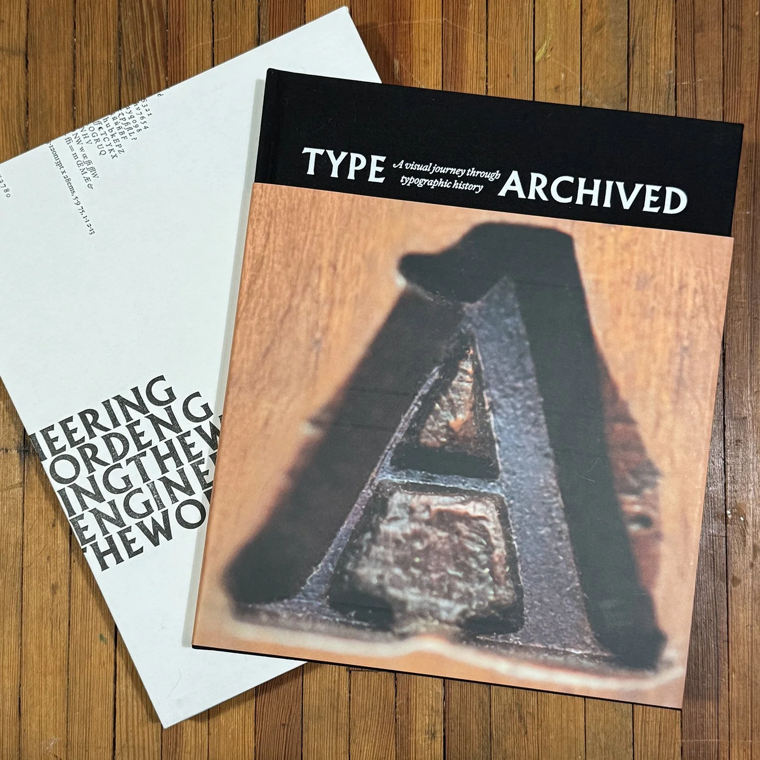
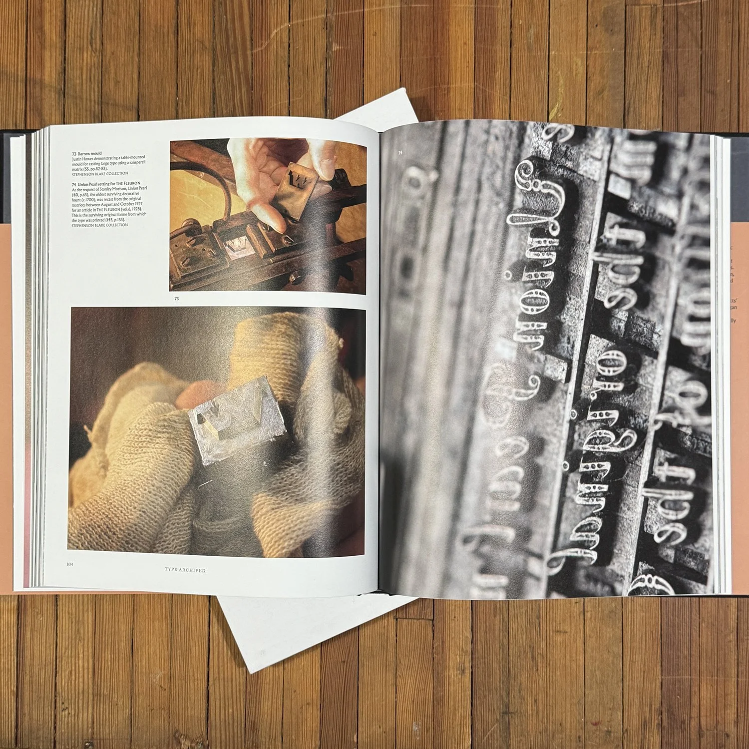
And a little something from across the pond… Type Archived is a deep dive into the collection of the Type Archive, a repository for centuries of British typecasting technology. While not currently accessible, this book features page after page of beautiful type and processes shared by the craftsmen that maintained the collection for so long.
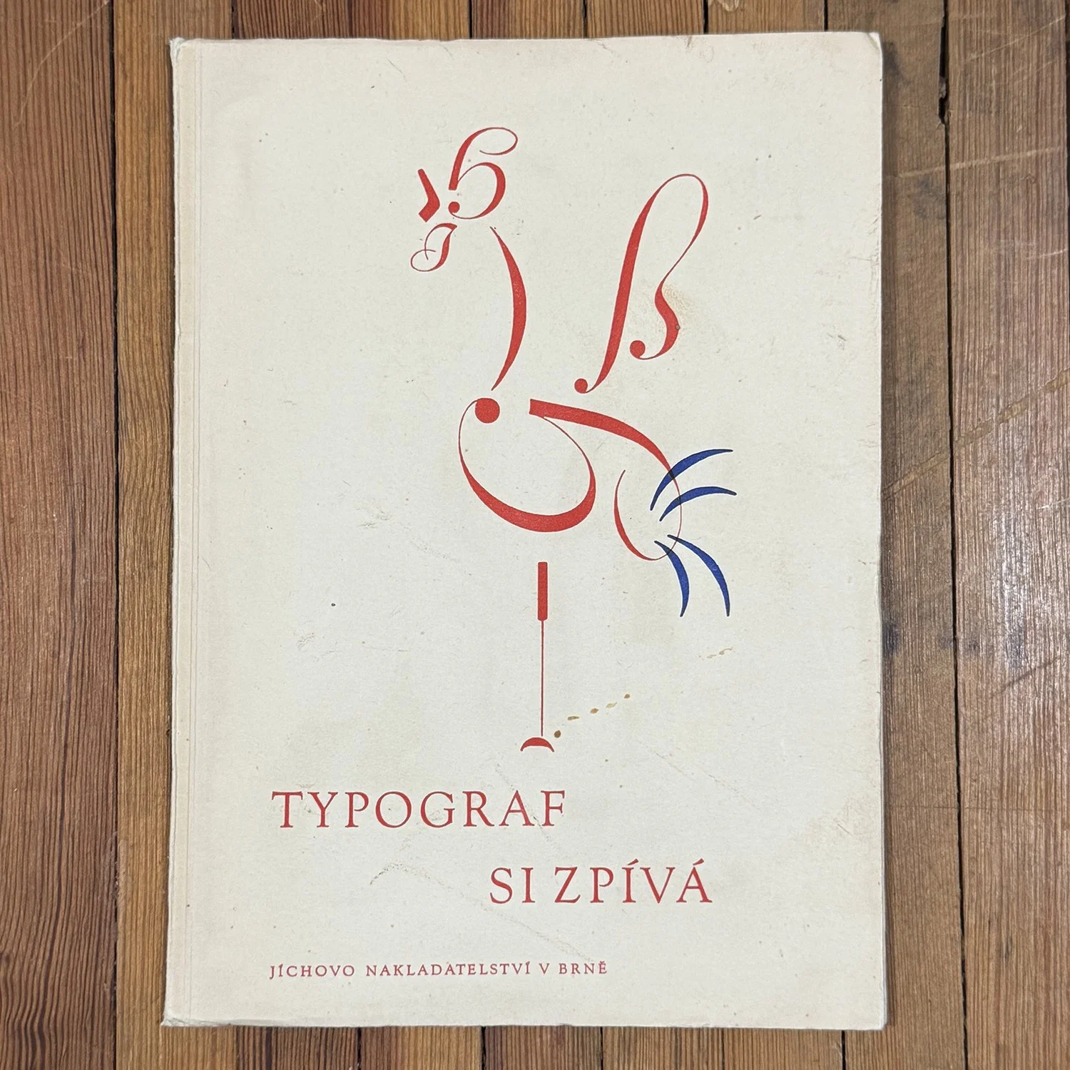
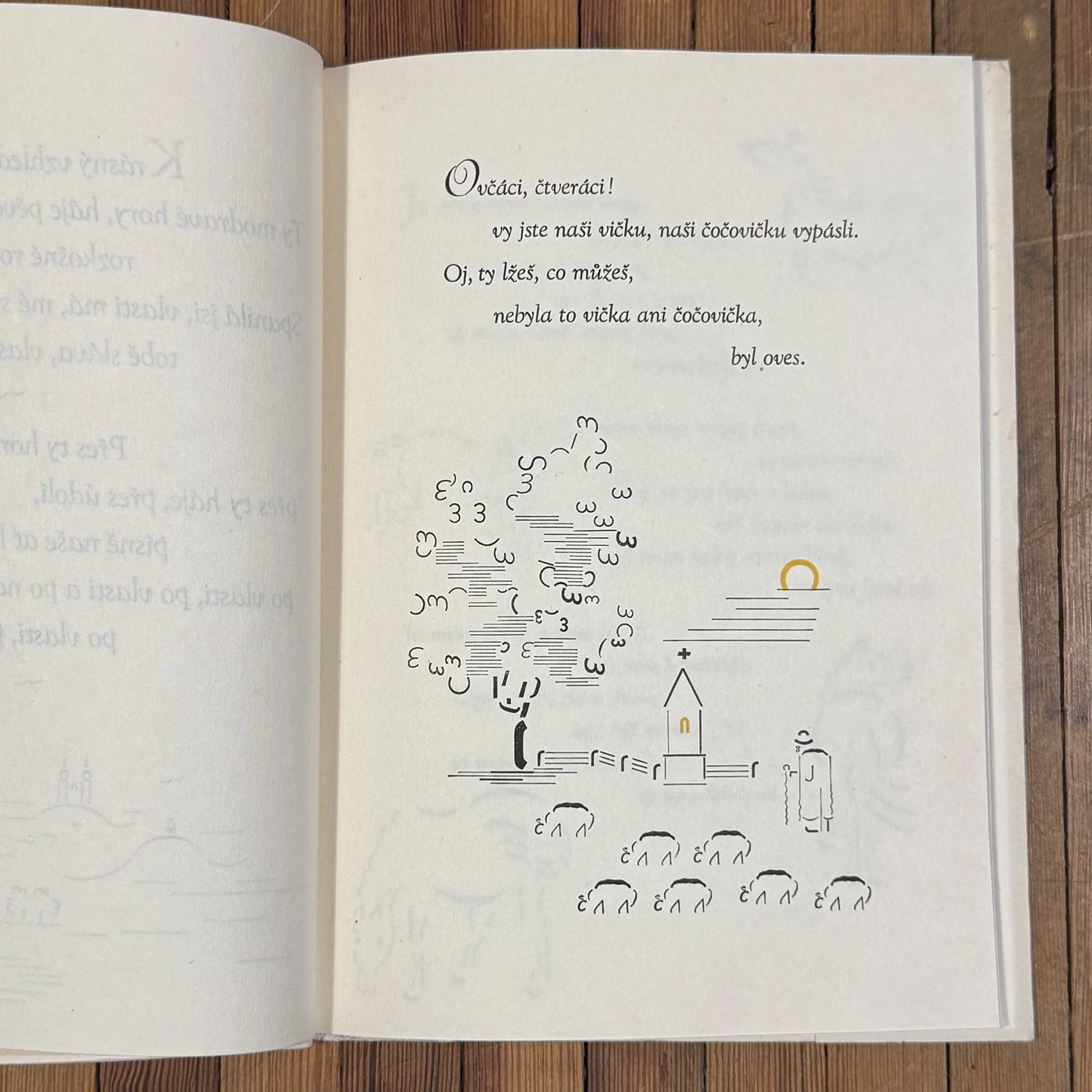
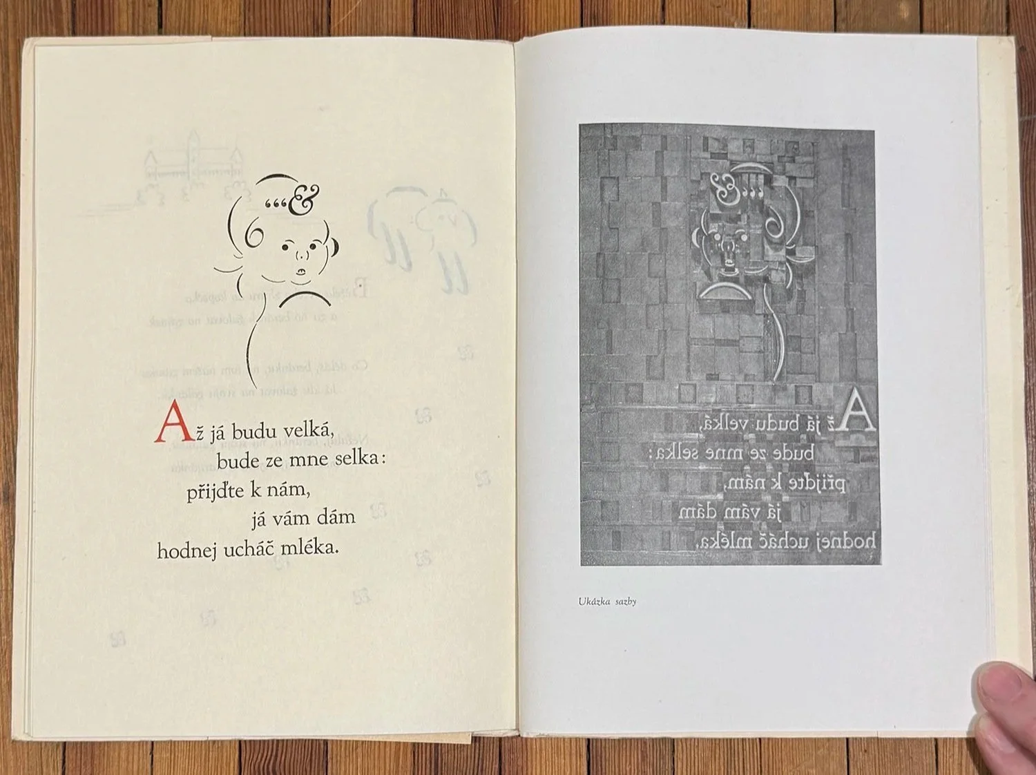
A friend let me know The Typographer Sings, a book I’ve always secretly coveted, was available for purchase and I’m so glad I did. Josef Zavrel was a Czech designer who played with typographic ornaments to create absolutely delightful image work. I especially love that it came with an additional support publication and lots of images of the actual type forms, which is rare.

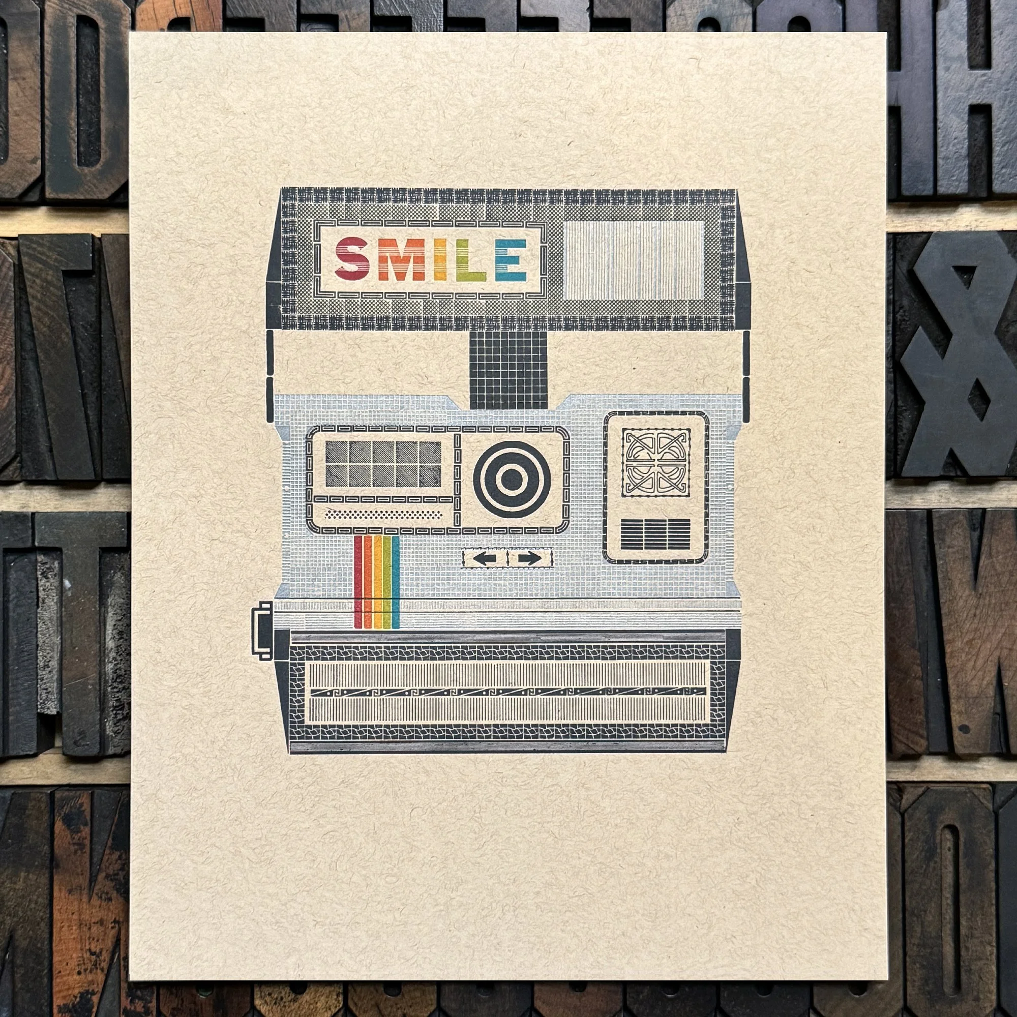
Smile, it’s an instant camera! This image, made from metal ornaments and type, is a representation of a classic Polaroid, with added text. It’s printed in 7 colors on light kraft recycled cardstock. Measures 8×10”.
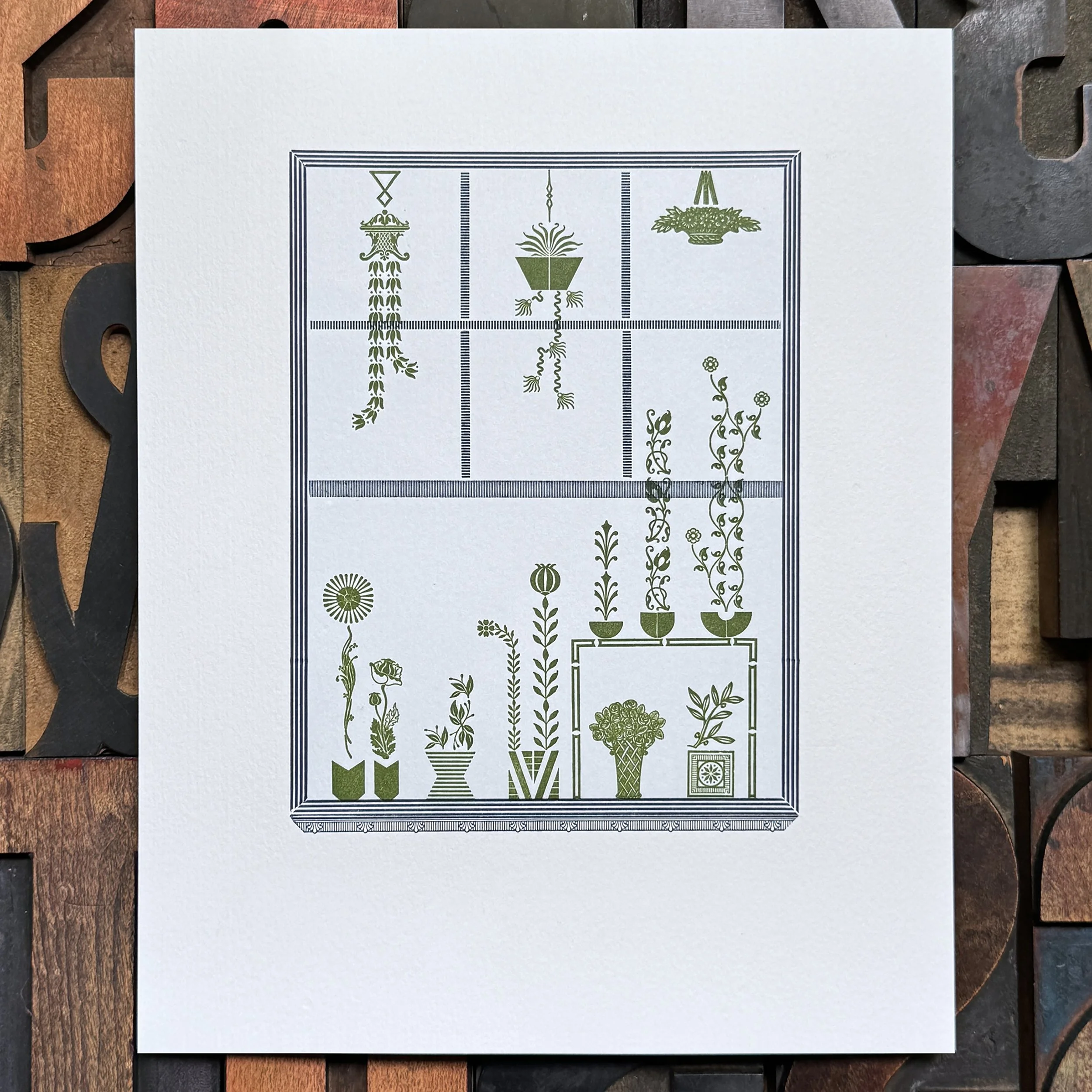
Inspired by a friend’s solarium, this print is meant to resemble a window, looking in on beautiful plants. It’s printed on soft cotton cardstock in 3 colors and features mostly 20th century ornaments. Measures 8×10”.

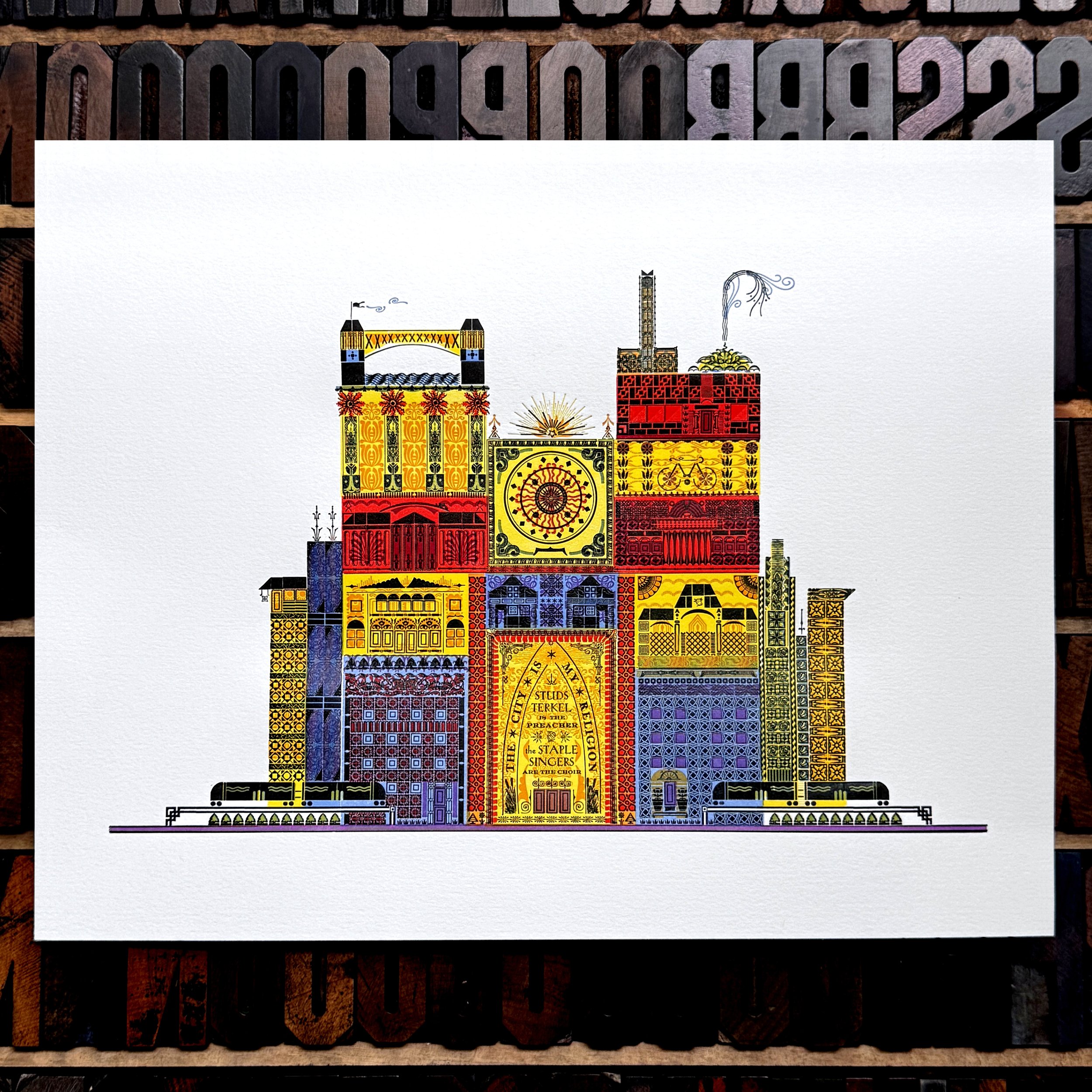
The City is My Religion was originally printed as part of a portfolio series in 2016-17. The purpose was to showcase various elements of the city that equate to a religious experience for a diehard Chicago lover. It’s built entirely from metal type and ornaments, some over 150 years old, into sections resembling important architectural details and community spaces. There are apartment buildings and bungalows, trains and streetlights, the Ferris Wheel and Buckingham Fountain. Museums, theaters, skyscrapers, small shops and a bike also make an appearance. Chicago’s commercial, printing, and stockyard history is there, too. The door pays homage to cultural heavyweights Studs Terkel and the Staple Singers. The colors are meant to resemble stained glass, overlapping in areas to create additional hues and context.
You can read more about the process of the reprint or grab the limited edition print here.

