Alphabets are Go!

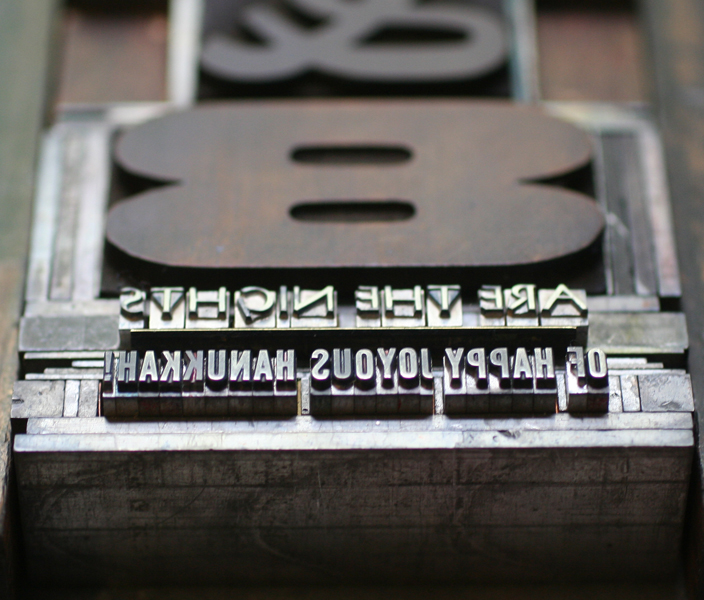
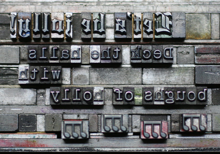
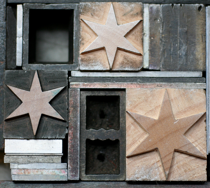
It's a pleasure to announce that the ornamental alphabet I built over the summer will soon get the royal treatment in book form. Co-published with Wells College Press, An Alphabet of Sorts is now available for presale, to be delivered in the Spring. To celebrate this collaboration, here is the Prospectus, which features all of the exciting details of what's to come. loprosp6
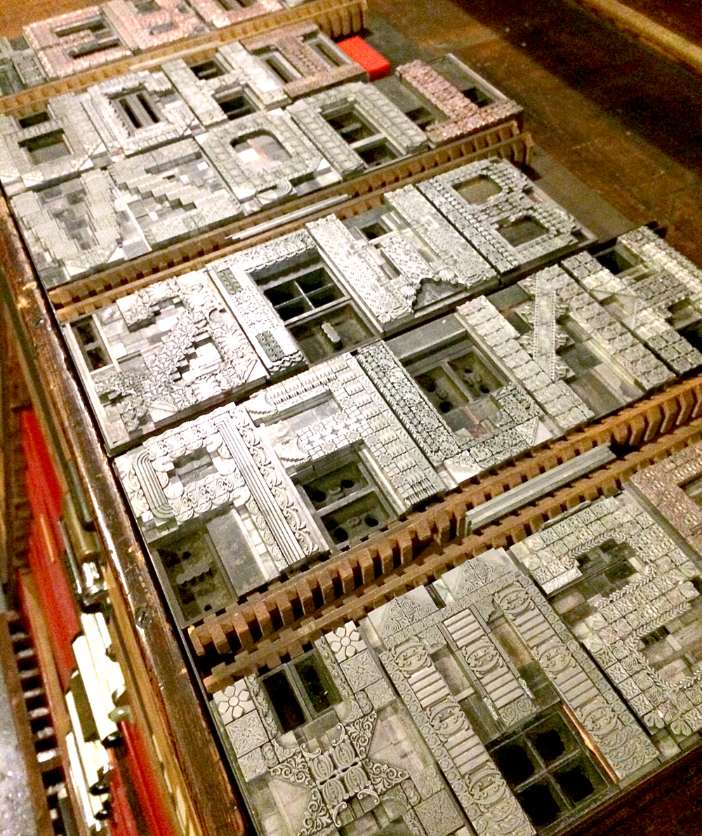
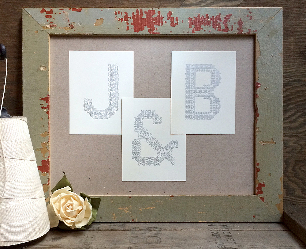
All fitting within a 6x9" page size, this is one of the tightest and most elaborate forms I've built in a while. Given the amount of information that needed to be conveyed in a small space, the type is largely 8 point and under. The previously set ampersand makes another appearance here.

loTprosp1
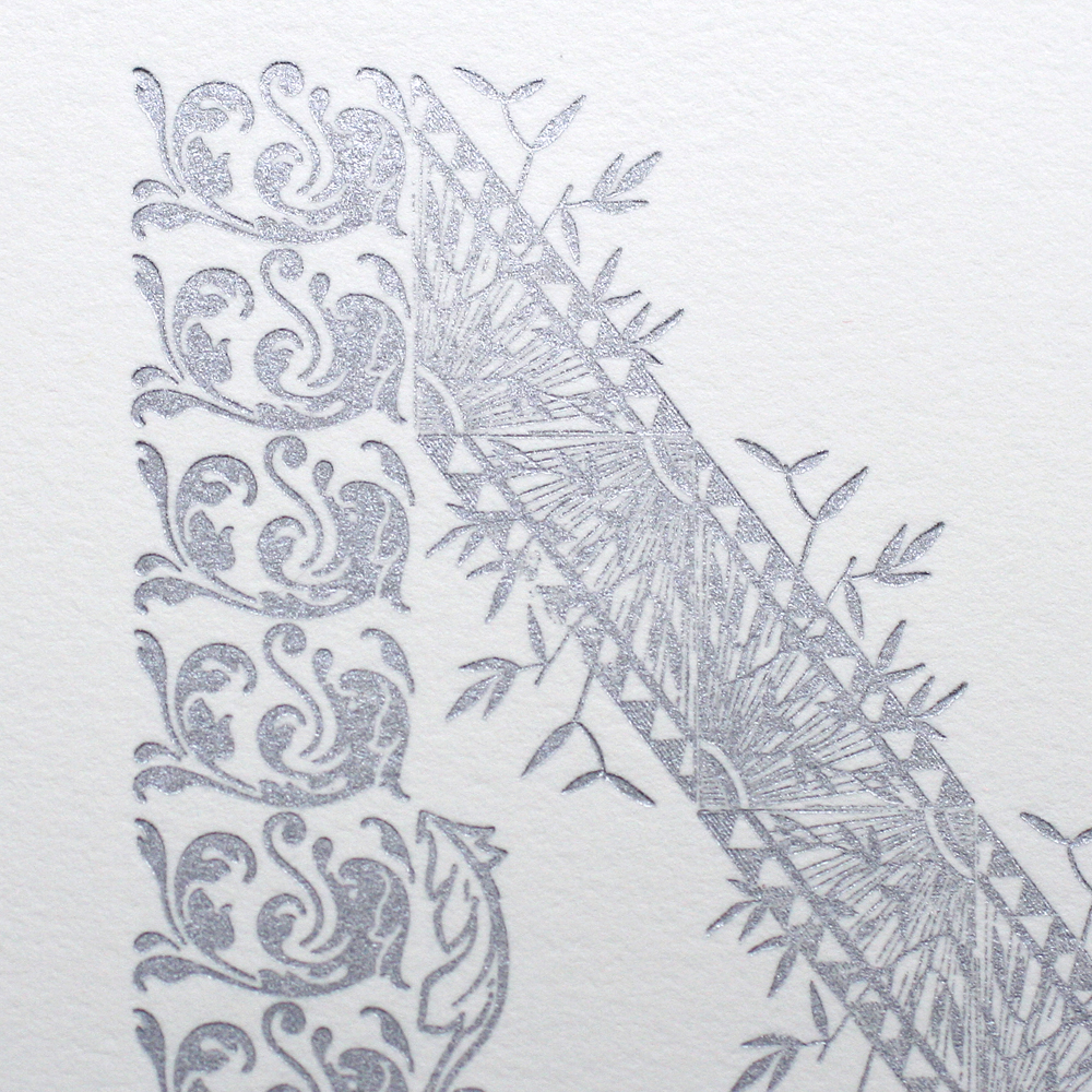
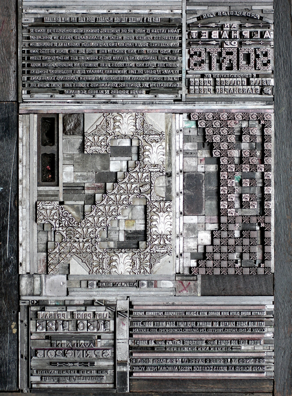
For the title, I set SORTS from 6 point square ornaments and added asterisks in some corners to soften what would normally be a smooth curve. ALPHABET is set in Cleft Gothic, a Chicago-based typeface designed about 120 years ago. I liked that it was small and gothic but had its own bit of ornamentation going on.

loprosp1

loTprosp3
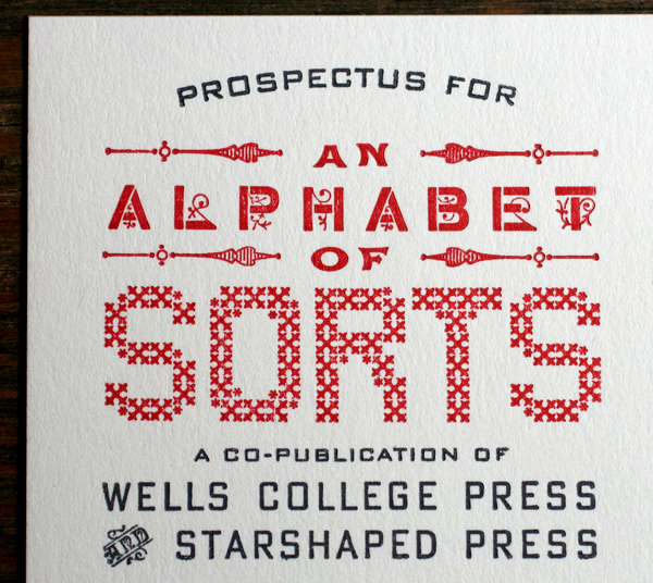
The main paragraph was set in 6 point Bernhard Gothic, both Light and Medium, and gives an overview of the forthcoming book. I'm so pleased to have Paul F. Gehl of The Newberry Library on board to write the introductory note to this endeavor!

loprosp7
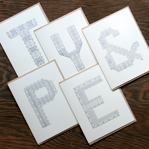
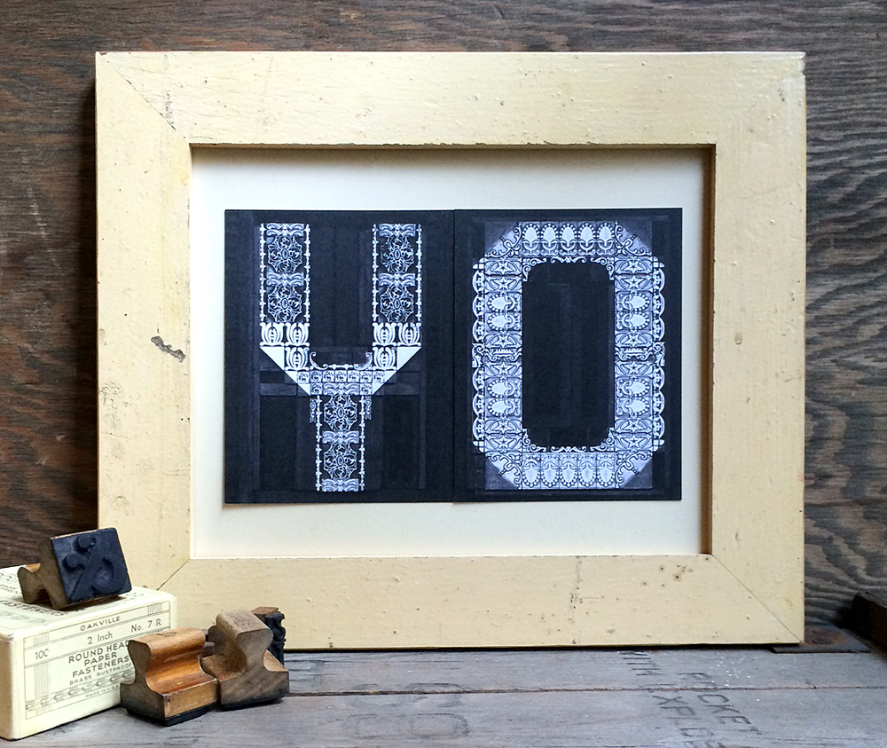
Since I'll be printing the cover and end papers as well on gloriously red Italian paper, I've been experimenting with creating a smaller alphabet unique from the large one that will be featured inside. One idea is to reverse out an alphabet from ornaments on a smaller scale. This would be a nice juxtaposition to the main letters and present a new challenge to designing a set of letterforms.

loprosp3

loTprosp4The bottom of the prospectus contains the nitty gritty details of the book. You may recognize the name of this guy listed here, now comfortably stationed at Wells.

loprosp5

loTprosp6


loprosp4

loTprosp7

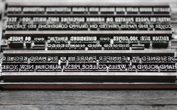
Presales are going strong, and the edition is expected to sell out! I will be finishing the printing by the end of the year so that binding can begin. Books will be delivered around May Day, 2015. I'm happy to send the above Prospectus; just contact me with your address!

An Alphabet of Sorts

Back in the Spring, I put together this little print for the Legion Paper Scavenger Hunt at the National Stationery Show (you can read all about that here), and never had the heart to put away the M form. That sparked the challenging idea to create an entire ornamental alphabet that could potentially be turned into stationery and more. metaltype1So I started in random order to develop other letterforms. Most measure about 21 picas high (about 3.5") with varying widths based on individual letters. I sketched rough layouts for each letter, with some being considerably easier than other. The L is unique in that I specifically used many of our ornaments originally designed for the Lanston Type Company.

lOnce I got into the flow, the letters practically designed themselves.

hdAnd then suddenly there were 26 letters, comfortably living on 3 galleys.

typeforms3I wanted to include an ampersand because they are perennially popular and it would serve my ideas for the end result of the project. But this form proved to be quite difficult; it looked as miserable as this image while I walked away from it for a bit to revisit ampersand designs that might better inform the outcome.

ampersandfailAfter a break, this is what came together. Getting all of the angles was pretty killer but the final form was solid. It even includes a tiny 'and' catchword.

ampersandOccasionally taking a break from the typesetting, I started printing the actual folded note cards. These didn't necessarily go in order, but the first three did. They are all printed in silver on Stonehenge cotton paper, and include 100% recycled kraft envelopes.

abcAnd here the M, slightly updated, makes another appearance.

McardA few of the details...such lovely ornaments.

Ndetail

RdetailThe stationery is sold in sets of 6 by the letter, so you can pick your favorite. Great for gifts, too! And of course there's the ampersand if you just can decide.

compiledstationeryIt struck me that the forms themselves were really beautiful and that they could perhaps be used for another purpose. So after printing each run, I left a little silver ink on them and grabbed the camera. I digitally cleaned up the images to adjust the contrast to best show the ornaments and then flipped the images so they could be read by all.

I

QThen I had these printed digitally as postcards on thick, recycled card stock.

compiledpostcards

EpostcardAnd they're fun to play with! Sold individually, it's easy to mix and match and spell whatever you like. Or, of course, send them as postcards.

yo3We also had some fun punching holes in them to make banners. Here are the adorable and lovely Will and Sido from Ravenswood's own Beans and Bagels.

willsidoBeautiful box sets all ready to go. These are available on our etsy site now.

cardspackagedAnd if you're interested, we can sell letters individually so you can use the actual printed cards as a display. Given that Mr. Starshaped and I will be celebrating our tenth anniversary this week, I put together this grouping for him. See the importance of that ampersand?

jb1

Tradition and Progress

Way back in 1996, I started working at Fireproof Press, run by John Upchurch and Matt McClintock, known for producing music packaging, posters, business cards and other oddball print pieces, mostly for Chicago-based artists. The third floor workspace, shared with Screwball Press, was hot in the summer, cold in the winter, scattered with press bits and flying sheets of paper. I loved every minute of my time there (almost). Everything was made better with root beer. John closed Fireproof in the winter of '98, and I like to think that had he not done so, I'd still be there today. Forced out into the world, I got one press, and then another, and in the summer of '99, Starshaped Press was born, at least in name. I took over a number of jobs that had been intended for Fireproof, and then began a two-year stint at Columbia College, alongside John in his new position. During that time I grew the business and set up our first studio, about 385 sq ft in the lovely Ravenswood area, where I worked exclusively for two years after leaving Columbia. In the summer of 2003, the studio moved to a bigger, brighter space also in Ravenswood, where the work continues today. Here's what an average day look like:

studio114To celebrate the 15th year of the studio, I've planned a series of prints to showcase some of the fine type in the studio as well as the ideals that have guided the work of Starshaped over the last 15 years. The first print pulls a quote from the Barnhart Brothers & Spindler type specimen book of  1923 and is printed in three colors.

bbspromo4The first layer is printed using the back sides of wood type, allowing the texture of the wood to come through.

Tbbspromo6

bbspromo3The border elements are composed of ornaments from different collections, mostly cast at Skyline Type Foundry.

Tbbspromo9'Tradition' and 'Progress' were printed with wood type that's in pretty rough shape. But I wanted to contrast the rustic aspect of this 100-year-old type with some of the newest metal type; 'typographic art' is set in Runic, a brand new cast and not used before this project.

bbspromo2

Tbbspromo2

Tbbspromo3Where did the time go? These four typefaces (Railroad Gothic, Onyx, Engravers Old English and Stymie Bold) have all come to the studio collection from different sources over the years.

bbspromo5

Tbbspromo4Here is a full shot of the final print. I wanted to deconstruct the traditional text-heavy broadside of the late 1800s while maintaining the 'more is more' approach to typesetting of that time. I felt this quote was particularly forward thinking, especially given that it appeared in print in 1923.

I am sending the print (along with ones to come this year) to the printers and designers that I admire, and that have championed Starshaped over the last 15 years, as well as folks that have a passing interest in letterpress and typography. There are still many copies left in the studio and I'm happy to send one to anyone that would like to have it! Just email with your info. And thanks for the support. 2014 is going to be a great year in the studio.

bbspromo1

Holiday Sneak Peek

Sure, it's May, but on the stationery calendar, that means it's time to present the year's holiday offerings. We've been busy designing, setting and printing fresh new cards and will be showcasing them very soon. This year we're featuring a number of hand carved multi-colored linoleum cuts, as well as intricate and layered patterns. We've also got two fabulous 2014 calendars which we can't wait to share. In the meantime, enjoy a sneak peek of some of the fabulous type and ornaments used for our new collection. Both single cards and boxed sets will be available this Fall... we don't blame you if you want to wait until then!

Tcheerstoyou

Teightaredays

Tletsbejolly2

Tletsbejolly

Thohoho

Tnoplacelikehome

Tohstarrynight

Tseasonsgreetings

I Wood Die 4 U

If you know anything about wood type, then you're familiar with the important role the Hamilton Wood Type & Printing Museum plays in the history of its creation, production and usage. In the last year, the heavy hitting digital type foundry, P22, teamed up with Hamilton to release new digital versions of many of their classic wood typefaces under the name Hamilton Wood Type Foundry. Rich Kegler, the talent behind the project, approached me about working with a few of the new faces, especially their star border, to see what I could come up with. And while pushing actual wood type around on press is more my speed, it was sure fun to come up with something that had no size restrictions or limitations based on what was in the typecase. From the comfort of my home and with Prince on the brain, here's what I did:

hwt1

hwt2

hwt3

hwt4

The Star Ornaments border is all sorts of awesome. It comes in various configurations that you can easily combine to create elaborate frames or maze-like images. And there are tons of stars to choose from, even more than what we have in the studio. Also shown here are: American Chromatic (too amazing for words, really), Antique Tuscan no. 9 and Republic Gothic.

Why wouldn't you want to get your hands on these gems? Follow along with the Foundry's adventures, and check out their site for ordering info. And no, this isn't a paid endorsement (just a plain ol' enthusiastic one), though if I'm lucky there might be some Buffalo wings in my future.