
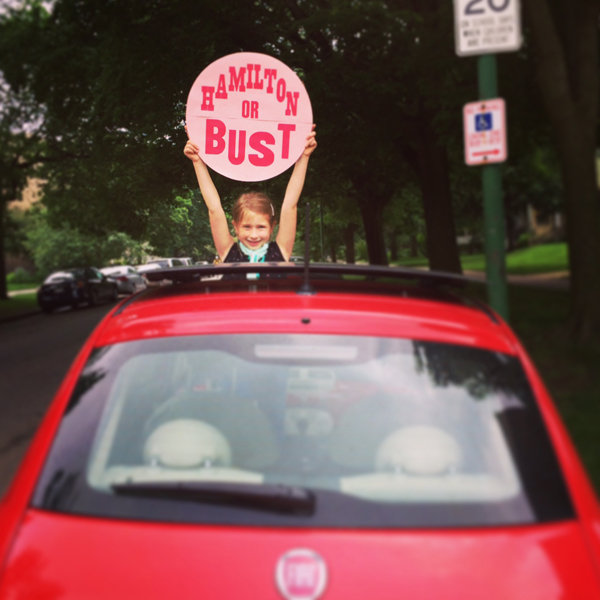
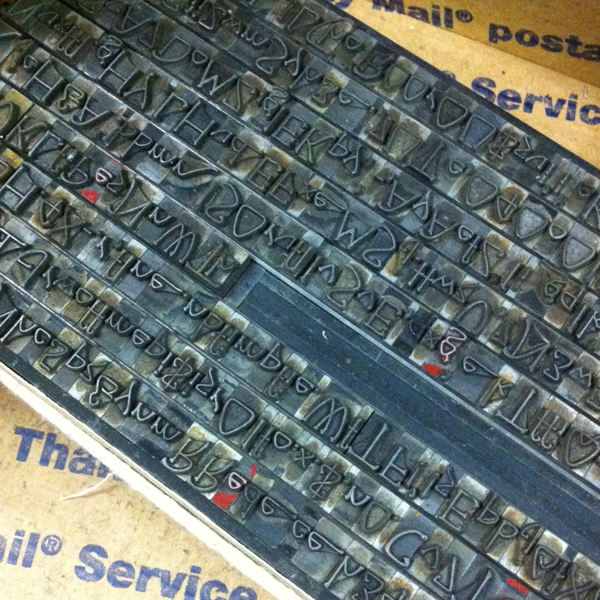
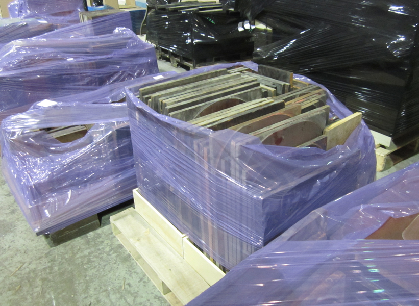
It's always a treat to drive up to Hamilton for a visit, especially when it involves seeing our print and type friends from the Amalgamated Printers Association, a group I've been a part of for 10+ years. After cutting school early, Jo and I hit the road. If this shot doesn't ring a bell, maybe this image from a favorite album will hint at our inspiration. Our little fiat is well traveled.
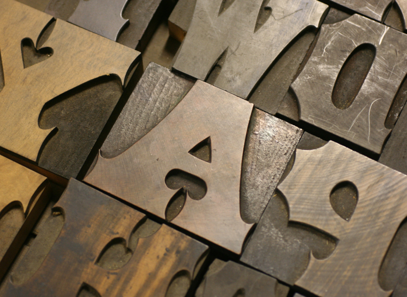
 After checking in (and yes, Jo gets a pretty special badge), we found our friend Scott from Moore Wood Type already at it, cutting type and doing demos for onlookers. He also brought a lot of his patterns for people to see so they could learn about the process of pantograph cut wood type.


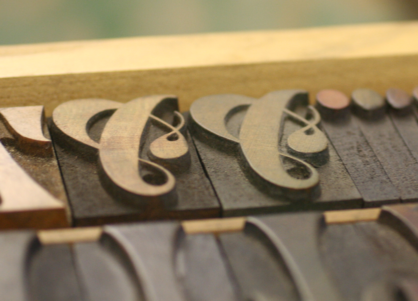
 Love these star patterns. You can see the 6 pointed Chicago style star (which Scott named 'Jo's star') down in the corner.
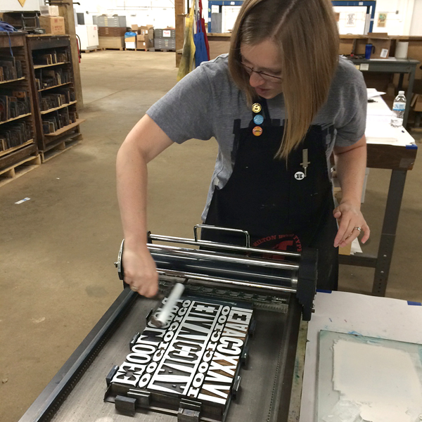
 We found our friend Jason of Genghis Kern trying his hand at the pantograph.
 Another workshop about wood engraving was also going on, and everyone there carved into blocks that were ultimately cut as letters for Wayzgoose 2014.
 Friday I finally got the opportunity to teach a workshop with a longtime friend and talented printer, Jessica Spring of Springtide Press. We worked with our class on two projects: the first was to contribute a page to a meander book and the second was to print type as pattern to then cut and weave. Jessica led the way on the book, setting up the form on press and then demonstrating how to cut and fold the single sheet into a book.

 Here are a few of the serious ladies pulling type for the print and paper weaving.
 Here's our good friend Erin of Inky Winke trying her hand at a little opaque white ink.
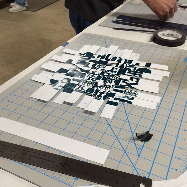
 Our prints were a bit wet, but we were able to trim them down to start weaving together. This creates an entirely new kind of print that can be trimmed to a smaller, square size, functioning as a piece of art in its own right.
 Mary Alice used a few different sheets of paper for her prints (and some attendees swapped with each other), and ended up with a very patriotic weave.
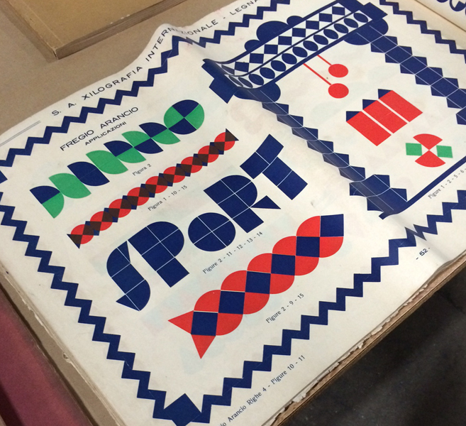
 Rich from P22 (and also responsible for spearheading the digitization of Hamilton's type for the HWTF) was there, showcasing his latest project. Borrowing the Cloister Initial matrices from RIT's Cary Collection, he worked with Greg Walters in Ohio to cast whopping 120 point versions of the beautiful initials. Bringing a set to Hamilton to share, he also printed a broadside with all of them; you can see a snippet of it below with the S and P we came home with.

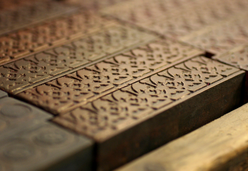
 Friday night, Greg Walters (who cast the above initials) gave a talk about foreign type specimen books and brought a large selection from his personal collection. Below are just a few shots of the pages I found incredibly inspiring, including these magnificent brass rules printed in multiple colors.
 Greg mentioned many trends, including the predominance of art nouveau faces, which all but escaped American type founders. There were also many thick and heavy, multi-color patterns and borders.


 After the conference, I realized I didn't get any full shots of the group. Luckily, an APA group photo is always taken, and hopefully we'll see that soon. There's been a sea change in the APA. Can you guess what it is?
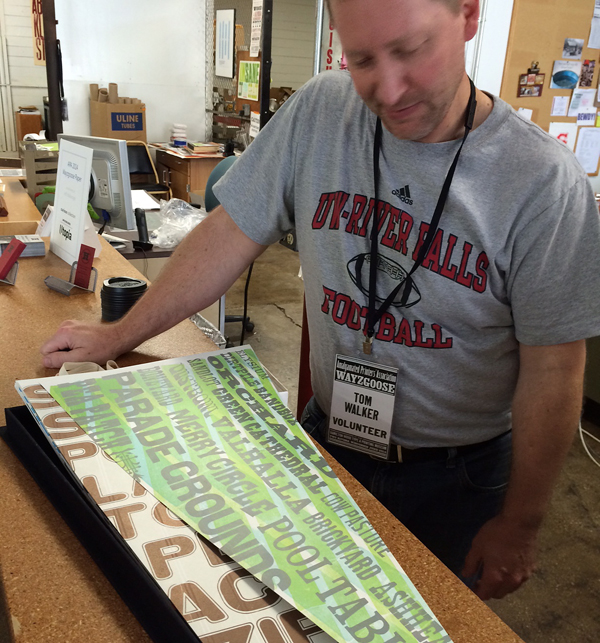
 Before checking out for the weekend, we got a little sneak peek at Tom Walker's incredible series of baseball-inspired pennant prints. Incredible and detailed work, with a hand built box to boot.
 As always, we had a great weekend in Two Rivers, and look forward to November when we're back again. And next year the APA Goose will be in Chicago, and it'll be incredible so mark your calendars.
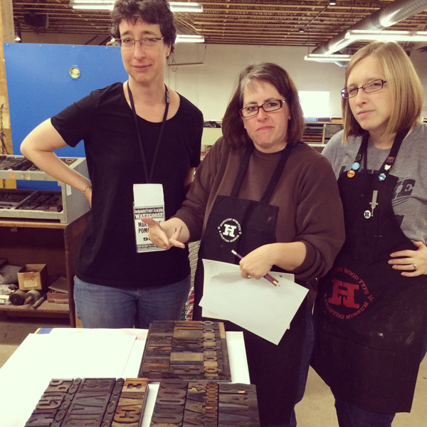
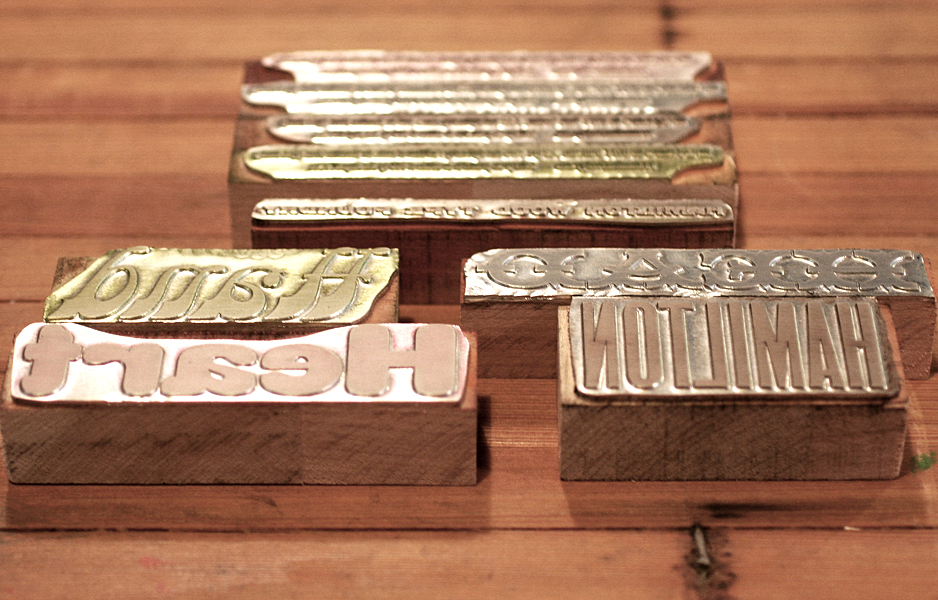
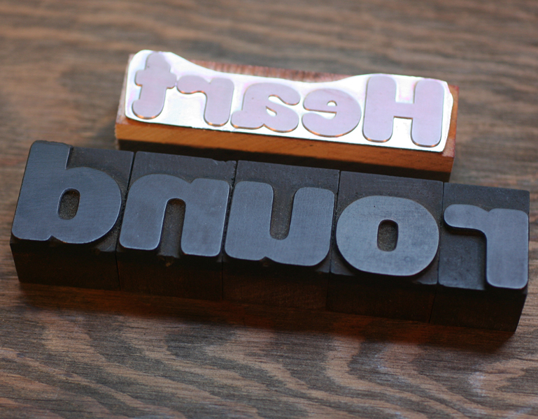
Matching type nerds!


