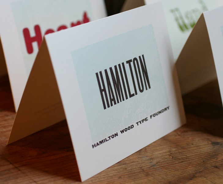
Starshaped rarely prints work that is not designed in the studio, given our mission of printing only with the metal and wood type we have. But every once in a while, a project comes along that offers a chance to combine our materials and knowledge with the talents of others in a collaborative way. You may be familiar with the Hamilton Wood Type Foundry's new initiative to digitize some of the gems of the Hamilton Wood Type Museum (we've played around with these before). The effort is spearheaded by P22, a type foundry I have long admired, so when they asked about printing some note cards that feature the new digital versions of some of the upcoming releases, saying Yes was the obvious answer. Four cards were planned to coincide with the theme of the AIGA National Conference in Minneapolis October 10th-12th, and would be given away at the Adobe booth, as three of the fonts featured are volunteer efforts by Adobe designers. The first, Gothic Round, will be in circulation before the conference begins, and the others have release dates over the next few months.
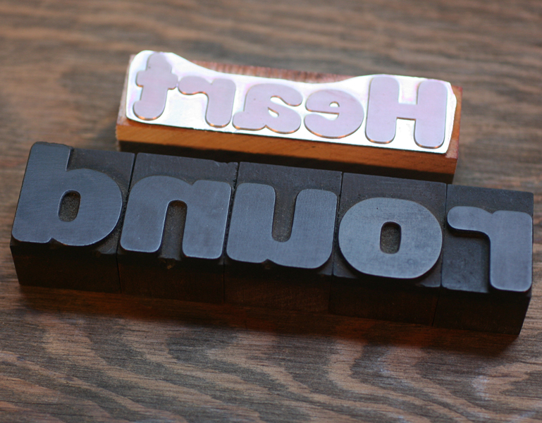
I love a little irony in our printing and this project is a great example. We were to print magnesium plates made from digital typefaces designed from the original wood type.
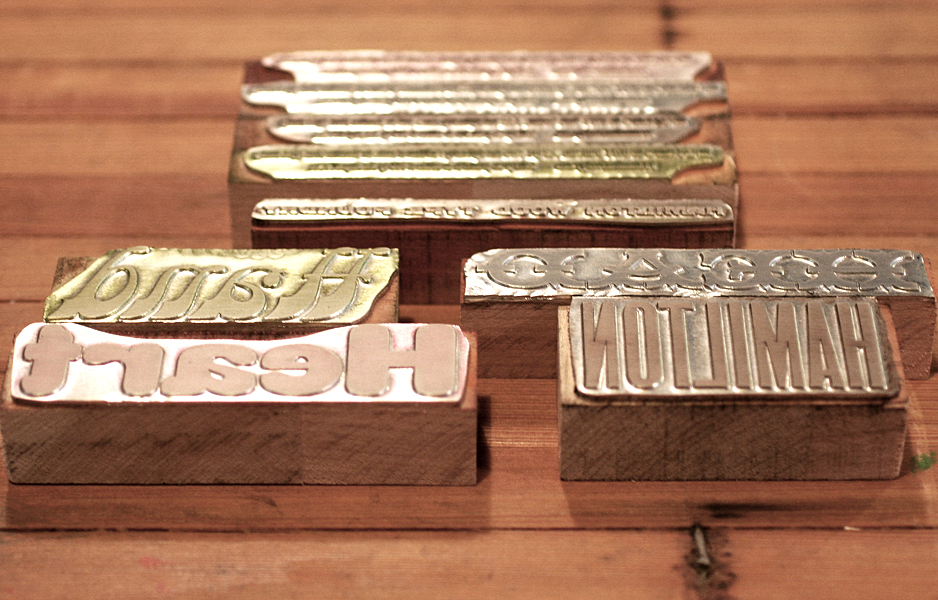 Just for fun, I pulled out some of our 8 line Gothic Round type to shoot with the plate for the first card:
 Each card would also feature a subtle background texture printed from the wood type in our collection. Here's the lucky piece, which has a lovely grain:
 Long ago I discovered through trial and fail that it's better to print transparent-base inks over the darker, more prominent ink color. So for each of the four cards, the main color was printed first and the lighter background wood texture printed afterwards. This keeps the darker color from pooling on top of the lighter pass, and anything with a mostly transparent base will never compete with a dark, saturated ink. In order to make sure everything would line up, I created a template on a transparency that I could place over top of the first color:
 The color palette was solid, and each card coordinated with rich envelopes from French Paper. Here's the cheat sheet for matching inks.
 These are the final cards together, along with a close up of the pale wood type texture.


 The sets are to be given away at the AIGA conference, and I'm told Hamilton will also have some. These faces were exceptionally designed the first time around for their wood type form, and I can attest to the quality of the new digital versions. If you can't work with the real thing, grab yourself these digital versions and support Hamilton. We've got some big doings up there in another month... more on that later.