Holiday Sneak Peek

Sure, it's May, but on the stationery calendar, that means it's time to present the year's holiday offerings. We've been busy designing, setting and printing fresh new cards and will be showcasing them very soon. This year we're featuring a number of hand carved multi-colored linoleum cuts, as well as intricate and layered patterns. We've also got two fabulous 2014 calendars which we can't wait to share. In the meantime, enjoy a sneak peek of some of the fabulous type and ornaments used for our new collection. Both single cards and boxed sets will be available this Fall... we don't blame you if you want to wait until then!

Tcheerstoyou

Teightaredays

Tletsbejolly2

Tletsbejolly

Thohoho

Tnoplacelikehome

Tohstarrynight

Tseasonsgreetings

Partners in Crime

This year has seen many specialty prints in the studio, including ketubahs, or Jewish marriage certificates, and this was one of our favorites. Michelle and John wanted something that was very typographic for their ketubah, and if it could reference their location and love of the ocean, all the better. Here's the final piece: michellejohn1

The very pale clouds were printed with a hand carved linoleum cut and add just a soft touch of sky behind the text.

michellejohn3

Tlino2

Typographic enough?

michellejohn5

The form for this piece was particularly impressive. Their names and the ampersand are wood, while the rest is metal, with a hint of deco to it. Force justified type presents a few challenges, given that the spacing has to be done by hand. There are hundreds of little brass and copper thin spaces in between most of the letters in this form.

Tmichellejohn1

Tmichellejohn3

Cityscapes are always fun, and San Francisco is no exception. We've had a little experience with the Golden Gate Bridge, so it was a bit easier this time around. The city and text are printed in steel gray, with a red that mimics the bridge alongside the pale blue sky and ocean.

michellejohn4

Tmichellejohn2

Congrats to Michelle and John! Enjoy your new life together in your beautiful city.

The Annual Platen Press Museum Type Sale

If you have any interest in the history of printing, the Platen Press Museum is a must see place in Zion, Illinois (about an hour north of Chicago). It's run by Paul Aken, who is very much a mentor and booster of all things Starshaped. My relationship with Paul goes back many years to when I routinely went to the museum to help identify type and learn as much as possible about printing. Every Spring Paul hosts a type sale at the museum to clean out many of the duplicate typefaces, as well as other bits and pieces necessary to the craft. For the last two years, the sale has also include complete tabletop and sign presses, all set up and ready to print. If you're just getting started, or looking for a few missing things that would make your print practice that much better, this is a not-to-be-missed event. 
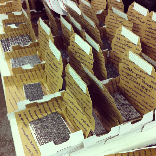
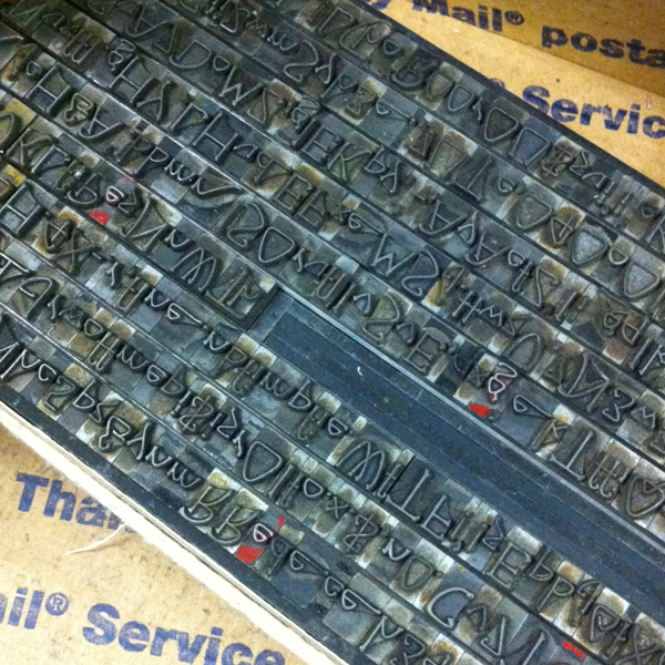
Today I went up to Zion to help identify, label and price some of the type that will be available. I'm thrilled to say there are some real gems set to go for the sale!

Here are the details:

Saturday, May 4th, 2013  ·  9:00 a.m. to 2:00 p.m.

Cases, Type, Tools, Supplies, Toy Presses, Books, Bits and Bobs

Table Top Presses (Pilots, Sigwalts, Kelseys) with new rollers and a starter kit

3051 Sheridan Rd.  ·   Zion, IL 60099

847-746-8170  *  847-731-1945  *  platenpress@sbcglobal.net

One Day Sale   -   No Shipping

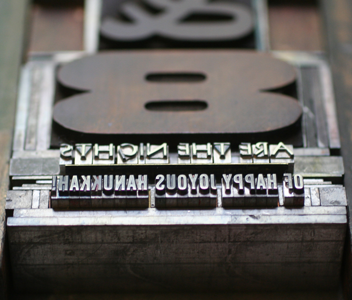
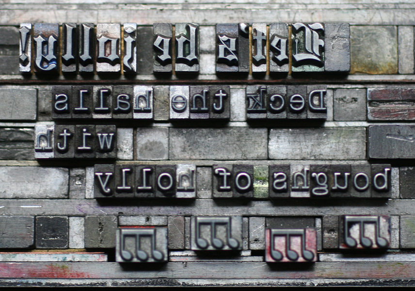
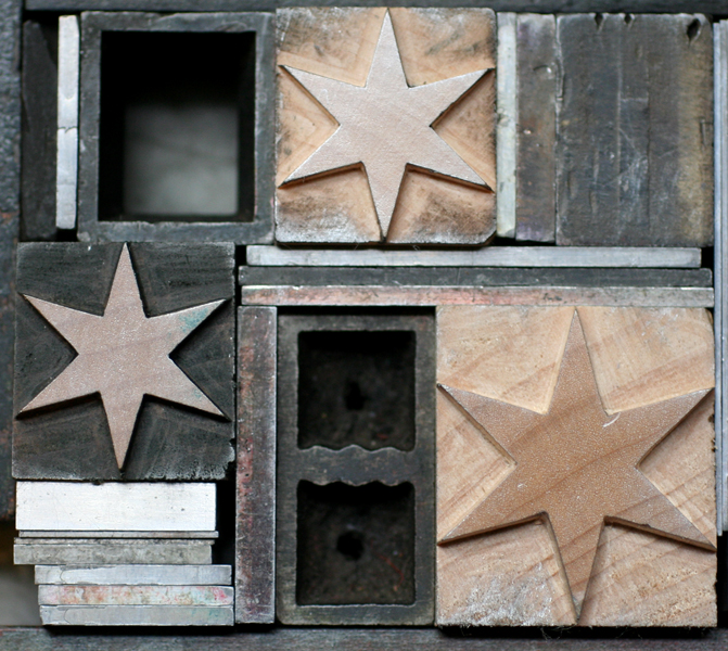
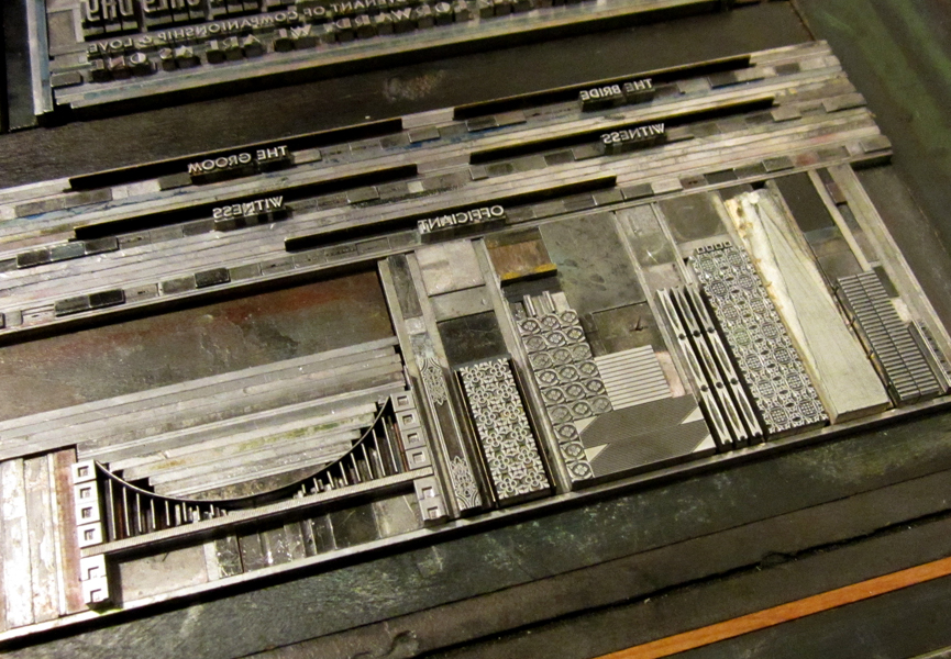
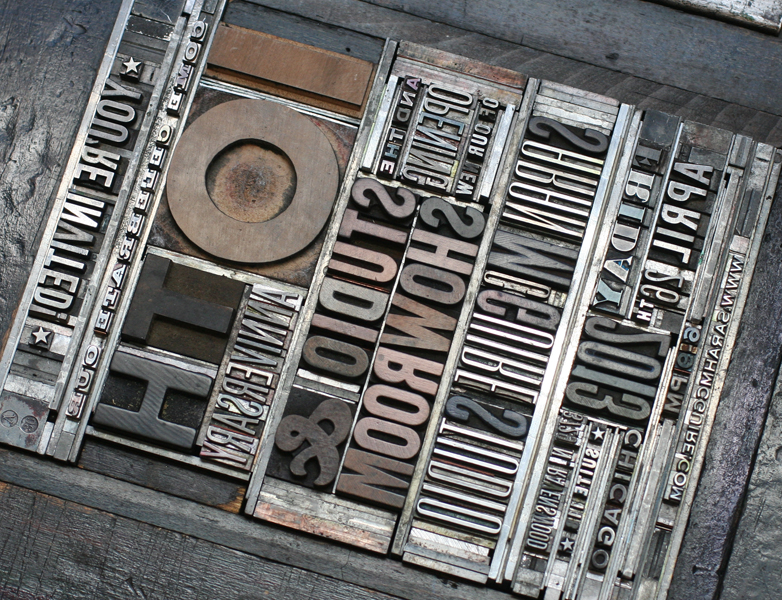
Here's a tease of just a few of the typefaces that are fonted up for sale. Type is also sold by the pound in cases, and there are blank cases as well. You really can't beat the prices (type ranges from $10-$100), not to mention the company of fellow printers that will be shopping. Hope to see you there!

photo4

photo3

photo2

photo1

I Wood Die 4 U

If you know anything about wood type, then you're familiar with the important role the Hamilton Wood Type & Printing Museum plays in the history of its creation, production and usage. In the last year, the heavy hitting digital type foundry, P22, teamed up with Hamilton to release new digital versions of many of their classic wood typefaces under the name Hamilton Wood Type Foundry. Rich Kegler, the talent behind the project, approached me about working with a few of the new faces, especially their star border, to see what I could come up with. And while pushing actual wood type around on press is more my speed, it was sure fun to come up with something that had no size restrictions or limitations based on what was in the typecase. From the comfort of my home and with Prince on the brain, here's what I did:

hwt1

hwt2

hwt3

hwt4

The Star Ornaments border is all sorts of awesome. It comes in various configurations that you can easily combine to create elaborate frames or maze-like images. And there are tons of stars to choose from, even more than what we have in the studio. Also shown here are: American Chromatic (too amazing for words, really), Antique Tuscan no. 9 and Republic Gothic.

Why wouldn't you want to get your hands on these gems? Follow along with the Foundry's adventures, and check out their site for ordering info. And no, this isn't a paid endorsement (just a plain ol' enthusiastic one), though if I'm lucky there might be some Buffalo wings in my future.

Celebrating our Neighbors

Every once in a while, the stars align and we can sneak jobs on press during our busiest times. I was recently contacted by Sarah McGuire, a local jewelry artist, about her upcoming 10th anniversary open house, with the hope that we could come up with a great invitation in a short period of time. Yes! Here's what we did, photographed with one of Sarah's lovely necklaces. sarahmcquire1

Sarah wanted a broadside-styled card with blocky, simple typefaces in various sizes, and definitely printed in silver.

sarahmcquire2

This is the form, showing the combination of metal type, wood type and rules (used for printing lines).

Tsarahmcquire

Tsarahmcquire3

Here's the form in the press, inked and ready to go.

sarahmcquirelockup

After the basic setup, I've found that large wood type often doesn't print as well combined with small type on a platen press. I took out the larger wood elements and filled them with spacing (called furniture) in order to run the small type first. After that, I put the wood back in and replaced the metal type with furniture. Two runs for one color seems like a pain, but the result is that much better and two runs on the platen are still faster than one on the Vandercook, where everything could be printed at the same time.

Tsarahmcquire5

Here's the studio address, in our own lovely Ravenswood neighborhood! We will be celebrating with Sarah in her lovely new space on April 26th, and hope to see you there, too.

sarahmcquire5